My journey through printmaking
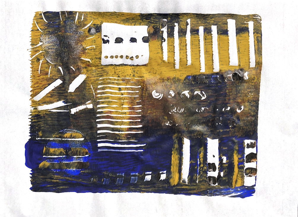
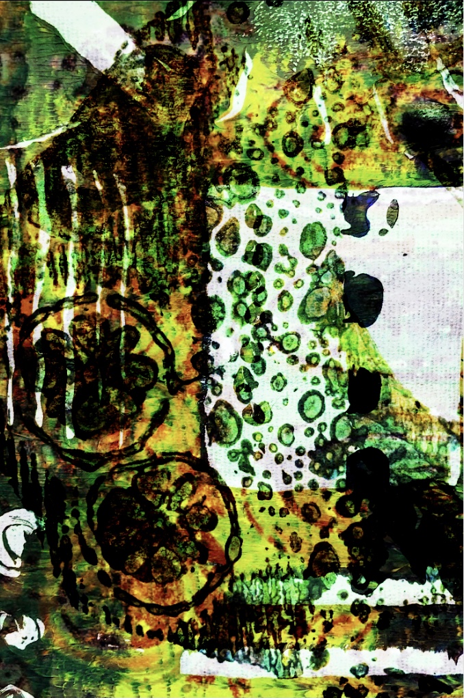
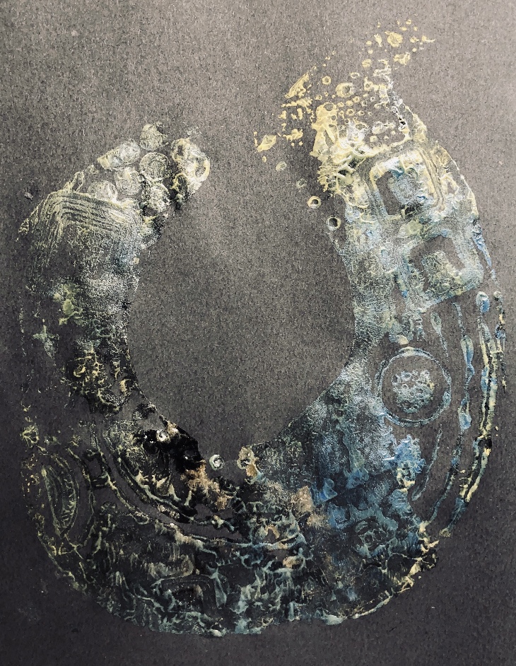
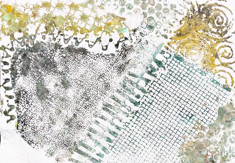
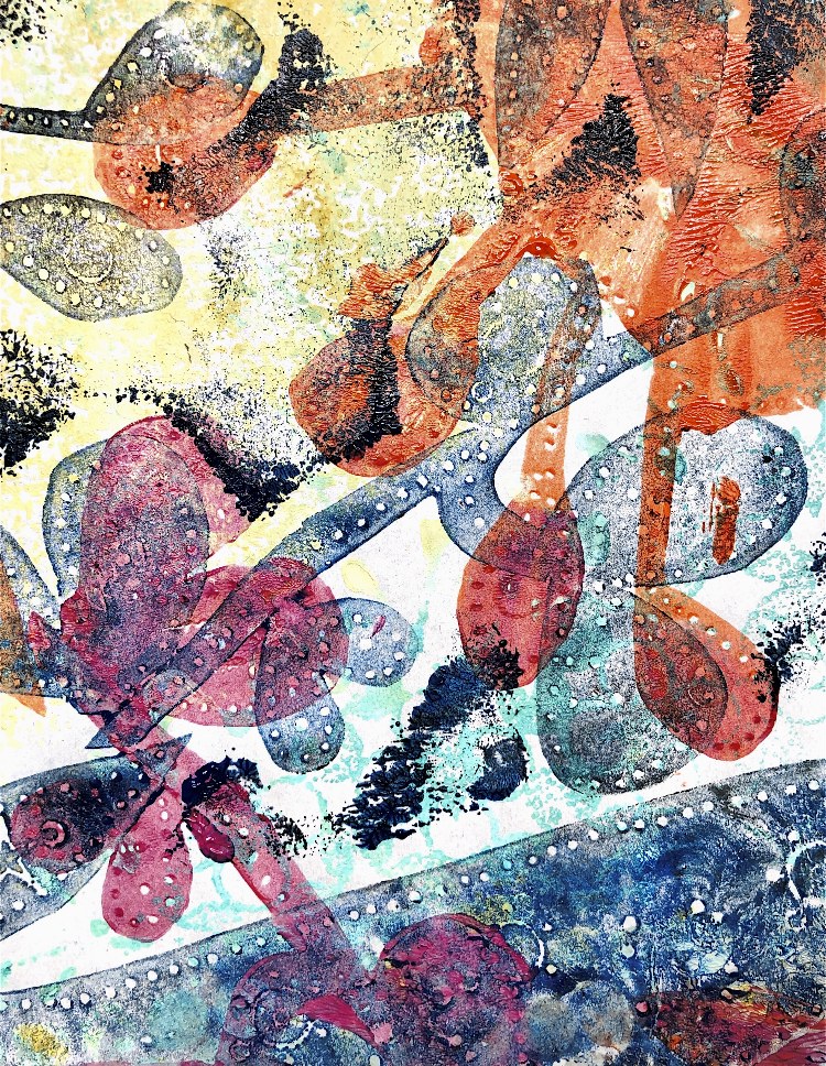
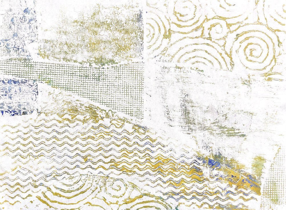
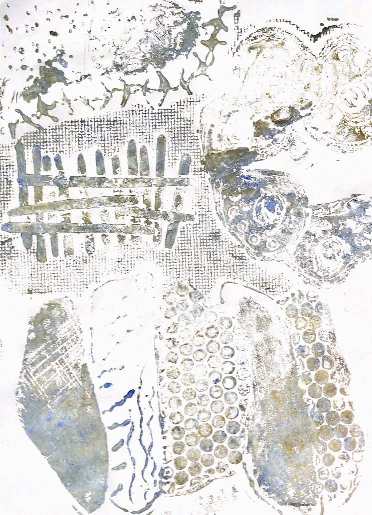
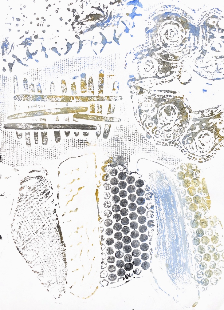
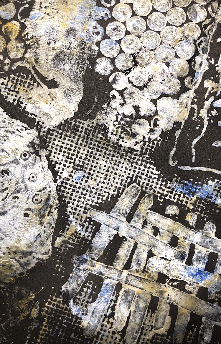
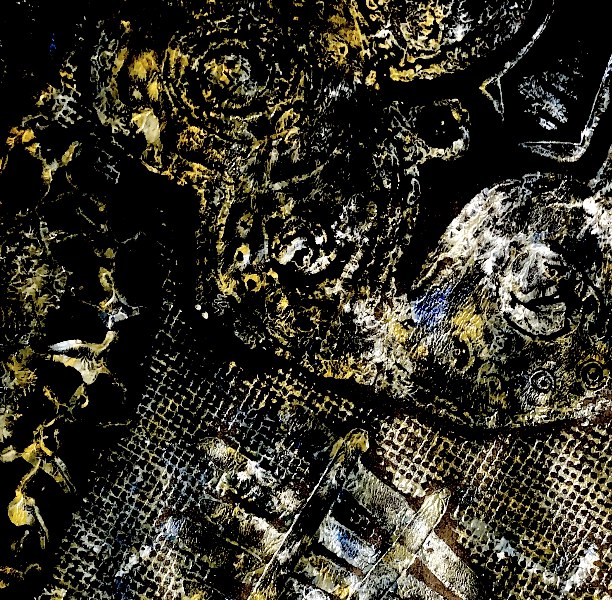
Fig, 1. These three initial monoprints are bold and bright, with strong shapes.
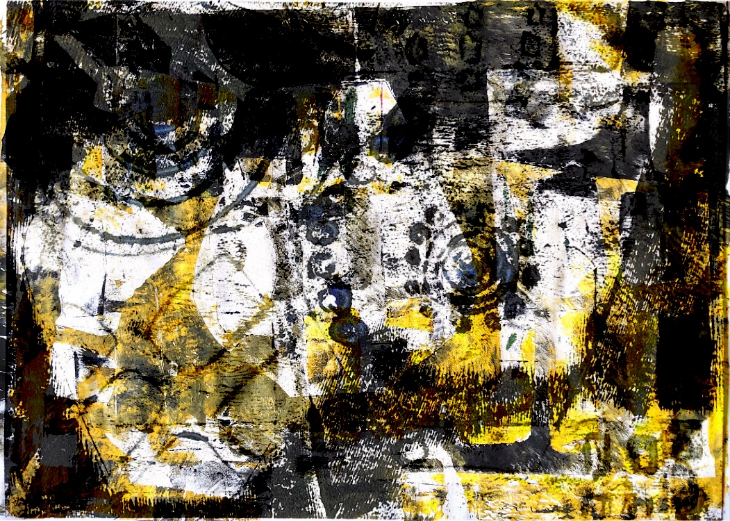
The first is smudgy with just three colours. The lines and circles create interest on the left hand side next to a blurry pale greyish area with dark vertical lines; a strong yellow focal point is towards the right hand side with a single narrow black line running through. This was my first print and I was not sure what would happen when I pulled it from the plate.
The next two prints have stronger geometric shapes and lines. The shapes are more definite and there are less colours.
None of the prints are finished pieces but they were my starting point for experimentation. I learnt from these how acrylic paints react on glass and gel plates and tried out different tools, papers and fabric.
******************************************
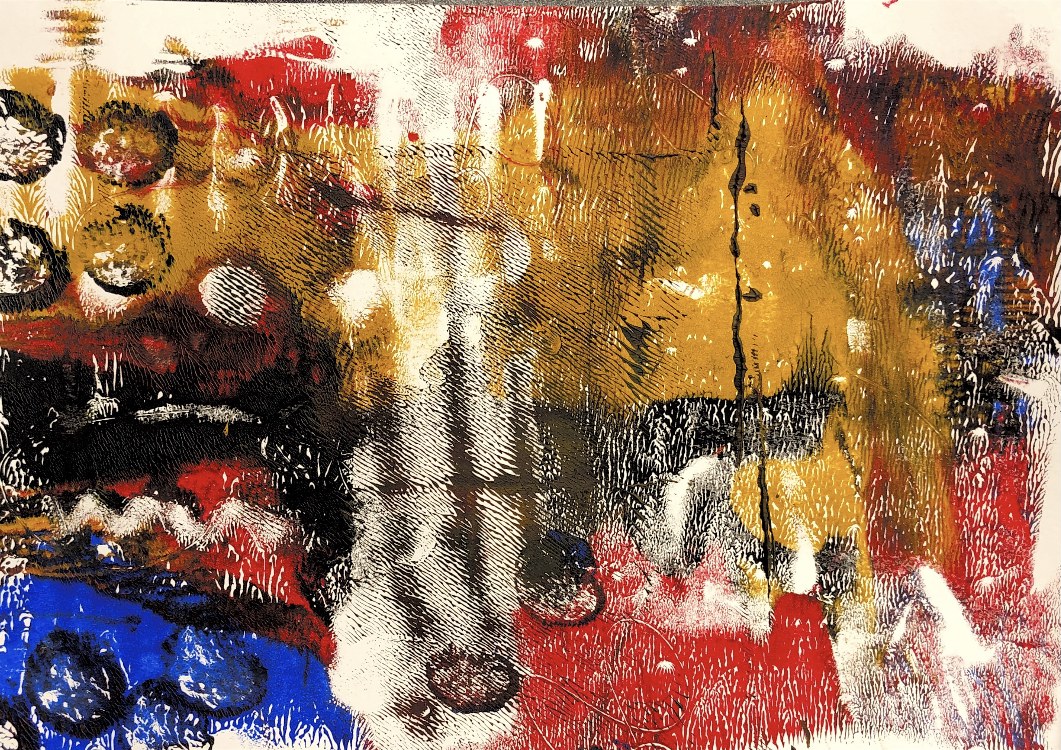
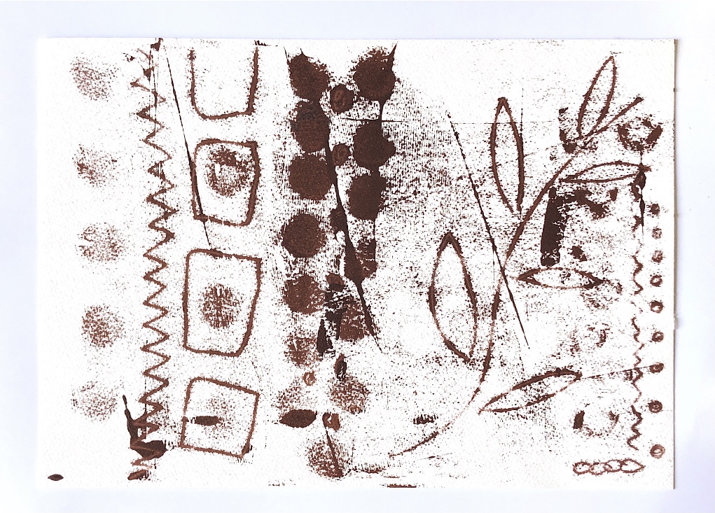
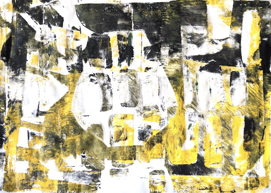
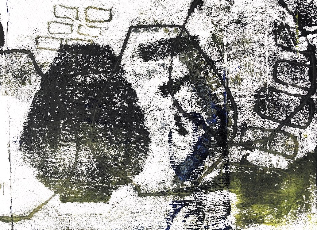
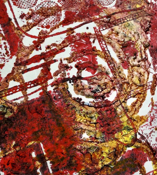
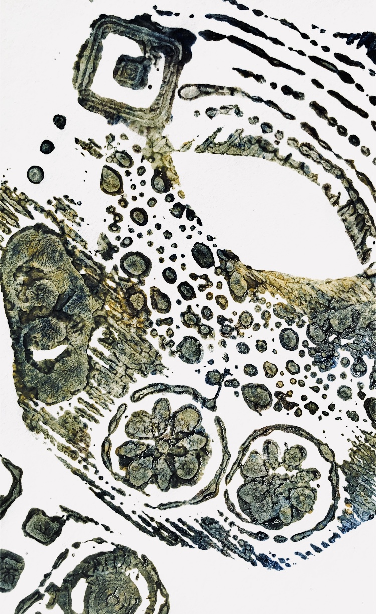
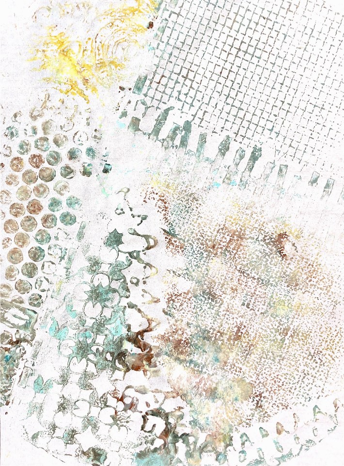
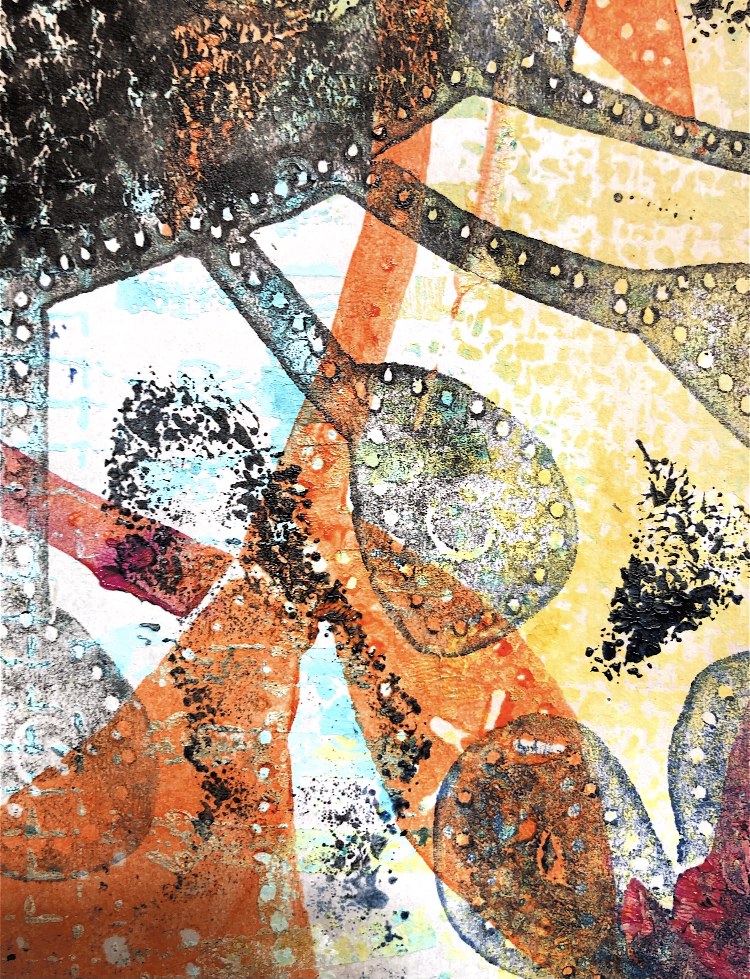
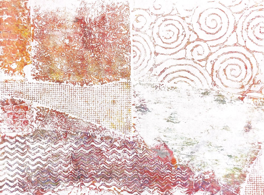
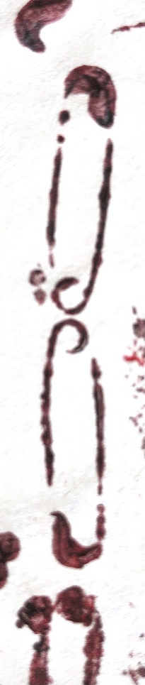
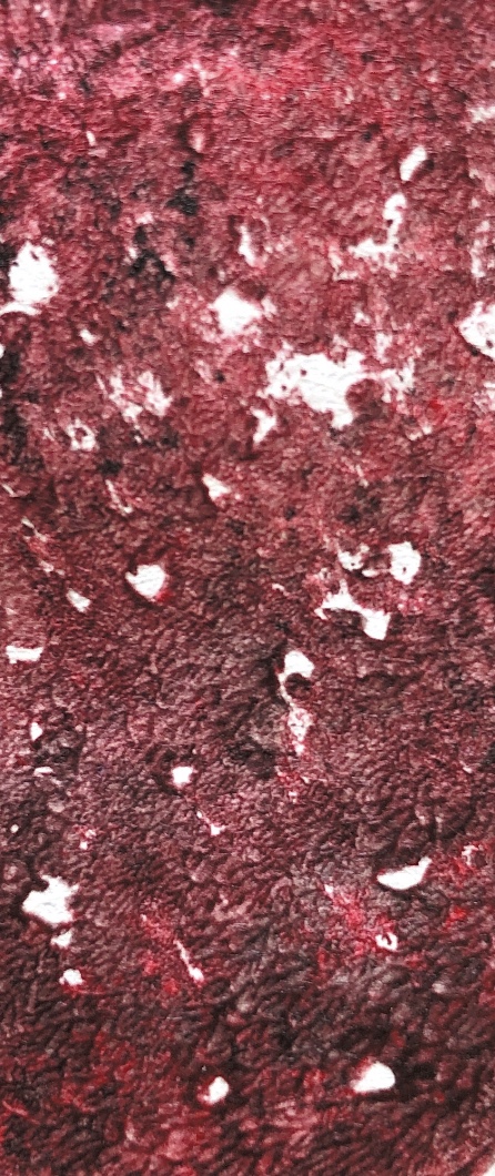
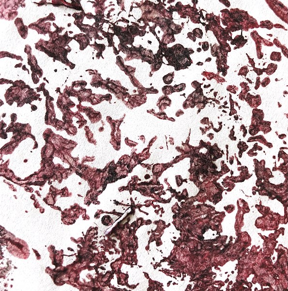
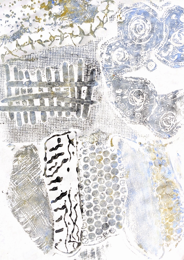
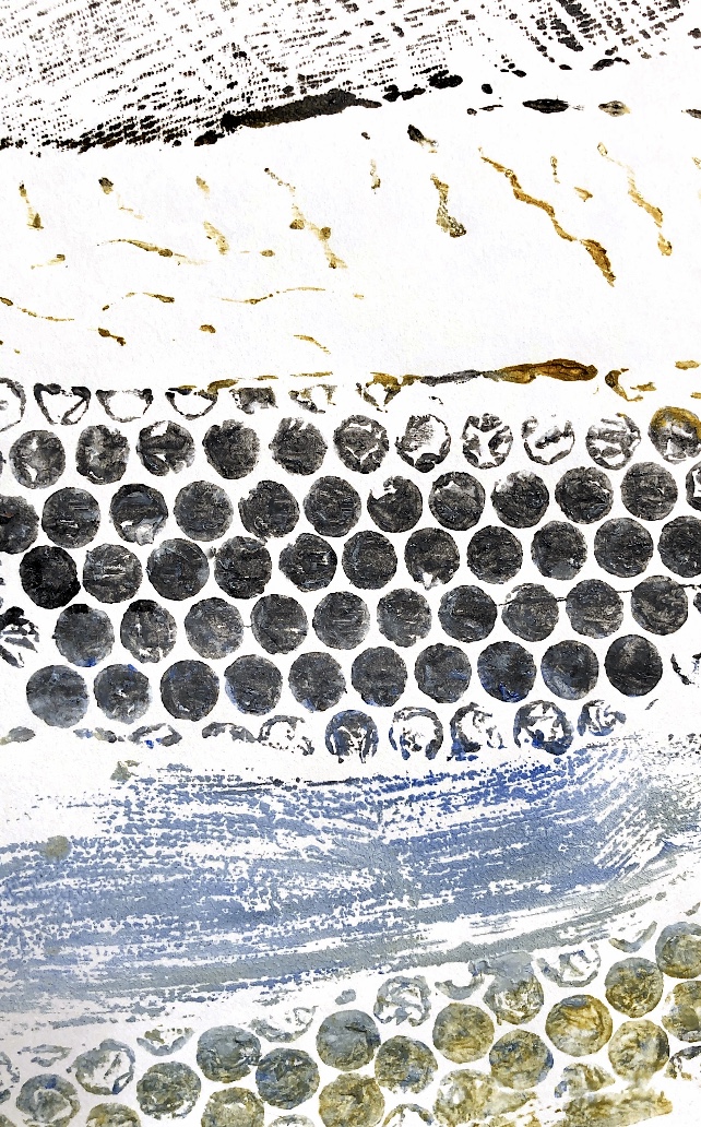
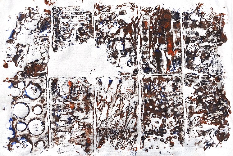
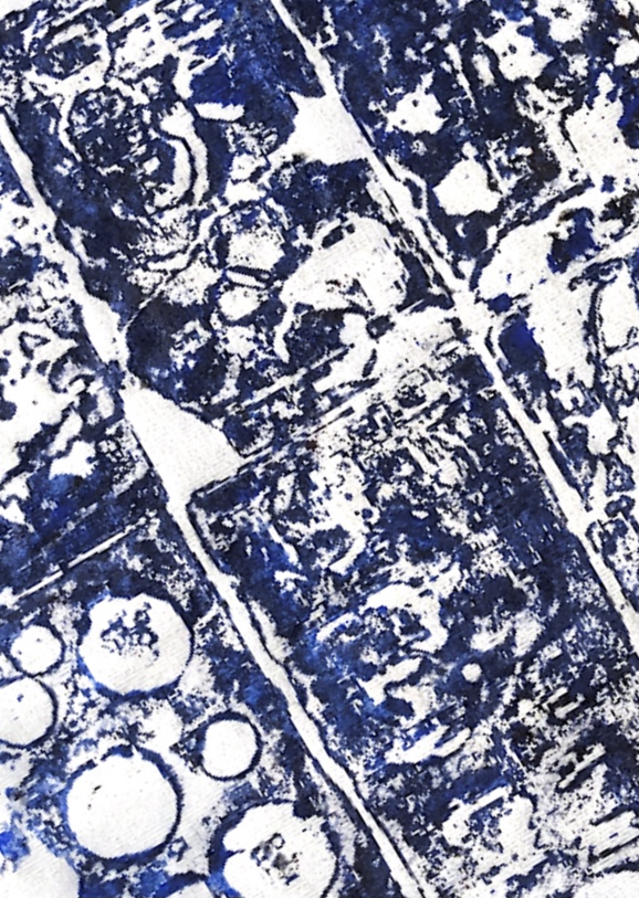
Fig, 2. I struggled with back drawing to create prints on cartridge paper but then tried watercolour paper which made a huge difference as it doesn’t pick up the paint so easily in the areas where no pressure is applied. This really was a time when trial and error worked!
The first sample was made with just one colour. It has a lovely out of focus look with a smudgy background and simple patterns. The single colour adds to the uncomplicated look. This print sparked my interest in this technique.
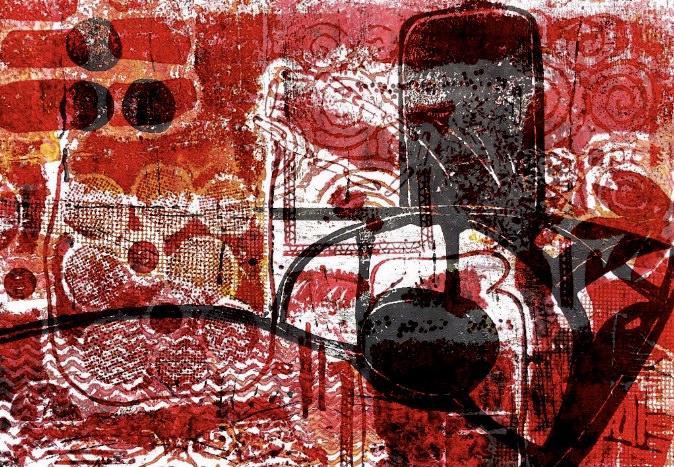
The second print was made with two strong colours and inspiration from a collage made in ATV. The thick paint and colour choice have made a dark, almost scary image with red, bloodlike splodges and a sort of crazy energy to the print. I don’t think this image could have been made with any other technique.
************************************
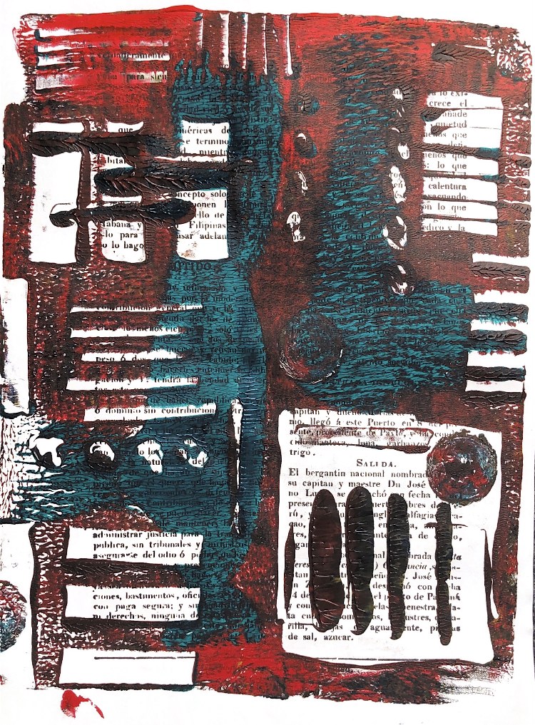
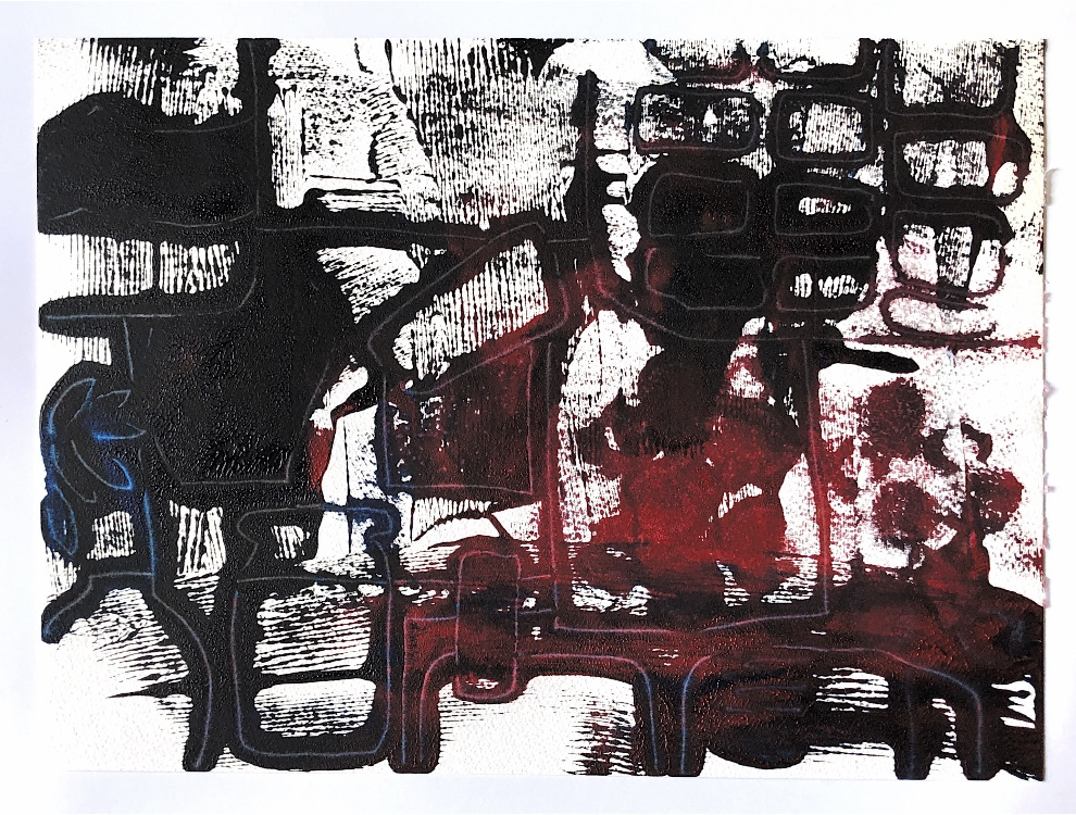
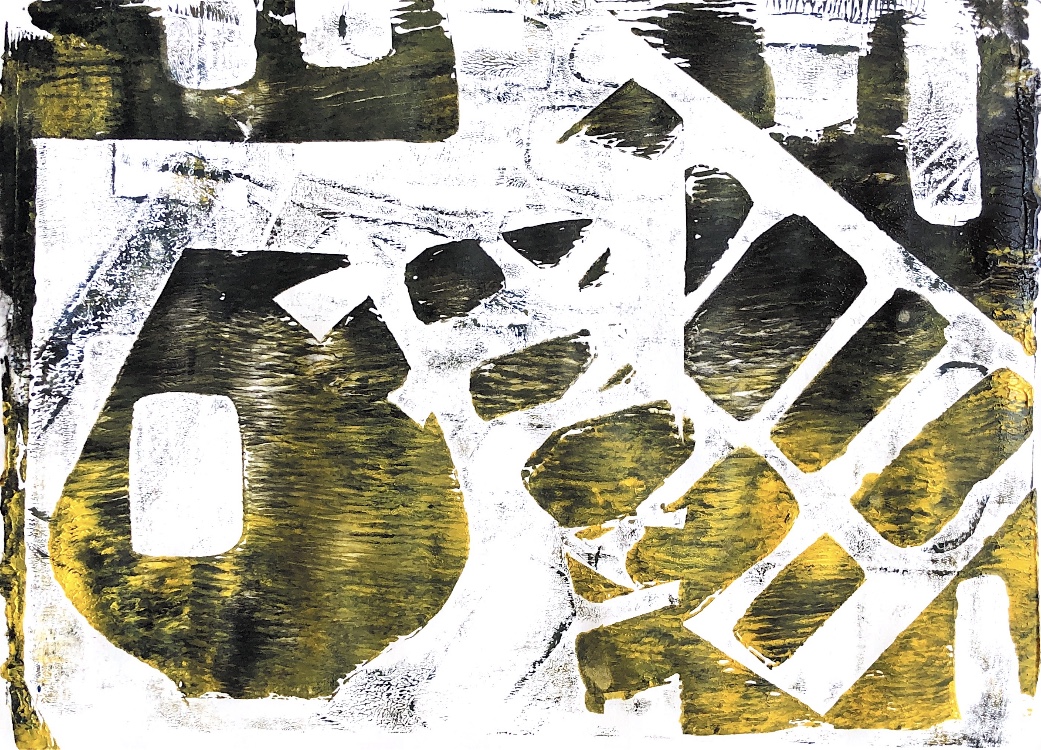
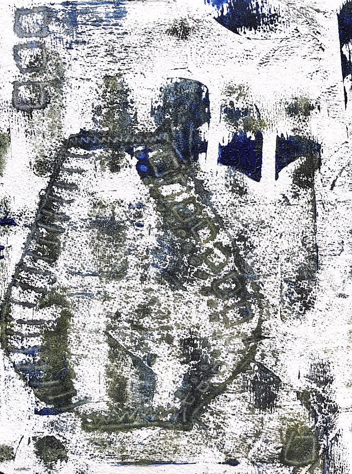
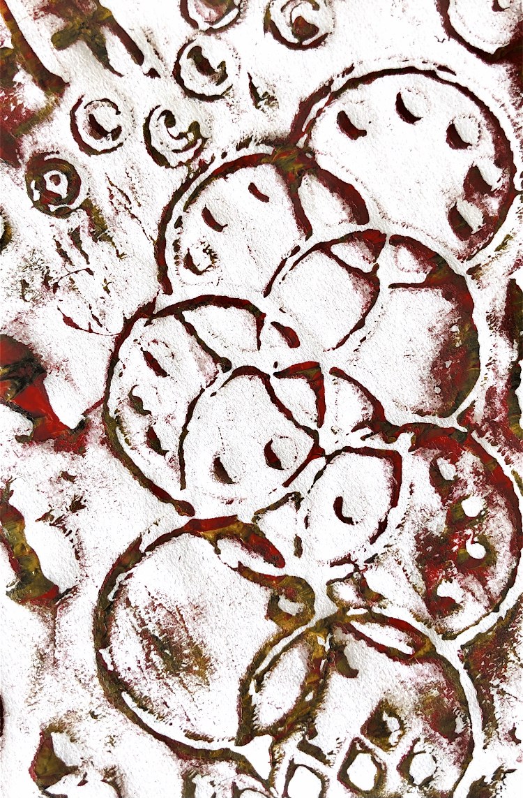
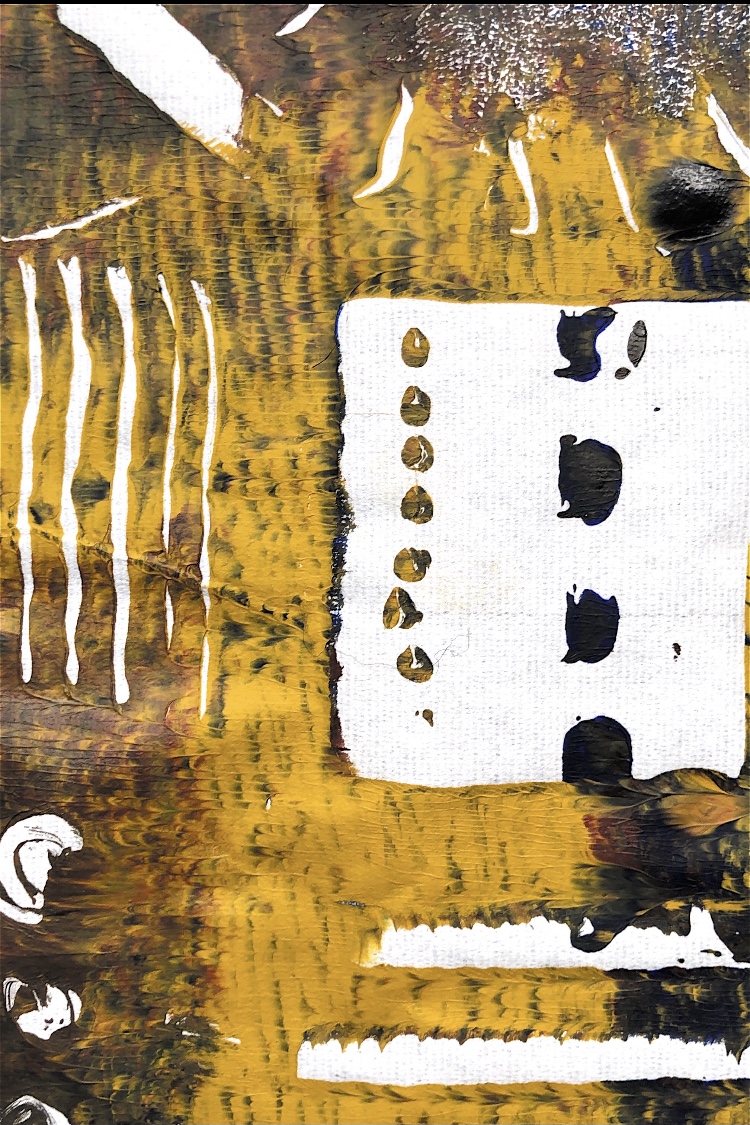
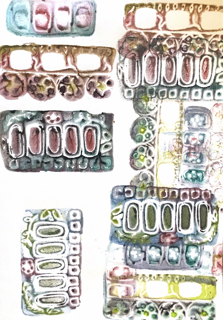
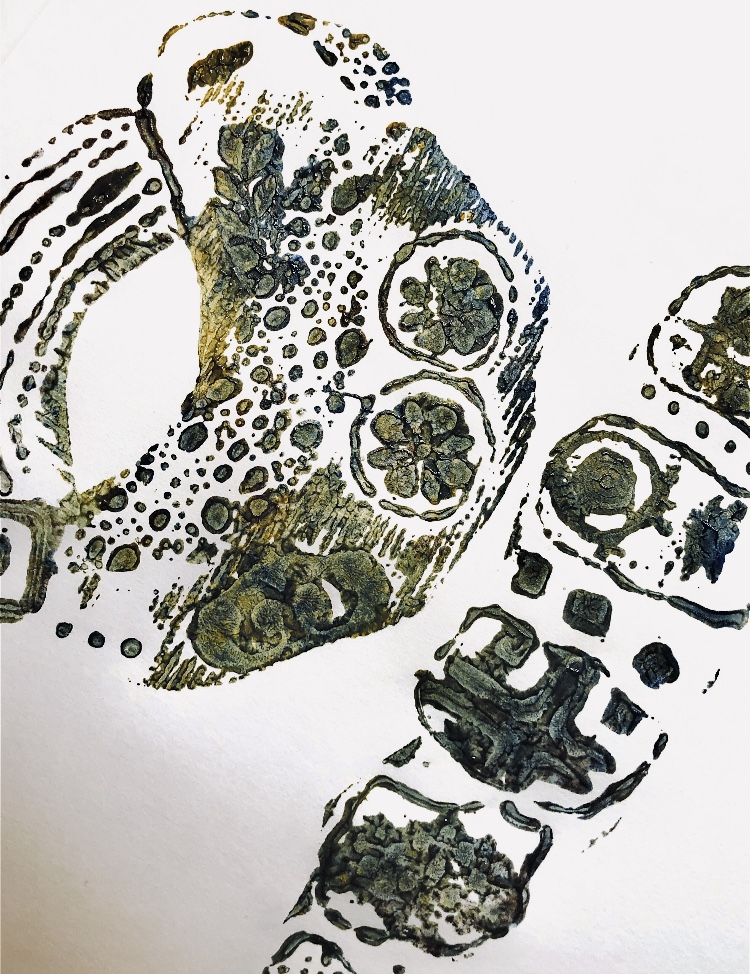
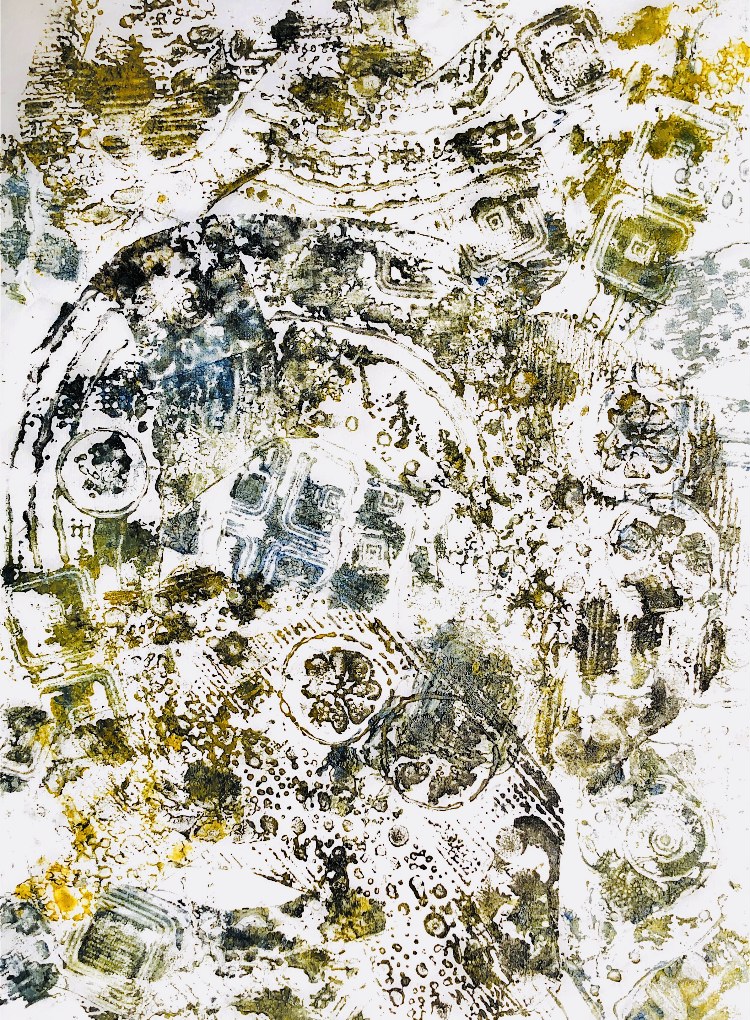
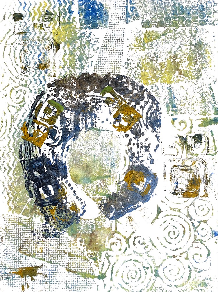
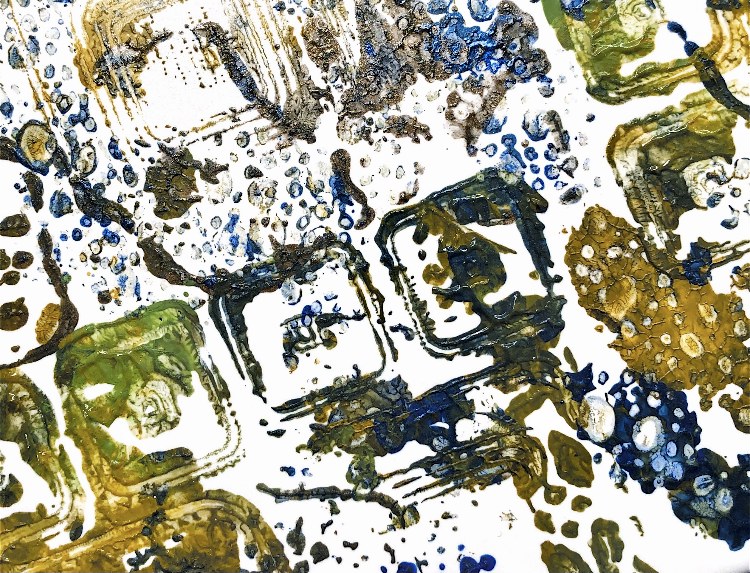
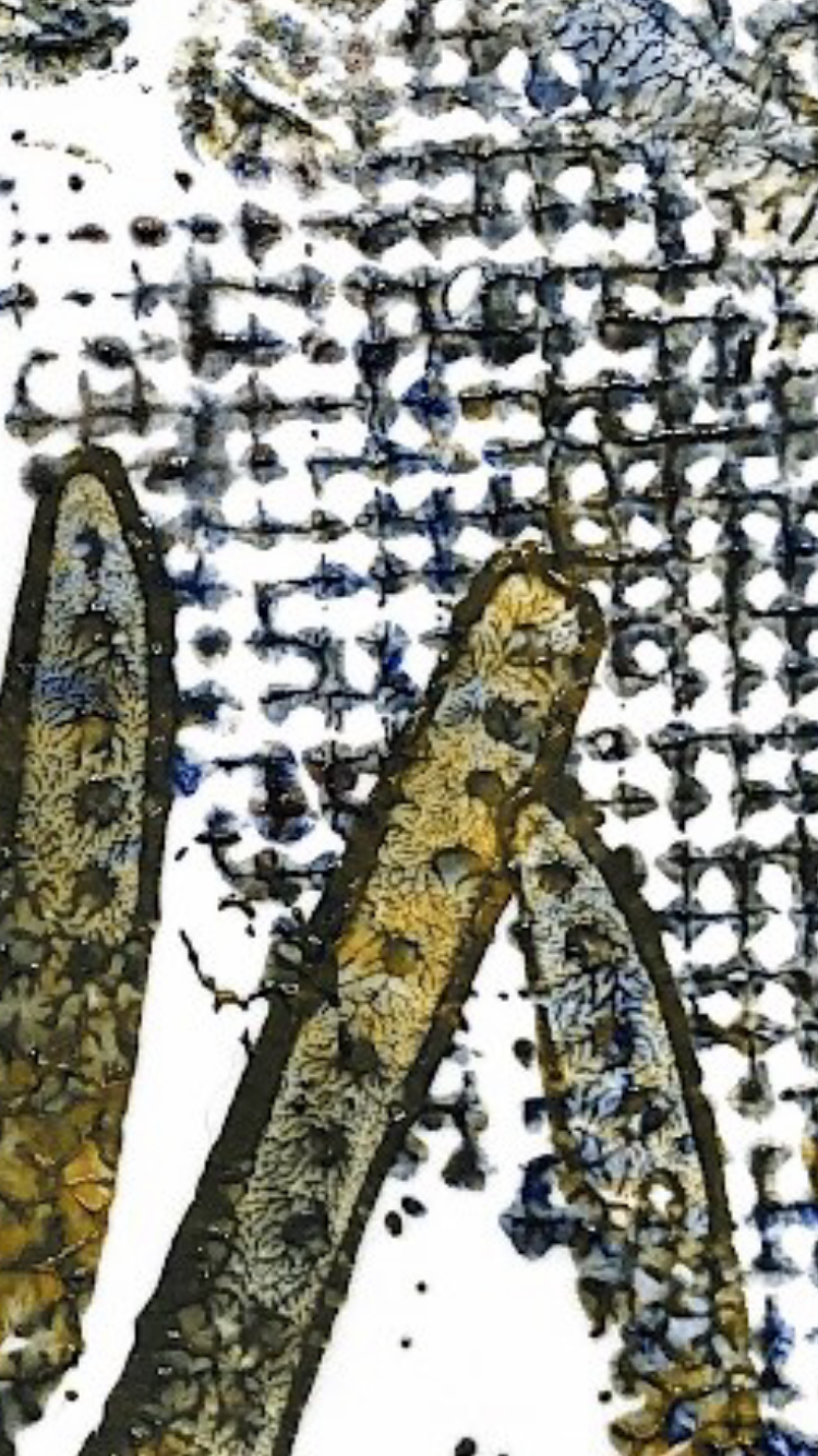
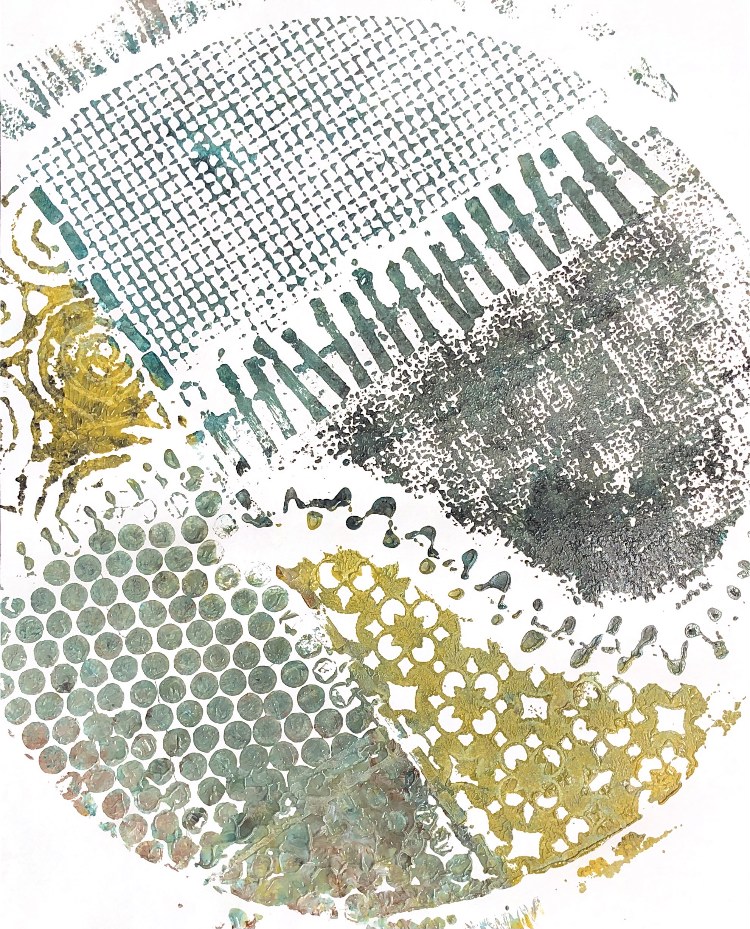
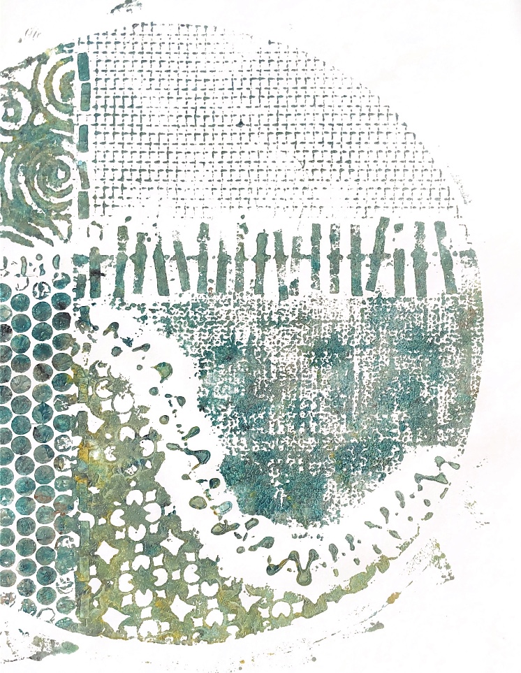
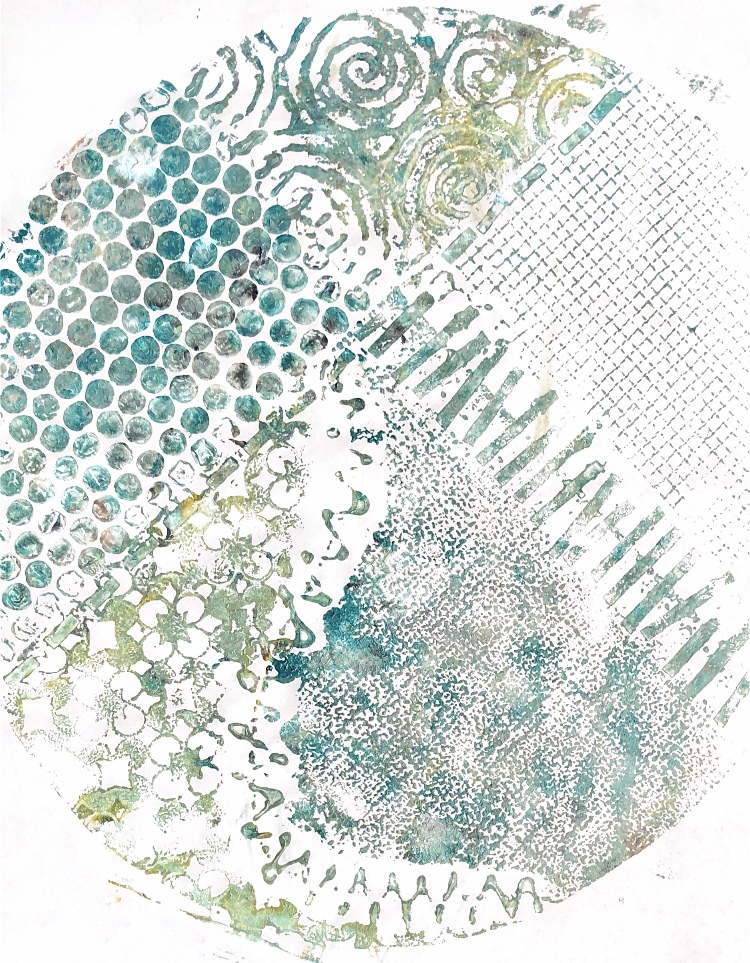
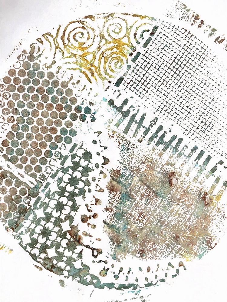
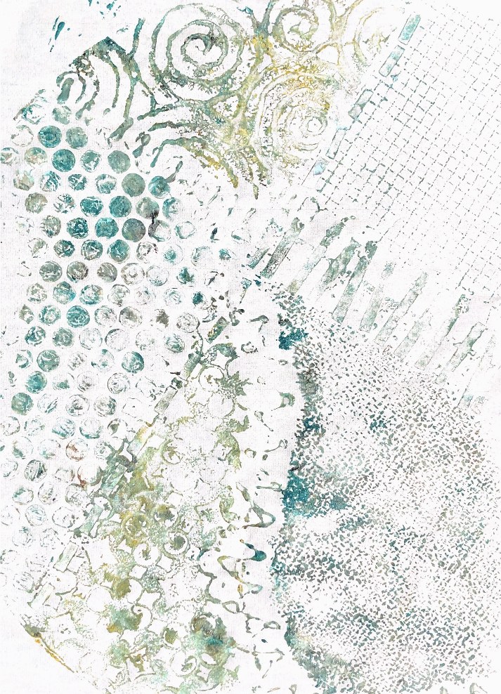
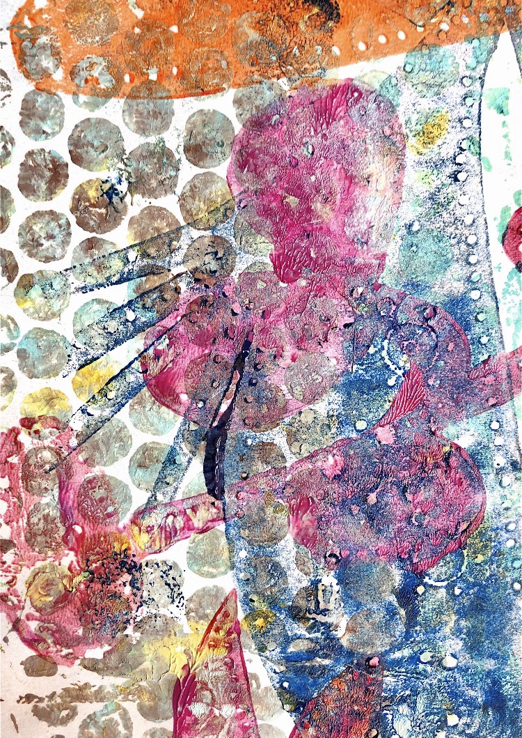
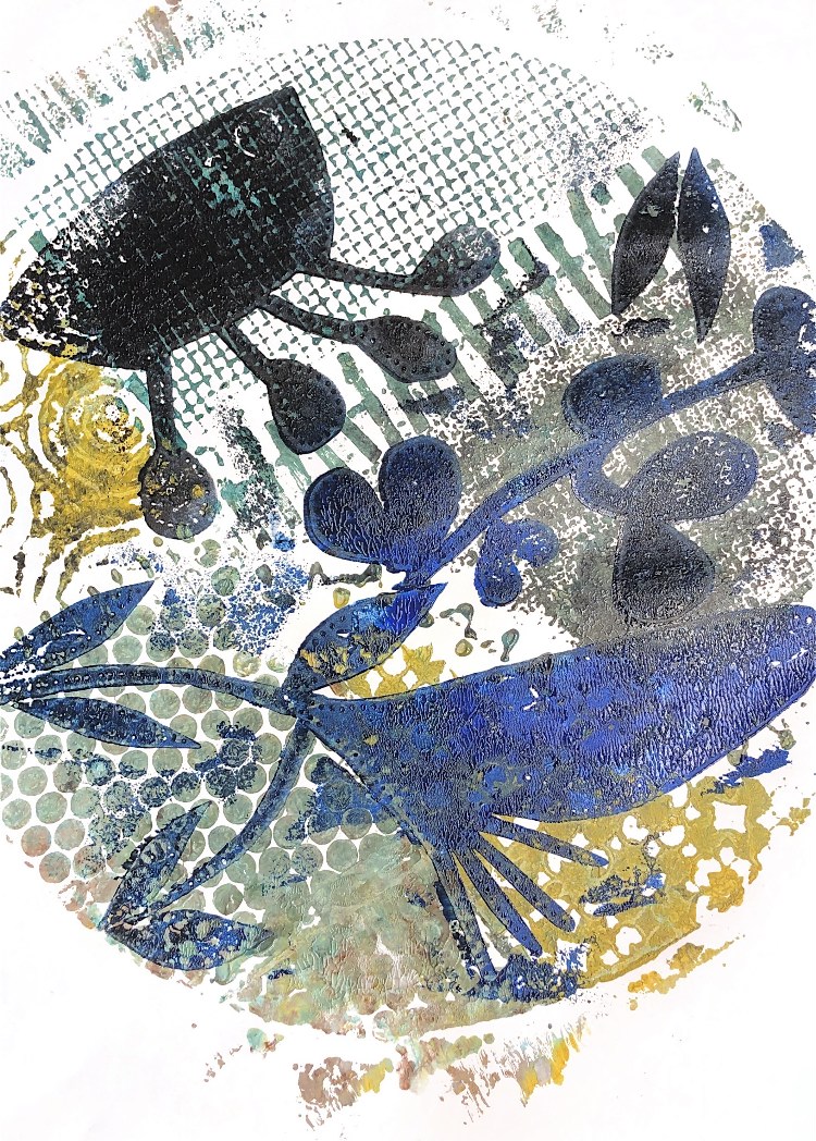
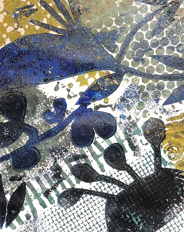
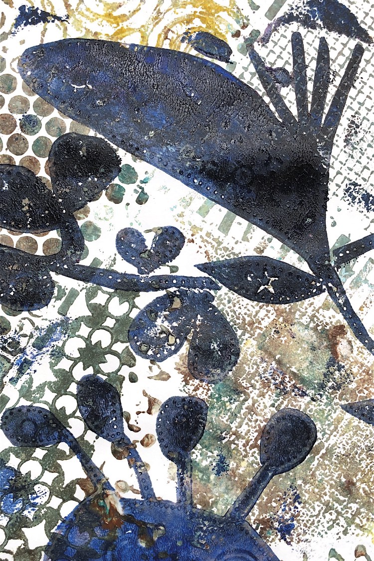
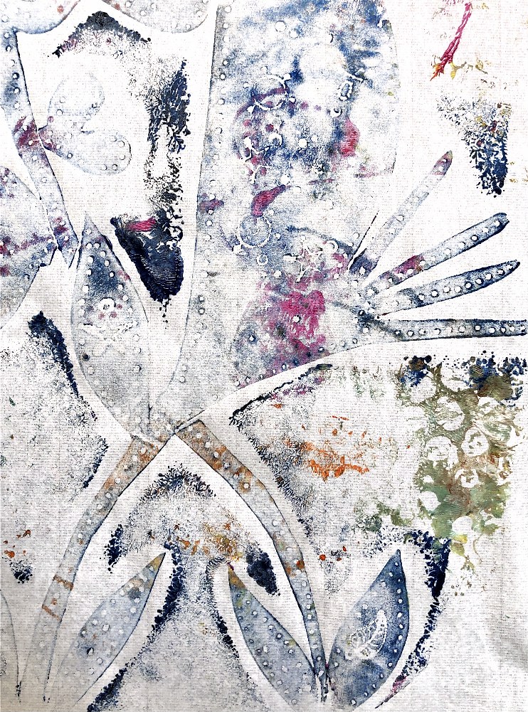
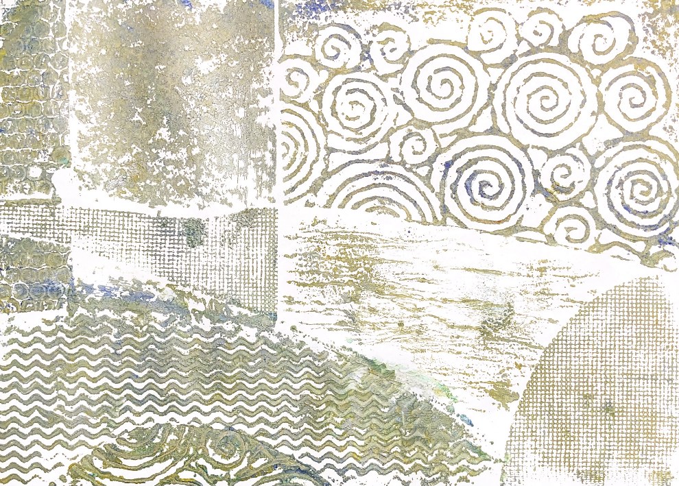
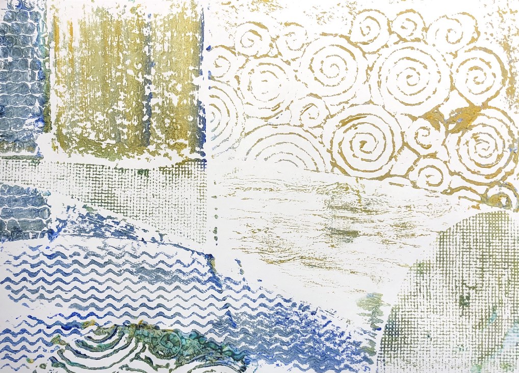
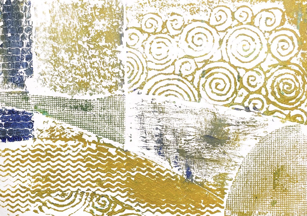
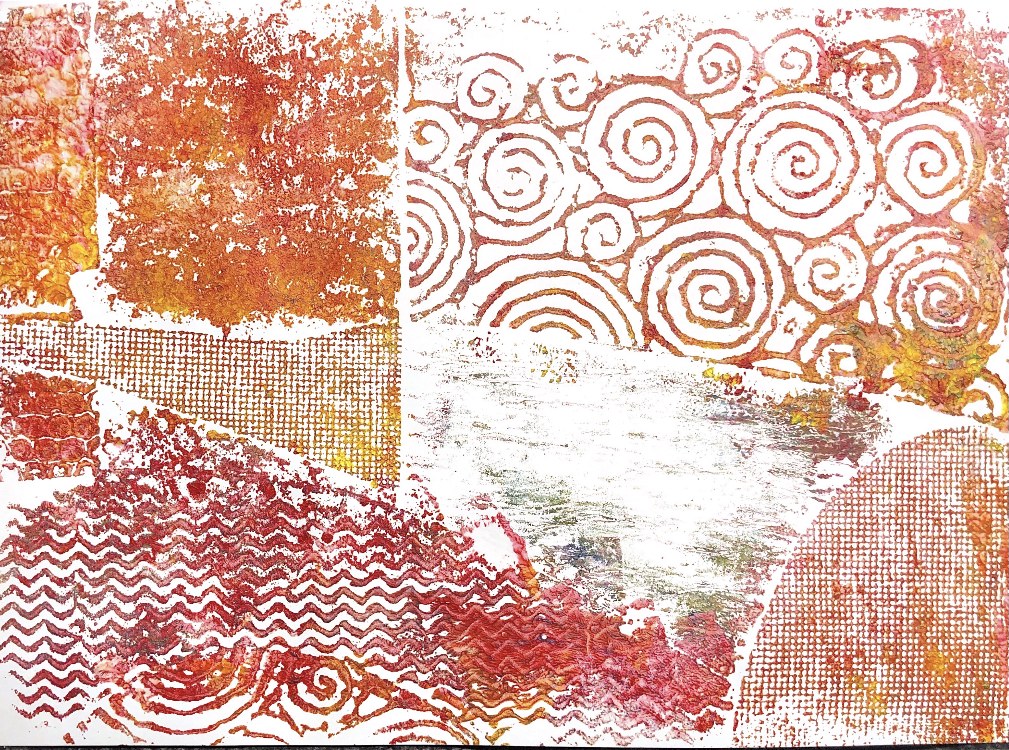
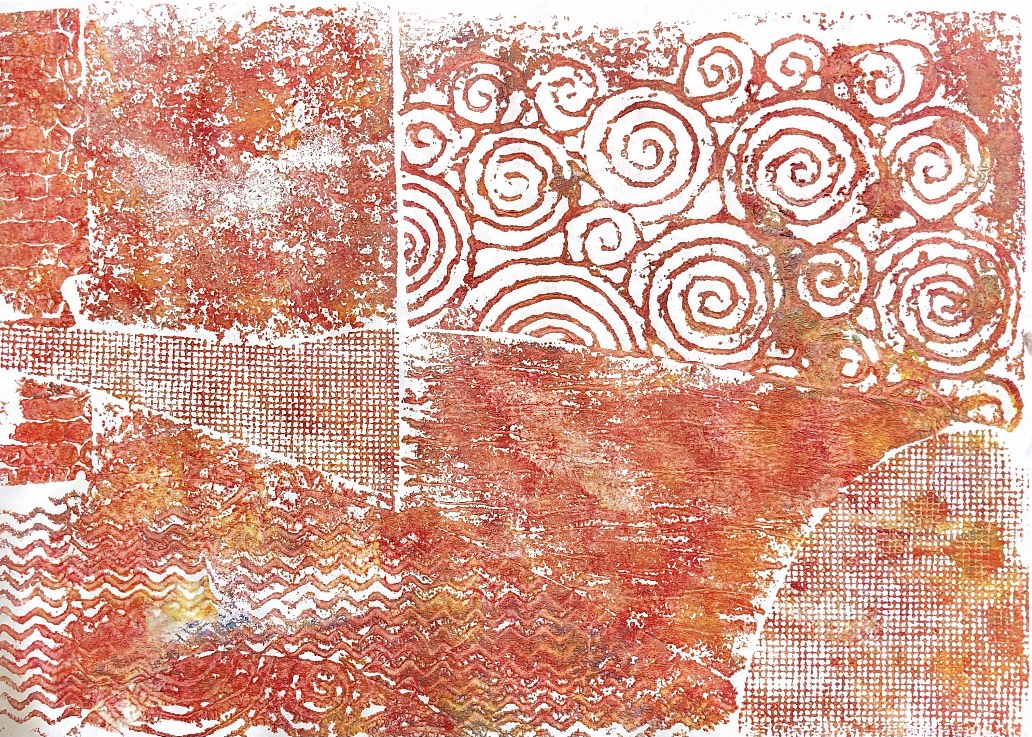
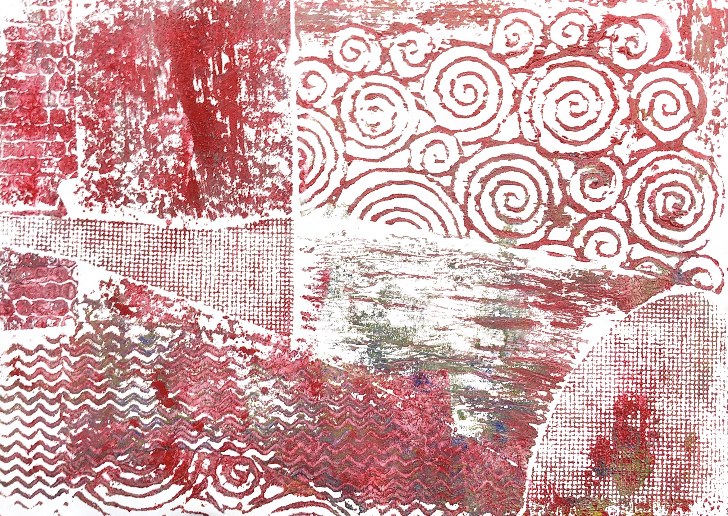
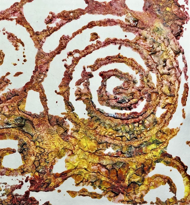
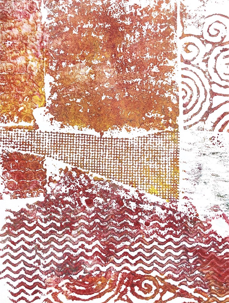
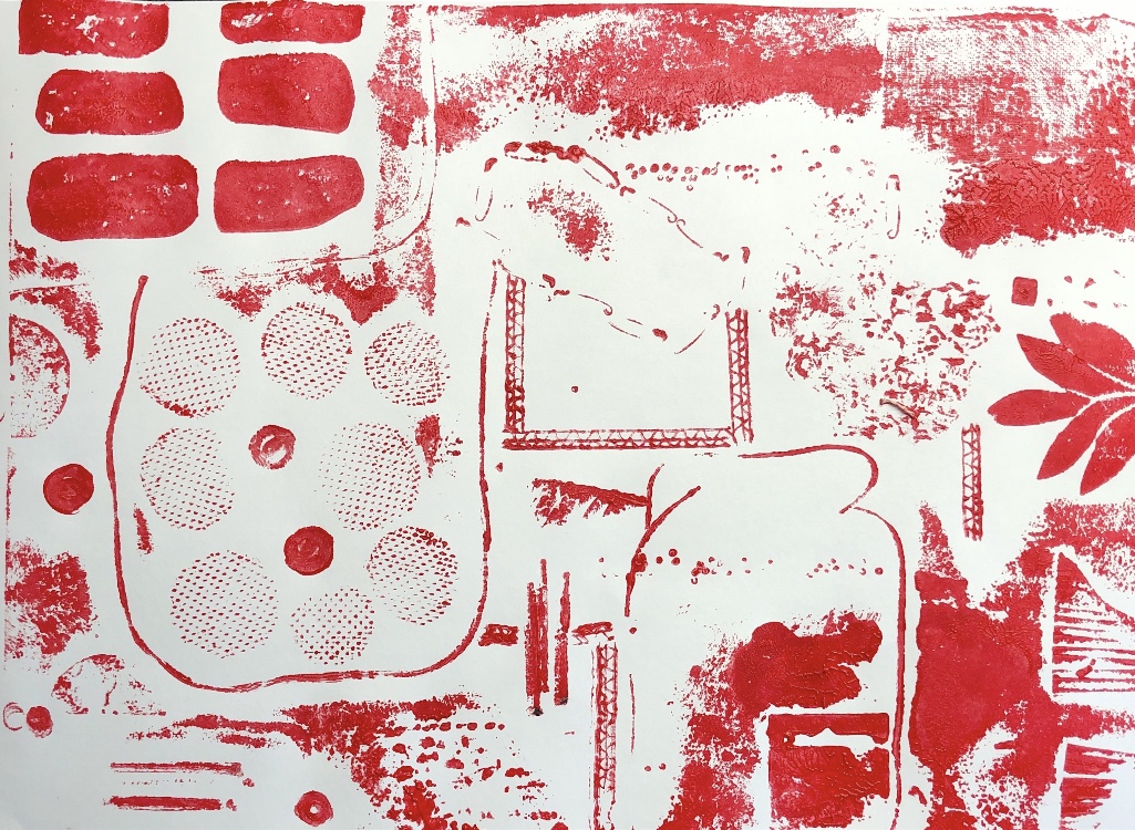
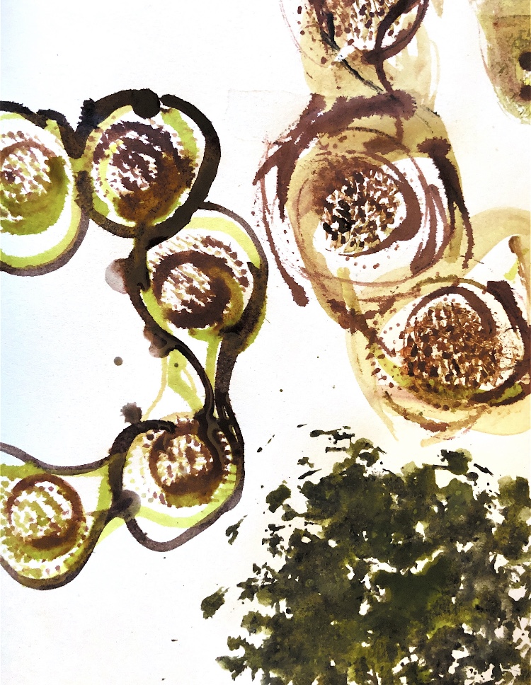
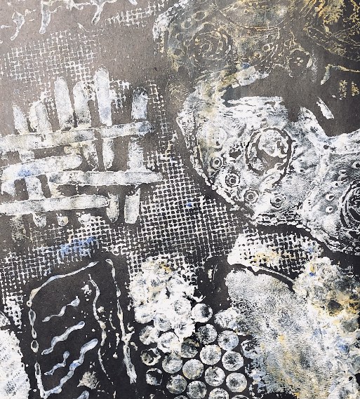
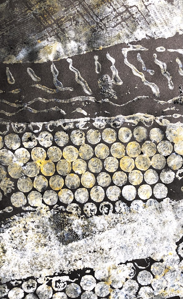
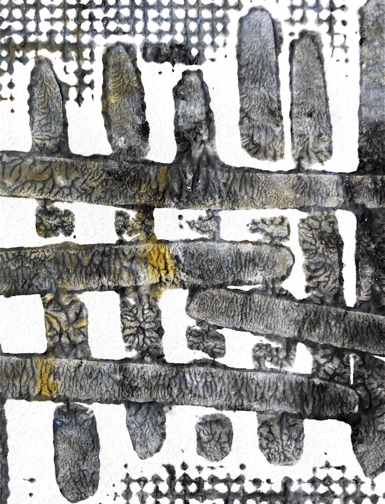
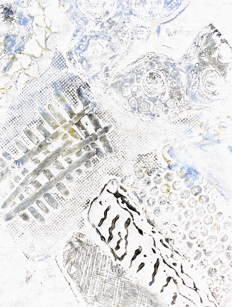
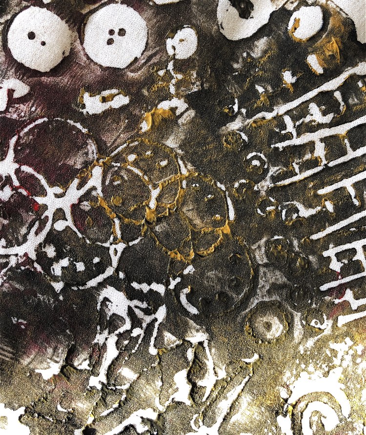
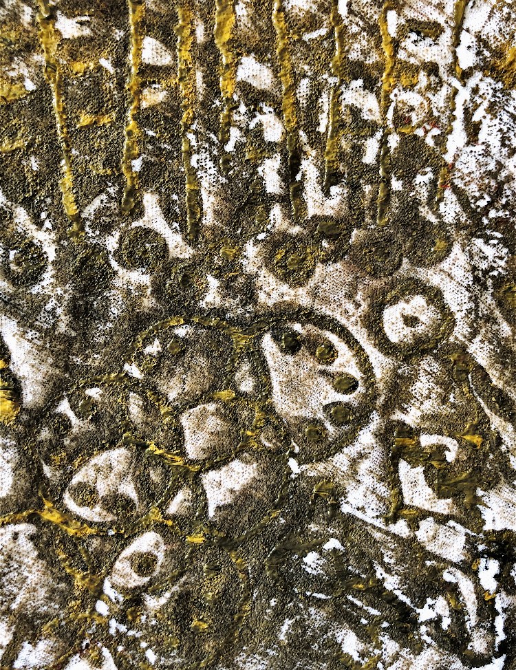
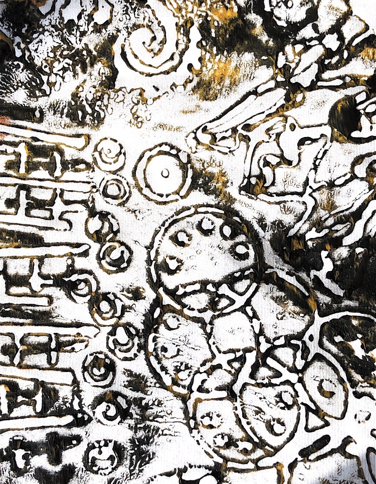
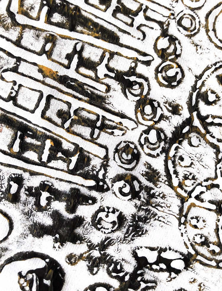
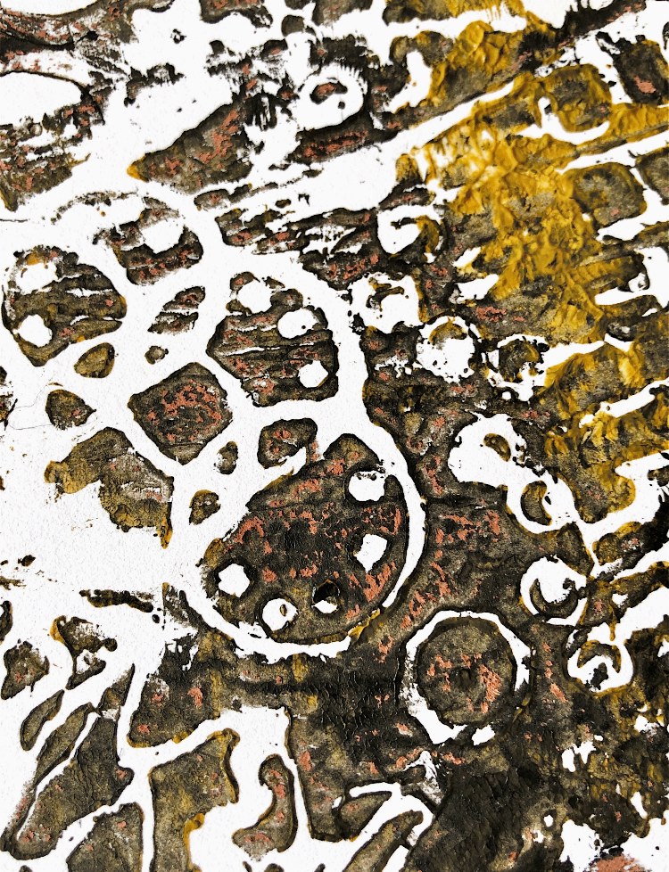
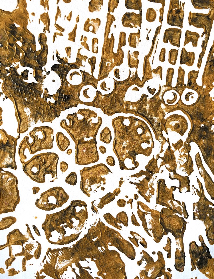
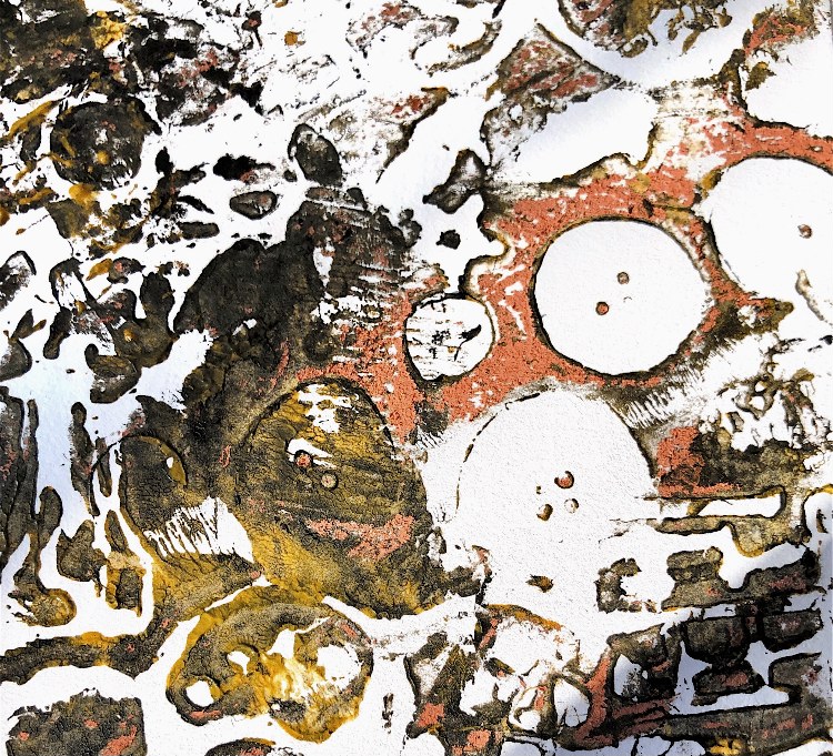
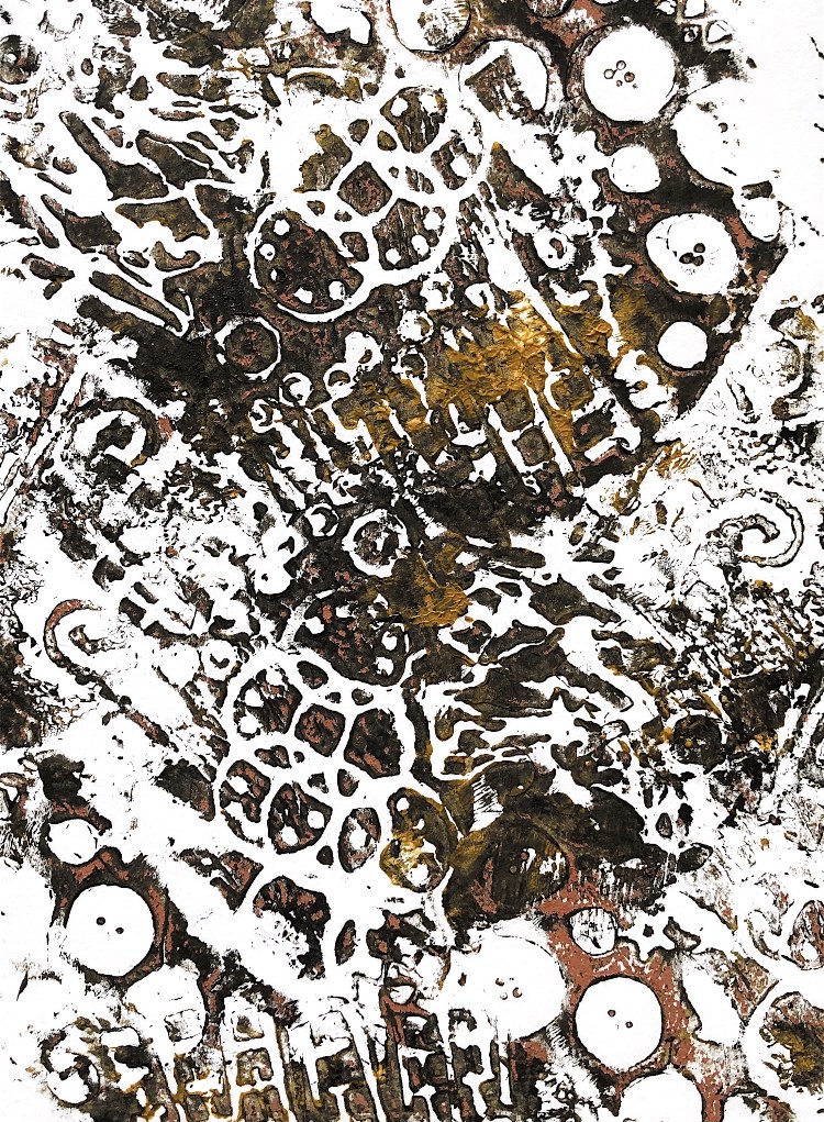
Fig, 3. I wanted to use this strong sample from my collage work as inspiration for prints using stencils and it worked brilliantly.
Because the inspiration was in black and white I didn’t want to add in too much colour so I just added yellow.
The prints have all been made by printing more than once, moving the stencils, which gives them depth and texture. The simple colour palette allows the shapes to stand out and these prints, although all different, are clearly derived from the original inspiration. In some areas the thickness of the paint has created textured patterns reminiscent of the collaged papers. They are a bit like a pin drawn through coloured icing on a cake.
I think it was at this point that I became interested in combining techniques and overprinting. I also found that ghost prints could be made and a stronger print made on top.
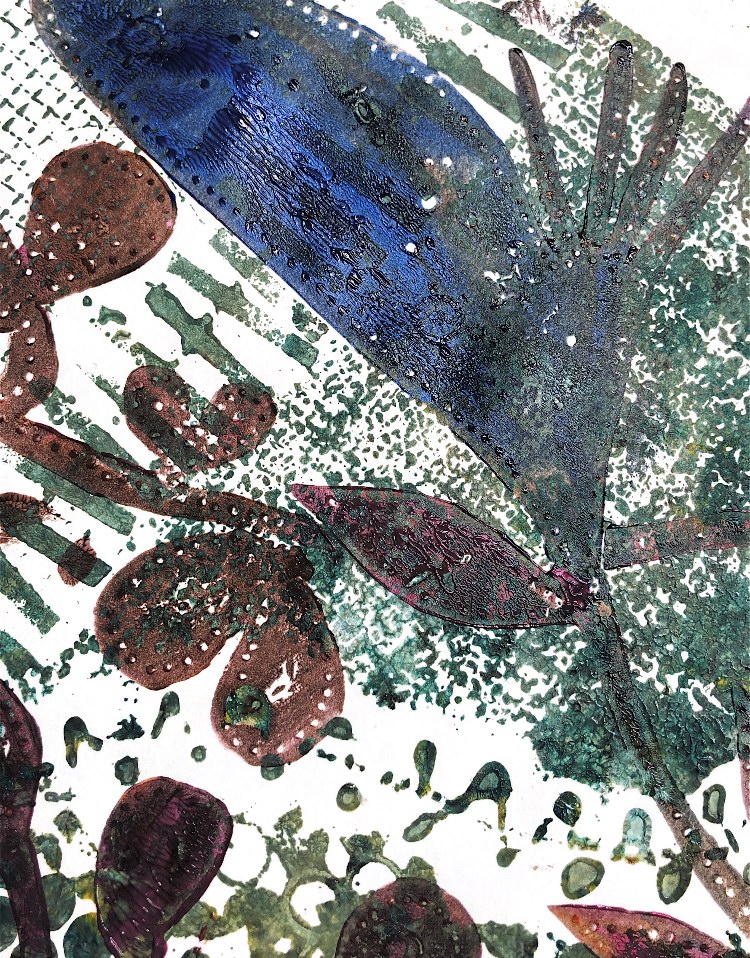
*************************************
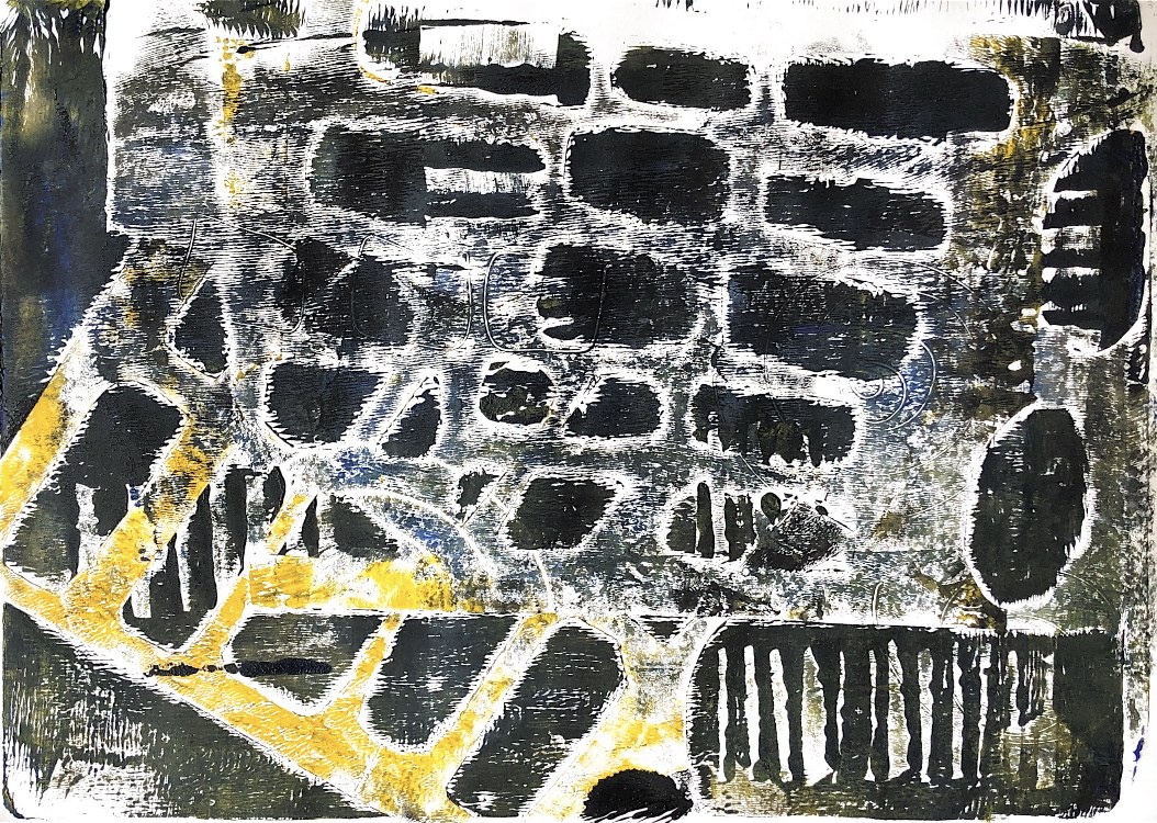
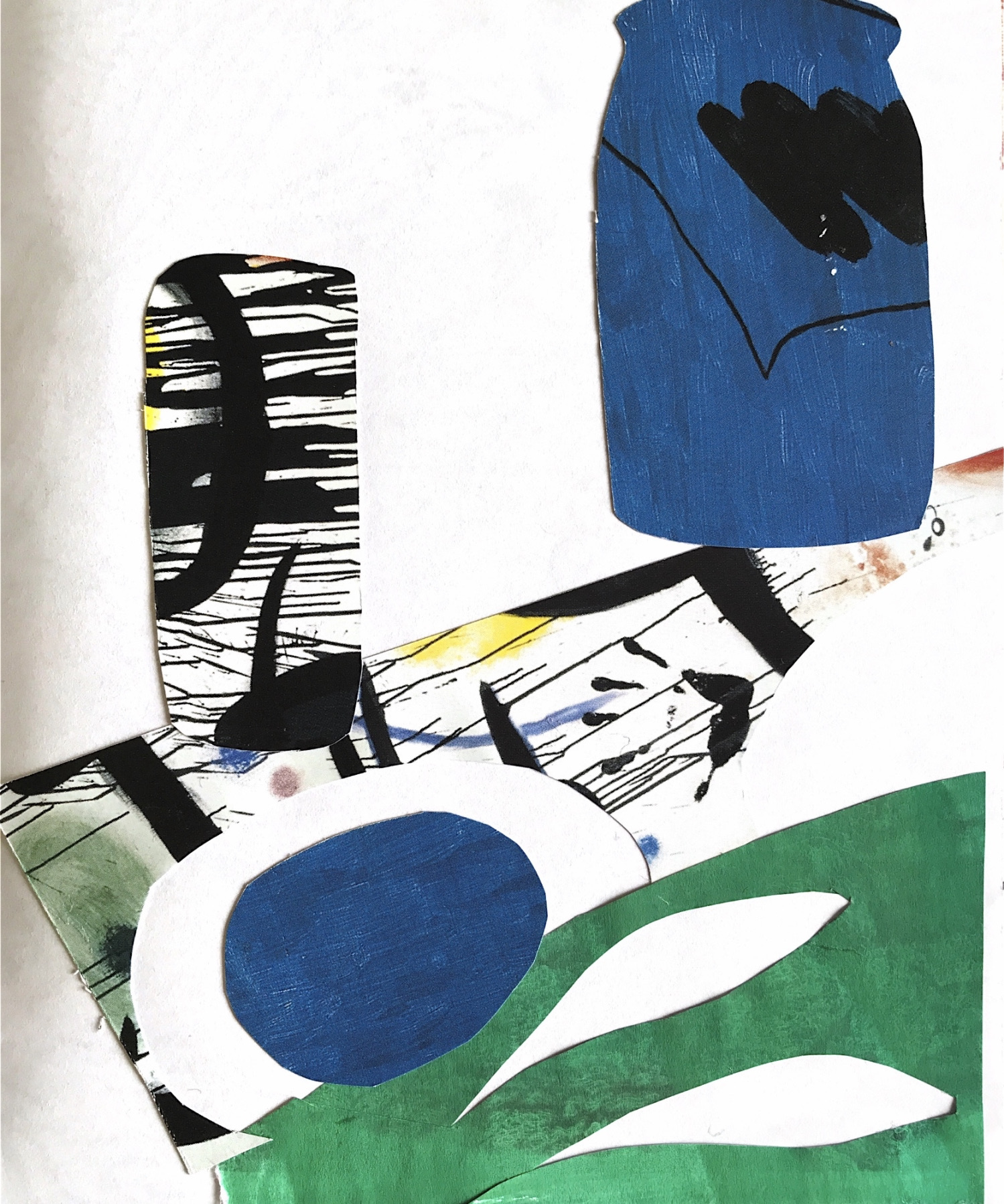
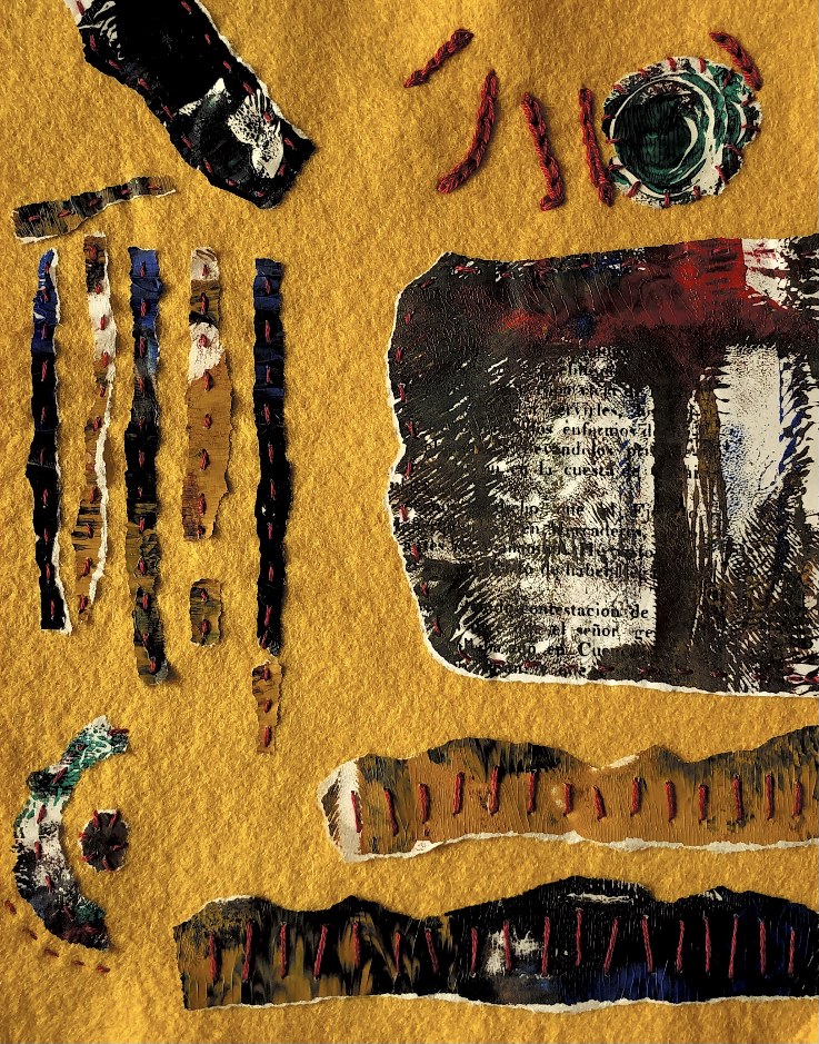
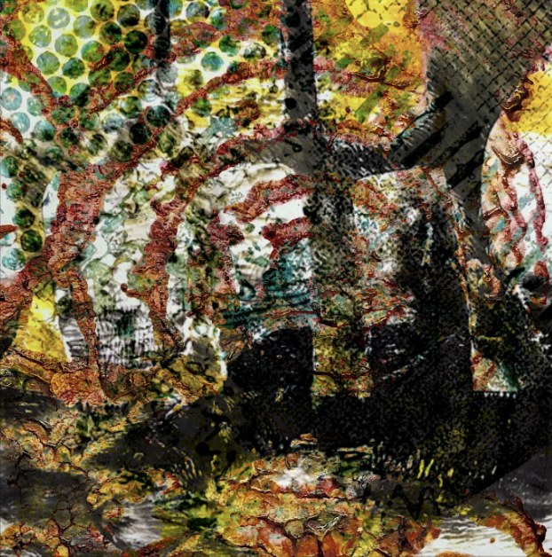
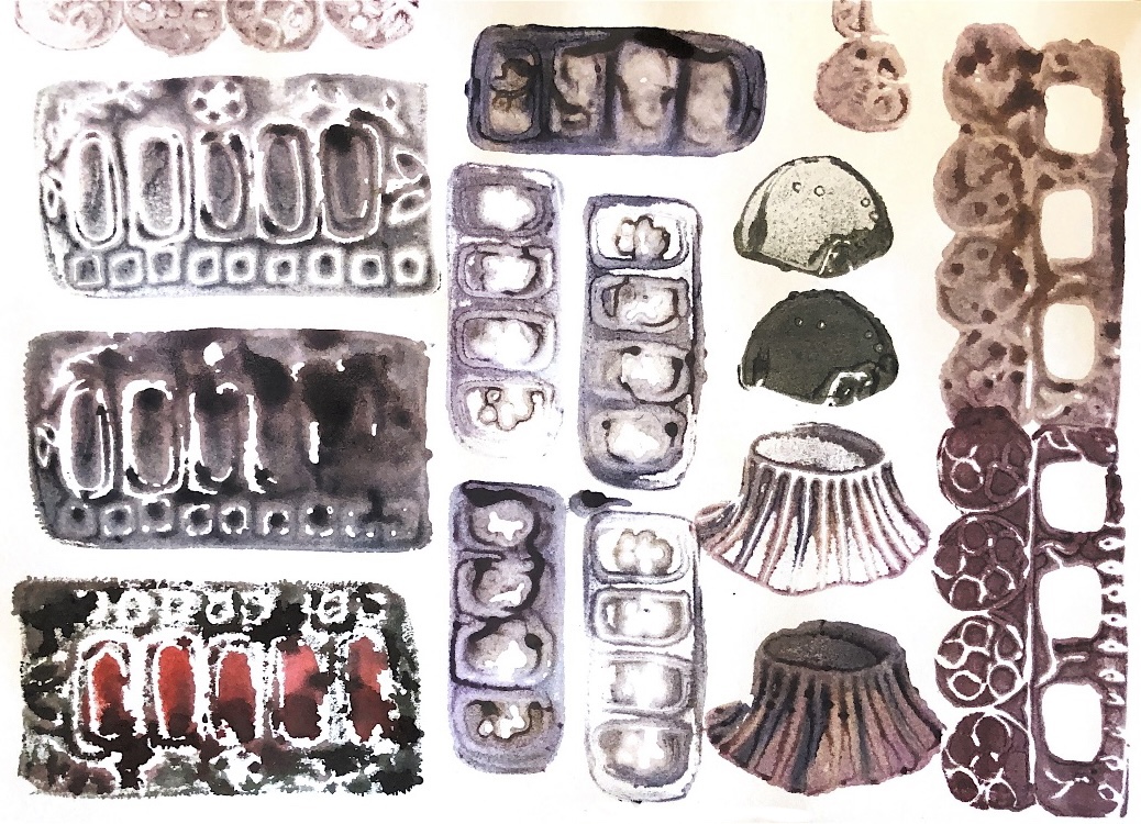
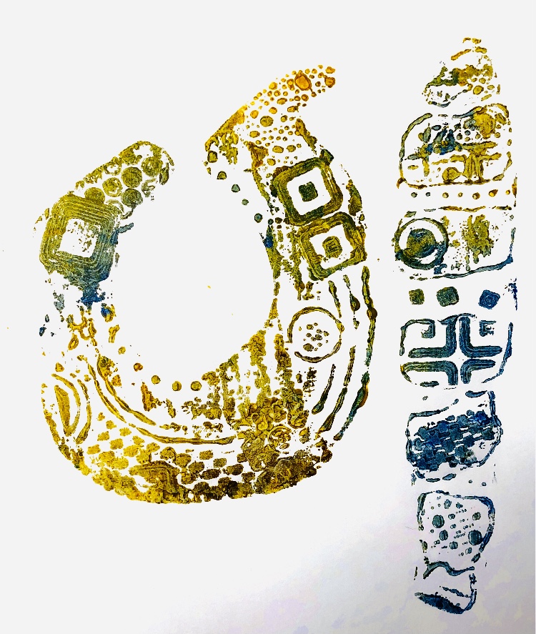
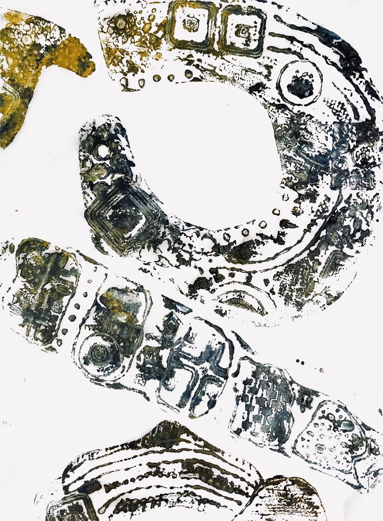
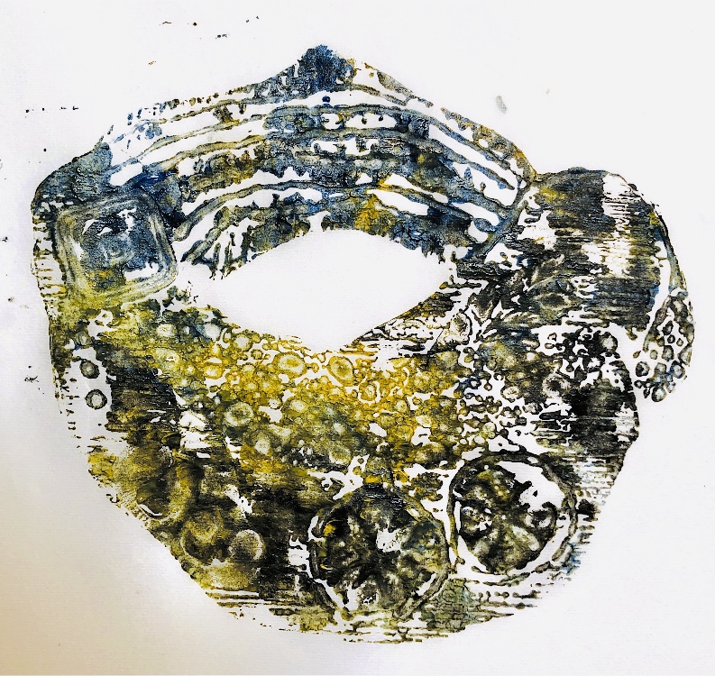
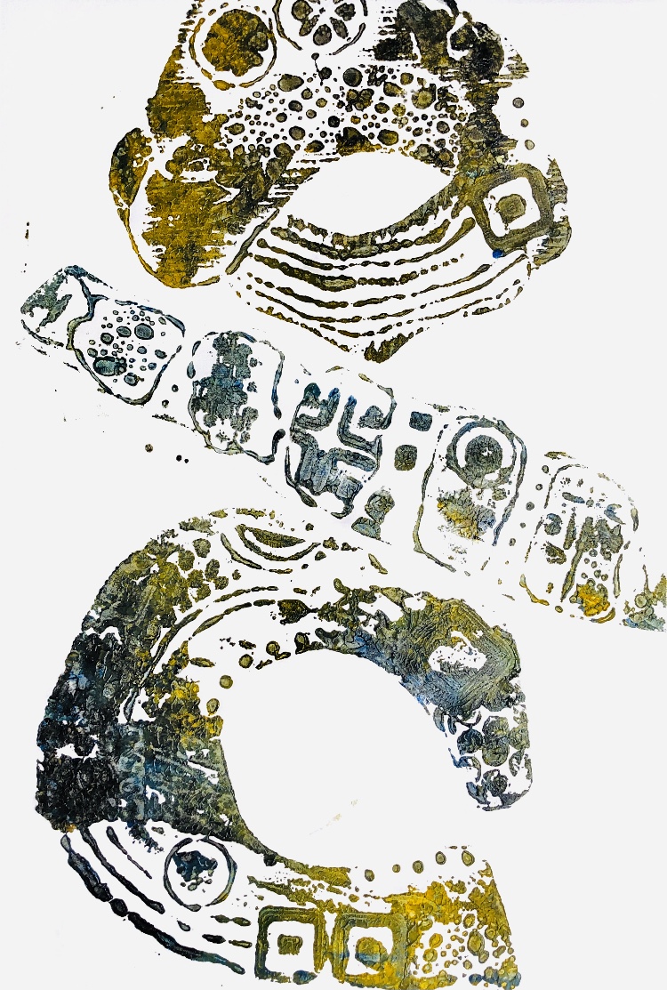
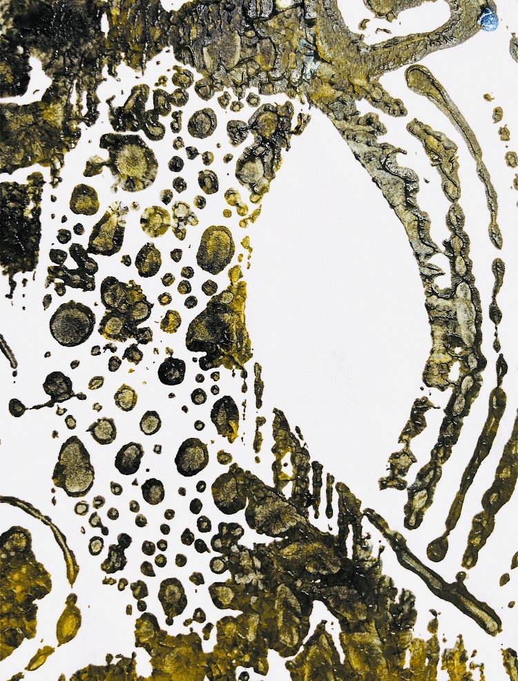
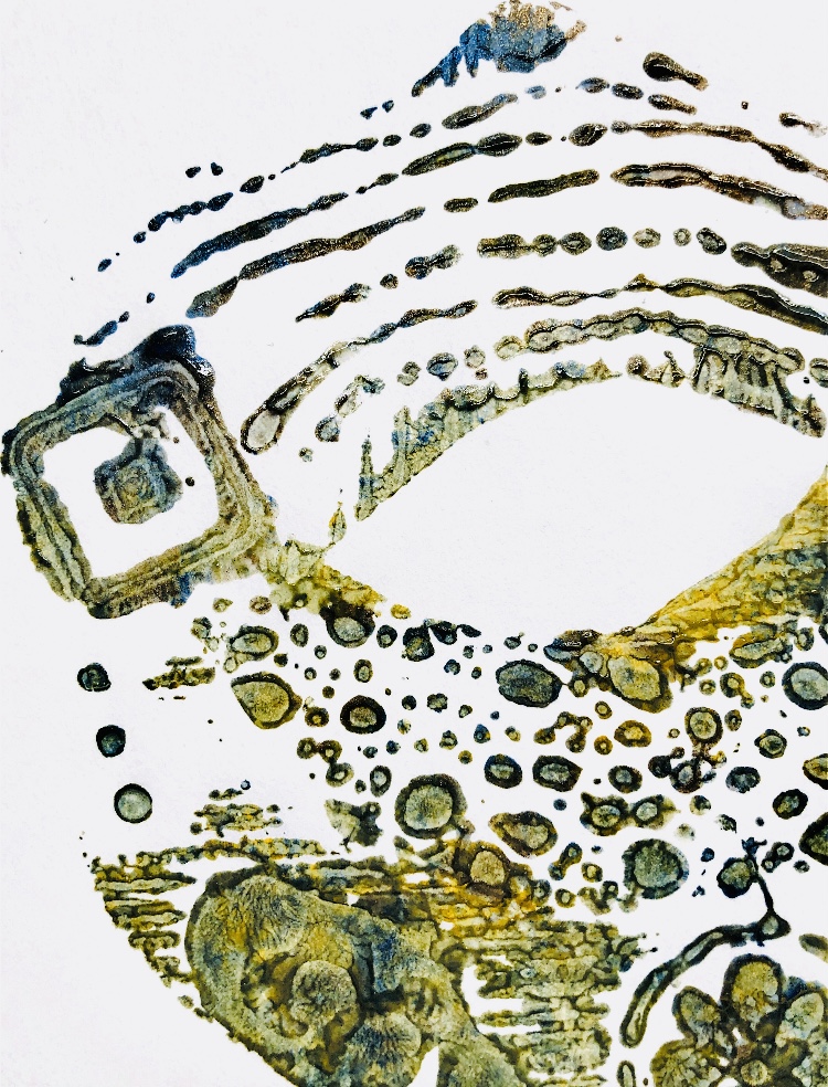
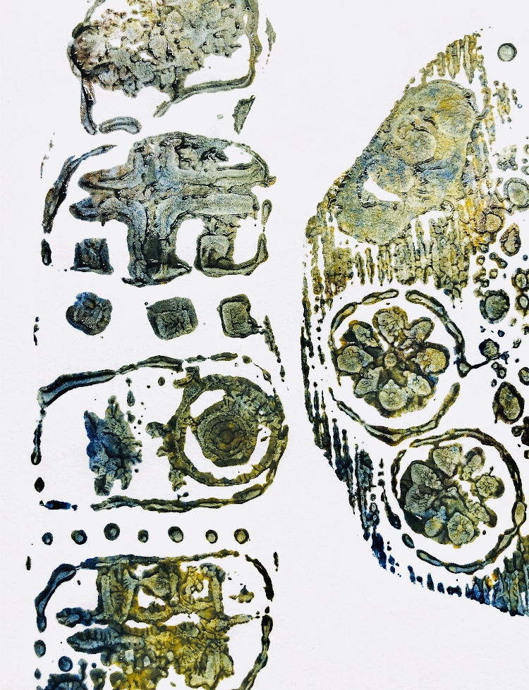
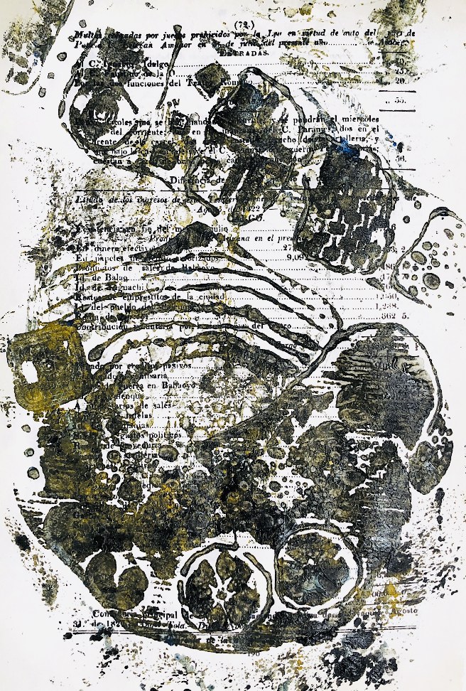
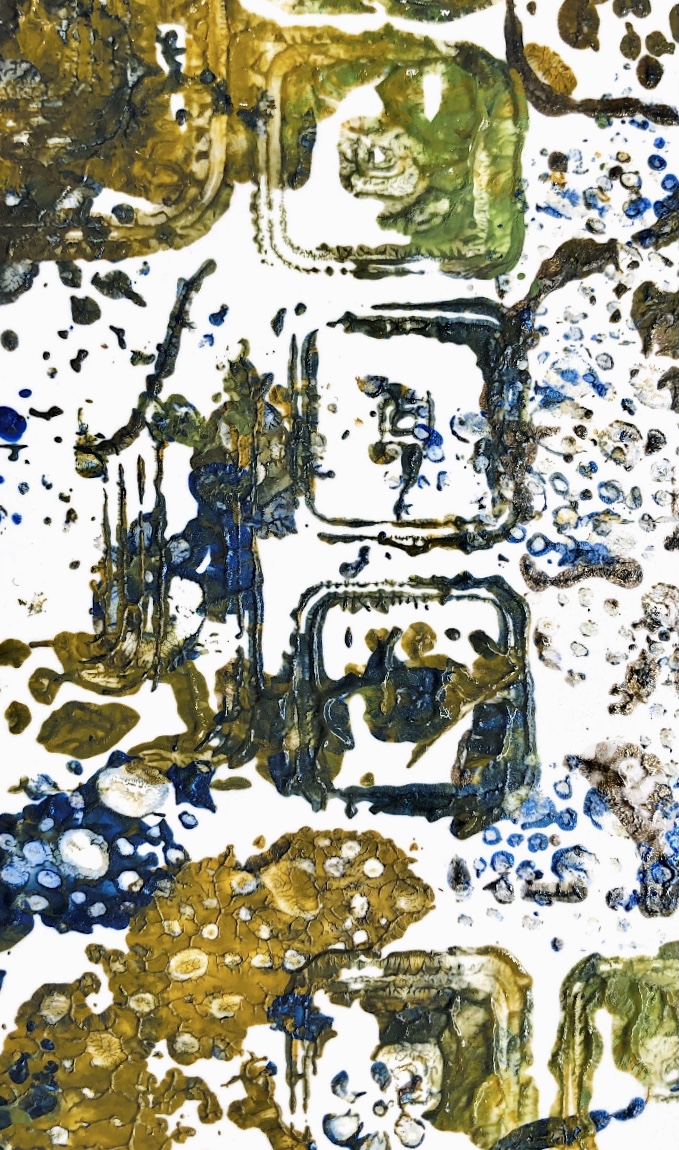
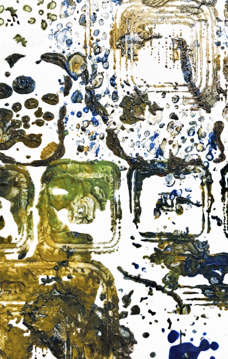
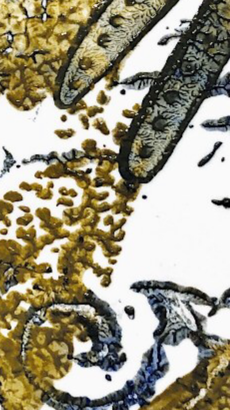
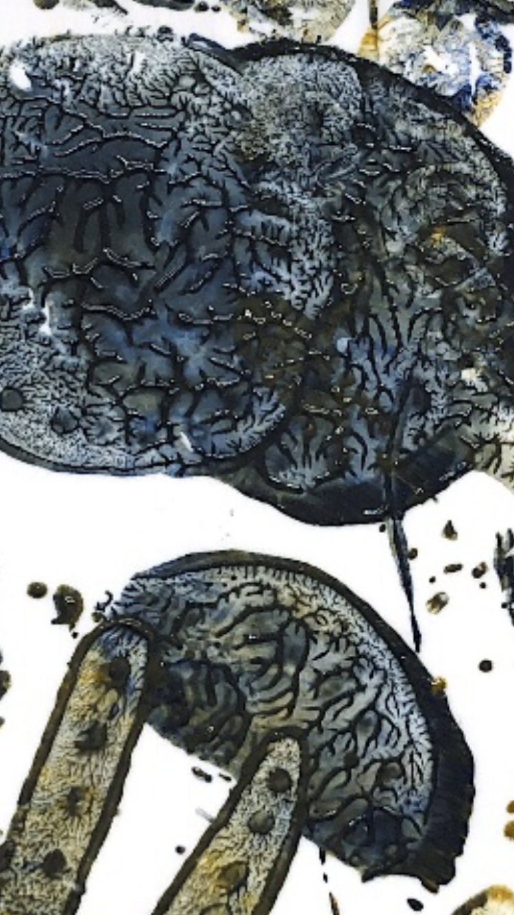
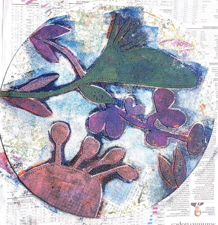
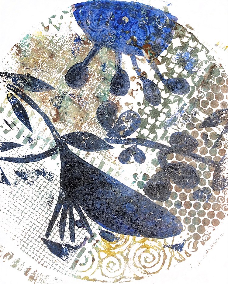
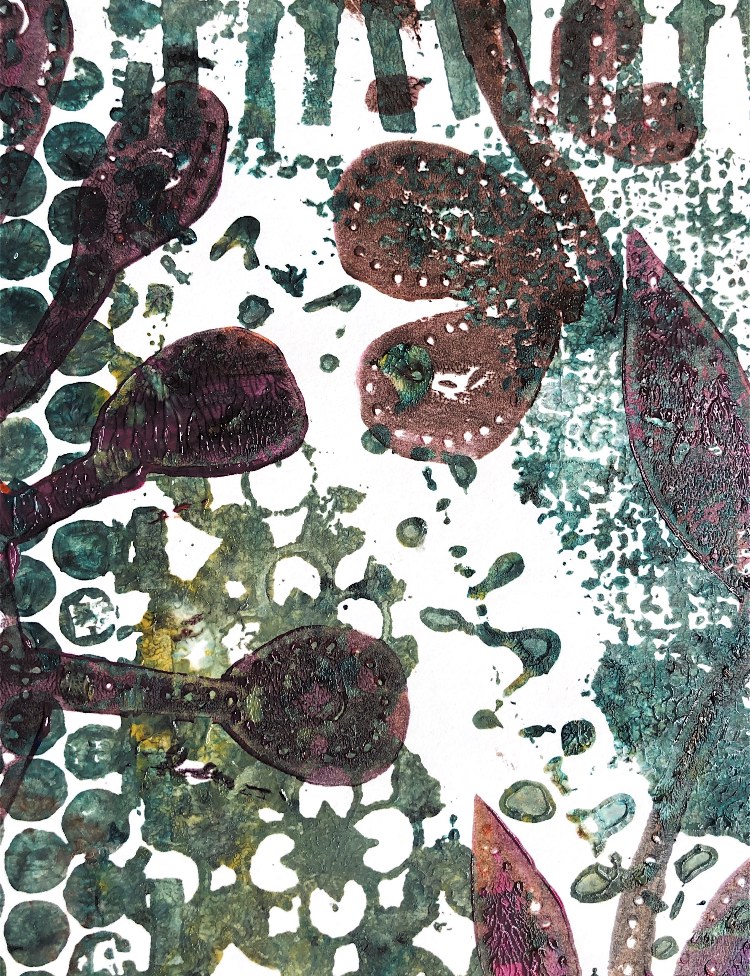
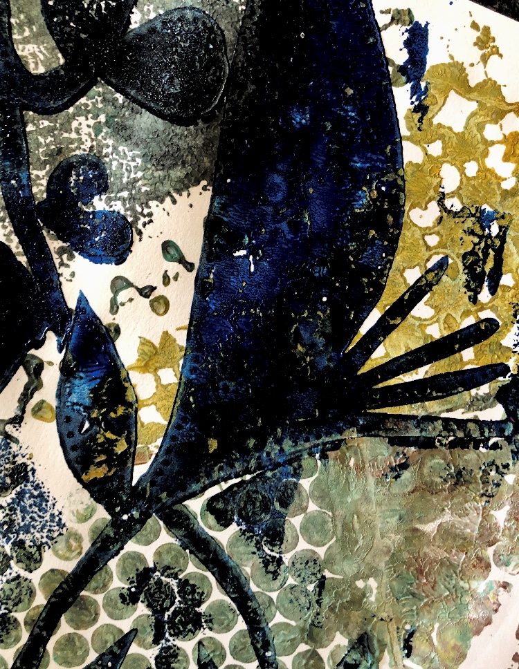
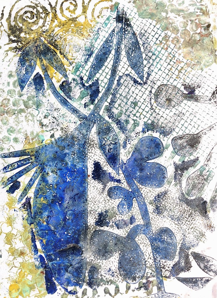
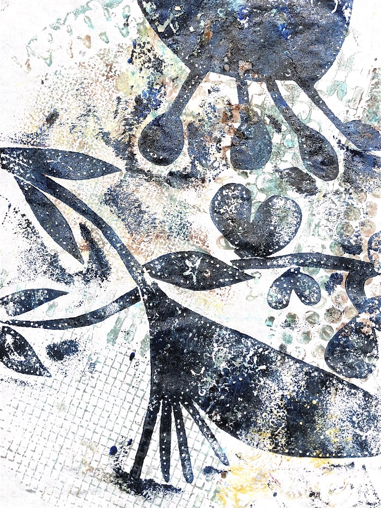
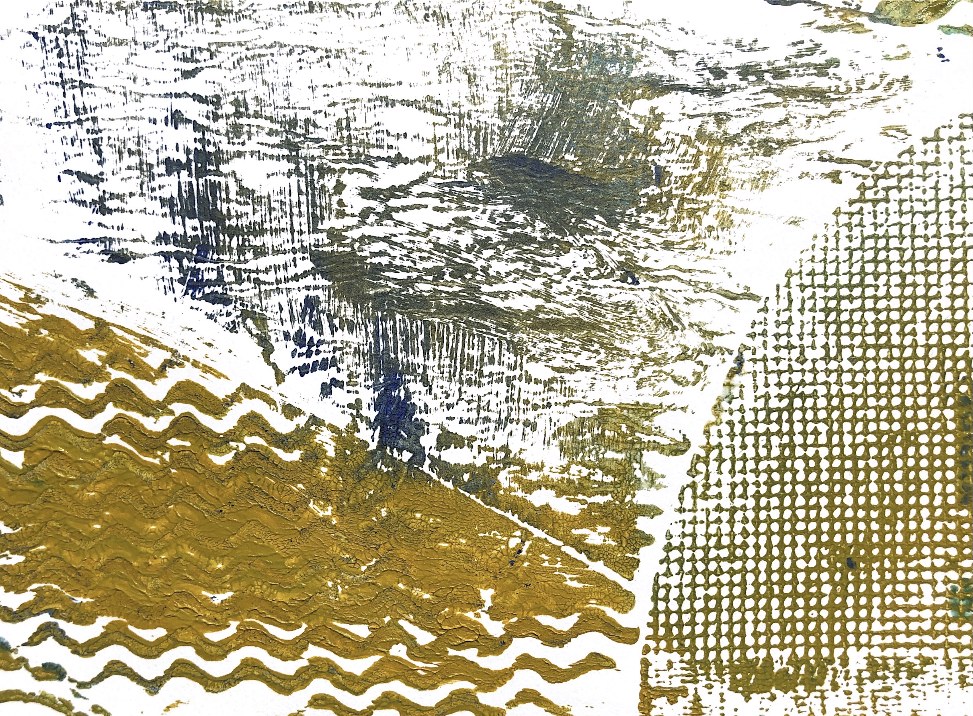
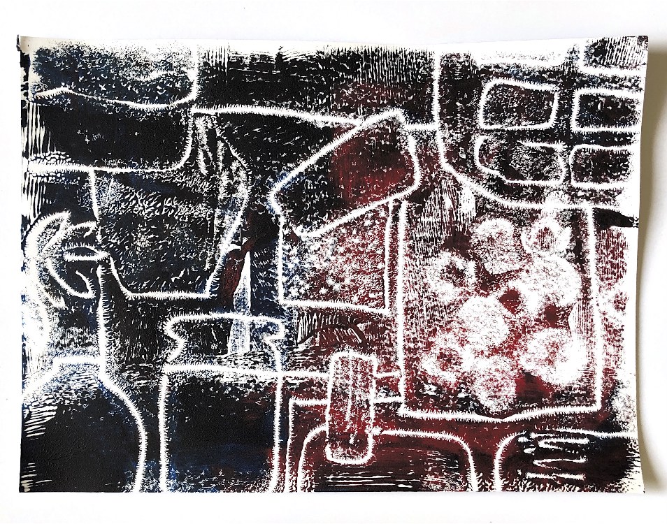
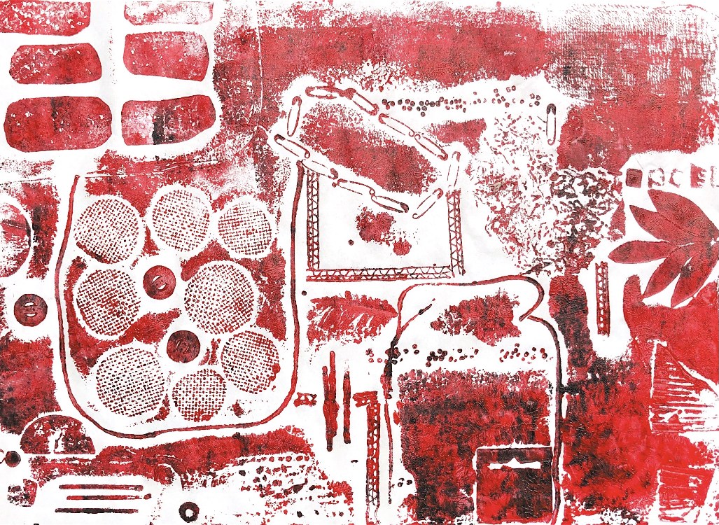
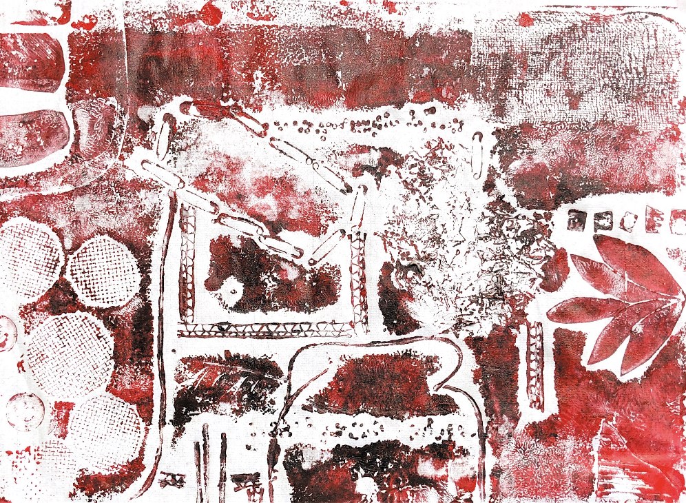
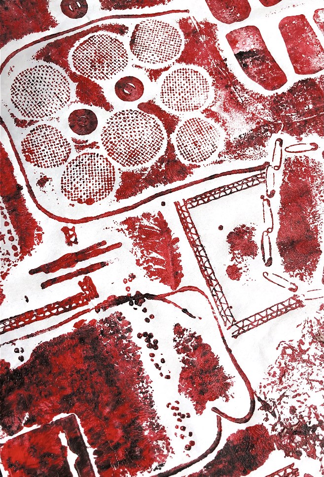
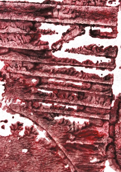
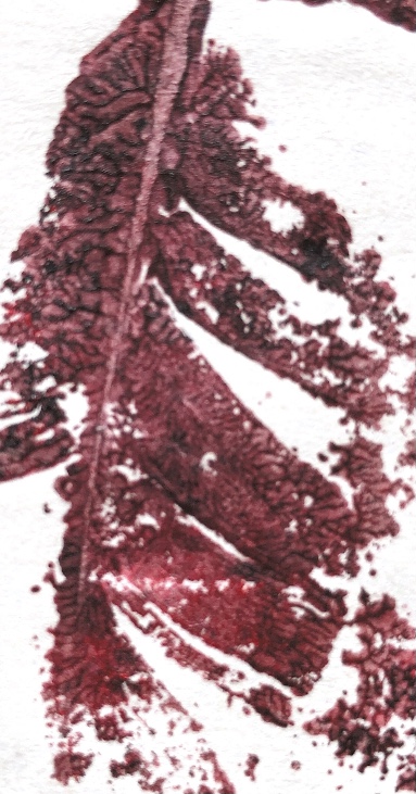
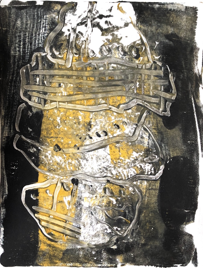
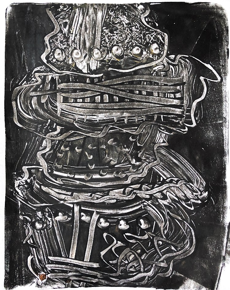
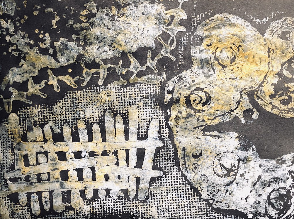
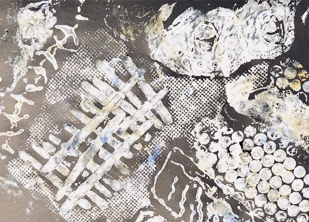
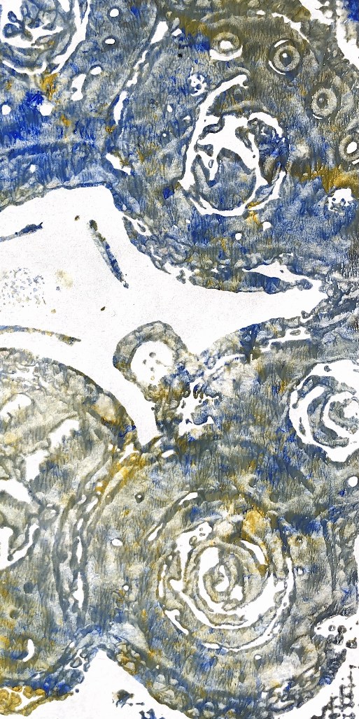
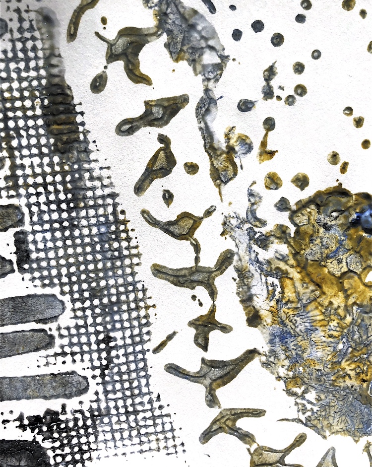
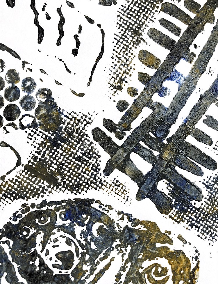
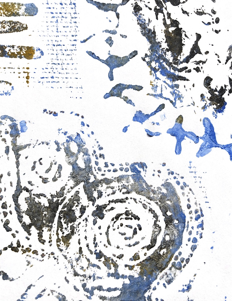
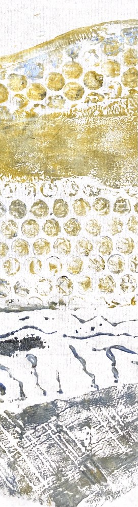
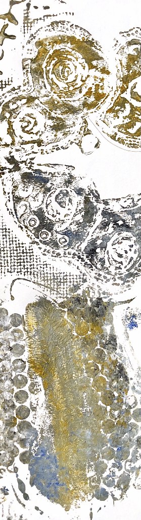
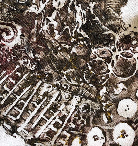
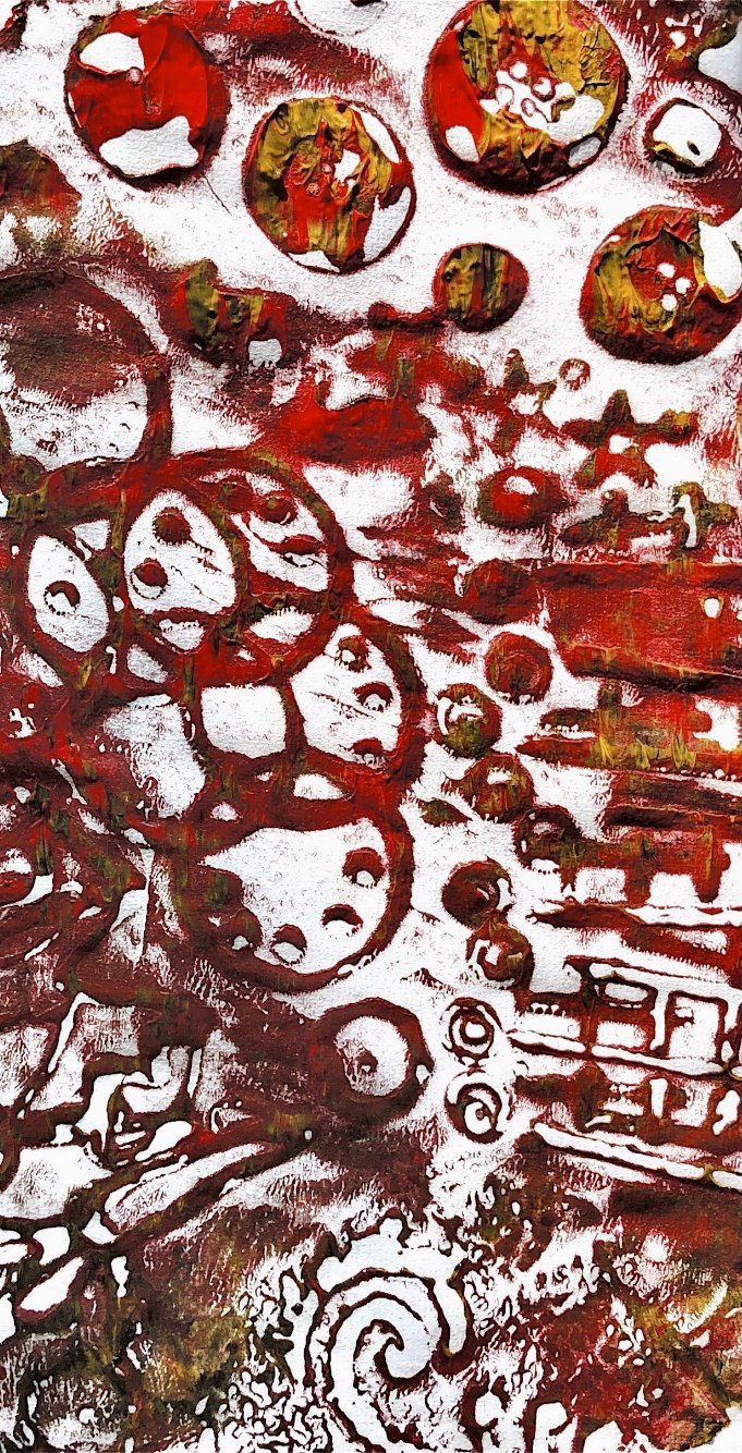
Fig, 4. These prints have combined stencils with backdrawing. I love this pot shape and have often used it in my designs. The grubby colours add authenticity to the prints making the pots look old and dirty and the various shapes within the prints look like decoration or ancient jewellery. The little hints of bright blue or yellow are like tiny bits of painted ceramic which has not worn away. I am intrigued by the contrast of old, organic and dirty pots, buried in the ground, with bright, decorative trinkets.
I really enjoyed this combination of techniques and I was able to make images that have depth and texture.
*************************************
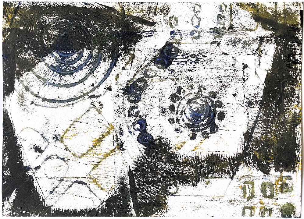
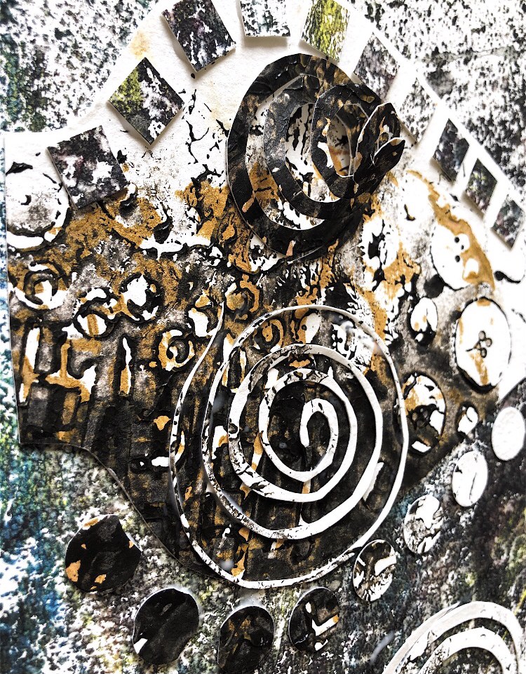
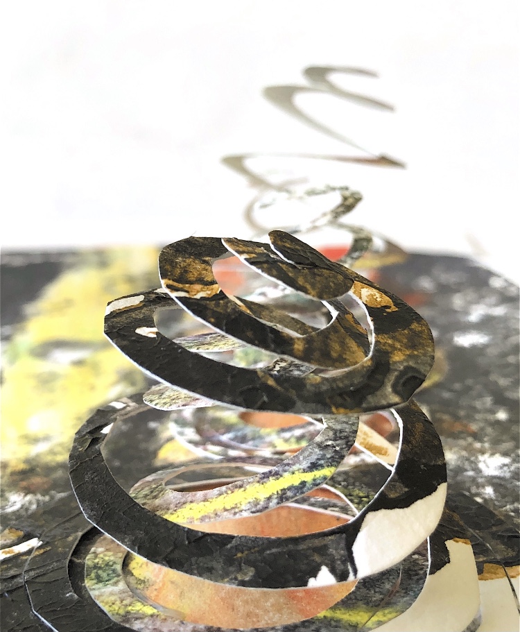
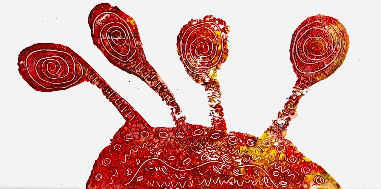
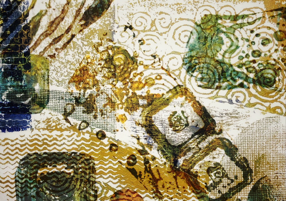
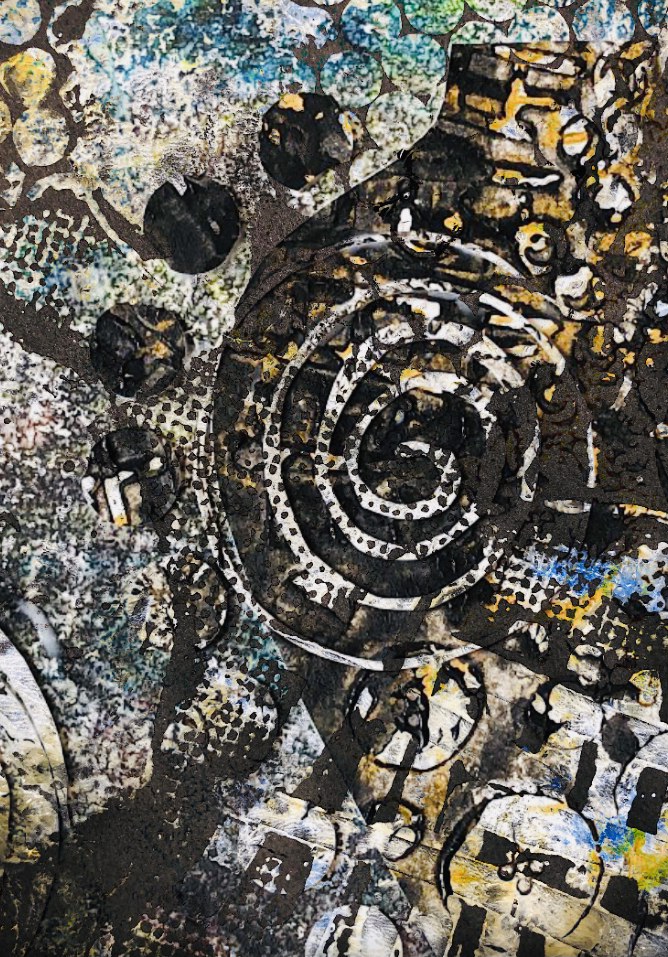
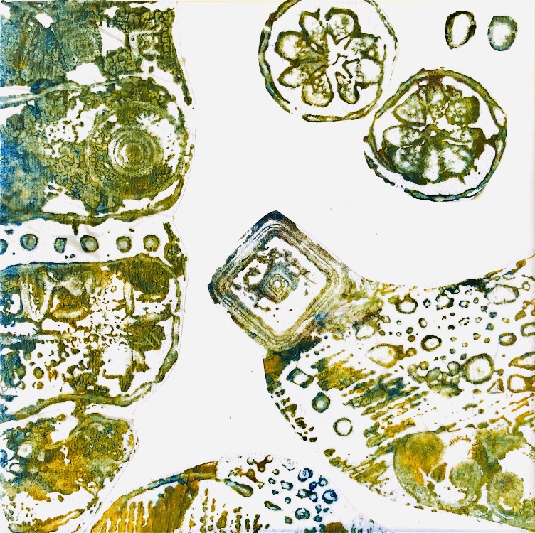
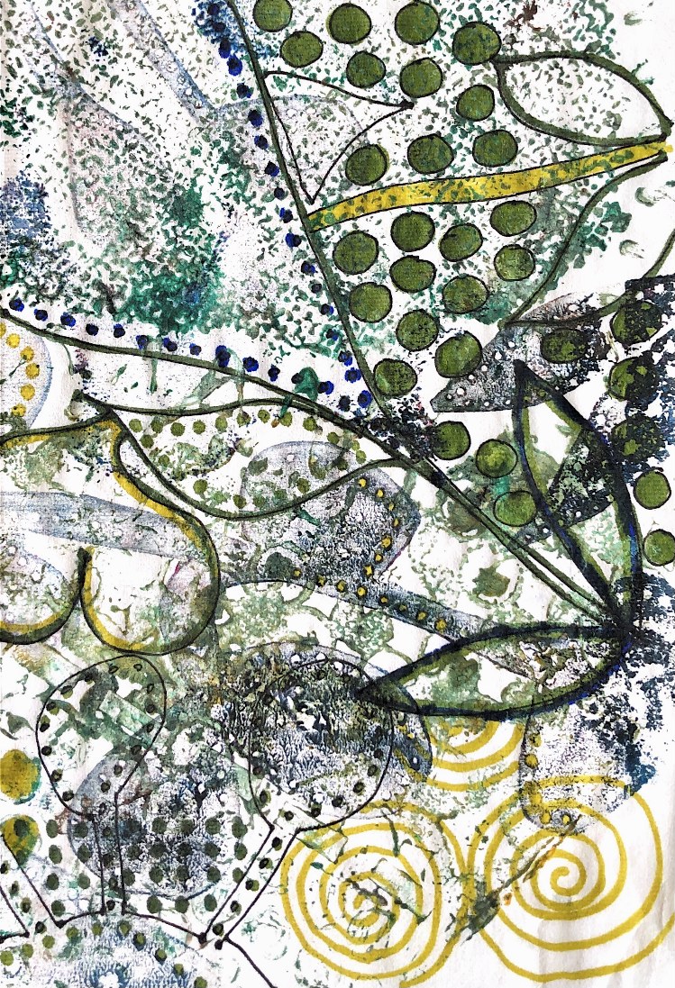
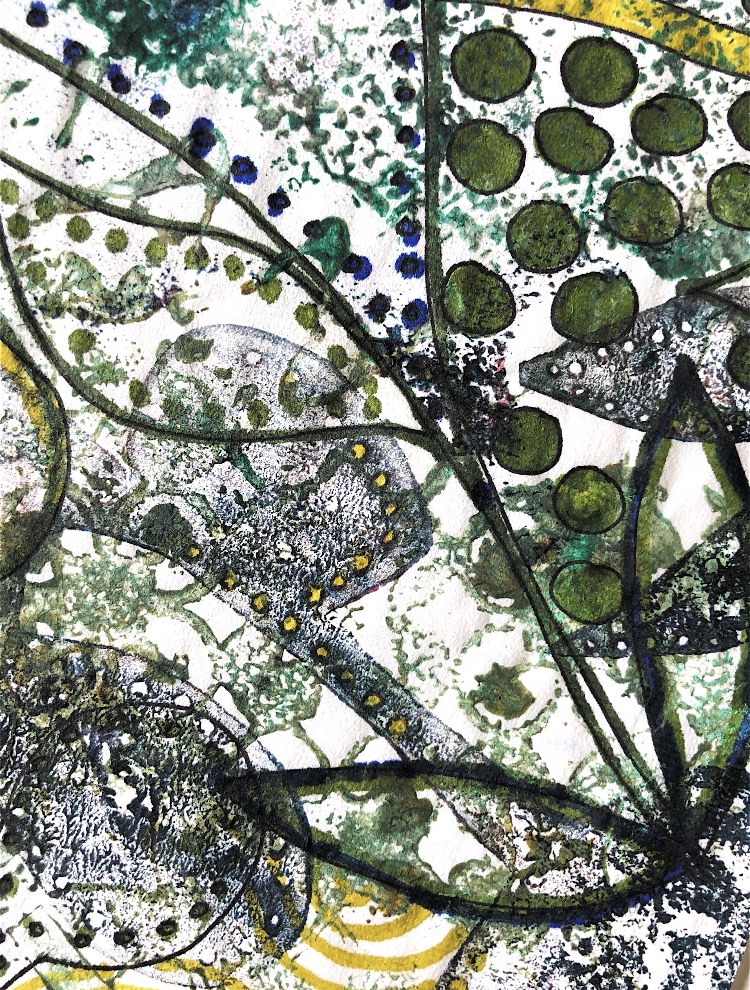
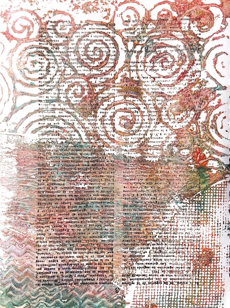
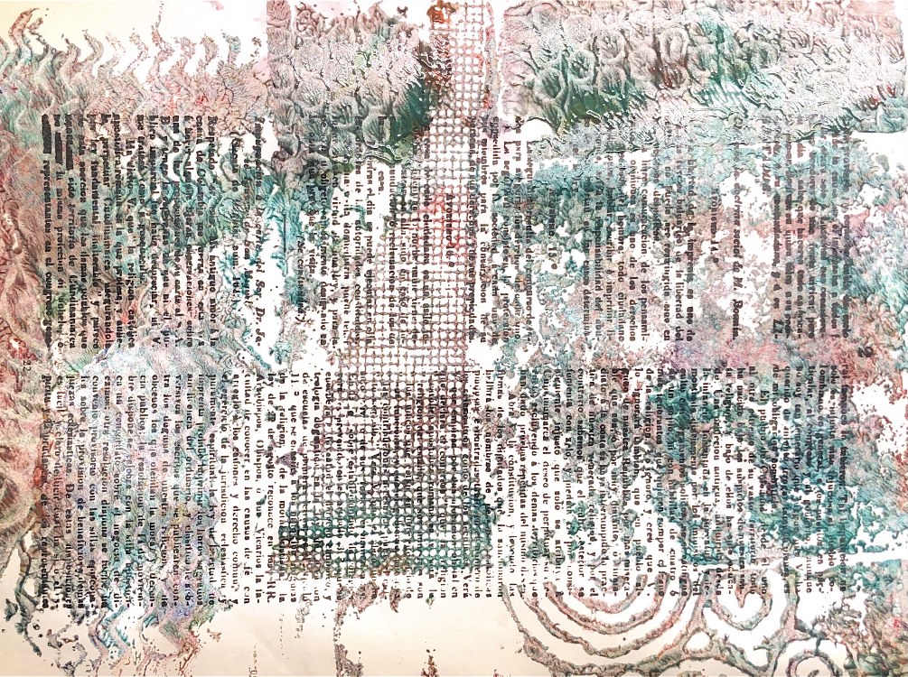
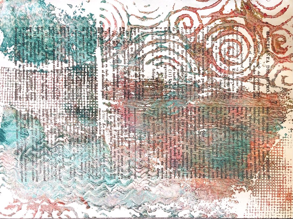
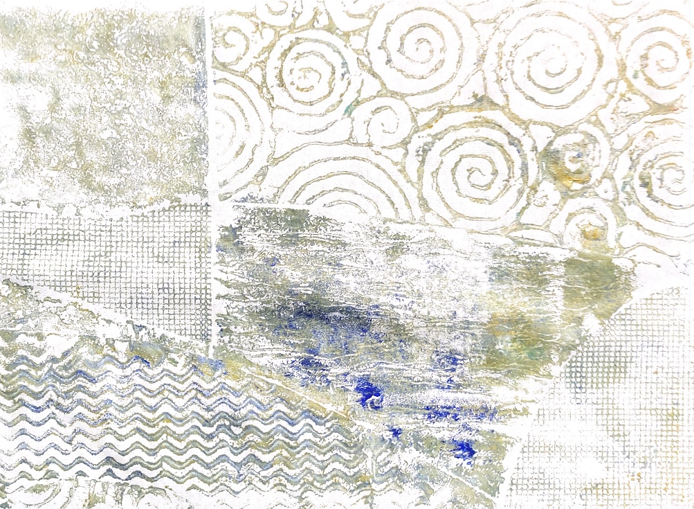
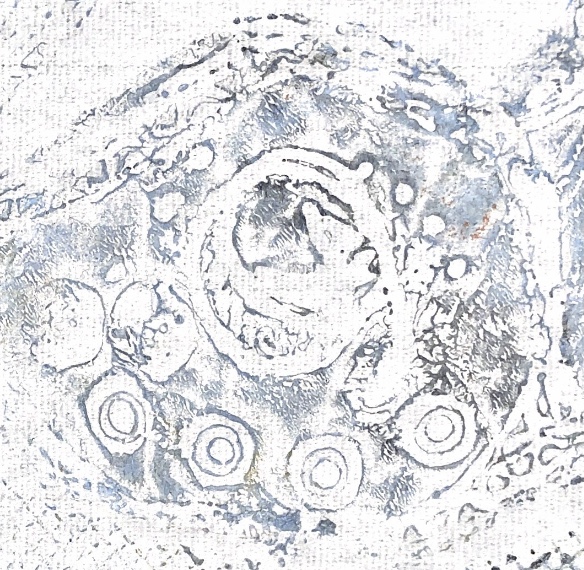
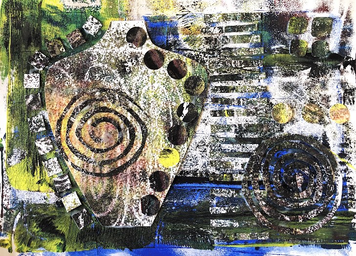
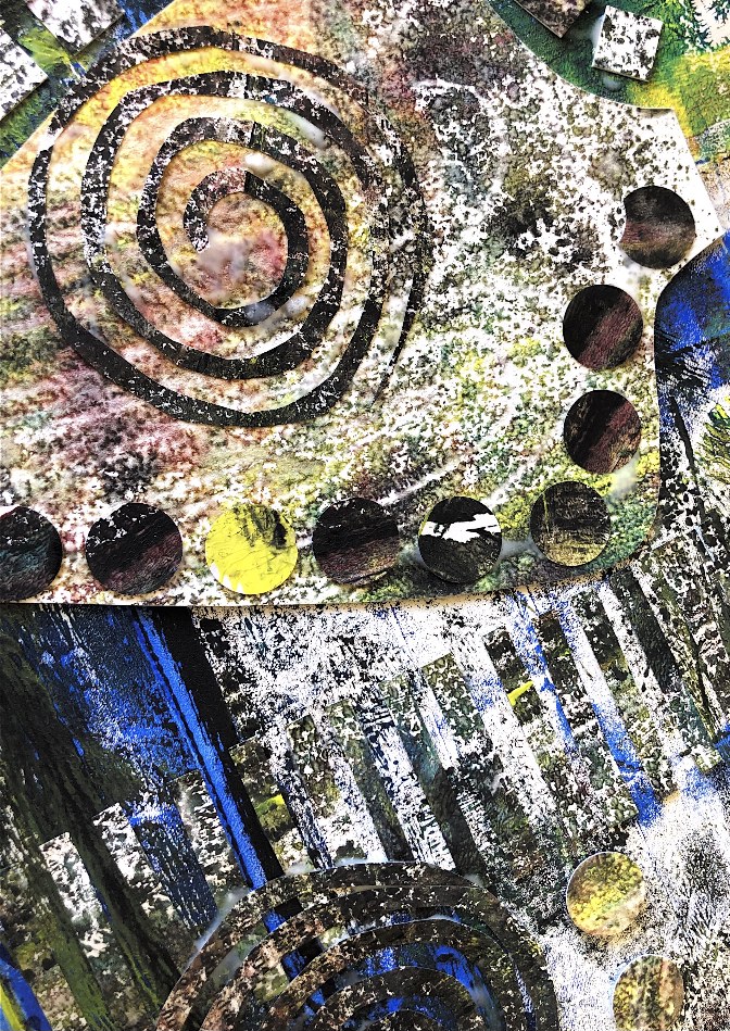
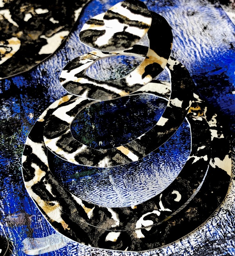
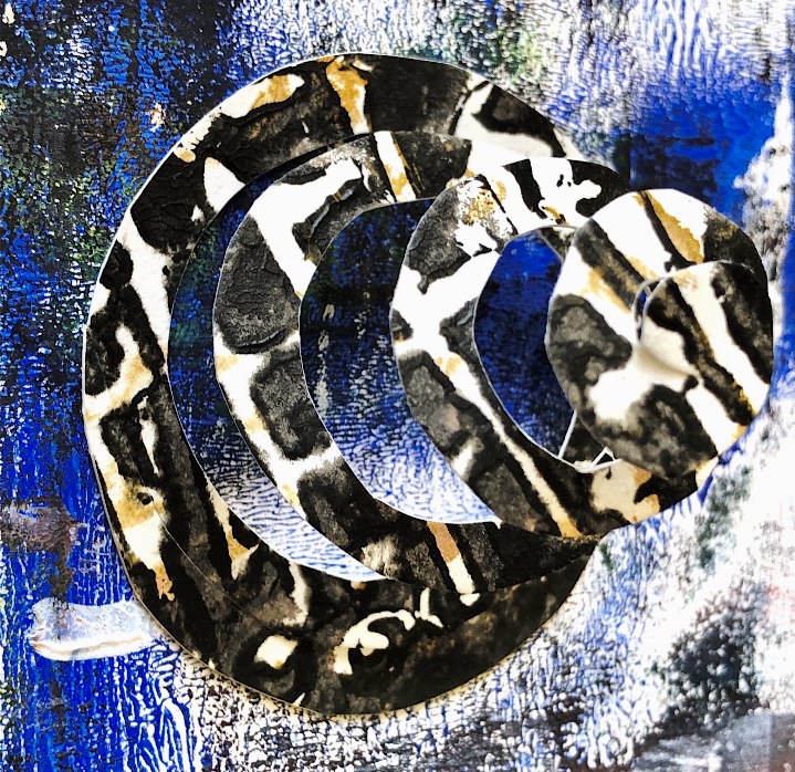
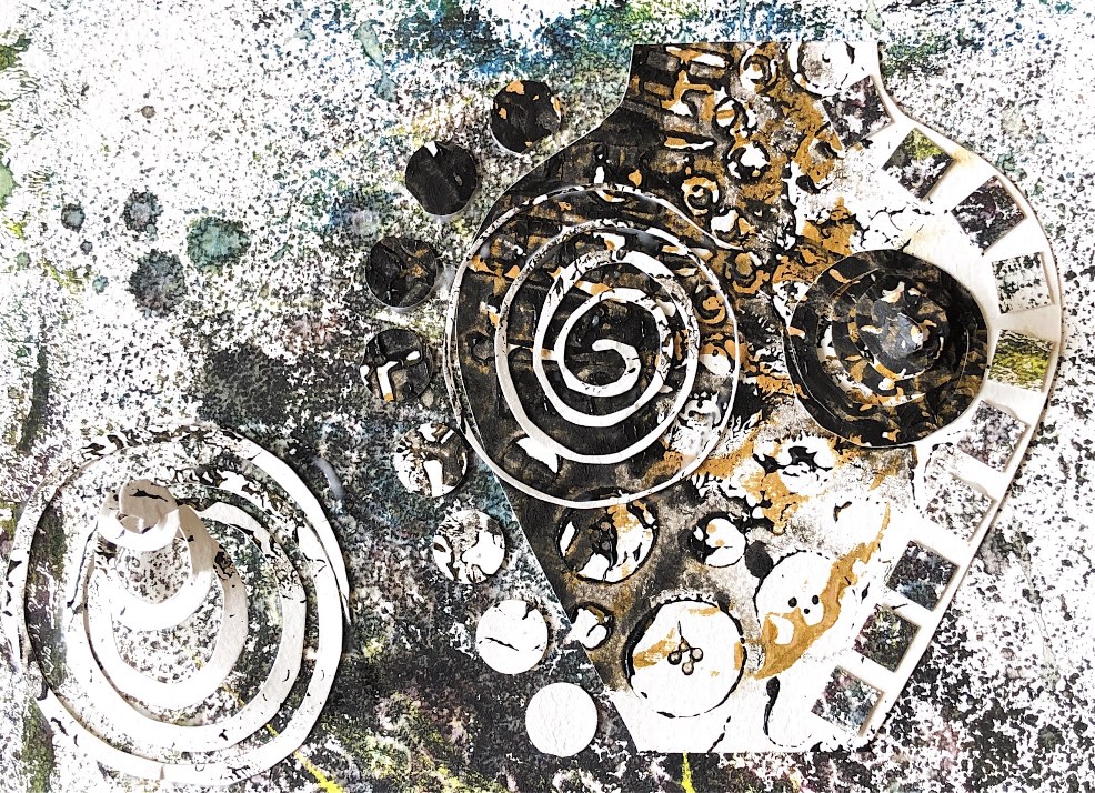
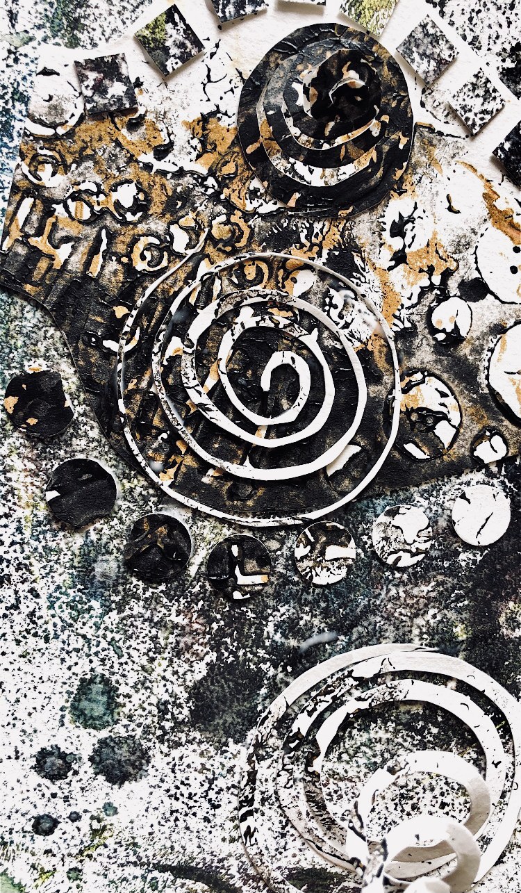
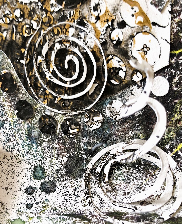
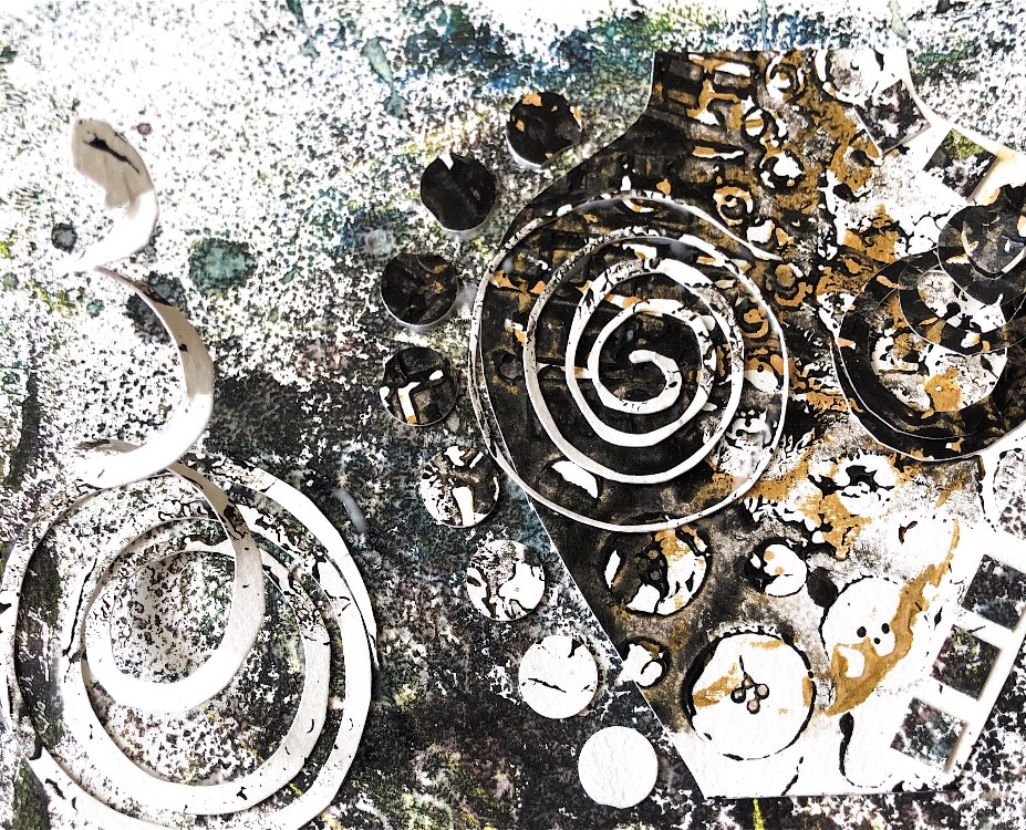
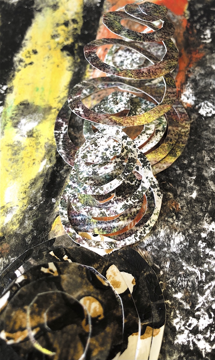
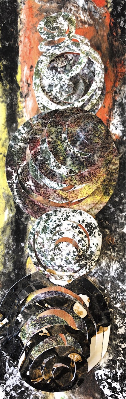
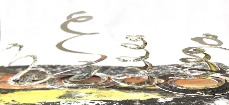
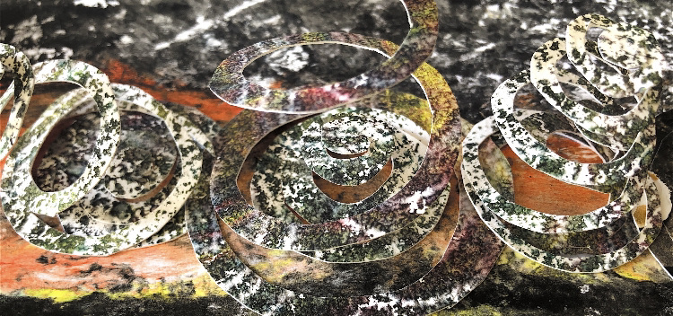
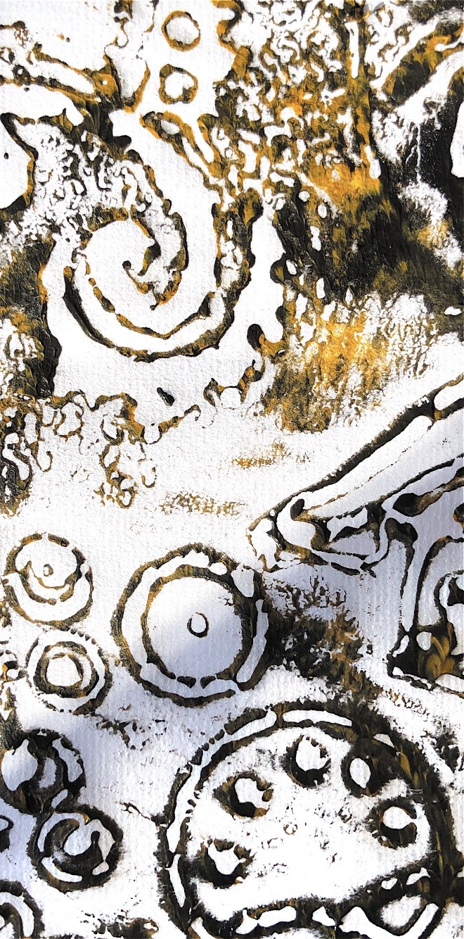
Fig, 5. Looking at the samples above I became interested in the spiral shape, and alongside simple collage shapes I made 3D spirals. When viewed from different angles these spirals add shape and movement.
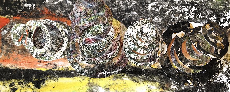
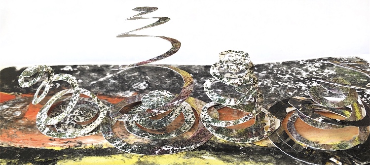
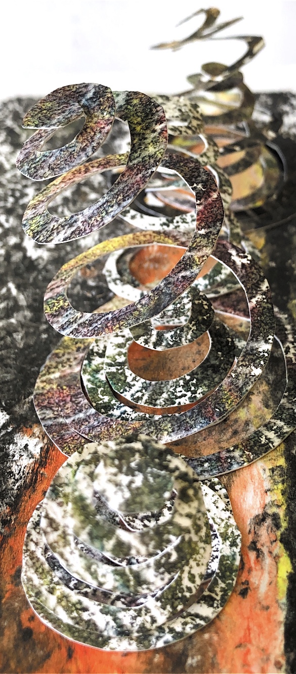
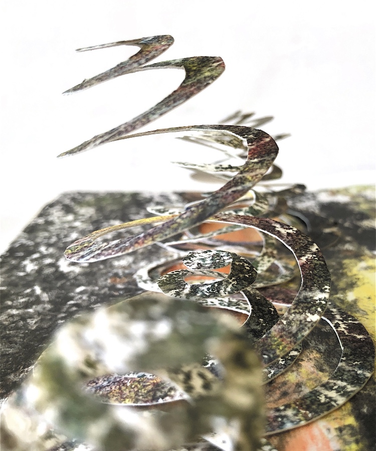
Fig, 6. Further development of the spiral images. These samples are fun, making a simple shape stand out. They create shapes and shadows from all angles.
*****************************************************
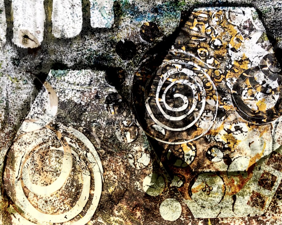
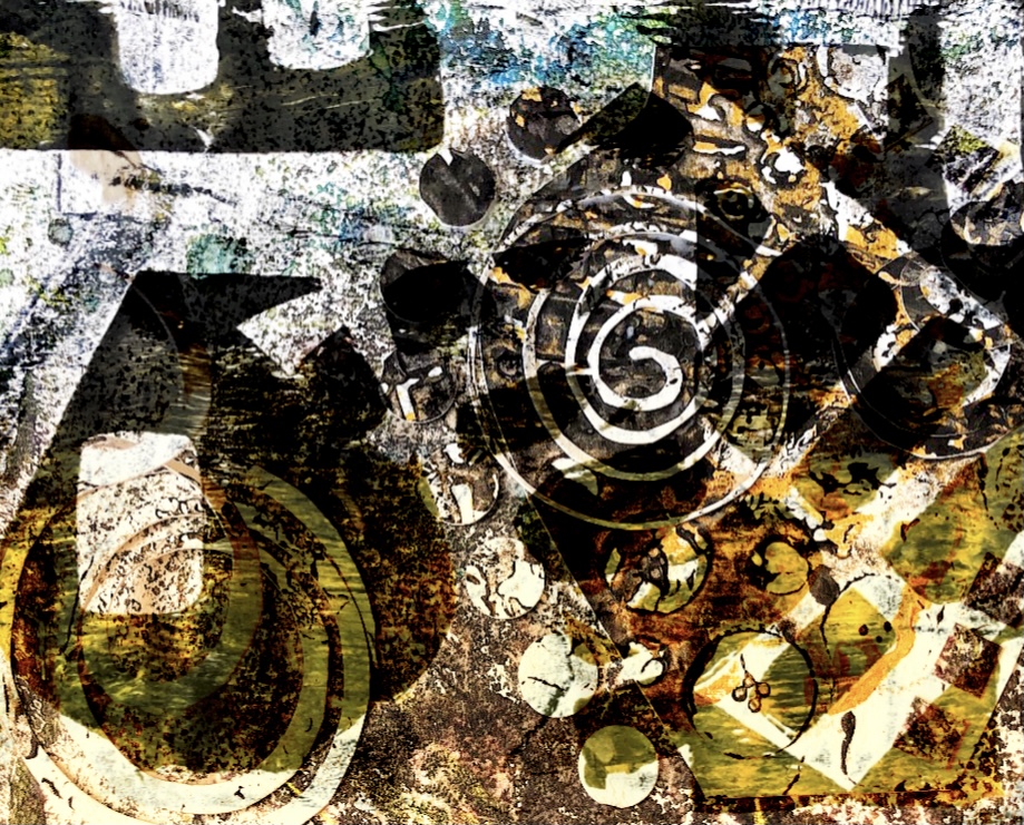
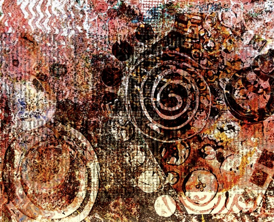
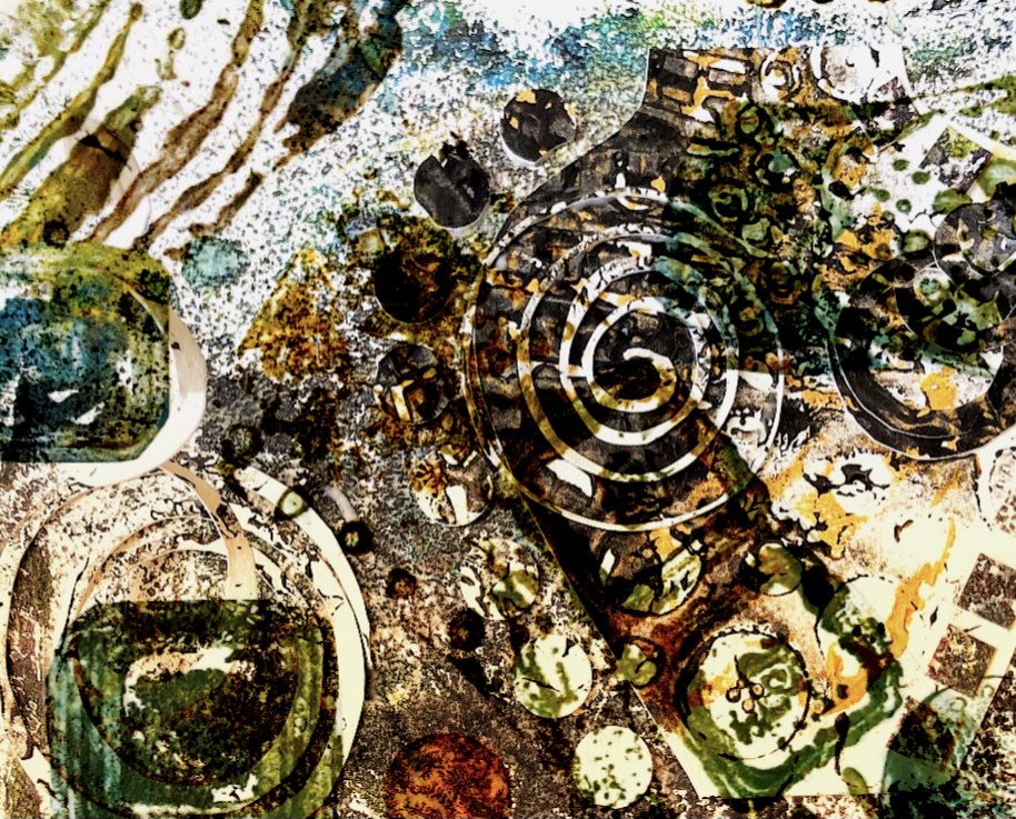
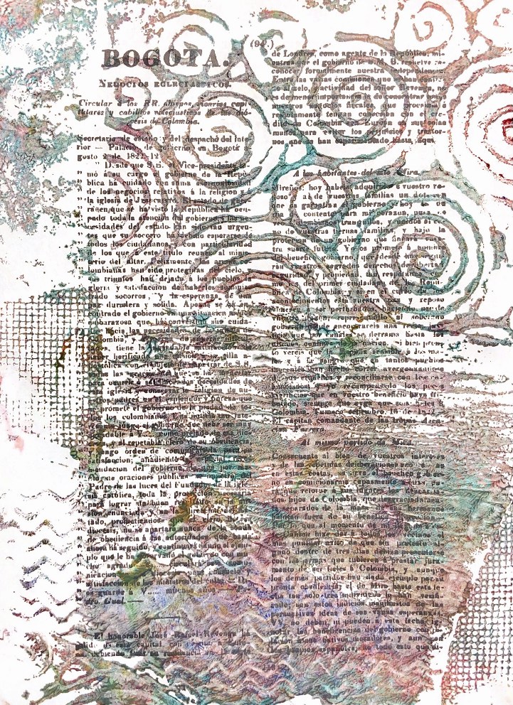
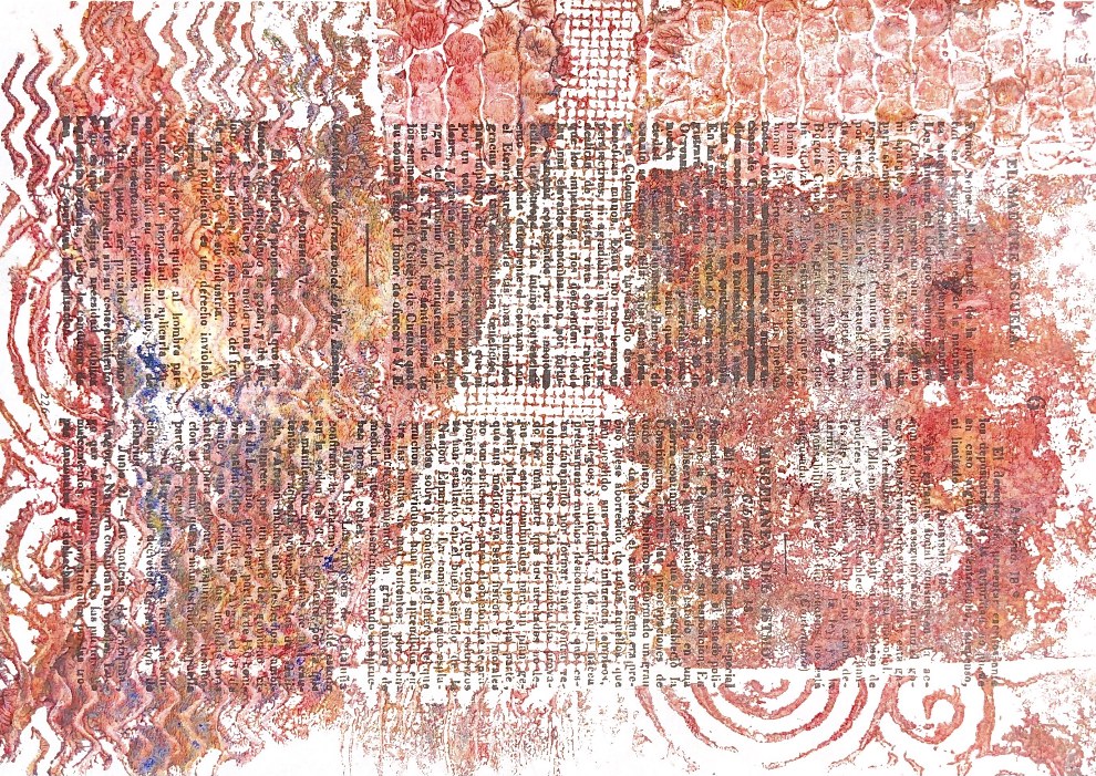
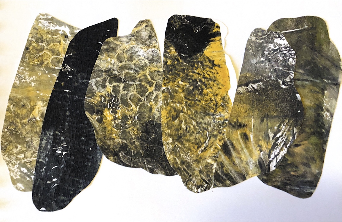
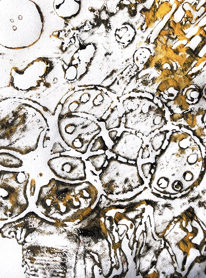
Fig, 7. These images have all been produced by overlaying photos in the Snapseed App. I tried this after talking to my tutor about drawing and development. The different papers used (some from printed books) and the 3D element in some of the images create busy, exciting samples – they remind me of an archeological dig with coins, jewels, crockery, and other artefacts all jumbled together. Again the concept of buried treasure appears in my work.
*******************************************
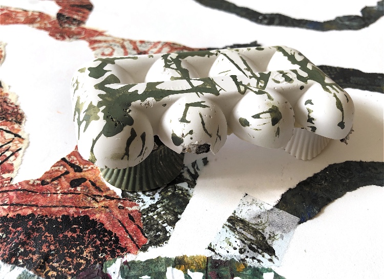
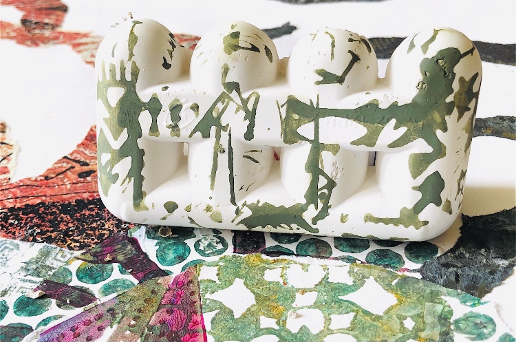
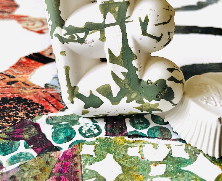
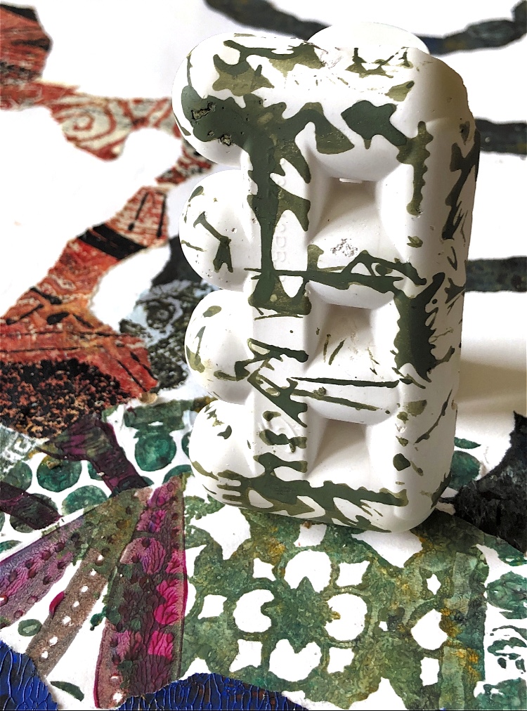
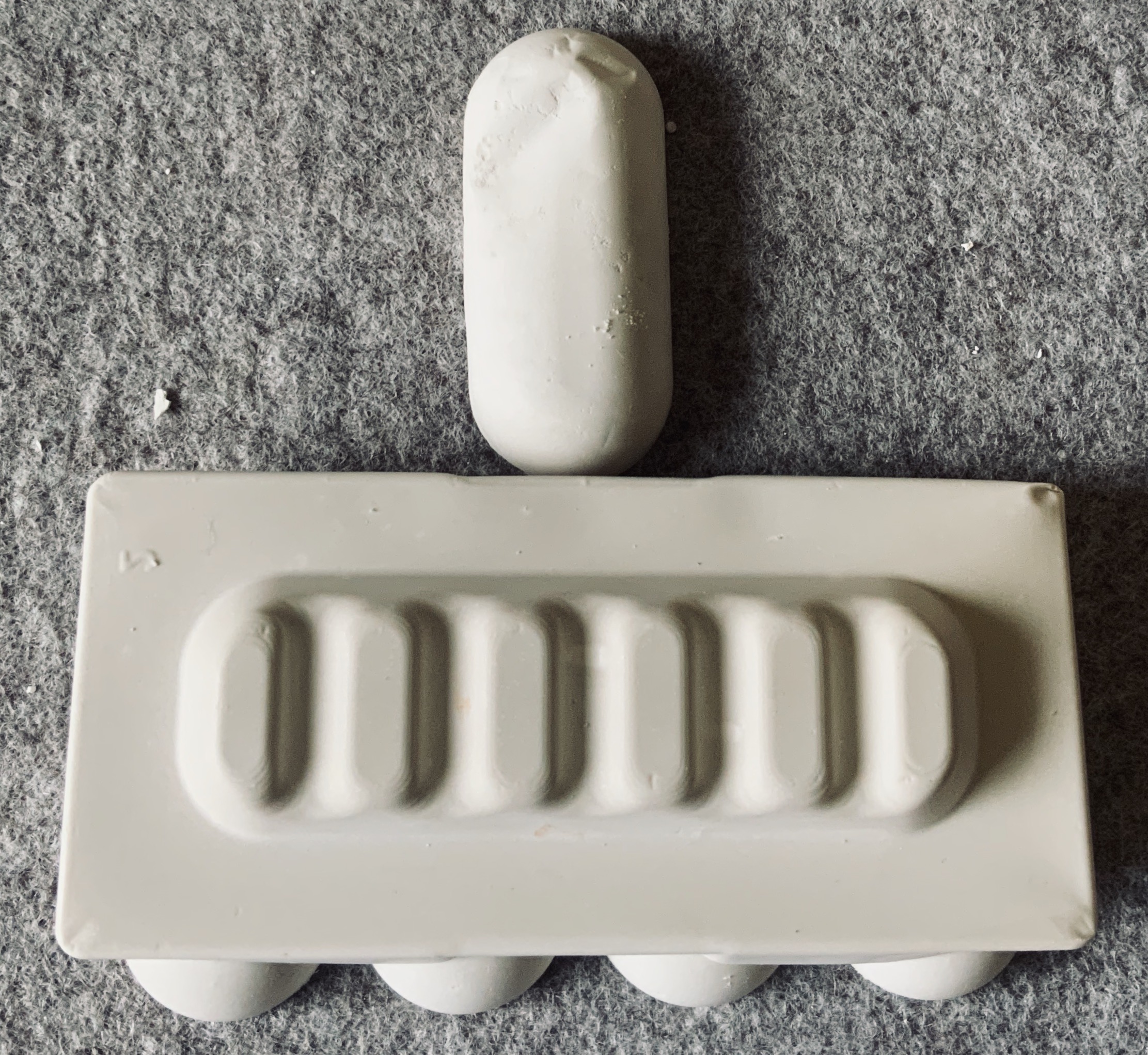
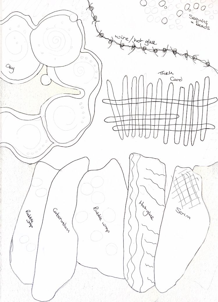
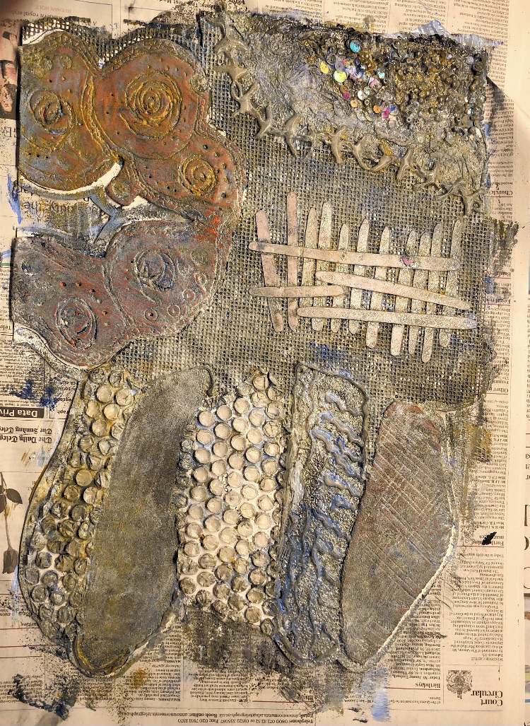
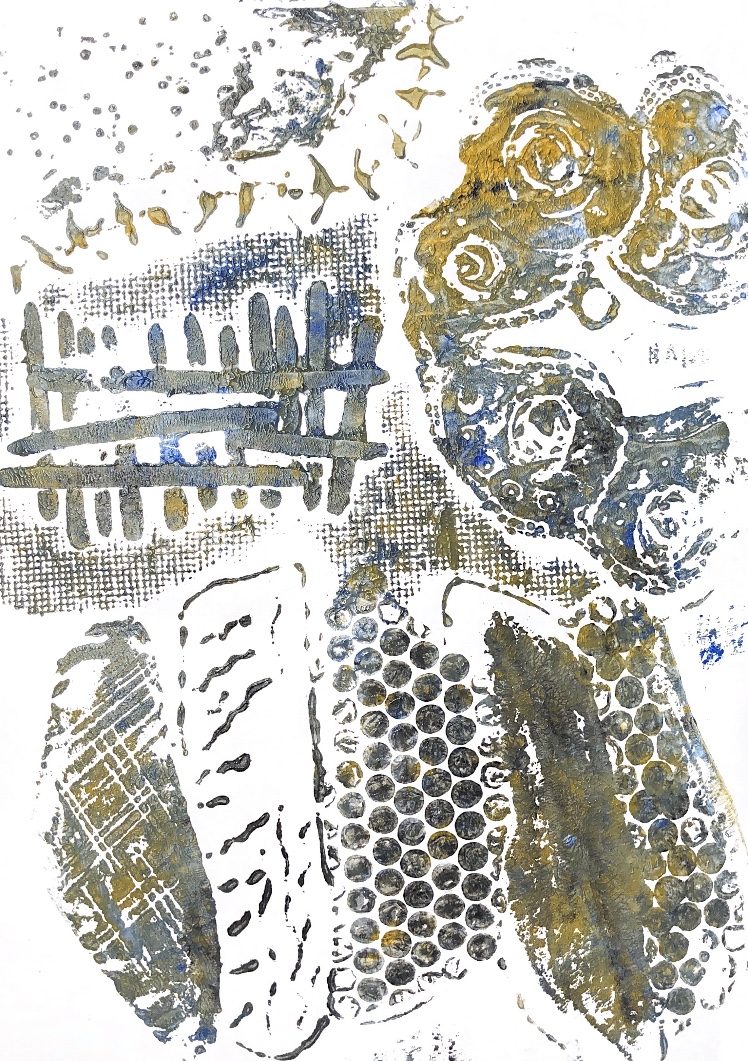
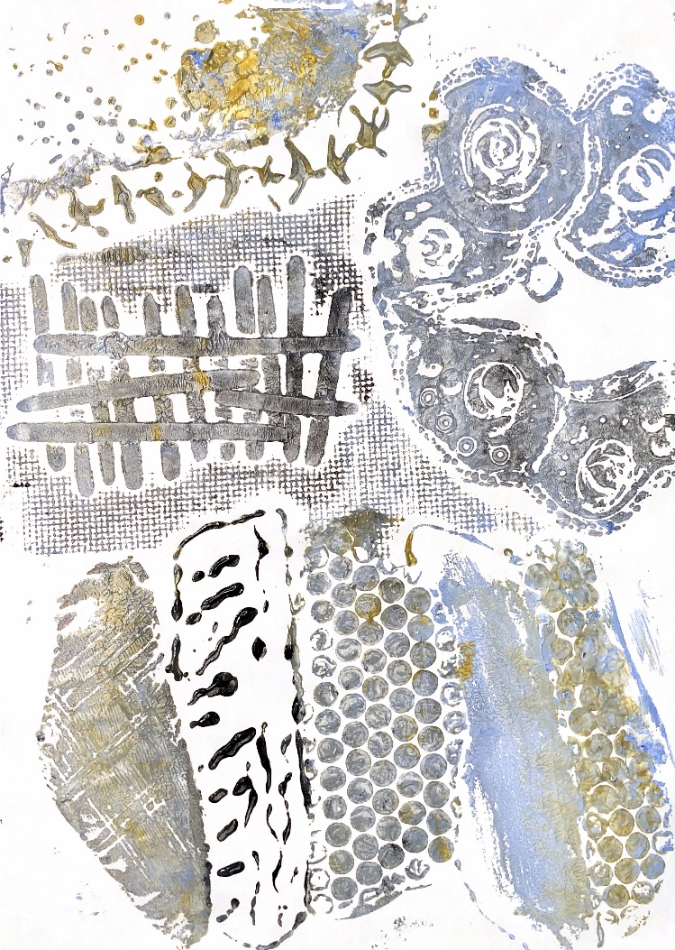
Fig, 8. Working with collagraph plates I experimented to see what worked for me. I didn’t get on with using polyfilla for this technique so I tried air drying clay.
This air dry clay piece made prints with an intaglio look without needing to use a press. I found that rice paper worked really well to pick up the ink in the channels. Some of the images seem to have a shadow effect which makes them appear to be 3D.
***********************************
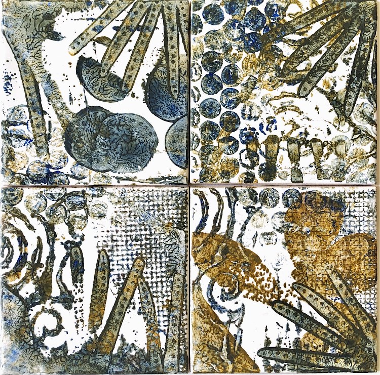
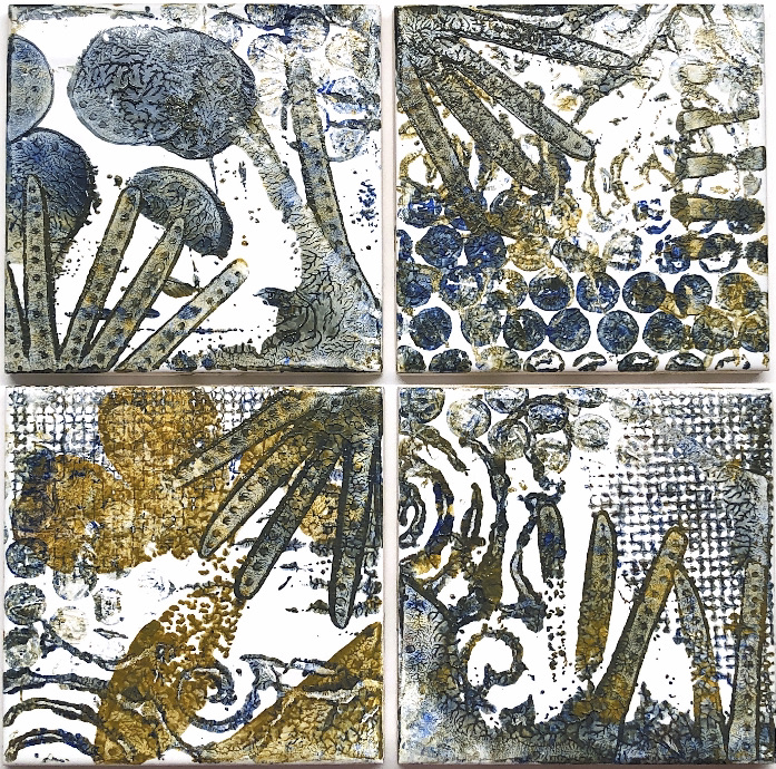
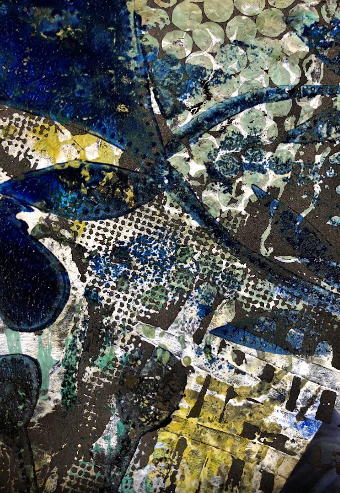
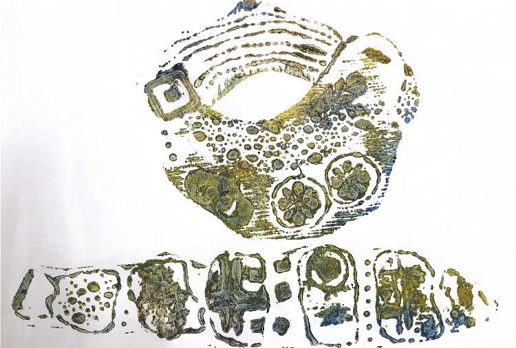
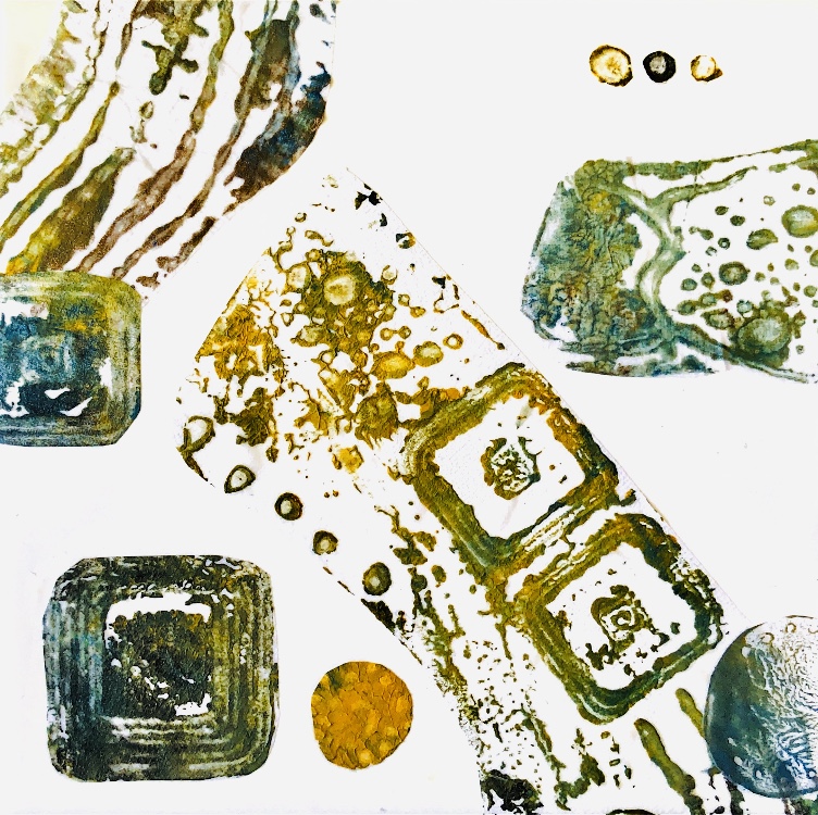
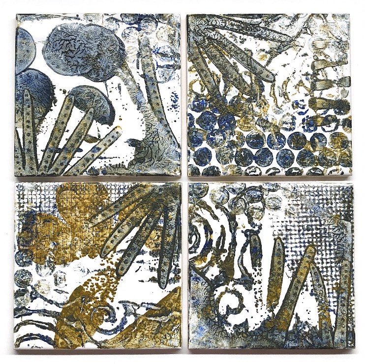
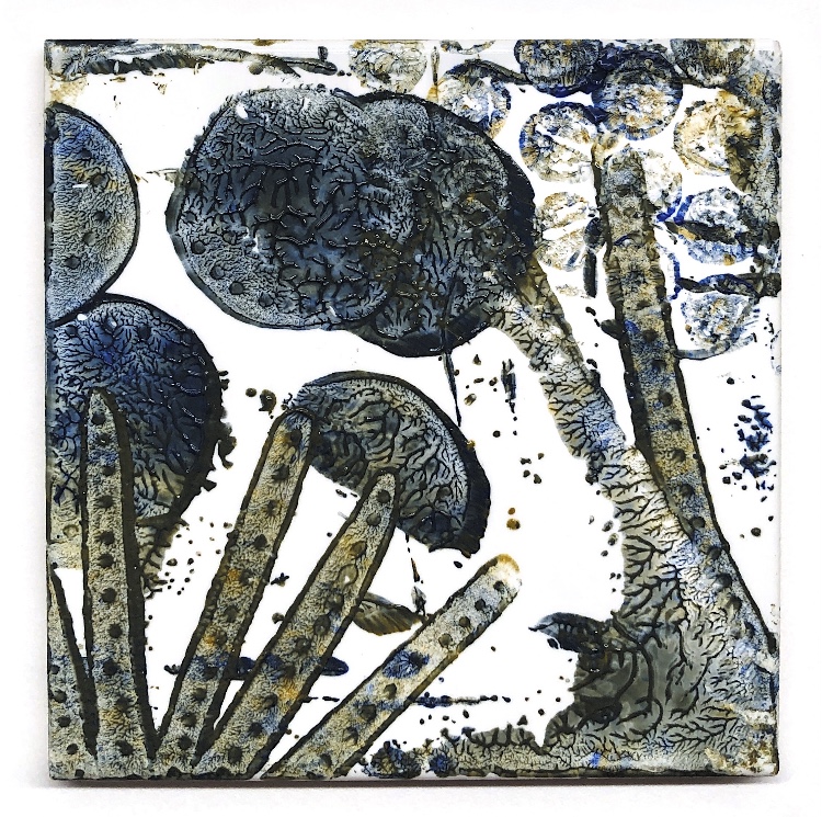
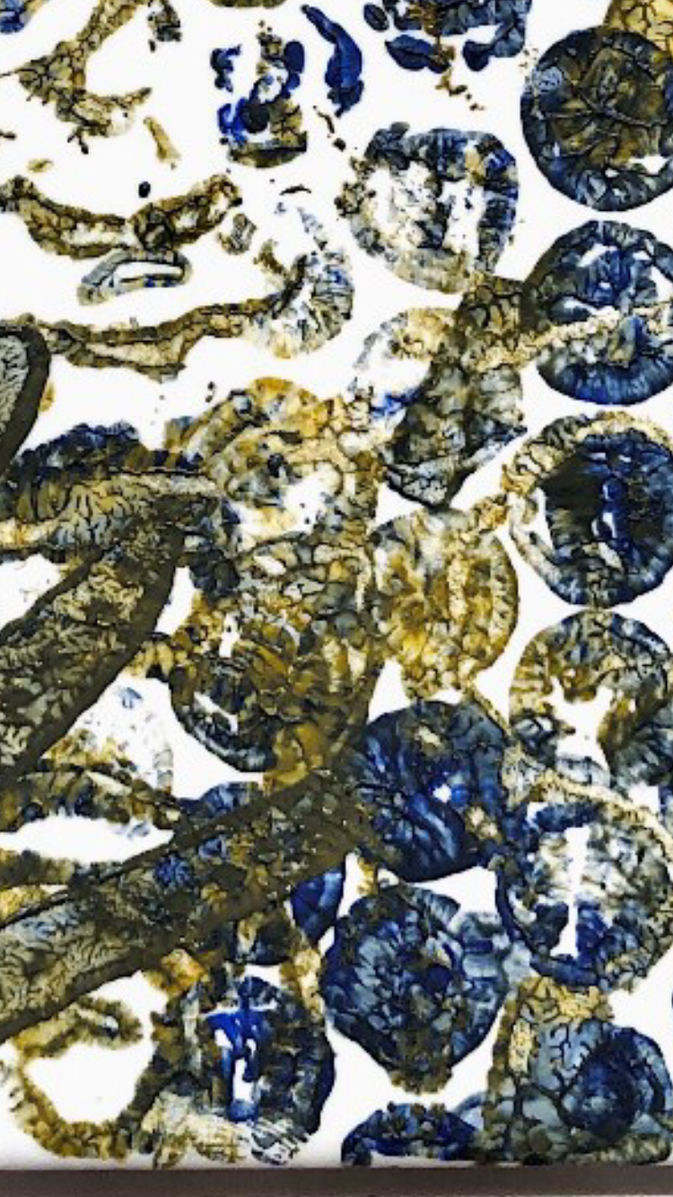
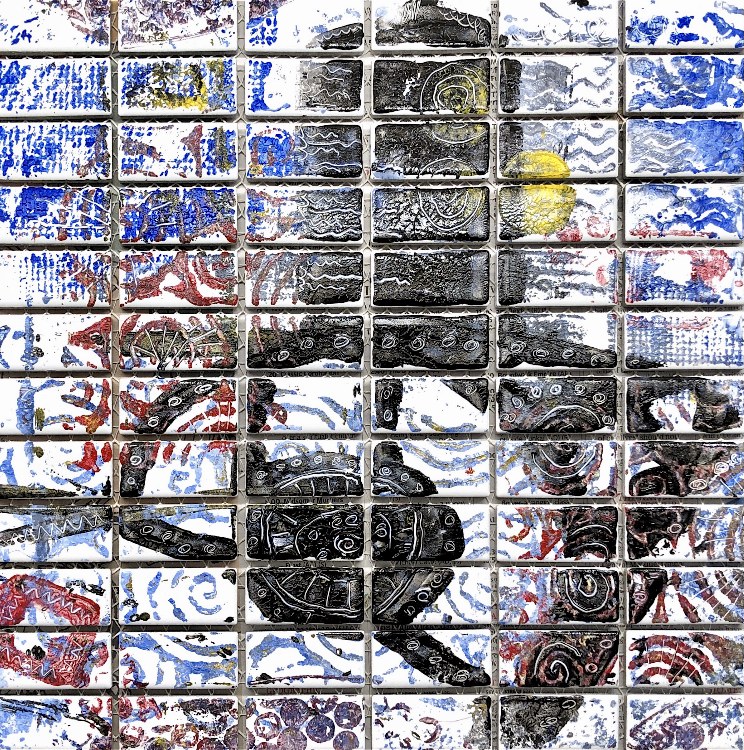
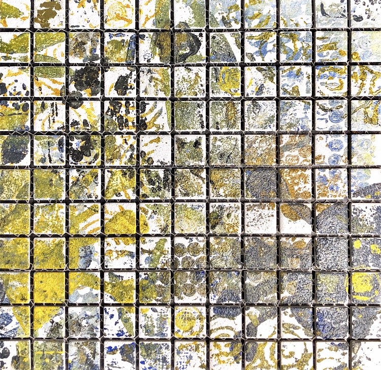
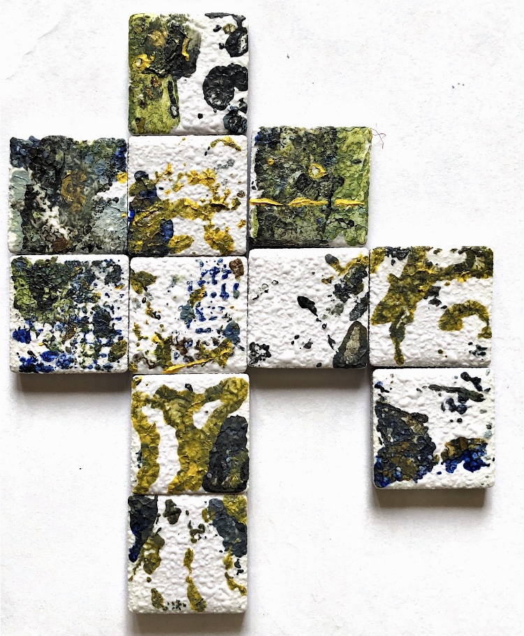
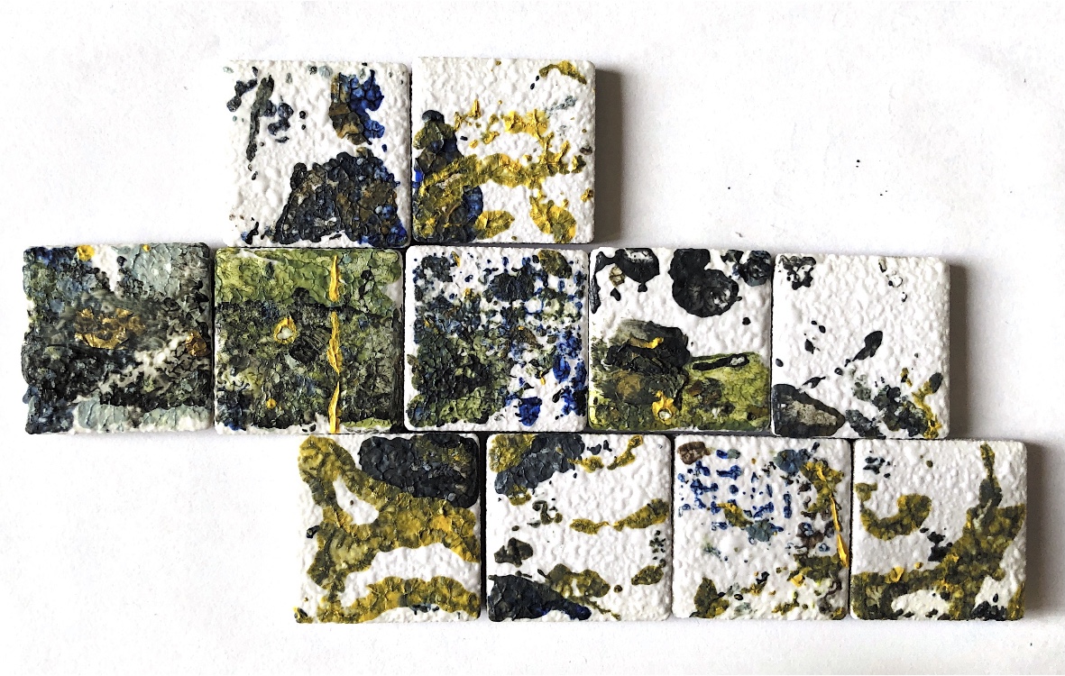
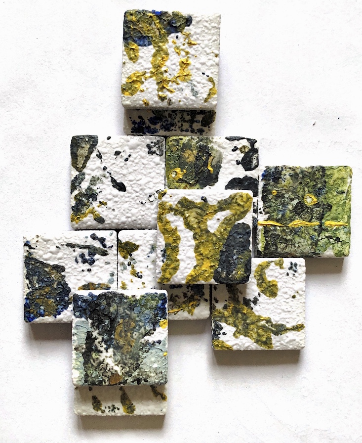
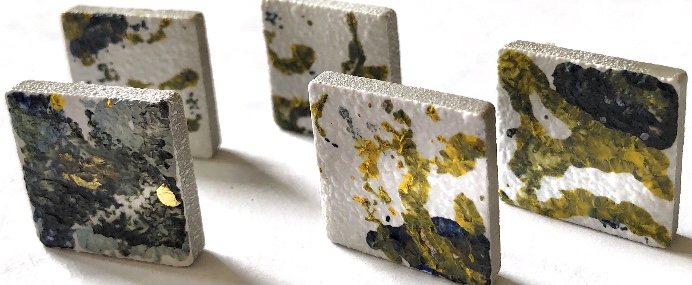
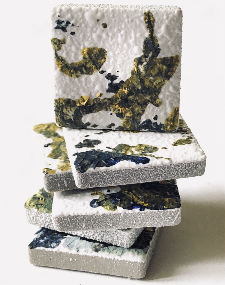
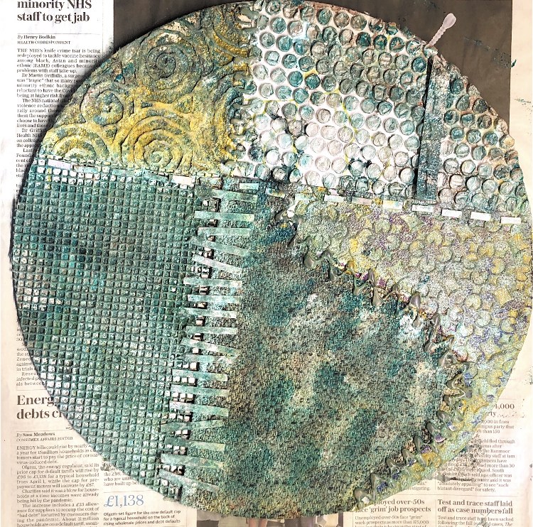
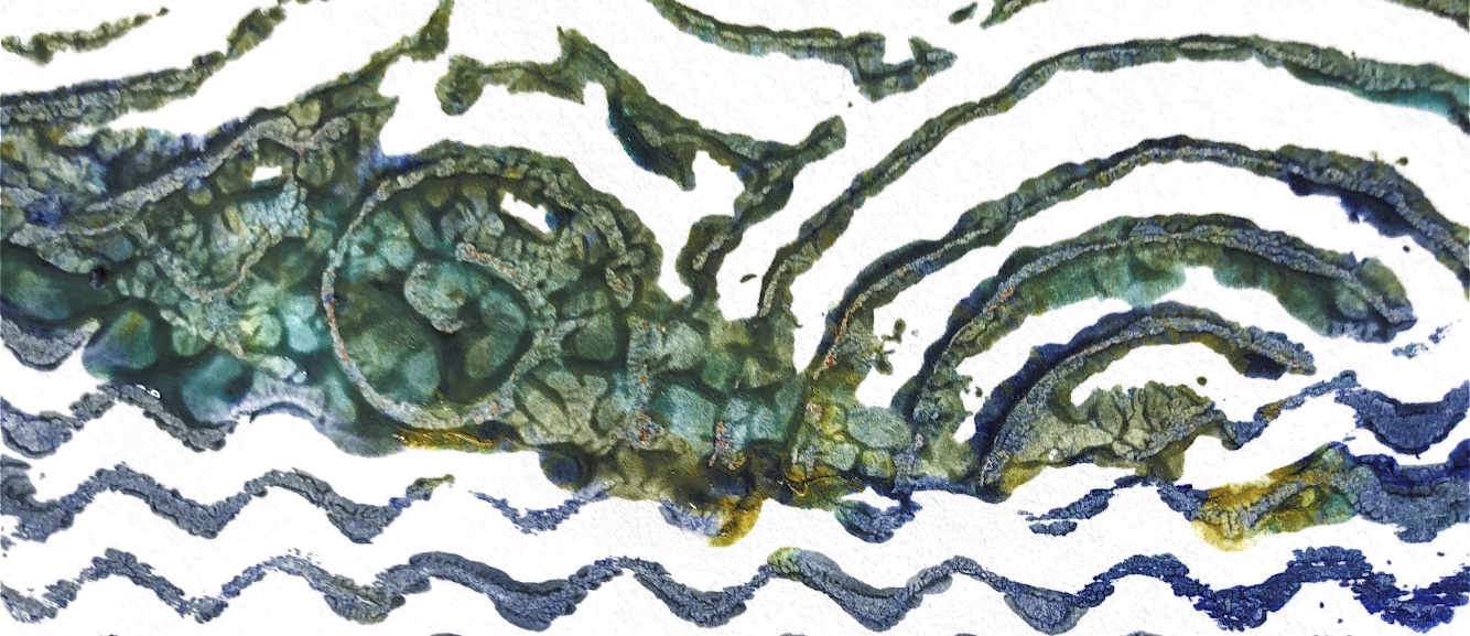
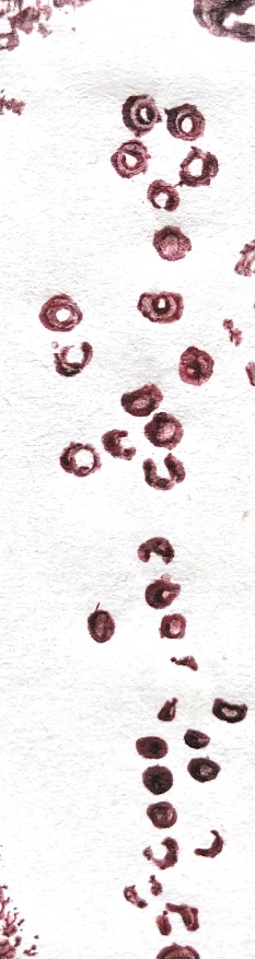
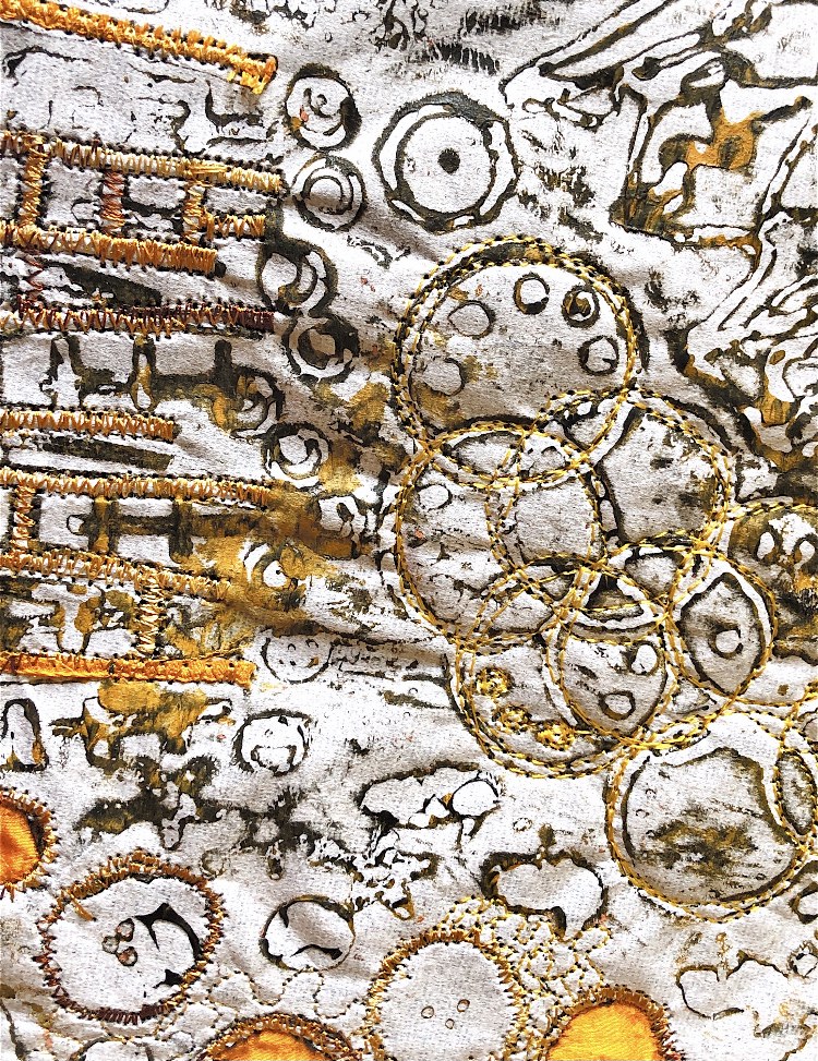
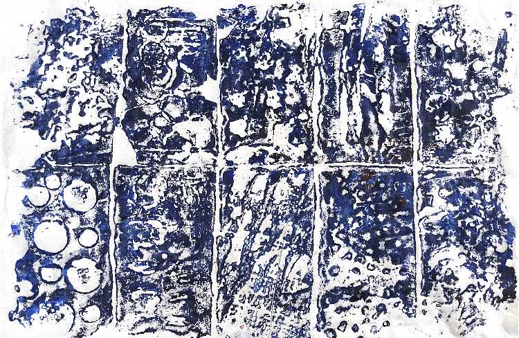
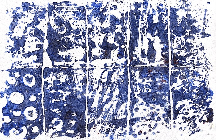
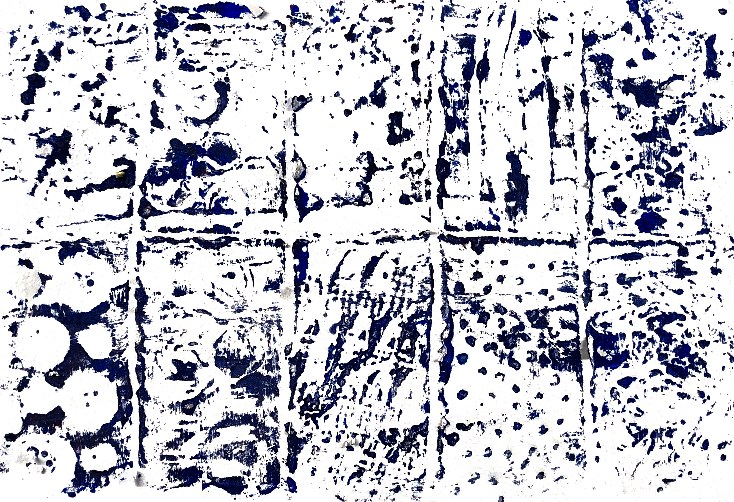
Fig, 9. Experimenting with overprinting led me to experiment with printing onto ceramic tiles. This collection of 4 small square tiles made from two different collagraph plates have a feel of water and plants. The different materials used for the plates meant that some tiles needed to be printed a few times to pick up the paint on their non flexible surface. Because the collagraph plates are flexible it was quite easy to select areas from which to print images. This was very different to printing on paper. I like the way the squares could be arranged in many combinations to create different mosaics.
I discovered that because the paint stays wet for longer on ceramics that I could draw into it with the ‘wrong’ end of a paintbrush to make further patterns, as in the third image below.
****************************************
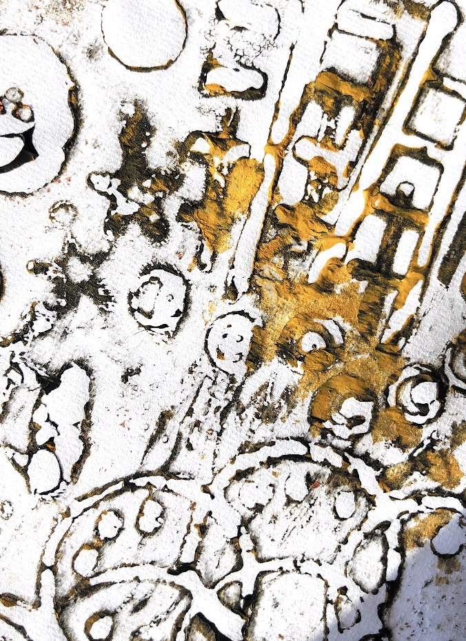
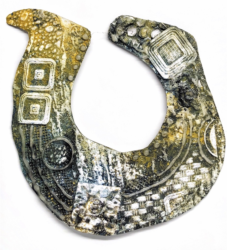
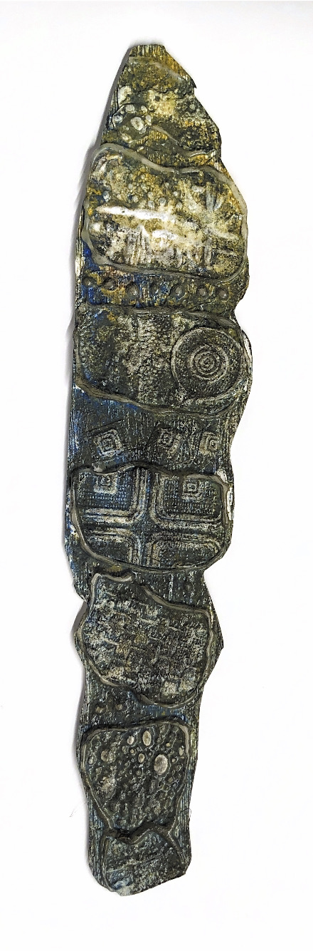
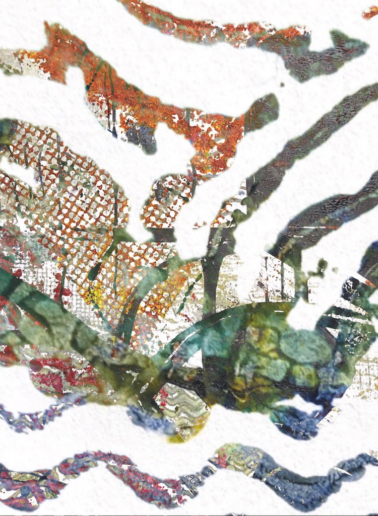
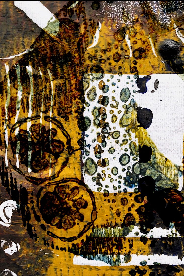
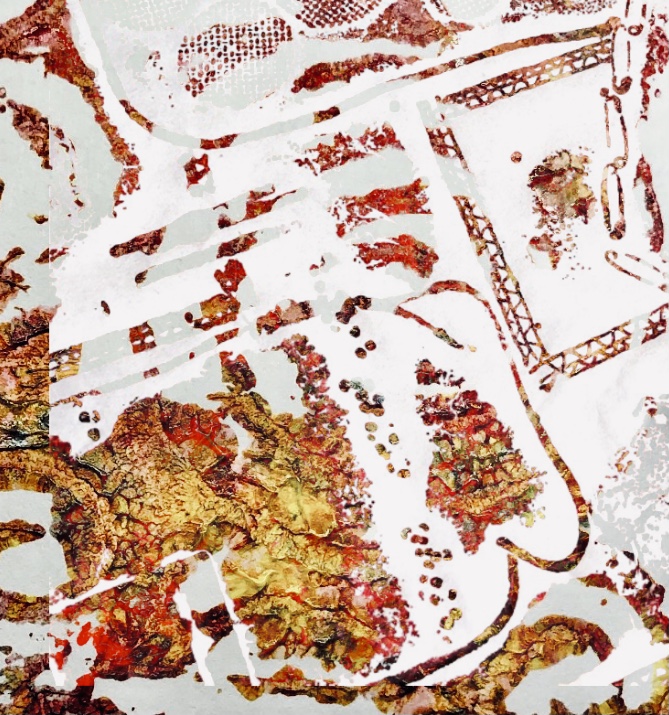
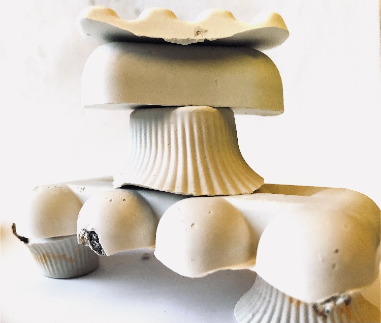
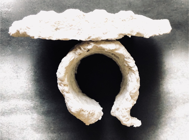
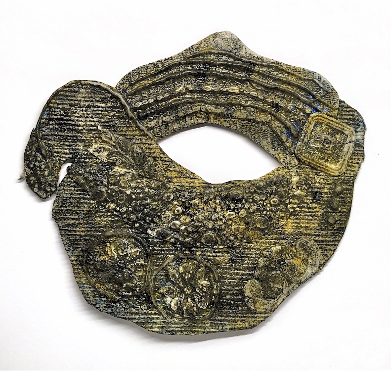
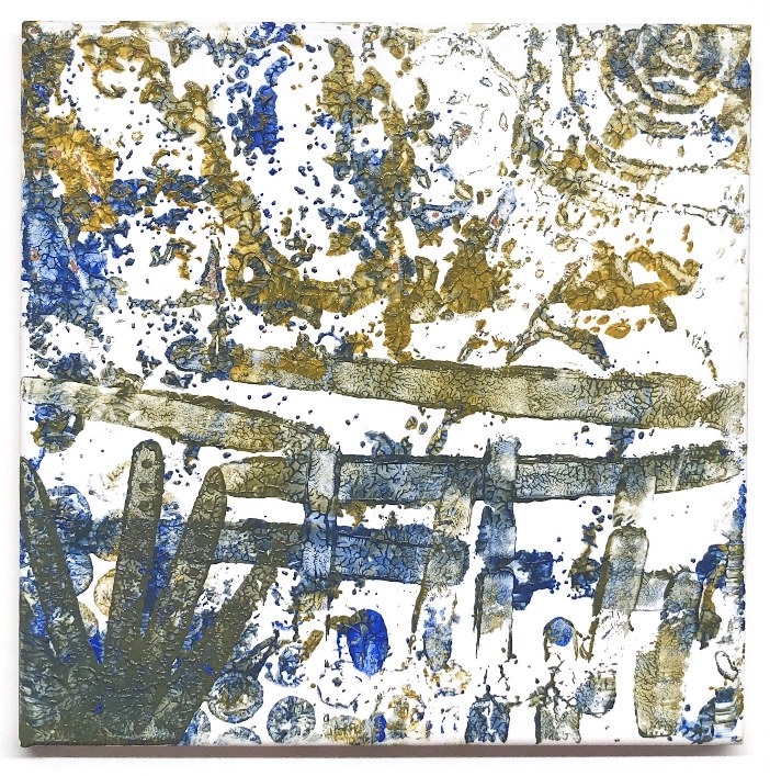
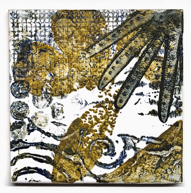
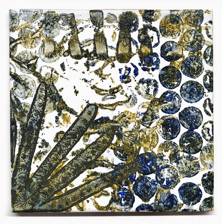
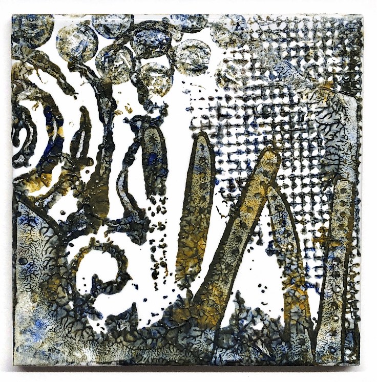
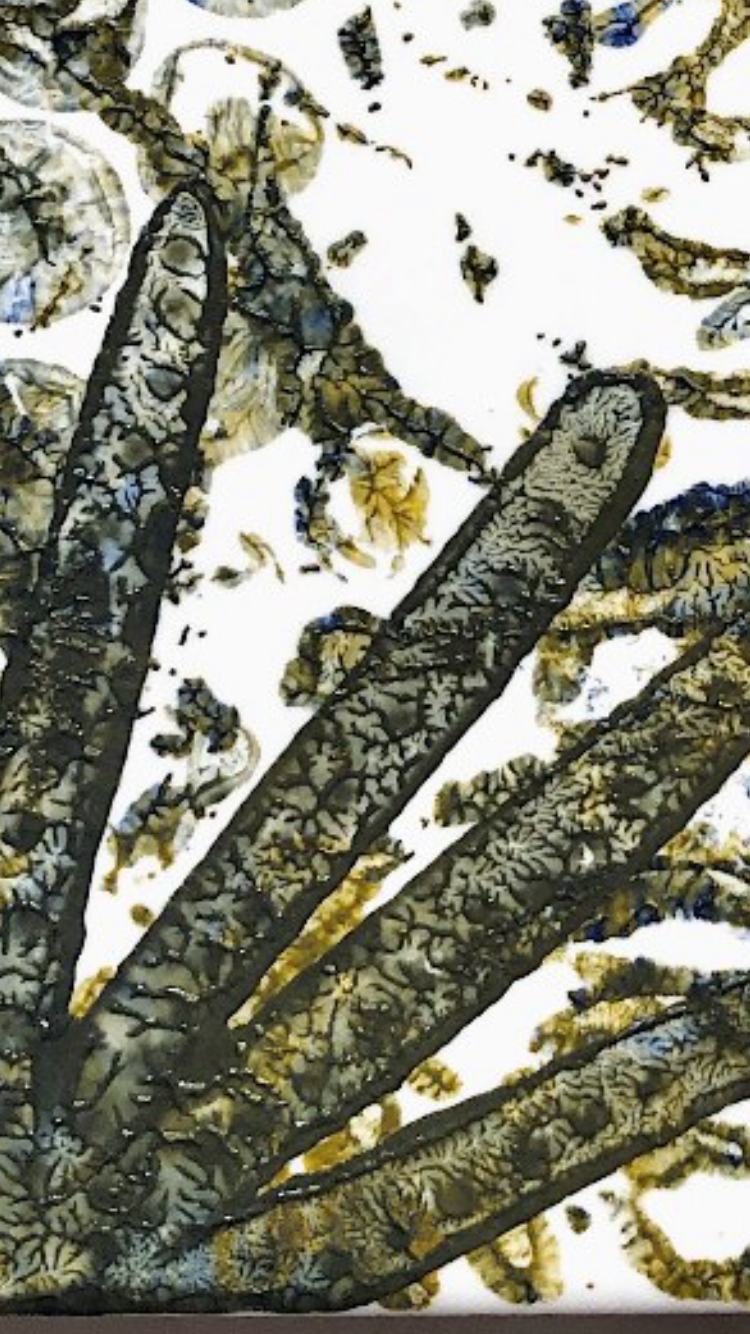
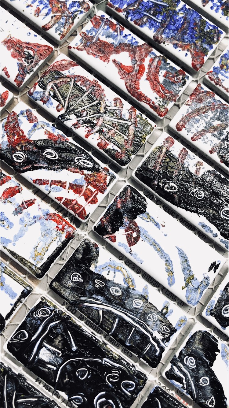
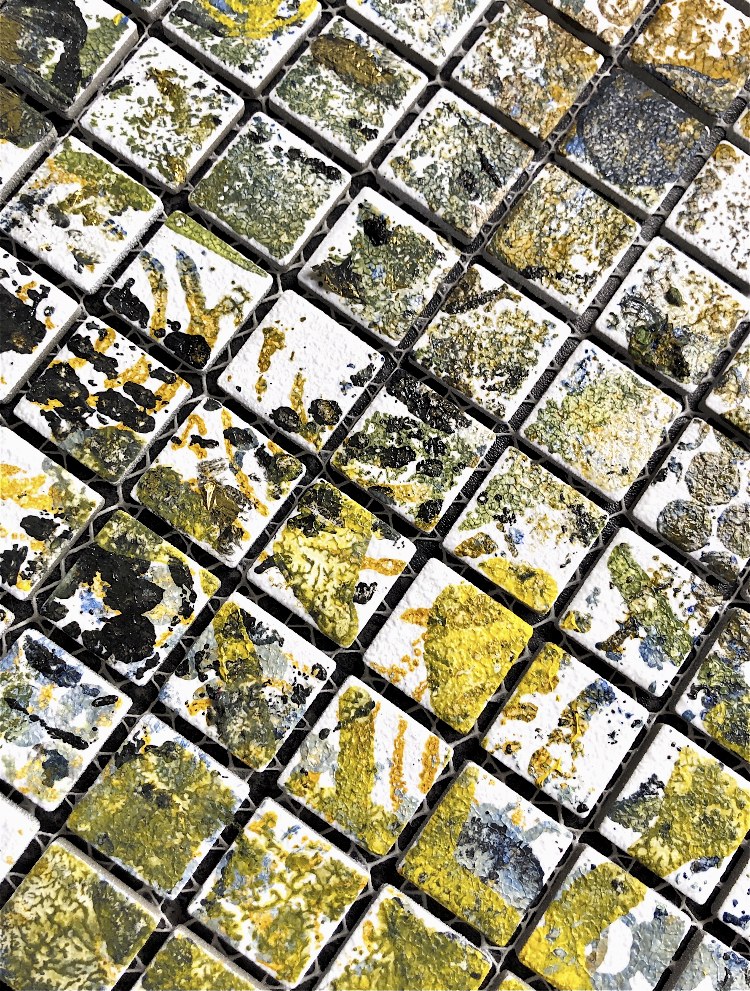
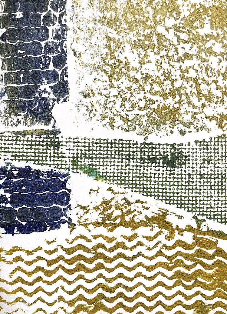
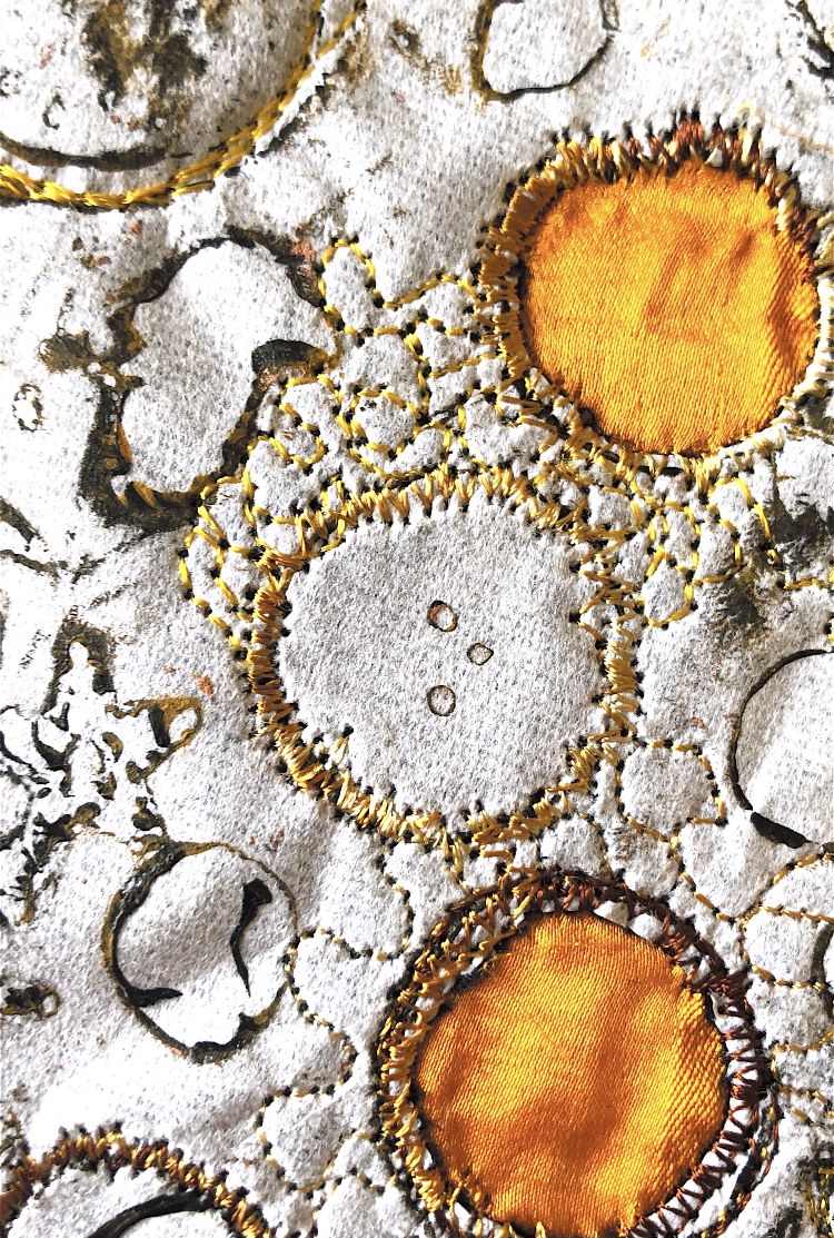
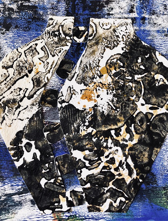
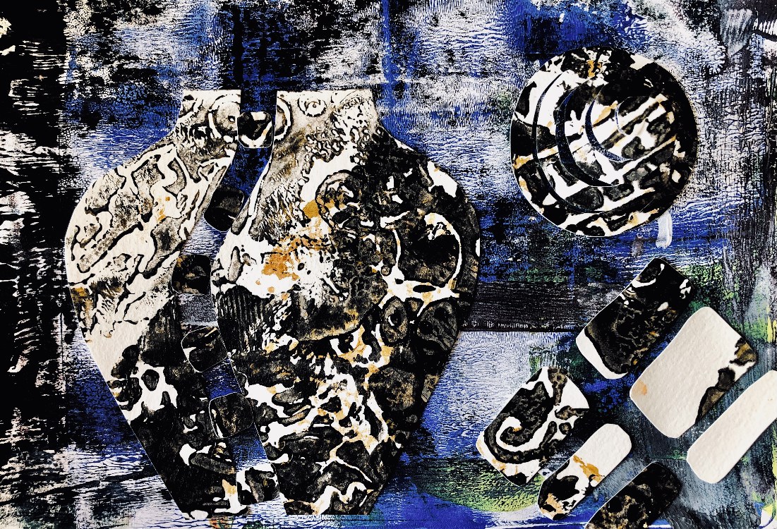
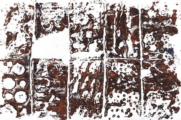
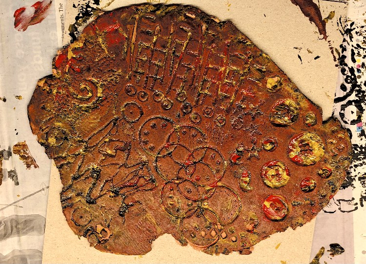
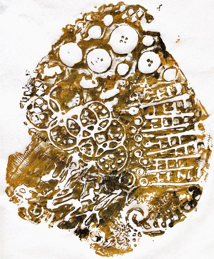
Fig, 10. For these samples I made shaped plates inspired by papier mache pieces from MMT3. This is when I really wished I had access to a printing press to get a more solid print. I think I prefer the painted plates to the actual print! I was inspired by the work of Clare Maria Wood and Peter Wray who both use shaped plates and take their inspiration from nature and man made artefacts, with strong focal points.
The last two images below were made by collaging rice paper printed samples onto ceramic tiles. This brightened the colours, as the pure white ceramic showed through the fine paper prints. The patterns are clearer in these samples and the rusty/verdigris colours are very pleasing.
*************************************
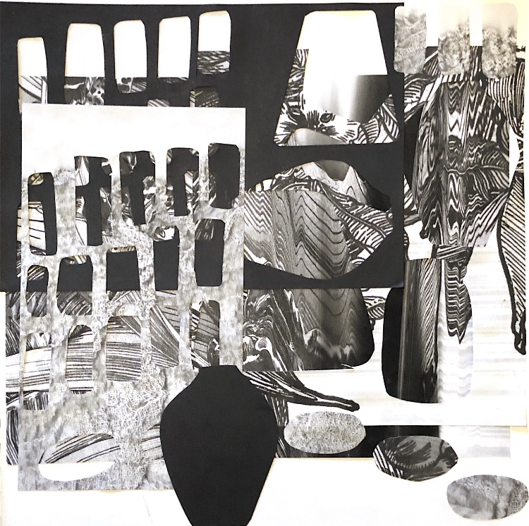
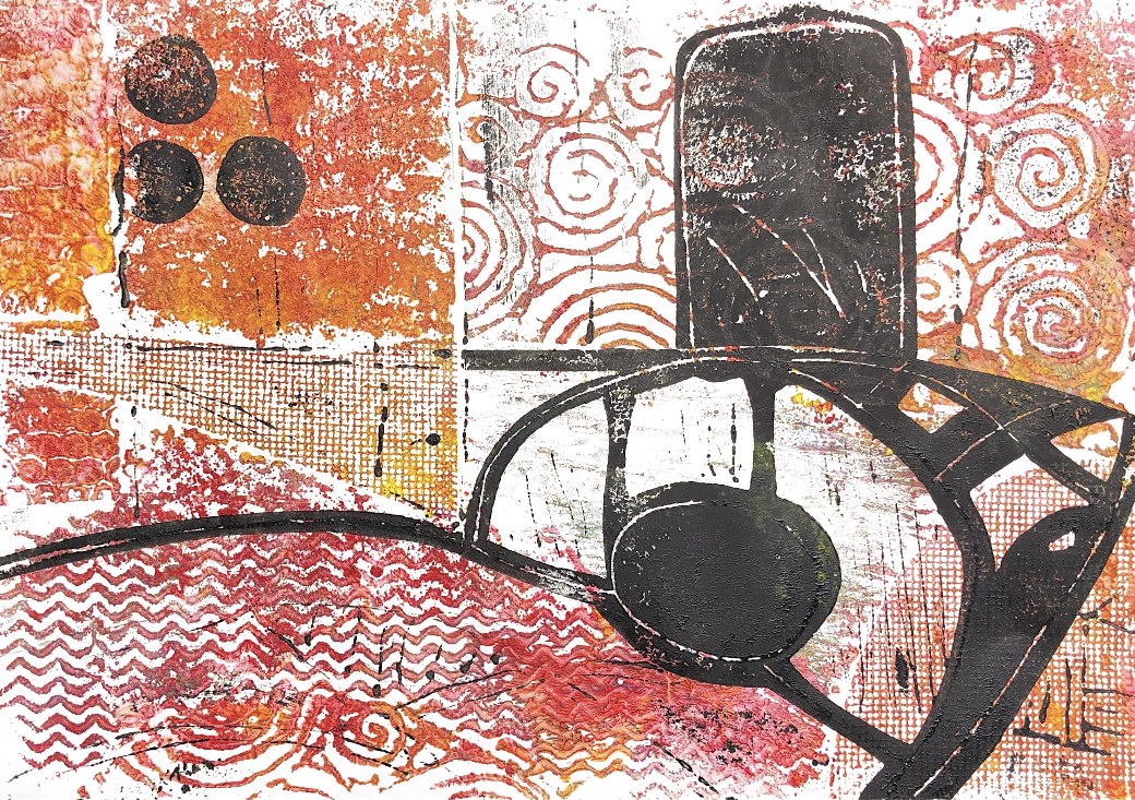
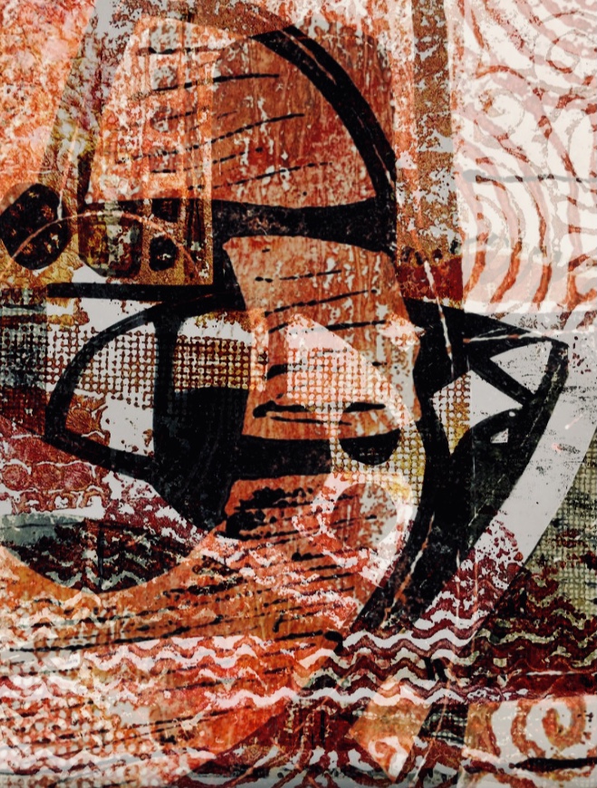
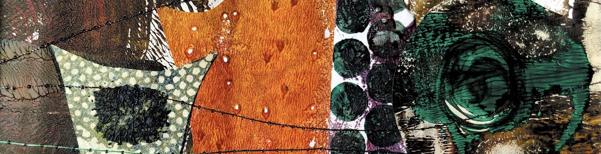
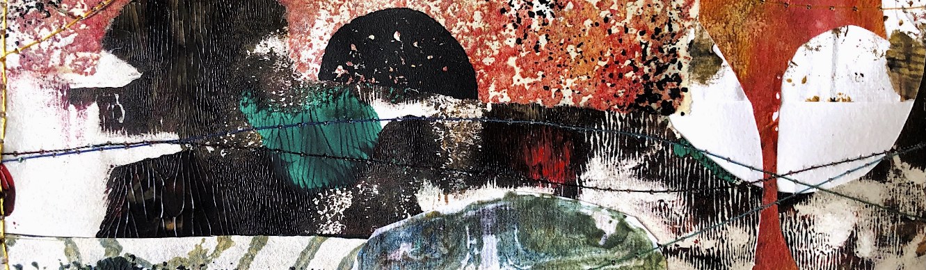
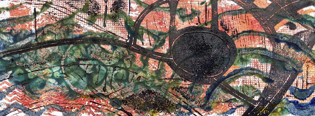
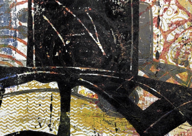
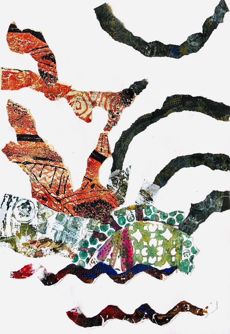
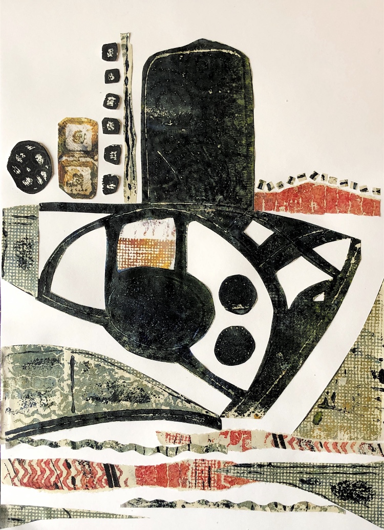
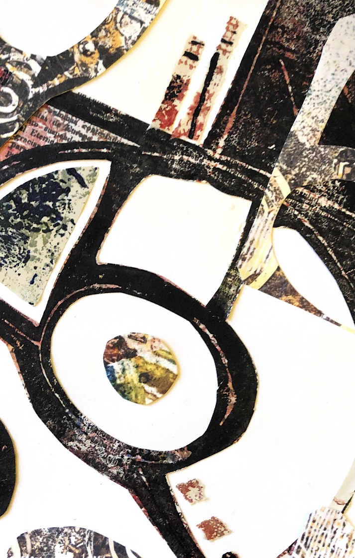
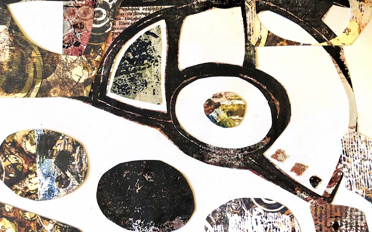
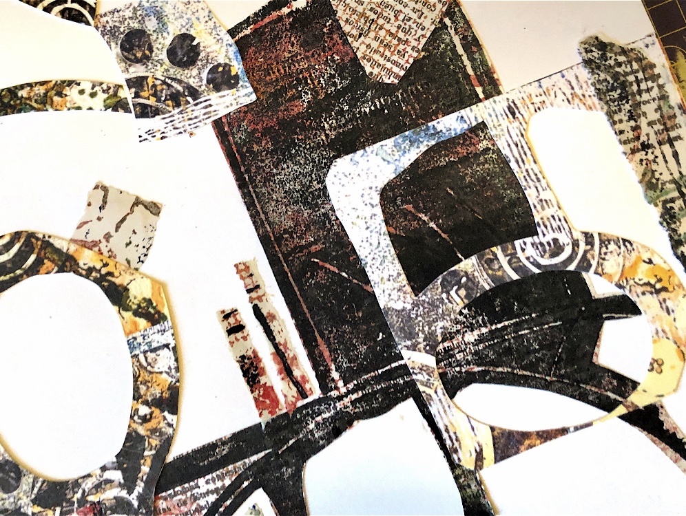
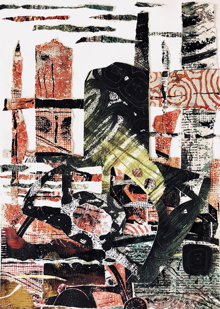
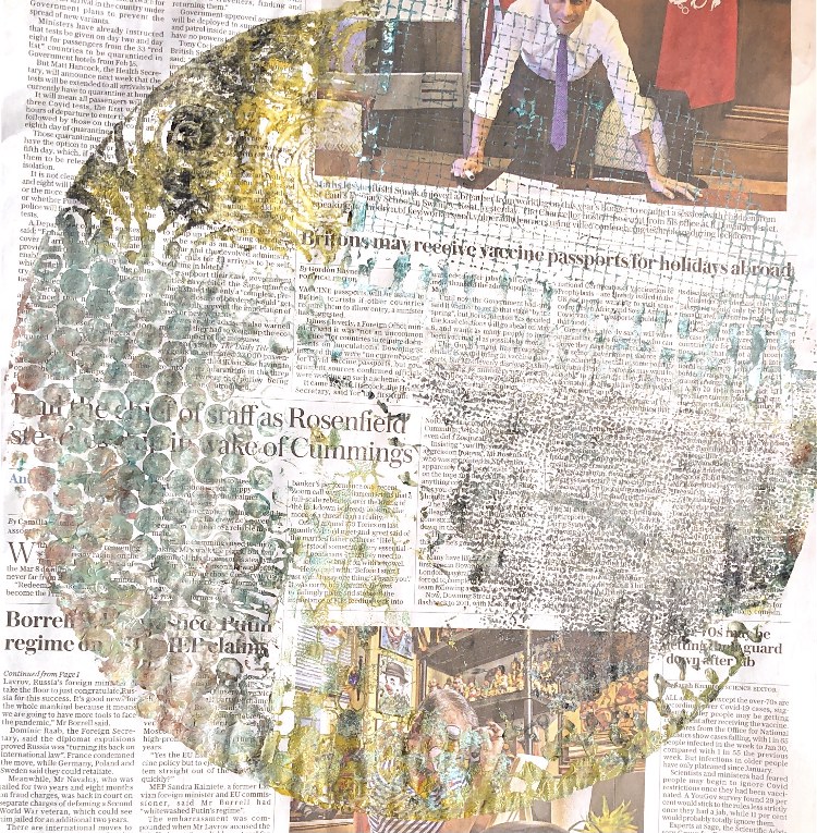
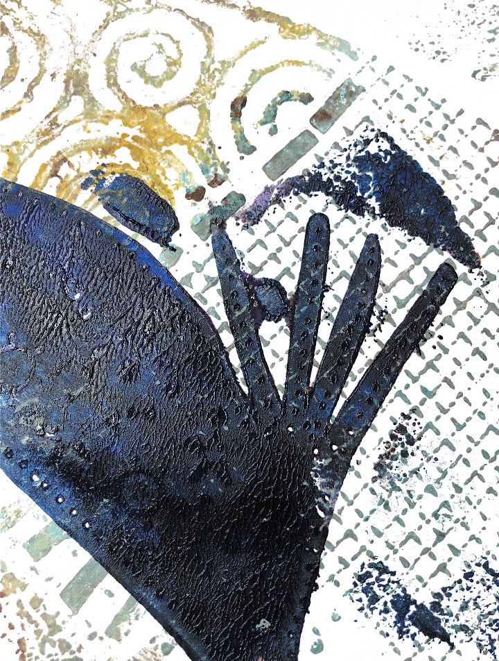
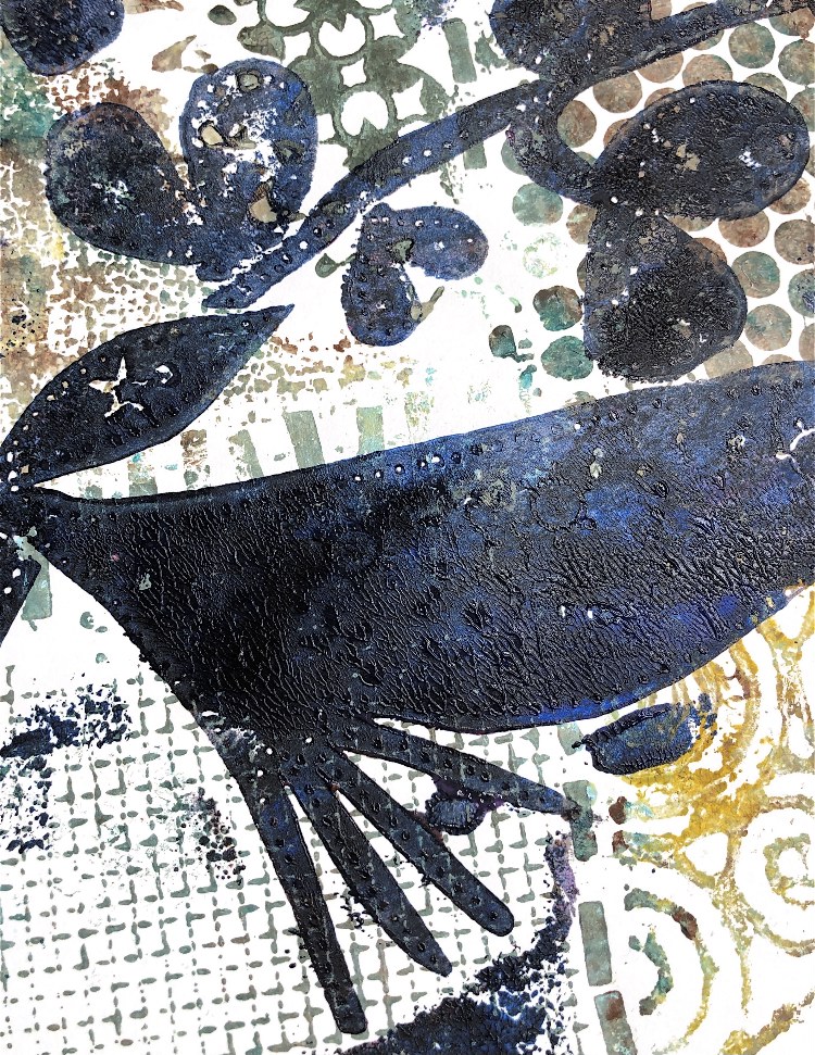
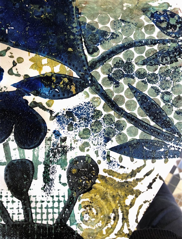
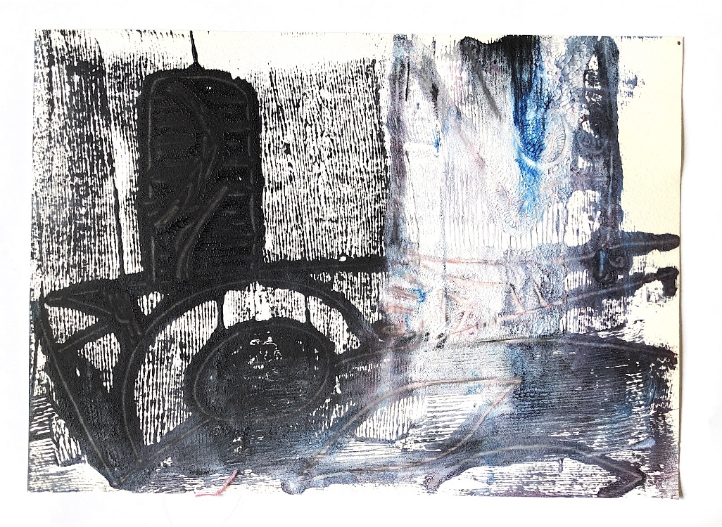
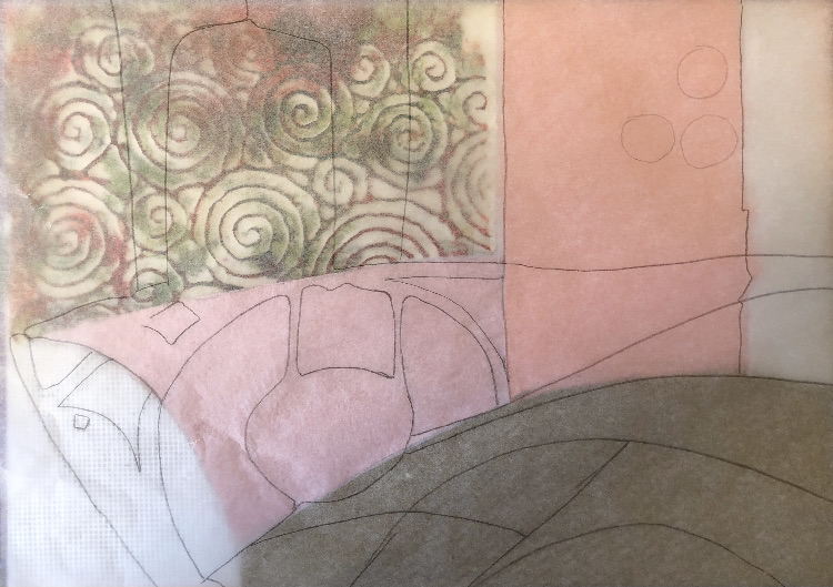
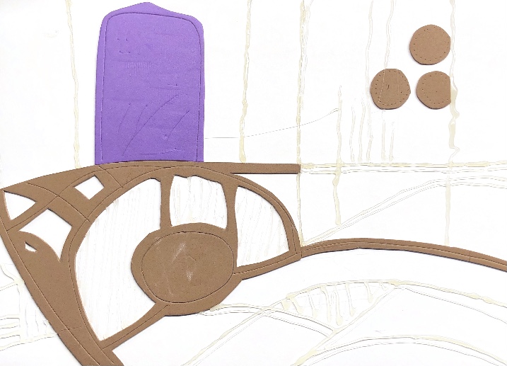
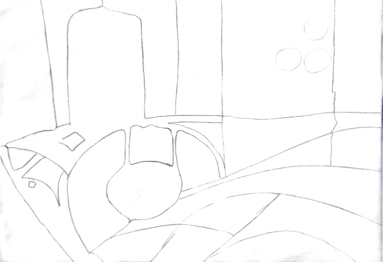
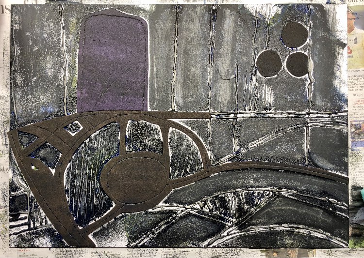
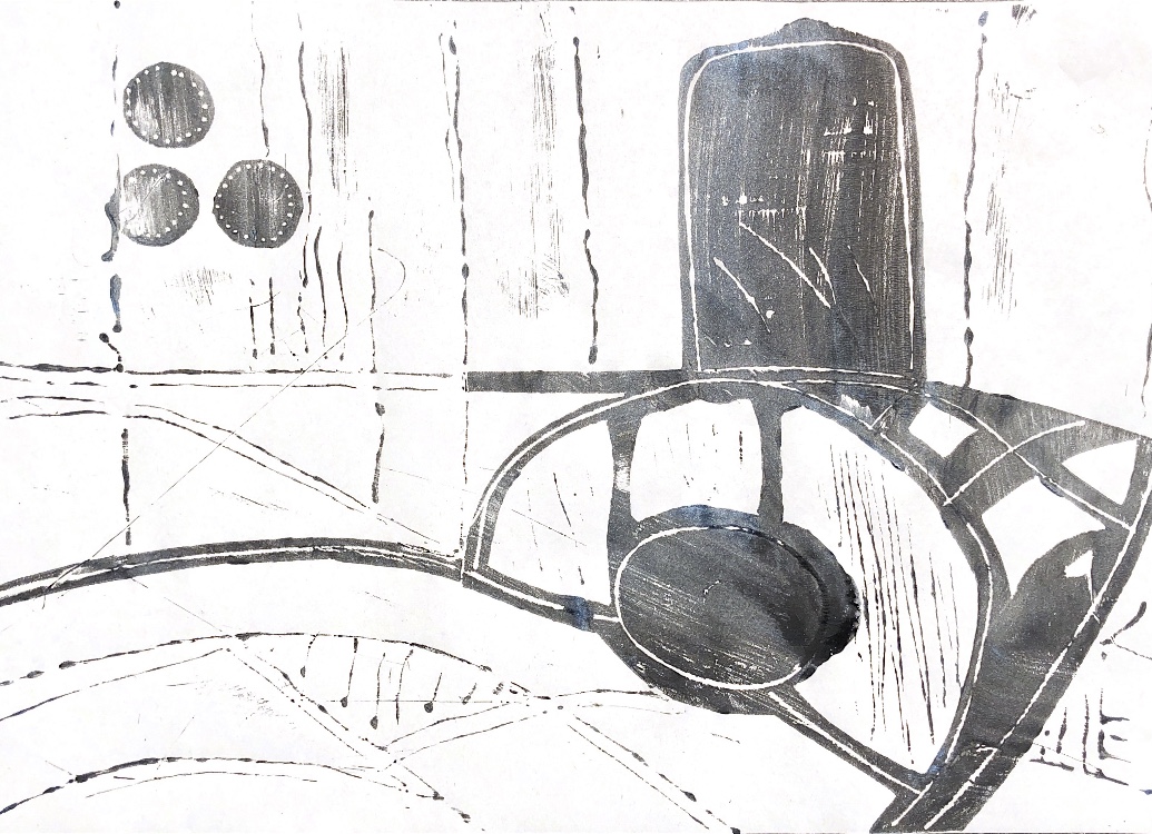
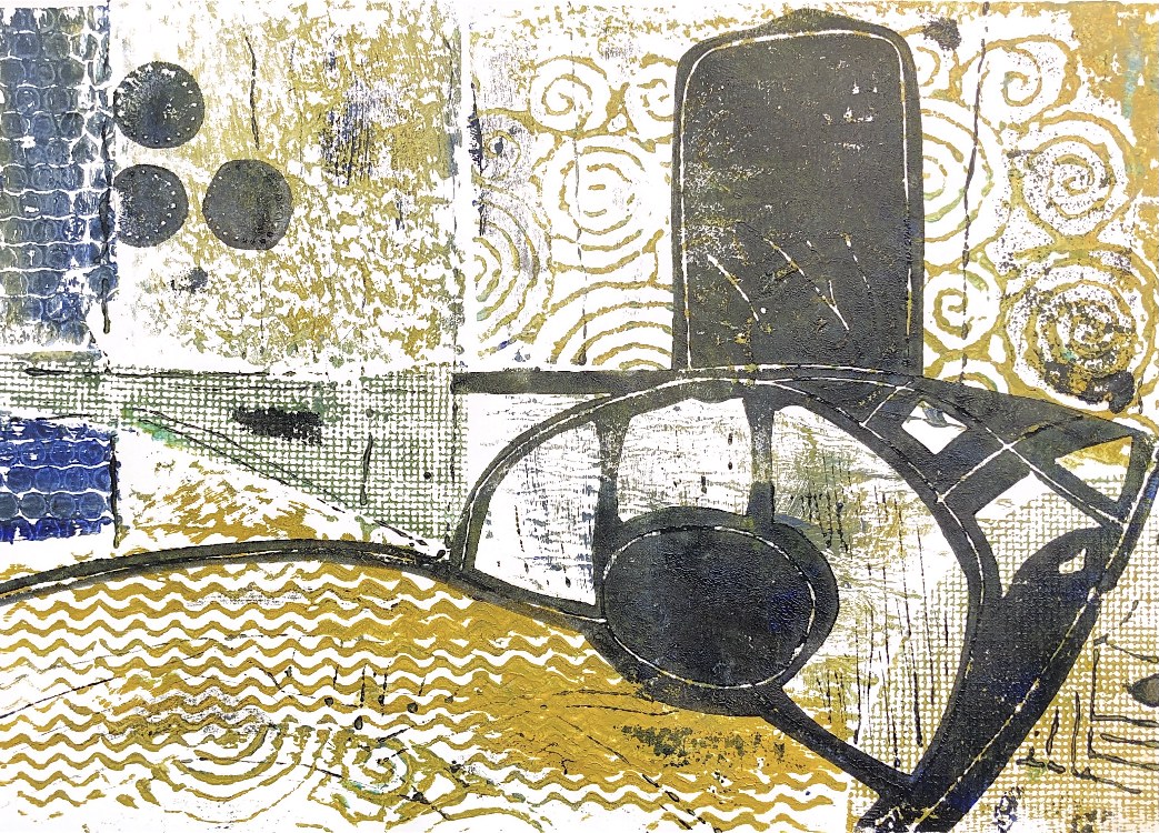
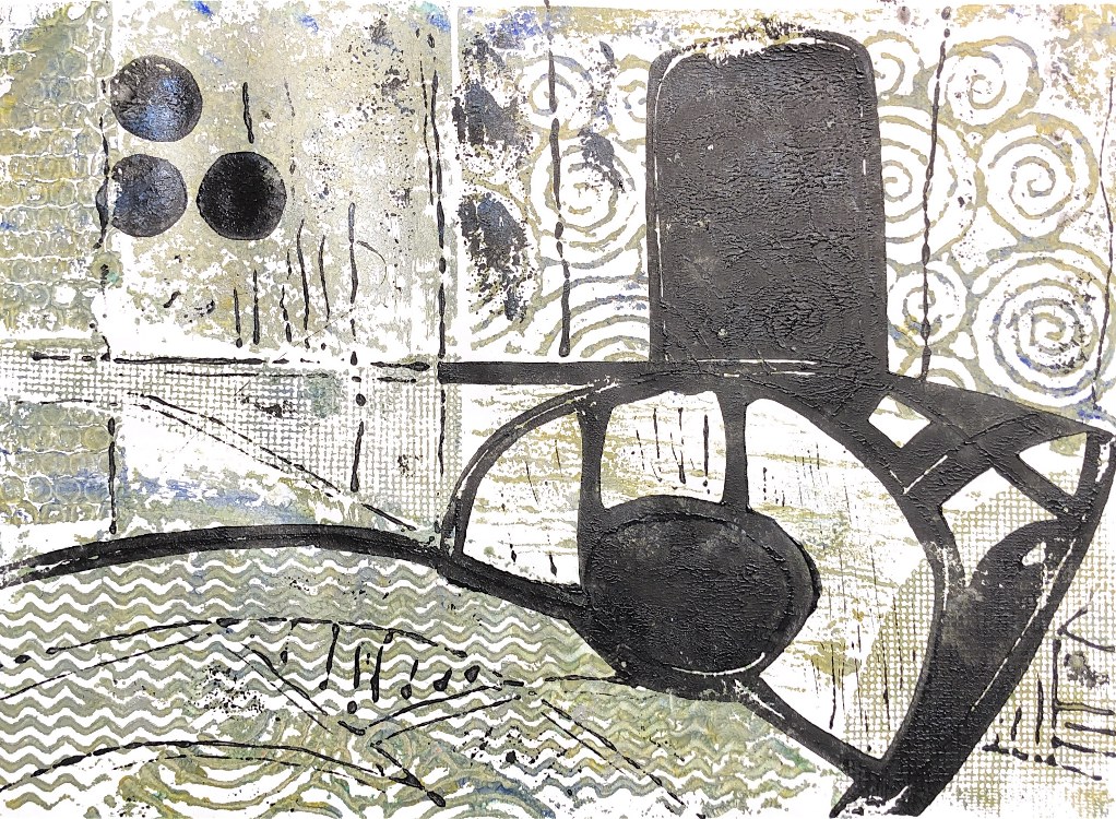
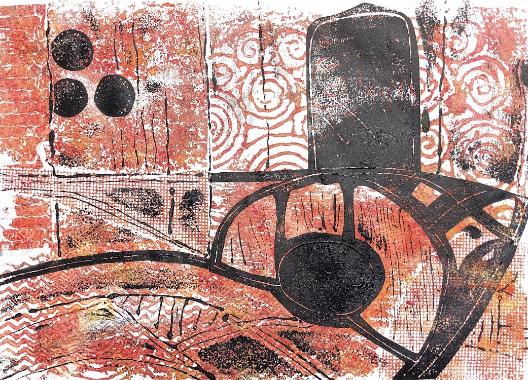
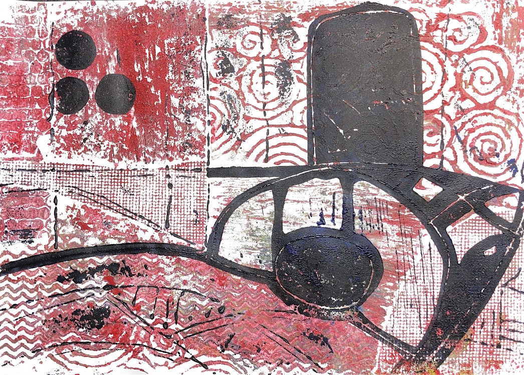
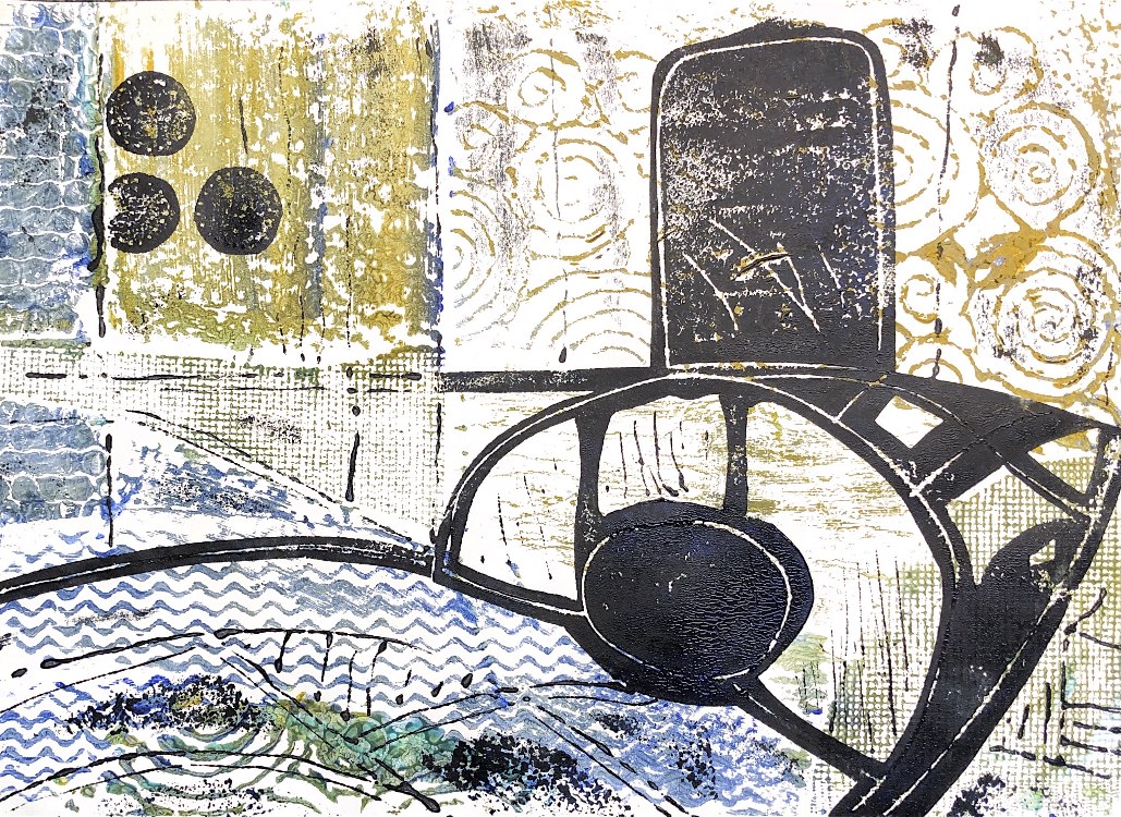
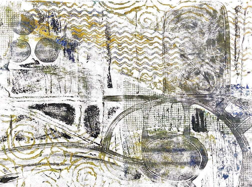
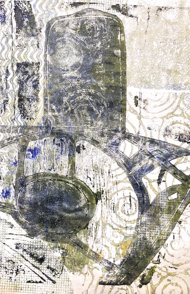
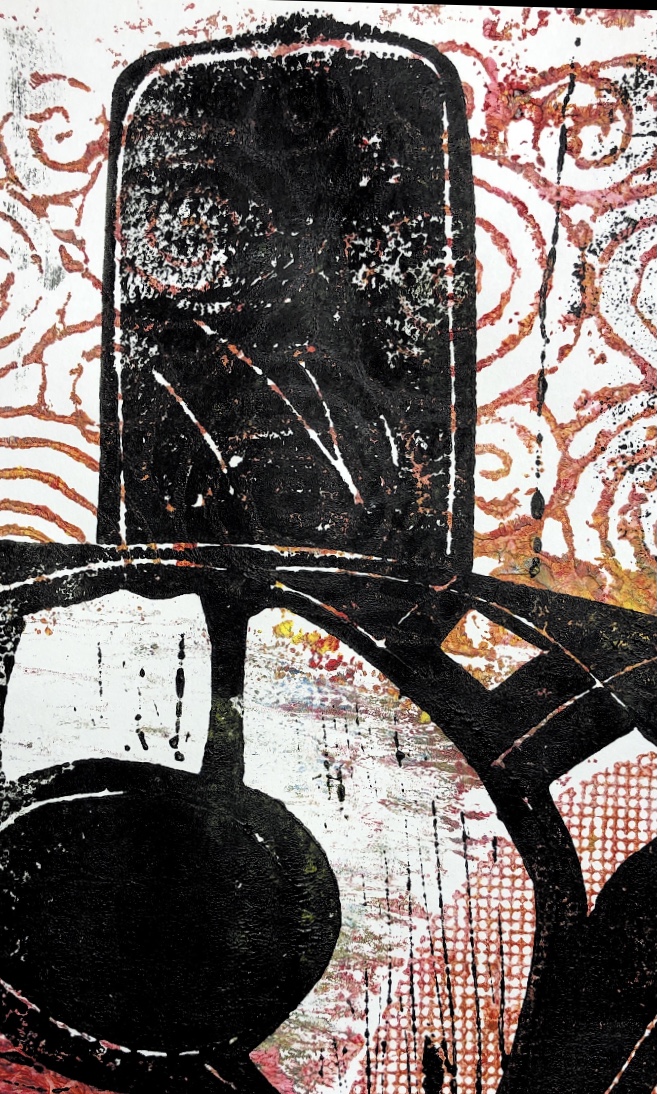
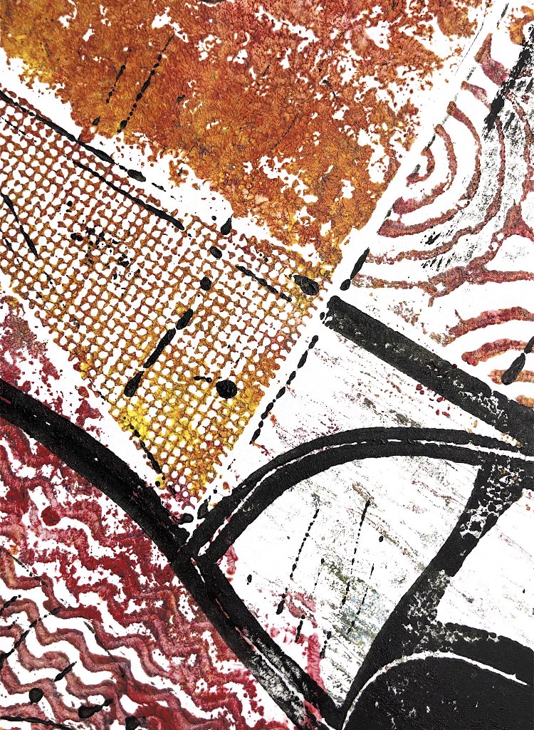
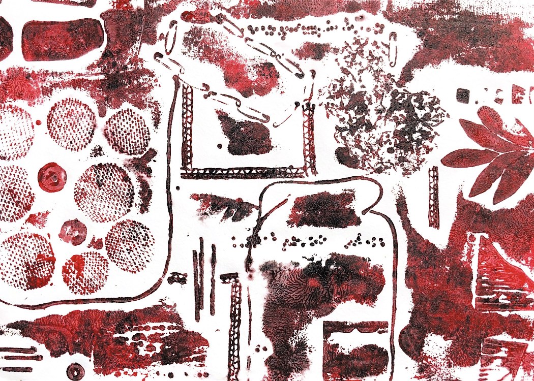
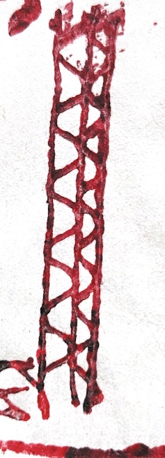
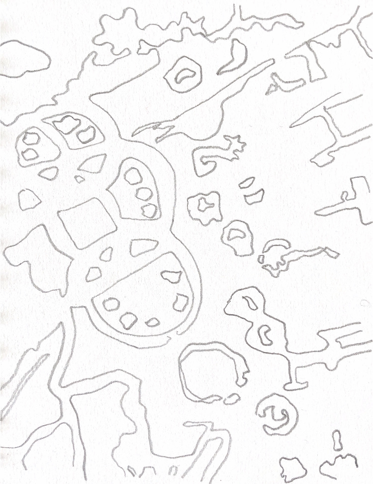
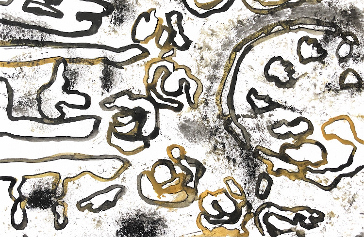
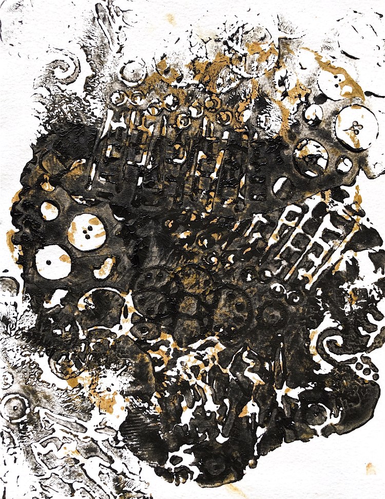
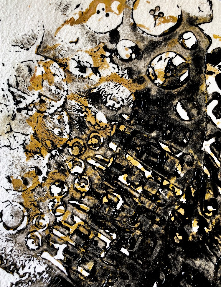
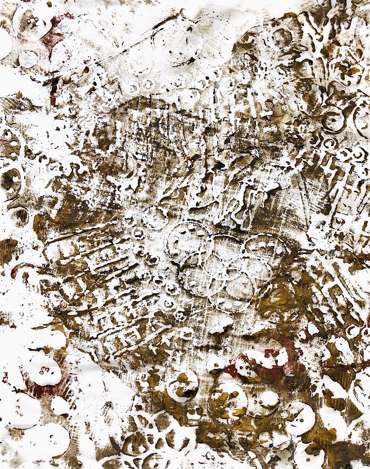
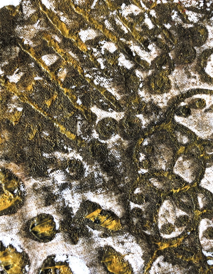
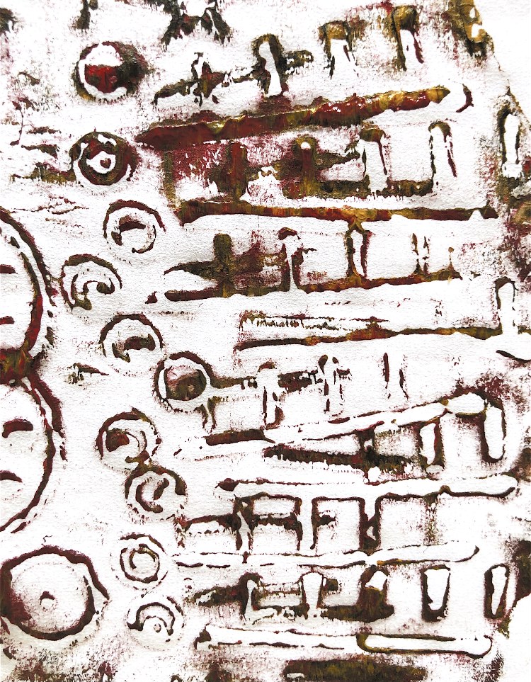
Fig, 11. Working with inspiration from a simple collage from ATV (shown below) and a subsequent back printed image, I made a series of strong prints with an industrial landscape feel. Some of these I manipulated with layers in the Snapseed App. I absolutely love the contradiction of the black ironwork of the machinery contrasting with the soft shapes and patterns creating the background. I have included the inspirational collage to show how this simple sample resulted in such a different final outcome.
I was inspired by the work of Laurie Rudling who combines stylised pattern with industrial scenes, and overprints his images to create detailed prints.
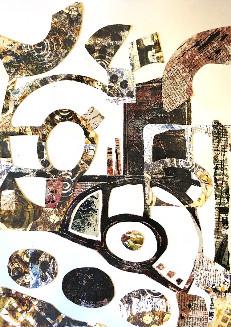
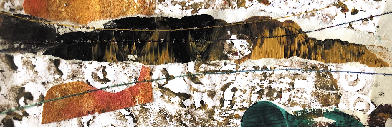
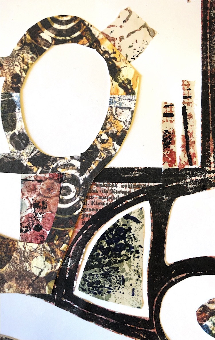
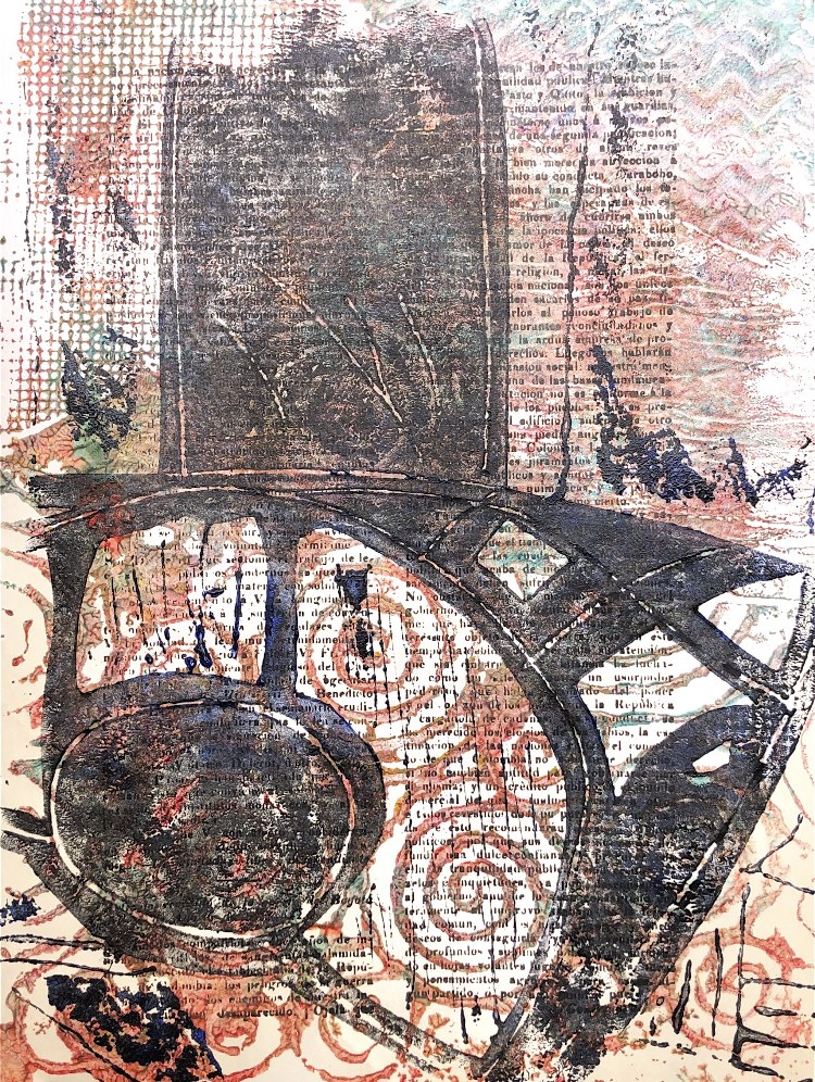
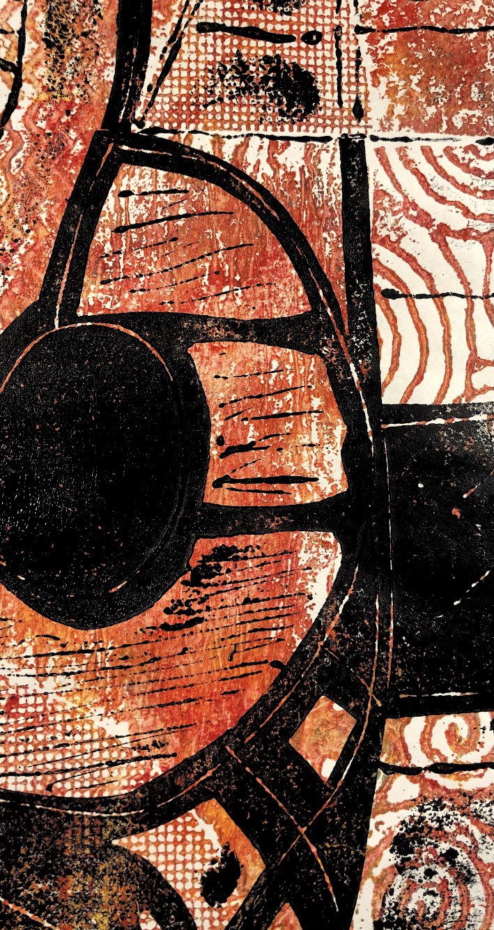
Fig, 12. I then moved on to make collage pieces using some of the printed paper. The last one I feel is the most successful, with chimneys in the background and a strong black piece of iron machinery in the foreground like a waterwheel. I live in an old mill with a huge chimney and imagine this print to be a scene I may have looked at in my village 100 years ago. The chaos, grime, busyness, heat, fire and smoke are all in this image.
********************************
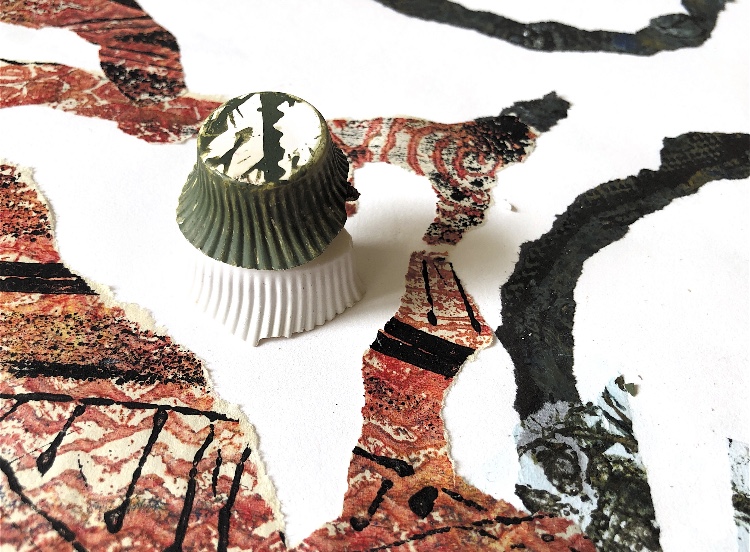
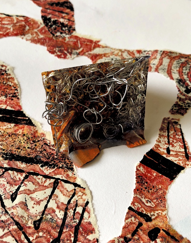
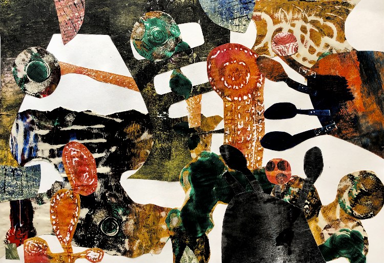
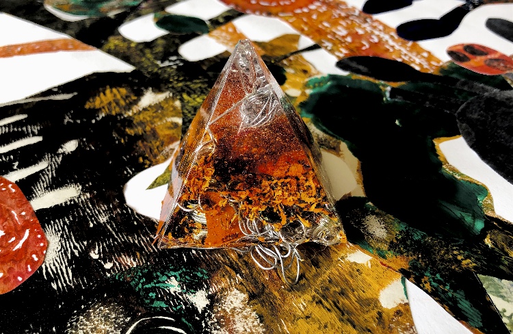
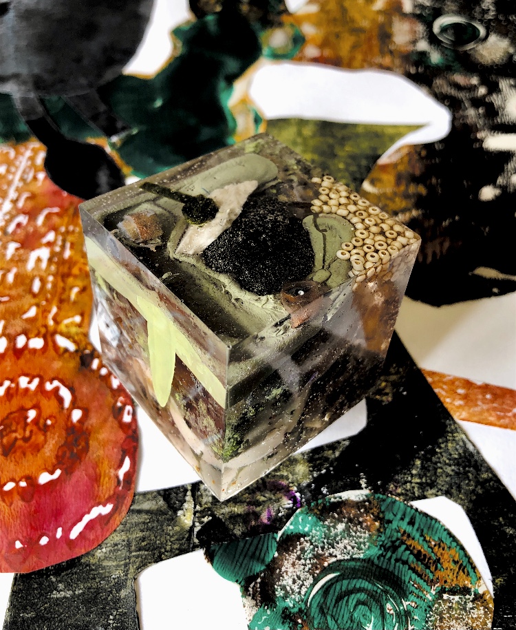
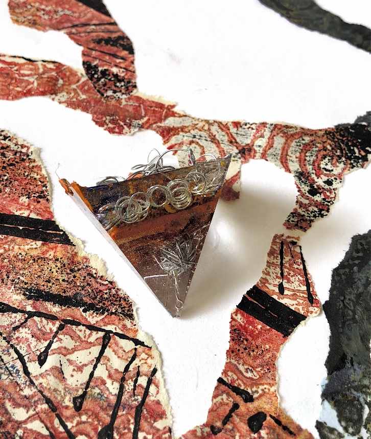
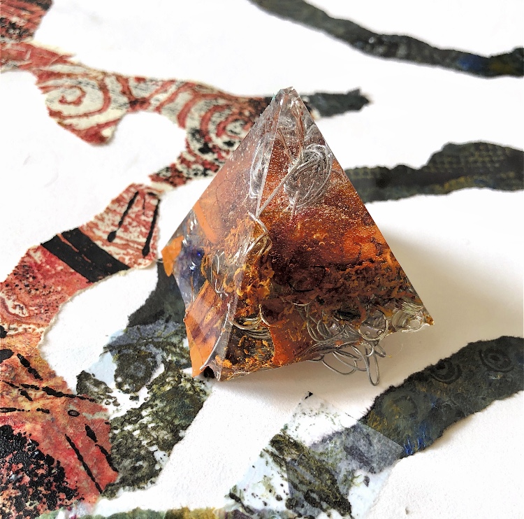
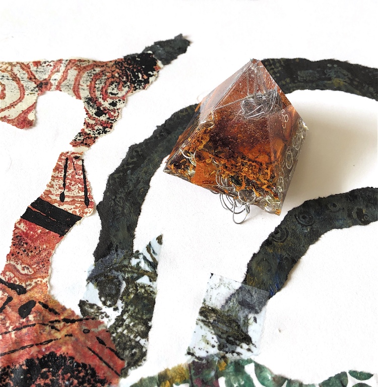
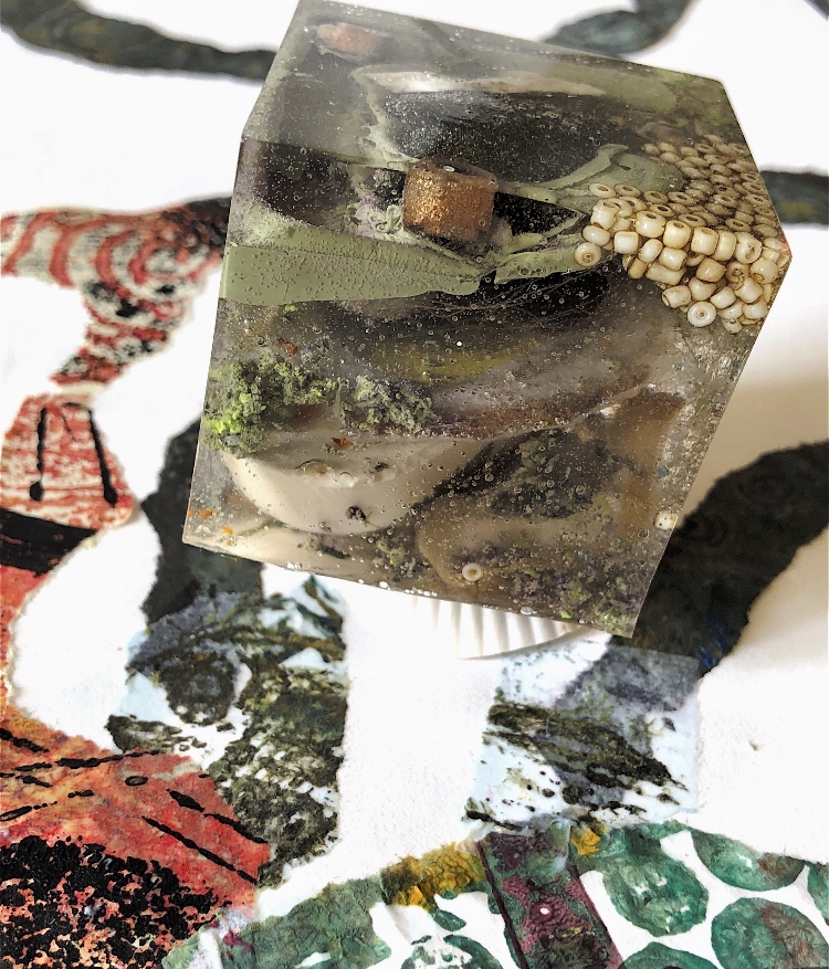
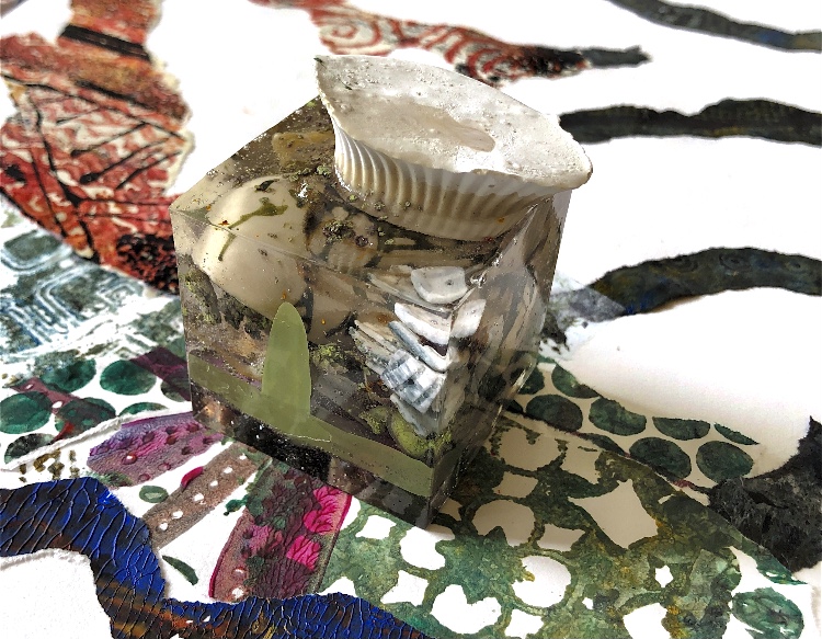
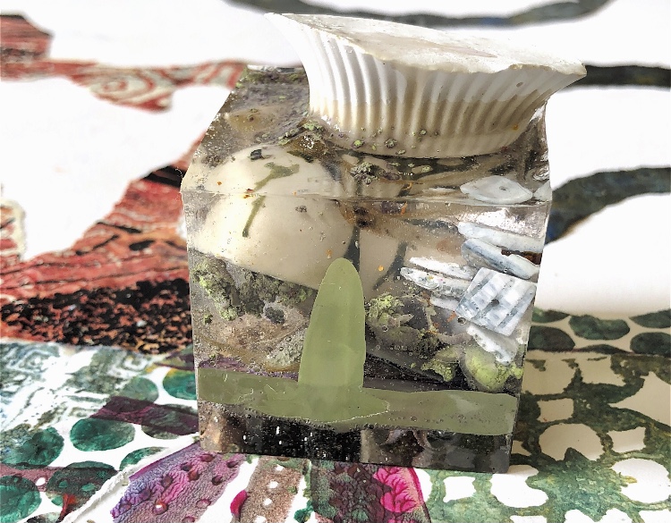
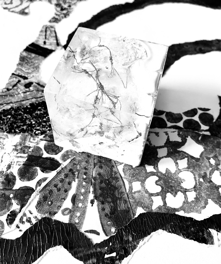
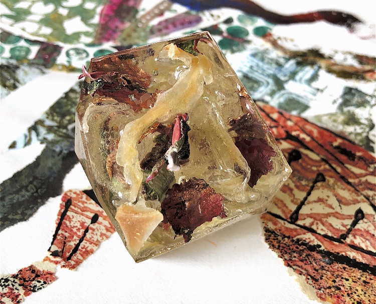
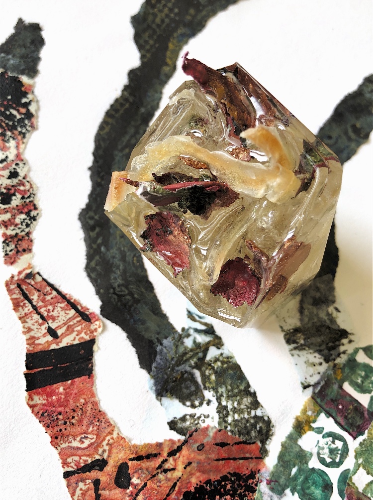
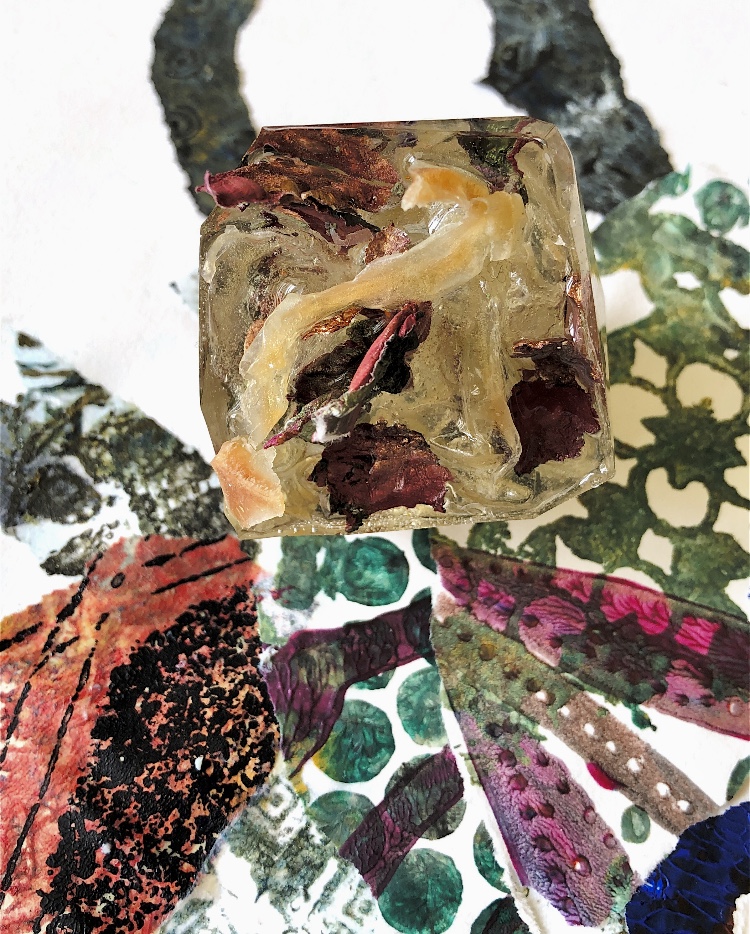
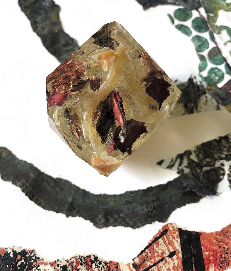
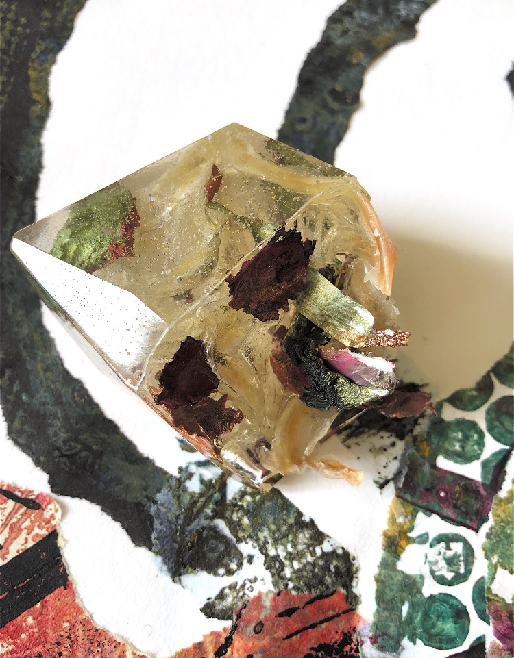
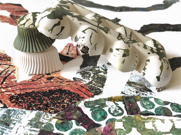
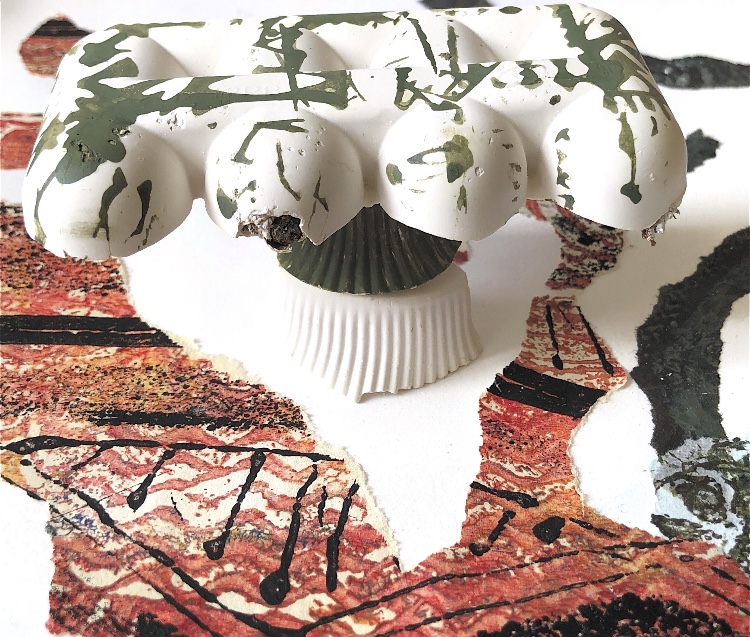
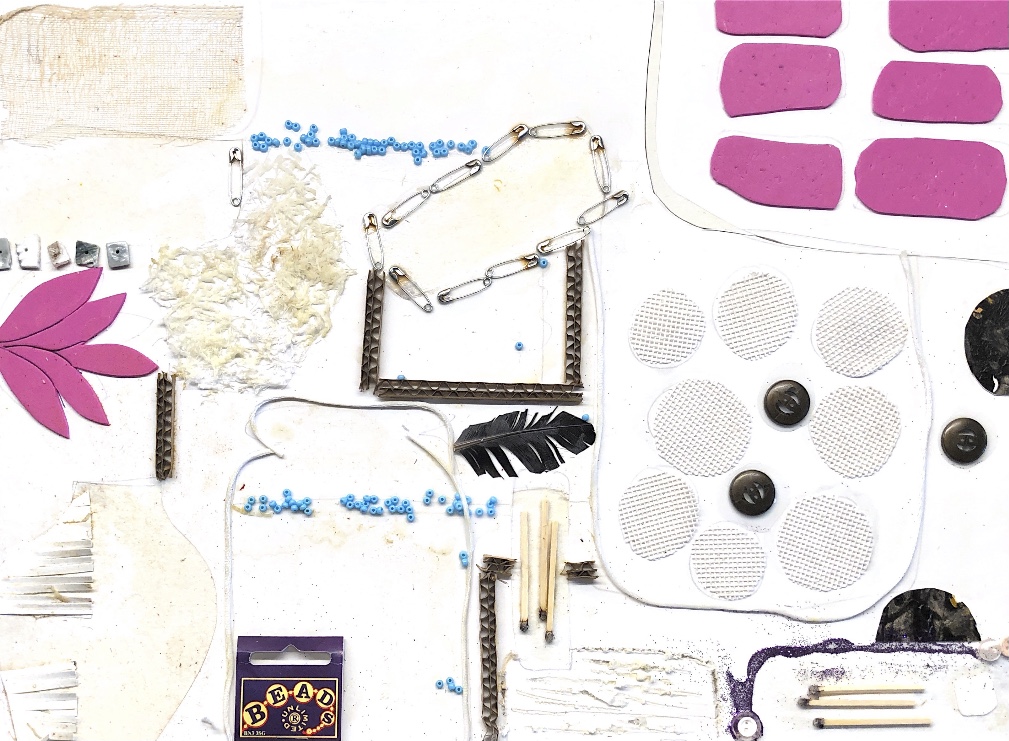
Fig, 13. Having played around with the photo manipulation App Snapseed I came up with an unusual image from which I made a collage. I then used some of my cast pieces from MMT3 to add another dimension. Some of these were plaster pieces that I had printed on and some were resin shapes.
I thought the collage was otherworldly and the introduction of the cast objects added to the surreal feel. The objects appear to have dropped from space onto a stark landscape and they invite the viewer to look closely. They create a focal point at odds with its surroundings which I really like. The combination of different materials, textures and shapes is something I want to explore further.
I tried brainstorming words for my initial thoughts about these images
Windy road, torn, broken lines, surreal, questions, maze, fallen, lost, loneliness, ripped, balance, chasm.
My journey through printmaking has been exciting and inspirational. I definitely want to continue to combine materials in my work and use assemblage in developed pieces. I have been excited by the surprises of printmaking as the result cannot always be predicted; colour and shape combinations appear and inspire different directions for working. I think I will always use print and collage as a part of my mark making in my sketchbook work.
************************************
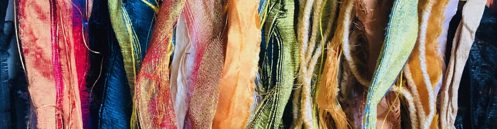
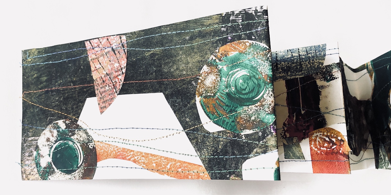
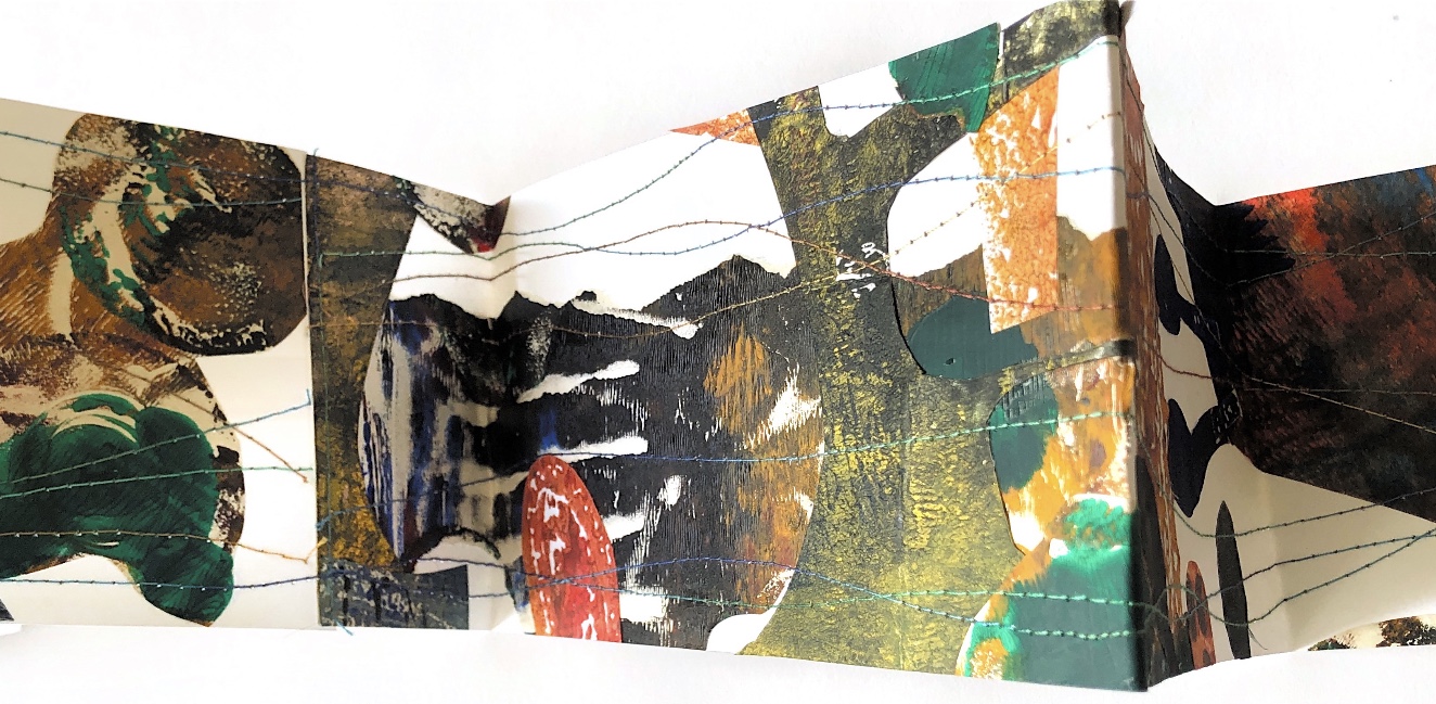
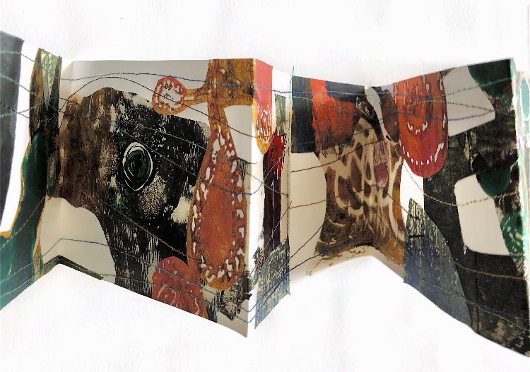
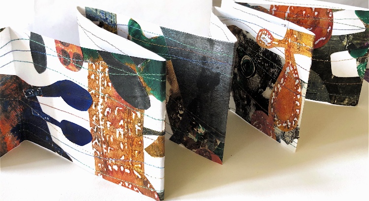
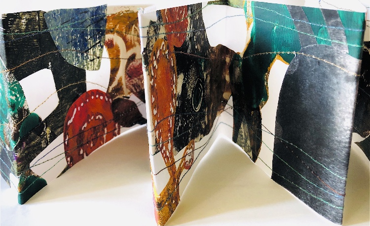
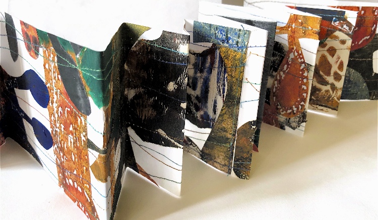
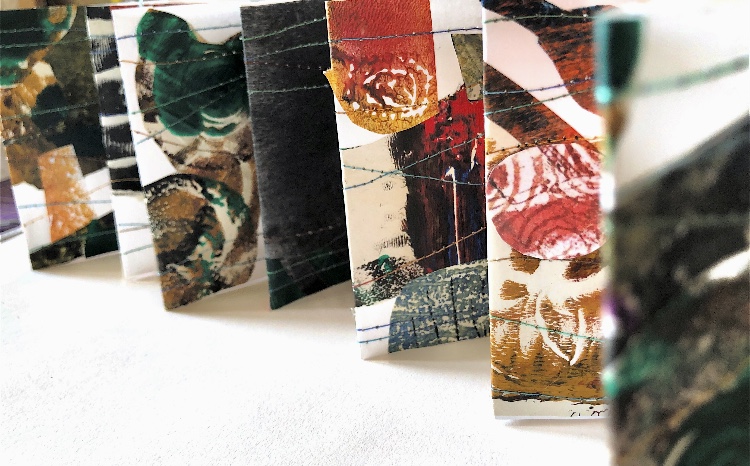
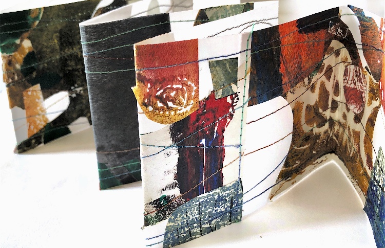
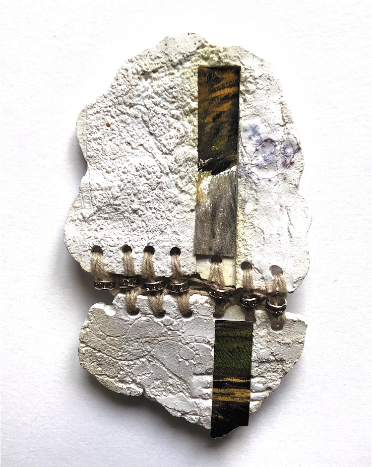
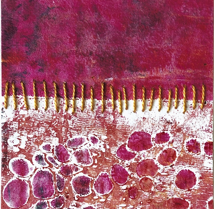
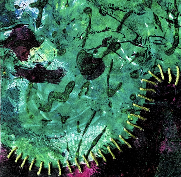
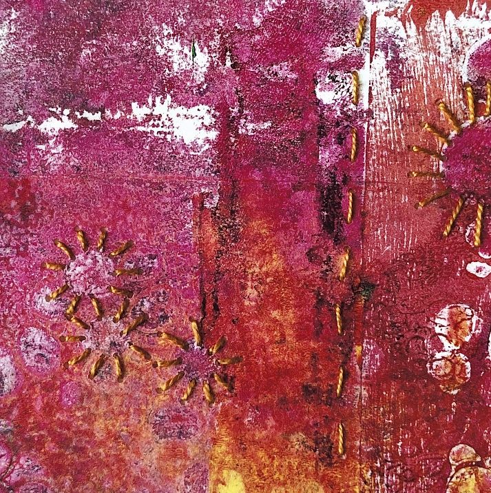
These last photos are of a collage I made with leftovers and then cut up and stitched to make a folded book. I really like the random nature of cutting things up without thought for placement and seeing what happens.
Fig, 14.