Category Archives: ATV PART 3. COLOUR STUDIES

Textiles 1 Part 3 Colour studies Written reflection

I have really enjoyed working with colour, developing colour palettes and creating different colour palettes with paint and textiles. Colour mixing was surprising – I needed to think about tone as well as colour, and tone was particularly important for the neutral samples. I experimented with mixing in all sorts of different colours to get the right result.

I have used colours that are not within my usual comfort zone, – colours of glass and unusual colour collage, and learnt lots of techniques to develop different ways of coming up with new ideas for colour, proportion and design – computer applications, use of old paintings, and collage.

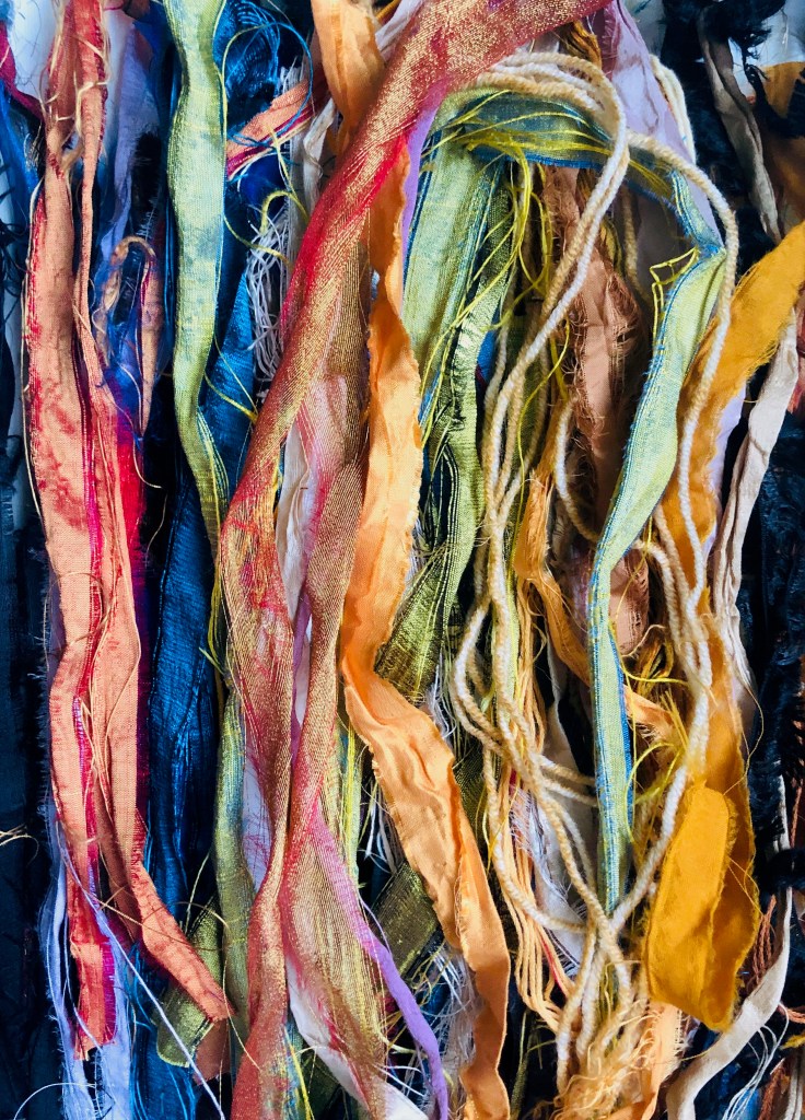
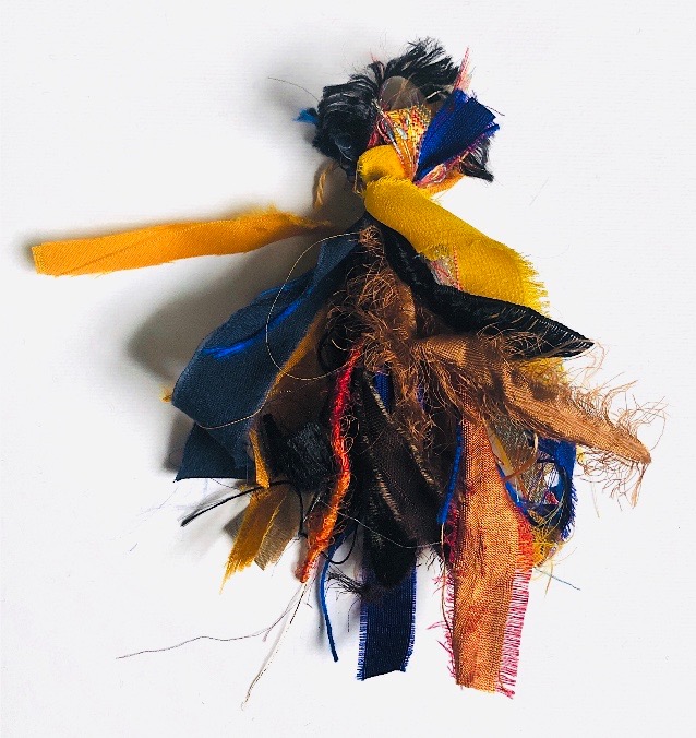
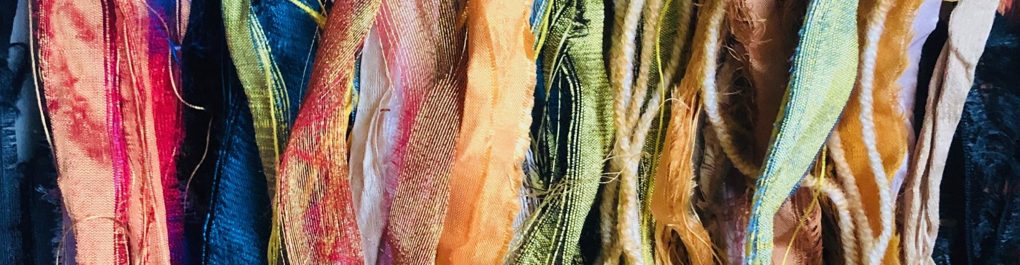
Again the sampling and development of ideas has proved so useful in achieving a pleasing result, reinforcing what I learnt in previous studies. I particularly enjoyed the colour wraps – the textures, movement and colours within the materials are exciting to use and create vivid tactile studies. I also created tassels with the materials, and have used yarn to create a stitched piece based on one of the Old Masters. I successfully developed the watercolour studies into 3 crochet pieces to explore further the relationships in the colour palette.

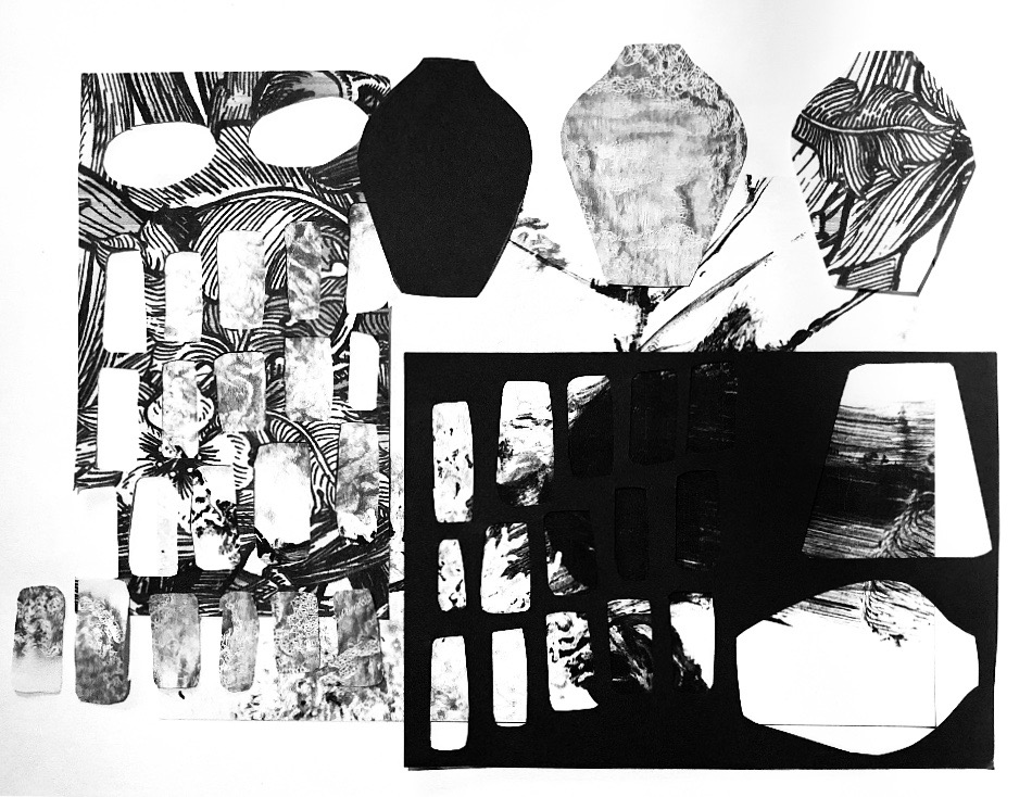
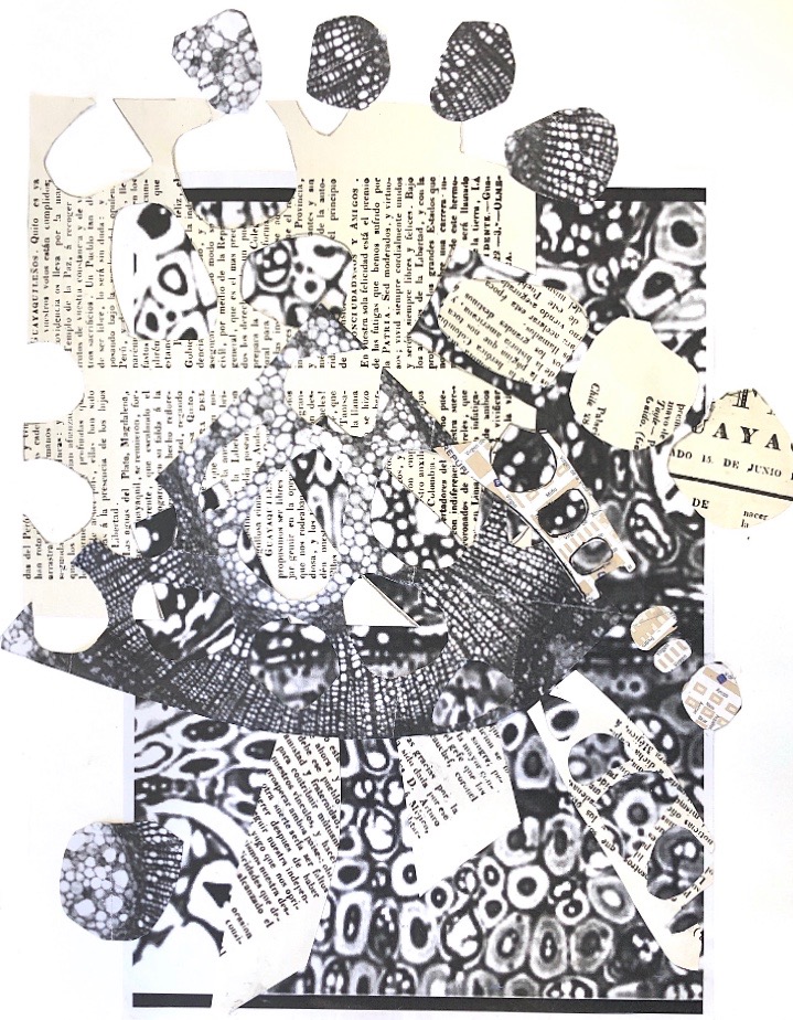
The collage studies pushed me to become more experimental with design and the techniques I learnt will continue to influence my design ideas. It was useful to move away from the original source photo for the final three studies and I was able to use different scales and arrangements while retaining a feel for the original design. I am really pleased with these collages.

My presentation skills are improving and I am proud of my colour resource book, I am looking forward to using it for future studies, and continuing to fill the blank pages.

Assessment Criteria

Demonstration of technical and visual skills

I have used a variety of materials and techniques to present my ideas, and demonstrated my observational skills in my use of colour and materials. I have shown that my design skills are developing with interesting composition.

Quality of outcome

My work has been presented clearly and coherently both in my Colour resource book and my learning log. I have worked hard to ensure my log is clearly categorised and that my assignment is beautiful to look at while being logical and clearly annotated.

Demonstration of creativity

My imagination is becoming more developed with a greater sense of freedom and experimentation, but I want to push myself more to be brave and experiment more. I feel my personal voice shows in my collage and crochet pieces but this is another area that will develop with my studies and experimentation.

Context

This is probably the area that I find most difficult.

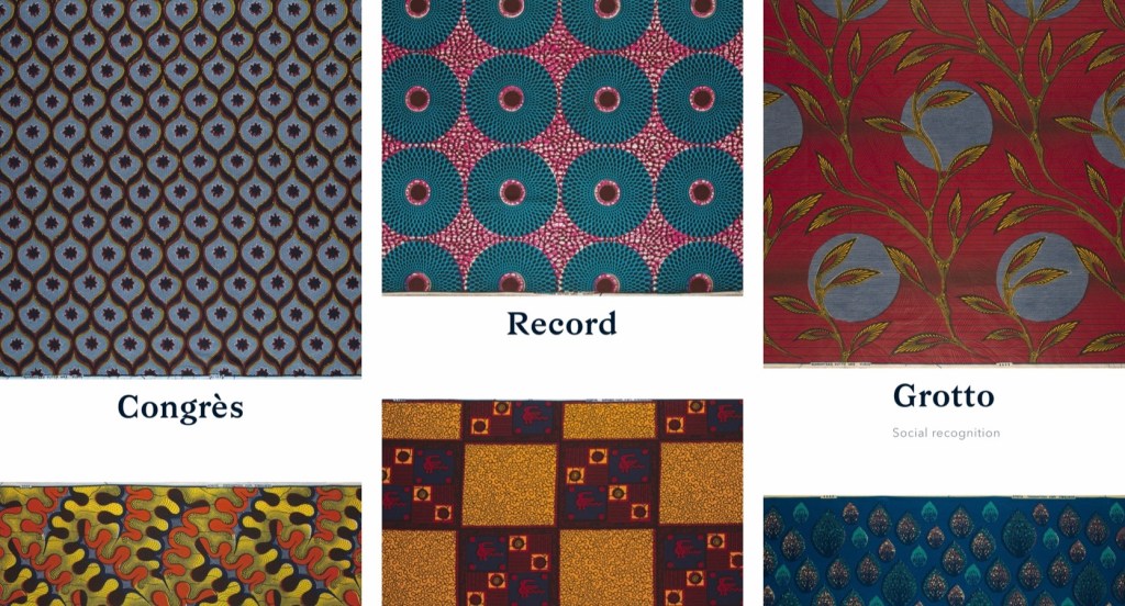
I enjoyed the research on textile artists and designers and can relate this to the colour work, seeing how a different colour palette can emerge from observation. I also found that narrowing down a colour palette and creating different palettes from one chosen colour can be an exciting process using computer software.

I still find reflection and critical thinking a difficult process and know I need to continue to work on this.

And finally

A couple more sketchbook pages

Textiles 1 Part 3 Colour studies Project 2 Exercise 3.4 Collage studies Part 2

I selected the simple colour combination study as my starting point.

I traced the picture and cut out shapes to use as a stencil

  1. Monochromatic study – Black and white

I created black and white photocopies of wallpaper patterns and scrim, and with book pages, and black paper I cut out the shapes from the original stencil and created a number of possible arrangements.

I then created two final studies

Using my iPad I created colour palettes for the studies and also manipulated some of the images for a different look.

2. Single colour study

Using the same method I cut the pattern pieces from book pages, drawing paper and maps that I had painted with Gouache and used magazine pages as a background.

3. Multi-coloured study

For this study I decided to experiment with scale, enlarging some of the stencils and using these alongside the originals. I used an old calendar with pictures by Miro as I love the colours and patterns which I think enhance the collage.

I also had some fun playing around on the iPad with different effects.

Workshop with Angela Oswald

Luckily for me as I was starting to think about more collage studies for this part of the course, I went on a very inspiring day workshop with Angela Oswald.

We did two exercises

The first involved writing words on a theme on a large sheet of paper and passing it round the room for other people to add their words. When we got our own piece back we selected a square that we found interesting and overlaid different translucent papers onto which we had traced our written design.

For the second exercise we were given photocopies of pictures through a microscope and asked to quickly draw a section, select an interesting square and then to colour in positive and negative shapes.

These shapes were then used as a pattern to cut from the photocopies and other black and white papers to create a collage.

The finished collage shown above with a close up really inspired me to think about negative shapes when I work on the next three collage studies.

Textiles 1 Part 3 Colour studies Project 2 Exercise 3.4 Collage studies Part 1

I took some pictures of a busy corner of my kitchen and played around with some of the online resources to look at colour palettes, – this gave me some starting points for colour schemes.

Original image
Adobe color CC Bright colour scheme
Adobe color CC . Muted colour scheme
Adobe color CC . Bright colour scheme
CoLRD colour palette and pixelated colours.
Quick simple collage using torn magazine pages.

Part 1

Simple colour combination

I decided to use just three key colours – orange, green and cream and with this in mind I painted some papers with gouache. I found that by simplifying the image and just using different shades of these three colours the image is pleasing to look at and much less busy than the original.

Simple colour combination

Unusual colour combination

How to be unusual? I decided to use colours that are unusual for me to use, and unusual for a kitchen scene. Again I painted papers with gouache but this time in purple, turquoise, red, and pink. This combination is well outside my comfort zone and makes for a startling colour scheme.

Unusual colour combination

Complex colour combination

For this piece I decided to use patterned paper to create lots of interest, tone and pattern within the design.

Patterned papers ready to use.

I drew a design on a larger piece of paper (A3) and made torn collage pieces of the main shapes. There is light and shade, and texture in this piece, and while it is busy and has many patterns and colours it retains the simple block shapes of the original arrangement.

Complex colour combination
Collage made from photo of the complex colour combination.

Textiles 1 Part 3 Research point 2 Digital resources

Adobe color cc

I found this tool easy to use, and enjoyed creating a colour palette from some of my work. It enables you to filter the colour palette in different ways as seen in the examples below. I think this will definitely be useful when I am selecting colours from images.

Saved colour palettes
Muted colours from ‘The birth of Venus’
Muted colours from a photograph of glass objects
Bright colours from ‘The birth of Venus’
Colourful colours from a photograph of glass objects
Colourful colours from ‘The birth of Venus’

Mudcube colour sphere

I played around with this tool creating colour schemes from one starting colour. There is ample scope with this to create all sorts of interesting colour combinations, but I’m not sure if I will use it.

Color Halipixel

I found this tool more intuitive with quick easy colour palettes from a starting colour, presented in stripes. I think I would use this tool to spark colour ideas and to look for different interesting colourways.

CoLRD

This tool was fun to use and I found I could make pixelated versions of images as well as colour palettes. Because it produces lots of colours from the image I think this will be really useful.

Textiles 1 Part 3 Colour studies. Project 2 Materials and composition Exercise 3.3 Watercolour studies

Still life using glass objects

Watercolour explorations

Three pieces of crochet inspired by the watercolour stripes from this exercise

Reflection

I tried to keep my selection fairly neutral with just a couple of coloured pieces of glass to add a highlight. I thought this would help me concentrate on the subtle colours observed in clear uncoloured glass. I chose a white base and background so as not to detract.

In each watercolour study I looked for different areas to focus on, – some are more subtle than others. I found it hard to mix very pale colours and shades but I think I succeeded in creating some interesting studies.

I think this would be an interesting exercise to undertake outside on a sunny day to make more use of light creating colours through the glass.

Textiles 1 Part 3 Colour Studies. Project 1 Colour palettes and proportion. Exercise 3.2 Translation through yarn

I have chosen three paintings to focus on initially, – Vermeer’s ‘The lacemaker’ and ‘The maid with the milk jug’, and Botticelli’s ‘The birth of Venus’.

Fabric, lace, thread from my stash at home.
Work in progress!
Vermeer. The lacemaker

Tassel based on ‘The Lacemaker’

Pixelated painting based on ‘The Lacemaker’
Fabric and yarn wraps based on ‘The Lacemaker’
Vermeer. The maid with the milk jug

Tassel based on ‘The maid with the milk jug’

Botticelli. The birth of Venus

Tassel based on ‘The birth of Venus’

Wraps based on ‘The birth of Venus’

Textiles 1 Part 3 Research point 1 – Textile artists and Designers

Voyage

Signature style – watercolour painting, colourful fresh, using nature and the world around us.

Painterly, flora, fauna, soft and bold, muted and colourful.  Free and sometimes abstract. Pretty. Using a lot of green, pinks, purples and blues in many shades and tones. Handpainted,- brushstrokes with gradients and blooms, bleeding. Organic forms using amber, emerald, cobalt and blue/green.

The colours in this design are muted and soft, and work well with the design. No one colour stands out and the colour scheme would work well on coordinating prints.

Marimekko

Signature style – original prints and vibrant colours. Abstract patterns, bold prints, large scale patterns and overlapping vibrant colours. Definite patterns.

Black and white, primary colours with splashes of other colours. Limited palette on each piece.

The use of a very dark colour in this piece makes the reds and pinks stand out more. The bold design works well with the colour scheme.

Mary Katrantzou

Signature style – Digital printing using fragments of images – precise to fit clothing. Use of Trompe l’oeil to create illusion such as oversized necklaces on garments.

Prints contain many colours – bold and bright.

Fashion prints

Jewelry dress – bold plain colours with a digital oversized necklace print in many colours – photorealistic.
This print uses many variations of colour. Colours are shaded which gives a realistic look to the insects and animals. The colour is very important as the print is very busy.
Shine and shimmer are used to good effect on a magical print using lots of colours on a dark background.

Wallace Sewell

Signature style – geometric formats using colour, structure and yarn, bold asymmetric blocks and stripes in varying scales and colours.

Influenced by the Bauhaus ideology. – aim to bring art back into contact with everyday life.

Strong bright colours

Strong bright colours make these stripes stand out. The design is very important but the colours and the proportions of these colours are what makes the design work..

Cole and Son

Signature style – Using block prints from historical designs and techniques.

Some designs are monochromatic, some have 4-5 colours.

This piece is monochromatic which emphasises the design. The colour works well and the proportions are not equal so the darker reds for the figures makes them stand out.

Paul Smith

Signature style -‘Classic with a twist’. Signature stripe in many colours.

Quirky and sometimes eccentric but wearable and not silly. Classic clothing in beautiful fabrics, well made. Using splashes of colour or prints as well as plain classic colours of white, cream, black and blue.

The signature stripe is a series of narrow stripes of varying widths in many different colours.There is a very narrow darker stripe that repeats and gives the whole design a sense of cohesion and style as the other colours are bright but soft.

Vlisco

Signature style – Designs using inspiration from Africa using a technique derived from Indonesian batik. Bright colours, strong patterns.

Geometric often, not many colours in each design, limited colour palette. The production process leaves vein like crackles and bubbles on the fabric which are impossible to replicate – this is the signature handwriting of Vlisco.

Prints of different scales and colours are mixed and matched to create vibrant,striking bags
The colours used in these prints are limited but work with the African theme.

Ptolemy Mann

Signature style – Using hand dying and weaving using the Bauhaus philosophy of product and art making combined. Signature is Ikat –  yarns are dip dyed prior to weaving.  

Using strong colours often with an accent colour

On this piece the coloured stripes are all at one end with muted grey and grey pink stripes at the other end.
The use of an accent colour stripe in this piece works well against the darker grey tones of the other colours.