Category Archives: Introductory project

Practitioners who use drawing and mark making

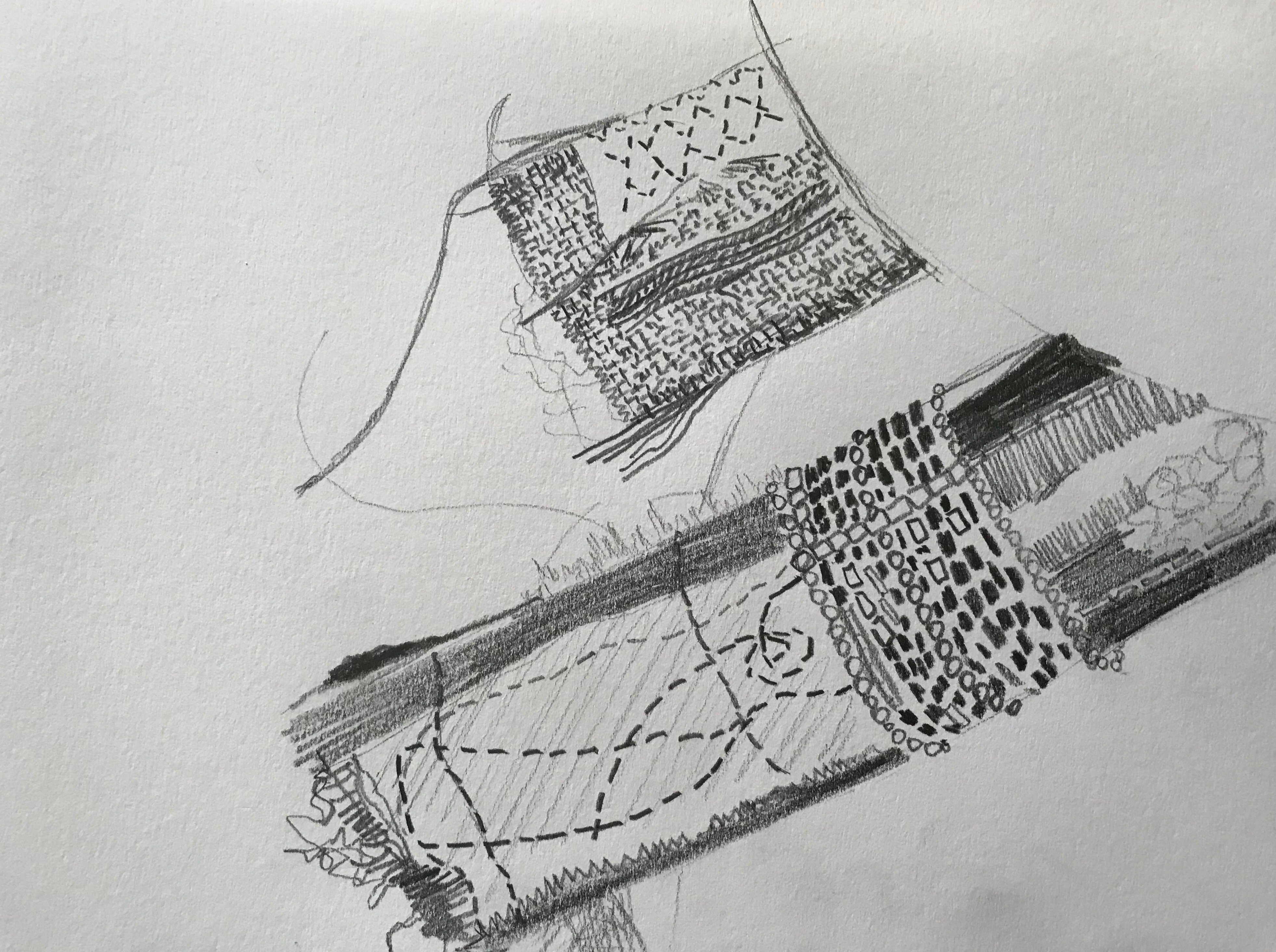
Practitioners who use drawing and mark making.

I decided to explore the work of the following artists:

Roanna Wells

Katie Sollohub

Debbie Smyth

Hilary Ellis

Louise Bourgeois

I chose these artists as I found something interesting in their work and a different approach both in ideas and practice.

I started by picking out a two or more pieces of work by each artist and also reading about where they get inspiration and how they produce their works of art.

Roanna Wells

I was interested in Roanna Wells’ series of paintings called ‘How they are ever changing’ due to the beautiful colours and the repetitive brush marks creating a hypnotic whole. there is something different to see each time you look at these watercolour pictures, and the subtle differences in shape, size, density and colour on a plain white background create an ever changing picture.

Image from http://www.roannawells.co.uk

Roanna Wells uses the following words in her website that I want to try to use in my drawings:

spontaneous

accidental marks

residue

repetition

multiples

fluidity

changing

Katie Sollohub

Katie Sollohub states that she is interested in documenting and recording the places she lives and works in. She uses drawings, paintings, performance, photography and poetry in her work. I like her quirky style and arrangements. Poetry is also something I am particularly interested in using as inspiration in my textile work.

Image from http://www.katiesollohub.co.uk

The following words jumped out at me from Katie Sollohub’s website and I hope I can relate these to my drawings:

documenting

recording

narrative

memories

details

frayed edges

unnoticed familiars

well worn and loved

Debbie Smyth

Debbie Smyth’s ‘Linear works’ are strong structures using knots and threads. I like the loose threads hanging from the knots which could move and subtly change the picture each time you look at it. They are hard and soft at the same time and I appreciate this contrast.

Image from http://www.debbie-smyth.com

The words used by Debbie Smyth that I want to use as inspiration are:

commonplace objects

changing angles and perspective

iconic objects

exaggeration

linear structures

Hilary Ellis

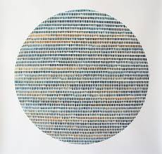
The pictures made by Hilary Ellis intrigue me. They are made up of repetitive marks using threads and beads which she states is ‘deliberately reminiscent of the labour-intensive toil of sweatshops, whose employees’ existence is reduced to a series of stitches.’  http://www.hilaryellis.co.uk

One interesting thing Hilary Ellis asks on her website is ‘When is a work of art finished?’ which is something I feel to be intuitive to the maker – I hope that I recognise this point and know when to stop!

Image from http://www.hilaryellis.co.uk

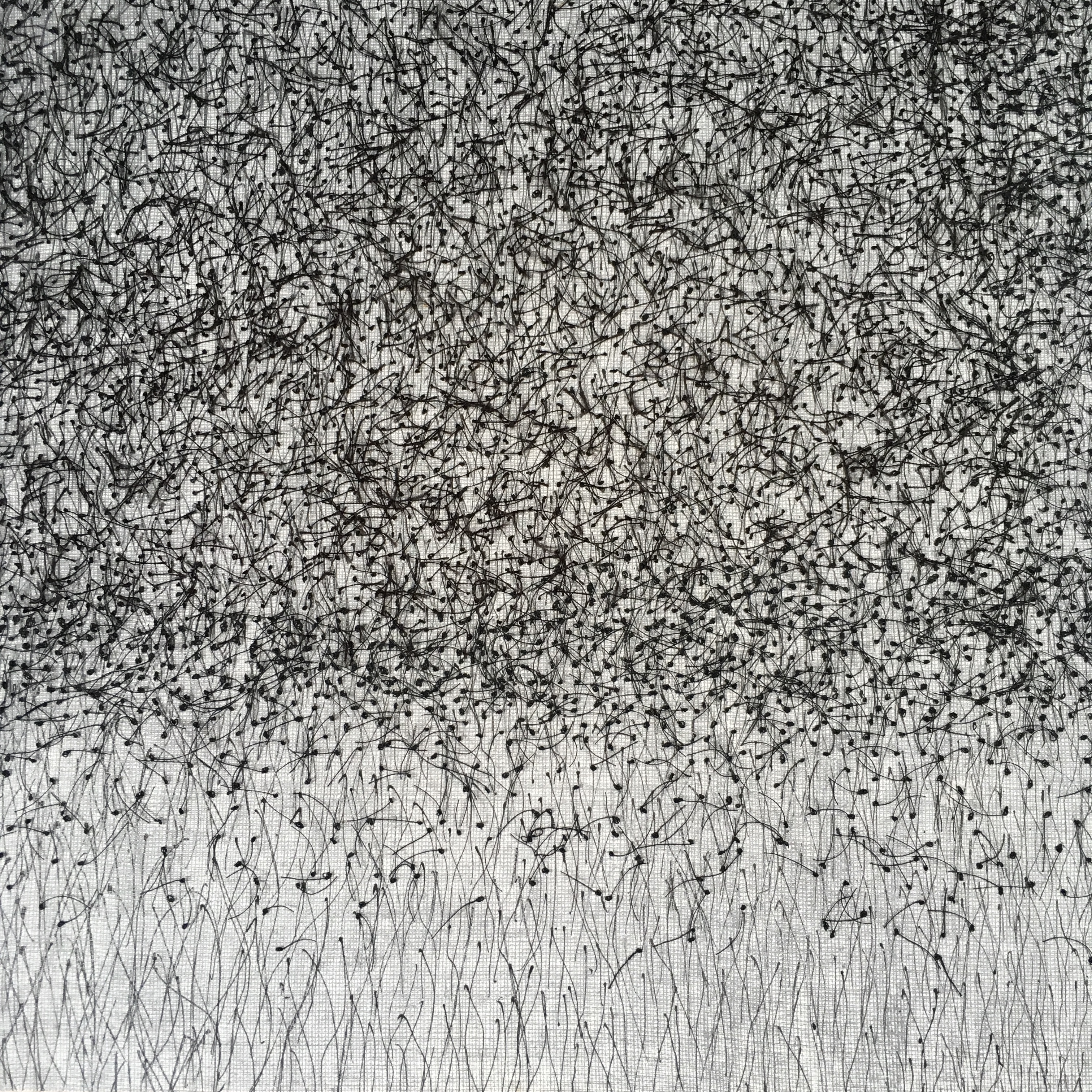
Hilary Ellis uses lots of words that I feel can help to inspire my drawing and mark making:

discreet yet insistent marks

scratches

chaos

order

repeated marks

deviations

frailty of the human hand

series of stitches

muted palette

ritualistic and repetitive

Louise Bourgeois

Louise Bourgeois used many different techniques in her artwork including, aquatint, digital, drypoint, engraving, etching, lithography, photogravure, relief, screen prints, and sculpture. Her works are bold, dynamic, brave, strong, uncompromising, assertive and unusual.

sculpture Image from http://www.moma.org

Aquatint is an intaglio (as opposed to relief) printmaking technique and produces areas of tone rather than lines.

Drypoint uses a plate which is incised with a hard pointed metal or diamond tipped ‘needle’, whereas engraving uses a tool called a burin to cut grooves.

Drypoint engraving Image from http://www.moma.org

Etching makes use of an acid resistant coating into which the design is scratched or pressed before submerging the plate into acid which etches the exposed areas.

Lithography uses ink applied to a grease treated image and is based on the immiscibility of grease and water ie they do not mix.

Photogravure is a photo-mechanical process using a copper plate and light sensitive gelatin tissue which is then etched.

Relief prints are made by carving into a print block which could be made of a number of materials, eg – Lino, erasers, wood.

Screen printing uses a mesh screen and a blocking stencil and can create bold prints. 

I have tried drypoint, relief printing and screen printing before and was interested to see what could be produced with these techniques.

The words associated with Louise Bourgeois that I thought could inspire me to try to do something different are:

forms

materials

scale

strange

organic

figuration

abstraction

evocative

eerie

loneliness

jealousy

anger

fear

art as a tool for coping

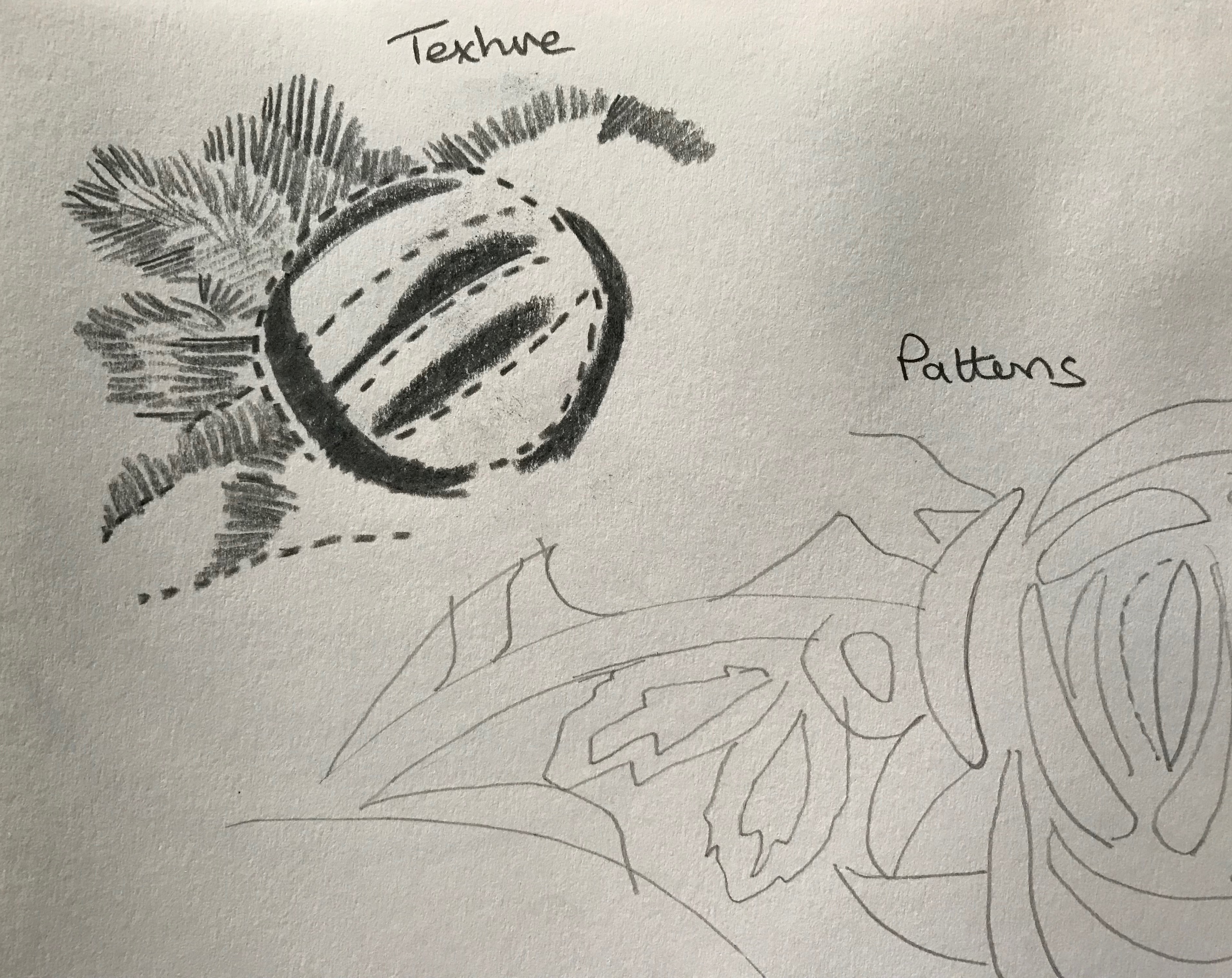
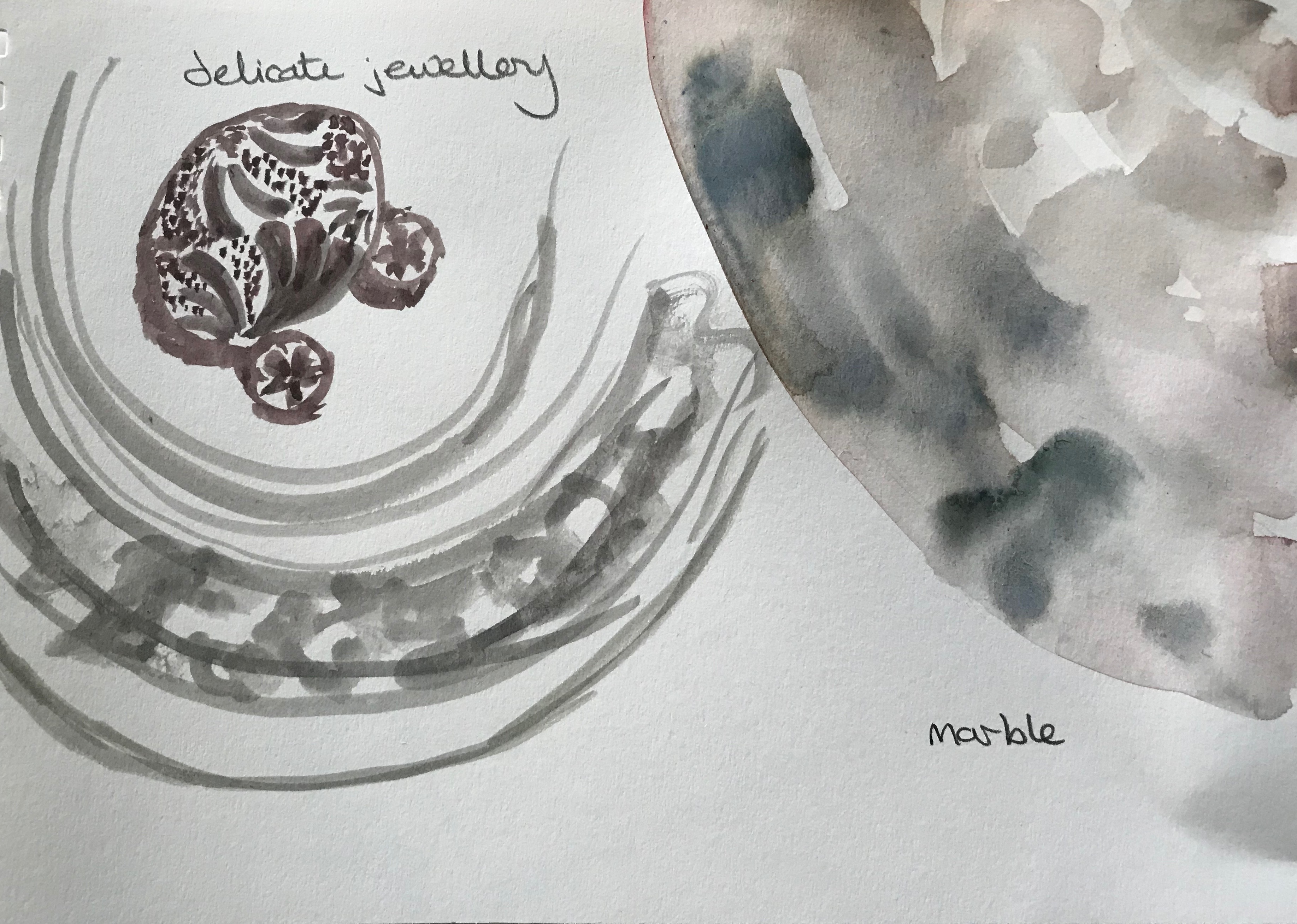
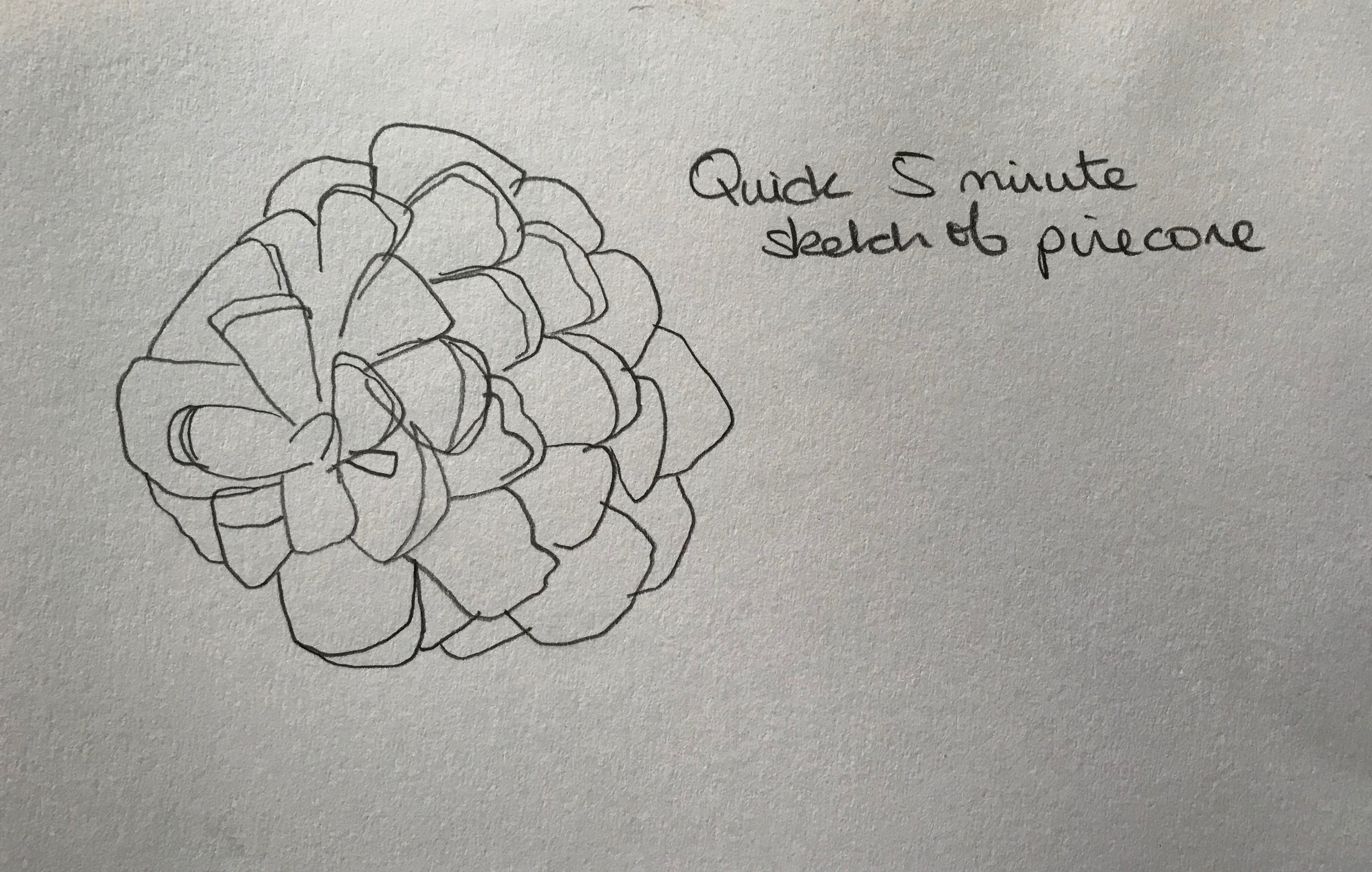
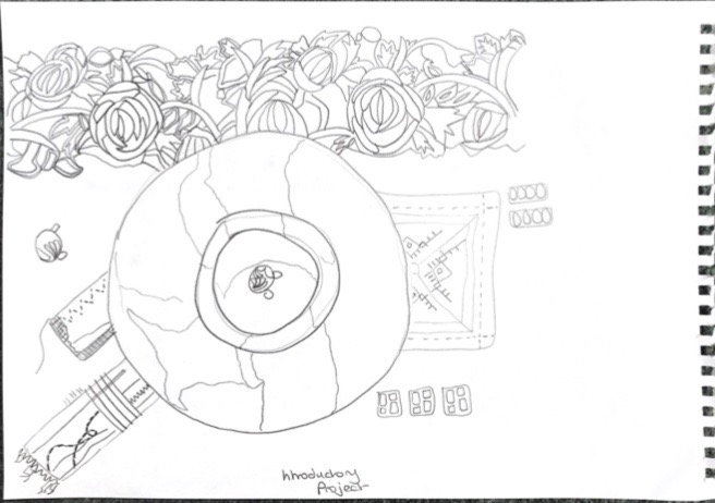
Now to start using these ideas in my mark making!!!

Balance and Harmony

I started the introductory project by choosing the theme ‘Balance and Harmony’ because this appealed to me most from the choices. I then did some brainstorming of the theme and came up with –

joining, concord, pleasing, consistent, old and new, co-operation, peace, understanding, compatibility, empathy, meeting of minds, affinity, understanding, chords, musical notes, holding hands, yin and yang, dancers, choirs, matching, proportional, balanced, compatible, love, conflict free, Chinese symbols, spirals, stability, self control, steadfastness, equilibrium, stone balance, work life balance, bicycle, flamingos on one leg, diet, right and wrong, light and heavy, smooth and textured, lemon and lime, bangers and mash, tea and cake.

I wanted to create a pleasing whole and with this in mind decided to start by concentrating on the following items to create my theme – leaves, pine cones, wedding rings, music, stone, circles, a piece of crochet, walls, shells and patterns.

I gathered some items together – some from my list and some others that I spotted around my home, and took the following photos

I was looking for a pleasing composition to create a harmonious whole, using heavy and light materials, smooth and textured surfaces, and dark and light shades. The items I chose each please me as they are tactile, beautiful in their own right and each (apart from the pine cone which I just like) have memories for me of places and people.

Once I started to arrange the items I got the feeling of arranging a dinner place with the bowl at the centre, textiles as napkins, and various treats and favours placed in a way to entice the diner. It made me think of Feng Shui.

I chose a clean white background as it is pleasing to the eye and accentuates the lines; also I realised it looks like a tablecloth.

I was pleased with the results and settled on the black and white image.

My drawings were done with pencil and watercolour in a limited palette – I intend to do some more in other mediums while sticking with the monotone theme.

More to come on this!

Detailed pencil sketch of the arrangement
Brush and ink quick mark making
Felt tip patterns
Watercolour
Quick felt tip outline drawing
Pencil close up larger scale drawing of one element

Reflection

I was pleased with the items and final arrangement I chose even though I was initially worried about drawing them. I was familiar with the items as apart from the pine cone they had special meaning to me – they had either been presents, or were pieces of old jewellery and textiles that I have collected throughout my life. Apart from the bowl the items are not valuable, but I can remember things about each of them such as where I wore them, who gave them to me, or where I bought them. Some of the jewellery is broken and no longer looks like its original form.

I found I enjoyed drawing with pencil and tried to use different pencils to achieve soft and hard effects. I also liked the simplicity of mark making with a felt tip.

I realise that my drawings are all on fairly small pieces of paper and know that I need to try a different approach and ‘go large’! I also found it hard to move away from drawing exactly what I see and just make marks.

Since making these drawings I have studied the work of some artists who use drawing and mark making as an important part of their work, and have written a blog about this.

i have also obtained a book called “Mark making in textile art’ by Helen Parrott (Batsford 2013) which I hope will inspire me to explore mark making in different ways.

Because I have been travelling a lot during this piece of work I haven’t done everything in the order of the course materials and on reflection I can see that doing more research in the early stages may have helped me to be more adventurous in my approach.