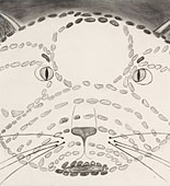
When I first read each of the project briefs I was filled with ideas and had trouble narrowing these down. I found it hard to work without colour but once I had chosen a theme for the Introductory project I enjoyed concentrating on the qualities and placement of the objects and feel I achieved “Balance and Harmony” in the outcome. Research into Wabi Sabi later on intrigued me and I want to try using this in my future work.
I am new to blogging and realise that my online blog is not easy to follow in places where I have worked ‘out of order’. Overall however I am happy with how I have presented my work and I have gone back over it to label items more fully. I was out of the country for much of the time and that presented challenges with research.
I am aware on reflection that I have not been brave enough to work in a different way, for instance in scale and the use of different materials and tools; however I am pleased with my choices of subject and the communication of my ideas in the drawing I have done. For example I used shadows to create an image to paint which I used in ‘Picking and portraying’, this enabled me to be free in my watercolour painting to achieve a feeling of movement and spontaneity. I am pleased with my use of pattern, colour, detail, and composition.
My thoughts on my future work are that I will practise constant reflection, and will make more notes on my blog and on my drawings with this in mind. I will also read the whole assignment brief before I start so that I can ensure I have done relevant research before I begin, and can then reference this in my pieces and reflection.
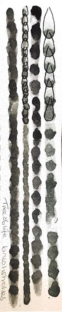
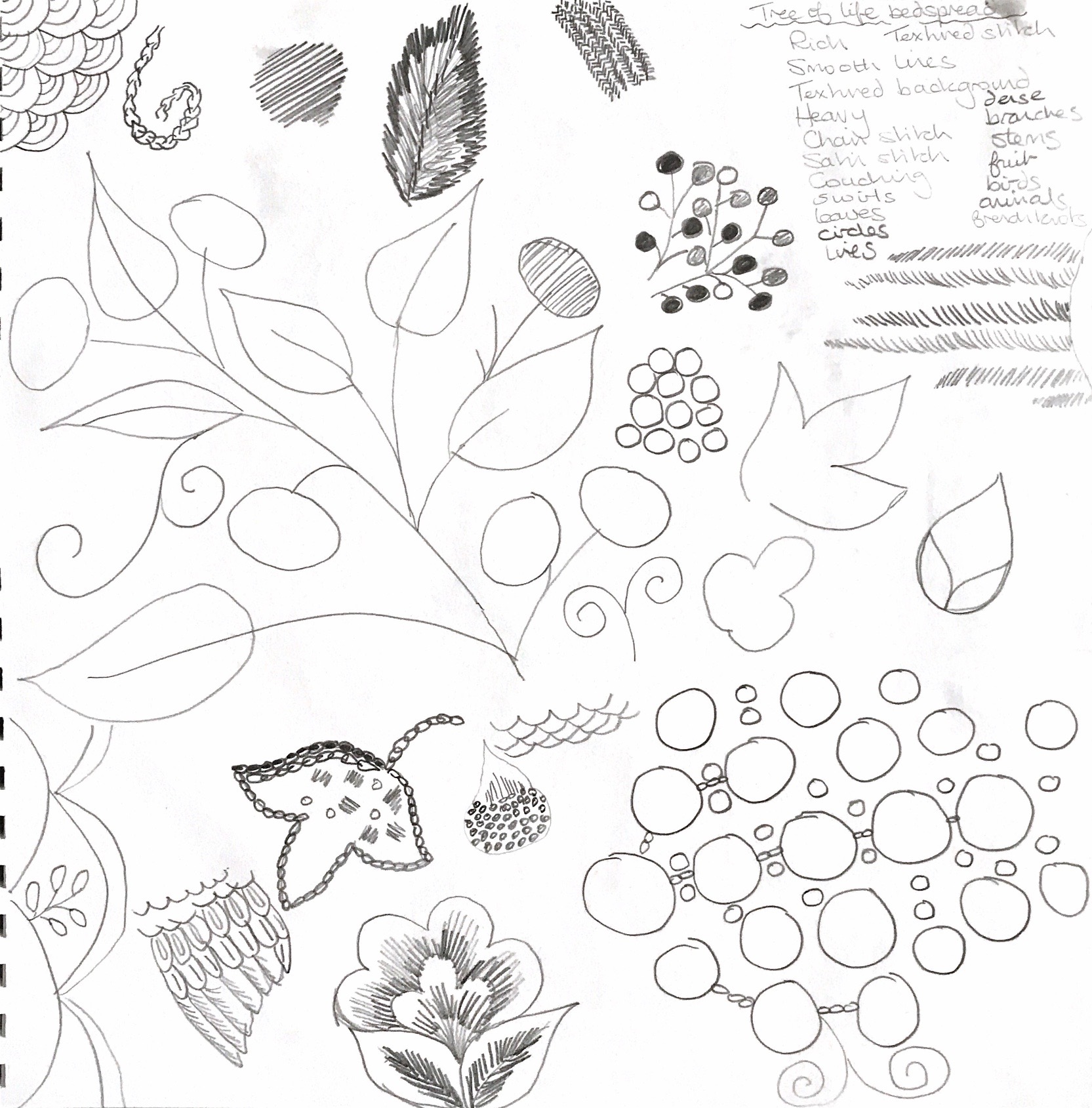
I chose to do my detailed drawings in pencil and pen as I felt this would be best to capture the fine details of my pieces. I was very interested in the stitches in each of the items and the patterns these created.
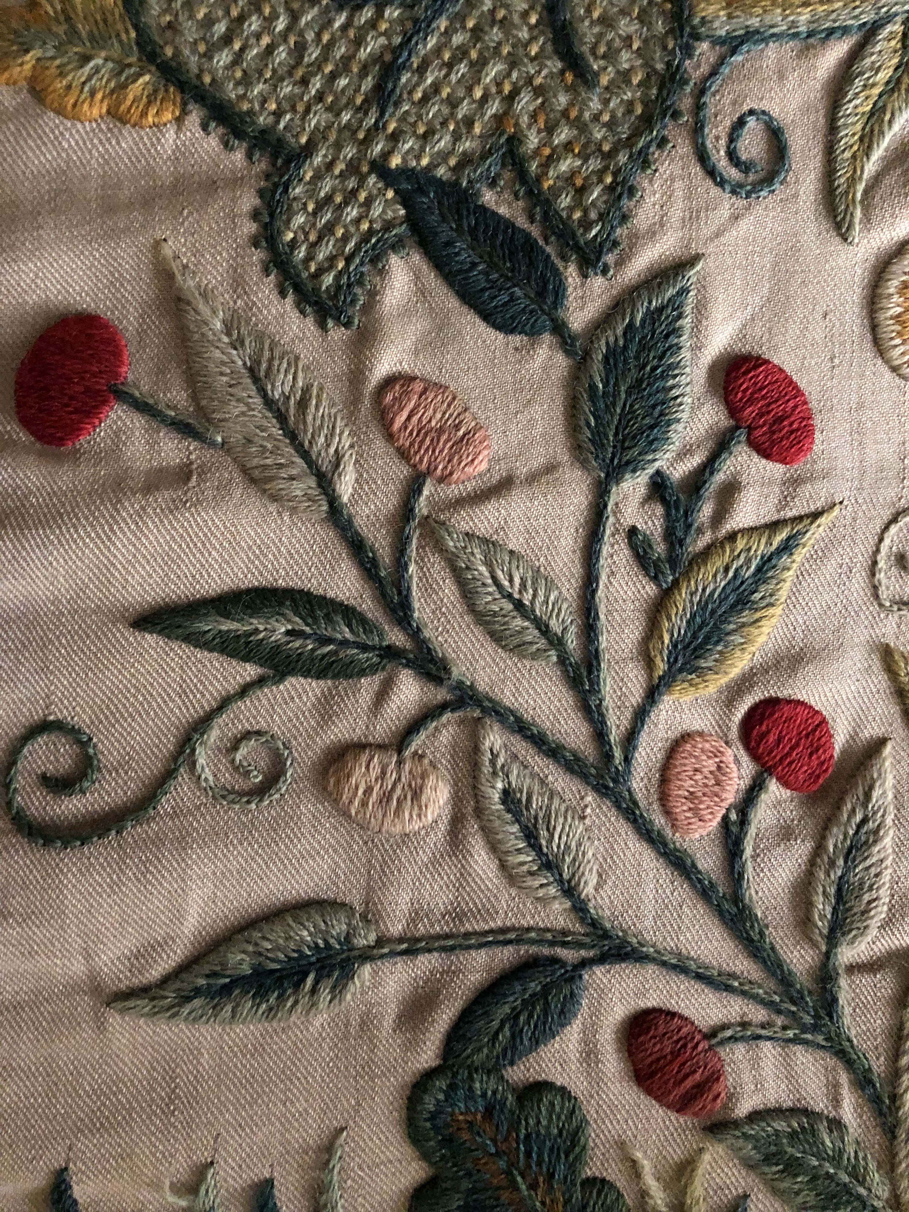
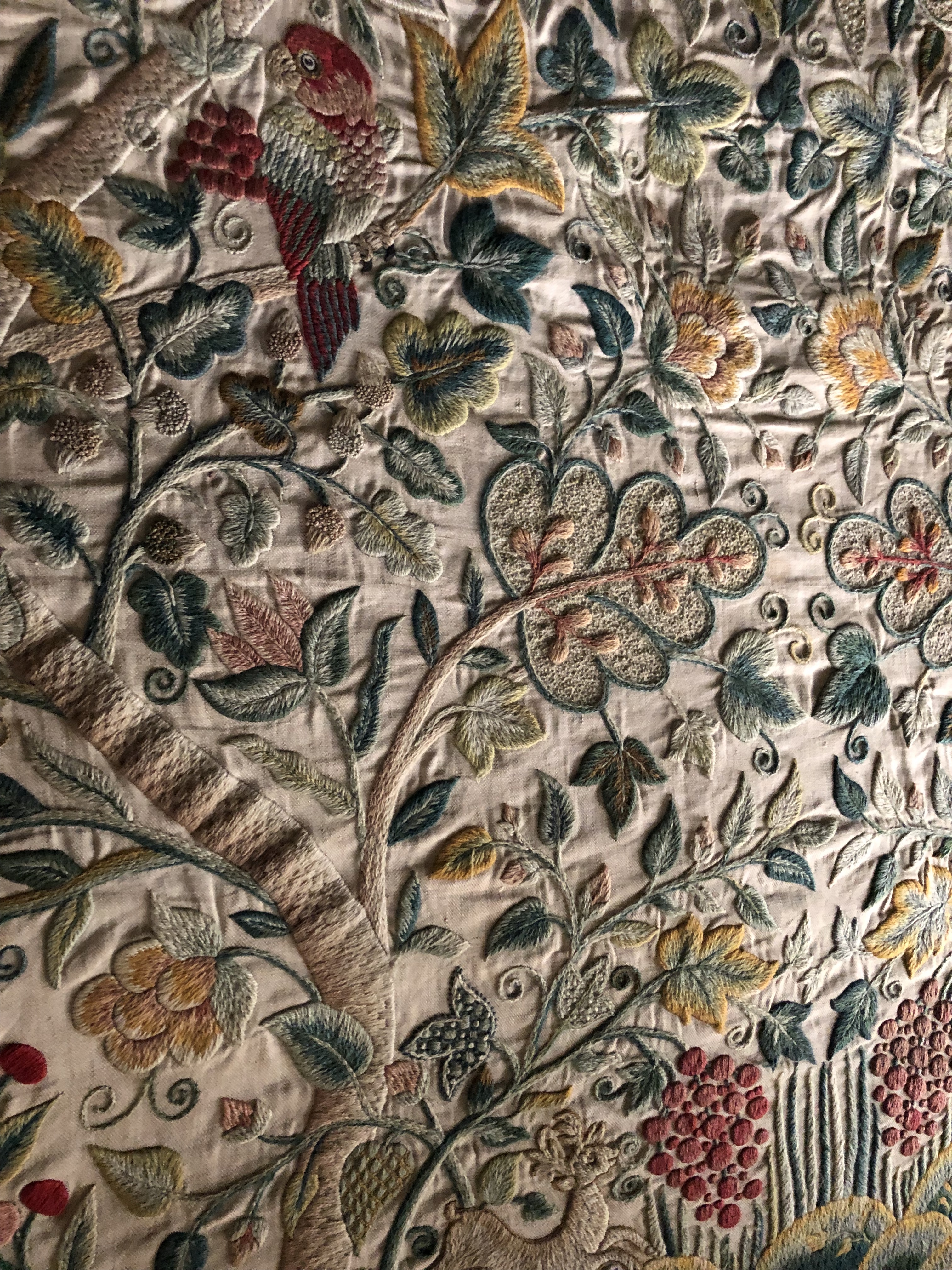
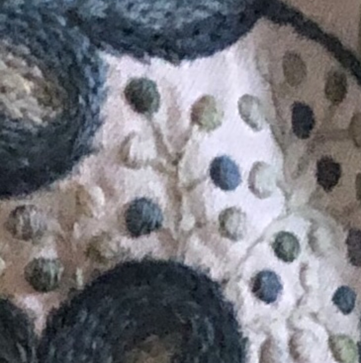
Tree of life detail
For the detailed picture of part of the ‘Tree of life bedspread I tried to capture the density of the stitching and used pressure to show the tones of the threads. The piece is very tactile and I tried to capture this in my drawing by showing the types of stitches – chain, satin, and stem stitch. The piece has been well cared for and shows no sign of wear and tear or of fading.
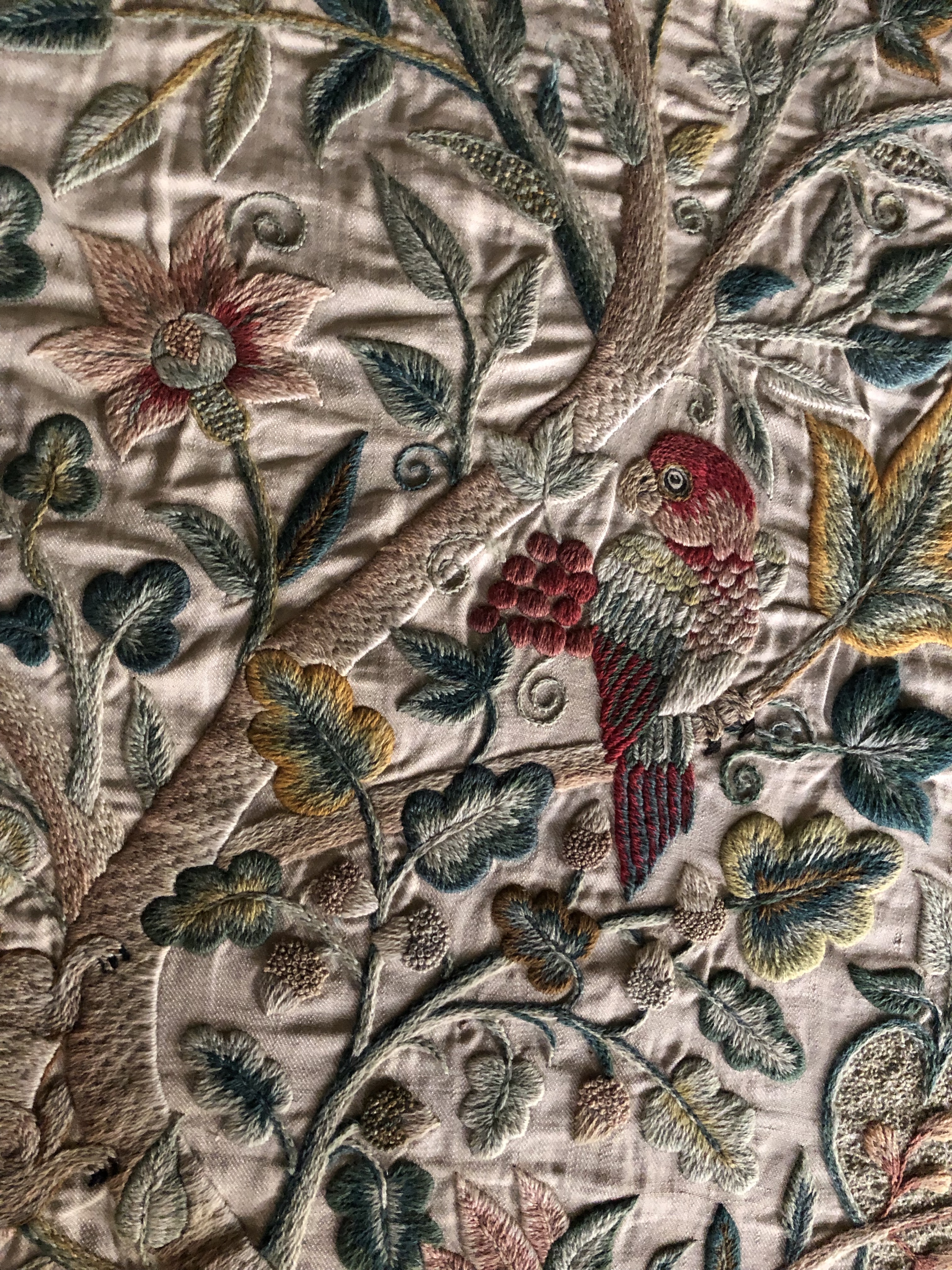
Tree of life detail
Again I have used pencil to capture another part of the ‘Tree of life’ bedspread. I have used different pencils from 6b to hb to suggest the tones of the threads used and also to indicate where a thread is loose on one of the stem stitch stems. I have concentrated on the direction of the satin stitches, the shading with different threads, and the outlining with different threads and stitches.
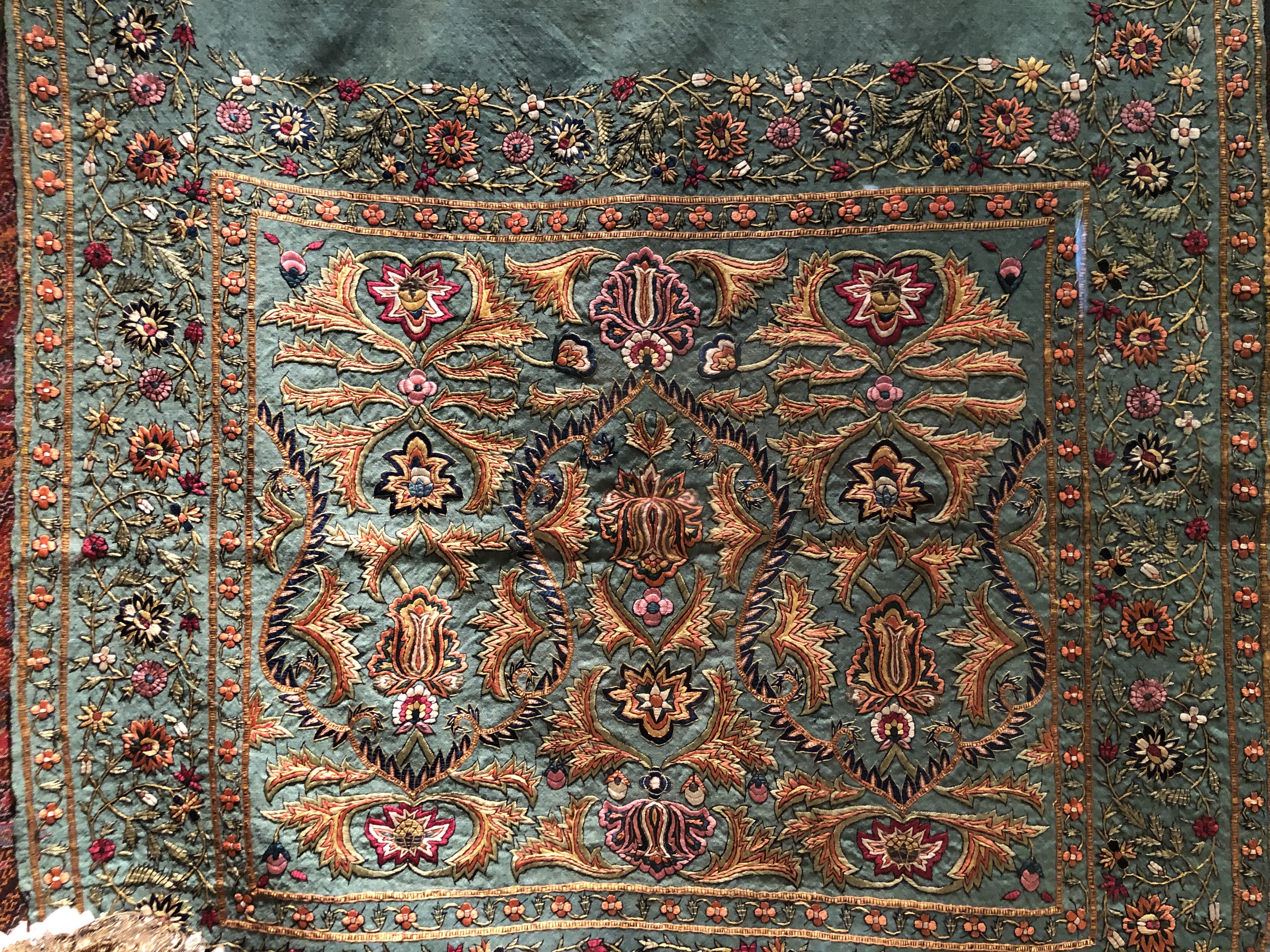
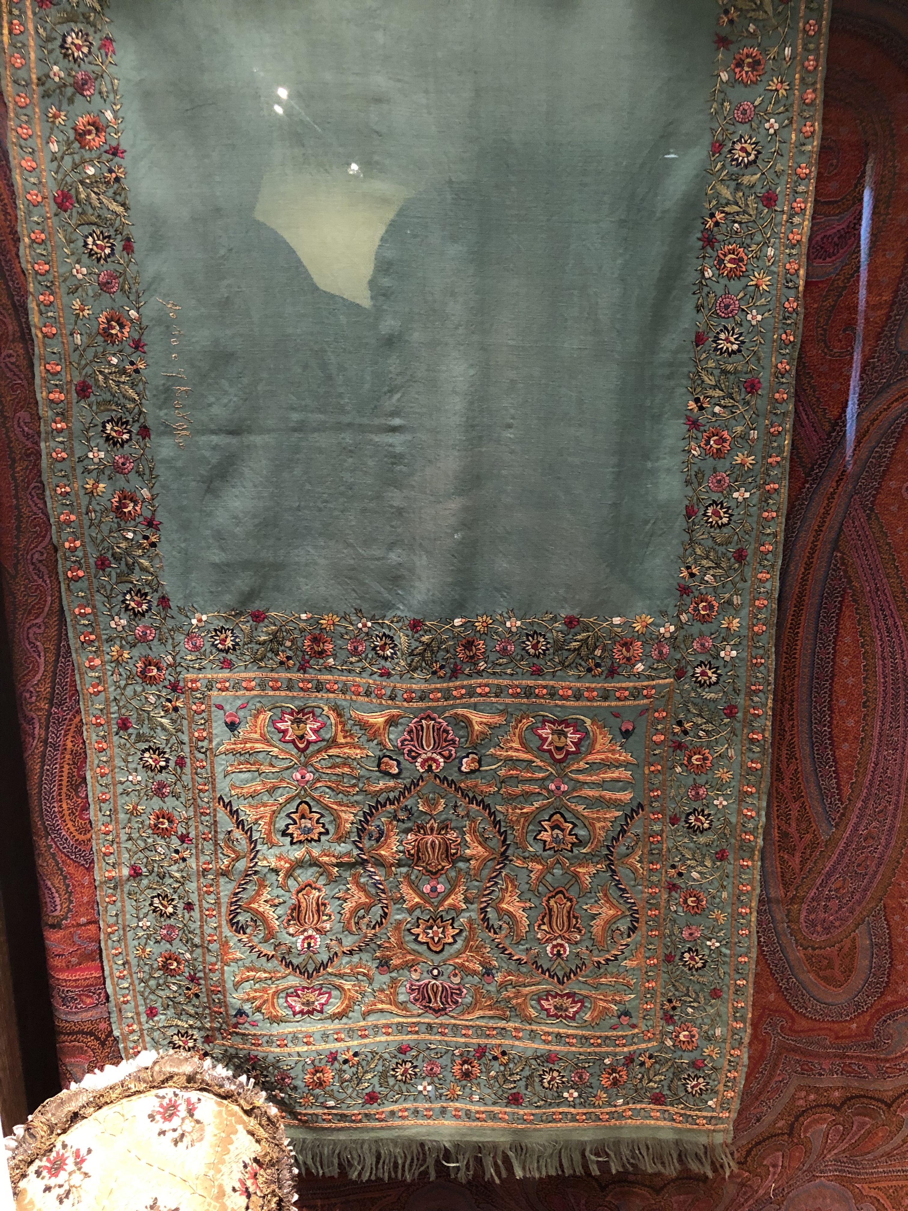
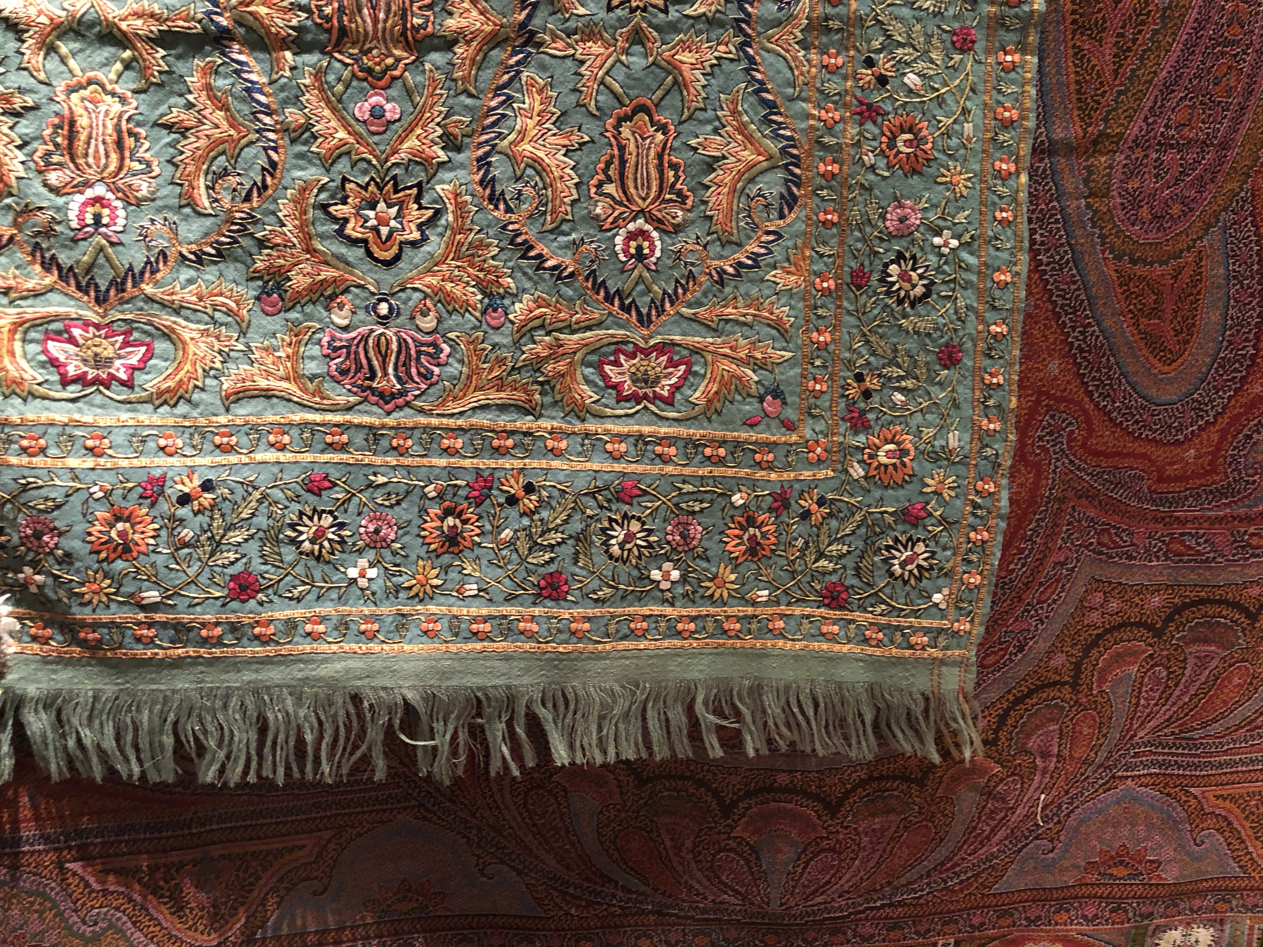
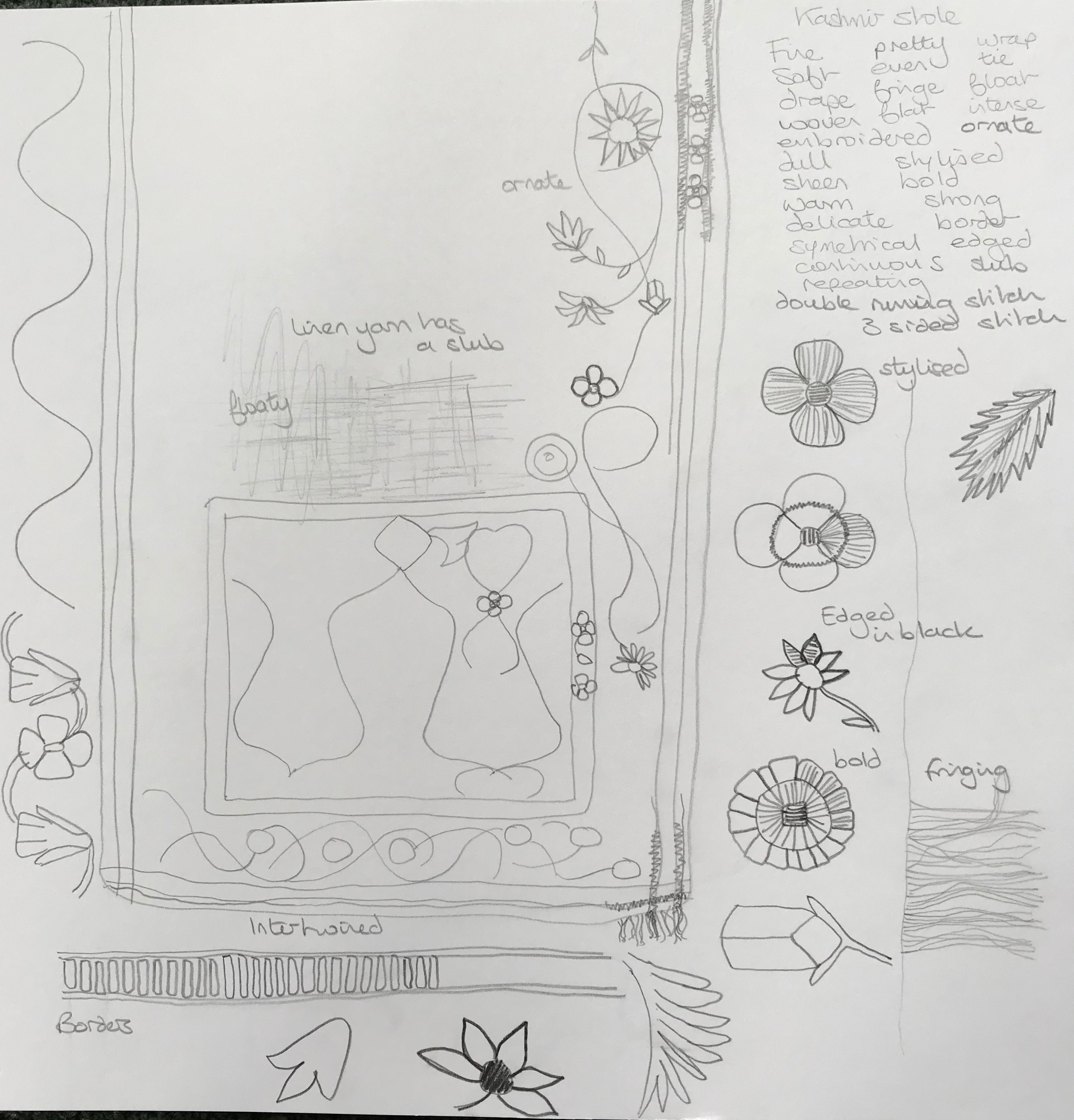
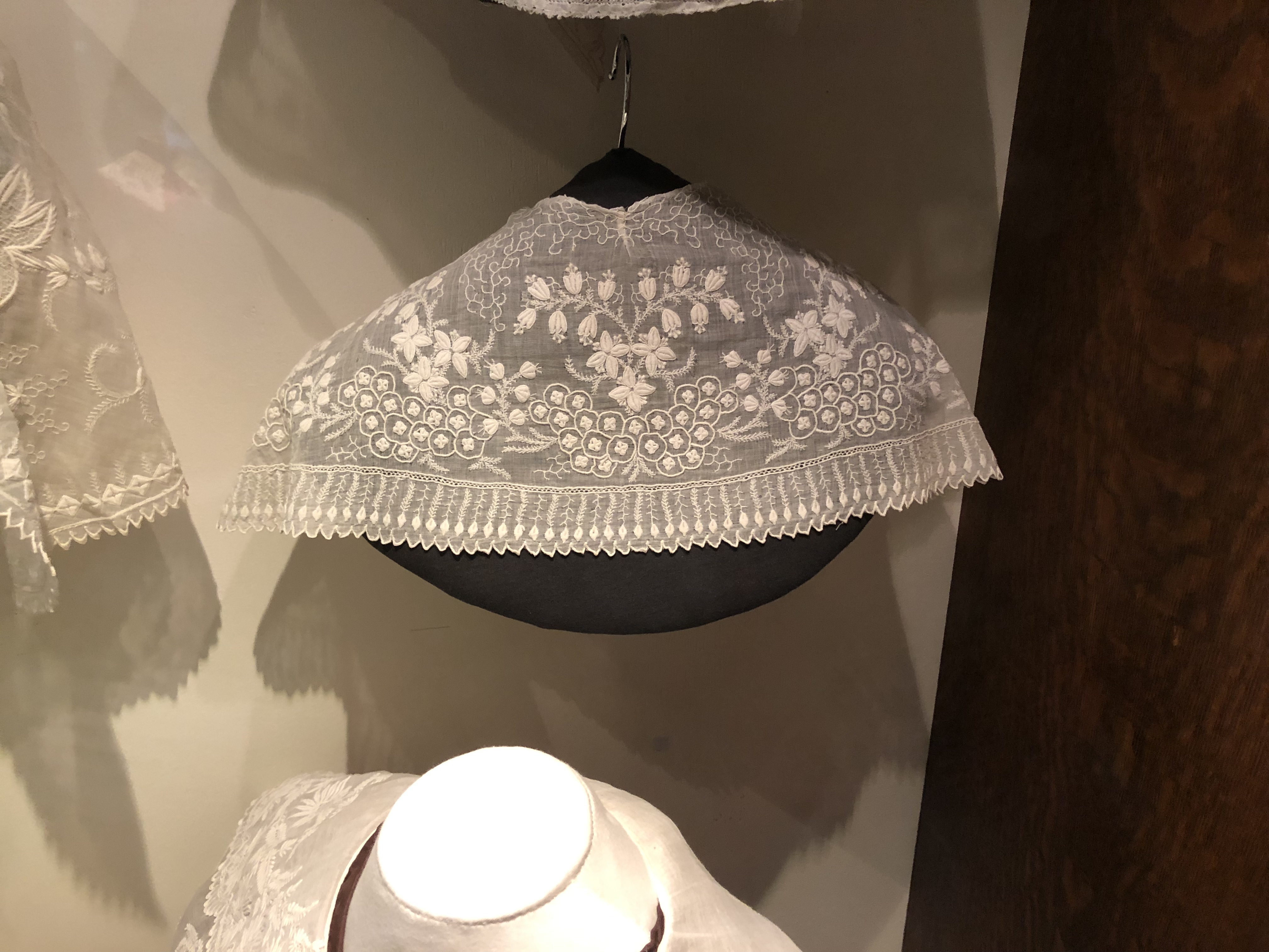
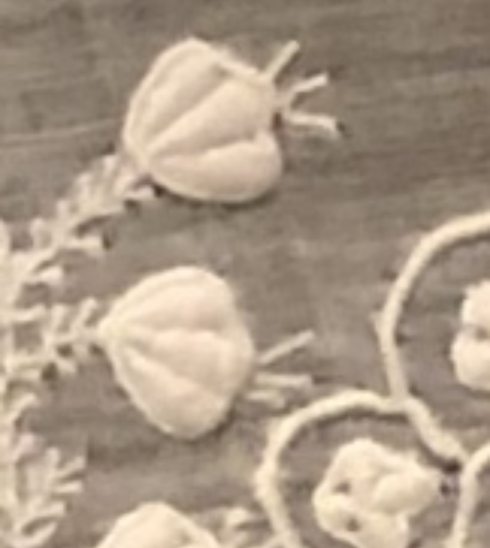
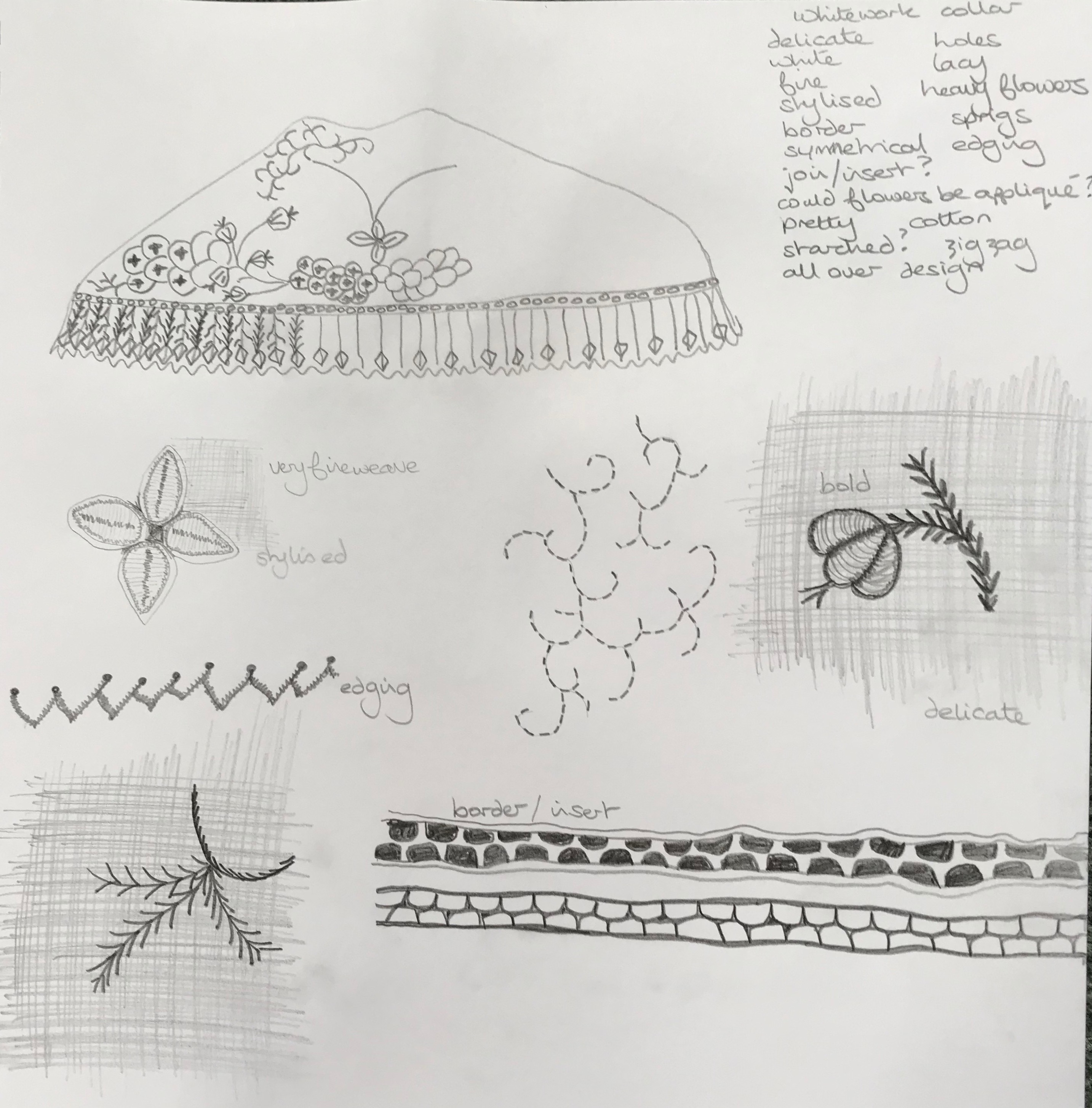
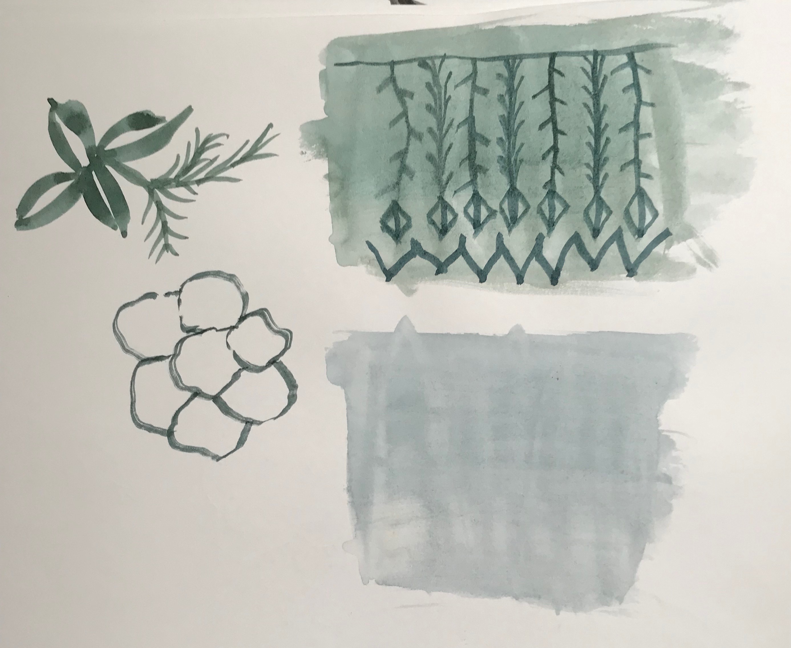
Kashmir stole detail
For this drawing with felt tip pen I tried to capture the intricate detail of the different flowers and plants and how they intertwine. The embroidery is bold and bright which is not easy to portray in black and white but I feel I have captured the essence and the essence of the cultural embroidery style.
I decided to explore the work of the following artists:
Roanna Wells
Katie Sollohub
Debbie Smyth
Hilary Ellis
Louise Bourgeois
I chose these artists as I found something interesting in their work and a different approach both in ideas and practice.
I started by picking out a two or more pieces of work by each artist and also reading about where they get inspiration and how they produce their works of art.
Roanna Wells
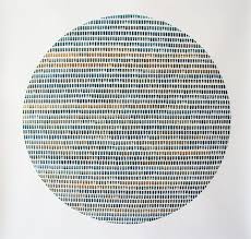
I was interested in Roanna Wells’ series of paintings called ‘How they are ever changing’ due to the beautiful colours and the repetitive brush marks creating a hypnotic whole. there is something different to see each time you look at these watercolour pictures, and the subtle differences in shape, size, density and colour on a plain white background create an ever changing picture.
Roanna Wells uses the following words in her website that I want to try to use in my drawings:
spontaneous
accidental marks
residue
repetition
multiples
fluidity
changing
Katie Sollohub
Katie Sollohub states that she is interested in documenting and recording the places she lives and works in. She uses drawings, paintings, performance, photography and poetry in her work. I like her quirky style and arrangements. Poetry is also something I am particularly interested in using as inspiration in my textile work.
The following words jumped out at me from Katie Sollohub’s website and I hope I can relate these to my drawings:
documenting
recording
narrative
memories
details
frayed edges
unnoticed familiars
well worn and loved
Debbie Smyth
Debbie Smyth’s ‘Linear works’ are strong structures using knots and threads. I like the loose threads hanging from the knots which could move and subtly change the picture each time you look at it. They are hard and soft at the same time and I appreciate this contrast.
The words used by Debbie Smyth that I want to use as inspiration are:
commonplace objects
changing angles and perspective
iconic objects
exaggeration
linear structures
Hilary Ellis
The pictures made by Hilary Ellis intrigue me. They are made up of repetitive marks using threads and beads which she states is ‘deliberately reminiscent of the labour-intensive toil of sweatshops, whose employees’ existence is reduced to a series of stitches.’ http://www.hilaryellis.co.uk
One interesting thing Hilary Ellis asks on her website is ‘When is a work of art finished?’ which is something I feel to be intuitive to the maker – I hope that I recognise this point and know when to stop!
Hilary Ellis uses lots of words that I feel can help to inspire my drawing and mark making:
discreet yet insistent marks
scratches
chaos
order
repeated marks
deviations
frailty of the human hand
series of stitches
muted palette
ritualistic and repetitive
Louise Bourgeois
Louise Bourgeois used many different techniques in her artwork including, aquatint, digital, drypoint, engraving, etching, lithography, photogravure, relief, screen prints, and sculpture. Her works are bold, dynamic, brave, strong, uncompromising, assertive and unusual.
Aquatint is an intaglio (as opposed to relief) printmaking technique and produces areas of tone rather than lines.
Drypoint uses a plate which is incised with a hard pointed metal or diamond tipped ‘needle’, whereas engraving uses a tool called a burin to cut grooves.
Etching makes use of an acid resistant coating into which the design is scratched or pressed before submerging the plate into acid which etches the exposed areas.
Lithography uses ink applied to a grease treated image and is based on the immiscibility of grease and water ie they do not mix.
Photogravure is a photo-mechanical process using a copper plate and light sensitive gelatin tissue which is then etched.
Relief prints are made by carving into a print block which could be made of a number of materials, eg – Lino, erasers, wood.
Screen printing uses a mesh screen and a blocking stencil and can create bold prints.
I have tried drypoint, relief printing and screen printing before and was interested to see what could be produced with these techniques.
The words associated with Louise Bourgeois that I thought could inspire me to try to do something different are:
forms
materials
scale
strange
organic
figuration
abstraction
evocative
eerie
loneliness
jealousy
anger
fear
art as a tool for coping
Now to start using these ideas in my mark making!!!
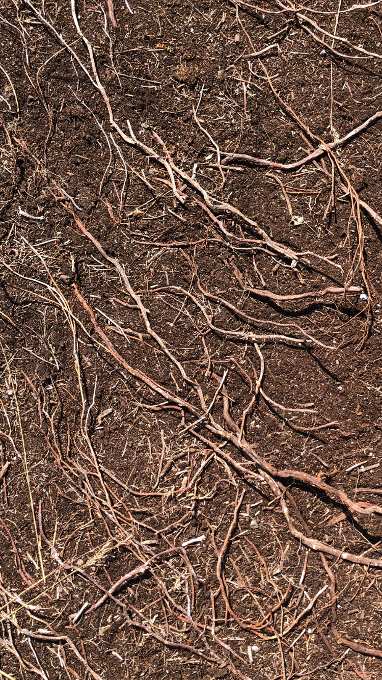
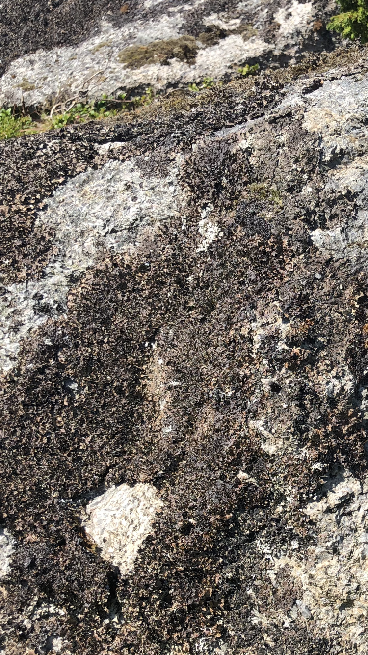
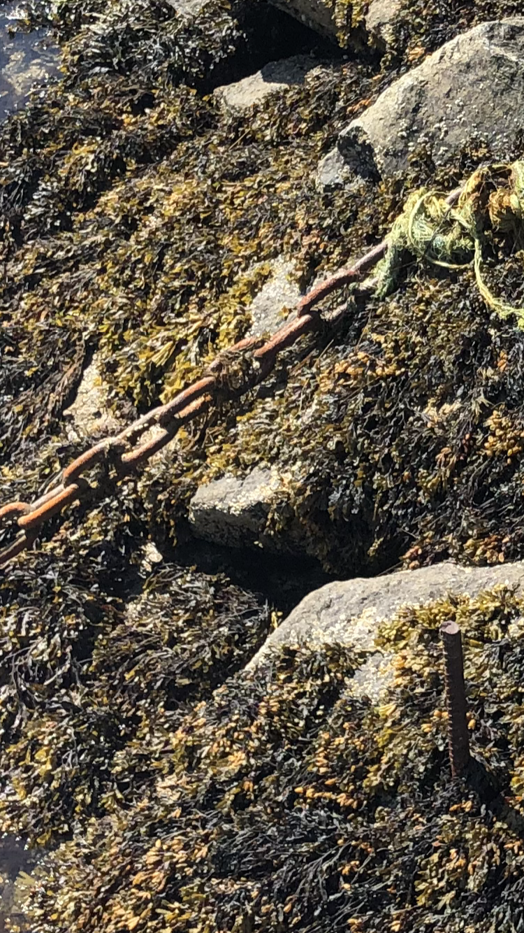
I am currently in Norway and having read Leonard Koren’s excellent book, ‘Wabi-sabi for Artists, Designers, Poets and Philosophers’, I was inspired to take the following photos.
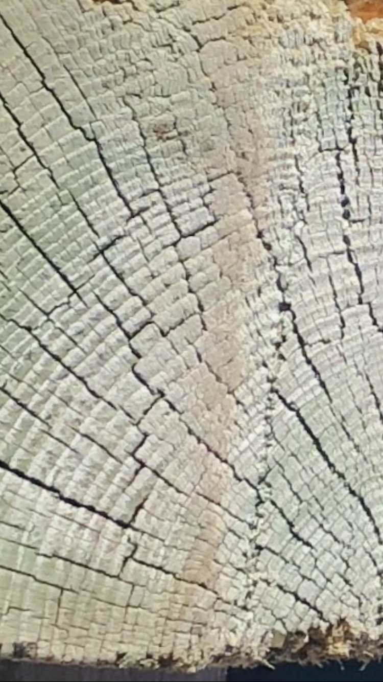
Wave – never the same, hypnotic and calmingPlant roots, ever changing, growing and dyingPlants and lichen on rocks making ever changing shapes and patternsChain rusting from exposure to the sea and weather, on the rocks amongst the seaweedUnder the sea – ethereal image, murky coloursUnder the sea patterns – silvertoneWeathered wooden post viewed from the topMetal plate on a boat with rust spots made by the sea sprayFish drying, silvertone
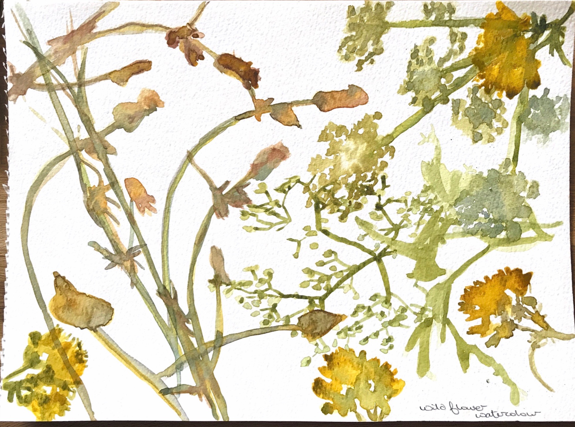
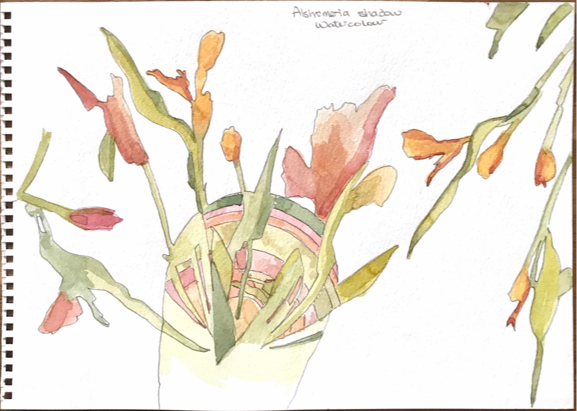
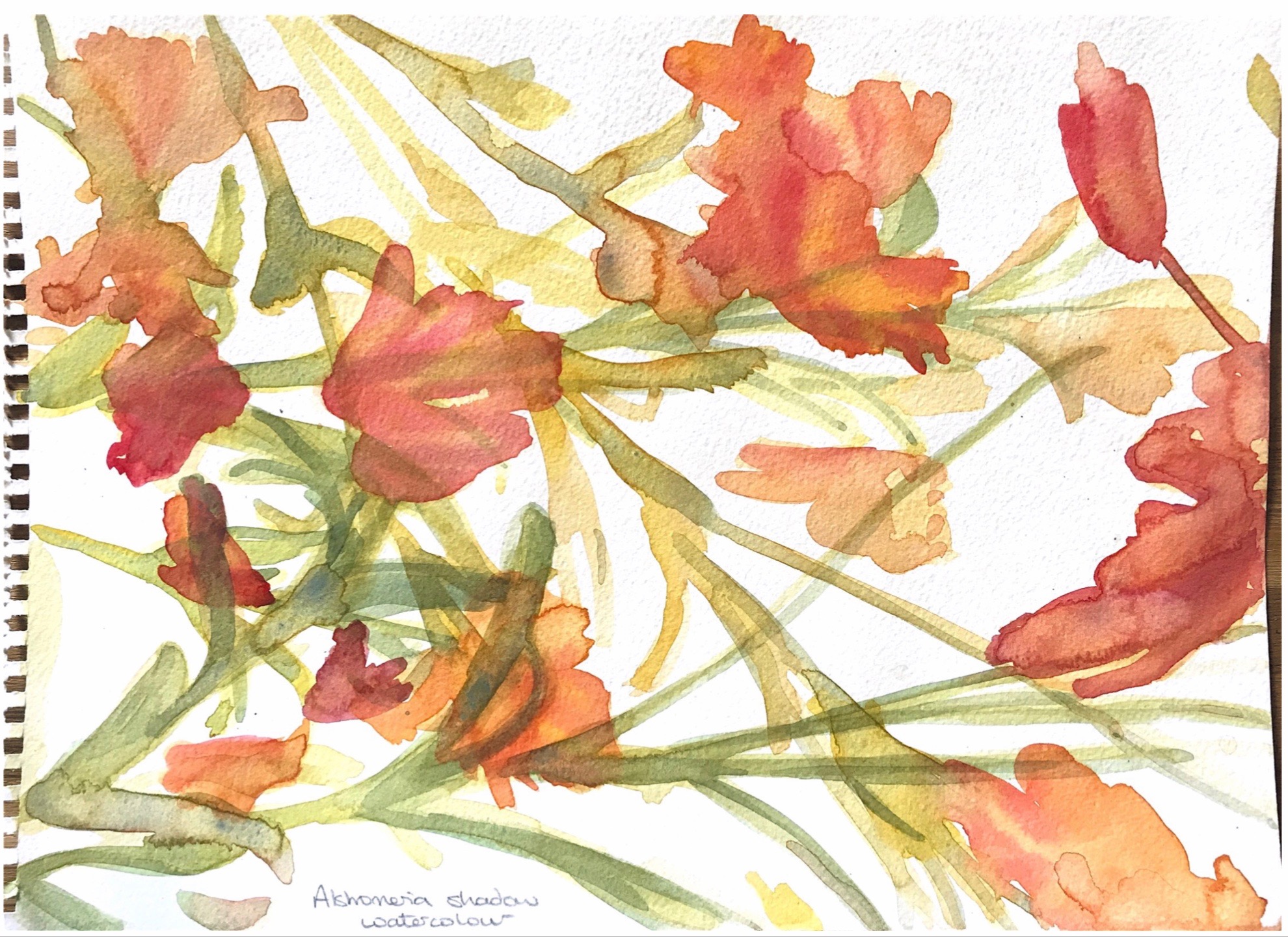
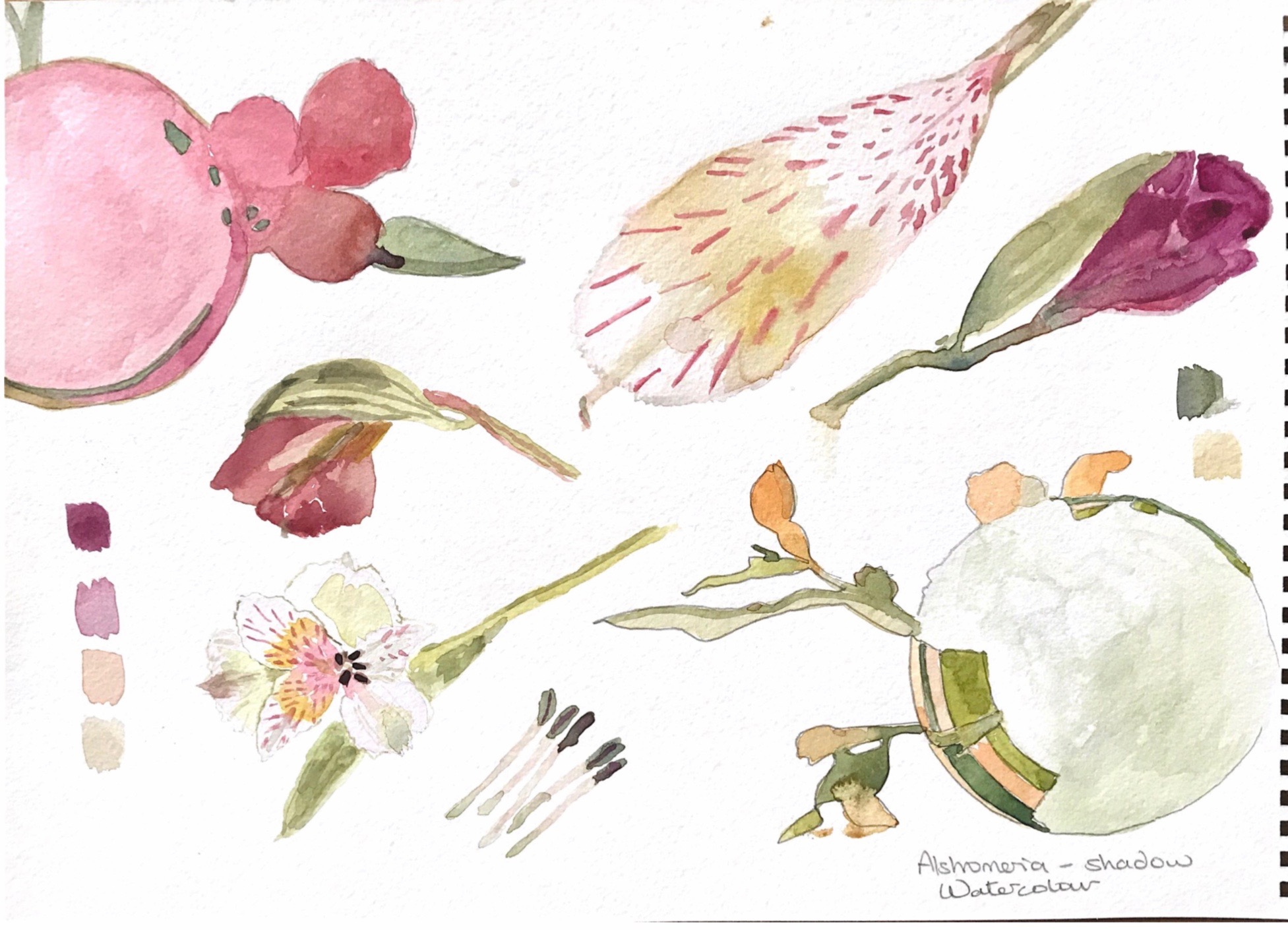
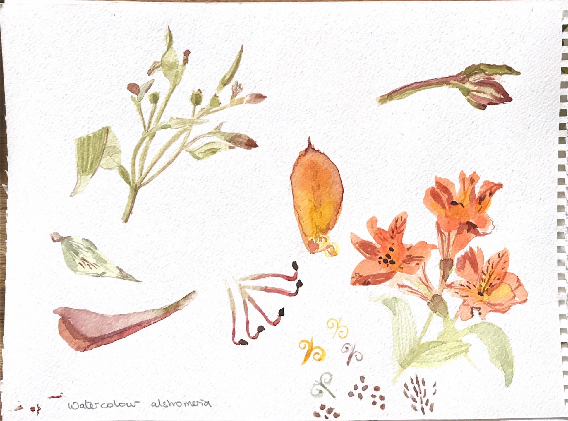
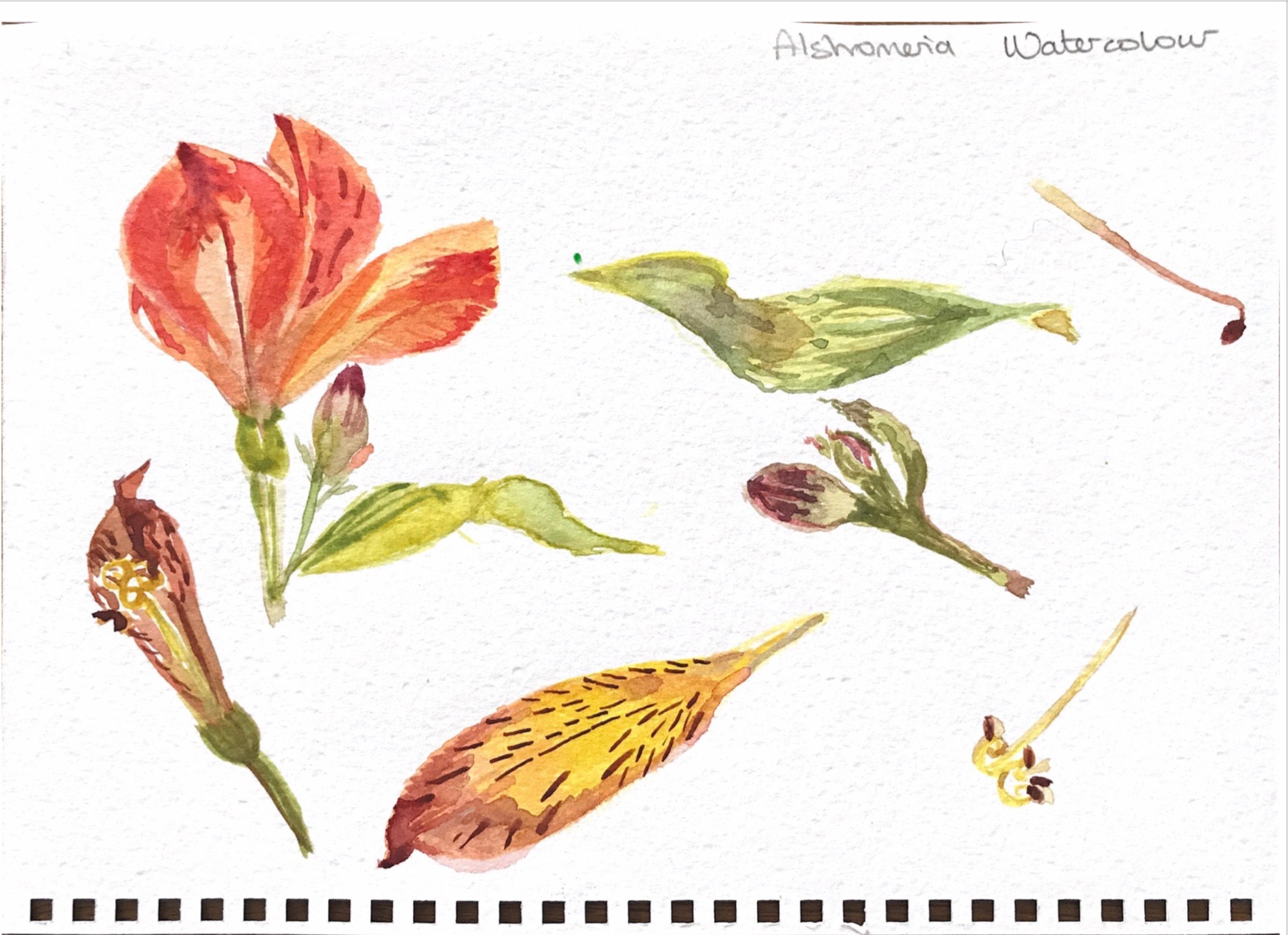
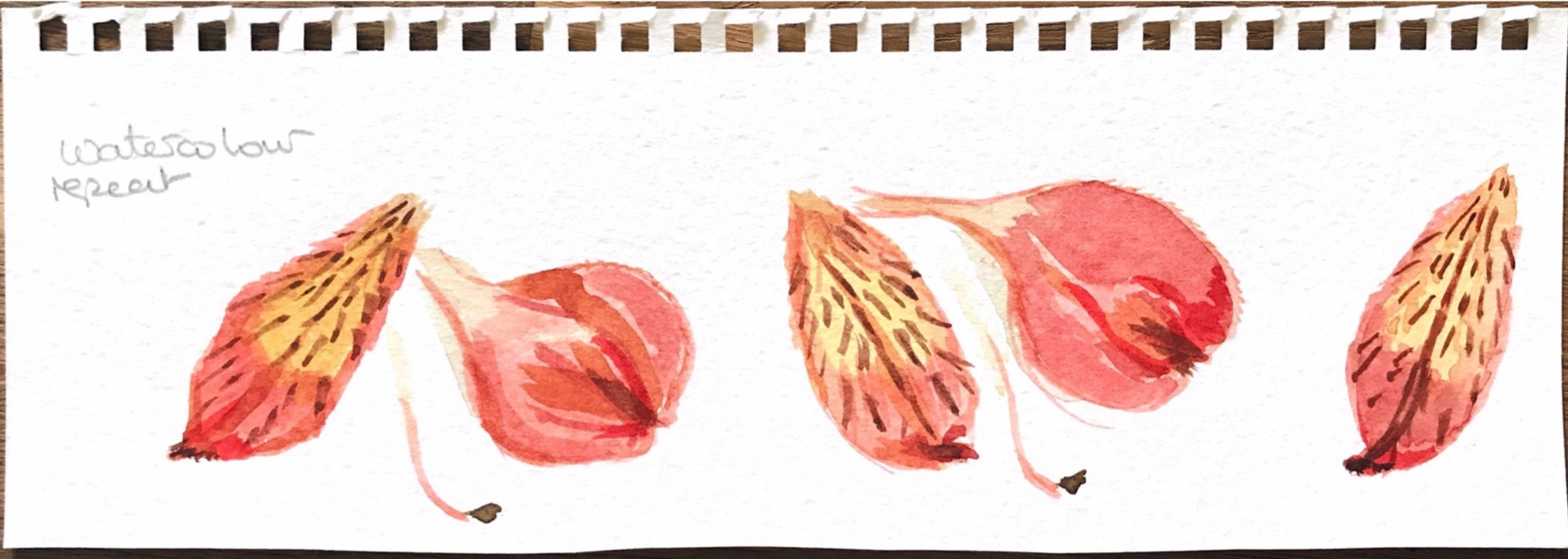
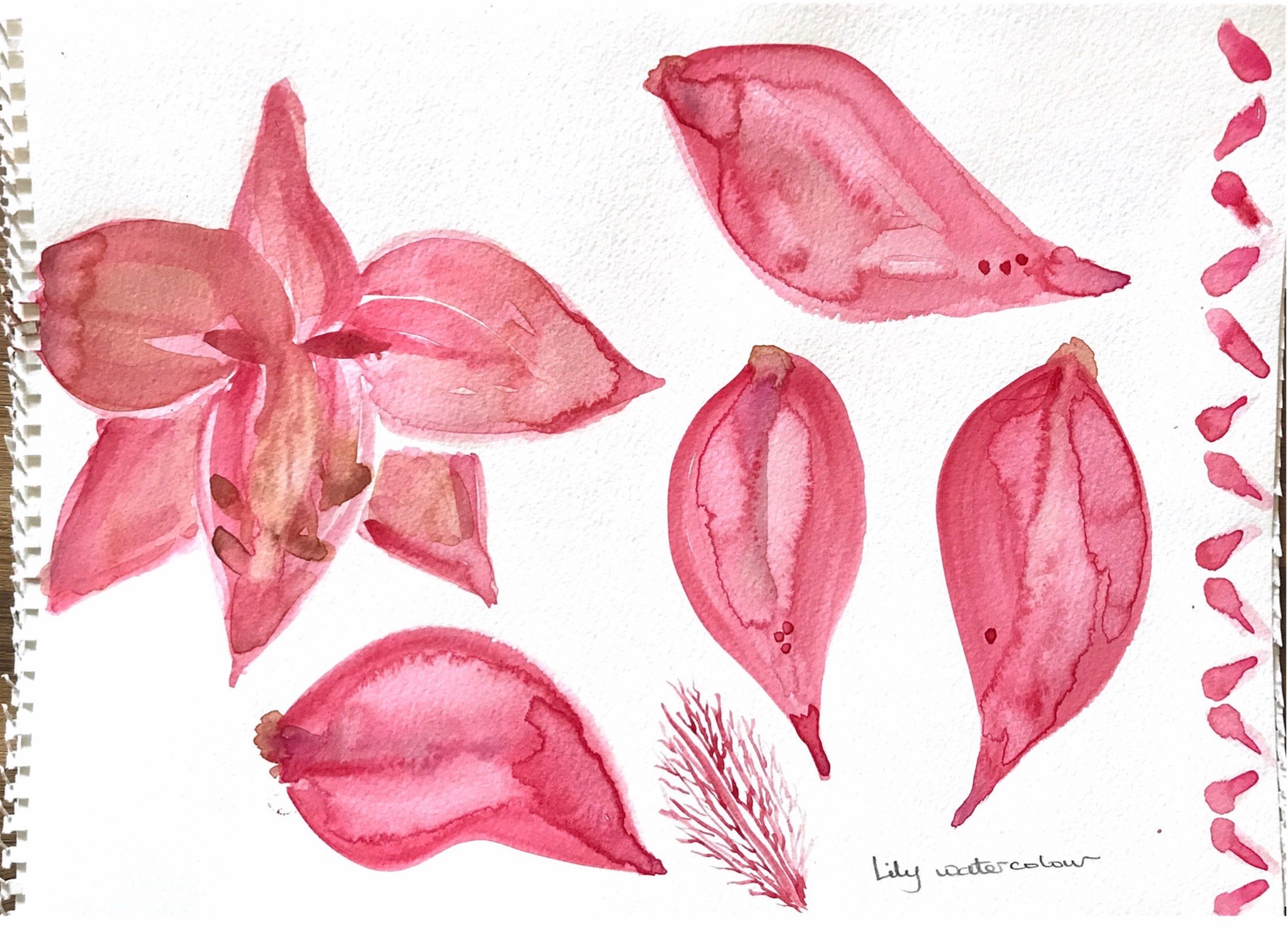
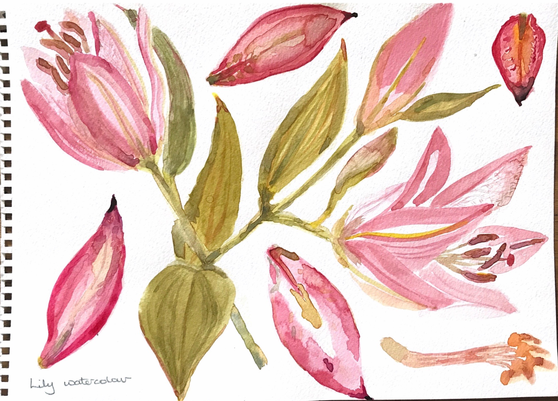
I chose alstromerias, lilies and some ‘weeds’ to start this exercise and thought I would try using watercolour. I haven’t used watercolour much before but I like the soft colours and the way they run into each other when wet.
I enjoyed doing this and felt the flowers I chose were lovely to paint. However it was the weeds that surprised me and I love the painting made by using the shadow cast on paper with direct light behind the subject.
I feel this captures movement and flow, I stood the plants in front of a light source and painted the shadows cast on the paper. This method freed me from trying to create an exact representation, and I notice that it captures the flow and movement of the stems.
The following paintings were made using the same method
I particularly like the way in which watercolour can be layered with the first colours showing through.Shadows and observation, patterns, scale These images were made by closely observing the flowers and observing what I saw, but there are also two shadow paintings top left and bottom right.
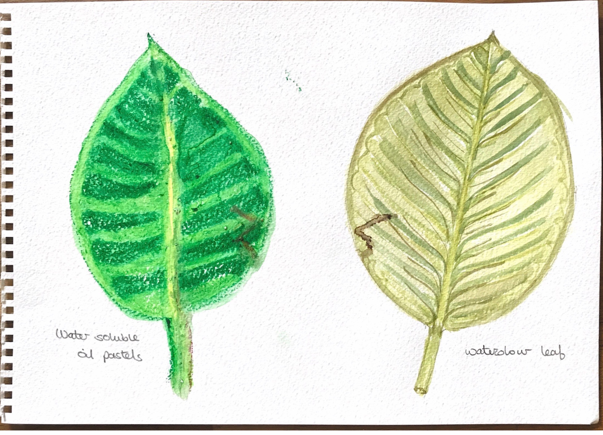
My observational drawings were mostly done with watercolour but I did also try water-soluble oil pastels for one leaf. I found this too strong, controlled and bold for my liking.
Leaves drawn with water-soluble pastelsPatterns and observations with watercolour Watercolour on rough paperWatercolour observationsRepetition – this could be developed as a border patternExperiments with very wet watercolours running into each otherWatercolour observations
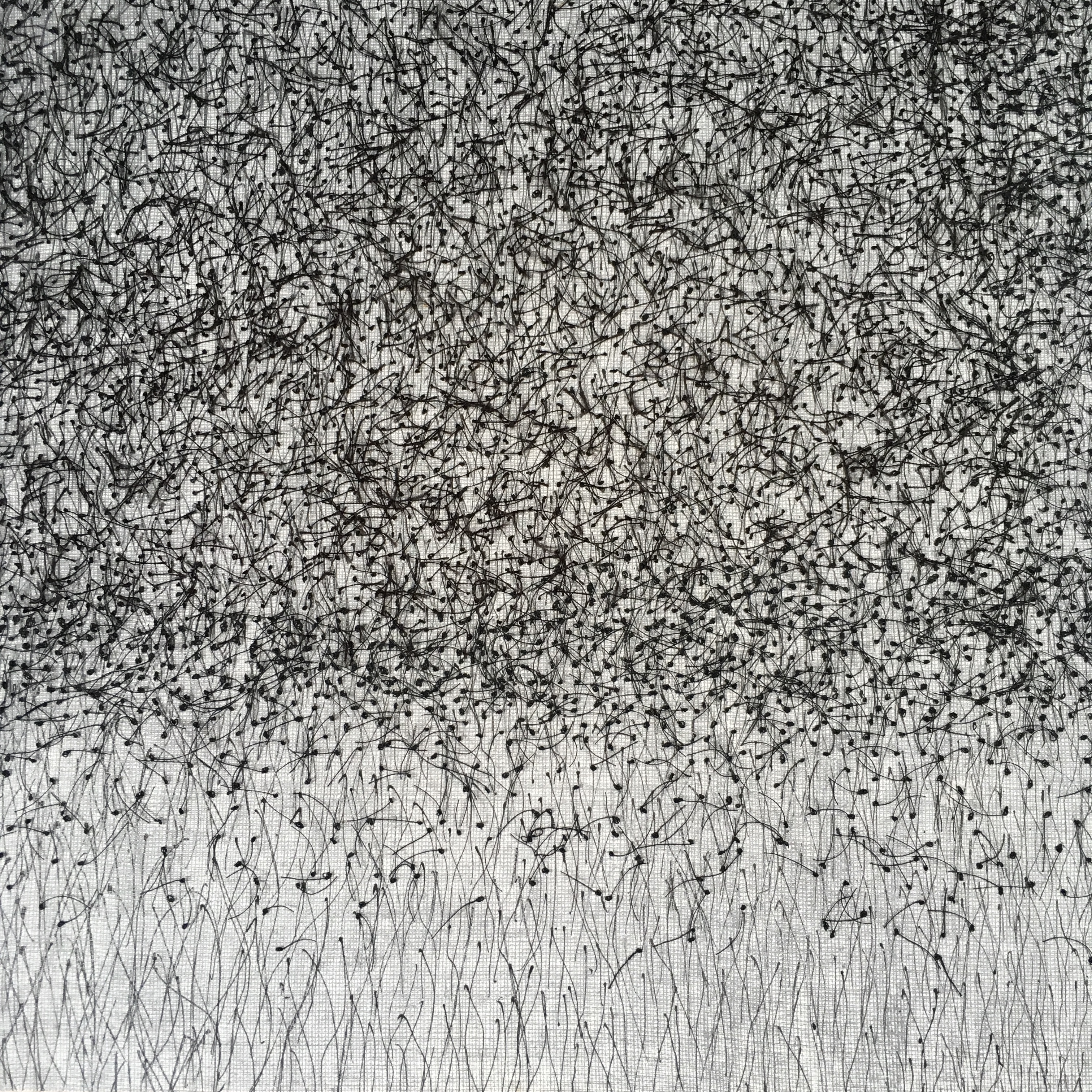
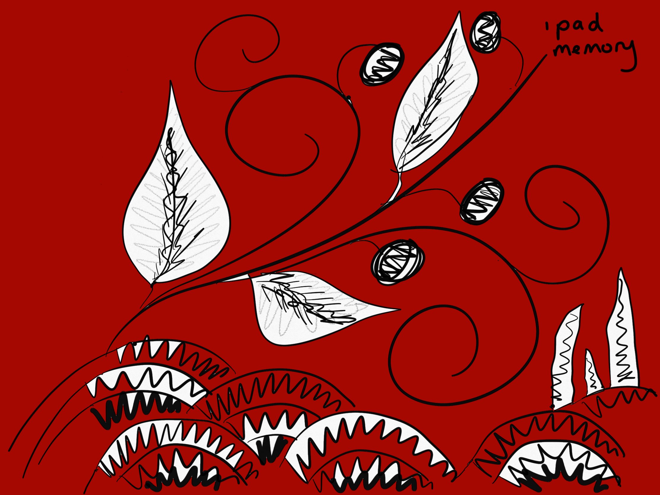
At this point I tried drawing with a different form of media, and produced a series of iPad drawings, exploring different mark making skills. Using some of my earlier drawings, the results are exciting and surprising in that they are flooded with bold colour and confident strong free flowing lines. The images are full of movement and pattern with lots of ideas for work in fabric.
Elizabeth Blackadder was born in Scotland in 1931 and apparently ‘spent a large part of her childhood alone, during which time she would collect plants and flowers, meticulously labelling them with with latin names ..’ (Artuk.org) She has also enjoyed gardening her whole life and this would explain her love of nature and why it appears in much of her work.
She travelled to France, Spain and Portugal in the 60s painting landscapes and flowers. Another influence has been the Japanese principles of Zen following trips to Japan. She has used Zen by giving importance to the empty space in her work – using simple white backgrounds, thereby allowing the viewer to concentrate on the colours and detail in her paintings.
Elizabeth Blackadder’s flowers are all painted with care and an obvious love for her subject and are almost like botanical drawings – linking back to her childhood fascination with collection and collation of plants and flowers.
According to the writer Deborah Kellaway, Elizabeth Blackadder’s favourite flowers have always been irises, poppies, lilies and orchids and she has also painted hellebores and anemones.(Artuk.org) These are all colourful showy flowers which would stand out against the white background.
I love the minute detail and the cleverly placed items, together with the beautiful colours and apparent simplicity of the compositions.
Timorous Beasties
Timorous Beasties are named after a line in a Robert Burns poem and the company was set up ion 1990 by Alistair McAuley and Paul Simmons who met while studying textile design at the Glasgow School of Art. They did not like the ‘tweeness’ of the floral prints of the time and what they strove to create was a more edgy and realistic depiction of their subject matter.
They began by drawing giant insects on pavements to make money, and now create ornamental patterns with a contemporary take on traditional patterns such as Toile de Jouy, Chinoiserie, Rococo swirls and Victorian paper cuts.
Plants and flowers feature in many of their designs as they did in 18th century patterns. Their website describes them as sharing ‘a world view where plants, animals and society are visually inextricable’. (Timorousbeasties.com)
I love the complicated pattern repeats and intensity of the designs with flowers and plants in many forms intertwined with animals and birds to create a wonderful colourful treat with something different to see every time you look. They fill me with energy and excitement.
I have ordered some samples of their wallpaper to make into notebook covers!
Jane Askey
Jane Askey has a fascination with remote islands and enjoys sketching on location, expressing being out in big open places in her paintings. (janeaskey.com)
The view from which she is painting is often elevated and will sometimes have something such as a vase of flowers in the immediate foreground, her painting of Edinburgh castle is a good example of this. Her paintings of a garden in spring has a dreamy feel with blossom on the grass and a single chair which sits among the flowers and trees.
Because she paints outside her paintings have energy to them and also a simplicity, capturing the moment in time.
I love the colour, balance, composition and atmosphere of Jane Askey’s work – it makes me feel happy, and the lightness of the painting technique is calming.
Visit to the Victoria and Albert museum
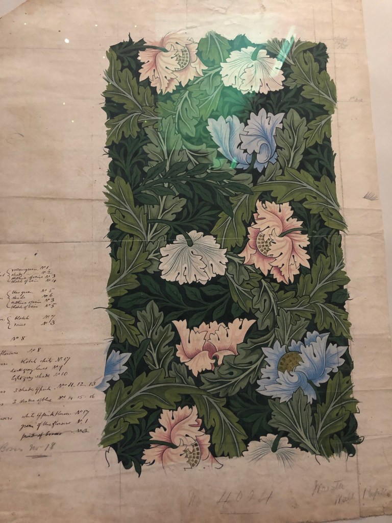
On 24th August I visited the V&A in London and went to have a look at the William Morris pieces. There weren’t many pieces to see which was disappointing, but I took a photo of one of his drawings for a repeated pattern.
Detailed notes of colours on an original William Morris drawing for a wallpaper repeat pattern.
I am intrigued by repeating patterns and I also was interested in the detailed notes of the colours used. I think this will make me try to keep detailed noted of how I achieve each mark, effect, colour, stitch and texture in my work, and what materials I have used in future.
David Hockney
I have had a look at the work of David Hockney and in particular the flowers, trees, plants and still life drawings.
I am particularly interested in the bright, bold colours that he uses. He often uses blocks of colour which may not be a true representation of what he is drawing. I feel that he finds a beauty in everything he draws, even if it is not immediately obvious. He uses many different techniques including painting, drawing, printmaking, watercolours and photography together with other media.
His way of painting lends itself to the use of iPad drawings, and I was drawn to his series of one large oil painting and 51 iPad paintings entitled ‘Arrival of spring in Woldgate East Yorkshire in 2011’.
I have discovered that David Hockney started using the ‘Brushes’ iPad and iPhone application in 2009 and has painted hundreds of pictures using this medium. I feel that he captures the essence of his subjects rather than striving for accuracy of form, perspective and colour.
Arrival of spring in Woldgate East Yorkshire in 2011′. (Thedavidhockneyfoundation.org)
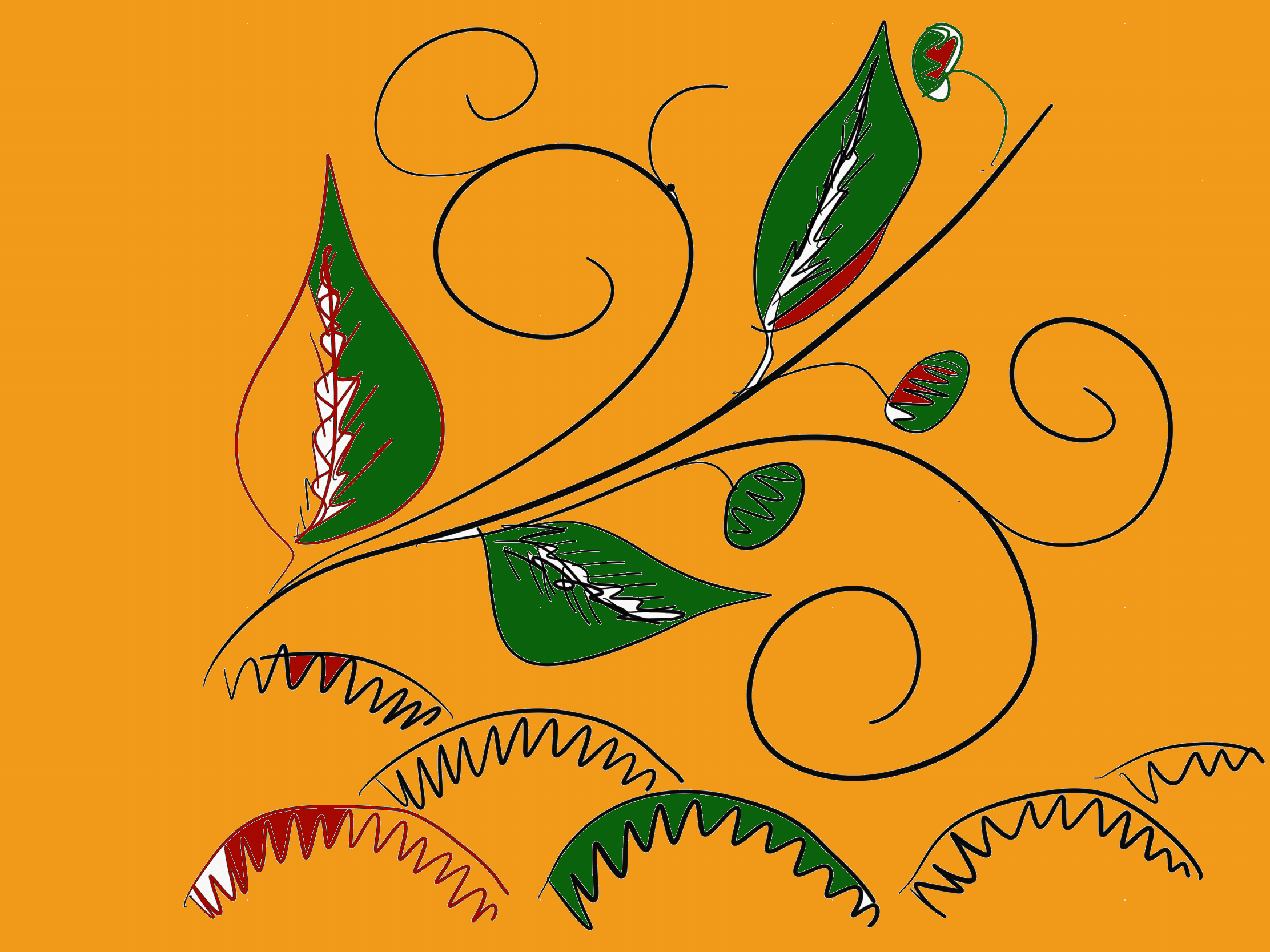
I have tried some iPad drawing based on my previous studies of archive textiles.
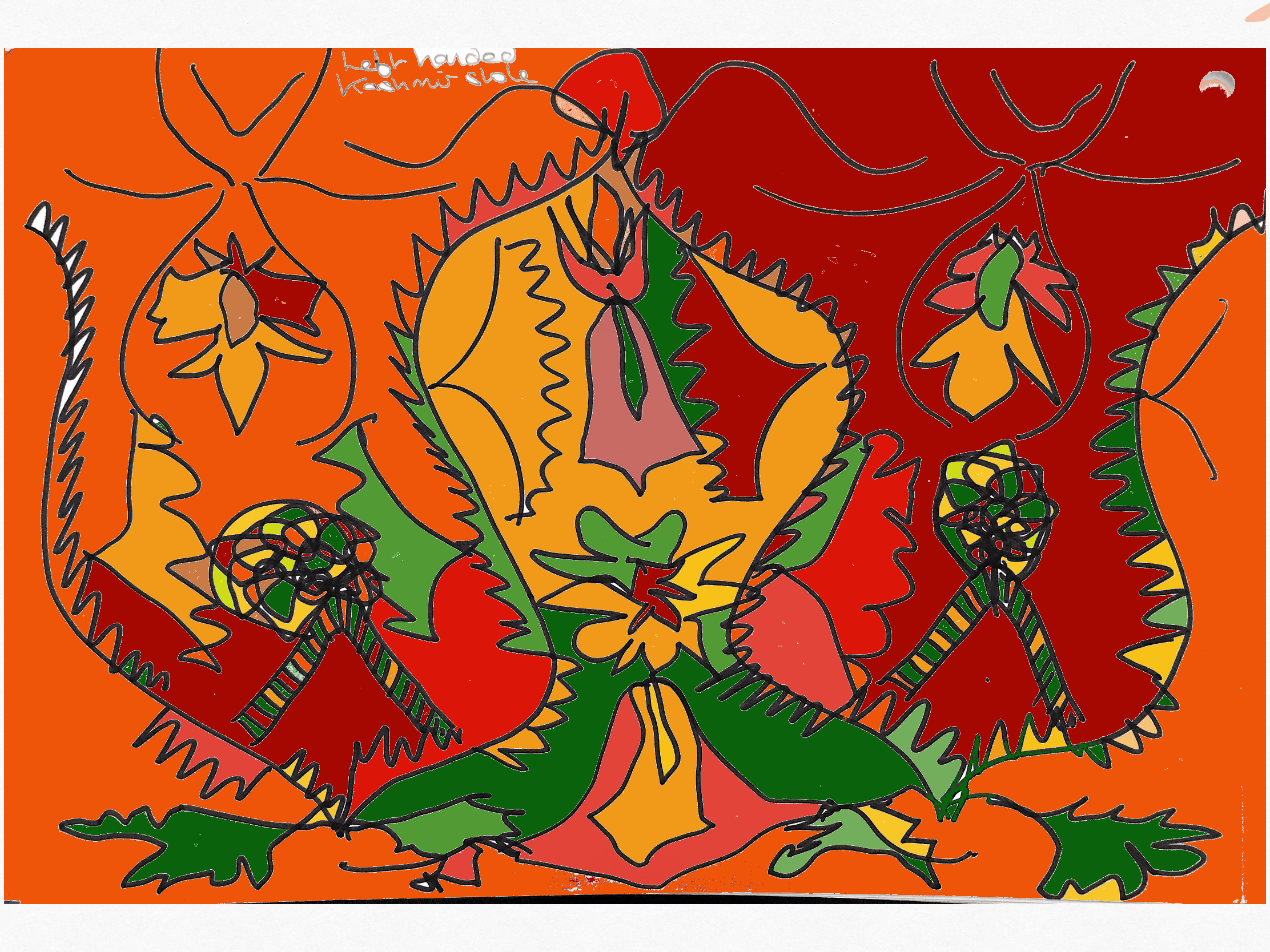
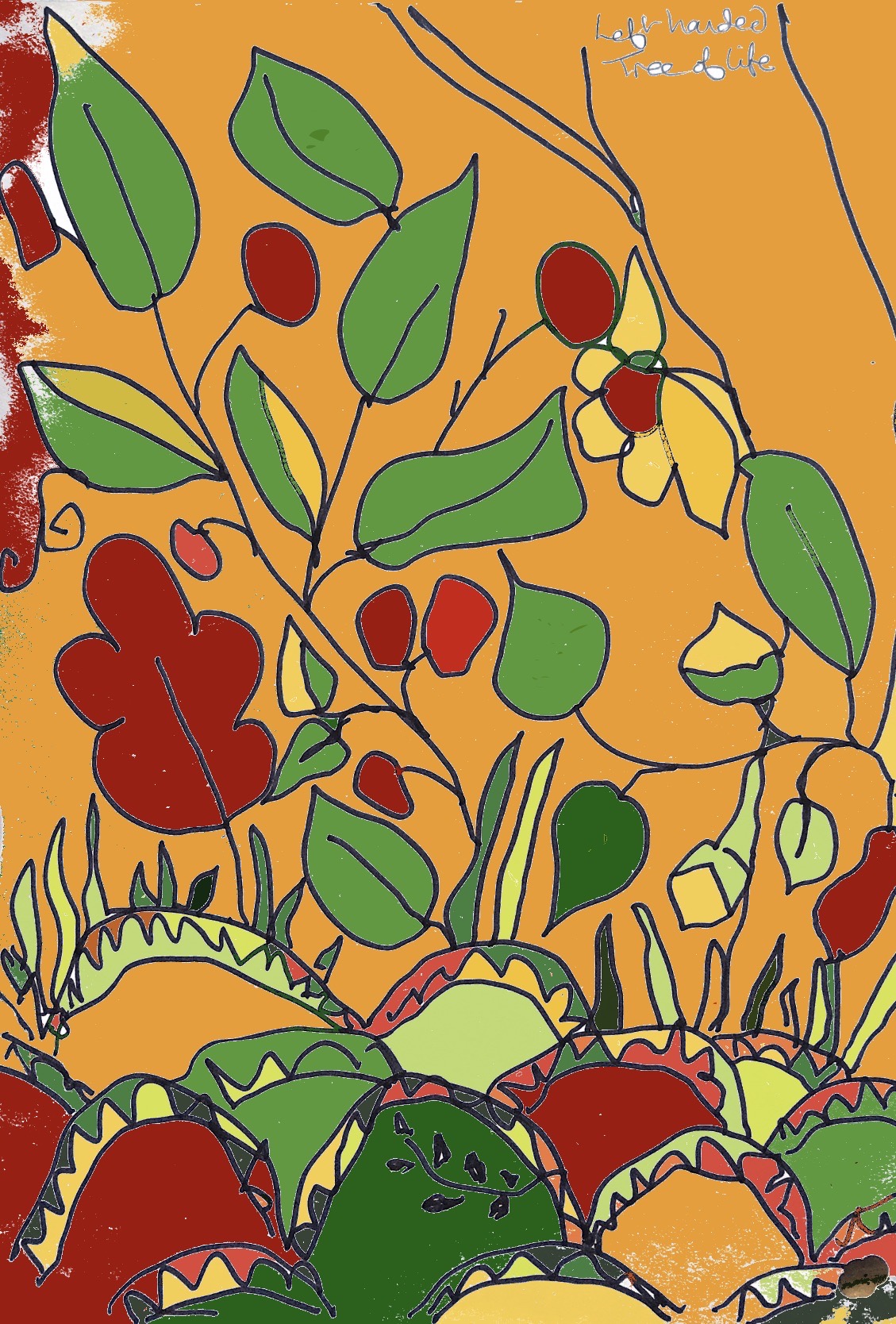
Tree of life detailTree of lifeTree of life – drawn from memory Kashmir stole – left handed drawing coloured by iPadKashmir stole – drawing with eyes closed coloured with iPad iPad drawing of weeds from Project 3 Picking and portraying
I believe drawing to be a creative process using any medium whether hand held or digital to make a mark and a 2D image.
In my mind making involves a process of arranging or joining things to make a 3d image but sometimes for instance in collage the line may be blurred.
Digital drawing and manipulation of photography are clearly relatively new but still create a unique 2D image and I think can legitimately be called ‘drawing’.
I have decided to study the work of Elizabeth Blackadder, Timorous Beasties, and Jane Askey so with this in mind I hope to try using inks, watercolour and water soluble crayons for the next project to explore colour blending, and also to try to keep in mind Wabi Sabi, – not looking for perfection. I like the idea of using different media and marks within one drawing.
I found the concept of Wabi Sabi a difficult one to put into words but I felt immediately drawn to it.
It is described as ‘the beauty of things imperfect, impermanent and incomplete’, ‘appreciating the simple, yet impermanent states of life’, ‘humble, rustic simplicity’ and ‘the way time affects deterioration’ (Savvytokyo.com’).
Having read articles, thoughts and descriptions of this way of thinking and seeing things, I would describe it as something transient, never perfect but with a beauty that isn’t obvious and may take study or thought to really appreciate. Using one’s imagination to fill in gaps or to look at how time has affected something is about accepting that there is beauty in everything.
BBC.com/travel states that in Taoism ‘since no further growth or development can take place, perfection is considered equivalent to death. While we strive to create perfect things and then struggle to preserve them, we deny their very purpose and subsequently lose the joys of change and growth’.
The more I read about Wabi Sabi the more I could see how it applies to my approach to textiles and art, nothing is better than a happy accident, and the use of an item over time gives it a story in its wear and tear that cannot be achieved intentionally. I am always drawn to the surprising patterns and contrasts of nature. One thing I have done many times is watch the sea from a ship and think to myself that however beautiful a wave is, it is there only for a moment and will never be exactly the same again. Much better to see that wave at that moment and feel pure joy than to take a perfect photograph that will never change.
I am going to try to keep the ideas i have about Wabi Sabi in mind while I review my archive textiles and the drawings I have made – to try to see the imperfections and simplicity, the asymmetry and irregularity, and how the pieces connect to things I love in my home and the world around me. I love the idea of creating something that continually changes and reinvents itself – never being finished.
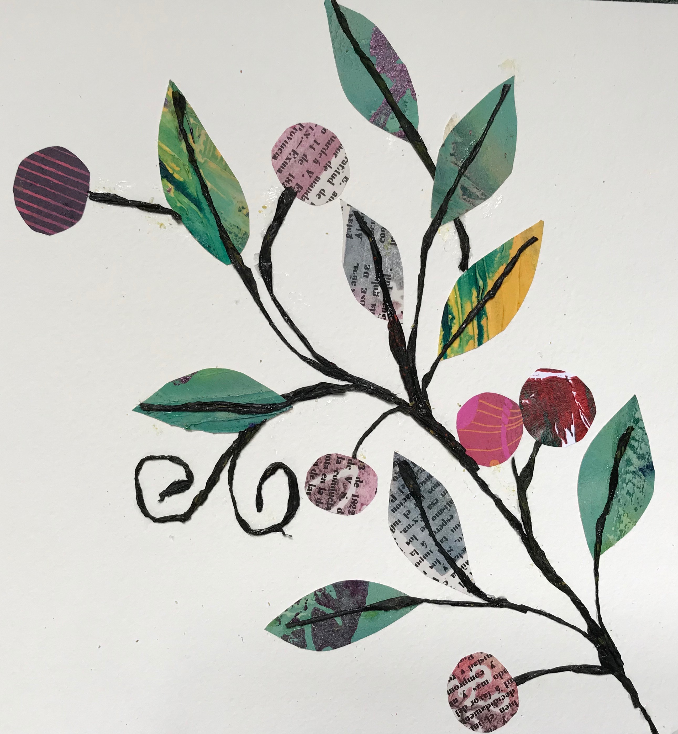
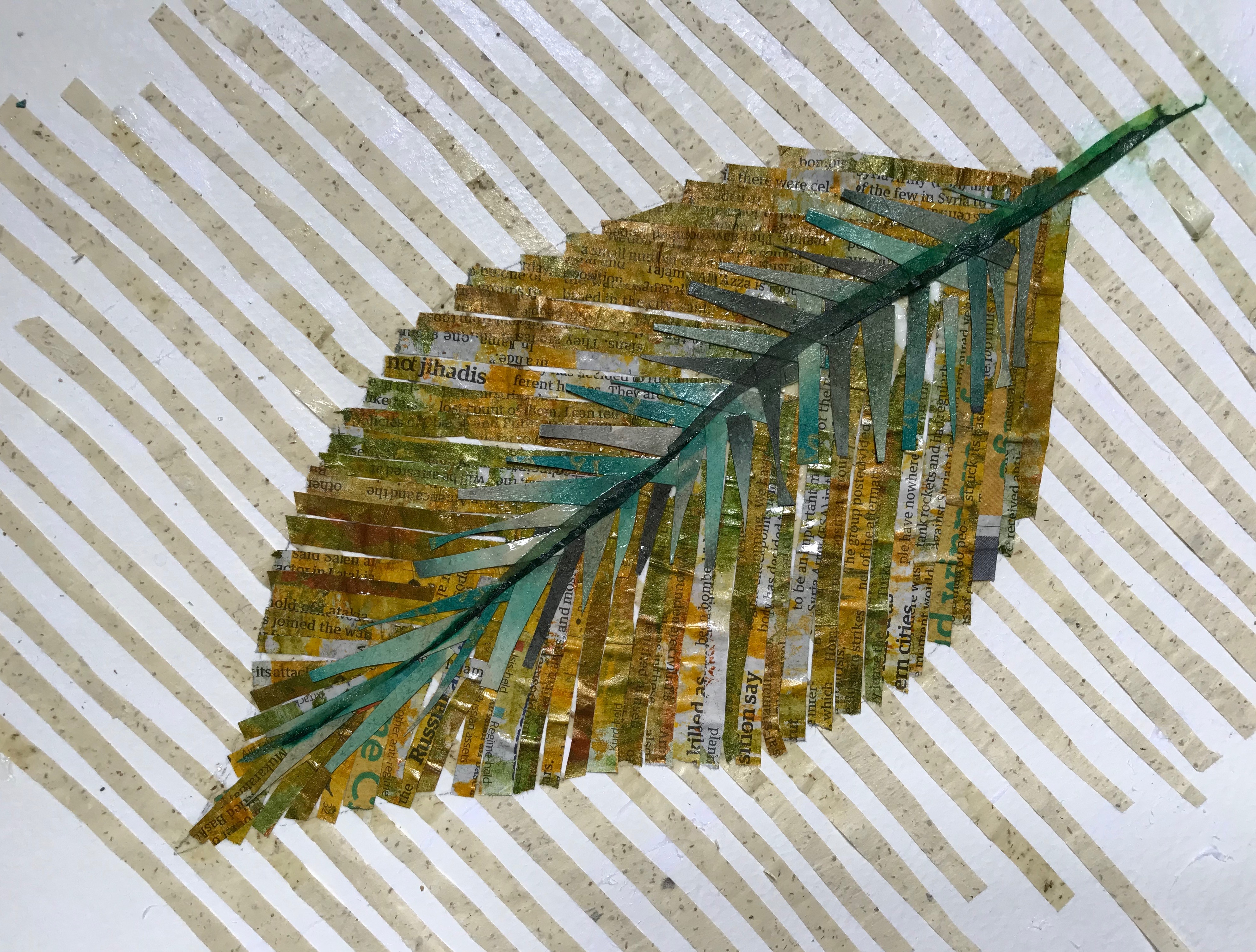
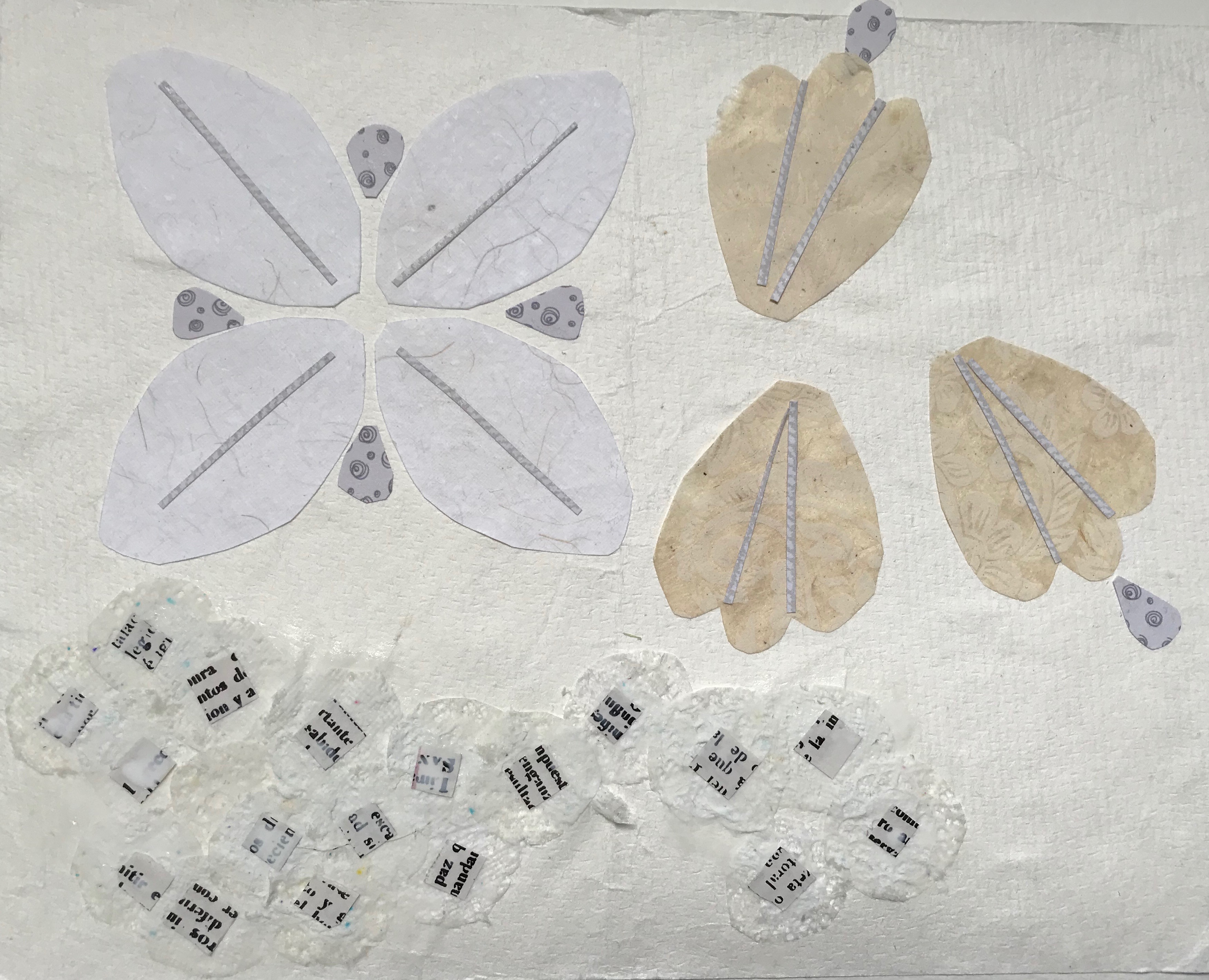
Tree of life bedspread using coloured book pages and rolled paper Tree of life bedspread – leaf – using narrow strips of coloured book pages and hand made paperWhitework collar using commercial papersTree of life – leaf using newspaper and coloured tissue on hand made paper
For the three pieces I have chosen, I have written some words and done some simple drawings to capture some of the qualities of each piece. As the pieces are in a museum I am not able to handle or rearrange them but what drew me to each of them was the decoration so I have concentrated on this.
I need to come back to this exercise and try some larger scale drawings and do more line drawings using different techniques. I know I need to move out of my comfort zone!!
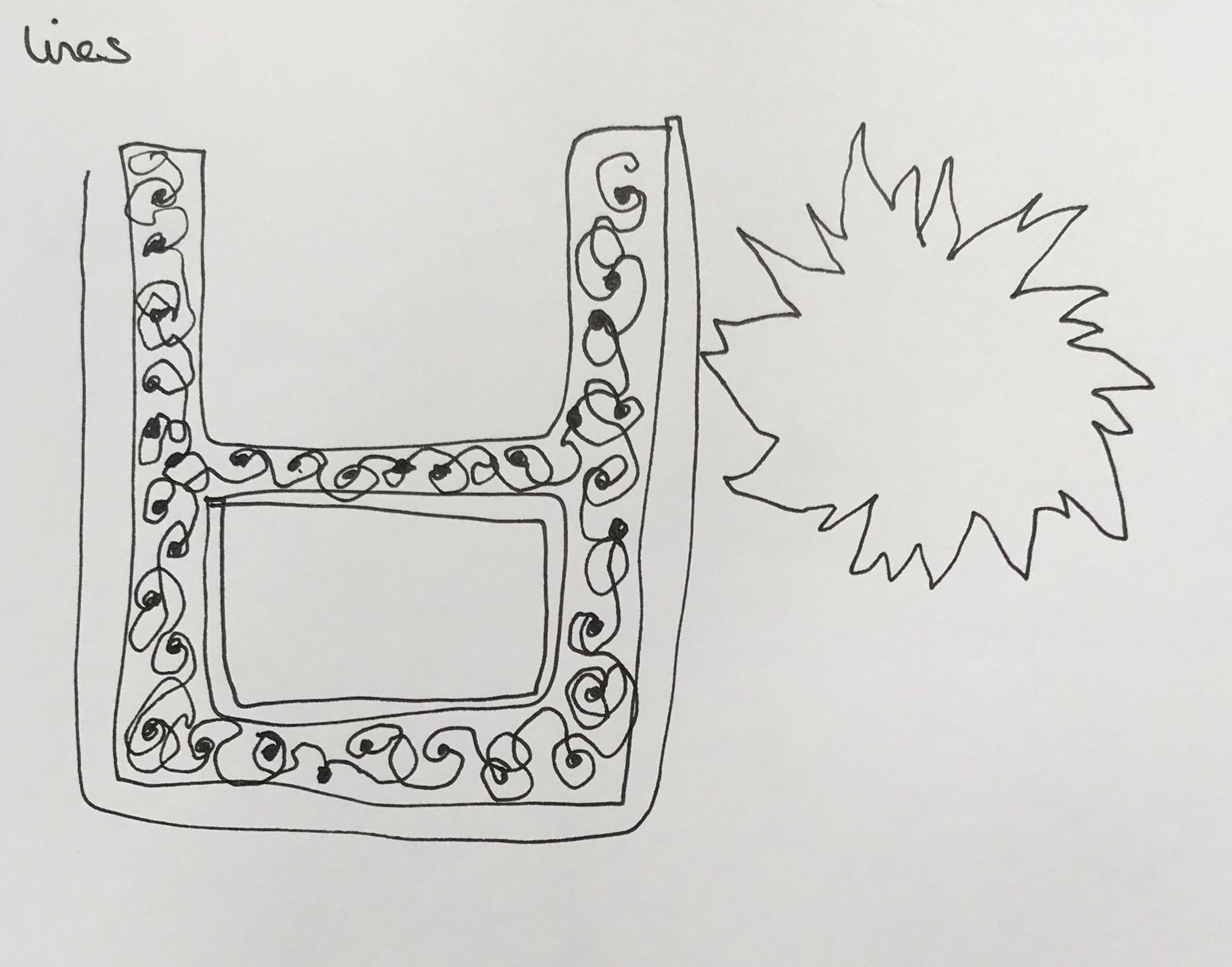
Tree of life bedspread Tree of life lines Tree of life bedspread Tree of life drawn left handed Tree of life watercolour Tree of life mark making Tree of life brushstrokes Tree of life brushstrokes suggesting stitches
Kashmir stoleKashmir stoleKashmir stole drawn with eyes closed Kashmir stole – drawn left handed Kashmir stole fringing – mark making using acrylic and piece of cardboard
Whitework collarWhitework collarWhitework – continuous line with double pen Whitework continuous lineLeft handed whitework