Embossing on paper is much easier with a piece of felt underneath. Anything softer would cause the paper to tear and on a hard surface it does not work! These marks are very tactile and create shadows on the paper.
Copy paper embossed with metal tool
Reverse side
Having made embossed marks into copy paper with a metal embossing tool, I drew the shapes – trying to echo the shadows, and made a print block. I guess the action of pressing into the foam is embossing so that is another material! The resulting prints were interesting and to add another dimension I impressed a plastic shape into the foam which worked well.
Another piece of foam with embossing made by pressing over a plastic shape made geometric prints.
Plastic divider used to emboss foam for a print block
Print
Print
Pressing copy paper over a metal coil needed a fair bit of pressure: wet paper created more intense marks, and wet hand made paper created a deep impression.
Metal coil pressed into copy paper
Wet copy paper
Wet handmade paper pressed over metal coil
Reverse side
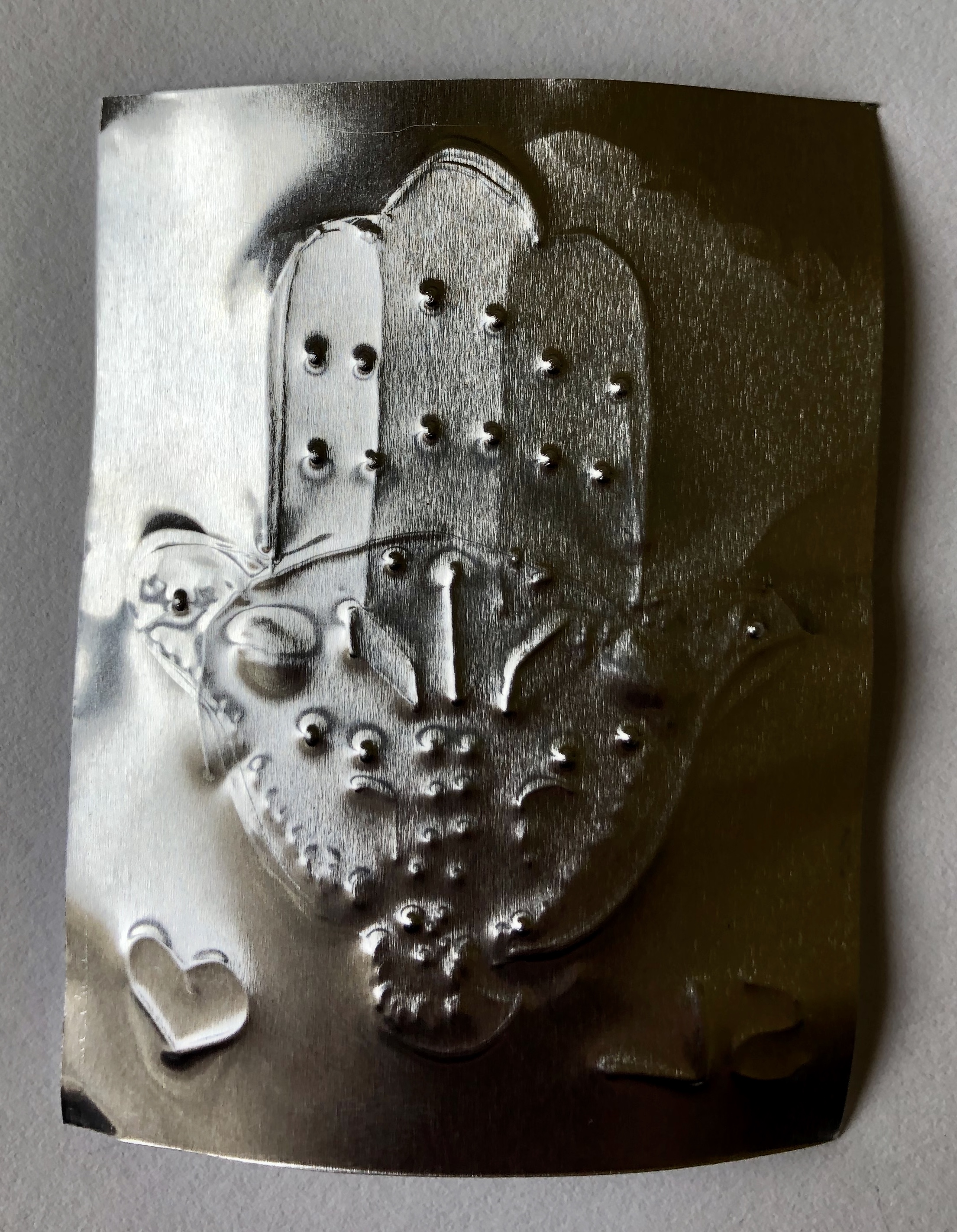
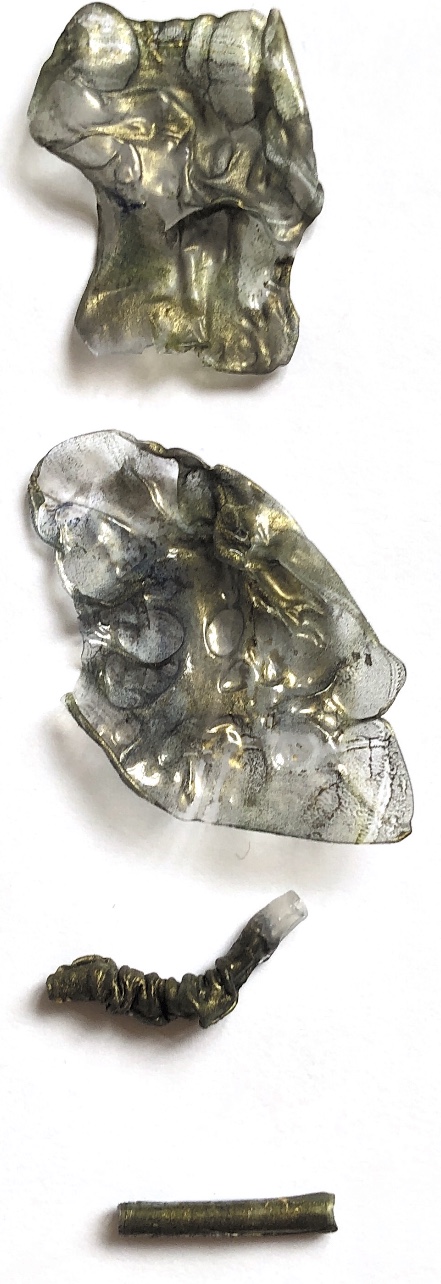
Using a plastic shape again I used paper and a metal sheet to compare results. The metal sheet result was easier to achieve with less pressure and is more interesting to observe as it catches light in many colours.
Plastic shape, copy paper
Reverse side
Metal sheet
Metal sheet reverse side
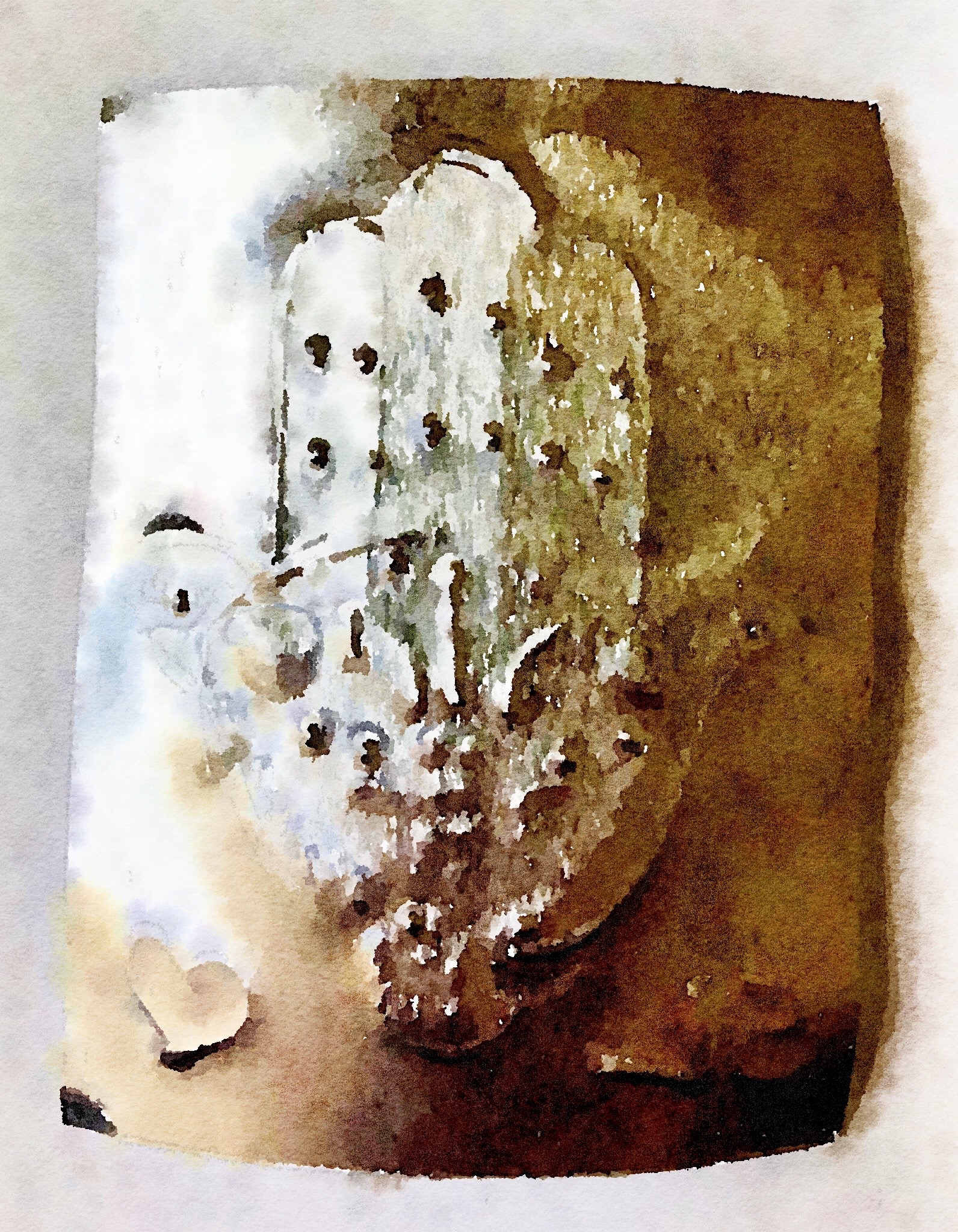
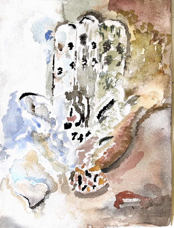
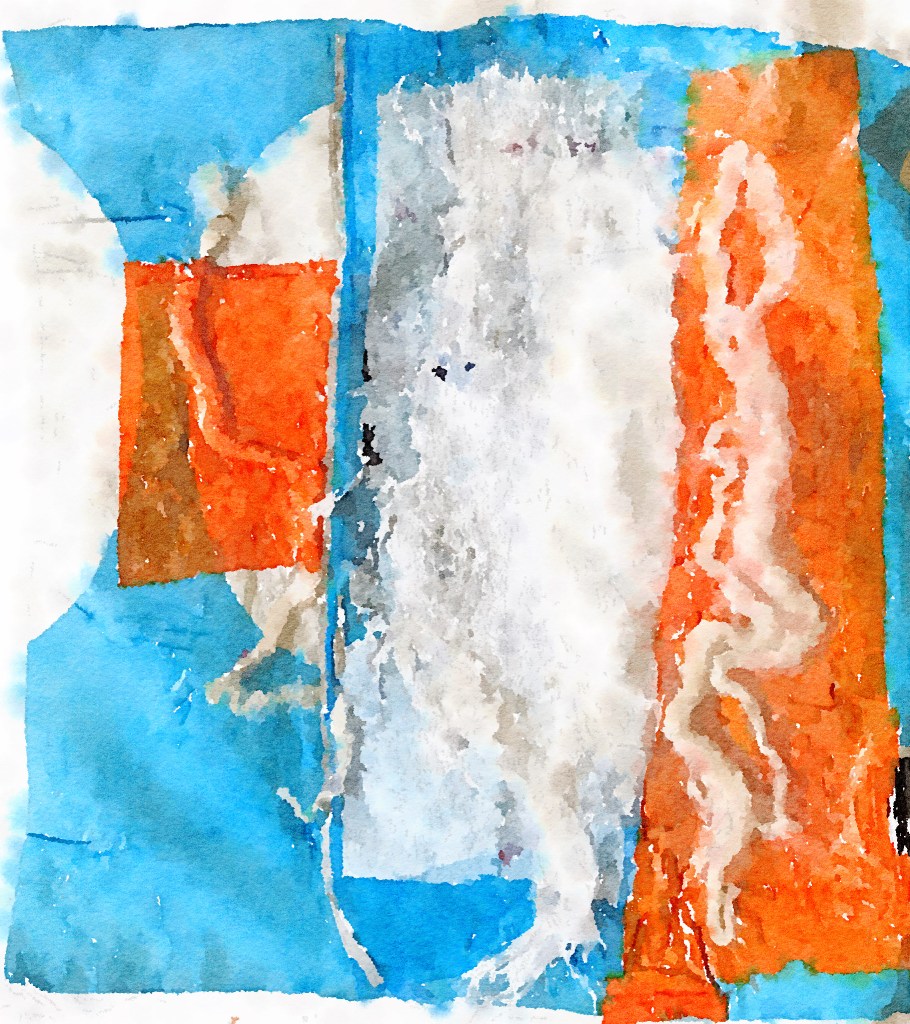
I manipulated the image of the metal sample in the ‘Waterlogue’ app and then did a watercolour painting to look at the colours and shadows..
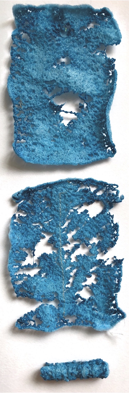
Embossing paper on beads and a wooden stamp produced less than exciting results! I also tried plastic and cardboard but this didn’t inspire me either. I guess that is what sampling is about.
Paper over beads
Paper over wooden stamp
Clear plastic
Carrier bag embossed with plastic shape
Cardboard with embossed lines made by crochet hooks
I haven’t been excited by this technique. I have found it hard to create interesting results with many of the samples.
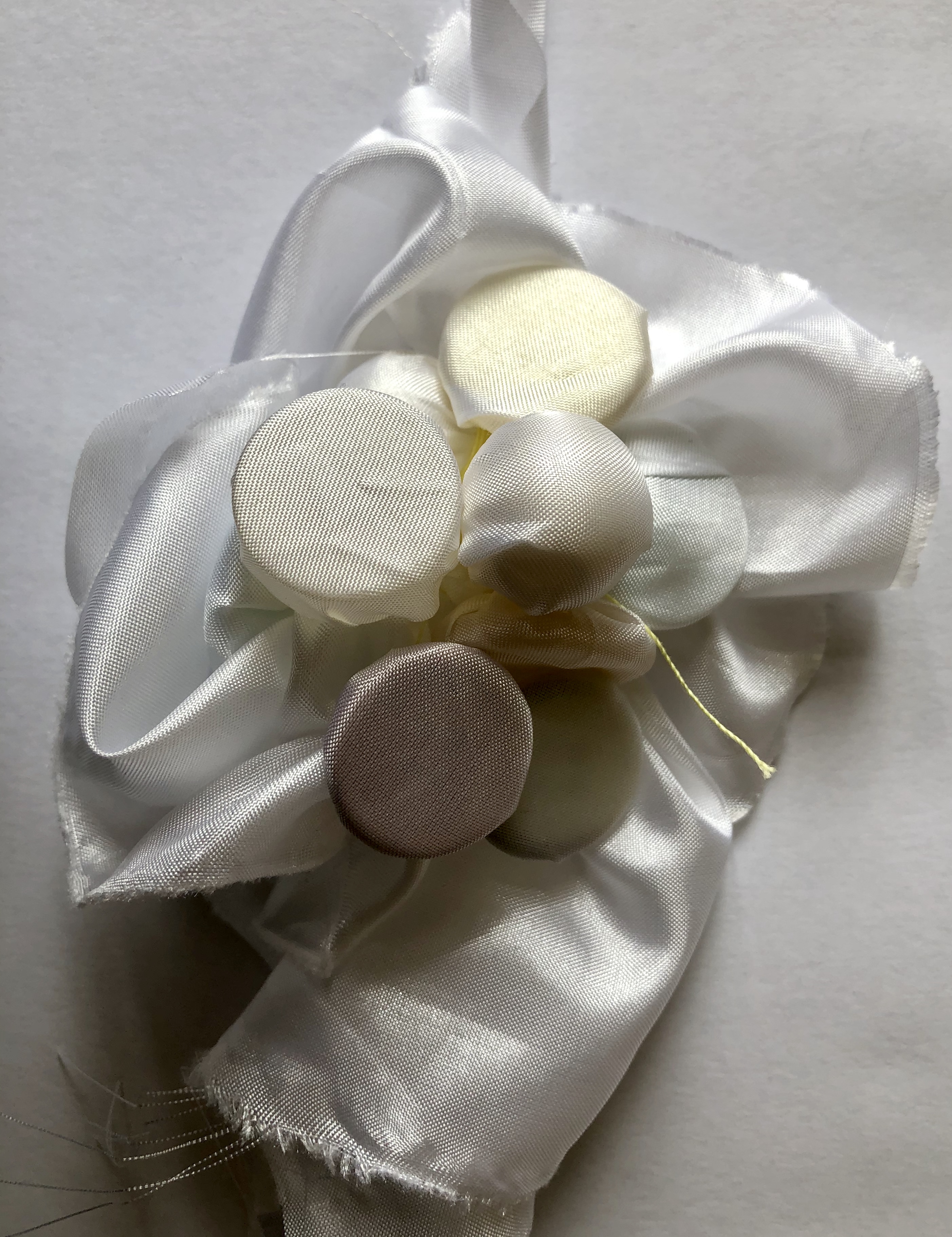
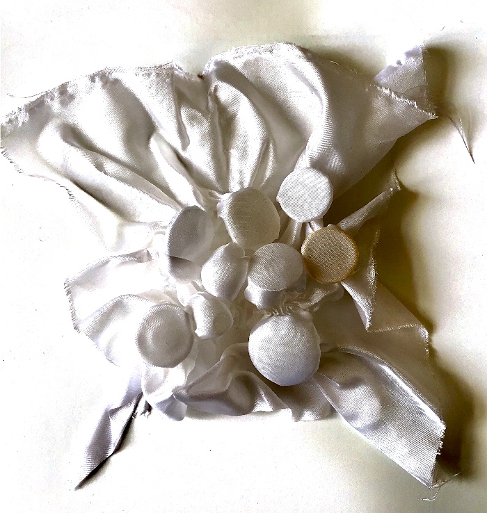
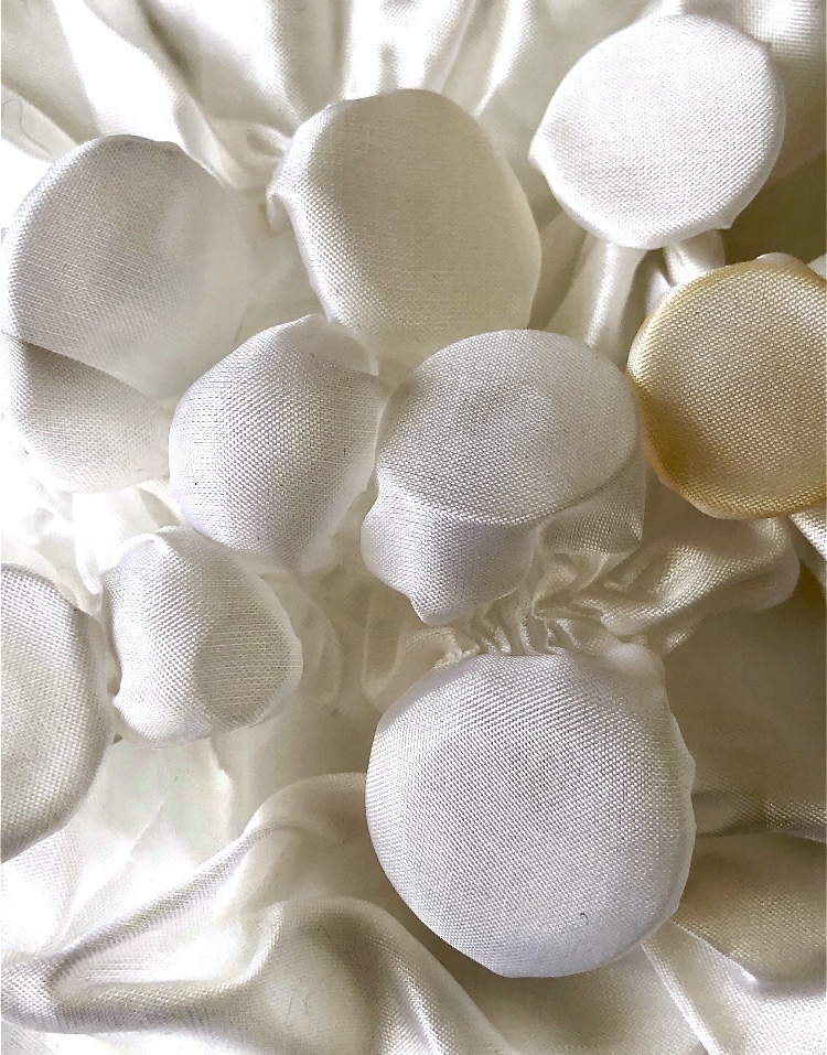
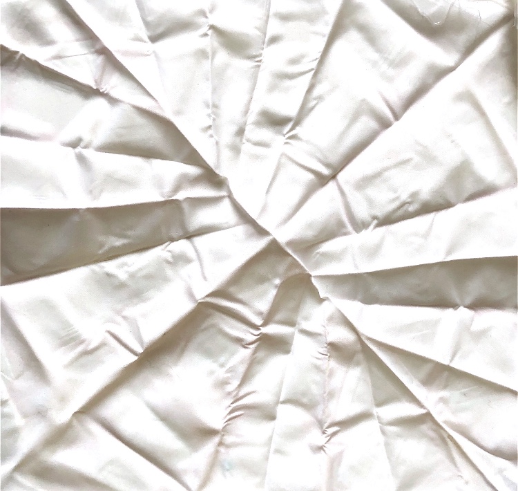
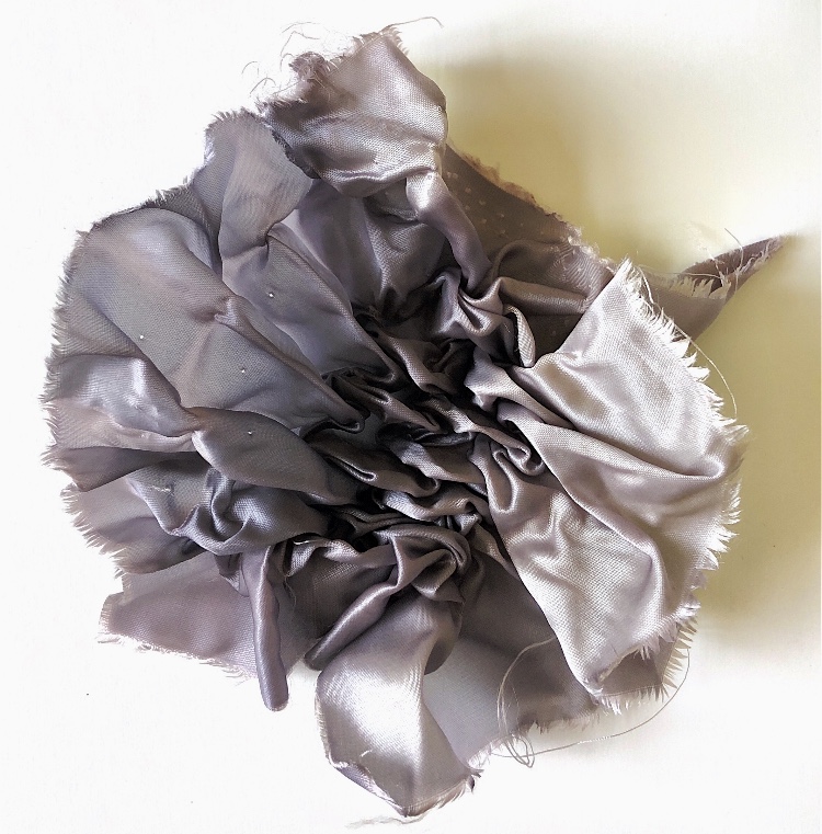
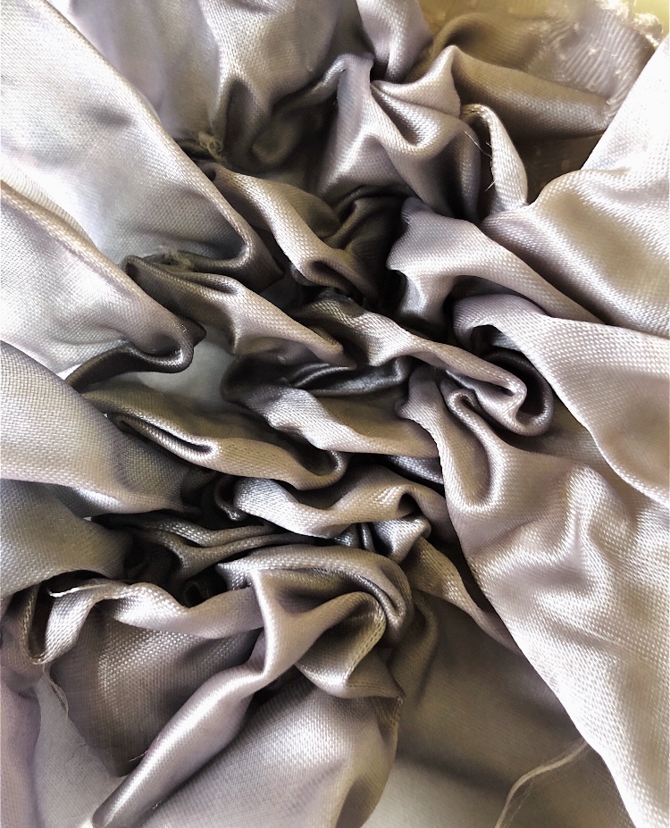
Fine white polyester satin with different buttons tied in – this worked really well and the fabric retained its shape after being boiled for 30 minutes.
Left handed drawing with artist’s pen of white polyester sample
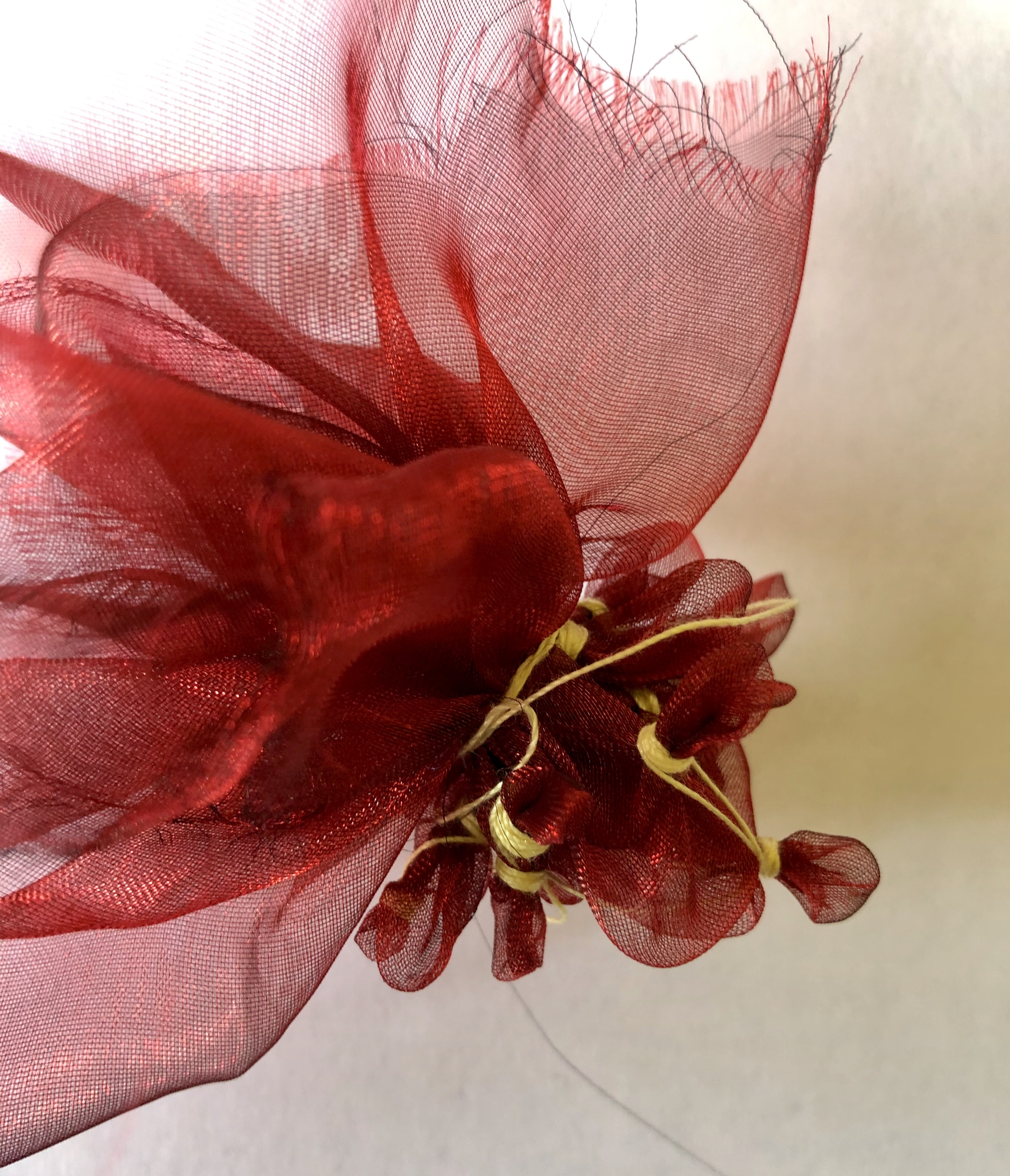
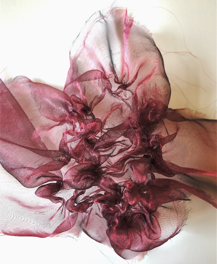
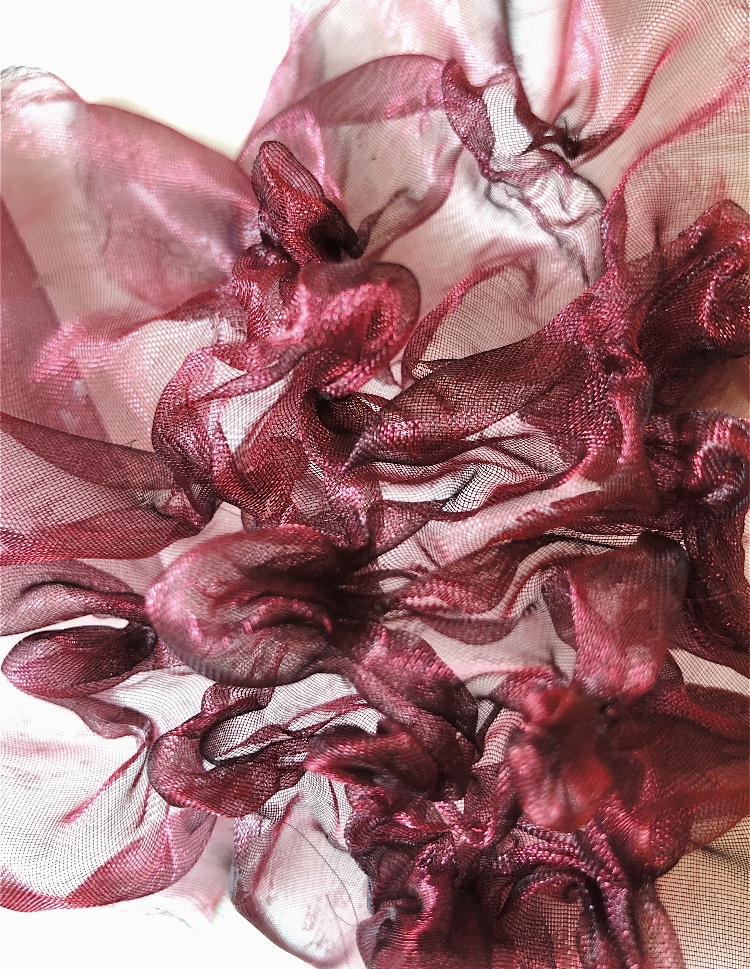
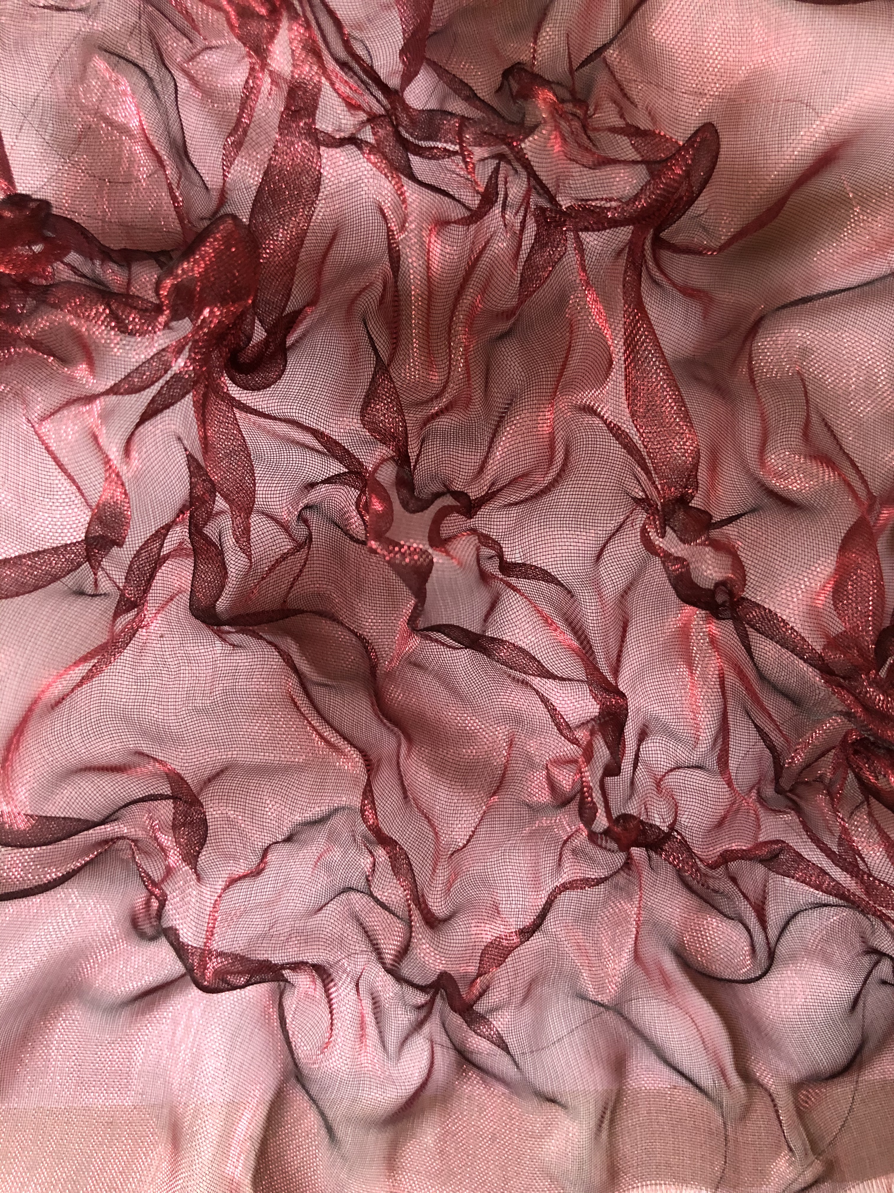
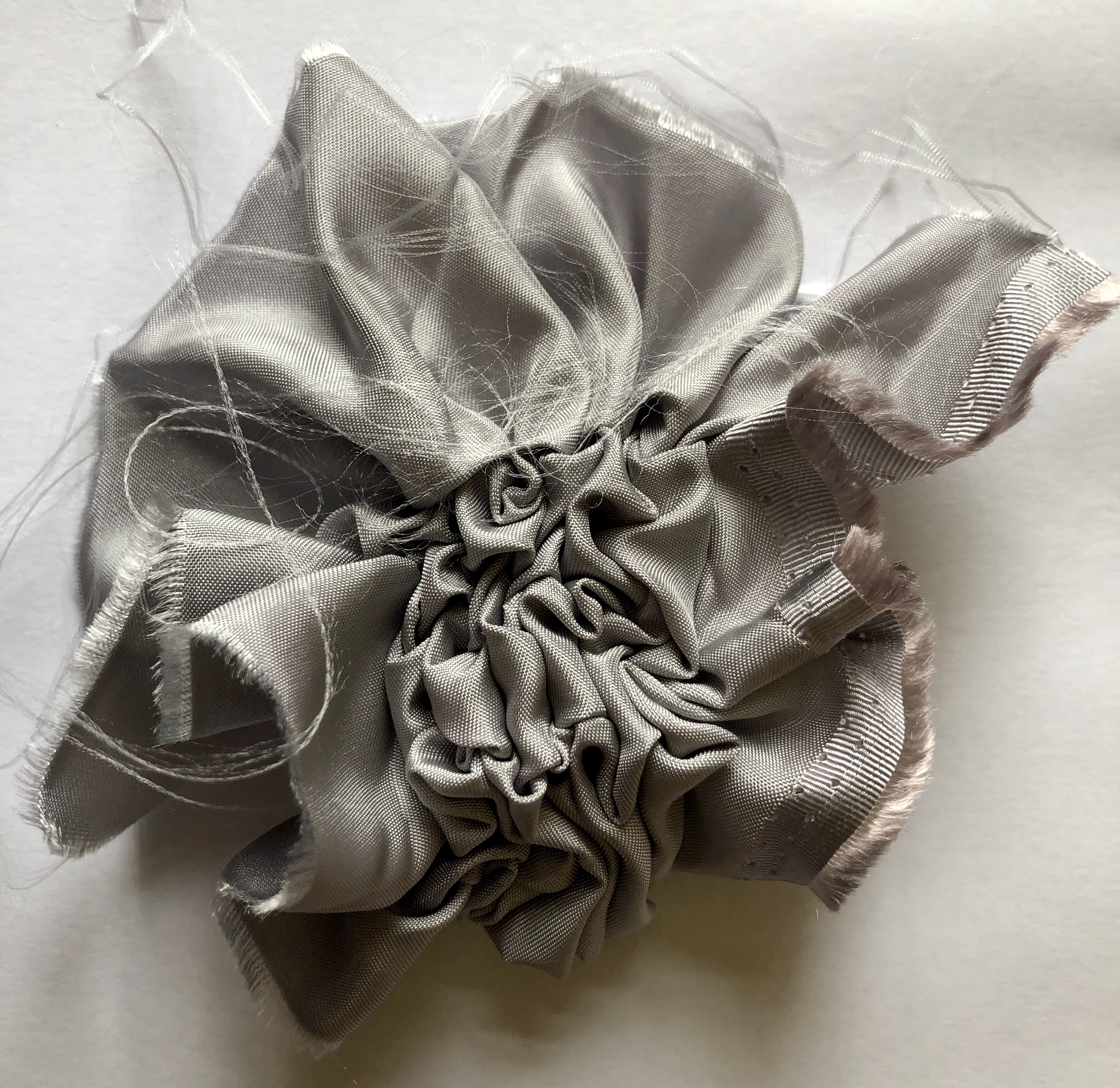
2. Next I used two tone red and black organza tied with cotton without inserts. Again this worked brilliantly and the colours of the organza are highlighted in the resulting sample. The springiness of this sample is reminiscent of the organza lingerie produced by Julie Waibel (www.julewaibel.com) who uses steam pleating to create her shapes.
Photo manipulation of organza sample using ‘Waterlogue’ app
Using crayons and watercolour I tried to capture some of the shapes and movement in this sample – I wasn’t particularly inspired by the result so I cut shapes and arranged them in a collage. The piece of paper from which I cut the shapes would make a good stencil or mask for monoprinting.
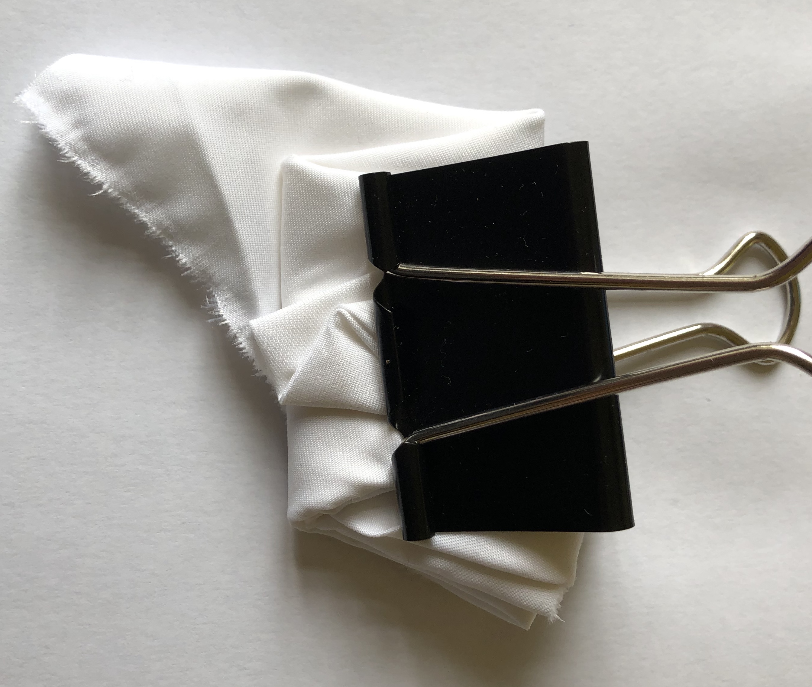
3. Folded polyester fabric produced strong pleats and folds.
4. Folded polyester fabric held with a clamp.
5. Polyester satin stitched as shown and gathered. This produced a really textured sample and it would be interesting to try different stitch patterns. Next time I will mark dots on the fabric to make the stitching easier!
Watercolour drawing of polyester satin sample
Photo manipulation of polyester satin sample using ‘Waterlogue’ app
Photo manipulation of polyester satin sample using ‘Waterlogue’ app
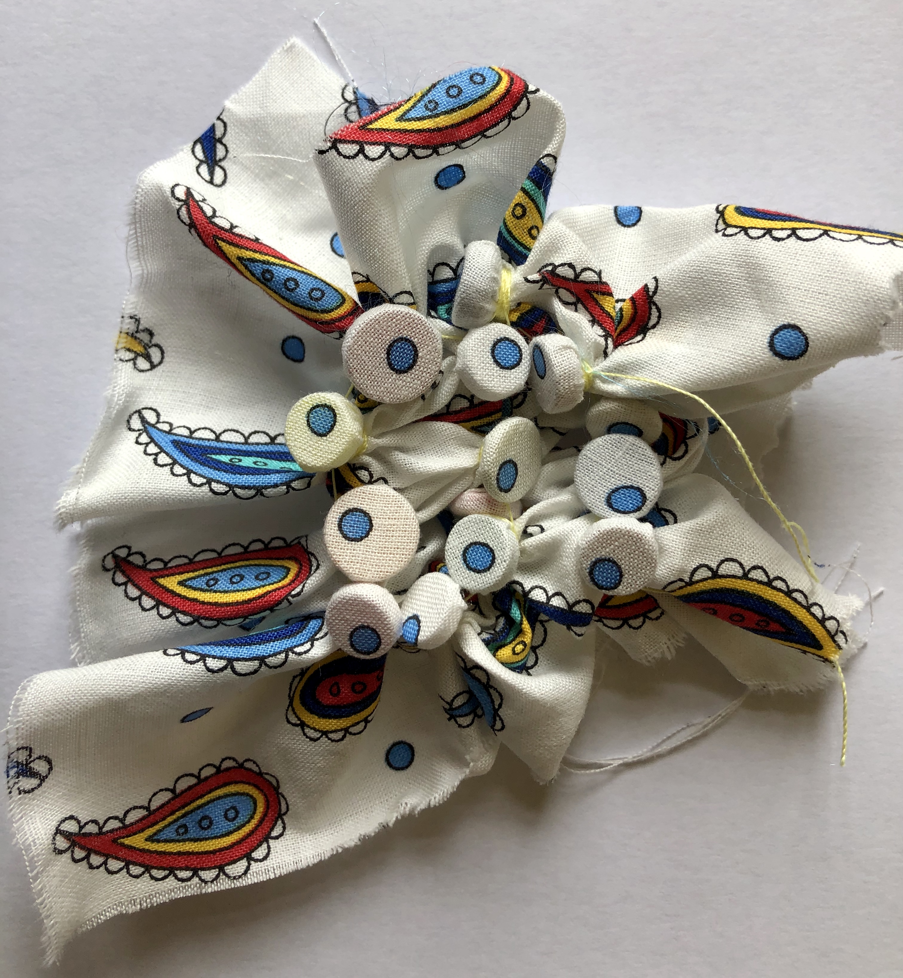
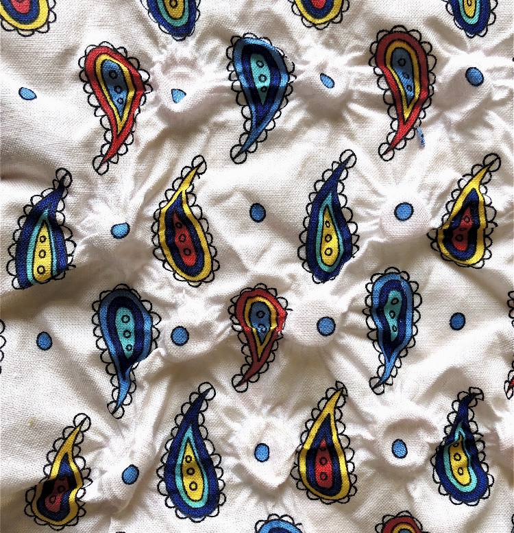
6. I tried using the pattern on this piece of polycotton and tied buttons where the dots were, but the fabric had too much natural fibre and did not hold the shape very well, – I need to find some patterned polyester to try this again as a pattern would definitely affect the end result if the shape held.
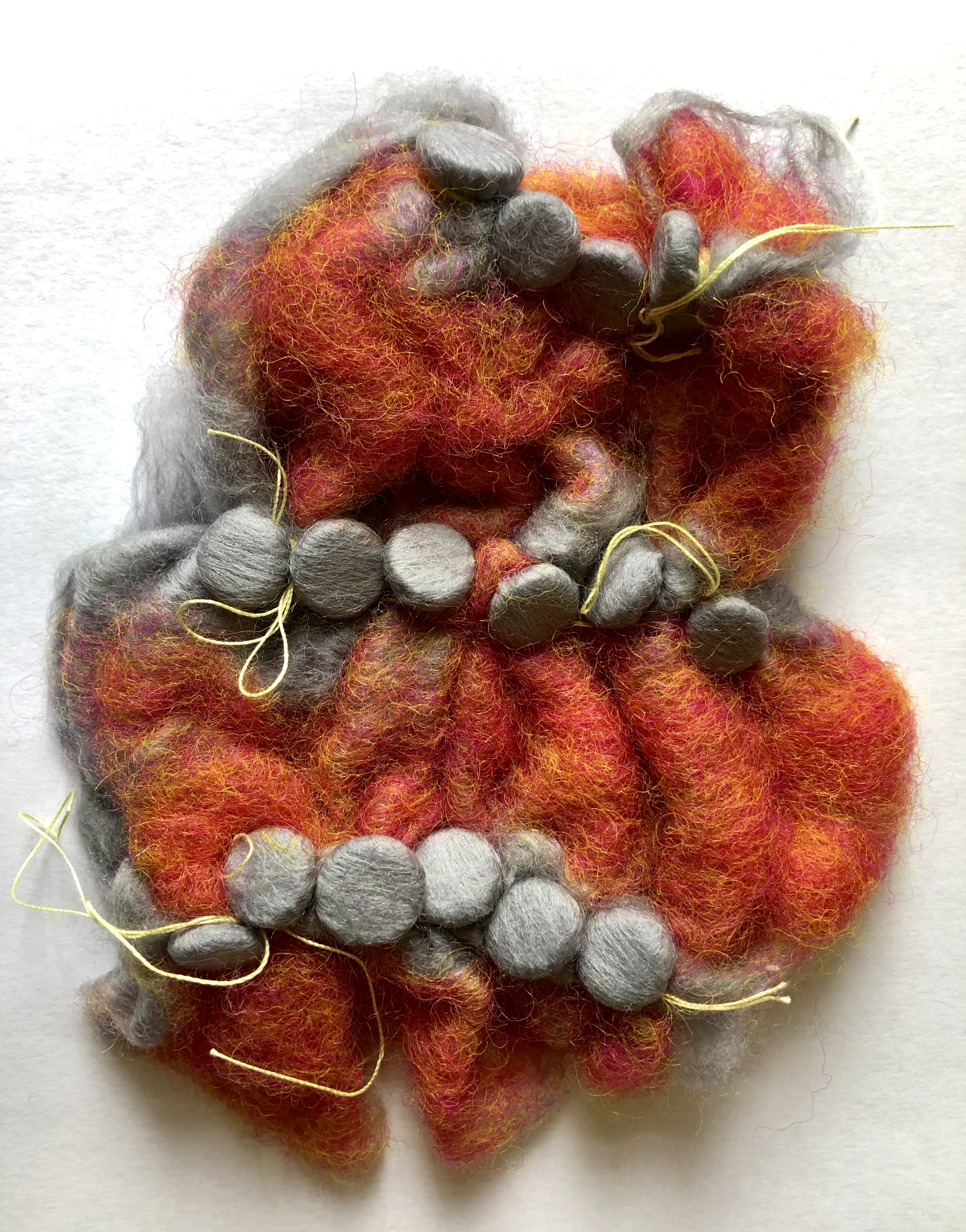
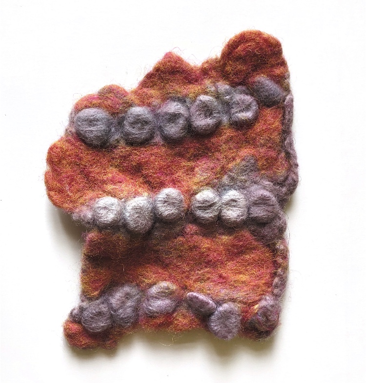
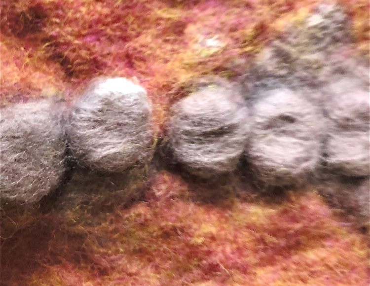
7. Hand made, wet felted prefelt with buttons tied in. This worked really well but I needed to hand felt the piece, as boiling on its own was not enough . This is an interesting organic sample which could be further embellished with stitch. I think next time I would just hand felt with hot water and soap to obtain a better result.
Inktense inks used with a foam stamp stuck to a cork
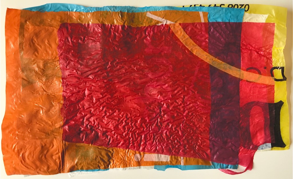
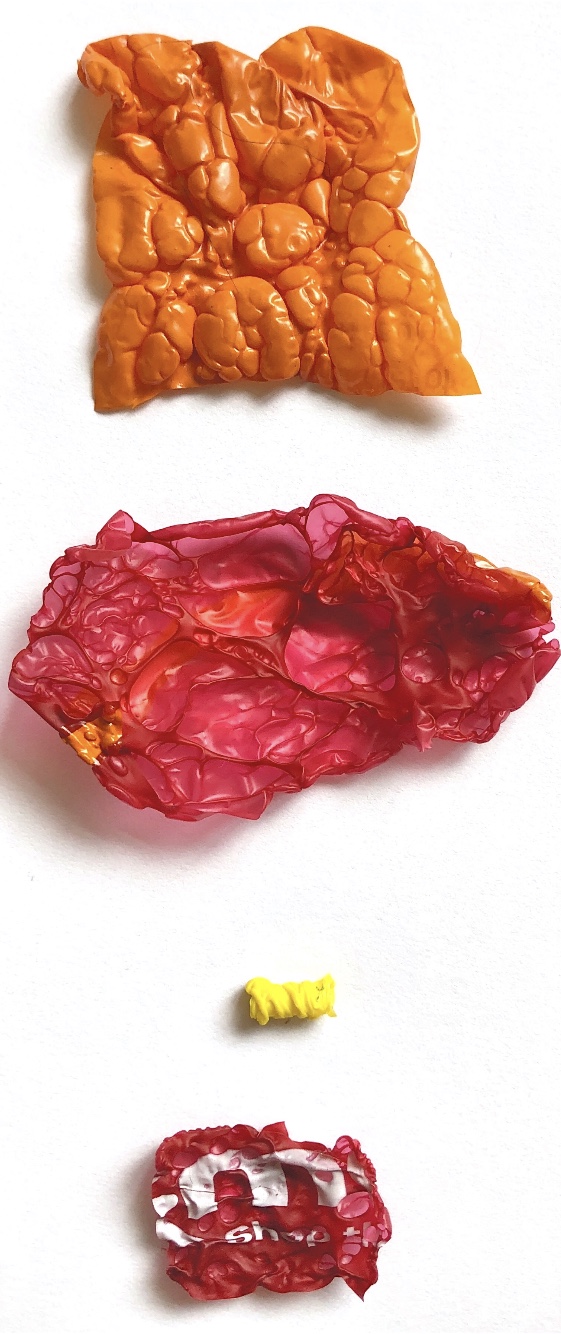
Now that we are all trying to recycle I don’t have so many plastic bags but I managed to find a few different colours and thicknesses to start my experiments. Using baking paper as a sandwich I cut and tore shapes to layer then ironed. The colours are vibrant and I also left the bar codes and writing on the pieces I used for extra pattern.
I enjoyed making prints inspired by the fused plastic and the texture of a foam print block captures the wrinkles created by heating the plastic.
Cut and layered 1
Cut and layered 2
Torn and stretched shapes
Printing inspired by Cut and layered 2
Printing inspired by Cut and stretched shapes
Moving on to trapping, some samples worked better than others. I am not so keen on the trapped card or the flower, but the trapped fabric strips which can be seen where the plastic has melted into holes could be developed further and stitched heavily to echo the patterns which can be seen through the plastic.
Corrugated card trapped
Strips with trapped fabric
Trapped fabric strip
Trapped fresh flower
Drawing of Strips with trapped fabric
Trapping and layering
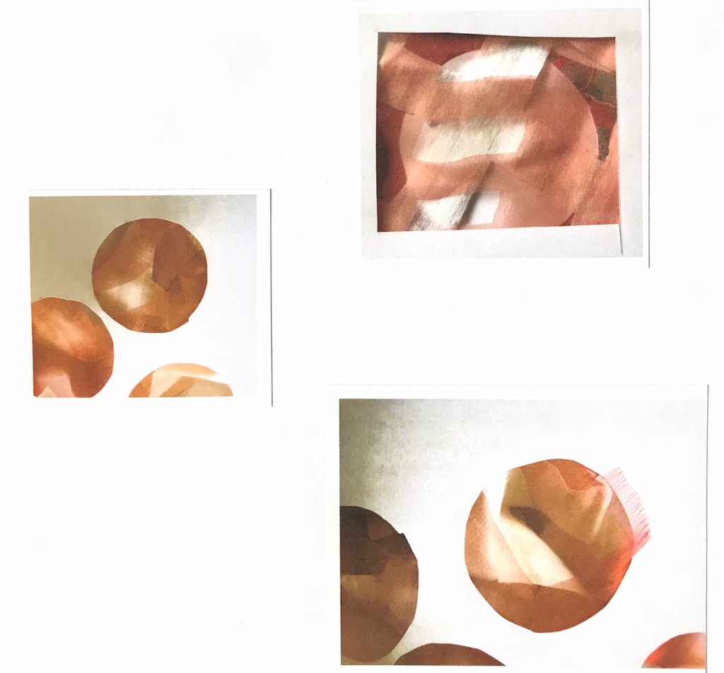
I scrunched up the plastic bags into balls with other materials (fabric, silk, paper and muslin) and then ironed them with a lot of pressure. The smaller samples remind me of jewelled brooches and I can see a lot of possibilities with this technique. I did watercolour sketches of these samples and also made more which I have stitched into – I am excited by these.
Scrunched 1
Scrunched 2
Watercolour studies of Scrunched 1
Scrunched and stitched
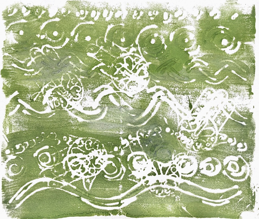
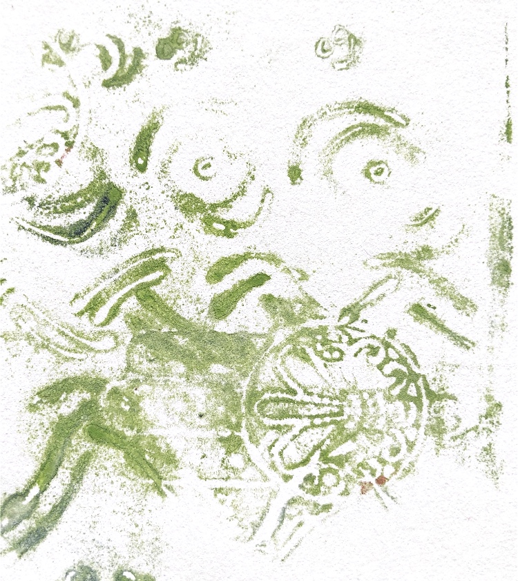
Pleating the plastic also worked well to give lines and blocks of colour. Again I felt printing was a good way to capture these shapes and I made a print block. The ghost prints made after the first print have a transparency and airiness which I feel captures the light plastic sample.
Pleated
Prints inspired by Pleated
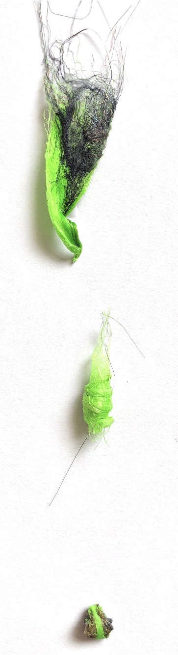
Trapped beads and sequins
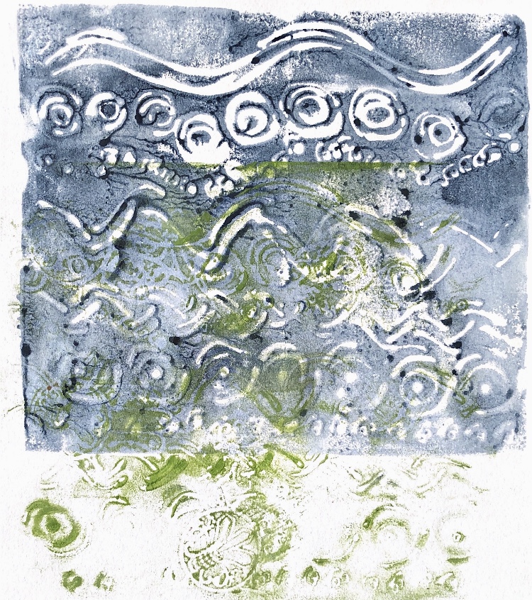
Manipulation of some of the images in the ‘Waterlogue’ app produced some interesting results.
Photos manipulated in ‘Waterlogue’ app
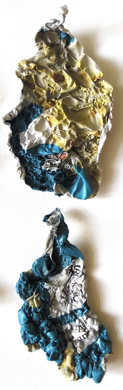
Exercise 2 Using a heat gun
Using a heat gun produced samples which were more 3D. Materials could also be manipulated into beads. I tried melting sequins but this did not work – they didn’t melt. I coloured the Tyvek and texturite plastic before heating, and on the tyvek the gold paint bubbled up to give a metallic look. The shapes are organic and very tactile – I think I may try stitching into them before I heat the materials to develop these samples further later on. The bubbles are either concave or convex depending on which side the heat is applied from.
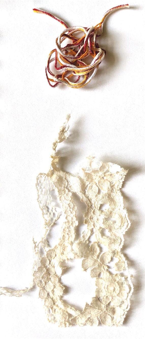
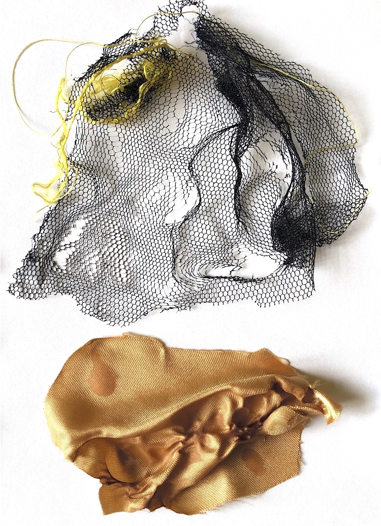
Heating tulle produced holes and distortion very quickly, and with lace the finer bits disappear first leaving the more heavily worked areas.
Samples above
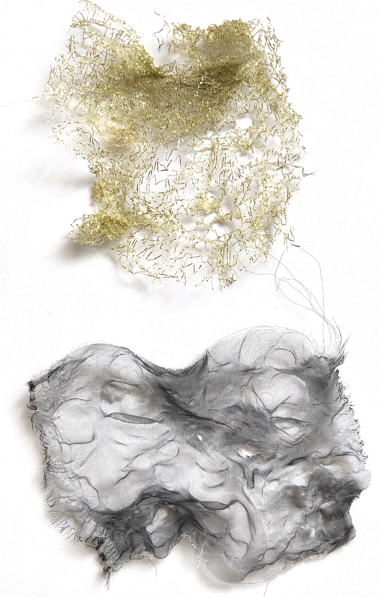
Tyvek Texturite plastic Felt
Plastic bags Metallic fabric and Organza Angelina fibre
Crisp bag Metallic cord and Lace Tulle and Polyester Satin
Sequins, beads and buttons trapped in Texturite plastic
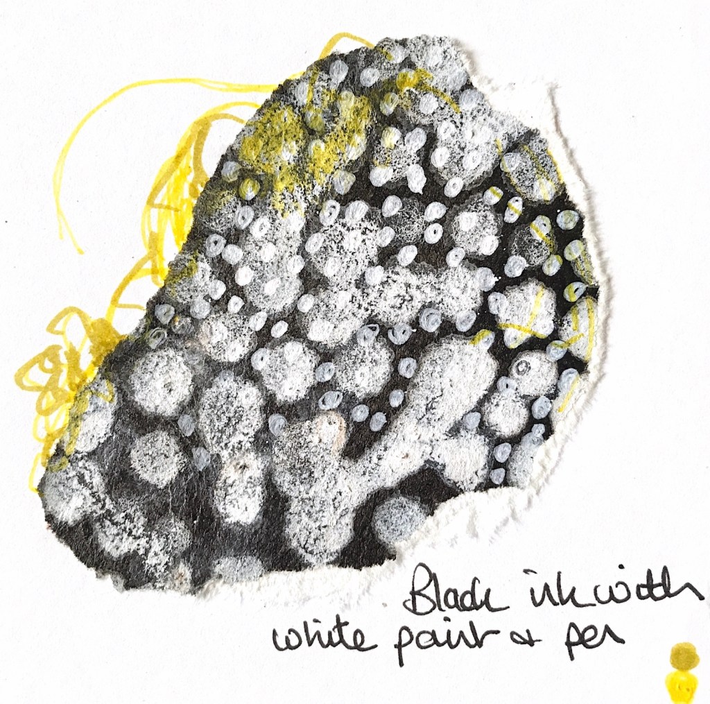
I chose to concentrate on the tulle sample and the satin sample for my drawings. The bleach pen I used didn’t really work so I need to investigate this further but the black and white drawings using ink, salt, white paint and a white pen could be developed with stitch as in one of my examples. I also like the tiny bit of yellow silk thread which had attached itself and didn’t alter with the heat.
Tulle and polyester satin heated with heat gun
Ink applied with cotton buds
Stitch idea
Drawings based on heated tulle and polyester satin
Just a few more observations – shrink plastic painted and heated (inspired by heated plastic bags), and glue used to draw and then painted over (inspired by heated metallic cord). I am particularly pleased with the drawing of the Texturite sample using PVA glue and watercolour – it captures some of the texture and translucency of the sample.
Shrink plastic
Drawing of heated metallic cord with glitter pens
Drawing of heated metallic cord with glue, glitter glue and paint
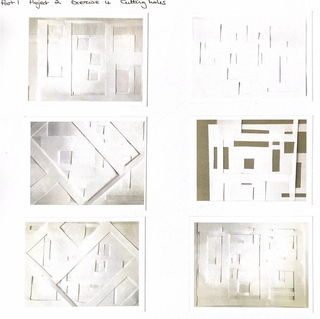
Having read through the introduction to Part 1, I decided to pick out exercises that interested me, in no particular order. I chose Exercise 4 Cutting Holes as I wanted to see what I could do with a seemingly simple technique. I chose to start with copy paper and cut rectangular holes randomly, then layered the sheets in different ways. Even with this thin paper, shadows were cast at the cut edges, and shapes and patterns emerged. I tried to emphasise the shapes and shadows in my drawings, and I think the black drawing pen worked really well.
Rectangles cut from copy paper with scissors, layered
Observational drawings
Using copy paper and circle cut outs, I bent some of the sheets into curves which distorted the shapes. I also used dotted lines in one drawing to suggest the circles in the underneath layer – these could be stitched with running stitch.
Circles cut from copy paper
Observational drawings
Printed paper and corrugated card add another dimension. I particularly like the photos taken at an angle, looking at the ends of the card and the arrangement of materials at right angles to each other. It is like looking through a window. I have added some watercolour on one drawing which I think works well to add depth.
Corrugated card, copy paper and patterned paper
Observational drawings
The next samples were achieved by holding a number of sheets of copy paper to a window. The shapes appear ghostly in the background alongside the sharp shapes of the top layer of paper. I also like the little splashes of colour where the trees outside can be seen. I used diluted watercolours to achieve the light effect.
Layers held up to the window
Observational drawing
Working with fabric and paper together produced different results – particularly as I chose two different fabrics. One was a transparent rust coloured organza, and the other was a white woven check cotton fabric. I cut holes in both and firstly layered them with white paper to look at the patterns.
Cut paper and fabric
Observational drawings
Layering the fabrics and screwing them up before taking the photograph provided movement and irregular shapes. Layering with coloured paper and corrugated card provided further interest. I combined black and white drawings with some colour. I am finding that I am more at ease with a drawing pen than with pencil, and I like to add a splash of colour here and there.
Cut fabrics layered and manipulated
Observational drawings
Exercise 6 Tearing
I chose this exercise as I felt it would be a good contrast to the precise nature of cutting. I started with coloured papers and corrugated card. Depending on which way the card is torn gives a different result, and this can be seen in the sample. I also tore a shaped mount and laid this over the torn collage to draw. This would be a good technique for designing 3D vessels with patterns as the observational drawing suggests.
Torn papers and card
Torn frame
Observational drawings
Using loosely woven muslin torn into strips adds another dimension. It doesn’t tear readily and the tearing action creates shapes, lines and holes in the fabric. Handmade paper tends to tear more easily with the grain, – torn against the grain it produces more wobbly edges. Paper also can be torn towards or away from you and this also gives different results. All of these results can be seen in the woven sample, which was really interesting to draw.
Torn papers, card and fabric, woven
Observational drawings
Next I tried tearing plastic in the form of a red carrier bag. It isn’t a material I have used before but I was really excited by the results. The plastic did tear but it also stretched and ruffled along the edges and could be manipulated to create lumps and holes which altered the transparency and colour of the plastic. I made simple samples with torn black paper, torn white muslin and the torn red plastic. I used inks, watercolour and a white pen to draw these samples and I am really pleased with them. There are lots of white lines which could be stitched to give texture over layered papers or fabric.
Torn paper, fabric and carrier bag
Observational drawings
Next I decided to combine materials and techniques to create some mini samples, and to loosen up my drawing I used my left hand. I pleated some materials and tore and tied others. They are all fairly simple but all create interesting drawings. I am pleased with the combination of black pen with a little splash of colour.
Torn materials – mini collages
Observational drawings all done with the left hand
Having done some drawing with my left (non-dominant hand) I tried drawing without looking at the pen/paper for this sample. The collage has been made with torn strips of paper and card. I really like the random nature of the drawing but I’m not sure I enhanced it by adding colour.
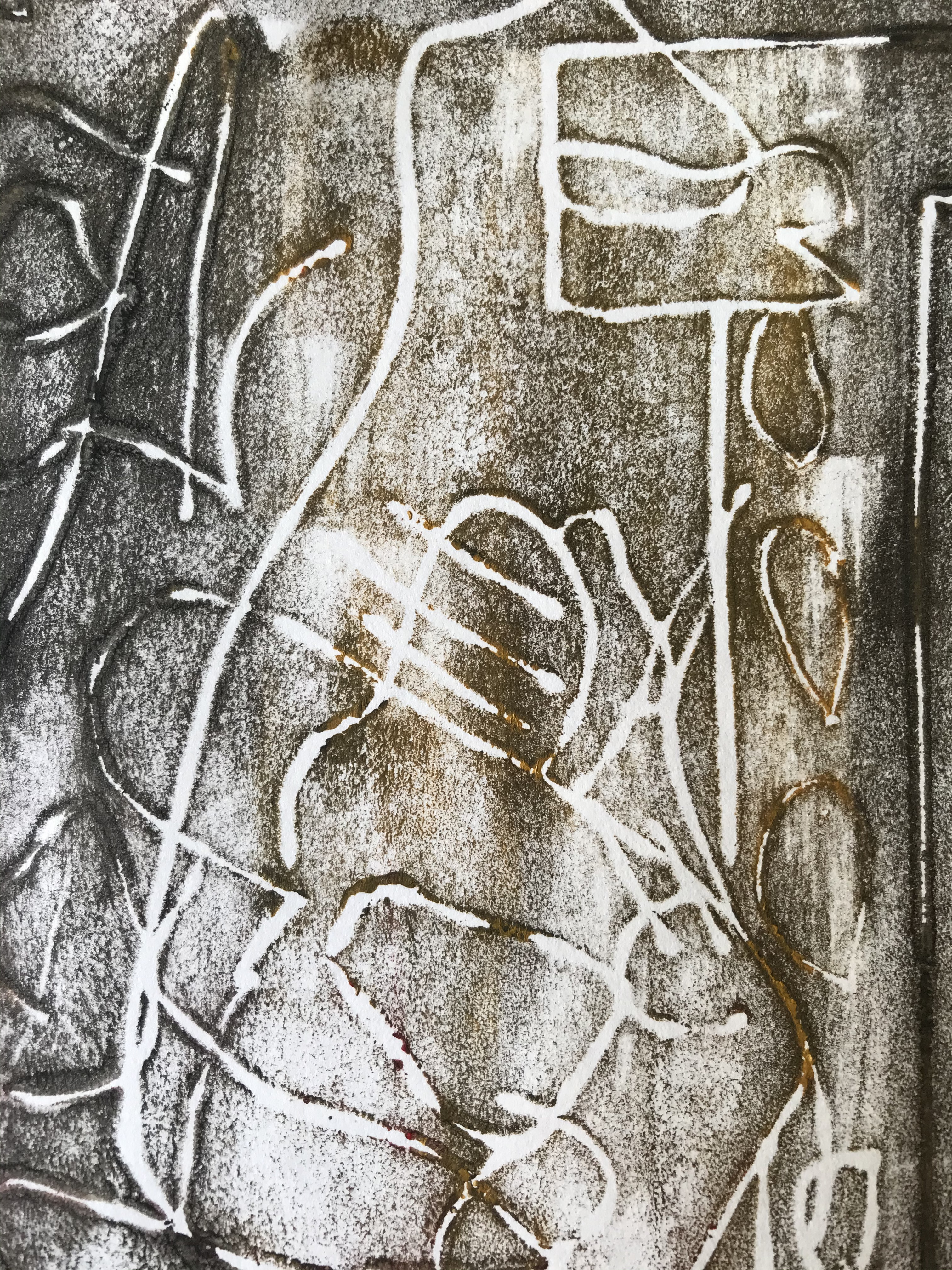
I felt I needed to use a different media to push this sample in a new direction so I made a print block from ‘Funky foam’ using the drawing as my inspiration for the lines. The resulting prints made using acrylic paint have some great shapes and lines which could inspire applique work and stitch.
Drawing without looking
Printing block based on drawing above
Prints
Prints
Drawing each of my samples has made me observe line, tone, shadows and shapes more closely. I am enjoying these exercises, and was surprised at the effects of using plastic – something I was reluctant to try at first as I thought it wouldn’t be attractive!
I am going to leave the sorting process until I have completed 10 exercises.
Artists and designers who distort a material’s surface as a form of creativity
Francisca Prieto
Fig. 1 Prieto, F. (2018) Traces of absence/Schroders. A collection of 19th and 20th century bond and share certificates from Schroders + treated brass and nickel silver. 105×165 cm each (triptych). At https://www.blankproject.co.uk/artwork/traces-absence-schroders (Accessed 01/07/2020)
This triptych is beautiful to look at with the three pieces creating one long rectangle of colour. On closer inspection it is made from numerous perfectly folded pieces of bond and share certificates and invites the viewer to look carefully at the images. These papers which are now worthless have been made into something beautiful. The folds create shadows and would look different from another angle and also in different lights.
The idea of creating perfect folds to create an abstract or figurative image intrigues me – the mix of line and shape with what could for instance be an accidental amalgamation of pieces. The use of old papers, relevant to the institution in which the piece is installed also creates a resonance which is something I would like to consider in future when choosing materials.
Fig 2 Prieto, F. (2012) Between Folds/Illuminated Ornaments Illuminated Ornaments selected from manuscripts of the Middle Ages by H. Shaw and Sir F. Madden. William Pickering: London 1833. 118×74 cm At https://www.blankproject.co.uk/artwork/between-folds-illuminated-ornaments (Accessed 01/07/2020)
I am drawn to the richness of colour in this piece, contrasting with the text. I have been to see ‘The Book of Kells’ in Dublin and was particularly drawn to the decoration, delicacy and colours of the illuminated letters. It is interesting to see how Pietro has taken inspiration from this type of decoration to create something so different and yet so reminiscent. The papers are perfectly folded to reveal what the artist wants the viewer to see and arranged to create a large letter ‘I’. From a distance the piece looks like a page with the rich pattern and colour of the initial letter contrasting with the rectangular arrangement of the text pieces alongside. Again this piece would change depending on the angle from which it is viewed and the light source. This piece excites me to learn more about folding – I enjoy maths and puzzle solving and am intrigued by the idea of combining this with design and colour in my own way. I could look at this piece all day every day and find something different to see.
Paul Jackson
Organic-01
Organic-06
Organic-12
Fig 3 Jackson, P. (1990s onwards) Organic series Begun in the mid 1990’s, the Organic pieces are made from one folded, uncut sheet, usually without glue. The surfaces are made with dry pastel and a sealant. They are usually 15-25cm in the longest dimension. At https://www.origami-artist.com/artwork/organic/ (Accessed 01/07/2020)
I am amazed that these pieces are made from one sheet of paper because they truly are organic in appearance – they make me want to hold them and feel every crease and curve. The fact that straight folds can create circles and undulating shapes is exciting, and the subtle colouring enhances each fold. I am not sure that I could achieve anything like these pieces but I have ordered Jackson’s book for further instruction. I can see that experiments with different materials could be inspired by the shapes and colours of these shapes and that the scale could be played with.
One-crease-01
One-crease-08
Fig 4 Jackson, P. (1984) One crease series The red and white pieces are made from wet-folded 400gsm watercolour paper. The yellow pieces are 80gsm copy paper. At https://www.origami-artist.com/artwork/one-crease/ (Accessed 01/07/2020)
The beauty of these pieces I think is their simplicity. In particular the shape of the red and white piece shows off the way in which the paper is shaded red to white and back to red again. The shadows made by the creases in both pieces create movement and interest. Also the back of the paper is as important as the front. I think it would be interesting to pursue this idea of simple folding with fabric pieces – maybe when photographing a flat piece of work.
I have now bought the Paul Jackson book ‘Folding techniques for designers from sheet to form’ and am very excited to use it to help with my sampling.
Goran Konjevod
Simple bowl
Fig 5 Konjevod, G. (date unknown) Pleat tessellations: folding copperSimple Bowl 36 gauge copper sheet 36 x 36 inches
Konjevod works with paper, metal mesh (including copper) and some cloth. I wanted to focus on a different medium so I have chosen to look at his works in copper. Many of these start with a square yard of copper sheet. The copper can be manipulated into many forms as it holds its shape well and the resulting forms are opulent and full of texture. The shine of the metal catches the light and colour of its surroundings. I am interested to see if I could incorporate stitch onto the metal before or after it is folded – this would be possible with a fine sheet or mesh and would change the end result. Also maybe other materials could be stitched on that wouldn’t normally hold their shape.
Jule Waibel
Unfolded rug
Fig 9 Waibel, J. (Date unknown) Unfolded rug Made with woollen felt
Jule Waibel works with a range of materials and one of the interesting things about her work is that it unfolds and refolds with use such as the vases that unfold as they are filled with water, the lingerie that changes shape when worn, and the cushions that retain their creases when the folded velvet is made into cushion covers. She uses heat setting with moulds to set the pleats and folds in her materials. These pieces excite me because they are so tactile and ever-changing – some such as her fashion pieces seem to literally breathe with the wearer. I am inspired to try the heat setting exercises in part 1 and also to work with wet felting to create shapes that stay in place when the wool is dried. Heat setting with moulds and ties could be combined with colour such as in tie dyeing maybe – I’m not sure how strongly synthetic materials which respond well to heat would be responsive to dye.
Anne Kyyro Quinn
Loop design
Fig 13 Kyyro Quinn, A. (Undated) Loop design Made with wool felt
Kyyro Quinn works with 100% wool felt which has amazing properties! It is durable, resilient, hypoallergenic, and self extinguishing with a flashpoint of over 450 degrees celsius. It has good insulating properties, absorbs sound and vibration energy, and absorbs harmful pollutants. What an amazing material! – I can see why Kyyro Quinn uses it to cover walls and surfaces and make curtains in commercial and domestic situations. The way in which she manipulates the sheets of felt together with the choices of colour makes it very tactile and sensuous to look at. There is a lot of movement and I find the whole effect very soothing. The folds and cuts are mathematically exact and sewn perfectly. These patterns could be used to inspire manipulation of other materials such as paper, cardboard and metal and the proportions could be altered and combined to create different effects. The pieces really make me want to experiment with wool felt in my samples.
While waiting for my next unit to begin (still waiting on student finance) I have been looking at different ways to create a sketchbook and experiment more in the process. I found out the scraps from ATV that didn’t get used for collage etc, together with drawings, pamphlets and painted papers. I bound the larger pieces into a book and used the smaller pieces to collage, layer and edge. I didn’t think too much about it and just had fun to see what happened.
These are some of the pages
Using just what I had left over was a useful exercise and as I just tried to be spontaneous, new shapes and colour combinations from unrelated exercises created new inspiration. I particularly like the combination of black and white drawings with coloured shapes, and paper with cutouts overlaid onto collaged pages.
I am going to take this spontaneity and joy of experimentation forwards to MMT and create an exciting inspirational sketchbook that I can return to throughout my exercises.
Due to lockdown there are no physical courses running so I thought I would run my own for myself!! I wanted to make some small books so with the aid of excellent ‘how to’ books by Sue M. Doggett and Alisa Golden and various Internet sites, I made a range of notebooks using different methods. I used fabric that I had printed previously to cover the boards to make covers, and cartridge paper together with some wrapping paper to make pages. Waxed thread was used for the stitching, – I stitched signatures together and then stitched them to each other and in some cases to the covers using long stitch, coptic binding stitch and stitching over tape.
Coptic binding
Paper tape sewn binding
Plain and patterned papers
Paper tape sewn binding
Plain and patterned papers
Soft cover wrap around book – single signature
Tape bindings and coptic binding
Long stitch binding
Organza ribbon tape sewn binding
Simple wrap around book with glued covers – single signature
I had a lovely weekend and learnt some new techniques. I hope to use these techniques to bind samples, sketchbook pages and to make more books as pieces of art in their own right.
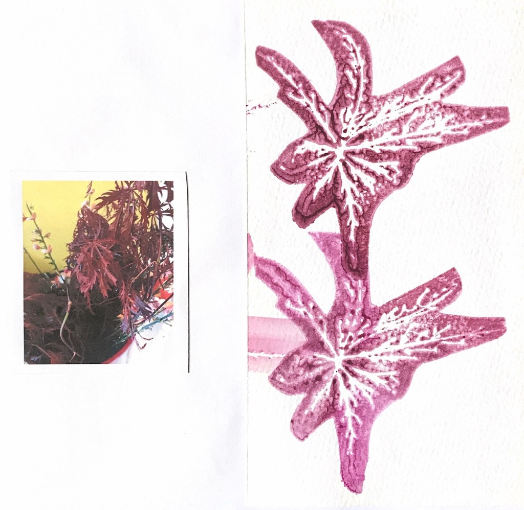
Part 5 has been a challenge to use what I have learnt from the previous parts to build my own capsule collection. I have started to use a sketchbook more regularly and have practised observing and drawing plants from life and not photos. I can see how a sketchbook develops and can throw up new ideas and inspiration.
At the start of Part 5 my sketchbook was not going so well and to begin with I chose to paint in a relatively safe way with watercolours mainly. I used a very wet and loose way of painting, and also used iPad drawings and printing to give a different look. This gave me an interesting and lively colour palette to work with and a range of strong, stylised shapes to manipulate in different interesting ways, with paper and fabric.
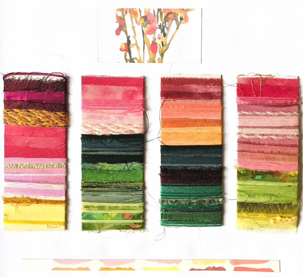
I really enjoyed building a response – playing around with collage shapes in patterned paper and working out ways to incorporate my ideas into 3d shapes. I was particularly inspired by weaving, which threw up new and exciting patterns and colour combinations, and also with using linear samples to make long fringes that move and change shape. I contrasted large stylised simple shapes with more complicated, fresh colour combinations produced by weaving. The exercises from previous parts of the course really helped to provide a framework for experimentation and development.
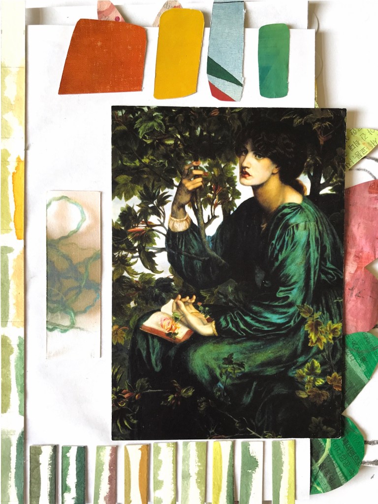
My choice of Eric Carle as an artist to study helped me direct my initial responses in particular with collage, painted paper and use of colour. I also found inspiration in the work of other artists such as Angie Lewin whose stylised flowers gave me inspiration to use shapes as a basis for some of my experiments, and Sheila Hicks whose colourful weavings really excited me.
I am pleased with my final 6 samples and feel that although they are each different in technique and in depth of colour, each piece has a connection to one or more of the other samples. Each piece has shown a well documented progression from the initial drawings and samples, and retains a floral essence in the colour and the shapes. Different techniques and materials have been used, which have created textural interest. Manipulated materials draw the viewer’s eye to look closer while retaining a strong impact from a distance.
On reflection I feel my strengths are in pattern and colour, together with shape, placement and collage. I have excellent skills in crochet and stitch which I would like to explore further with more weaving techniques with different materials. One thing I don’t feel I have demonstrated or explored fully is hand stitching, and I have started to put some hand stitching into some of my sketchbook samples. I am pleased with the development of my controlled paintings into more abstract themes and the stylised shapes in my samples.
Having explored more mark making in my sketchbook I can see that this would be another route to explore in future work. I have now numbered my sketchbook pages in response to feedback from my tutor.
I have also experimented with taking photos of my work and putting them into a computer program to change the look for further inspiration.
I have enjoyed every part of this unit and can see my progress as I look back to a tentative start at the beginning of the unit, followed by lots of exercises and sampling to arrive at a capsule collection of which I am really proud. I look forward to continuing to practise my drawing skills and to take more risks in future units.
Reflection on assessment criteria
Demonstration of technical and visual skills
I have used a variety of materials sensitively and in combination to create interesting, considered results. My samples show a good variety of technical skills such as crochet, painting, collage, weaving, and making 3d shapes together with a love and affinity with colour and design. My capsule collection is exciting to view both as a group and individually,
Quality of outcome
My work is presented clearly and photographed well on a white background. I have shown the progression of ideas and thoughts from initial drawings and responses through to the final pieces in my learning log.
Demonstration of creativity
My imagination came in fits and starts to be honest, but by looking back to my drawings, samples and previous work on this course, ideas started to flow, and I was able to experiment further to develop exciting combinations and outcomes with a rich colour scheme. I really wanted to use different materials and construction techniques together and feel that my personal voice is developing through these experiments.
Context
I have looked at the work of a number of artists for this part, collecting pictures, ideas and information on how they work. I have reflected on my work and ideas as I have gone along and taken a more critical approach in my reflection.
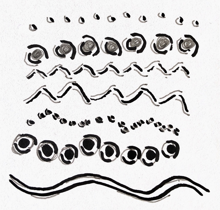
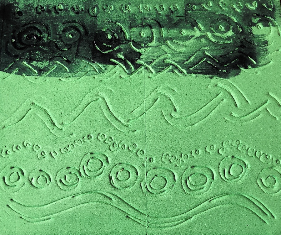
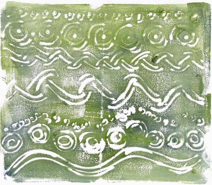
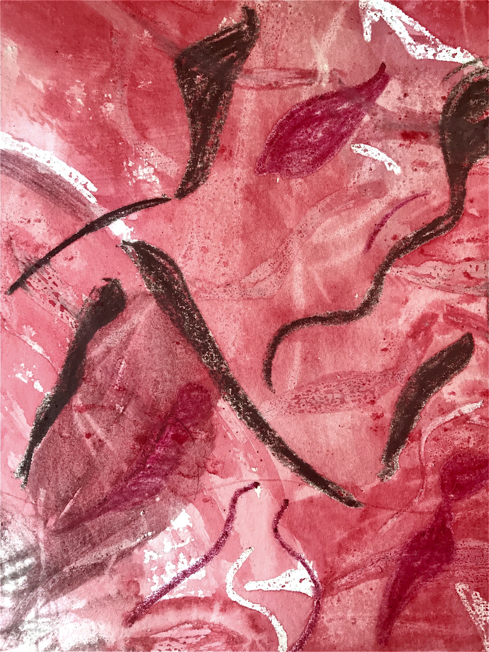
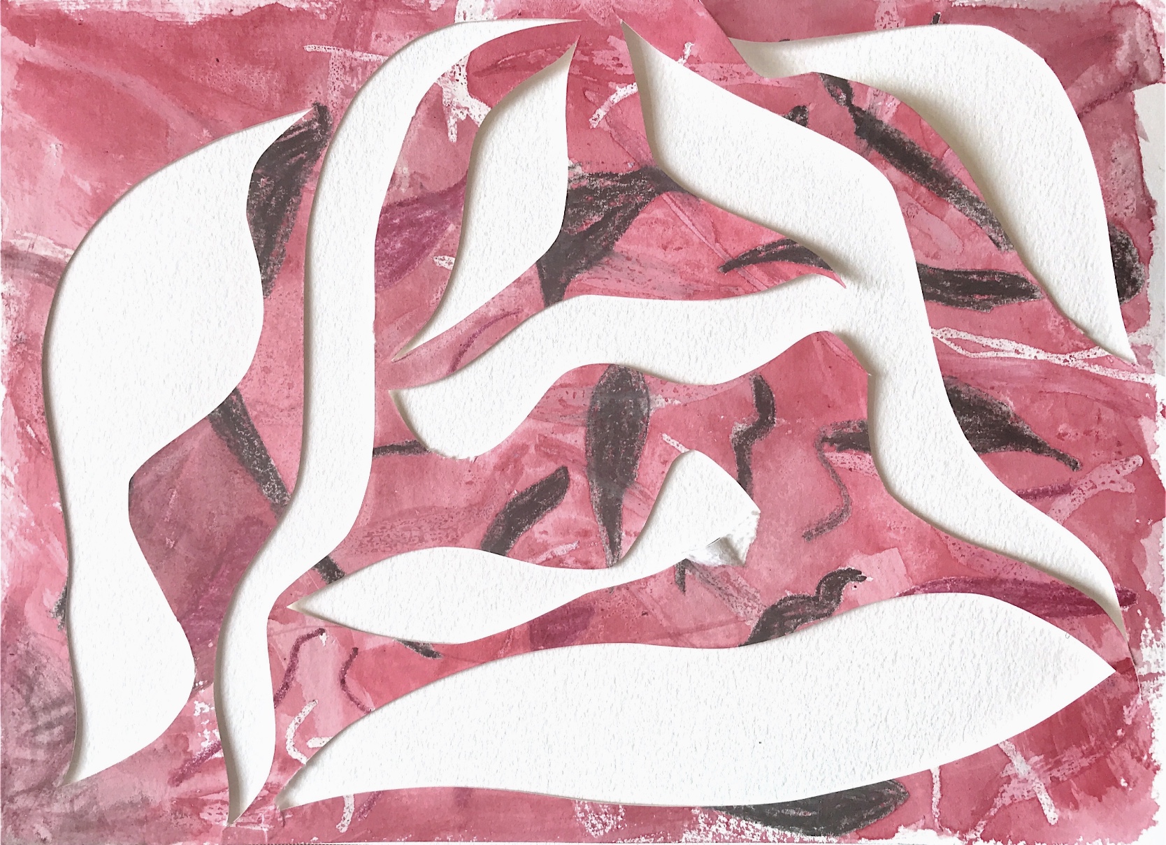
Simple quick drawingsWatercolour paintingWatercolour ‘shadow’ paintingWatercolour paintingWatercolour ‘shadow’ paintingWatercolour paintingWatercolour with pen outlineWatercolour with simple shapes outlinedWatercolour with outlined shapesFelt tipiPad drawingiPad drawingPrinting using ‘Funky foam’Printing using ‘Funky foam’Shadow painting with stronger colour palettePrinting using ‘Funky foam’Printing with flower patterns drawn into ‘Funky foam’
Project 2 Building a response
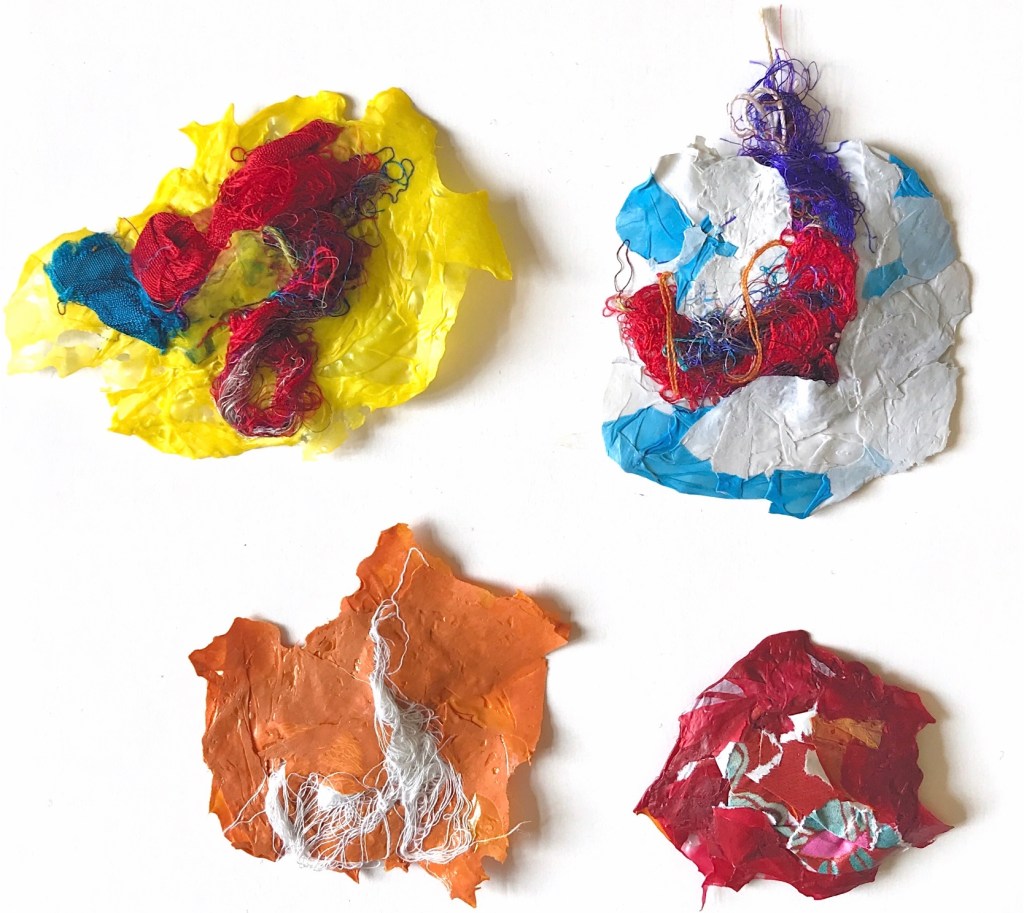
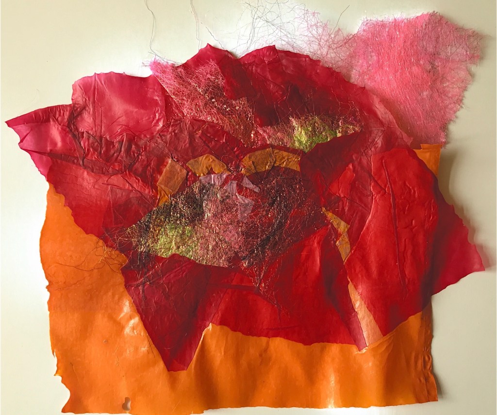
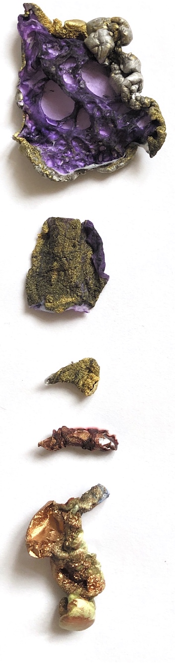
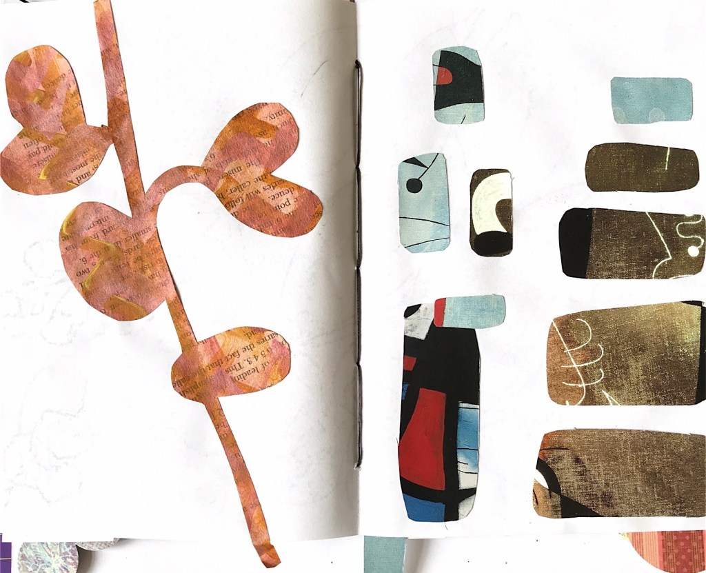
Colour chips – watercolourColour wrapsColour chips – GouacheColour wrapsBlack and white tracings from drawings and paintings aboveShapes isolated from tracingsShapePaper collage using shape isolated from tracingShape from tracingShape from tracingPaper shapes ironed onto fabricCollage with paper shapesCollage with paper shapesFurther examples of isolated shapesPaper collageFabric collageFabric collage with machine stitchingPaper manipulation with shape inspirationHand stitched paper collagePricked pattern on paper, and paper collage concentrating on colour and patternPaper manipulationStrong colour scheme collageFlower colour scheme from colour chips and wraps with painting cut into squares and rearrangedCrepe paper manipulation to look like petalsFlower painting woven, with paper beadsWoven paper with thread and squares stitched togetherStitch ideas on collaged squaresPaper tassel Paper beads with thread and paper shapesButtons in the flower colour scheme wrapped in tissue paperLayered paper with cut out holes and stitchWoven paper shapesWrapped squares and woven textiles with fabric shapes. Inspiration for shapesFabric collage, machine stitchedPaper weaving with shapesFabric collage with hand stitch. Shape inspiration
Project 3 Experimenting and taking risks
Painted papers in colour schemeFringe sample using machine cords and shapesSecond fringe sample using cords and different shapesThread wrapped wooden beads with paper stems
3d paper flowers
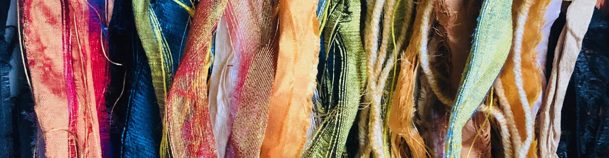
Woven fabric strips with shapes Shapes with crochet embellishmentWet felted piece with paper and beads stitched by handSilk paper shapeAlstromeria petals ironed and bonded to fabricSilk paper woven with real petals machine stitched