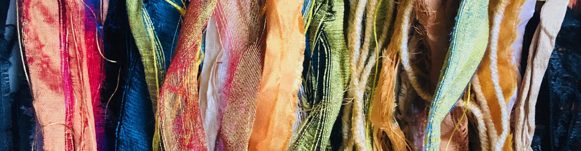
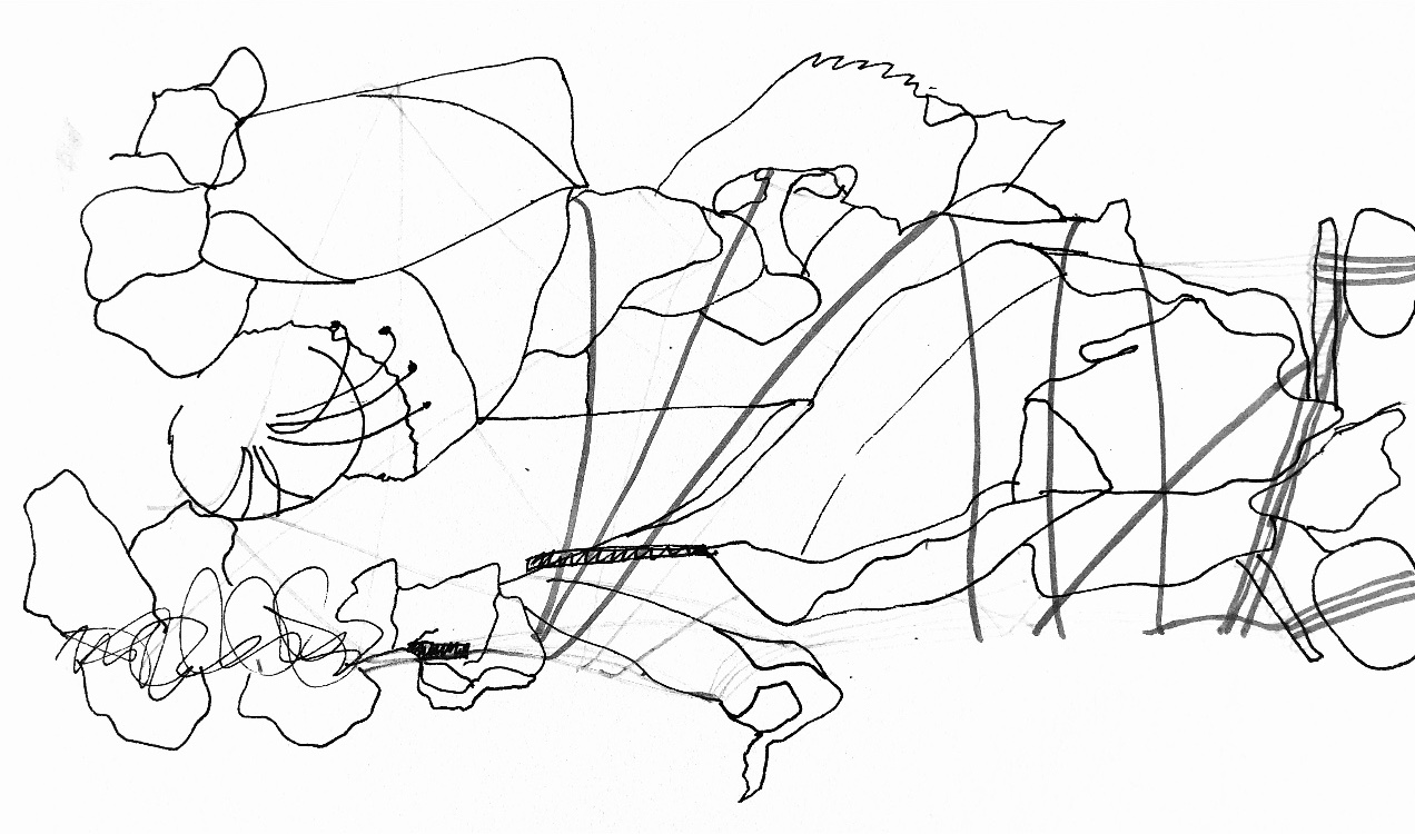
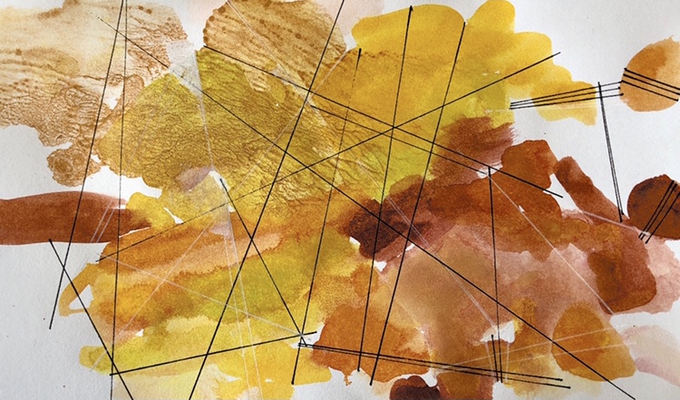
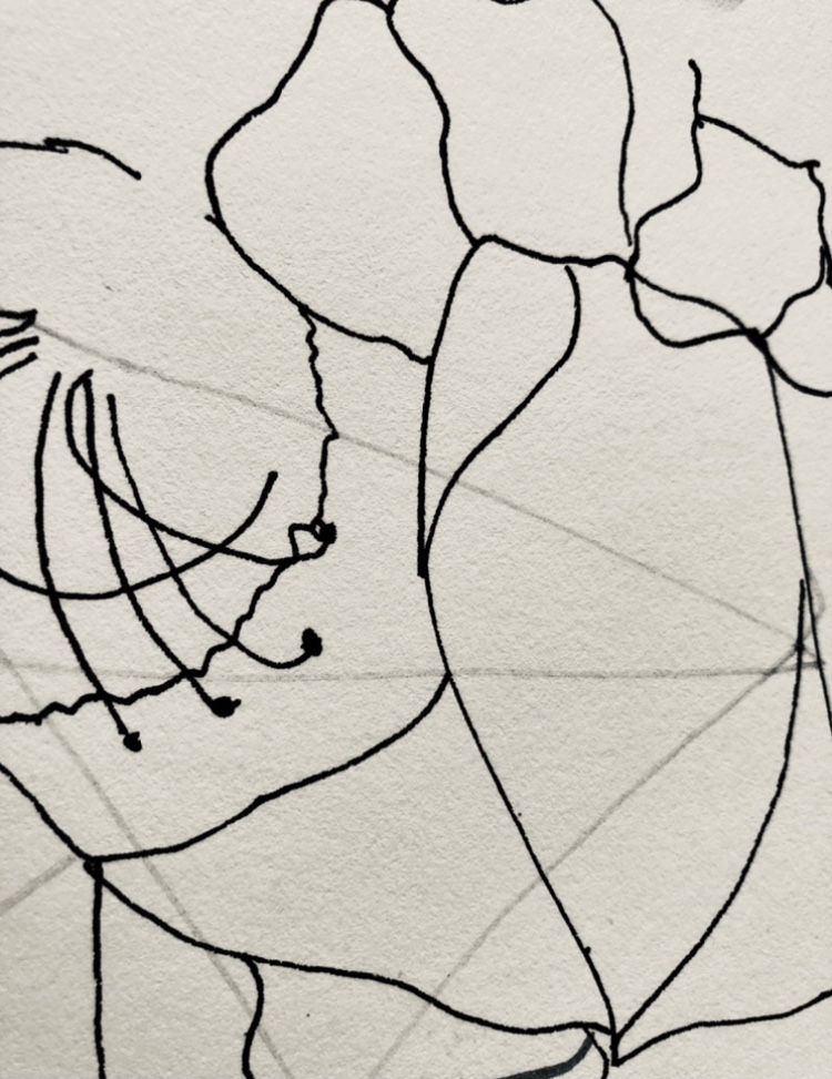
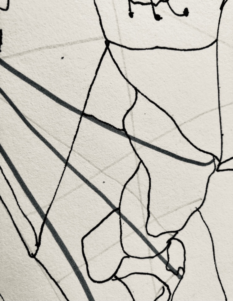
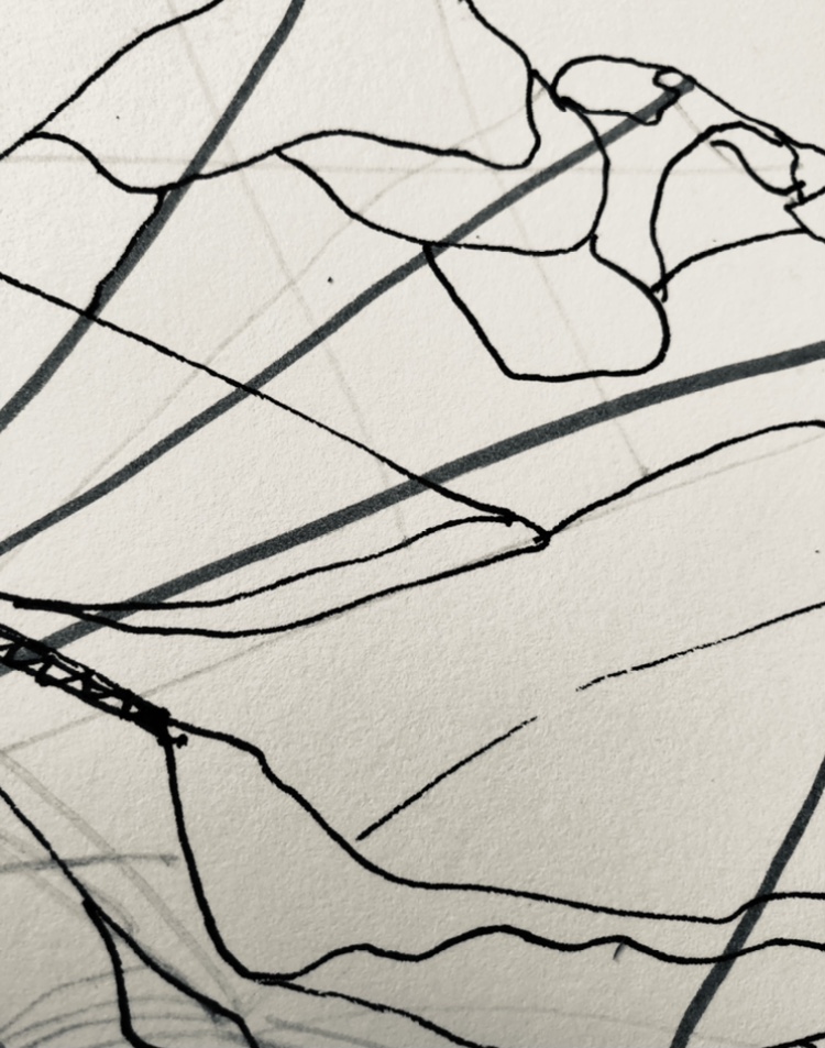
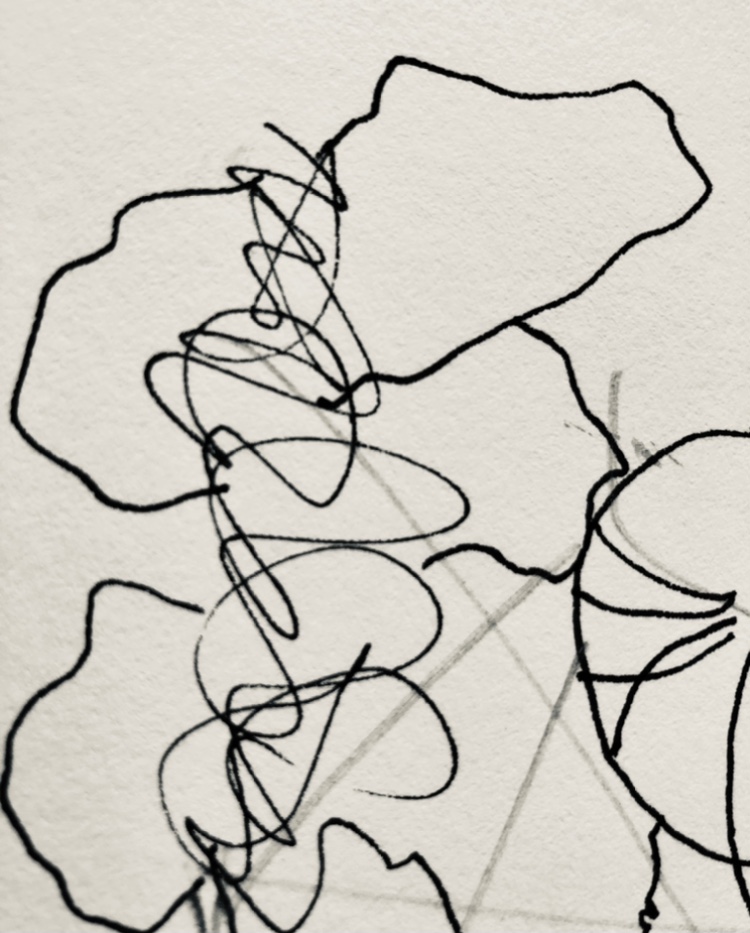
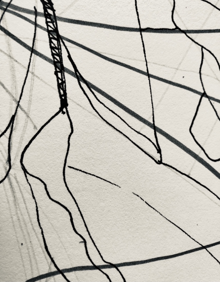
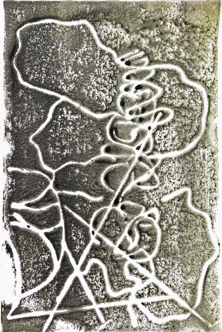
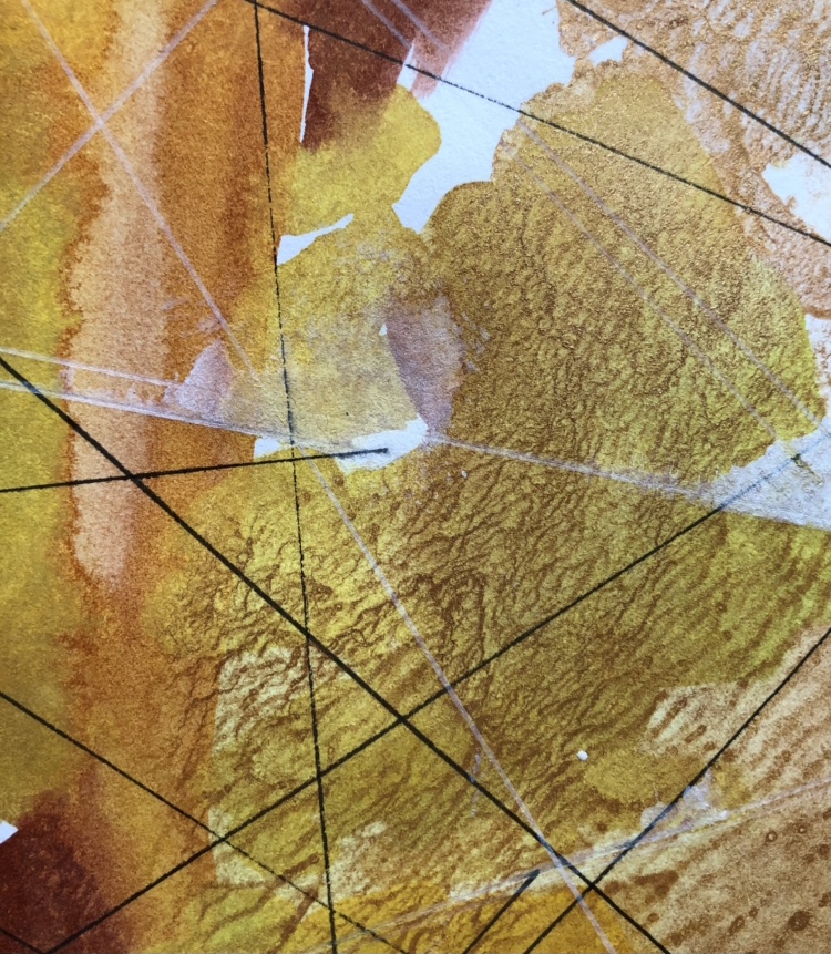
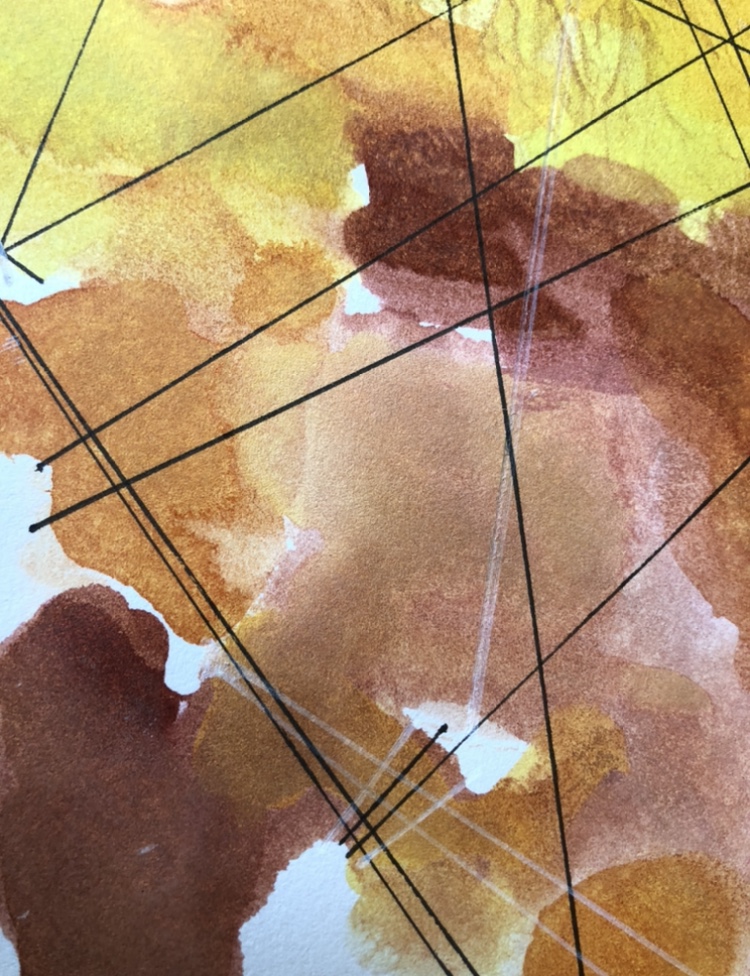
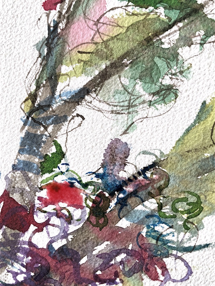
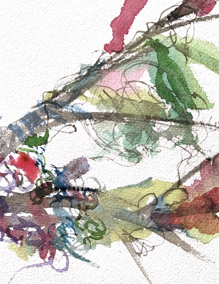
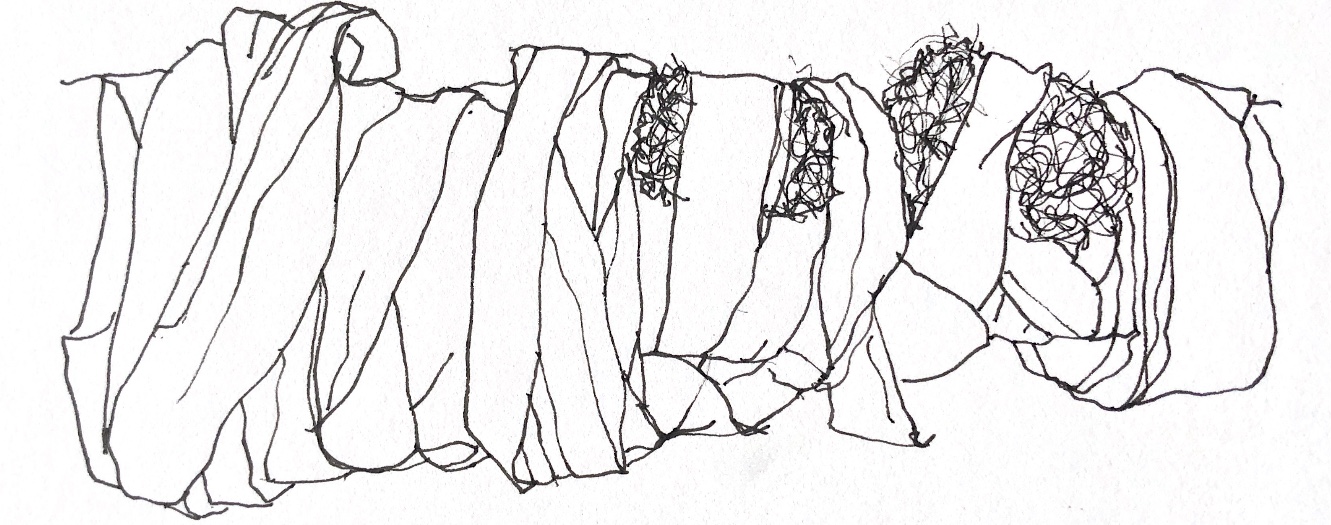
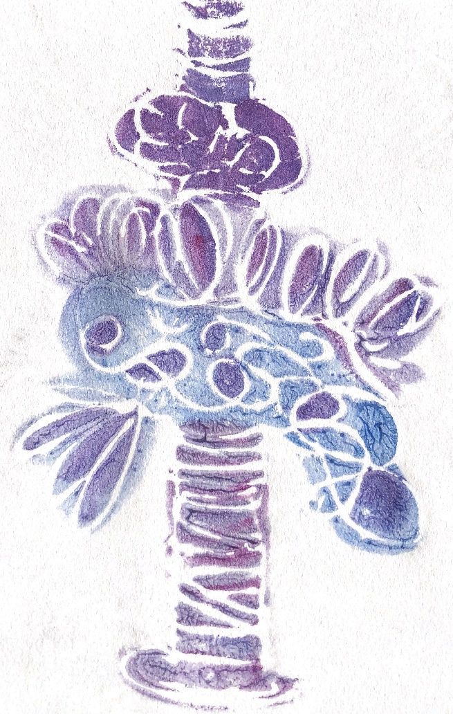
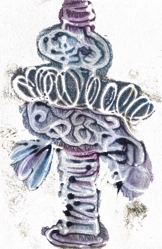
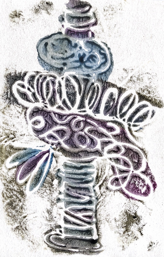
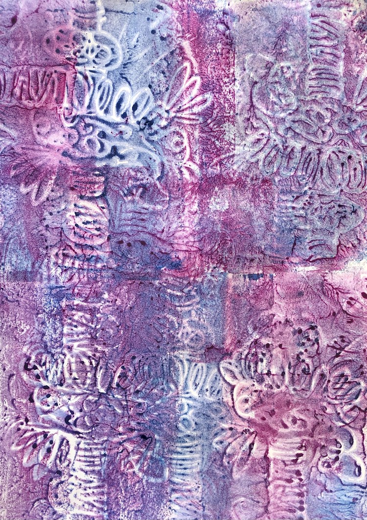
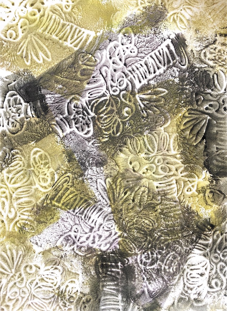
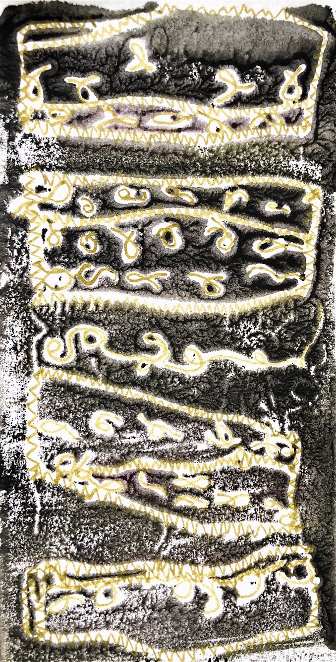
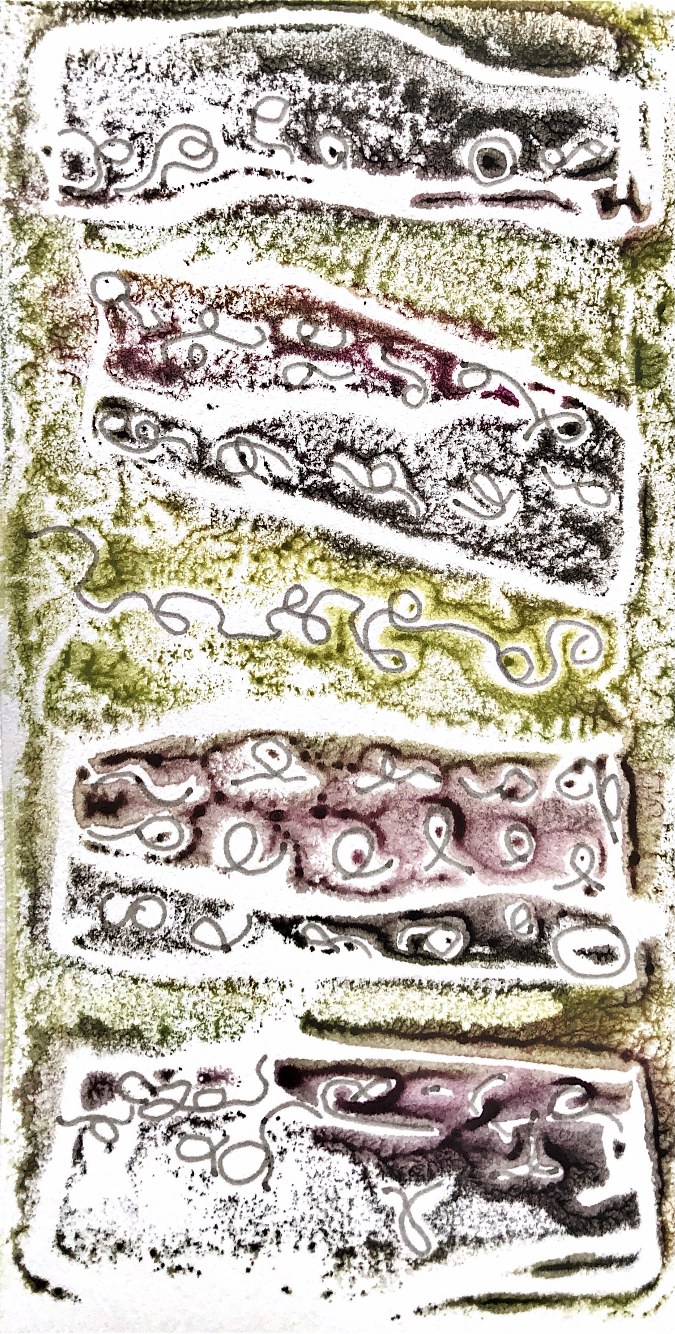
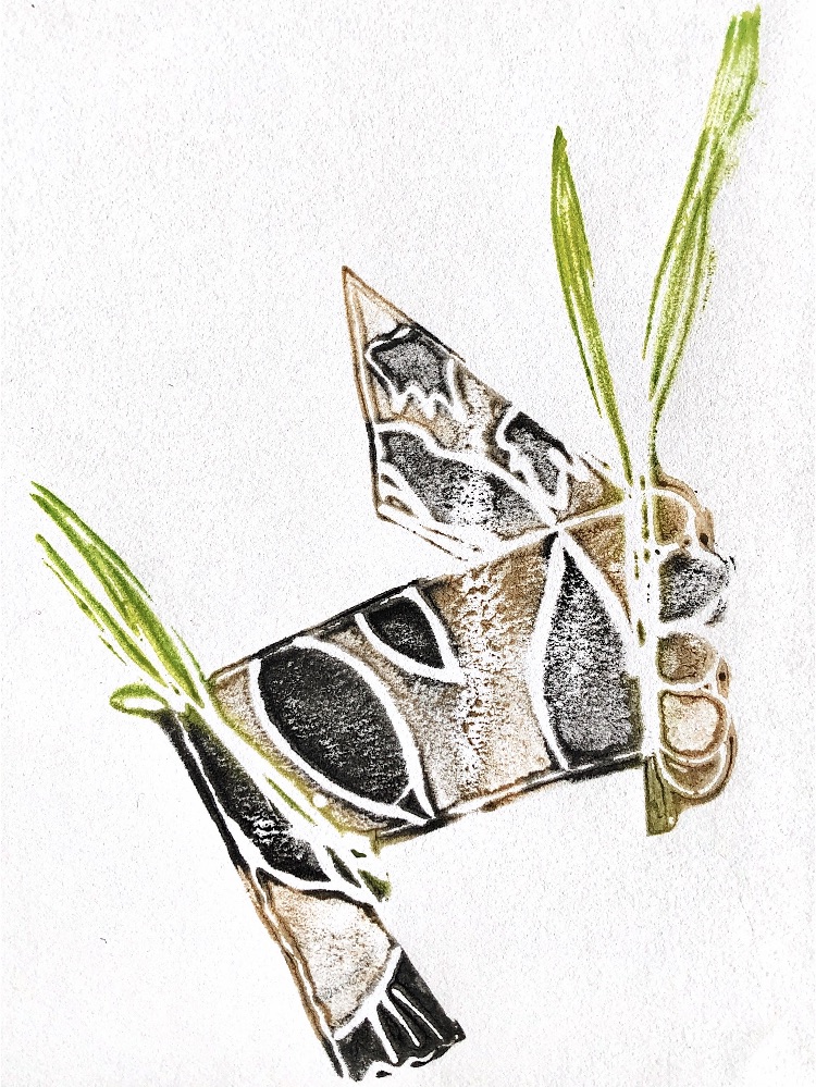
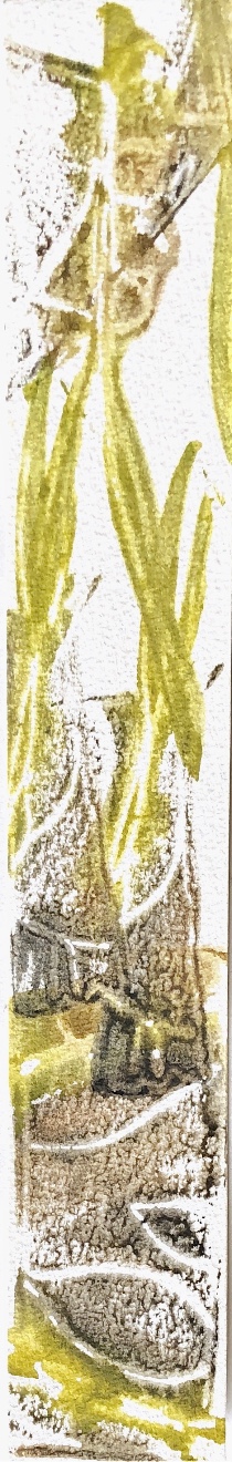
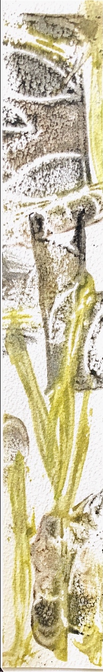
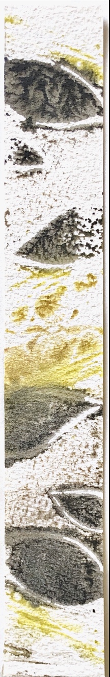
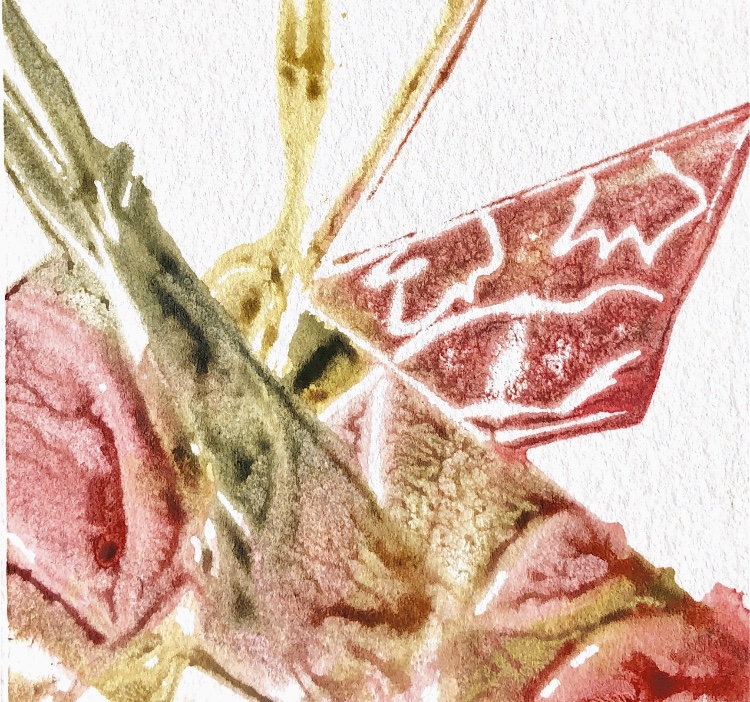
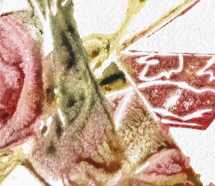
I did a quick sketch and painting of this sample which I zoomed into to make ideas for printing and patterns for future work.
For this sample I used watercolours to capture the feel of the piece. I think the translucency of the watercolour encapsulates the light airy materials used, and the subject matter.
Inspired by my earlier research into the joyful and colourful wrapped items in Judith Scott’s work, I tried to not think too much about where my samples would take me for this exercise. I chose to use mainly materials I had used before to see how different combinations would work.
Sample 1
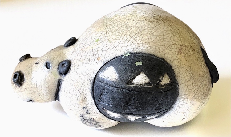
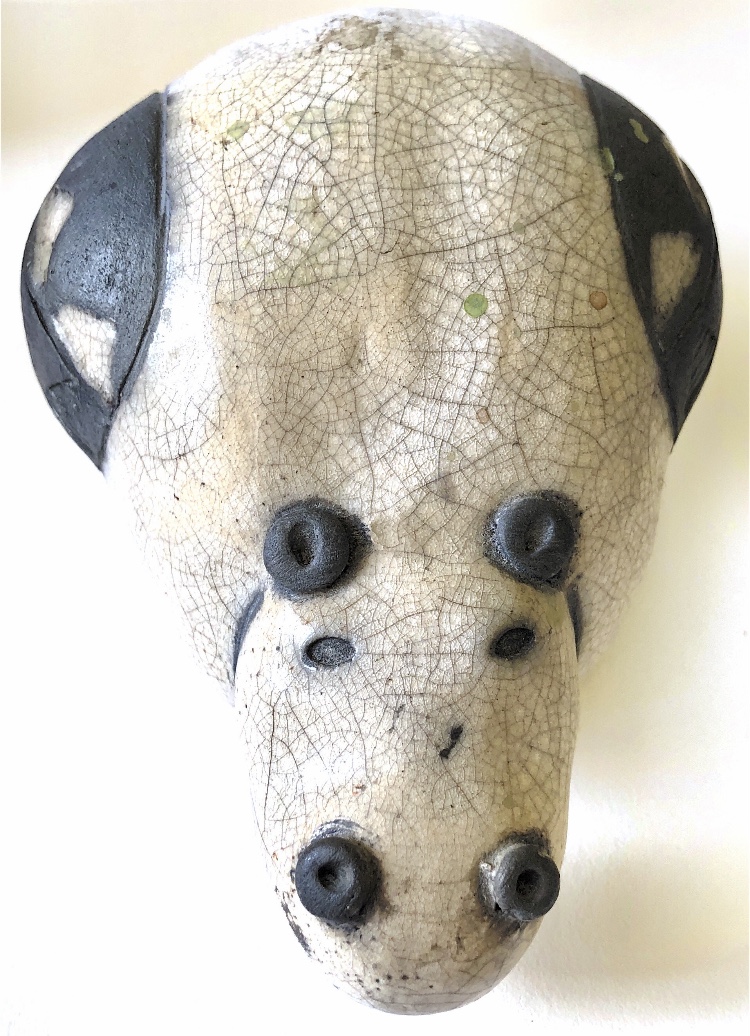
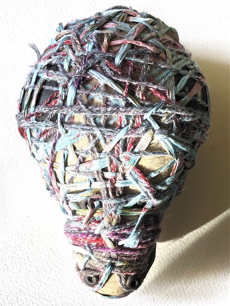
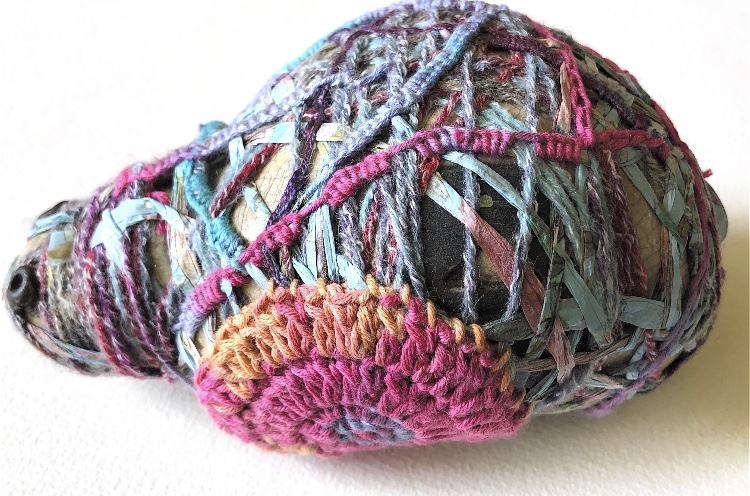
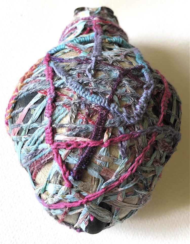
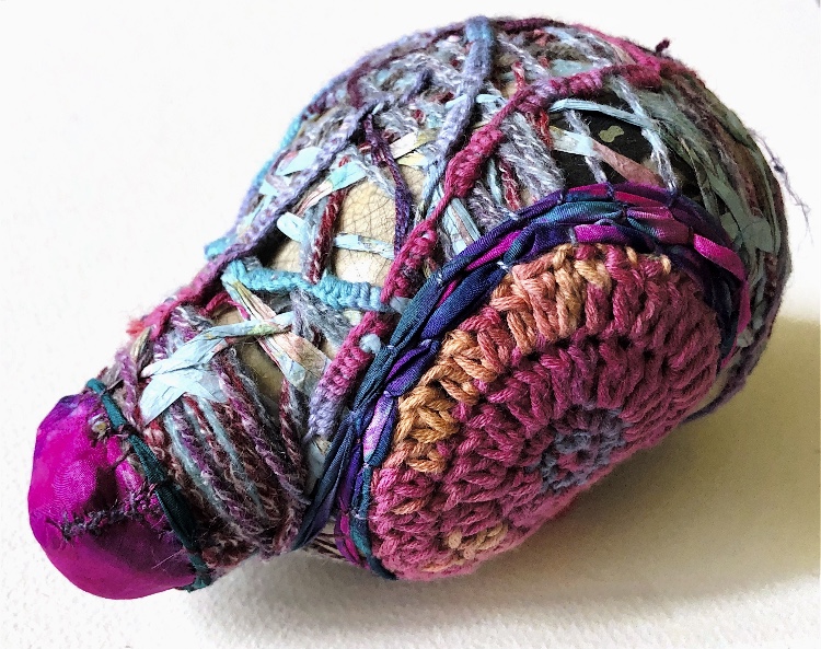
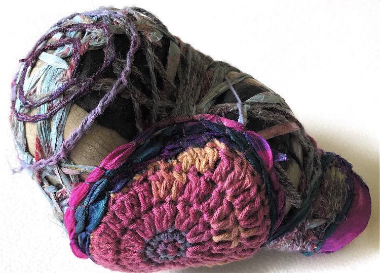
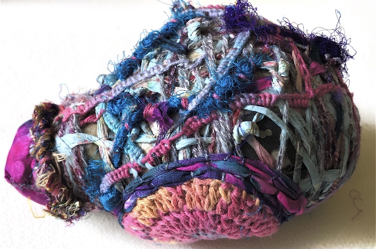
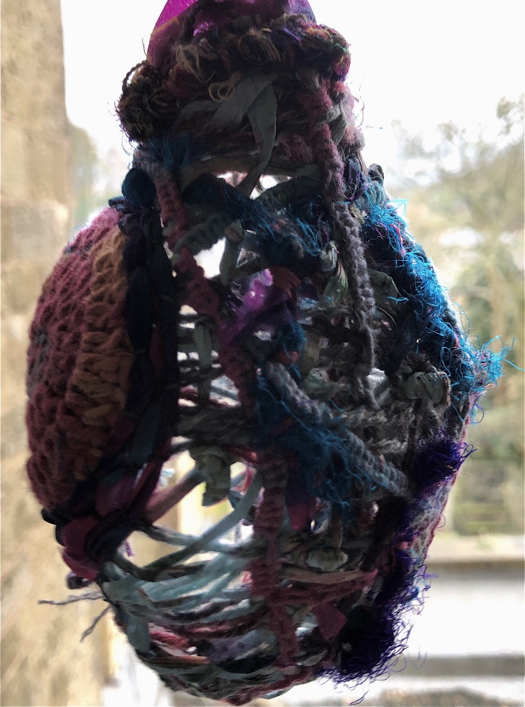
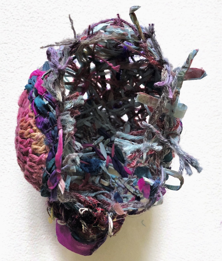
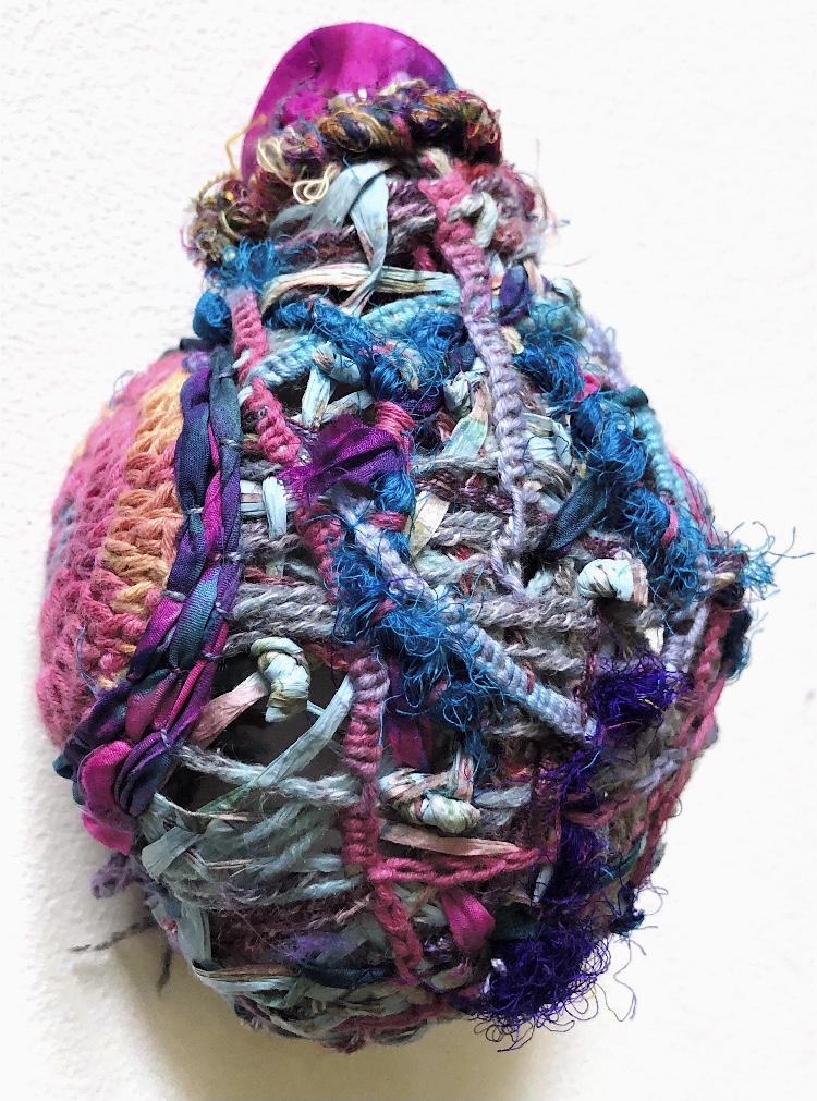
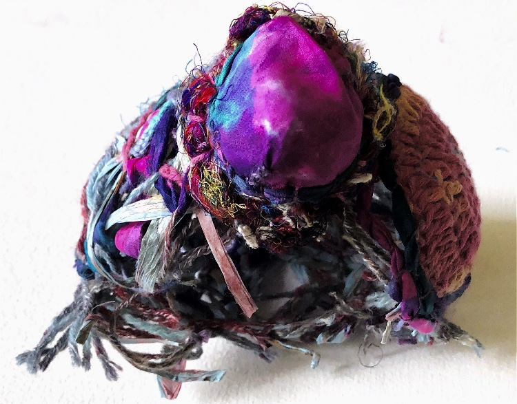
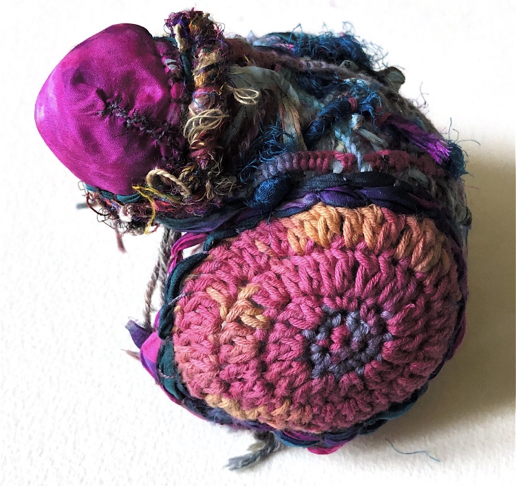
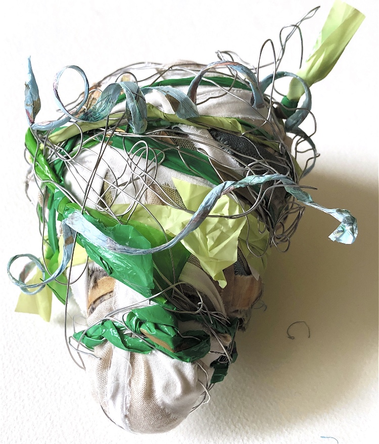
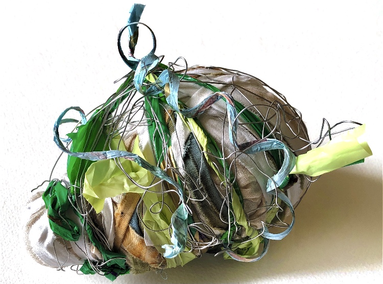
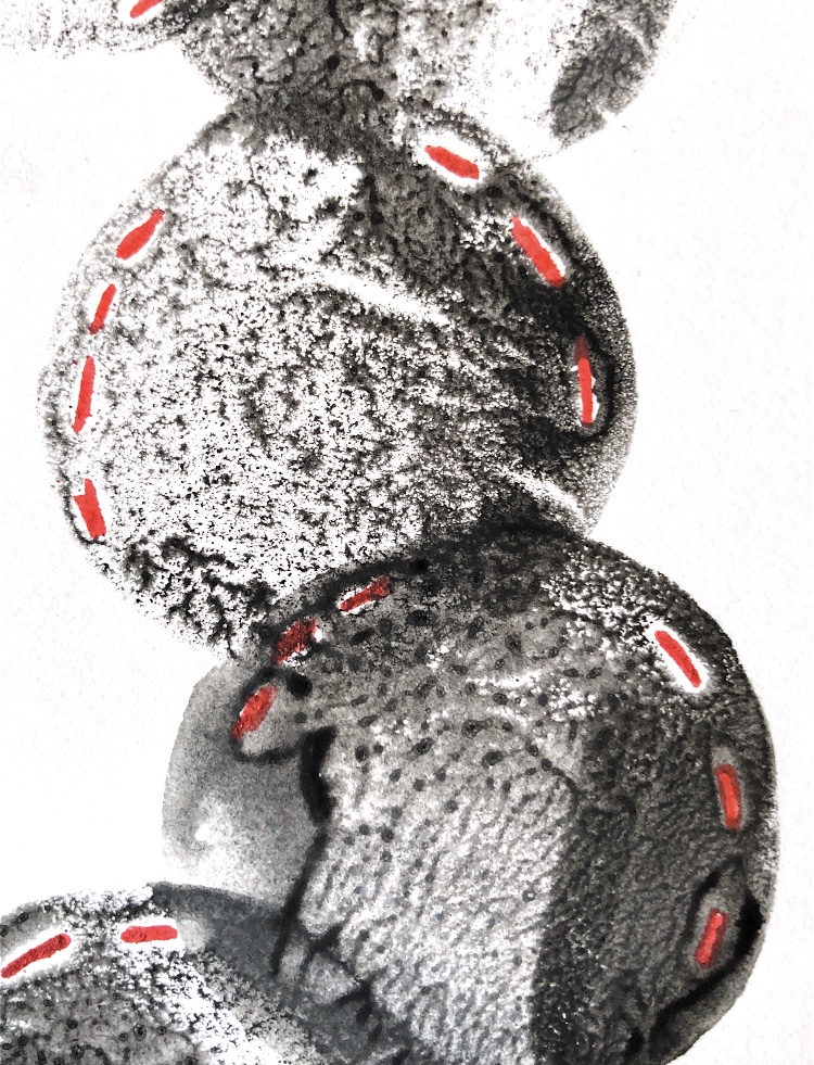
For this sample I used a hippo ornament. I first wrapped it with yarn and strips of tissue paper, then I added woven yarns, stitching, a circle of crochet and a piece of silk fabric. The sample retains the shape of the hippo but the materials contrast with the object. Lots of texture and colour combinations, together with the definite crochet wheel outlined by couched fabric make a bold sample. The addition of the silk is like a smooth jewel at the edge of an uneven, crazy shape.
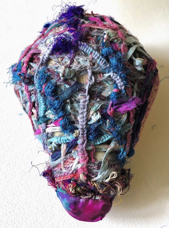
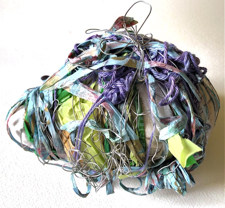
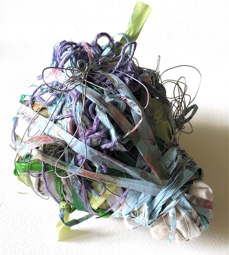
Having cut the wrapping from the ornament I then took more photos – the materials can now be manipulated into different shapes. The cut threads create more interest and movement. The piece is more organic and reminds me of an insect with lots of legs.
Sample 2
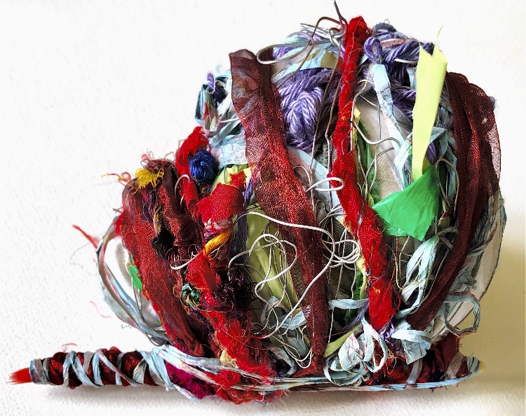
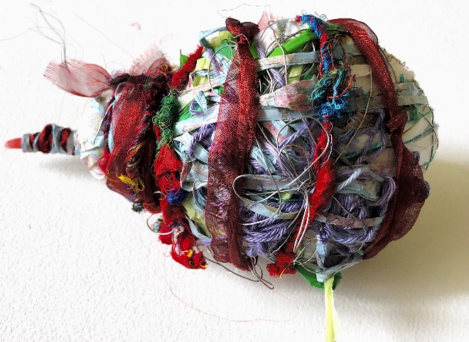
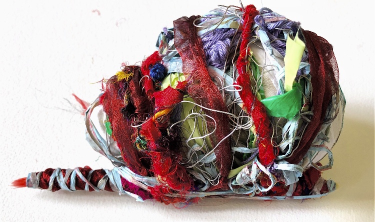
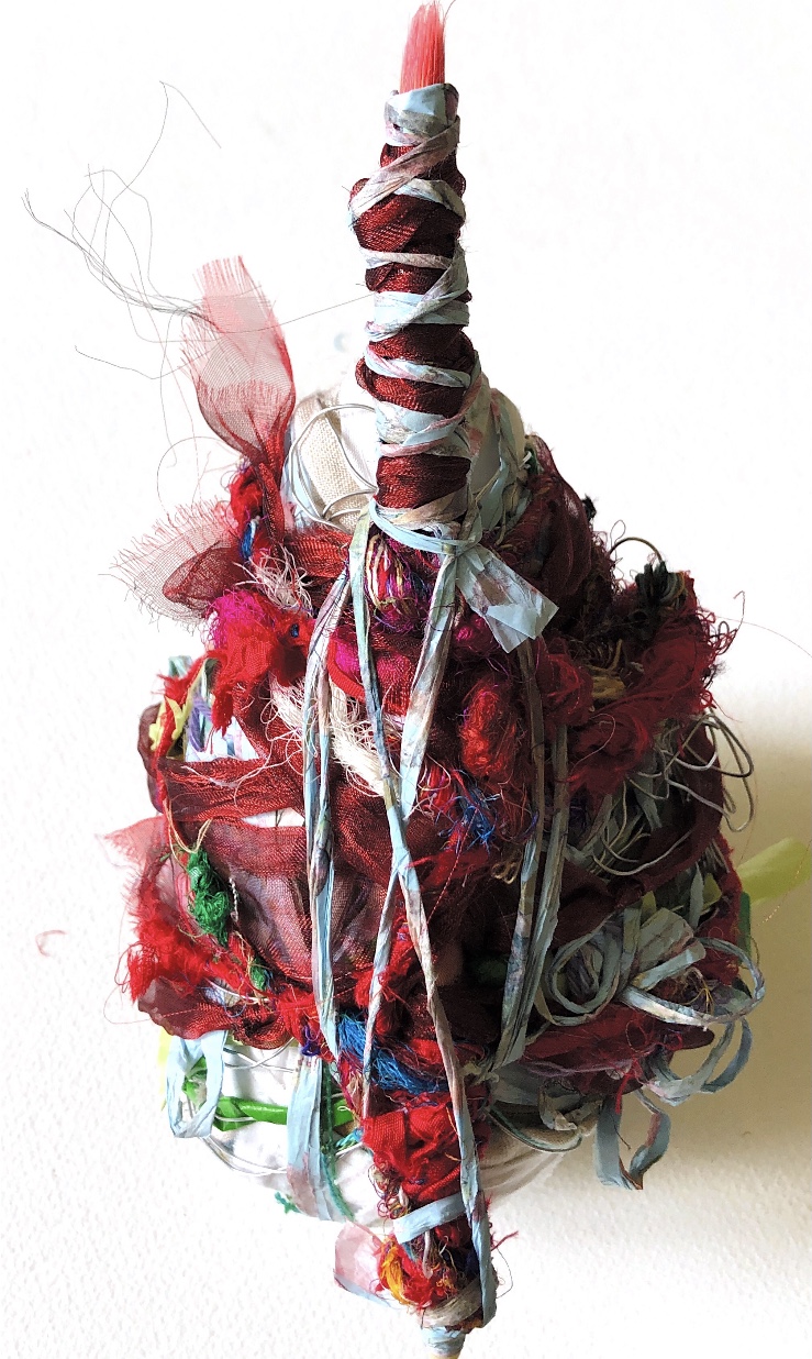
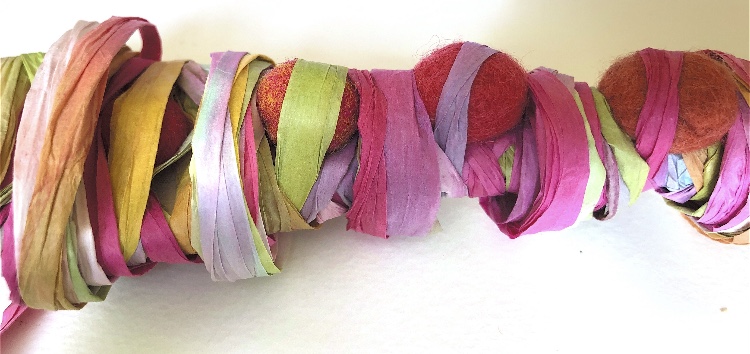
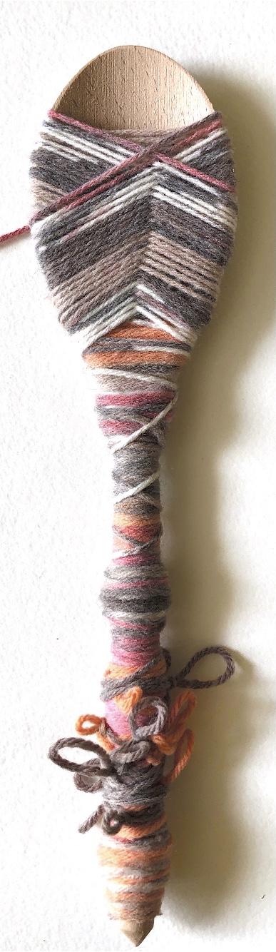
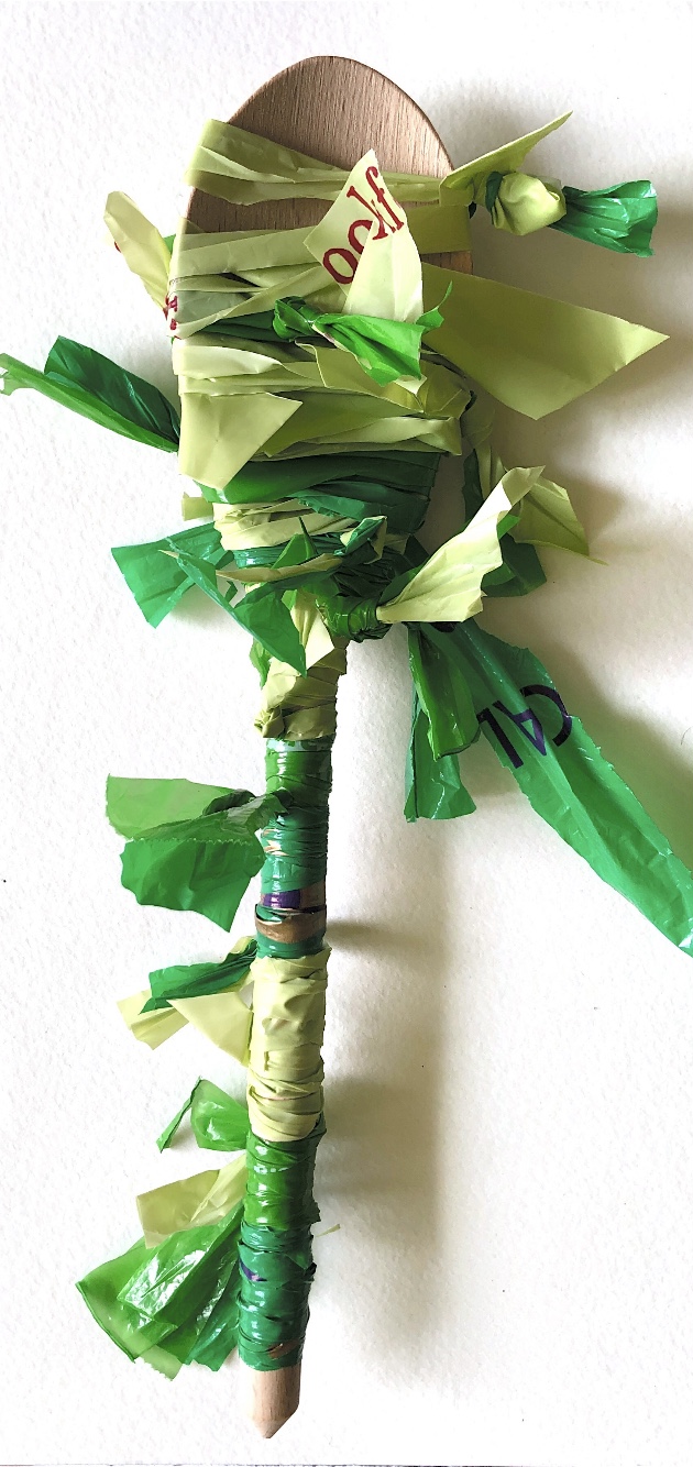
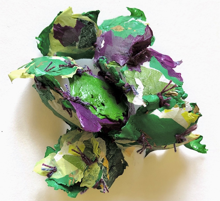
Using yarns and other materials previously used for wrapping samples in exercises 1 and 2, I wrapped the ornament in a more experimental way, gradually adding more layers.
The addition of a paintbrush and further wrapping changed the feel of the sample – it is brighter, and more interesting, looking less like the hippo underneath!
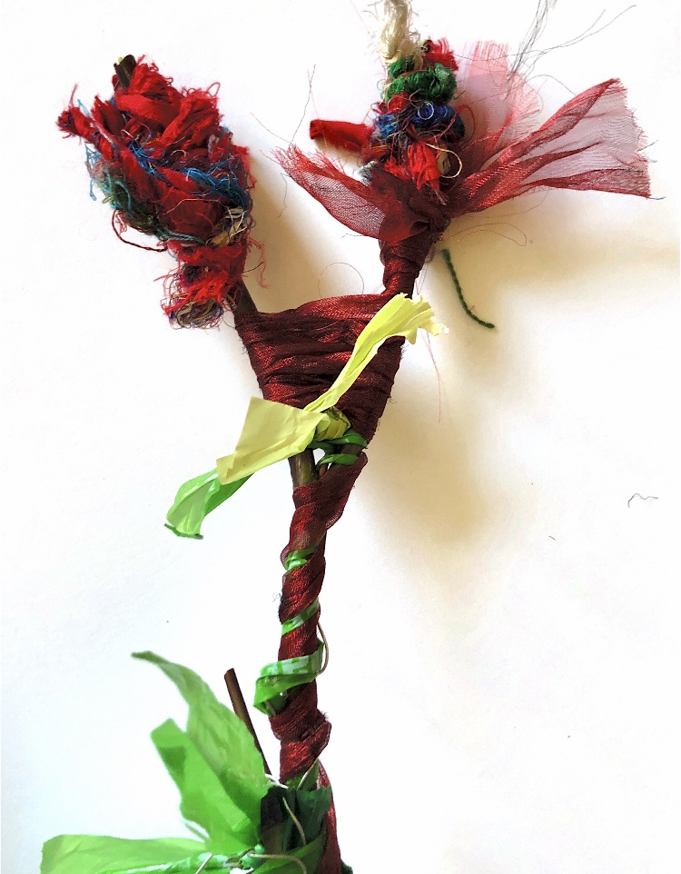
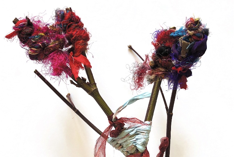
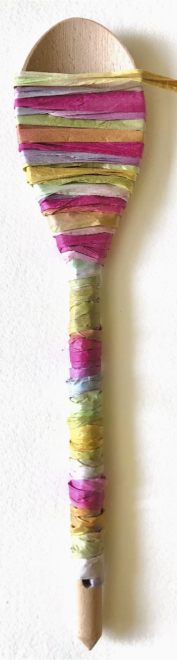
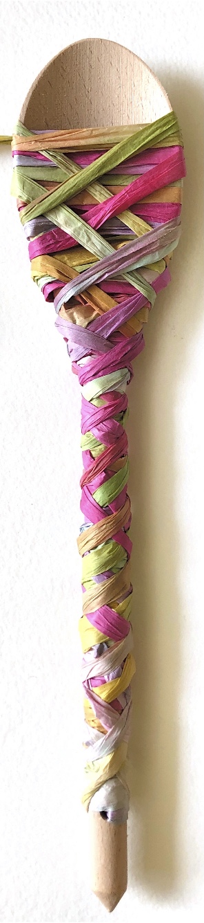
Sample 3
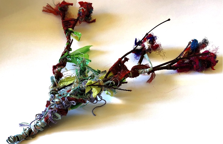
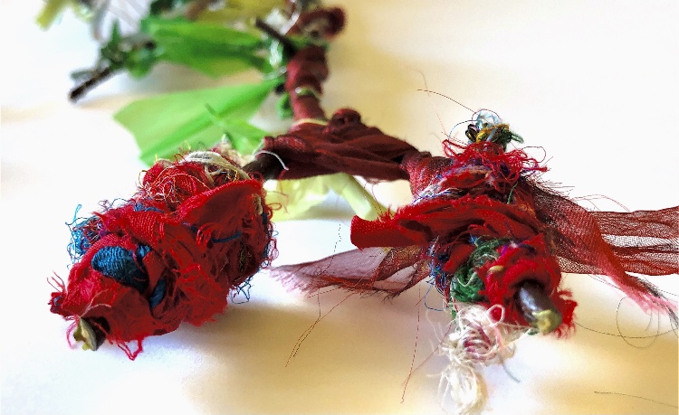
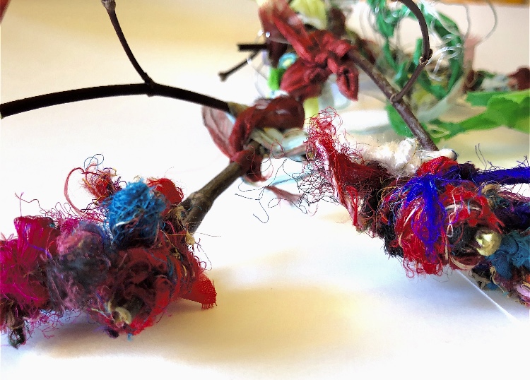
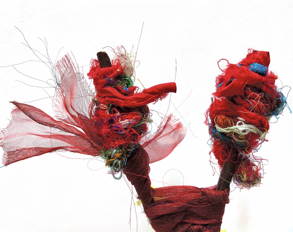
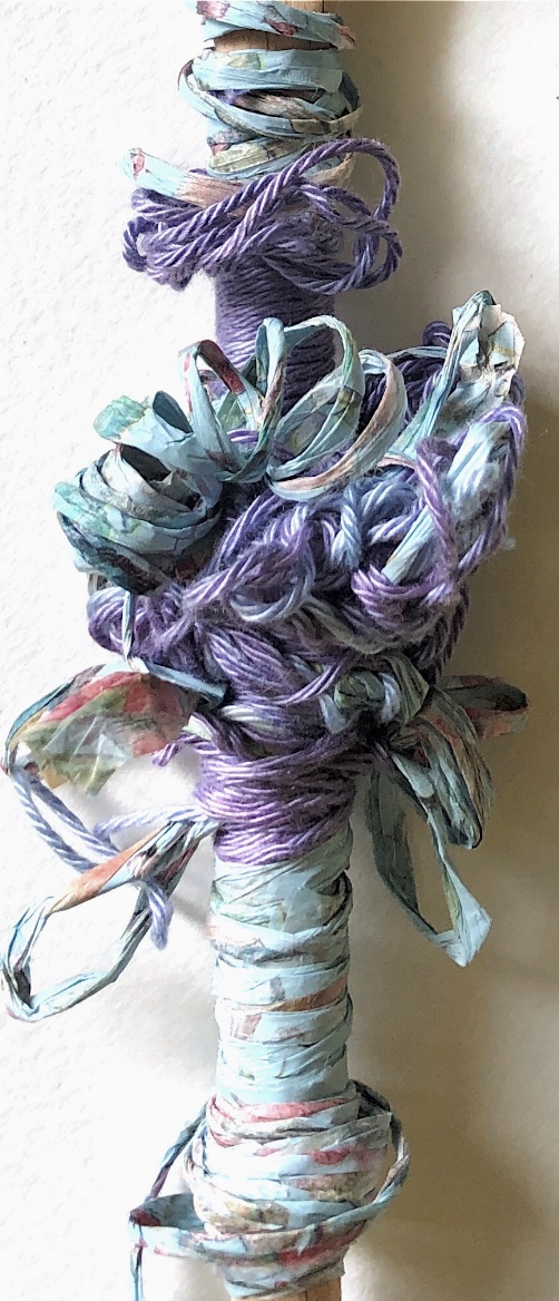
Using the same wrapping materials I chose to use a stick from the garden. There is a floral quality to this sample and it also feels like a Japanese brush painting with bold, lines and stylised motifs.
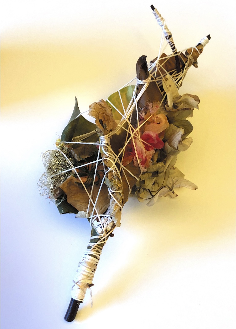
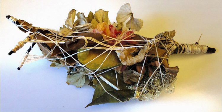
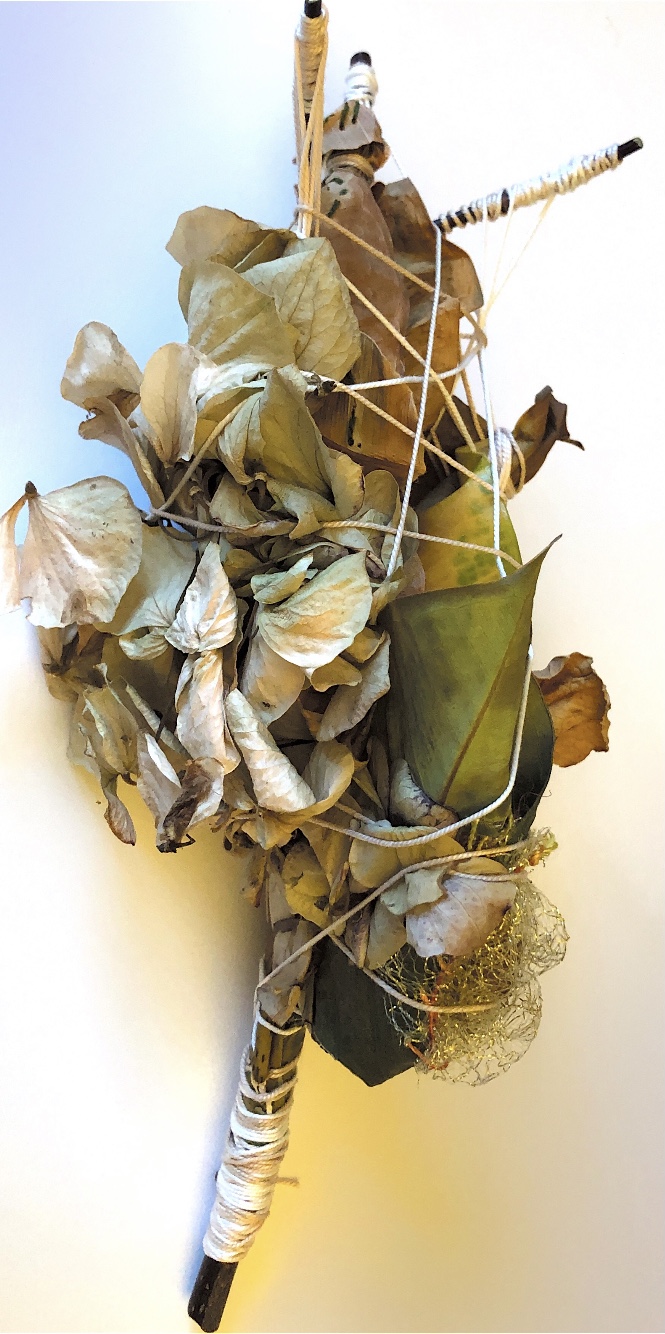
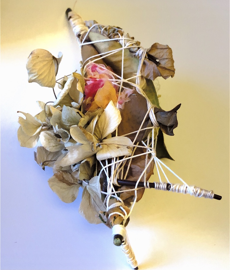
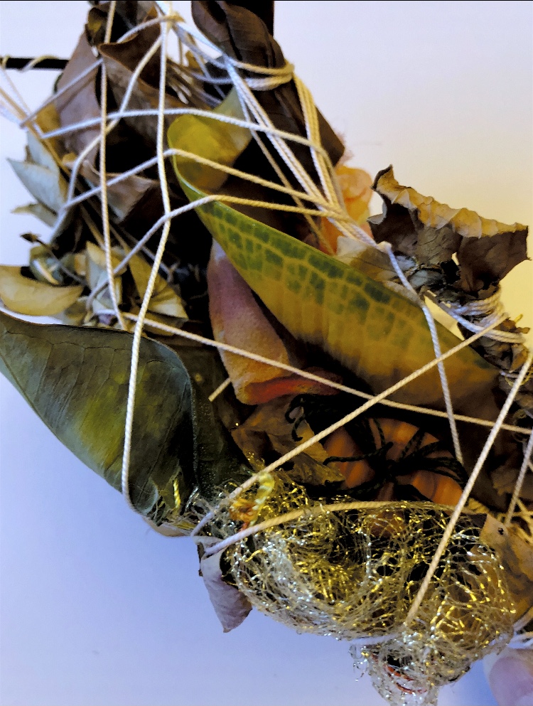
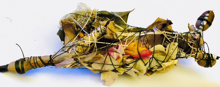
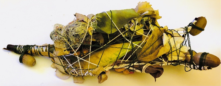
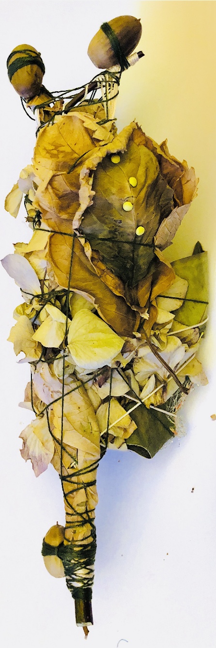
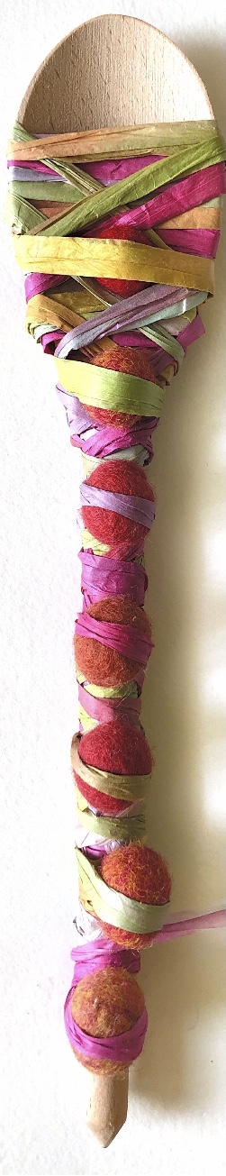
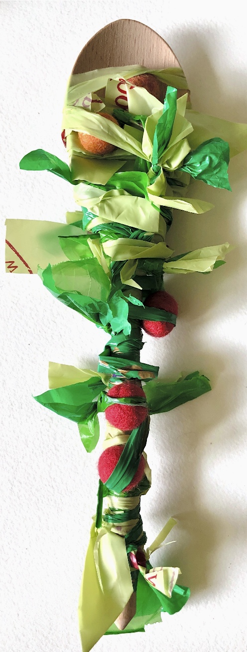
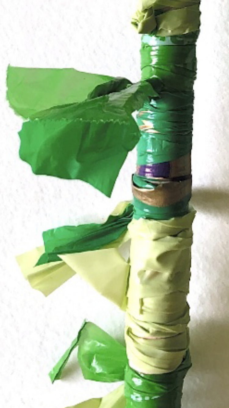
Sample 4
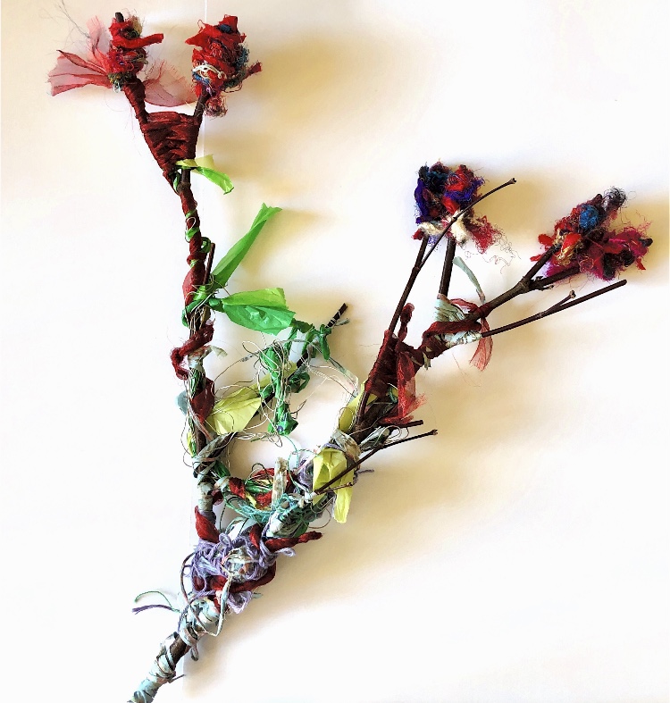
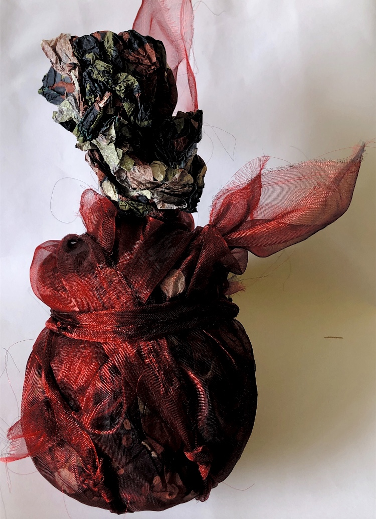
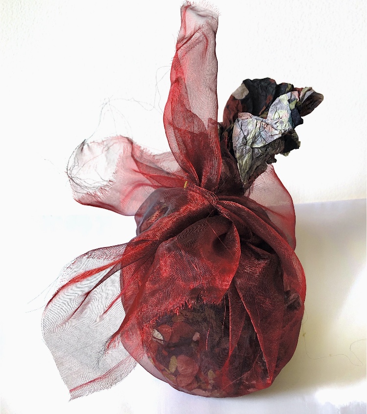
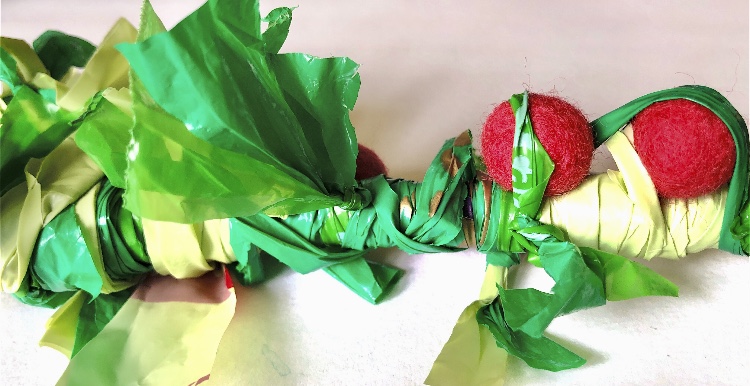
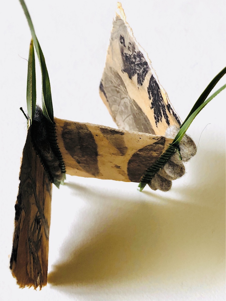
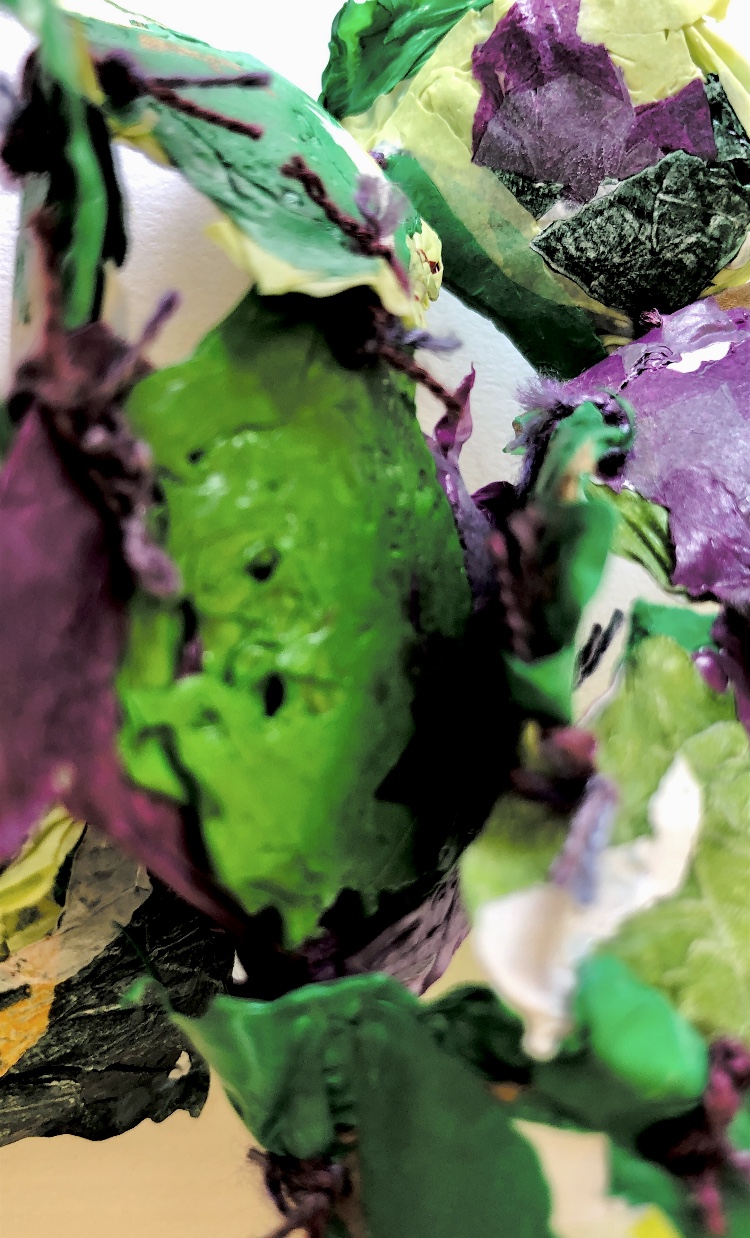
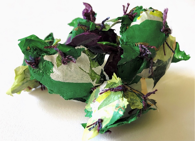
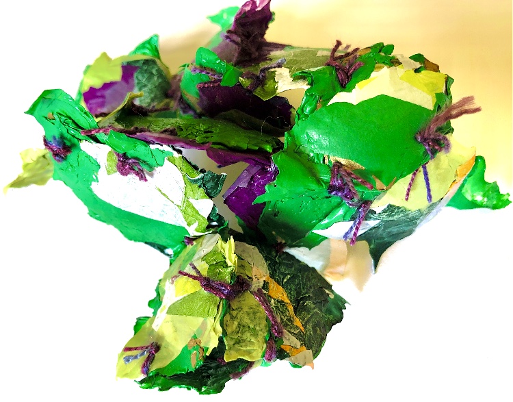
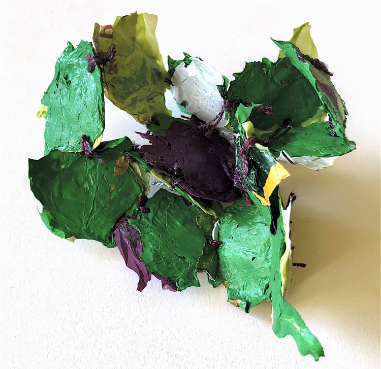
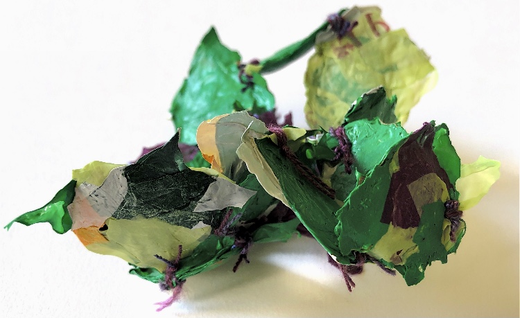
In MMT Part 1 I made some samples with stitched leaves and left them to dry afterwards. I have bound these to a stick using a neutral thread. These samples are full of natural colours and shapes, contrasting with the lines of wrapping and occasional flashes of colour from inside where there are a large button and fine fabric stitched to the leaves.
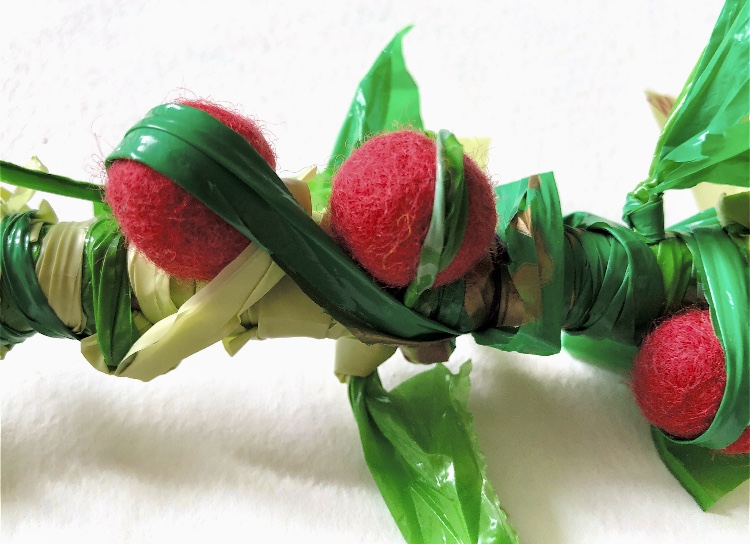
Adding more leaf samples together with acorns and a different wrapping yard created a different feel to the sample.
I have really enjoyed this exercise and can’t wait to try to capture these samples in my sketchbook. I’m thinking of trying to look at the patterns made by the wrapping, and simple shapes and lines.
I enjoyed working with all the different materials used, and the combination of these materials. Using a variety of yarns, paper, wire, plastic and natural materials created visual and tactile texture. Adding further materials to each sample as I was working created exciting and unusual colour combinations and this was one reason I mostly used what was already on my work table rather than sourcing new carefully chosen materials.The research I did at the start was really useful to make me look at wrapping in a different way – trying not to be too set in my thinking – moving outside the box to see what would happen. I am pleased with all of my samples, particularly where I have mixed materials. I have worked on the premise that if I don’t feel inspired, I add more wrapping until I am!
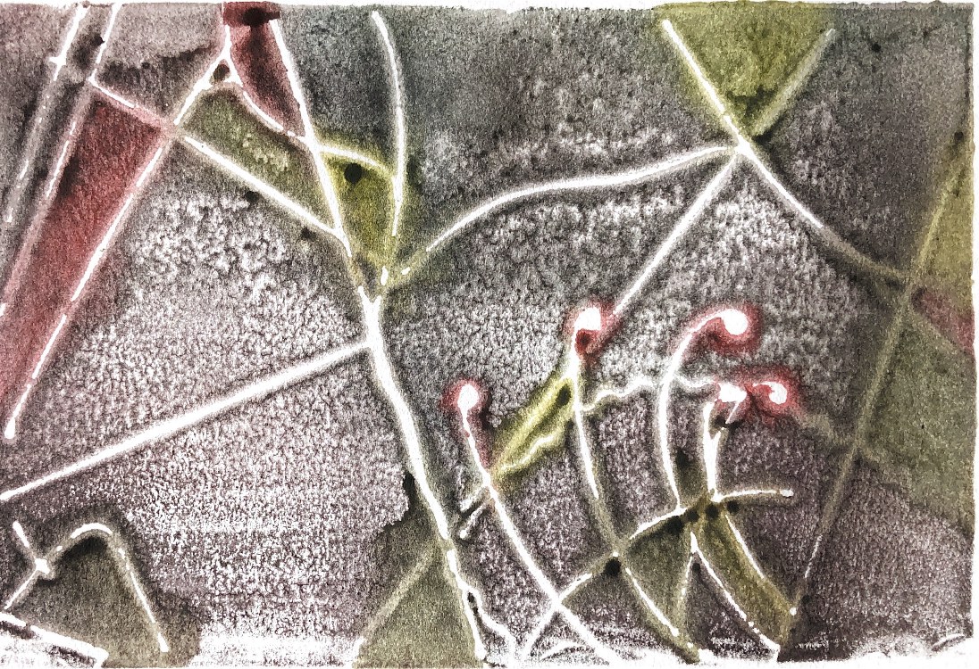
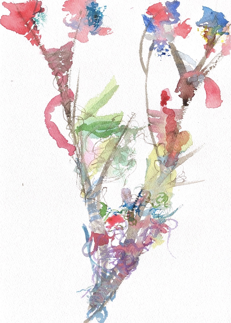
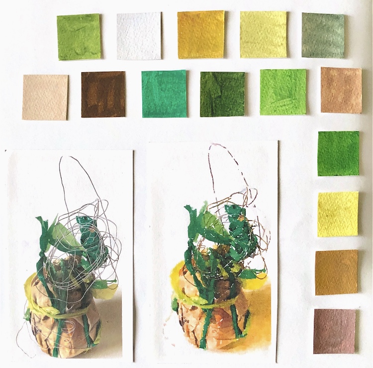
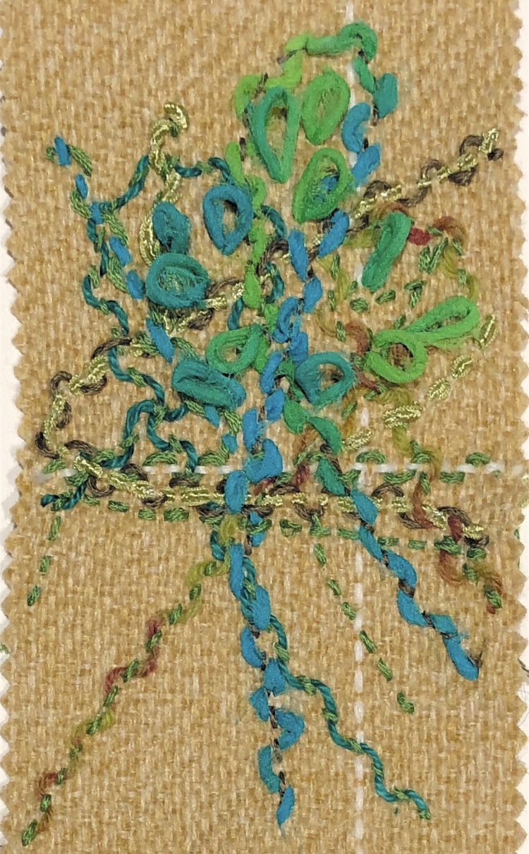
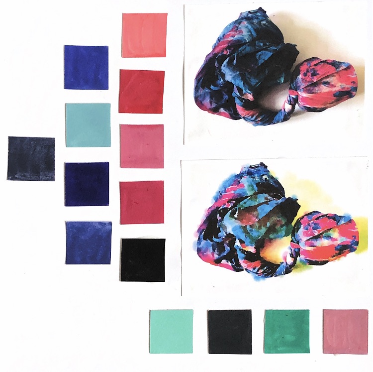
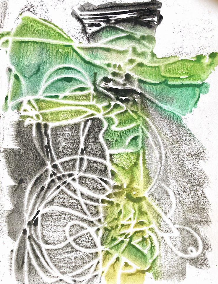
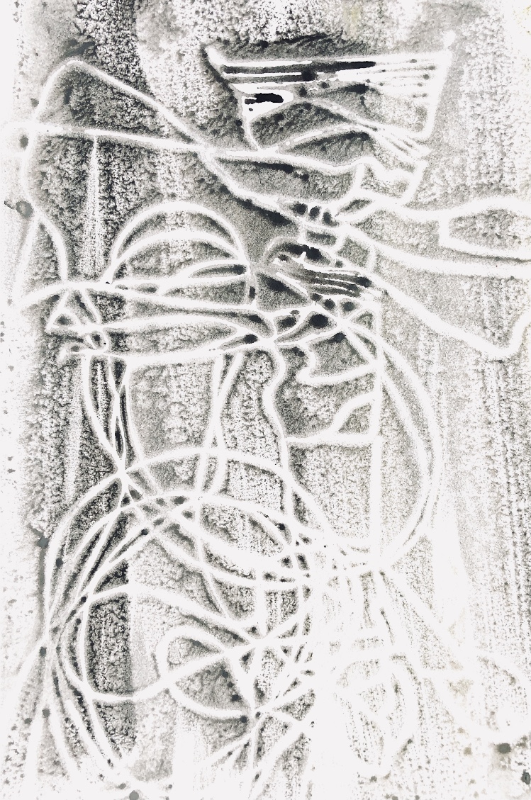
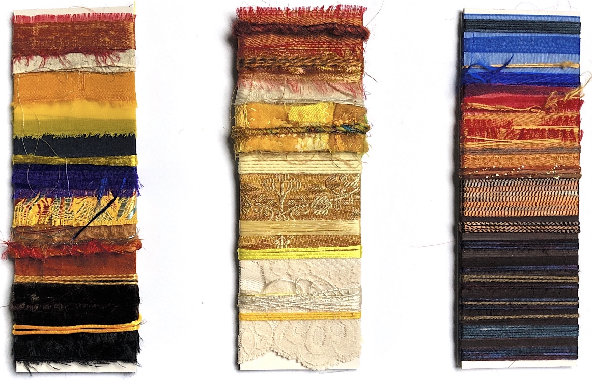
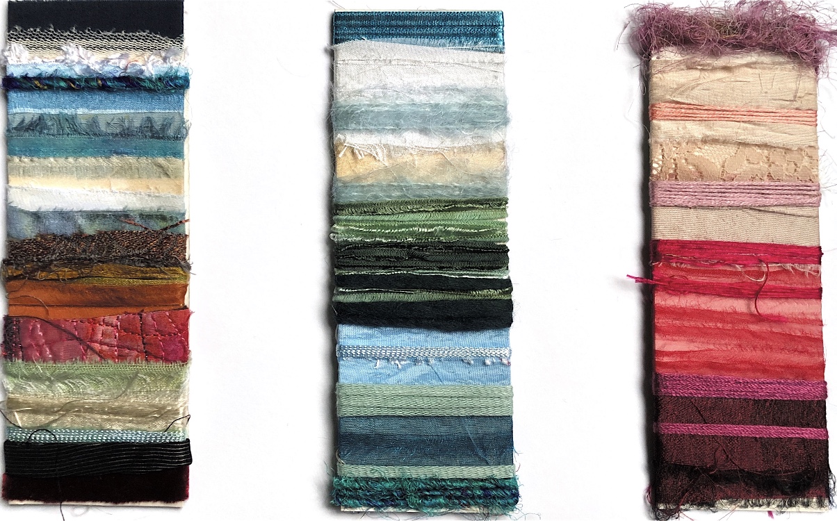
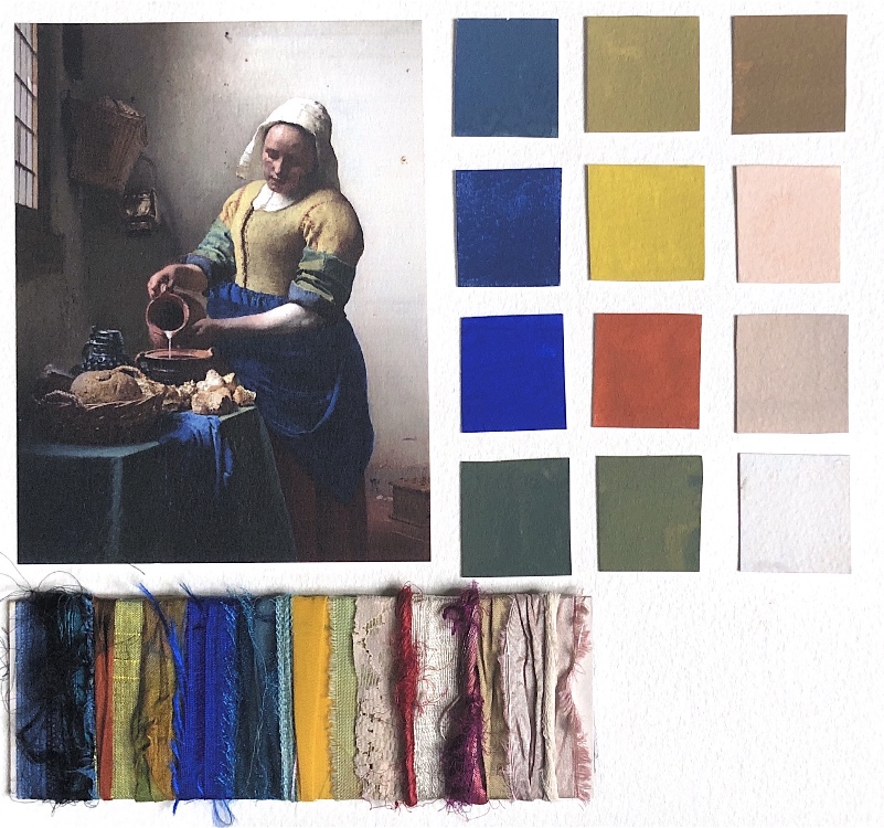
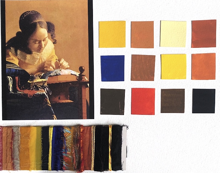
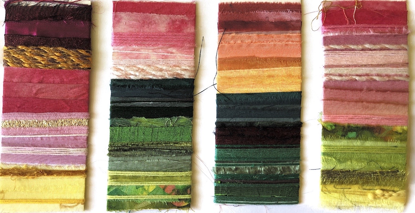
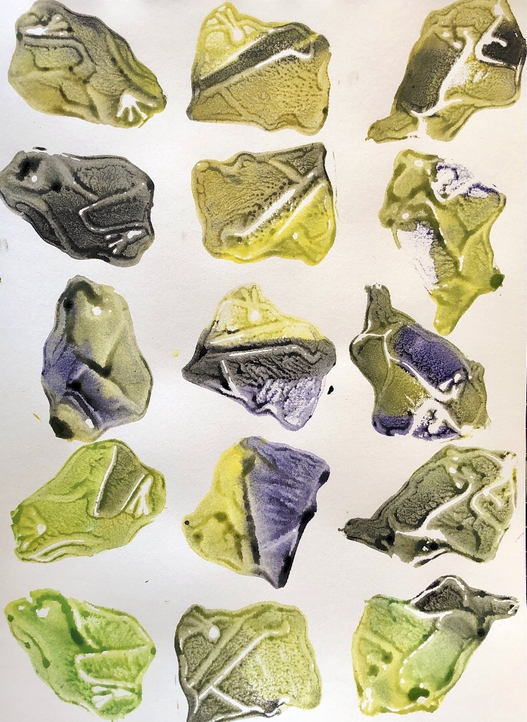
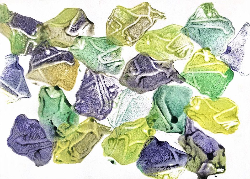
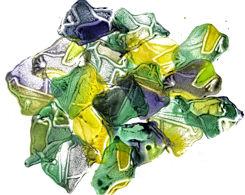
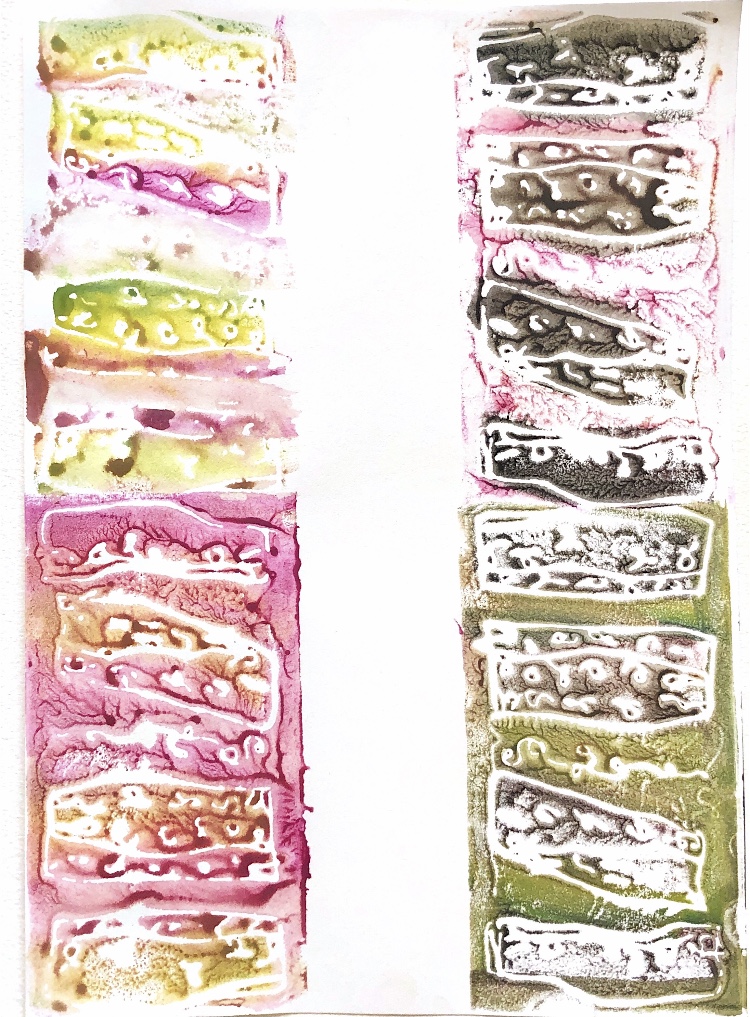
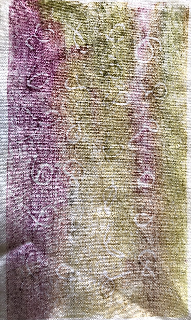
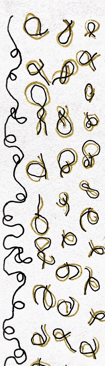
I decided to focus on colour for a while and having manipulated some of my photos in the ‘Waterlogue’ App, I painted some colour chips with gouache.
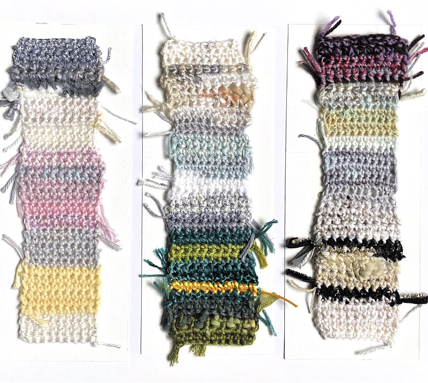
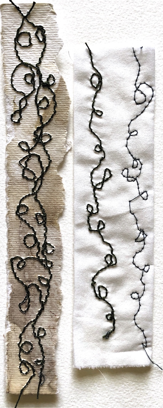
This gives me a clear colour scheme from each of the four images I chose, to try to match with fabric and thread for stitch/crochet experiments. From one image I have made a stitched sample, and from another I have experimented with freeform crochet.
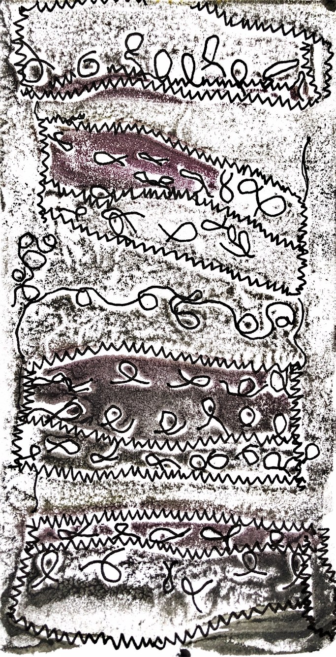
I am particularly pleased with the crochet sample as a response to the wrapping as I feel it captures the colours, random patterns and movement of the original sample.
Before starting this exercise I have done some more research. Looking at the work of artists Christo and Jeanne-Claude, I have picked out three different inspiring works.
I find this piece very satisfying. The arrangement of different sized cans has height and depth, making a pleasing composition. The contrast of the smooth unwrapped tins emphasise the folds and texture of the fabric and rope wrapping the other cans. They are all wrapped differently, two with formal folds and one with the fabric more uneven and scrunched around the tin. The shadows created by the folds and creases add another dimension. A single rope appears to hold the fabric in place. The cans are all monotone except for the one in the foreground which has a slight gold effect as if gold wax or paint has been brushed over to catch the edges. There is a lot of contrast in texture and tone. The plain light coloured background means that all emphasis is on the cans – even the unwrapped ones have marks and rims to add line and pattern.
The first thing I thought of when I saw this was -‘what a lot of fabric!’. Even with pre-cut and sewn pieces, there is still a huge amount of gathering, creasing, crumpling, folding and arranging going on here. The red rope stands out and appears to be tied rather haphazardly, with knots showing and little pattern or symmetry. The figure can still be made out under the fabric and it looks as if it has been wrapped in a shroud – suggesting a reverence for the figure underneath.
I love the fact that the fabric used to wrap these trees is translucent, creating an ethereal effect. The branches can be clearly seen, and the fabric delineates and emphasises the overall shape of the tree. The light from the sky would change in direction and density throughout the days and weeks which would mean the wrapped trees appear different each time they are viewed and depending on the viewpoint. In Japan trees are wrapped for practical reasons each winter, to protect them from frost and snow. The trees above appear to have lost their leaves so I presume it is winter in the photograph.
Exercise2
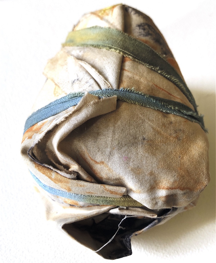
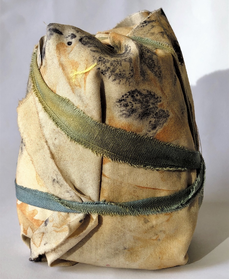
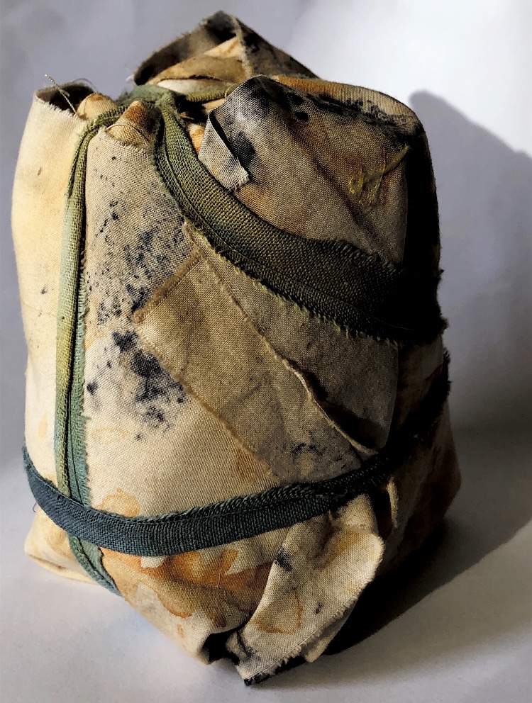
For this exercise I chose to wrap a Marmite jar as it is simple but has a definite shape to it.
Sample 1
Folded cotton fabric simply wrapped and tied with cotton strips. This sample looks different from each viewpoint. Raw edges and folds combine to make an interesting shape that is controlled and neat, or messy and untidy depending on the point of observation.
Sample 2
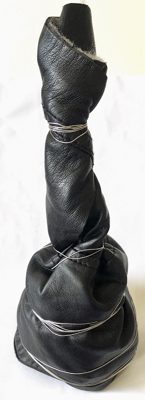
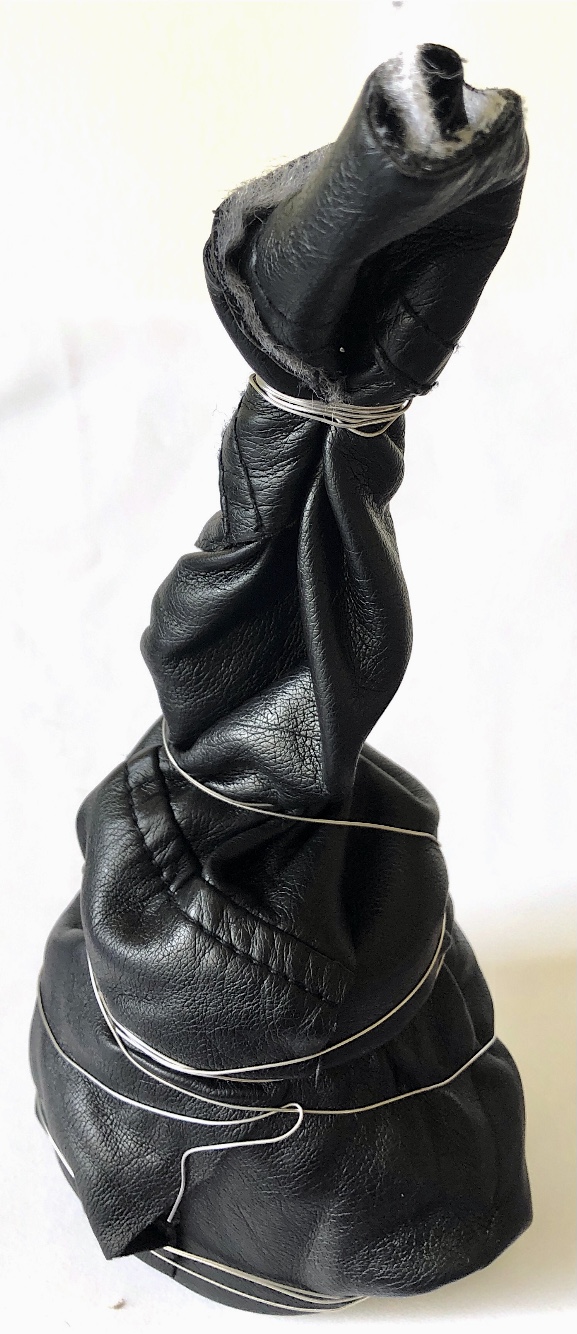
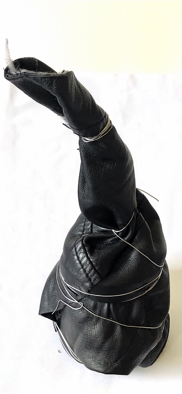
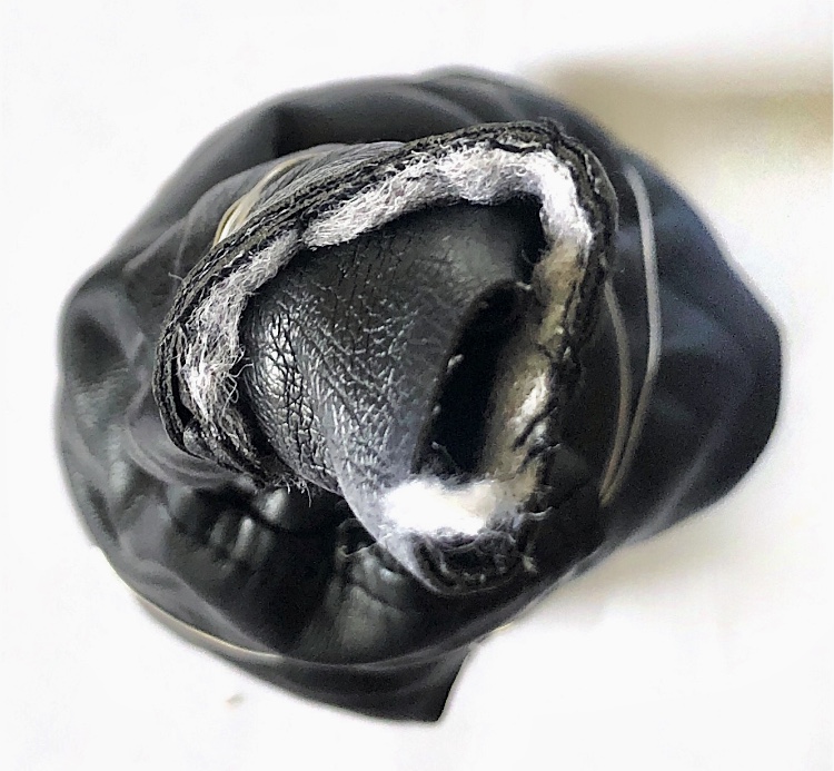
My faux leather jacket was going to be thrown away so I cut it up and used some to wrap around the jar, elongating the shape and securing with wire. This completely changes the original shape, the stiffness of the faux leather holds the structure in place and the wire brings another texture and point of interest. Some of the stitching from the jacket can be viewed, spiralling around the sample.
Sample 3
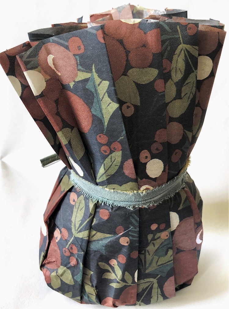
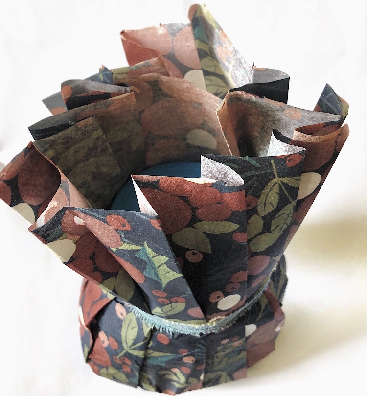
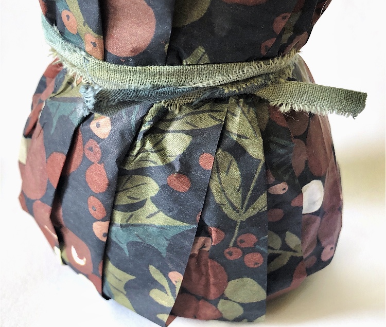
For a totally different, more formal look, I pleated tissue paper and just tied it around the top of the jar. The paper splays out at the top but retains the folds. This could be achieved with fabric with steam pleats or stitched pintucks.
Sample 4
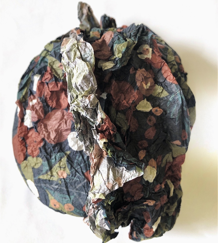
Scrunching the tissue paper before wrapping, and creating ridges gave a totally different appearance, and the paper did not need to be tied to secure. This looks organic and soft, – very tactile.
Sample 5
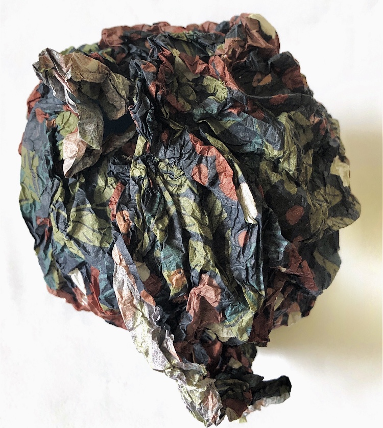
Using the sampe scrunched tissue and some ripped cotton ties made a very sculptural sample.
Sample 6
Sample 5 was wrapped in red/black shot organza. The solid textural paper contrasts with the sheer, shimmery organza, tied at the top, giving the appearance of a wrapped present secured with a bow.
Sample 7
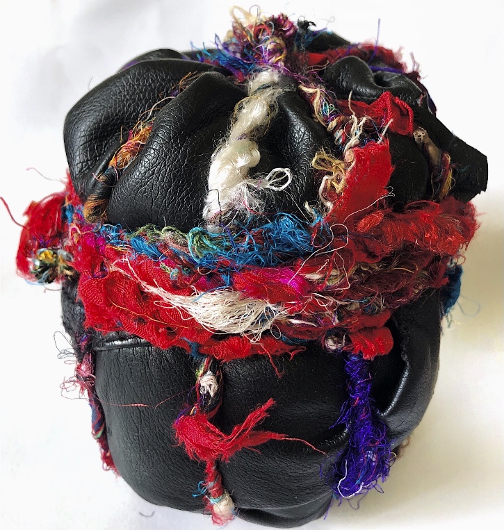
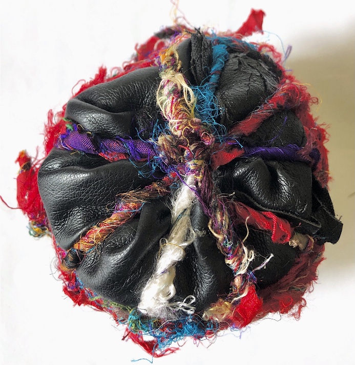
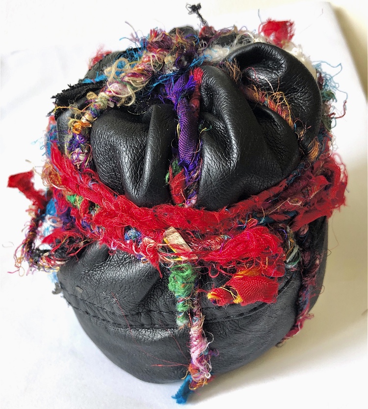
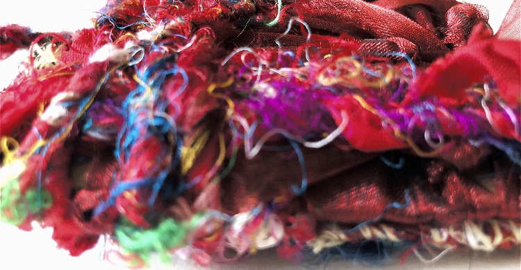
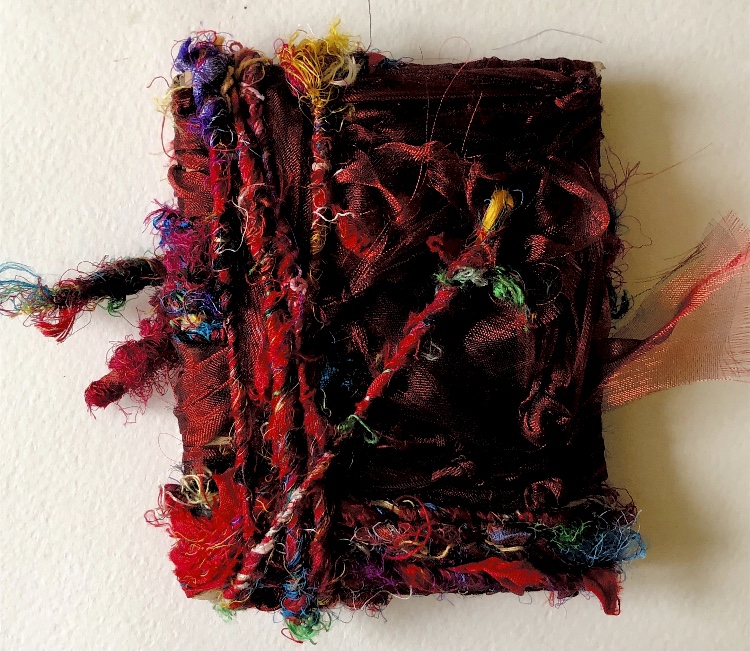
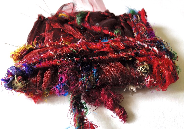
Faux leather tightly tied with sari silk yarn in a pattern – again this is a very tactile and visually exciting sample with the black smooth leather catching the light, contrasting with the multi-coloured, hairy, soft rough yarn. This piece makes me want to hold it with my eyes shut to feel every surface.
Sample 8
The natural fabric simply folded and wrapped, criss crossed with ripped natural cotton creates a pattern reminiscent of the wrapped mummies in my research. The roughness of the fabric ties would get more pronounced with age and handling.
Sample 9
Here I used the same fabric and ties but wrapped very loosely to create a more organic shape.
Sample 10
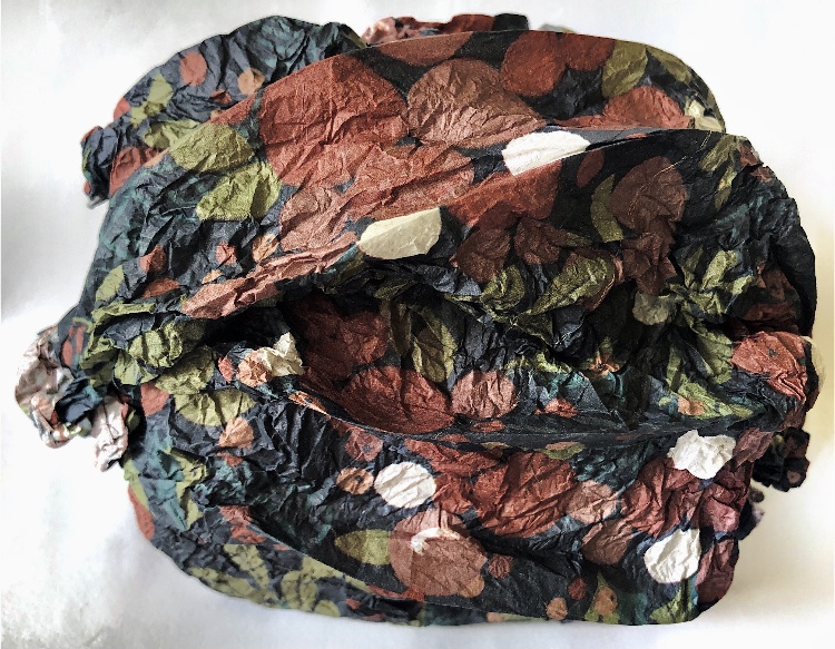
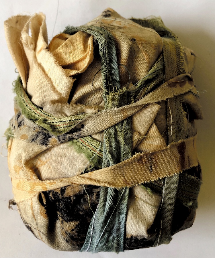
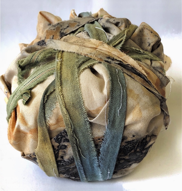
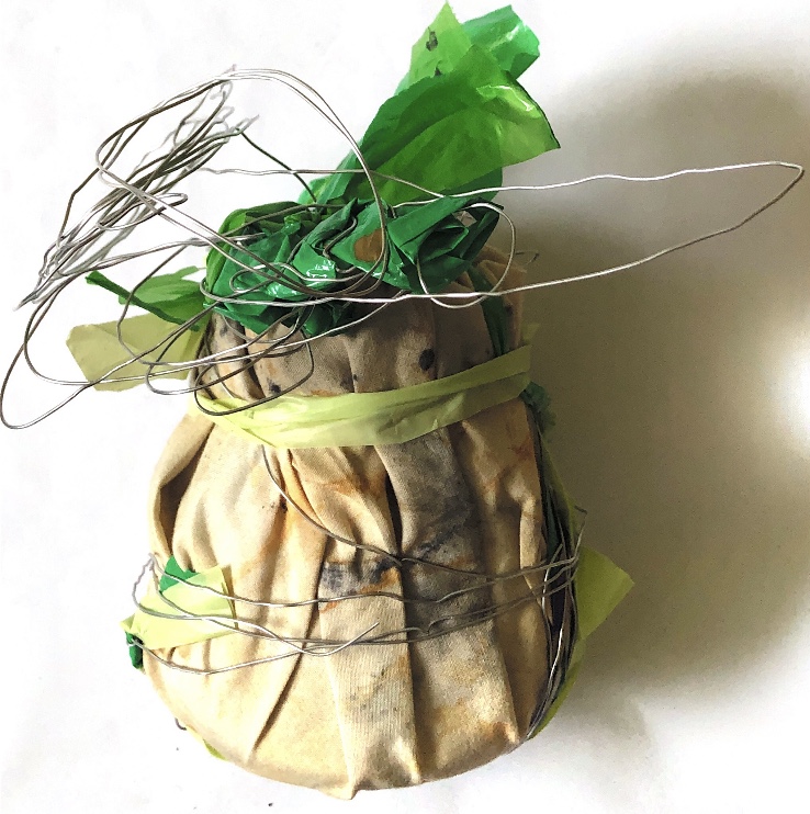
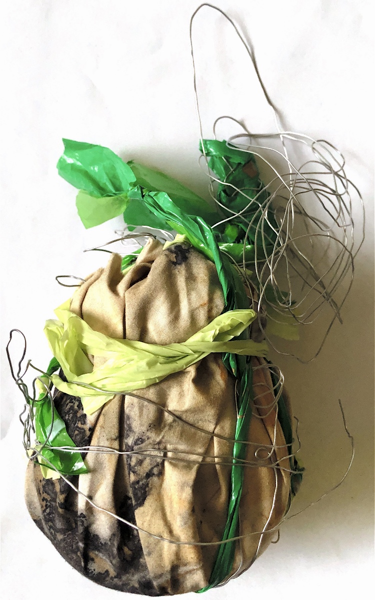
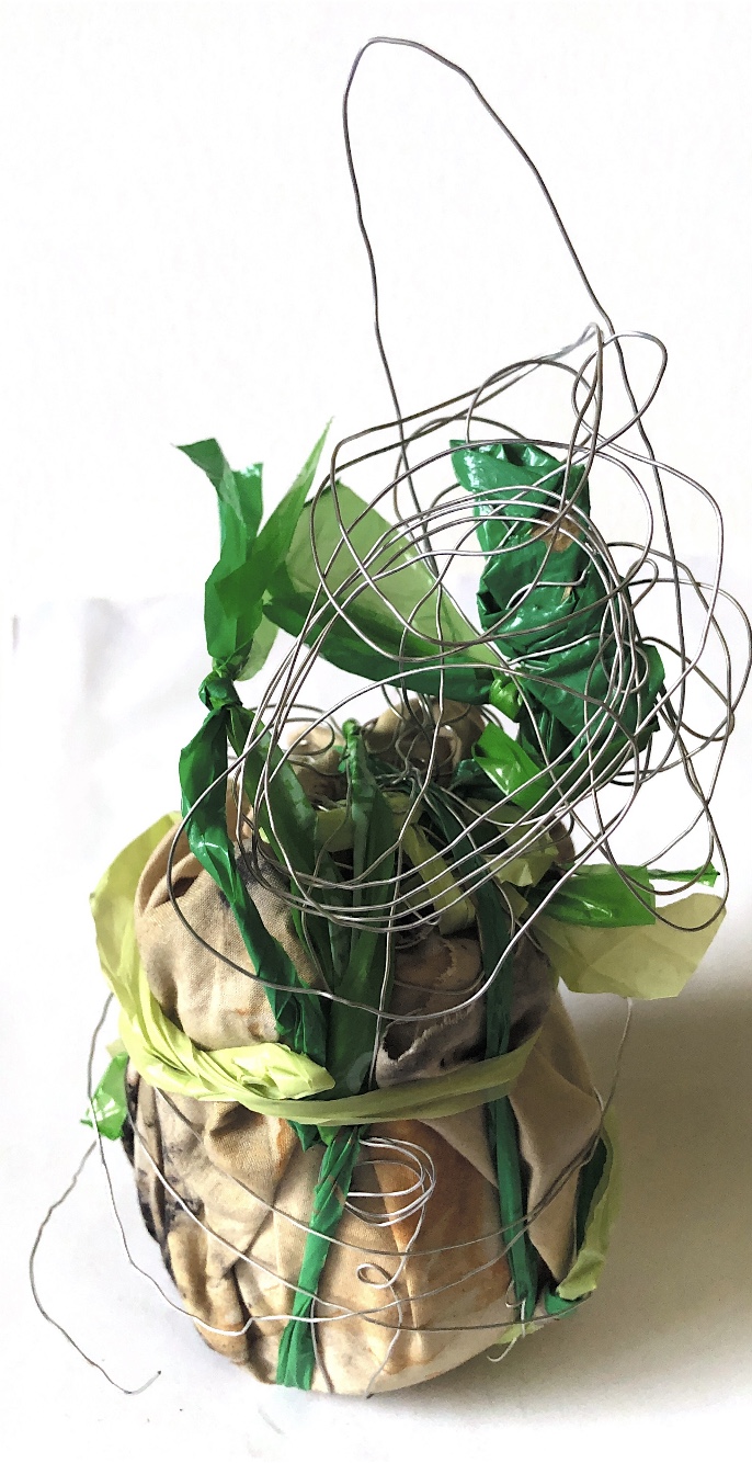
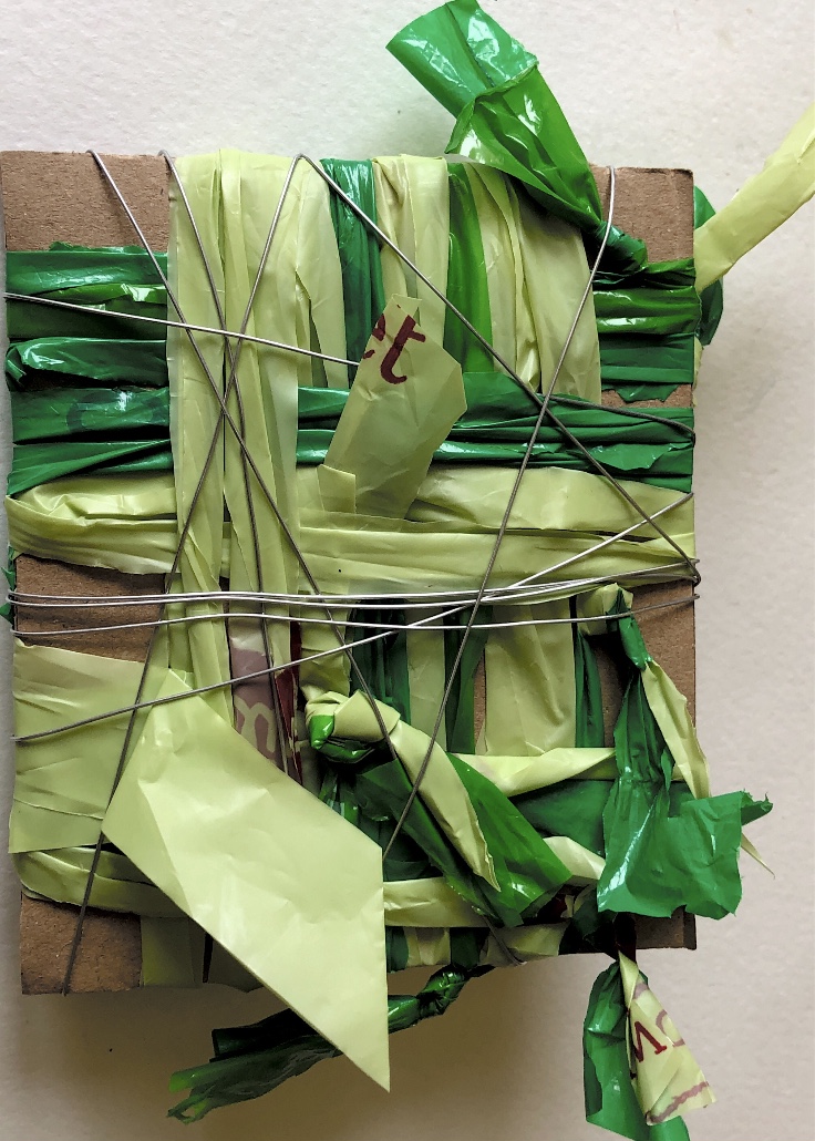
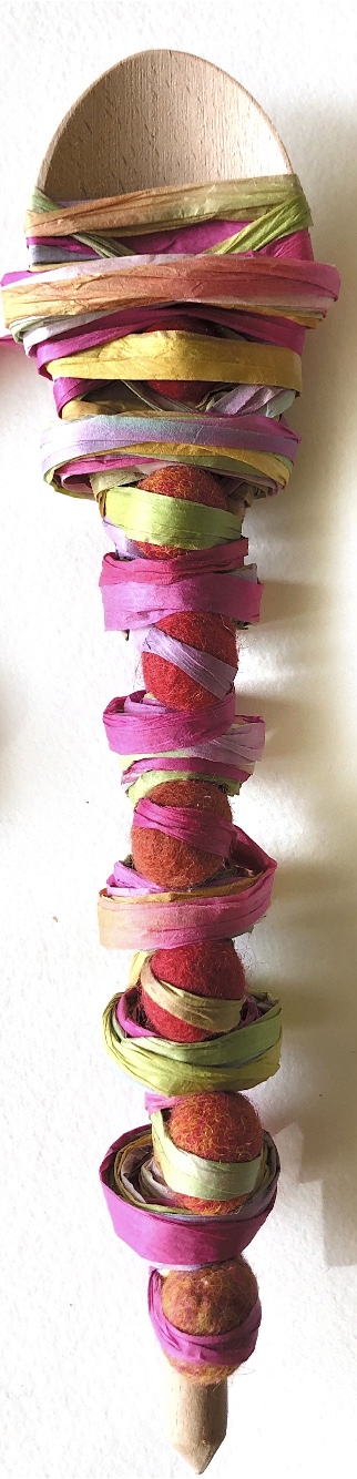
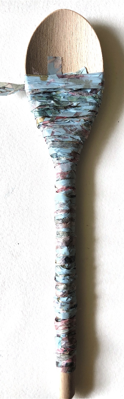
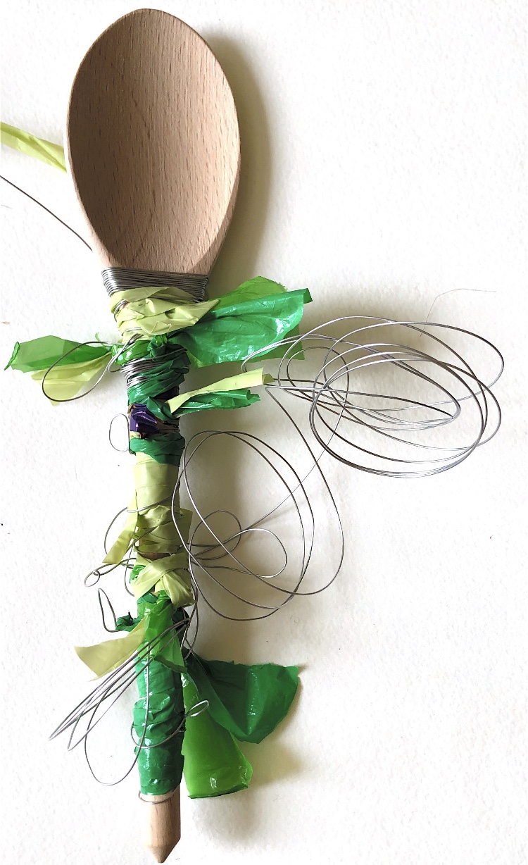
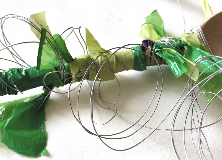
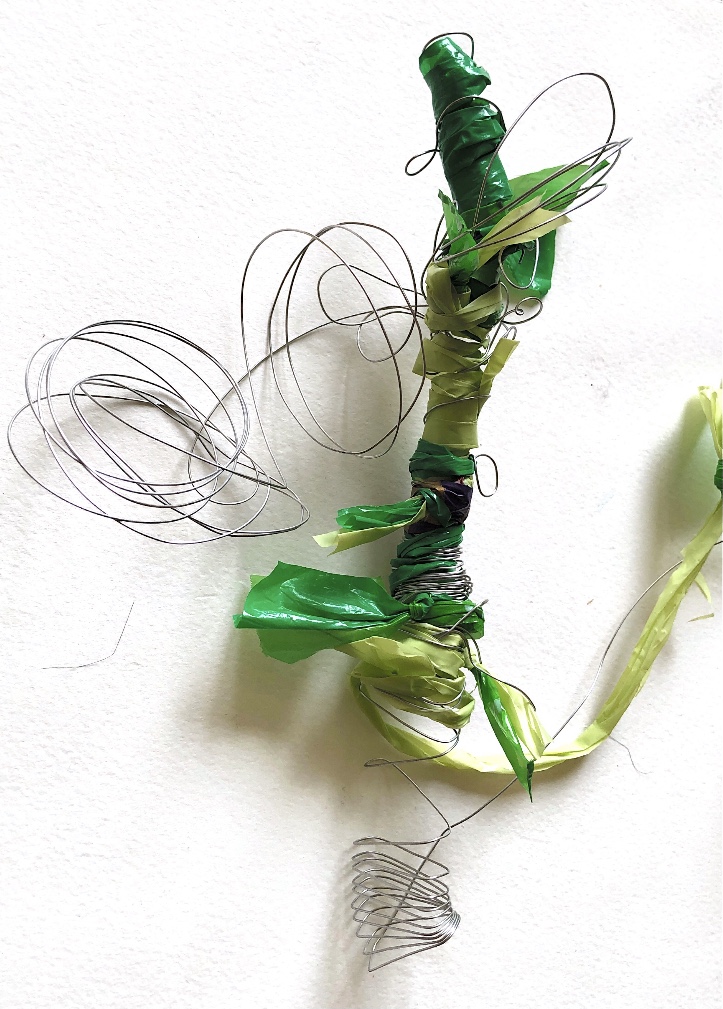
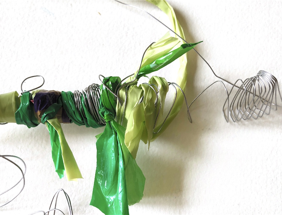
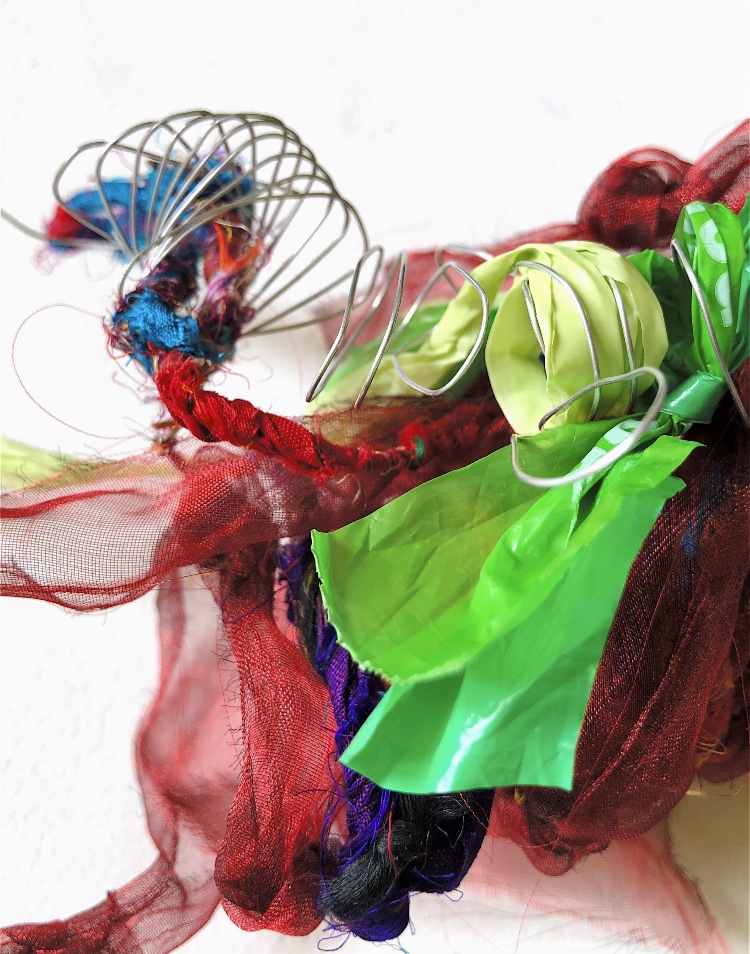
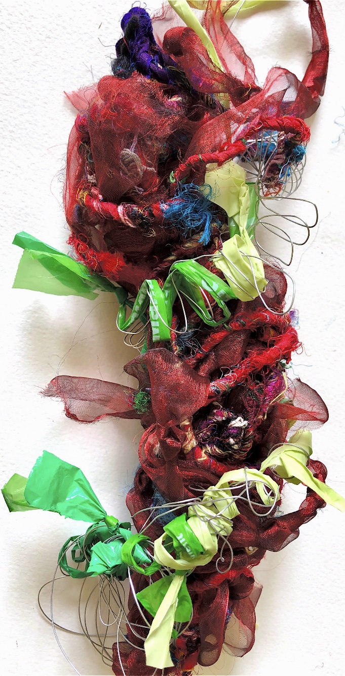
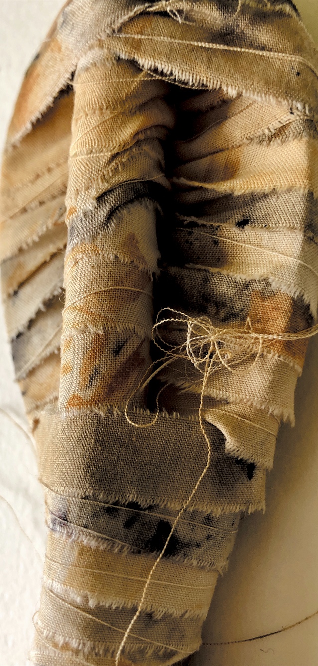
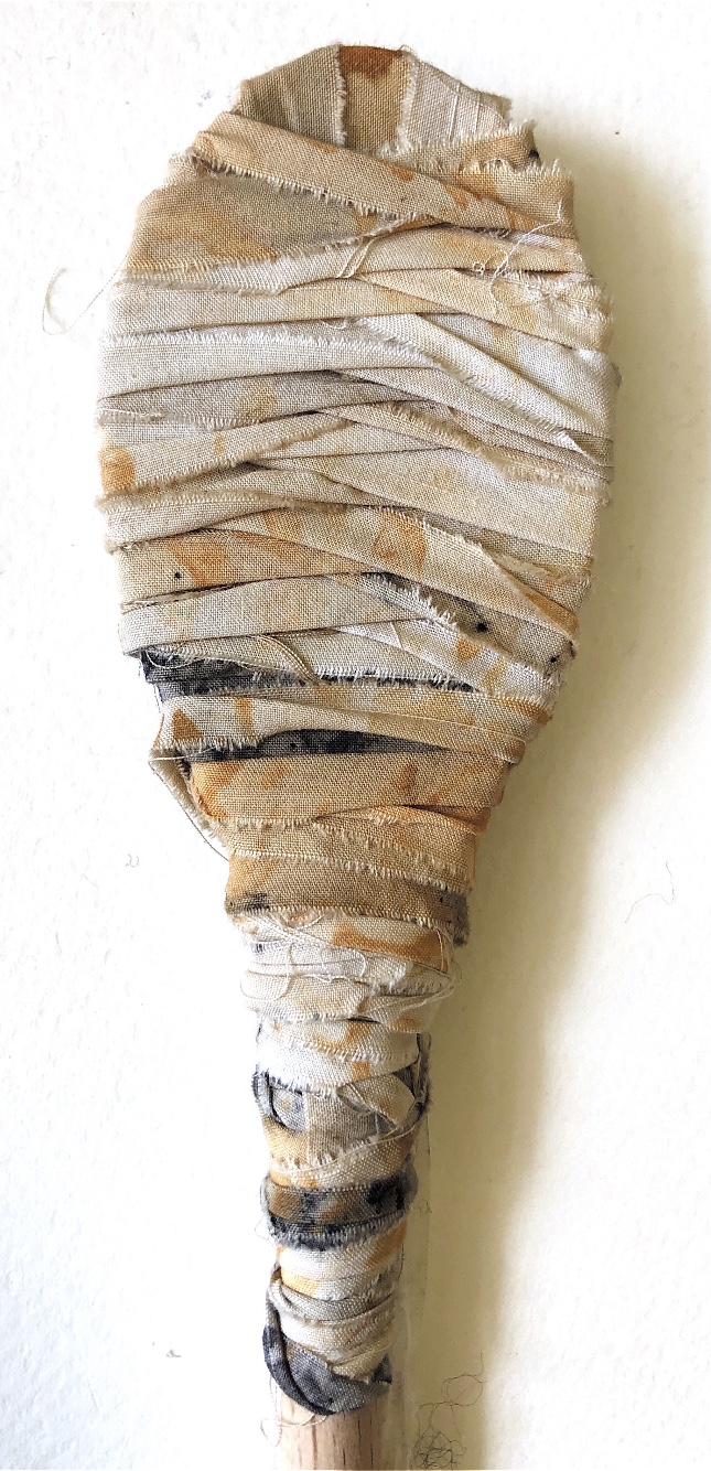
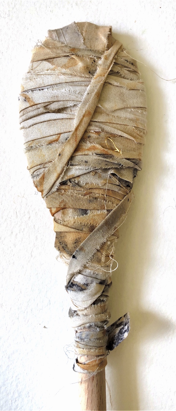
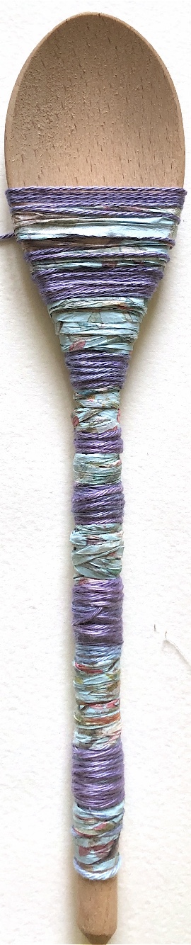
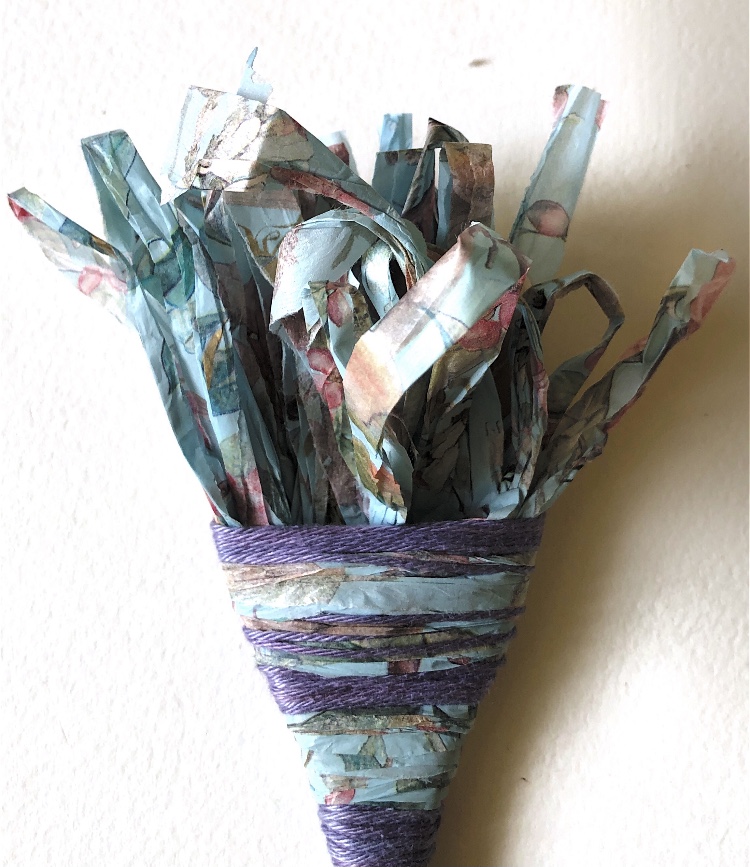
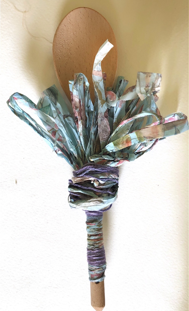
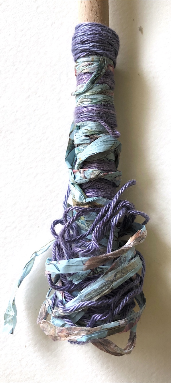
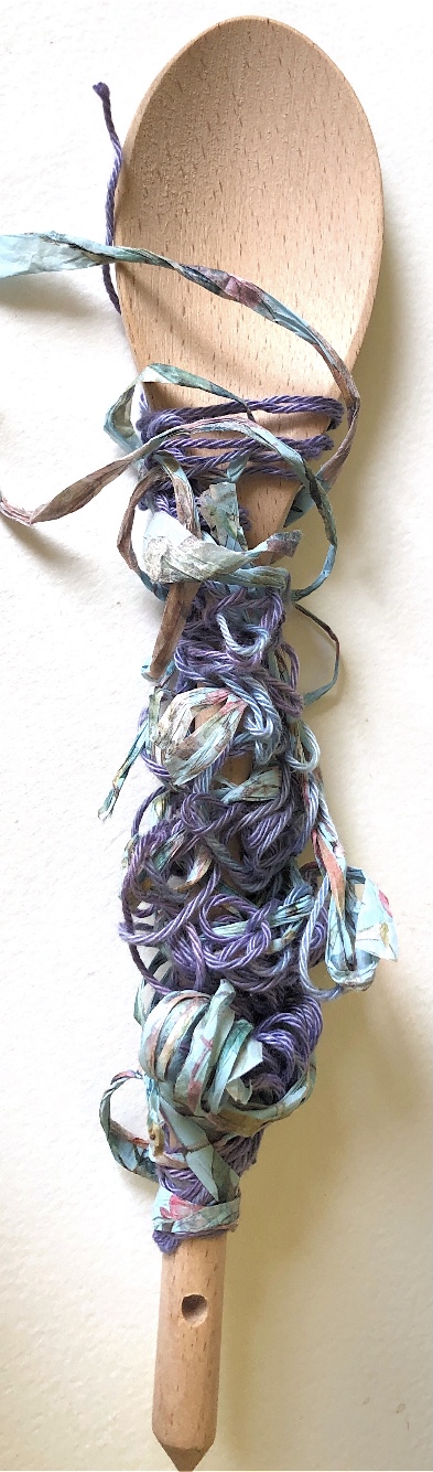
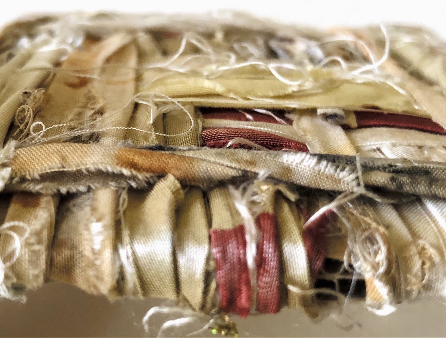
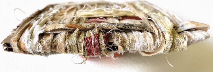
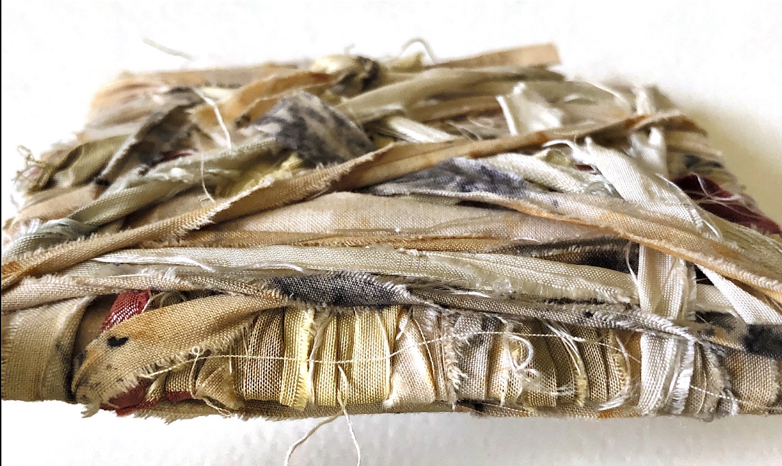
I had a sample from Exercise one that had been removed from the wooden spoon which I really wanted to use again. The natural fabric contrasts with the man made plastic bag and smooth shiny wire wrapped around it to make a sculptural sample.
Sample 11
Looking at Christo and Jeanne Claude’s wrapped trees in my research I tried photographing a sample with the light from the window shining through (It is winter so there is not a lot of light!). I think this would work better with something more interesting to view inside – clearly that is why the trees worked so well!
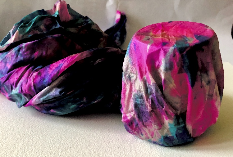
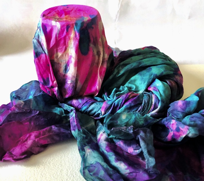
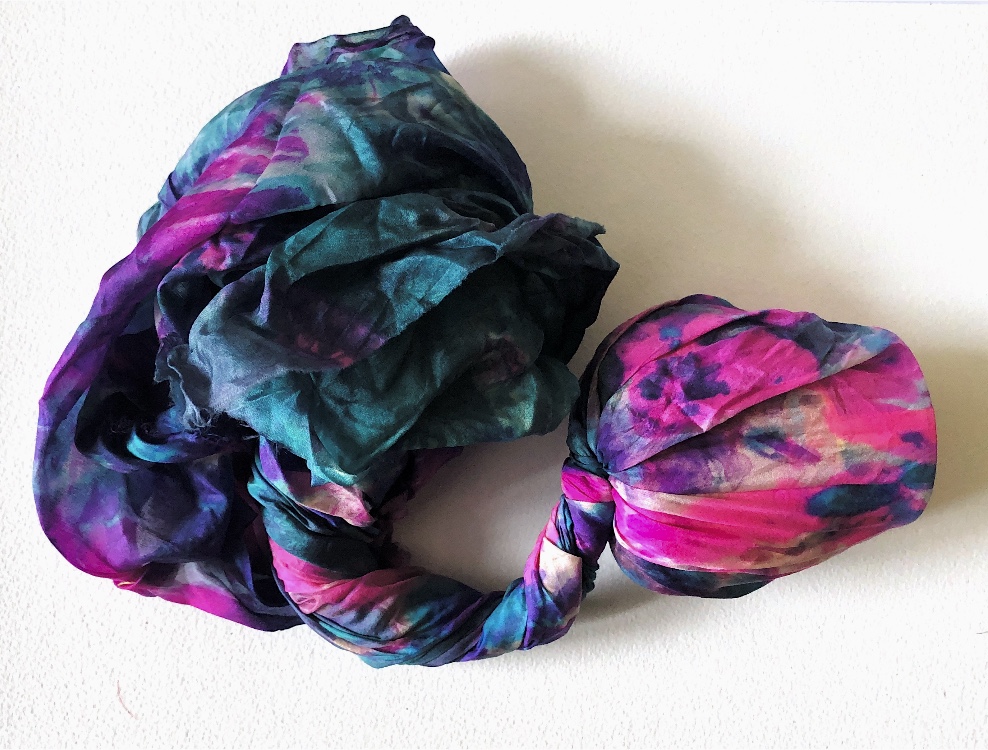
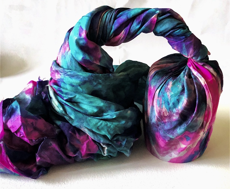
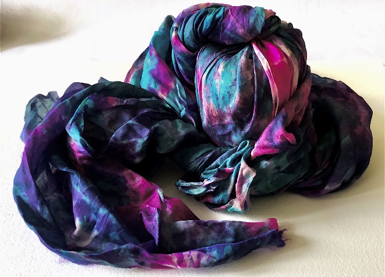
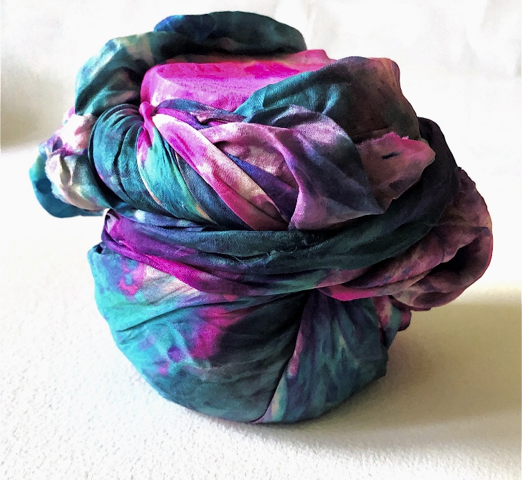
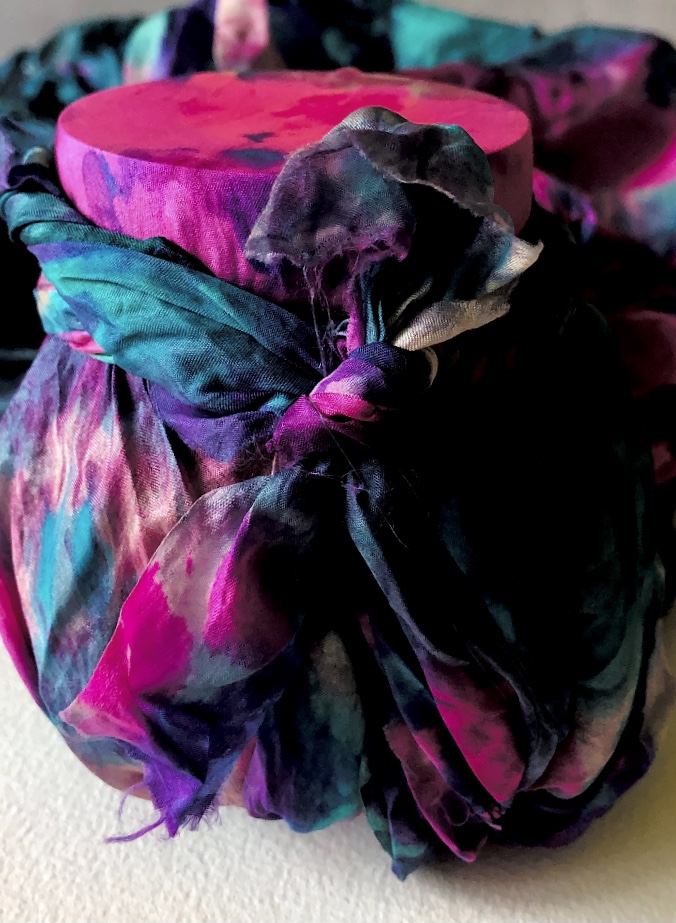
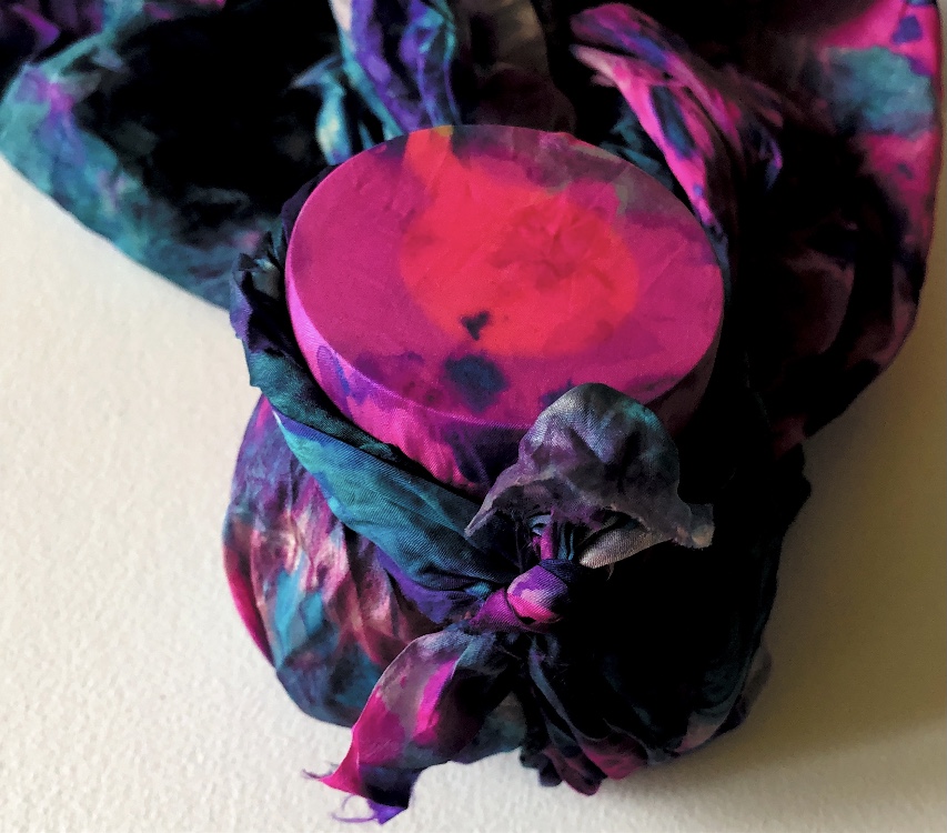
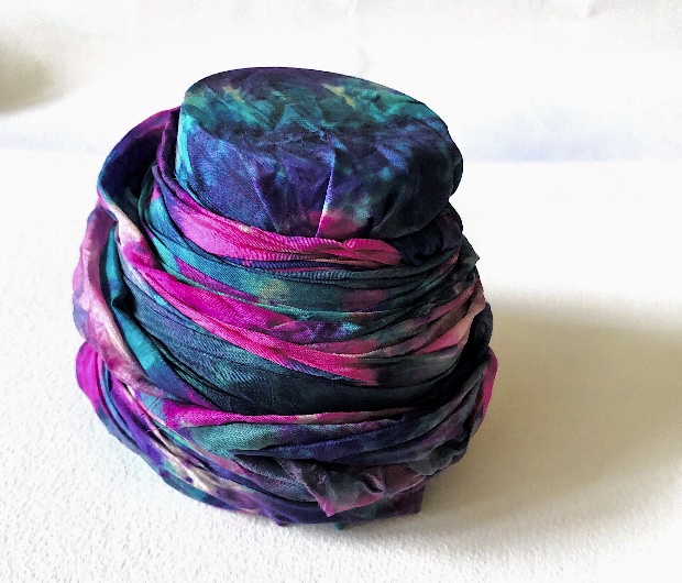
Sample 12
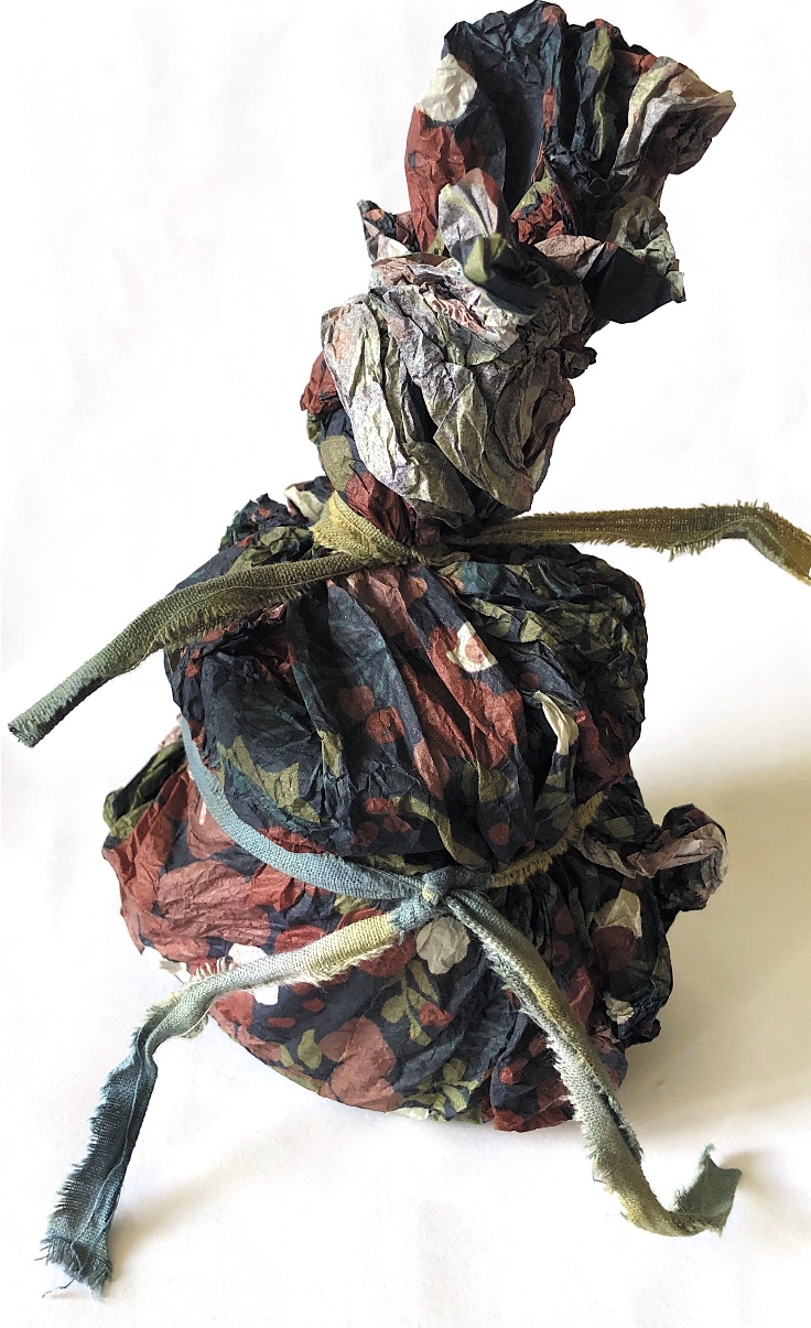
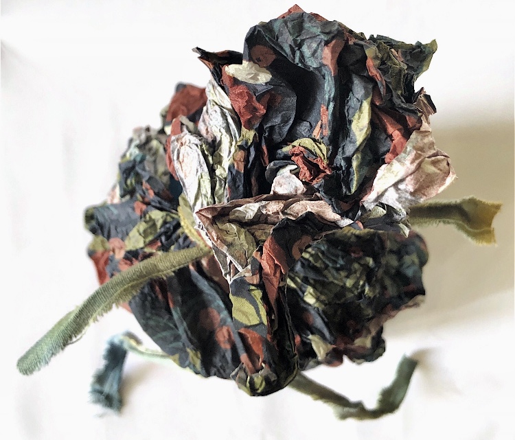
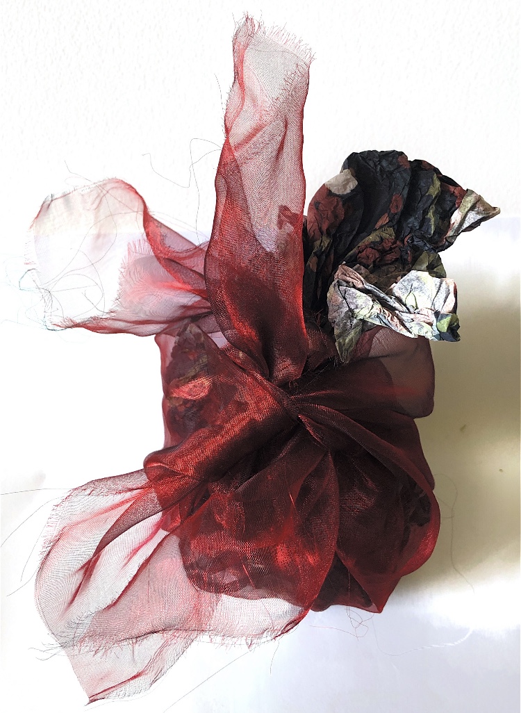
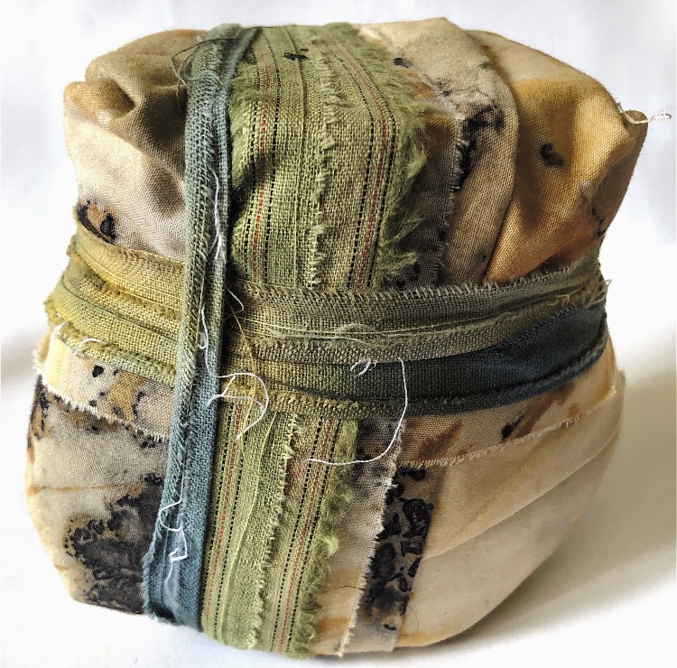
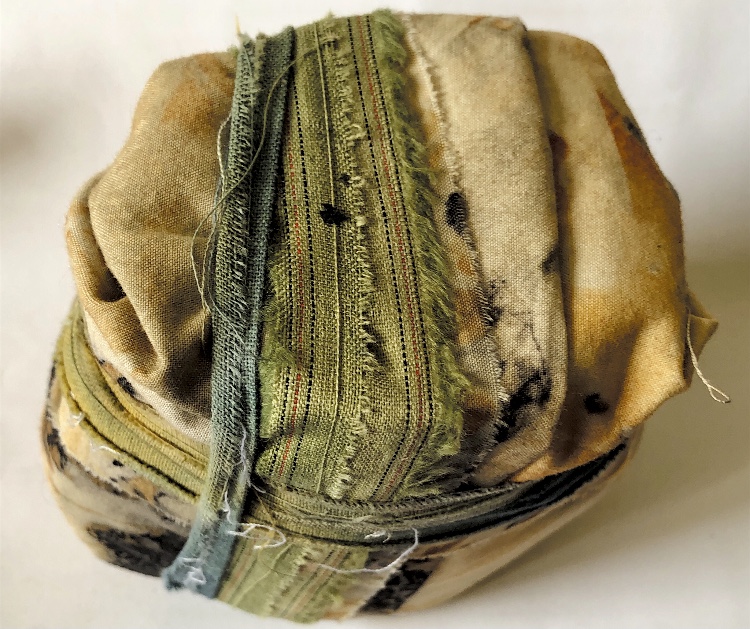
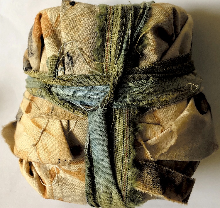
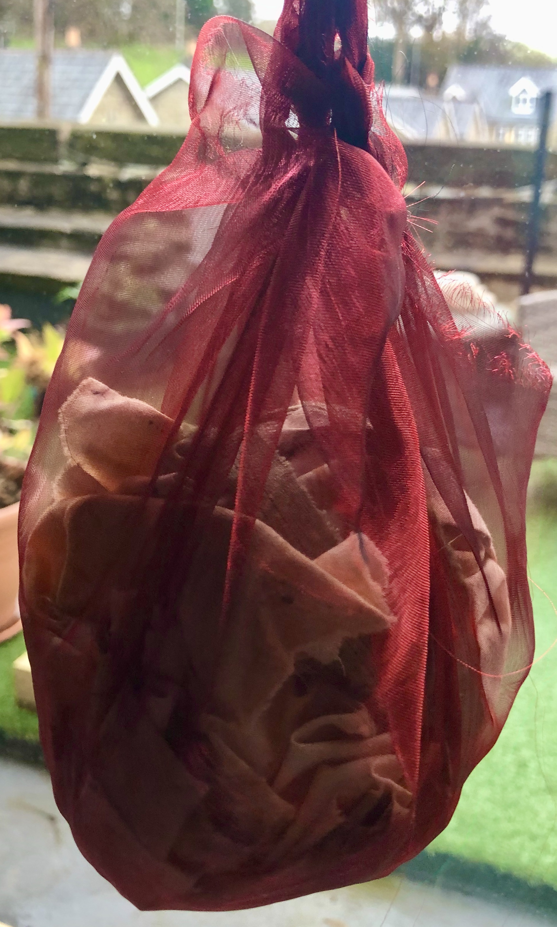
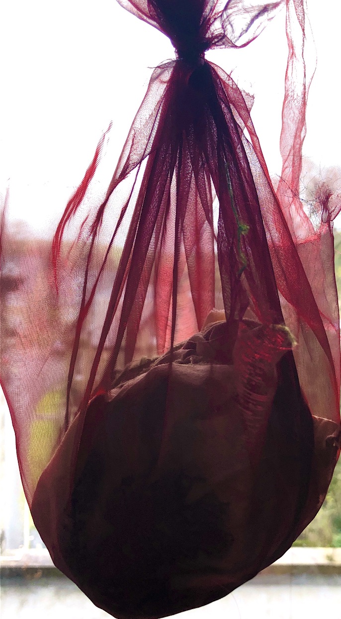
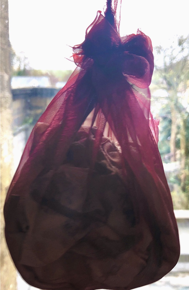
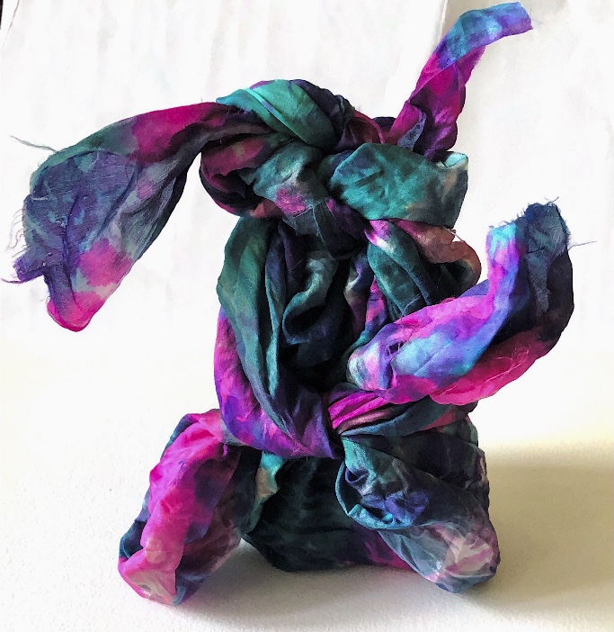
Referring back to my research and the process of Furoshiki, I used a square of tie dyed silk to wrap the jar. These samples are very sculptural, – the wrapped jar shape appearing bold and heavy against the unused soft, light, silk fabric around the base. Some of the samples look like a strange flower on a stalk, while others are reminiscent of wrapped turbans.
I have really enjoyed this exercise, wrapping something with weight such as this jar creates samples that need to be felt and held to fully appreciate their beauty and fascination.
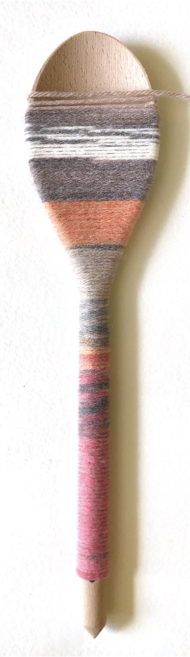
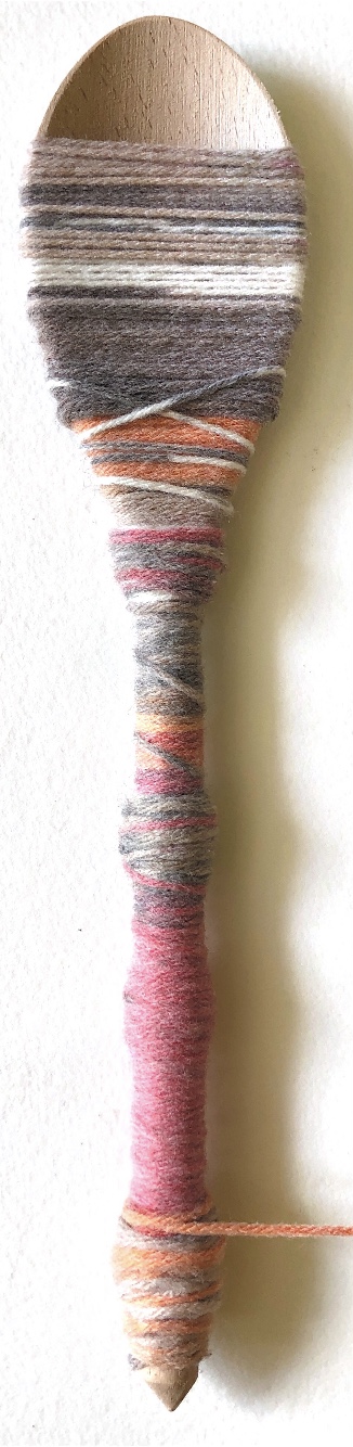
Looking back to my colour wraps from ‘A Textiles Vocabulary’ I can see that I gravitate naturally towards the colour schemes I developed there.
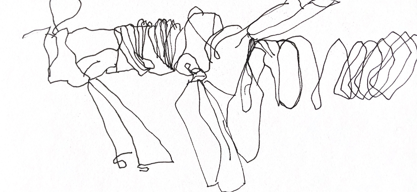
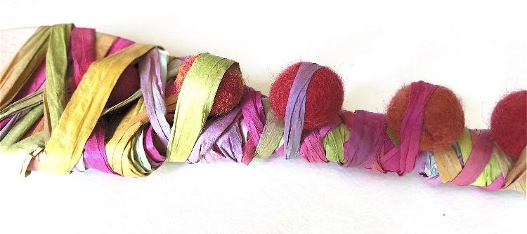
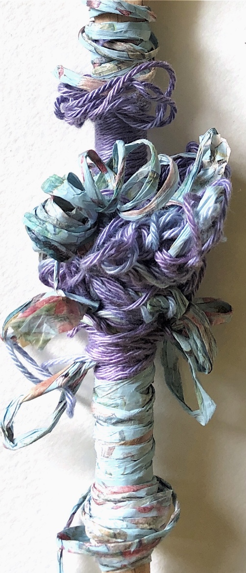
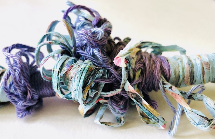
Once I started to experiment with using more than one wrapping material, and using different tensions I found that the materials ‘spoke’ to me and formed a variety of loops and shapes. I then took photos of the materials once I had pulled them from the spoon, and also wrapped them together, making organic, writhing shapes with lots of movement.
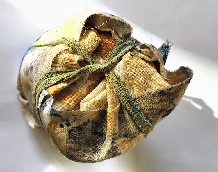
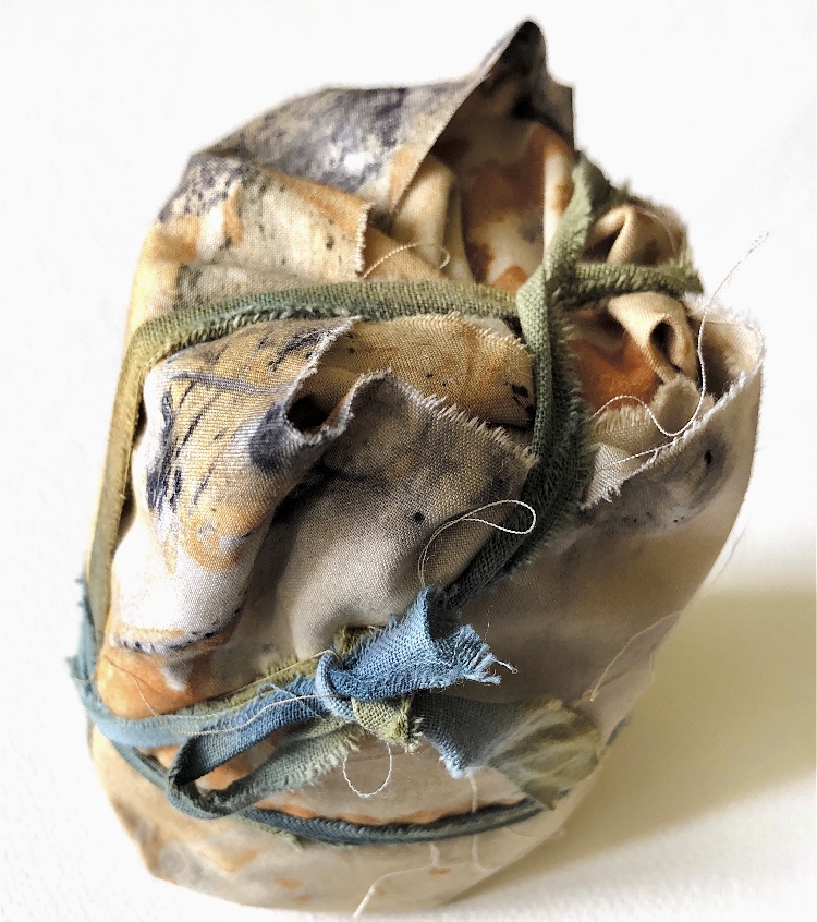
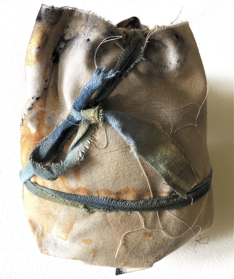
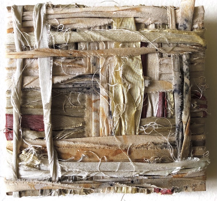
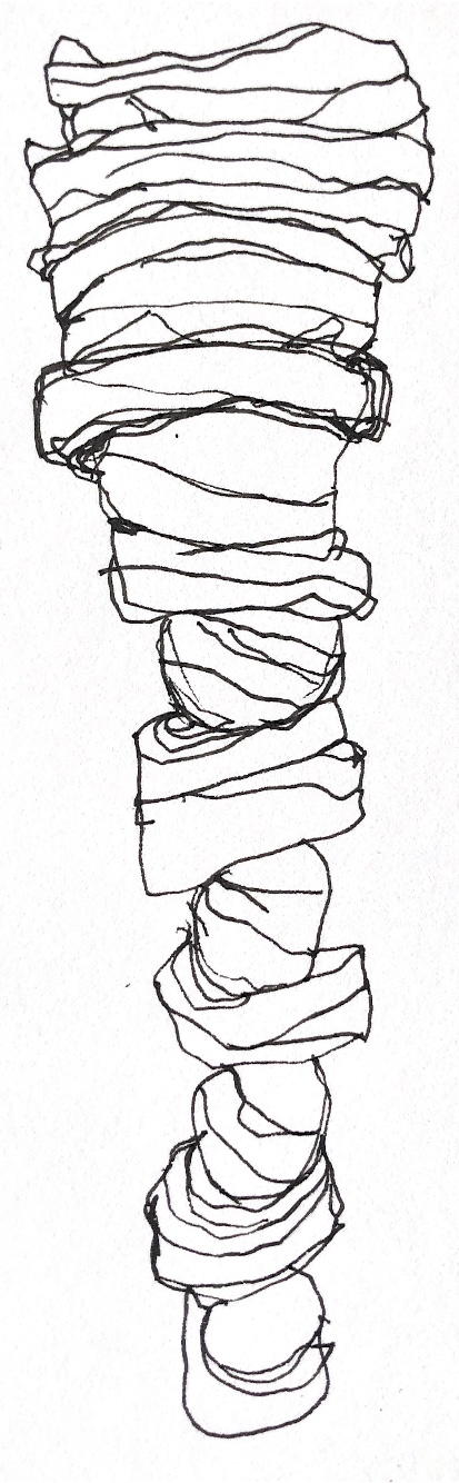
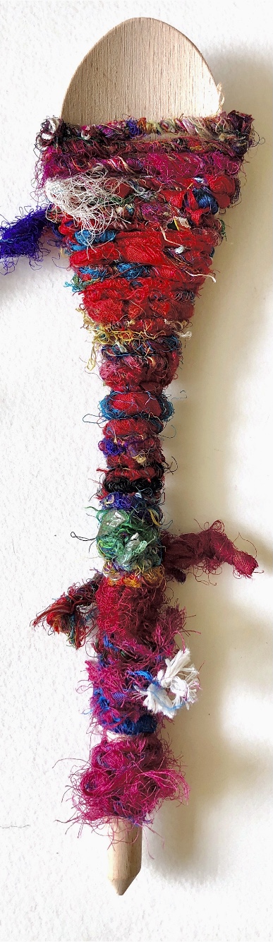
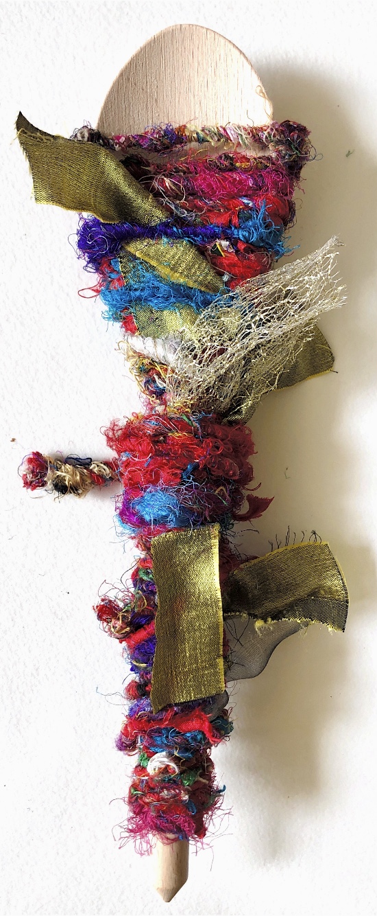
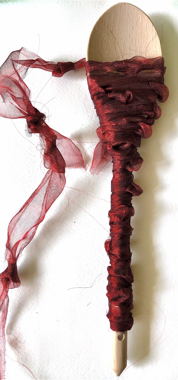
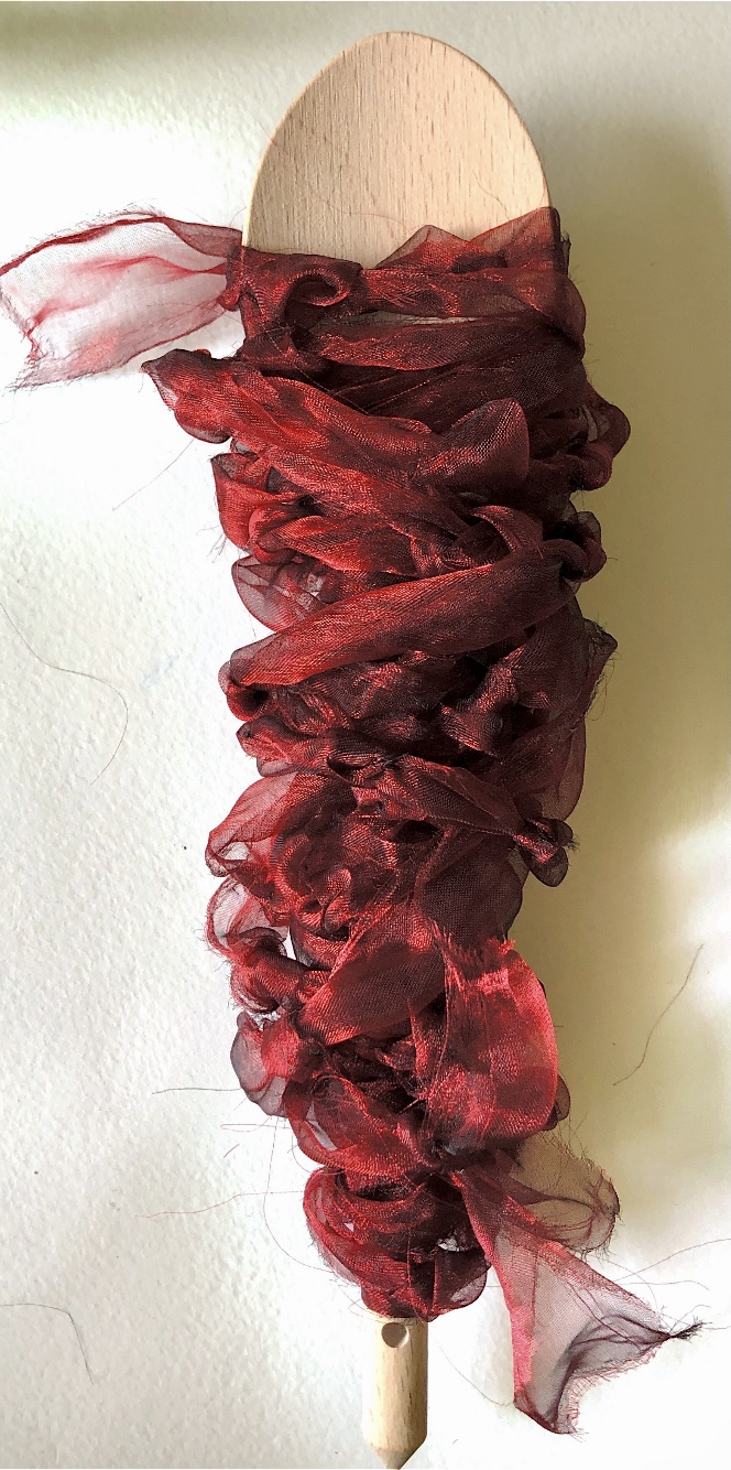
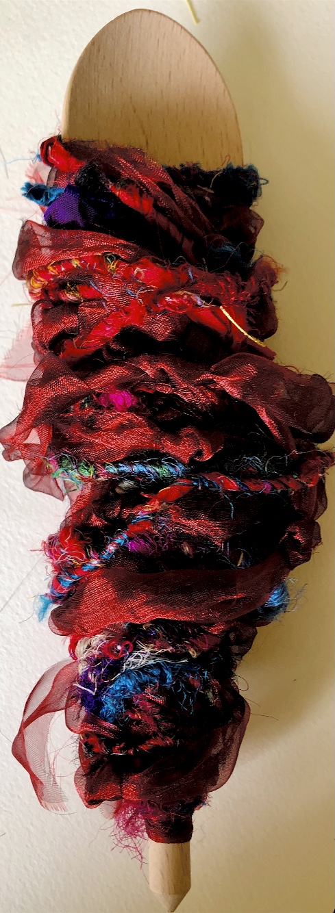
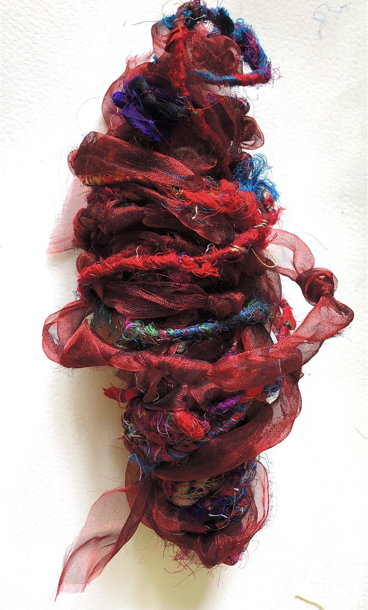
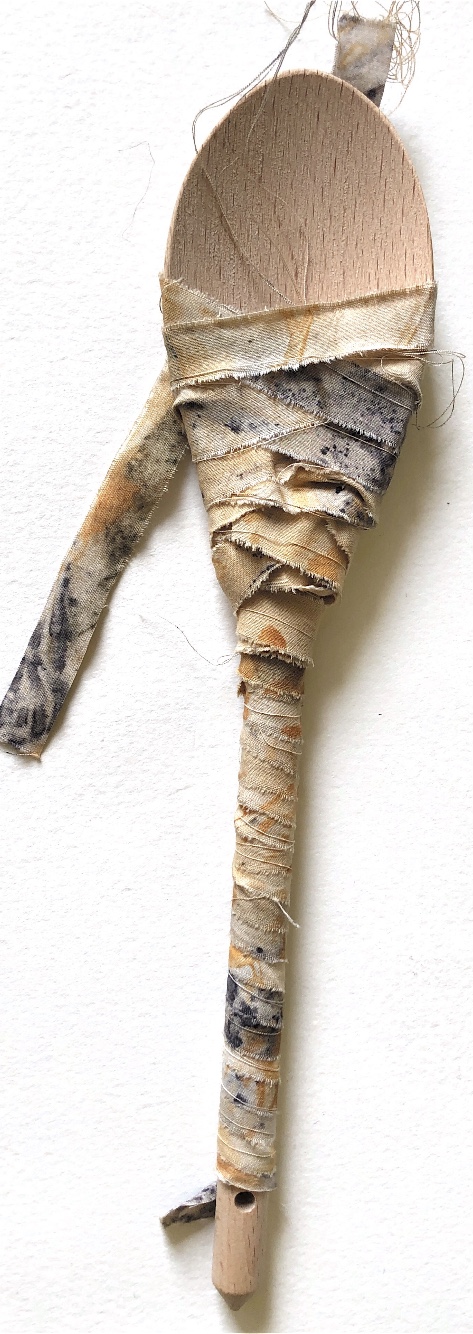
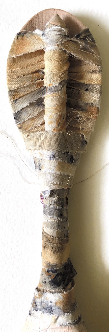
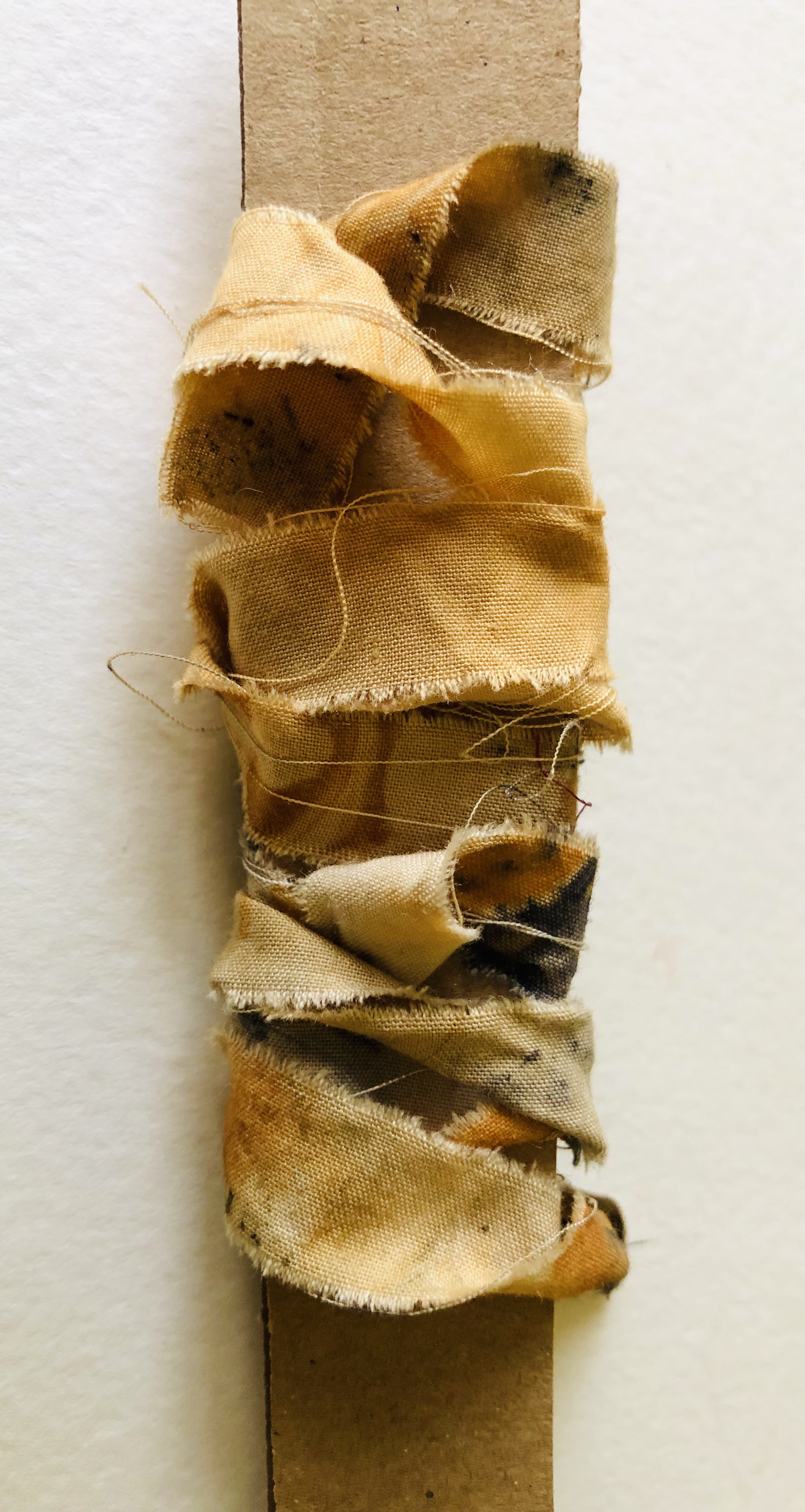
Referring to my research for Joining and wrapping I was inspired by wrapped Egyptian Mummies. I used eco dyed fabric strips and wrapped the spoons tightly in patterns, and also loosely. These techniques need further development – I have thoughts of wrapping different shapes and trapping elements in the cloth.
Using tissue paper and knitting wool was again interesting, especially with a looser approach to the wrapping and also when the spoon was removed, – as the paper kept its corkscrew shape. The different materials work well together especially as the pastel colours create a harmonising effect. The tissue paper was surprisingly strong when torn into strips along the grain.
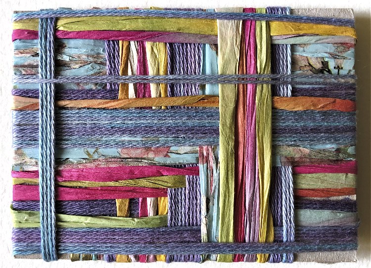
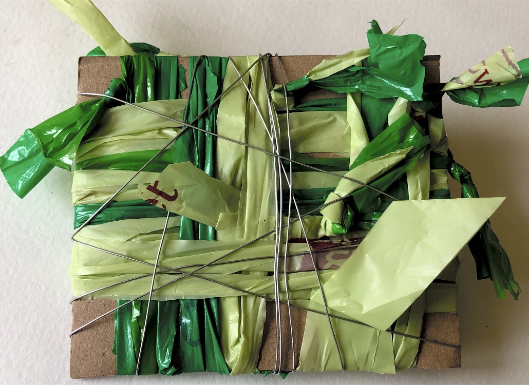
Working on wrapping rectangular pieces of card and using direction and angles to create patterns worked well with a wide variety of materials. Some of the samples have also been photographed from the reverse side.
I can see that colour, as well as material and technique, has played a major part in my wrapped samples, and I have chosen to work with a wide range of colours including the subtle shades of the eco dyed cotton.
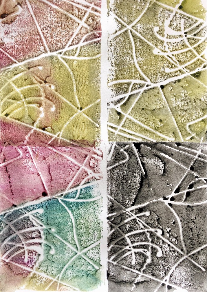
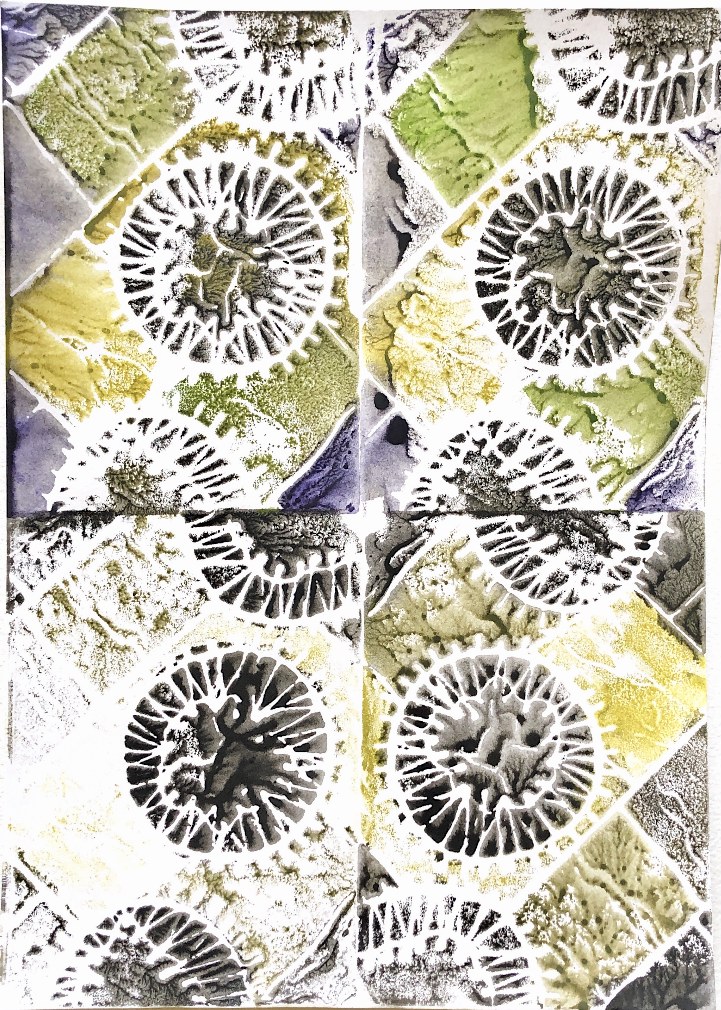
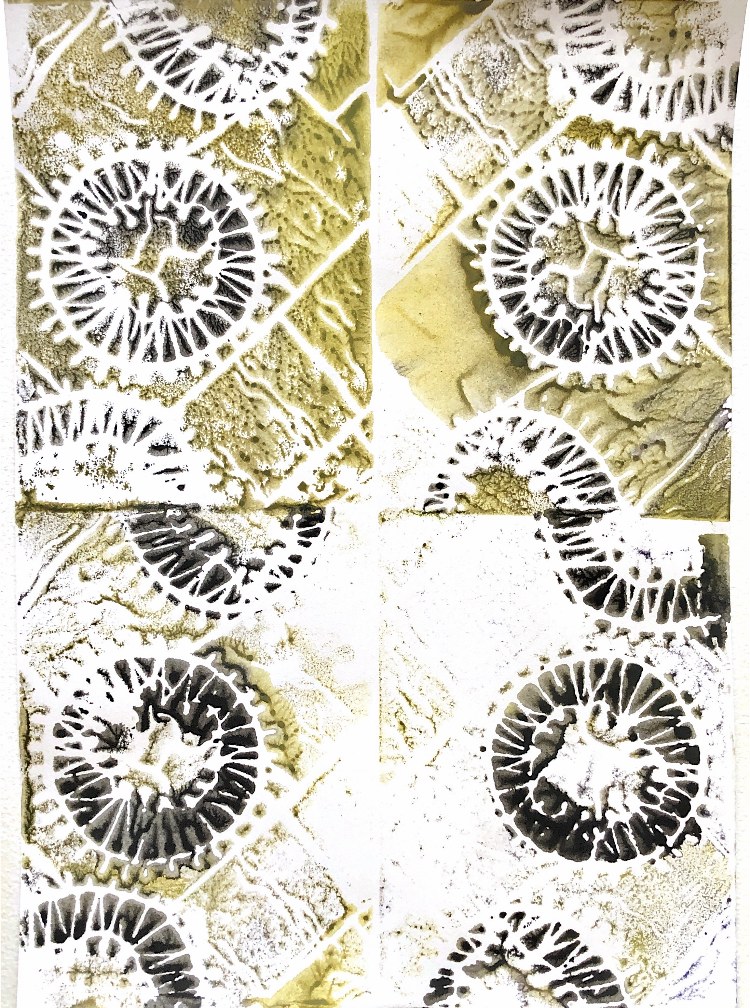
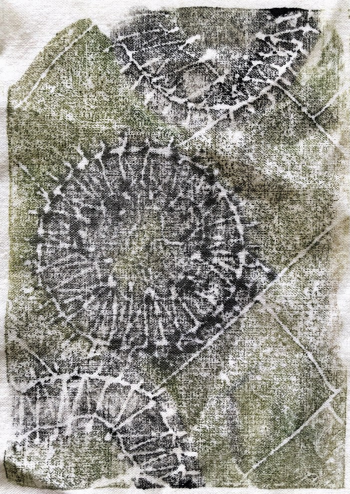
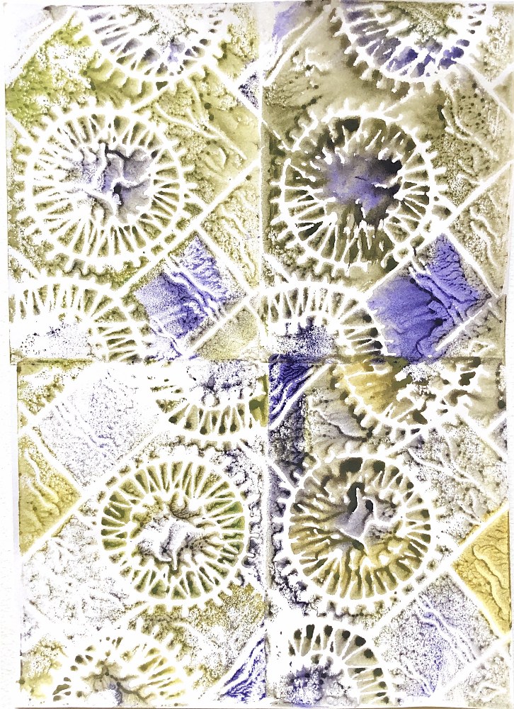
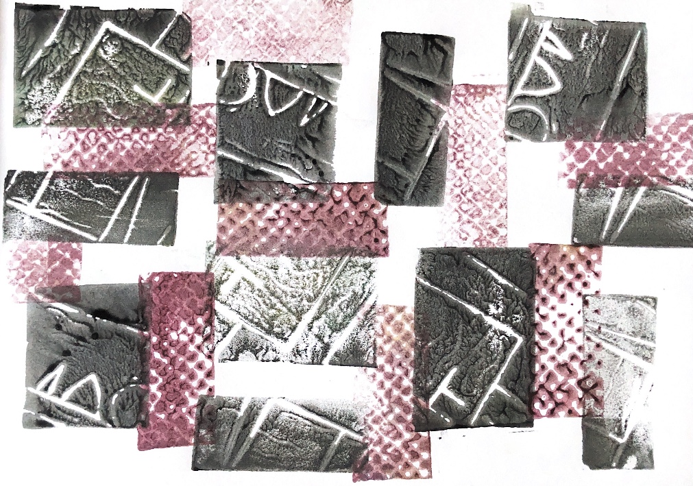
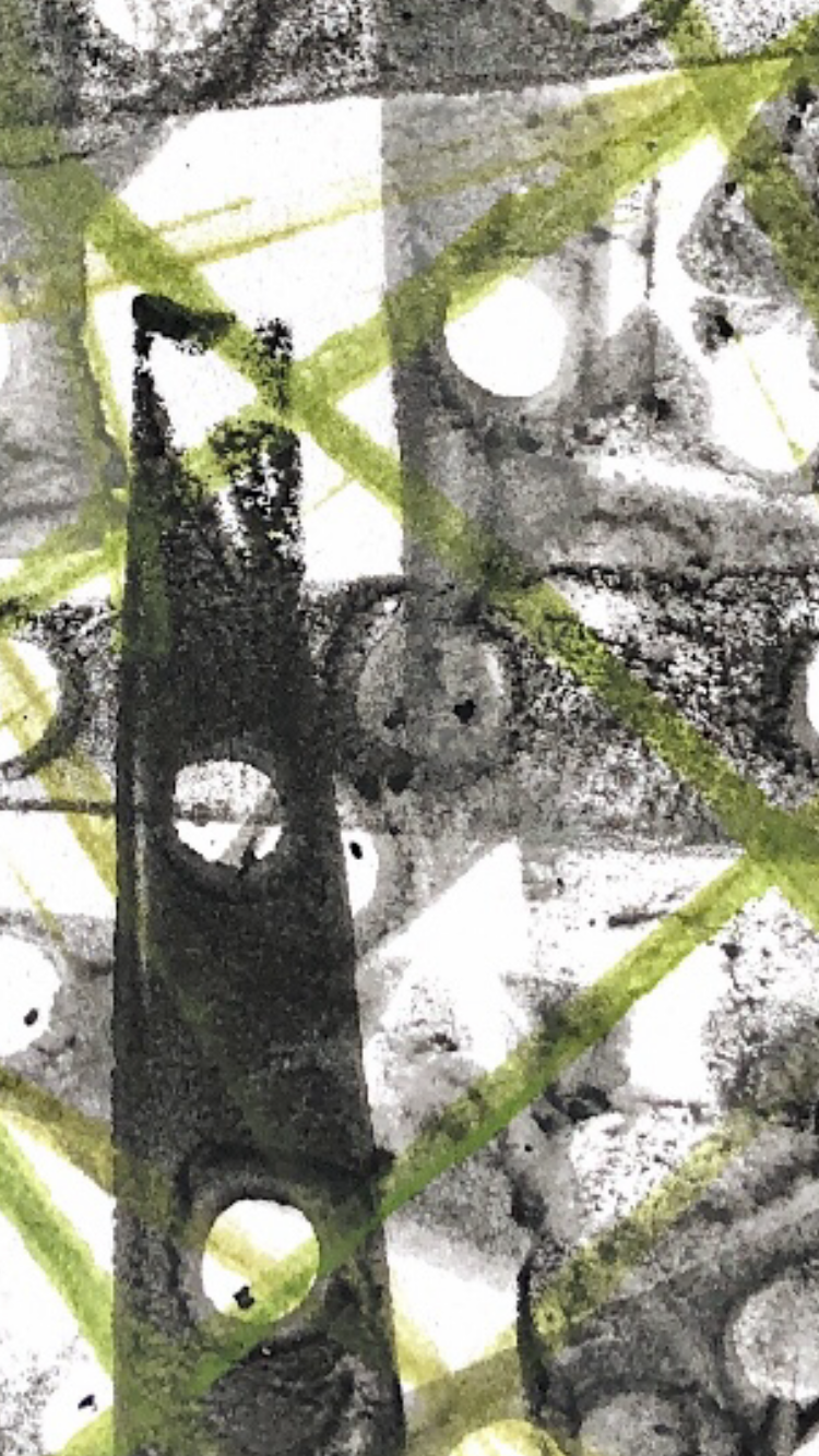
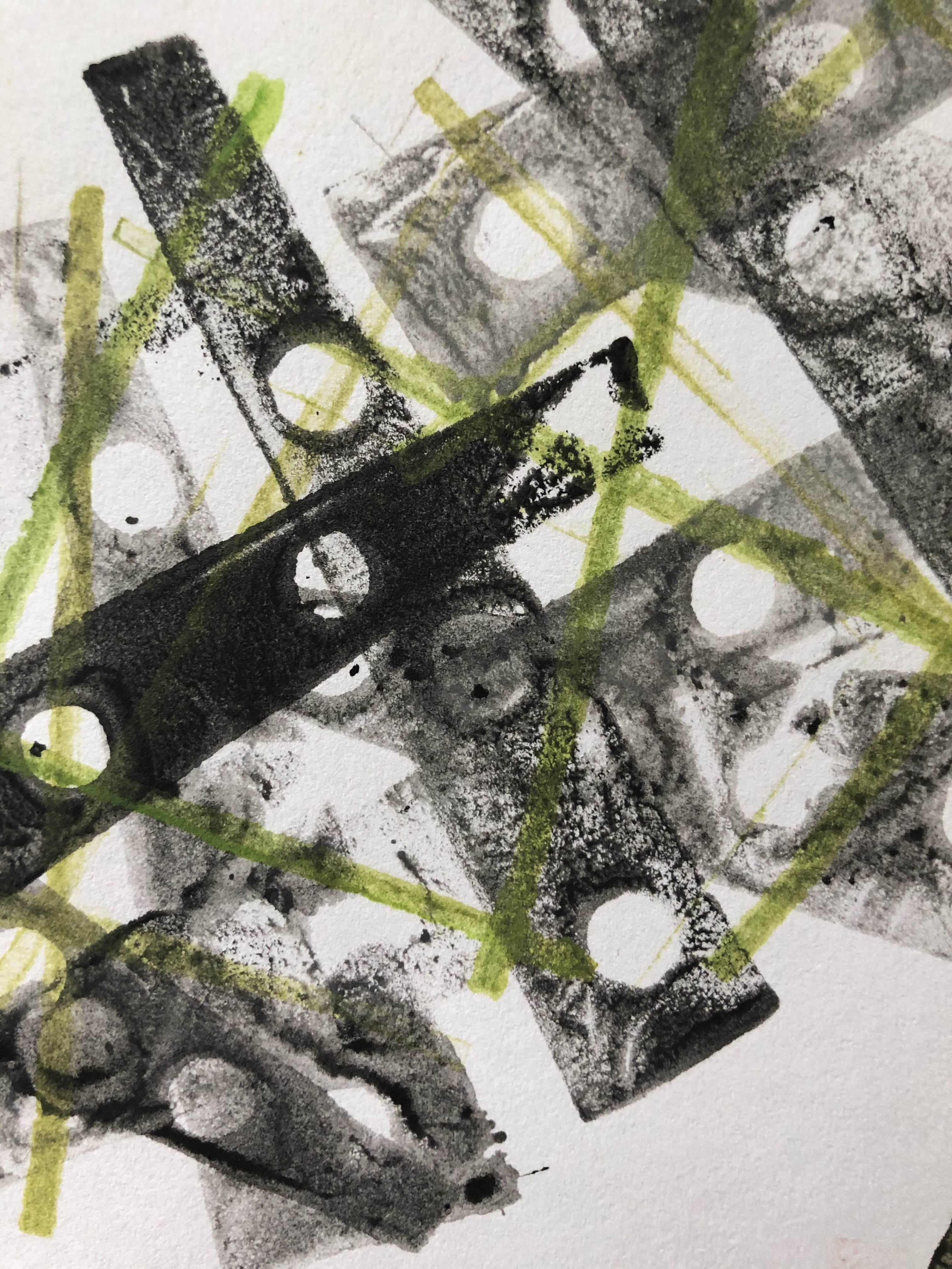
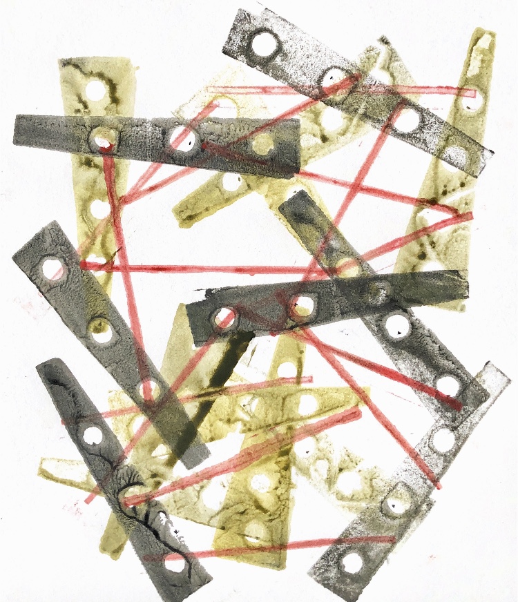
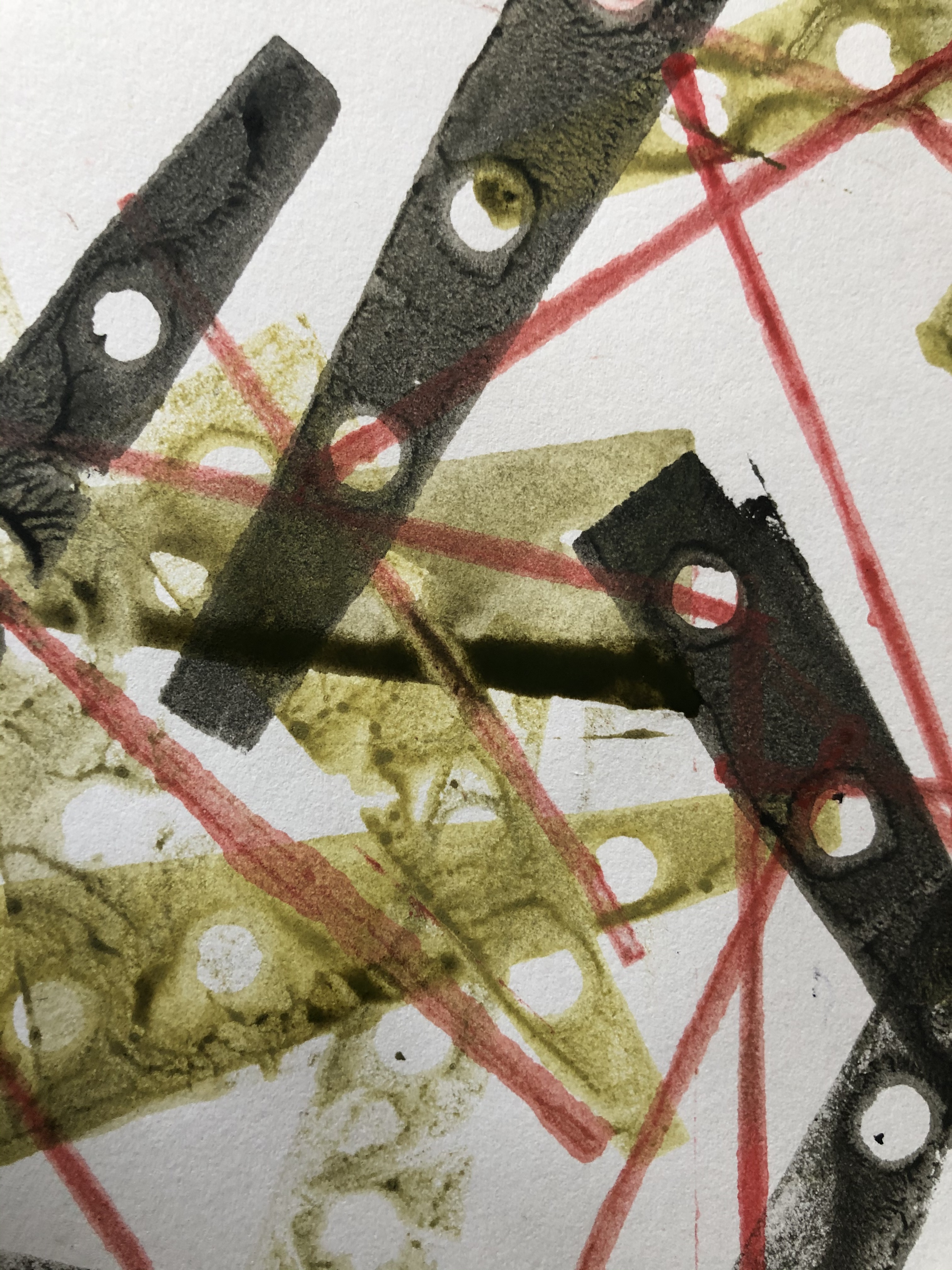
Printing on paper and fabric with one print block.
Sample 2
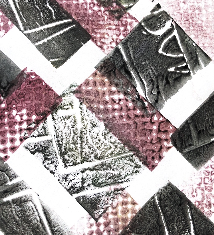
Printing with small varied blocks to make a pattern in different colourways. This pattern is very angular.
Sample 3
Watercolour on paper
Sample 4
Small print blocks overlapped to create an overall image of the sample.
Sample 5
Print on paper with added pen detail, and machine stitching on paper and fabric.
Sample 6
Printing on watercolour paper, repeated images and partial prints.
These exercises involving different materials have produced surprising and exciting results. Some materials are easy to join such as paper and fabric, but others require more thought such as metal and thick card as these materials are hard to pierce and may not stick easily. Joining different materials means you have to consider each in turn and come up with ideas that suit all mediums. It was interesting to extend the colours of the material while joining such as in sample 2 above, and to make 3D shapes by joining such as in sample 4. Some materials and samples could be manipulated such as sample 3 to give an ever changing shape and material properties.
It was good to return to the heated plastic surfaces from Part 1 for the developed samples and in these samples I have demonstrated three really diverse ways of joining the materials.
Joining different fabrics such as in Sample 5 required a joining method that was sympathetic to all materials in its construction and how it looked, and I think I achieved this, creating a beautiful ethereal sample, with strong shapes, colour and detail.
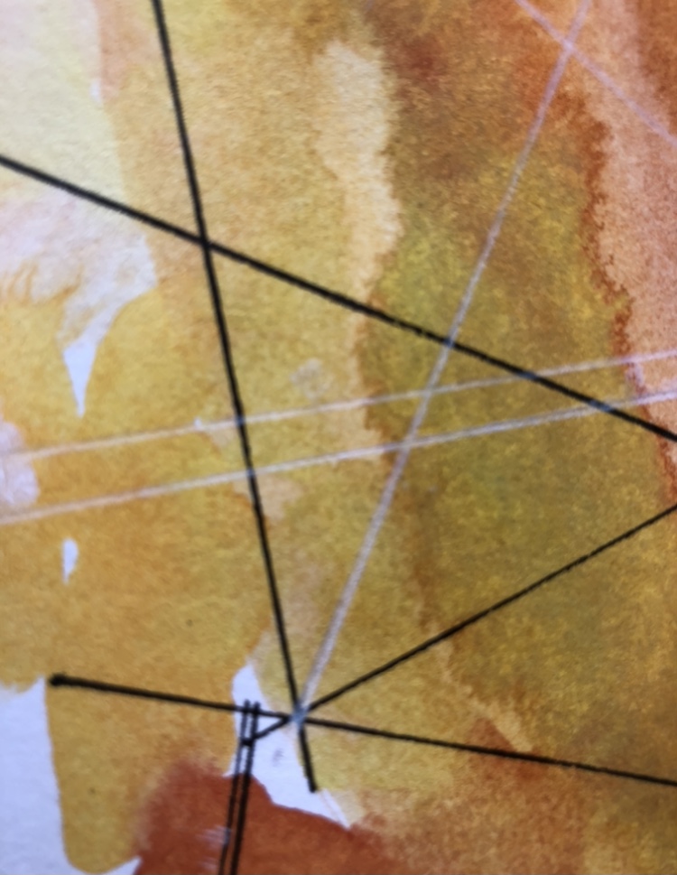
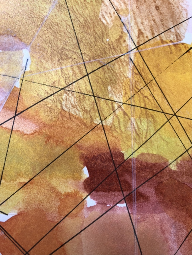
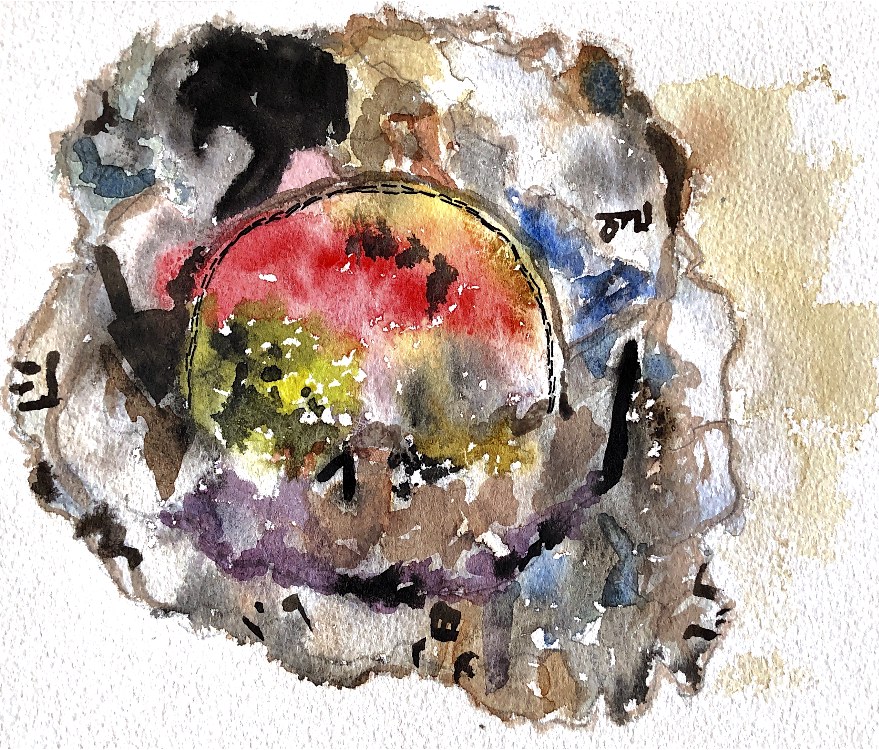
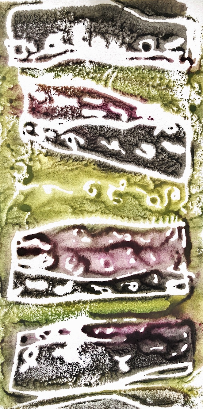
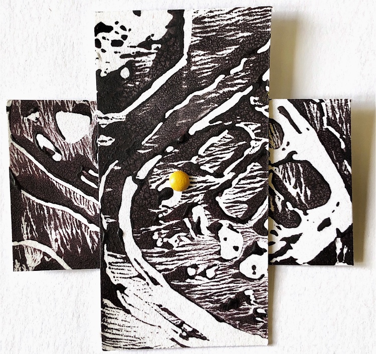
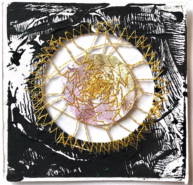
I used colour in most of my samples but where I have used black and white such as in sample 3, colour has been reflected from the centre circle to create shadows of colour, as shown in my watercolour painting.
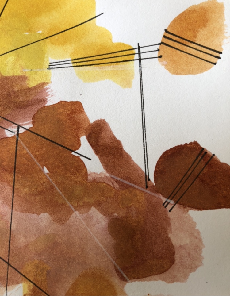
Making marks with machine stitching created strong patterns and lines, but I still prefer to use hand stitch in my work, even though this takes more time. The little stitches and knots in sample 4 create interest and texture, drawing the eye in to detail in what is a very busy overall piece.
I have tried to work in varied ways, some out of my comfort zone, and this has definitely paid off in this collection.
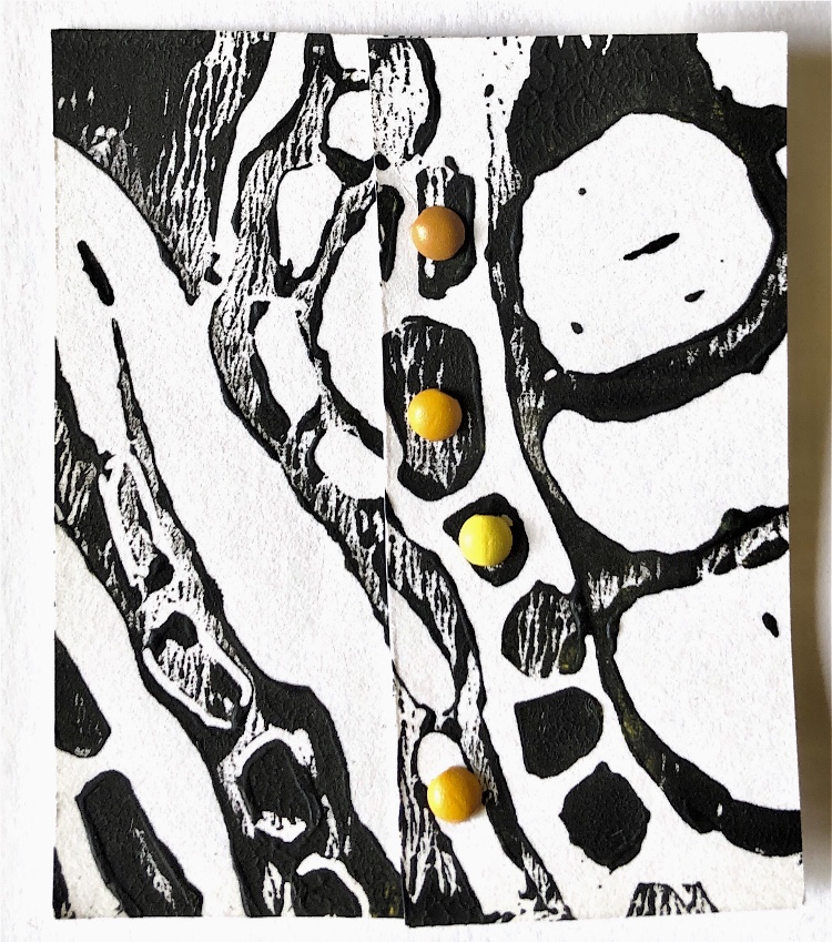
Plastic bags ironed by fusing, holes cut and small plastic ‘jewels’ inserted with hand stitching. I decided to use different materials to develop this sample, and looked back to some of the samples made in part one. The thicker pieces of the plastic were harder to stitch through but I think the slightly uneven stitching contrasts well with the plastic and enhances the overall effect.
Sample 2
Inspirational sample
Fused plastic bag shapes joined with cross stitch canvas and stitched with tent stitch. For this piece I decided to change one of the materials and to look at the colour and placement of the stitching. The joins are very flexible and the one sample could be folded into many 3D shapes. I have moved on from the original sample by using coloured threads that match the adjoining plastic shapes so that the canvas stitching becomes part of the overall design. I’m not sure that the running stitch used to secure the materials adds anything to the overall effect but it would have left holes if I took it out. This is something to consider – as with paper, holes punched in the wrong place still show.
Sample 3
Inspirational sample
Circle cut from collaged paper with torn circles machine stitched – pleated and gathered to fit. Although this is a relatively simple sample, I wanted to work on the idea of joining different sized curves and to crumple the paper to create a sample that changes every time it opens. Newspaper works really well for this and was easy to join to a sturdy paper circle for the base.
Sample 4
Inspirational sample
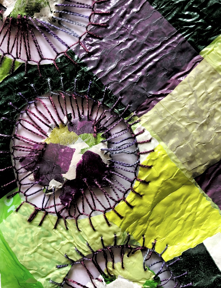
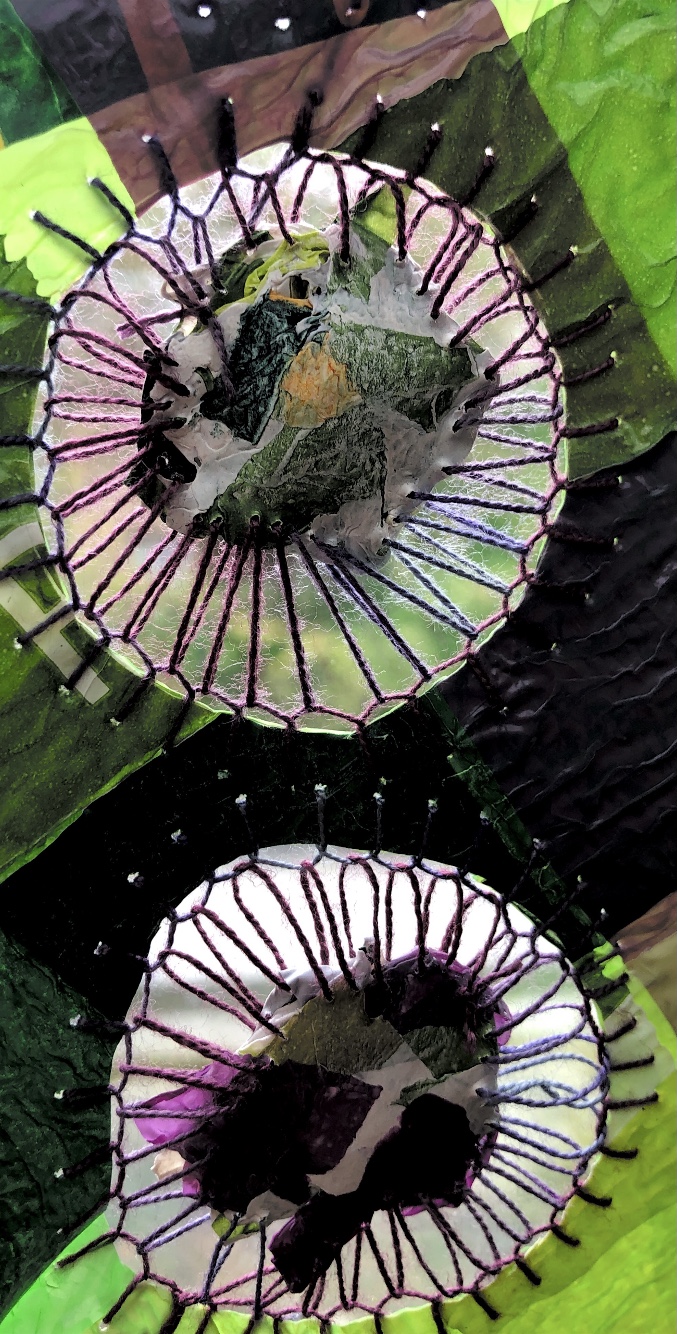
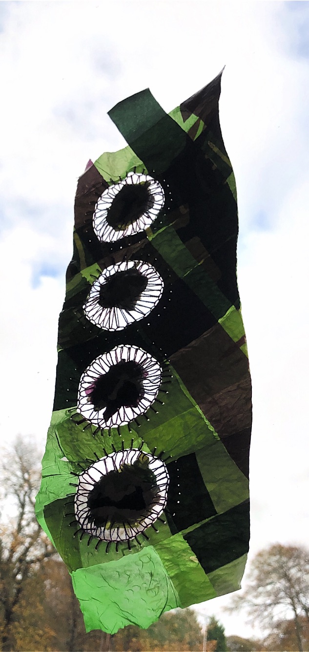
Pieces of plastic bags ironed to make small ‘jewels’, joined with hand stitch into groups of three and then each group sewn together. The rough edges of these pieces proved a challenge to join – the original sample was made from perfect circles. The result is so interesting – who knew I would enjoy working with plastic bags? There is so much movement in this piece, and the carefully chosen colours work well. The contrasting textures of plastic and stitch , with the cut ends of the threads showing, create an exciting, tactile sample.
Sample 5
Inspirational sample
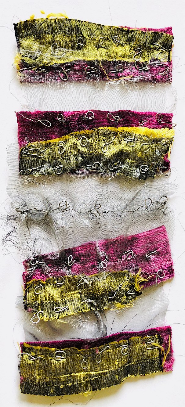
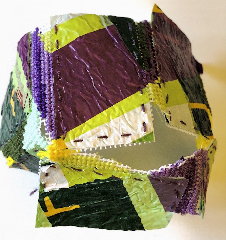
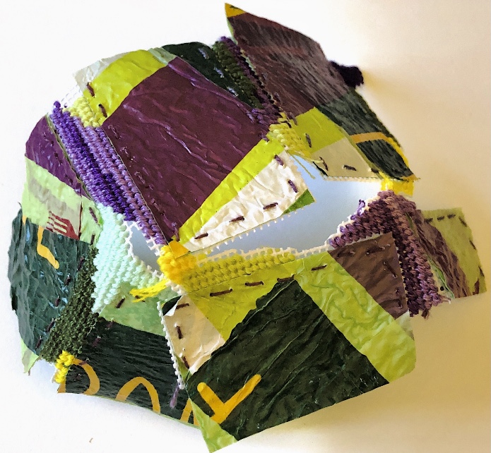
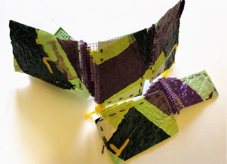
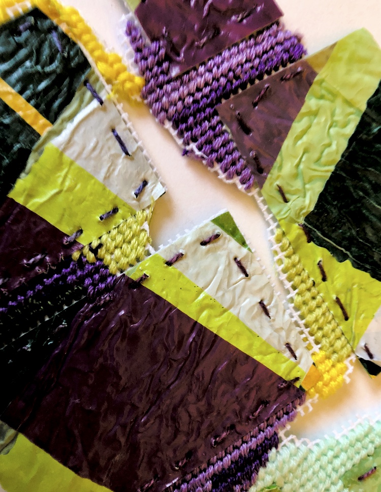
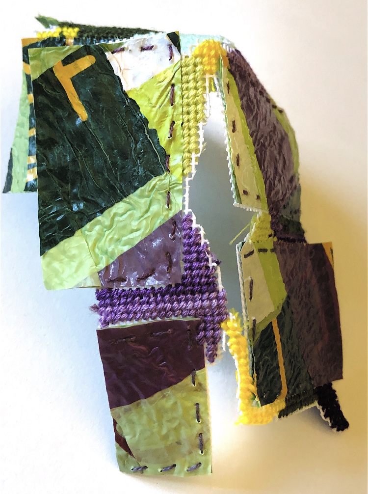
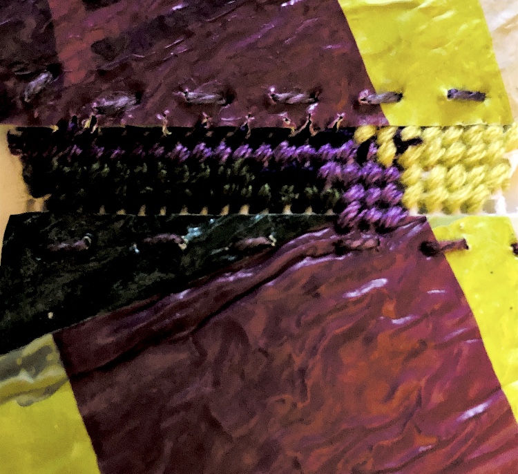
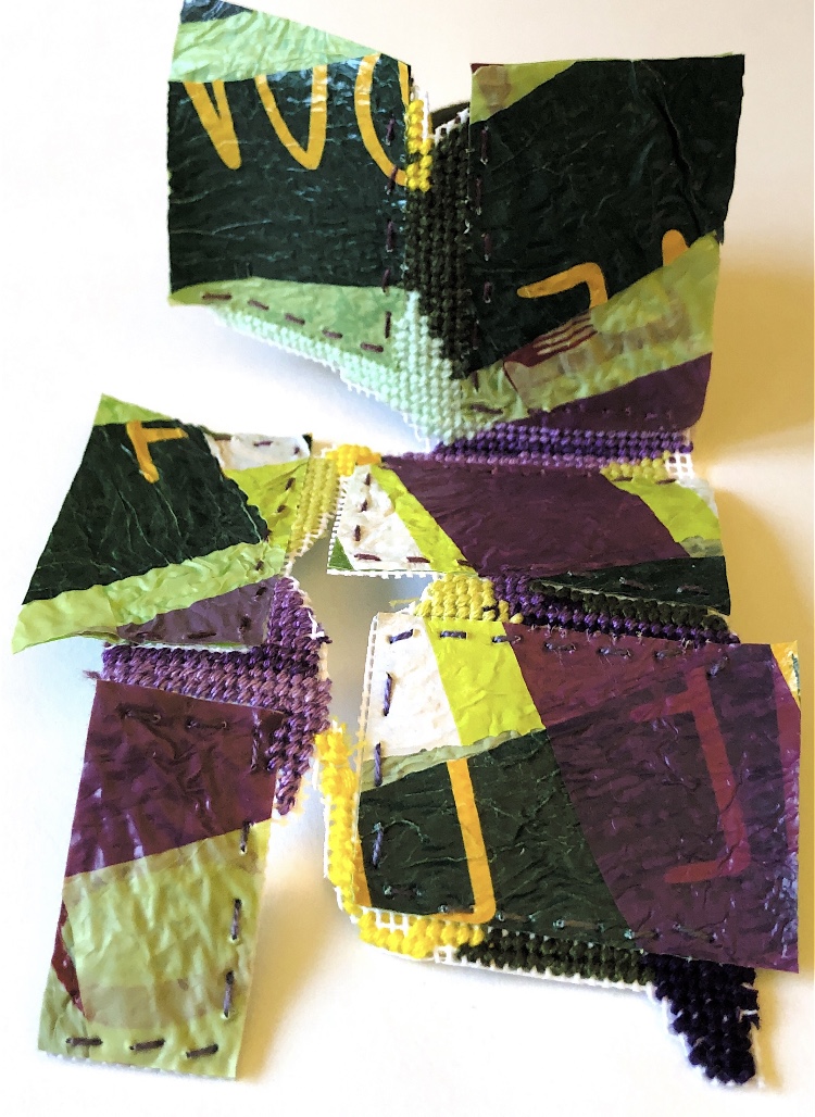
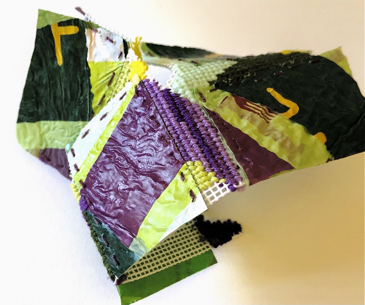
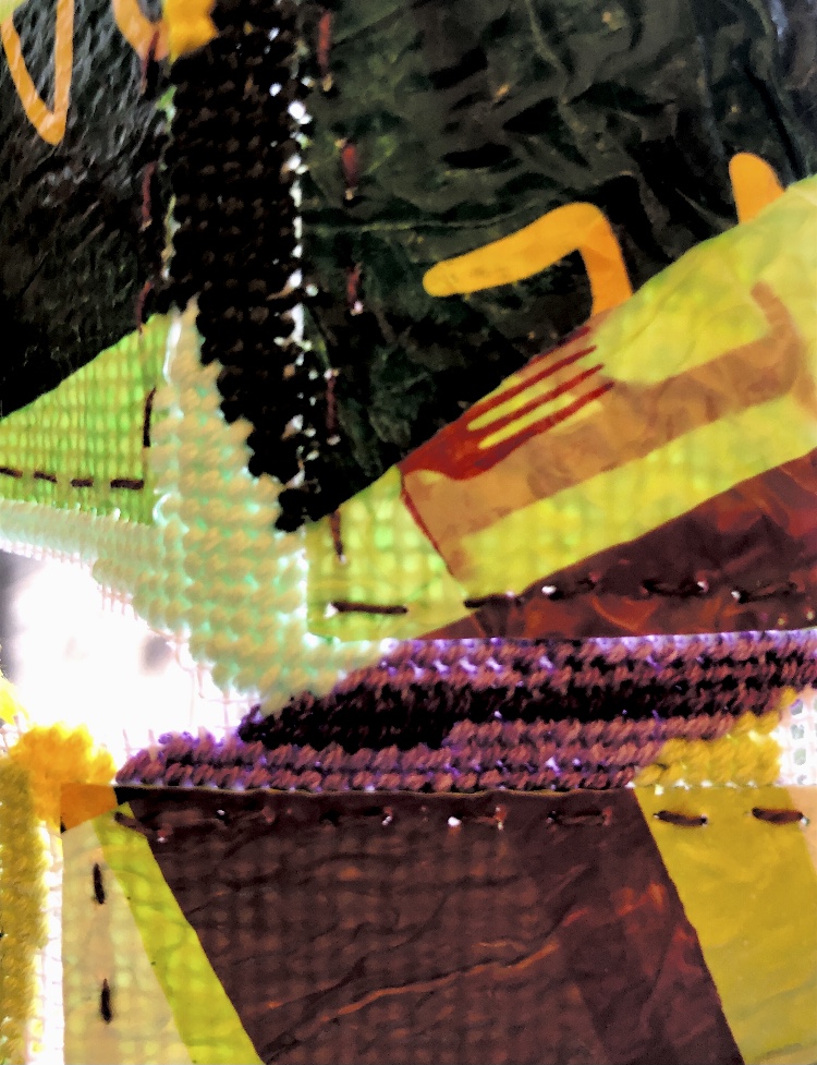
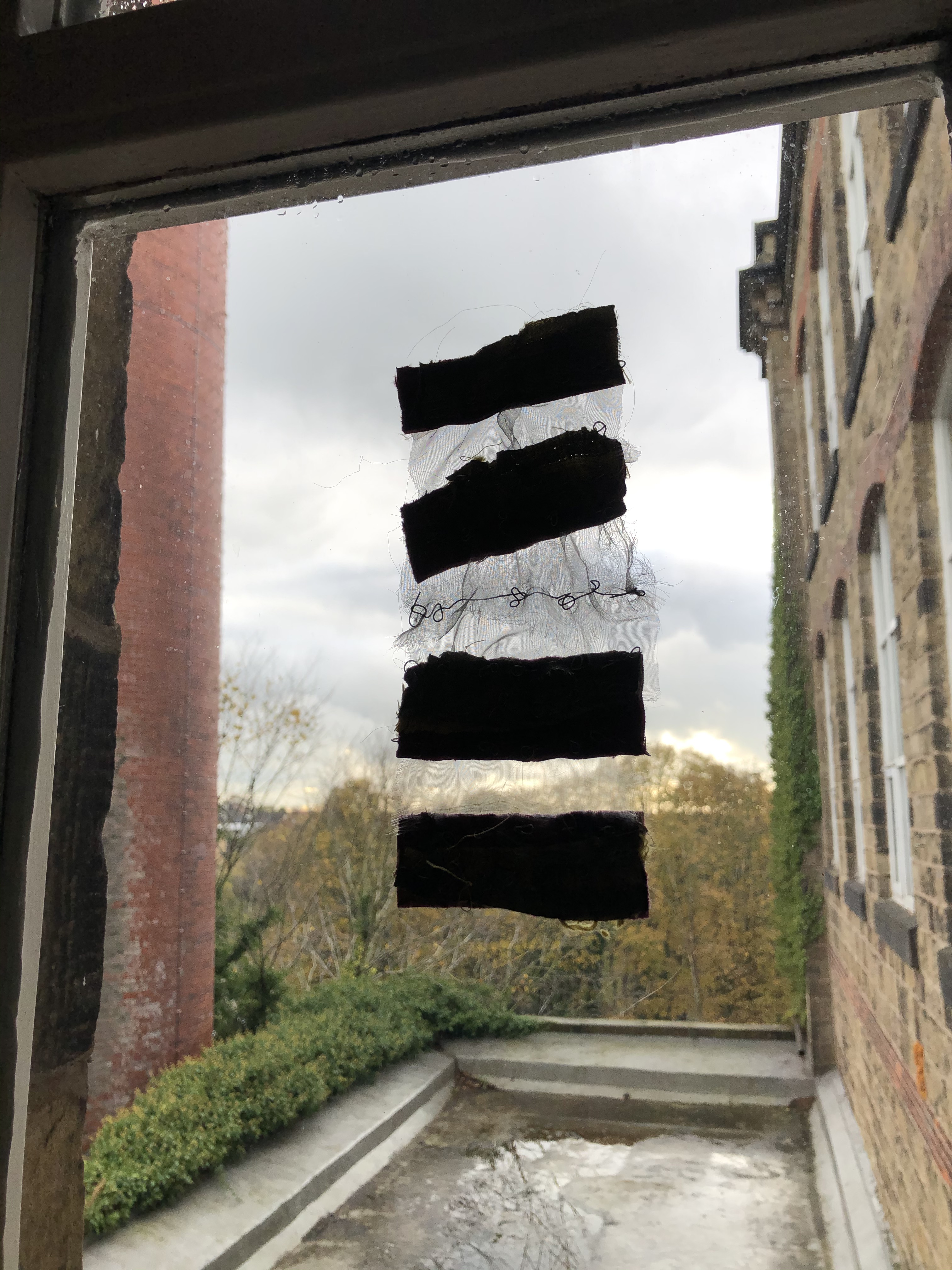
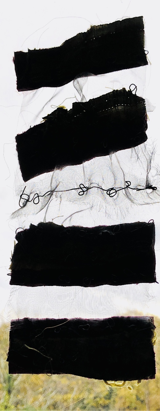
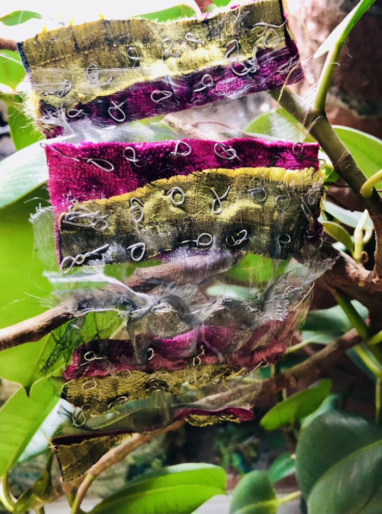
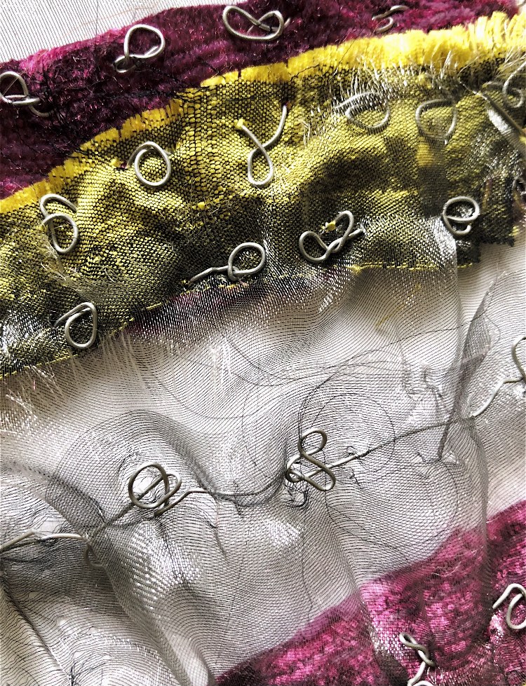
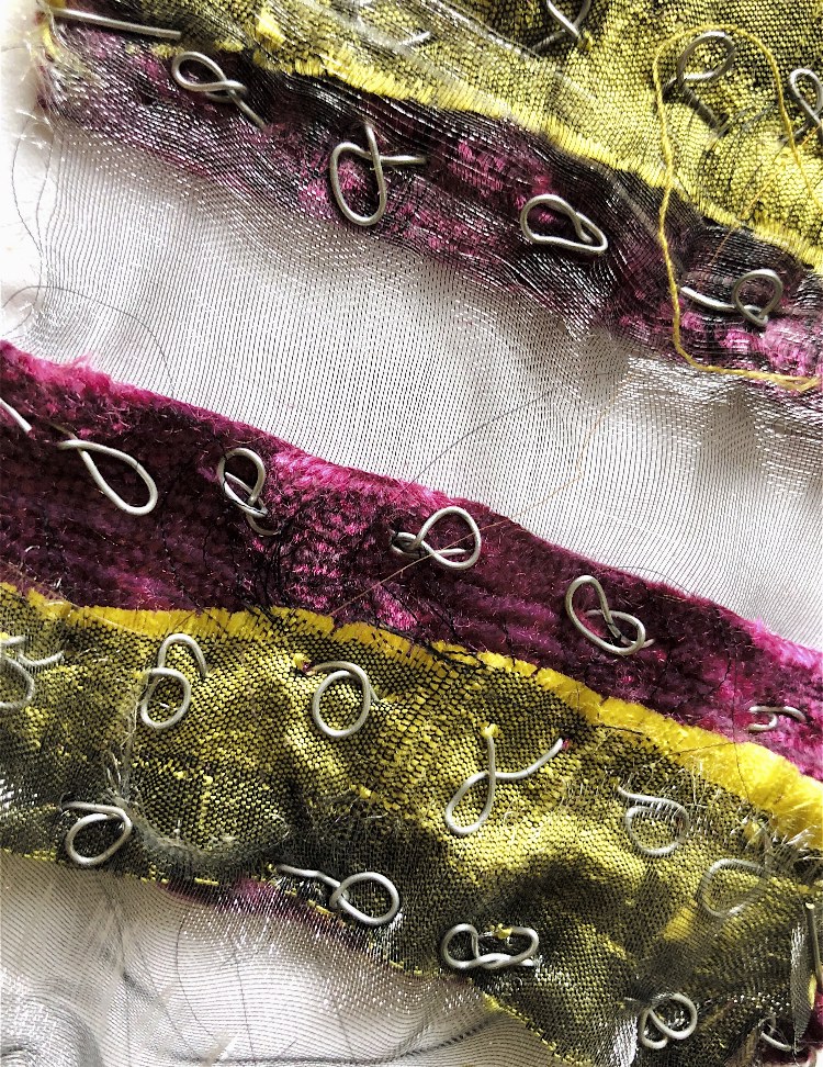
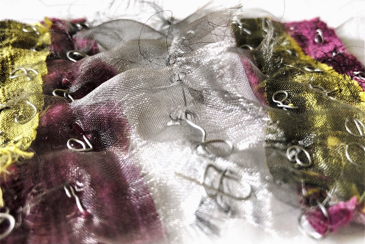
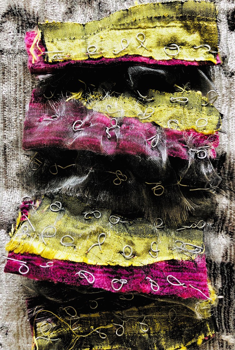
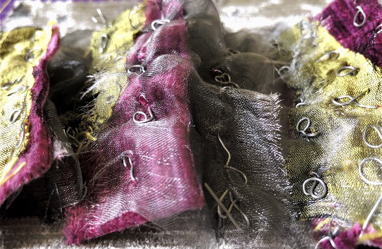
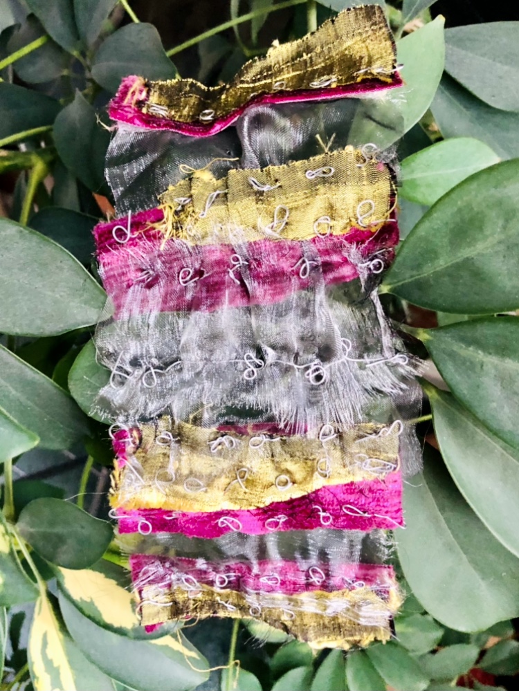
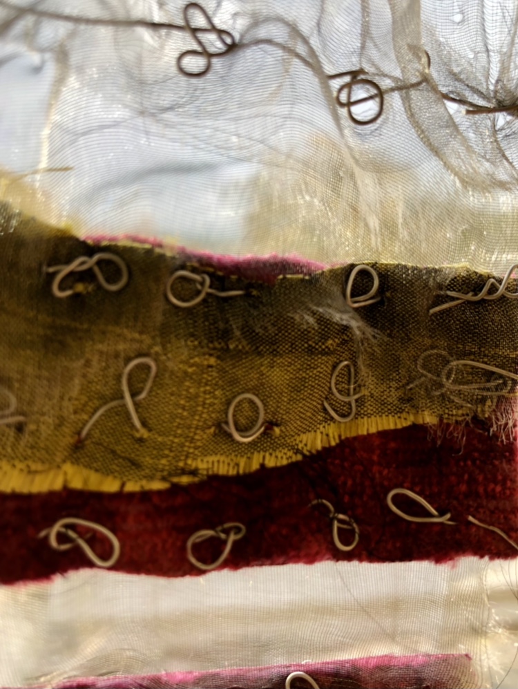
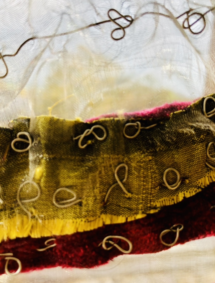
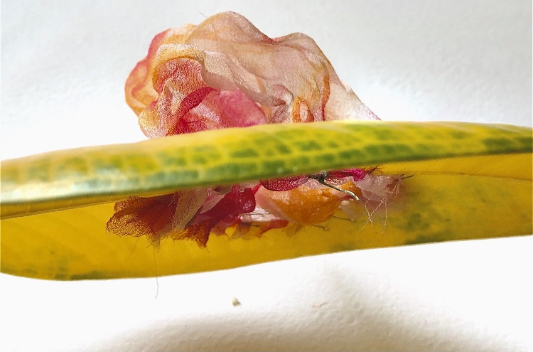
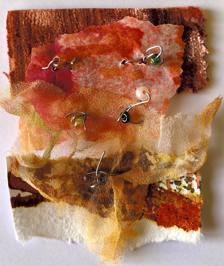
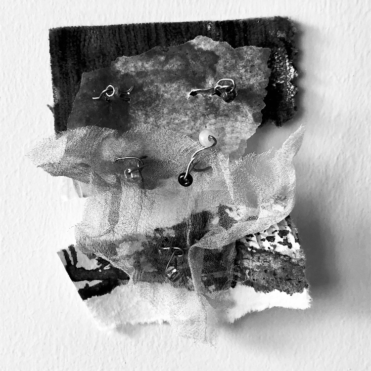
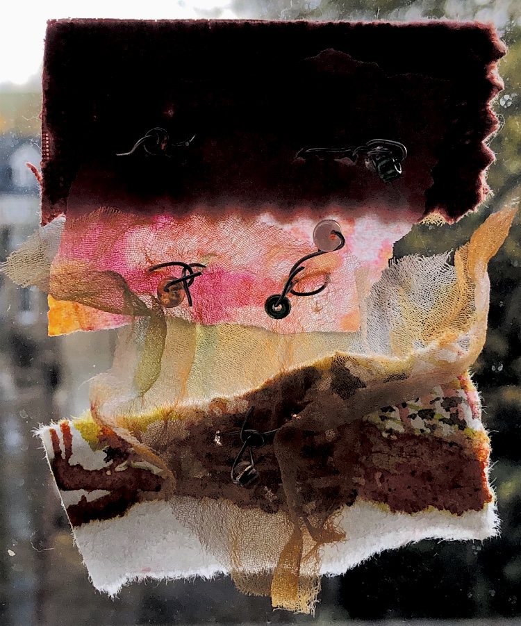
Developing the theme of attaching a very fine translucent material to heavier fabrics using wire, I selected some slubbed silk, and chenille furnishing fabric in a bright vivid green and a raspberry colour. I sewed the strips together and to grey organza using wire. It was quite difficult to sew with the wire but the resulting uneven loopy stitches create a lot of visual interest and tactile quality to the sample.
Sample 6
Inspirational sample
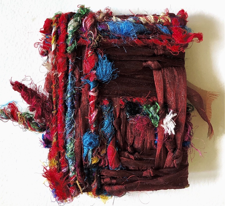
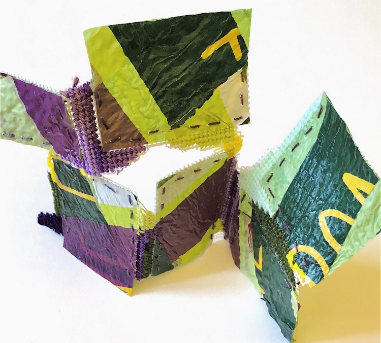
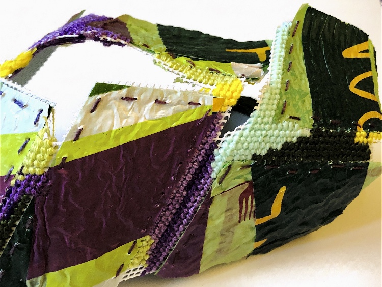
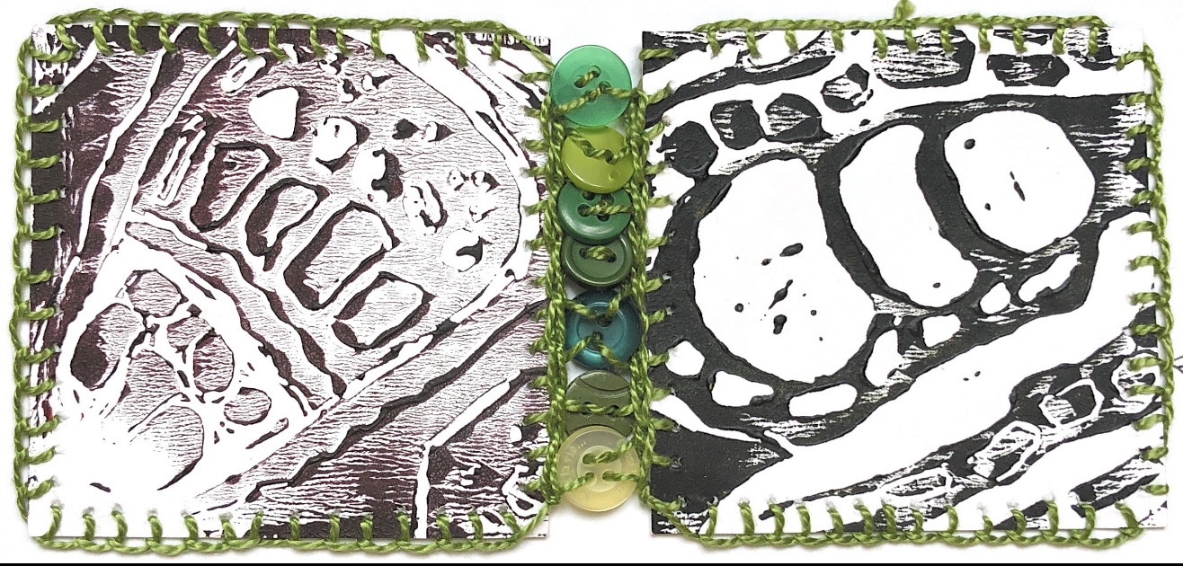
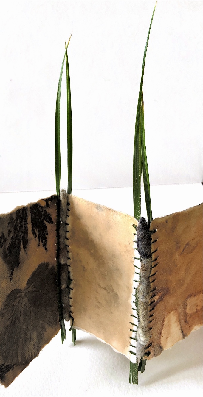
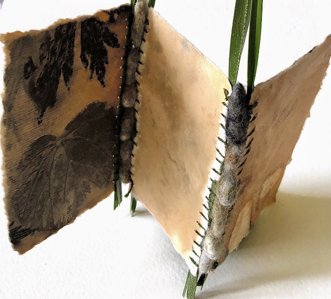
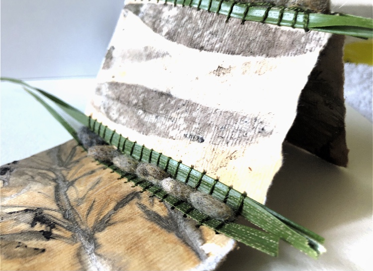
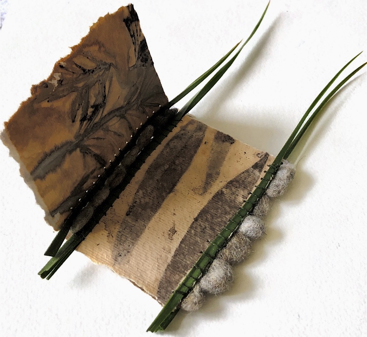
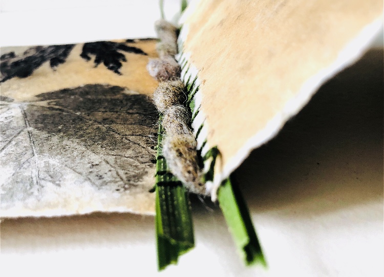
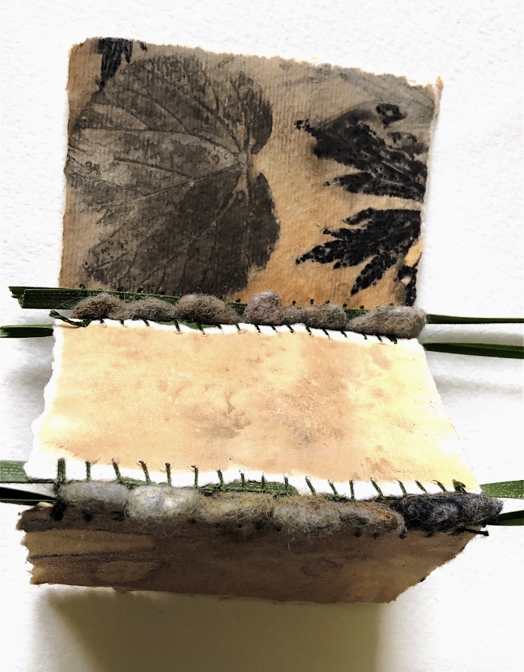
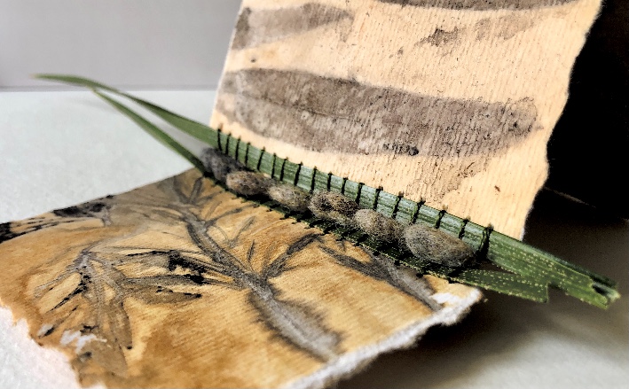
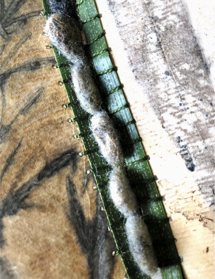
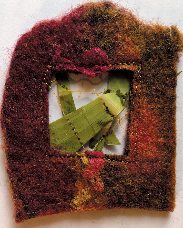
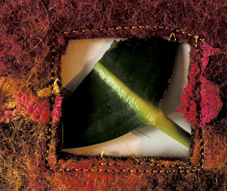
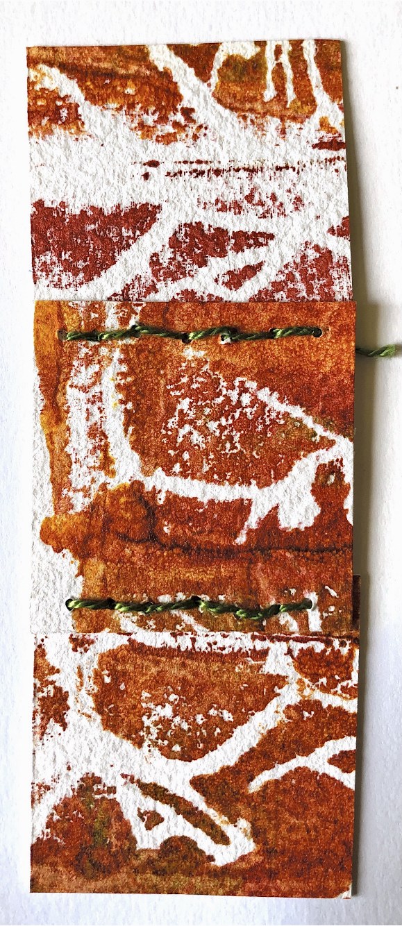
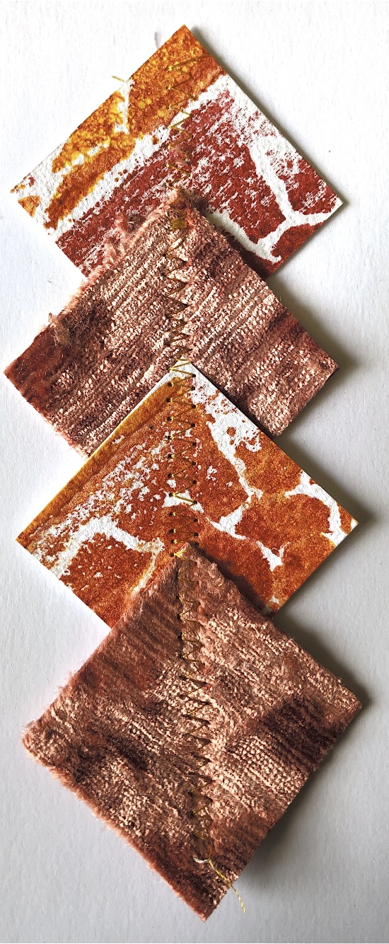
Looking at this sample and also some of the work I did with leaves I decided to experiment with a more natural colour scheme and materials. Using watercolour paper eco-dyed with plant material, I blanket stitched along the edge enclosing leaves. Substituting felted ‘stones’ for the buttons worked well and proved easy to stitch through. This method of joining could be used to make a book, or longer concertina shape. Like most of my other samples there is a flexibility to the piece, creating a structural 3D sample.
Materials joined – watercolour paper, craft paper, postcard, leaves, hand made felt
Methods and materials used to join – glue, paper fastener, hand sewn buttons, wrapped embroidery thread, machine stitching
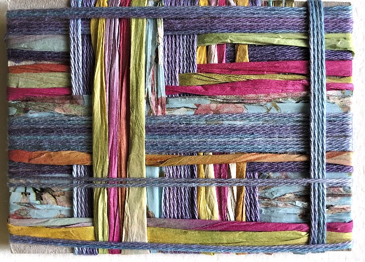
Simple overlaps, joined by a fastener and by slotting strips together make angles that can easily be manipulated into other shapes.
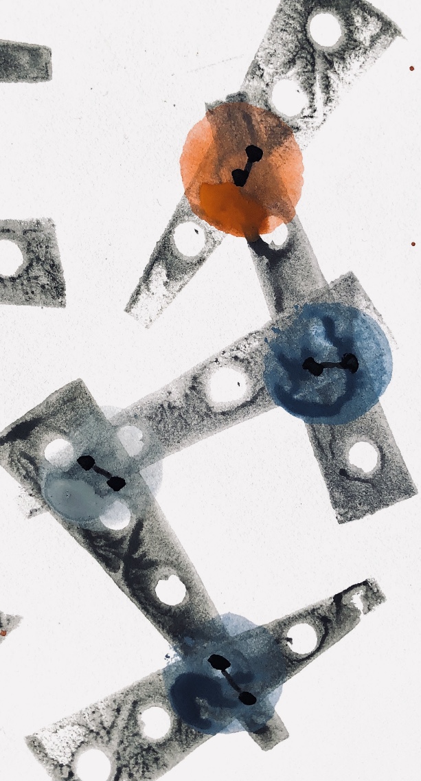
Some very wet, loose watercolours captured the look of this sample made from a postcard.
The angles in this sample are made with the paper, and the thread used to wrap around and join. Simple print blocks emphasise the corners and different angles.
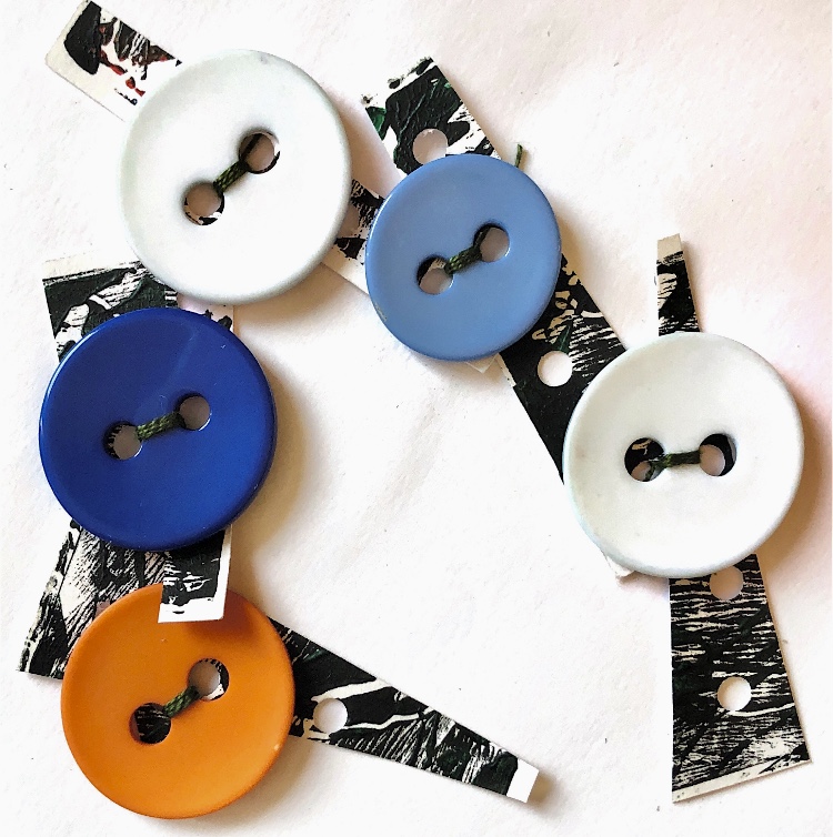
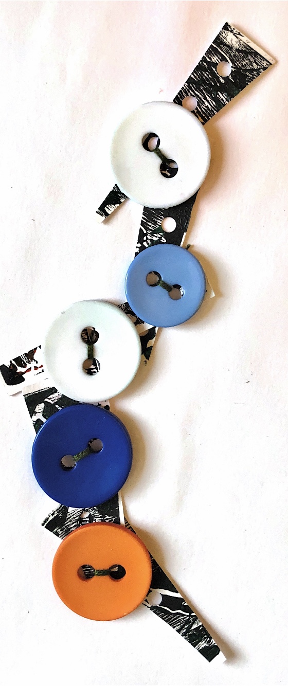
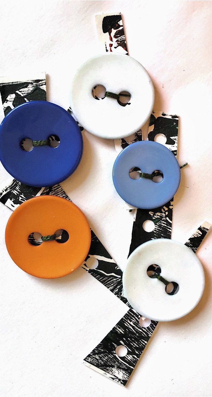
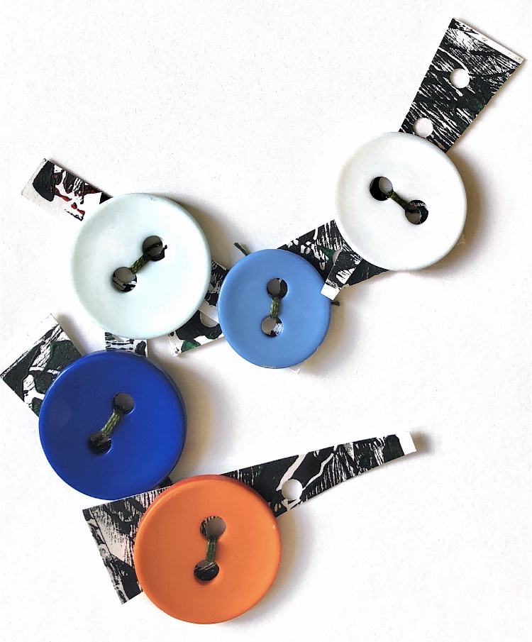
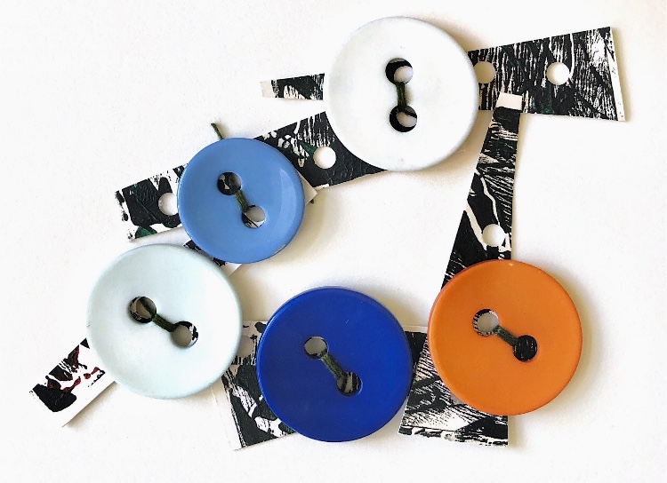
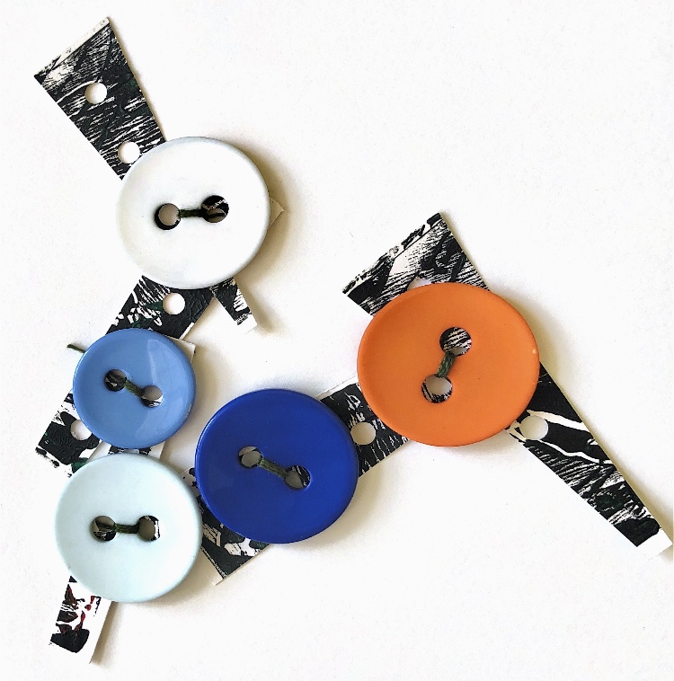
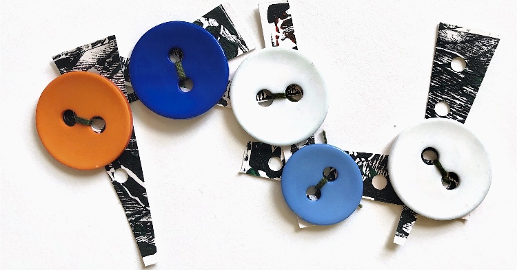
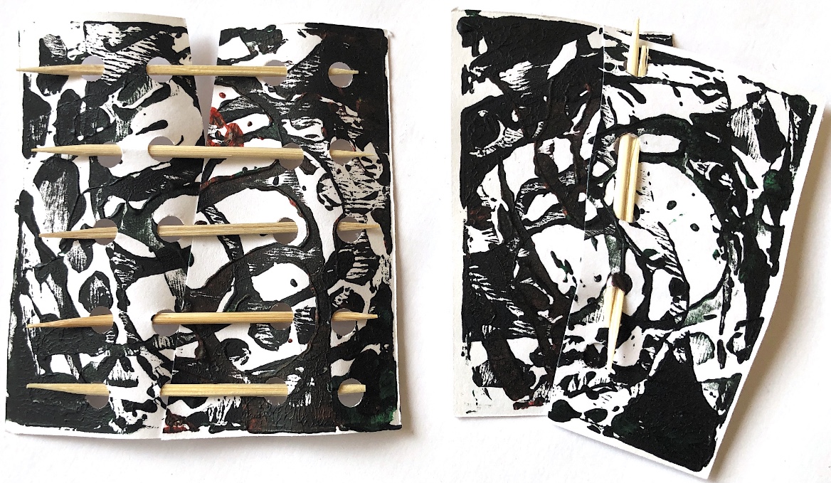
For the following sample I used heavy paper into which holes were punched. Buttons were stitched on using the holes and the resulting piece can be changed into many shapes, all containing multiple angles.
Using circles both on their own and with straight lines produced a different sort of corner/bend/angle. Having made two simple collages I then looked for and photographed some of the angles, corners and shapes within.
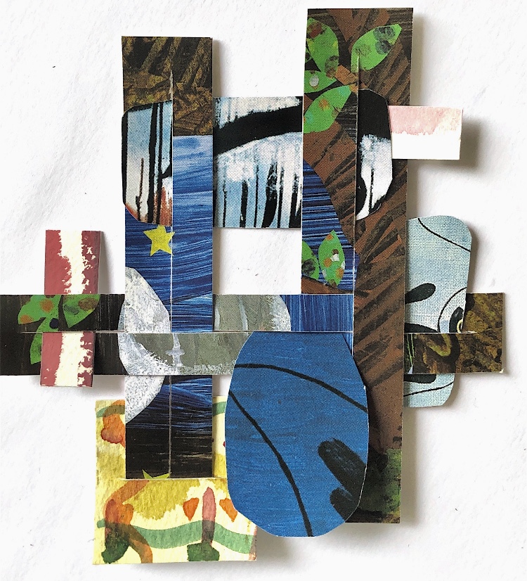
Using a tracing of one of the collages as a starting point, I cut out a series of shapes from different papers and created more samples. I concentrated on creating pleasing compositions with the shapes and colours. I think a bigger colour contrast might be useful to consider in future samples like these – maybe a dark colour as a background or an accent colour. However maybe this could be added with stitch?
The addition of hand drawn ‘stitching’ makes the collages look like applique.
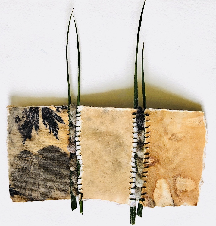
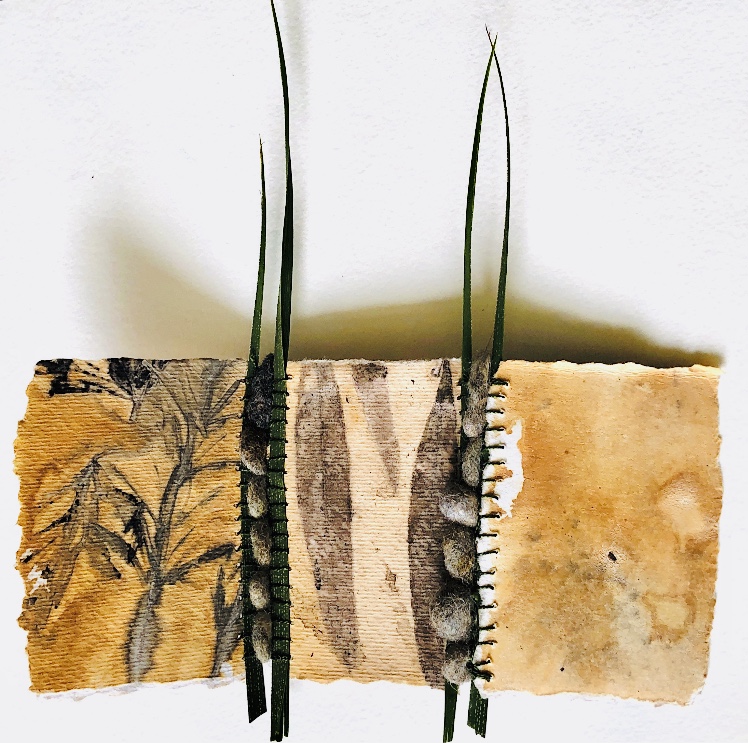
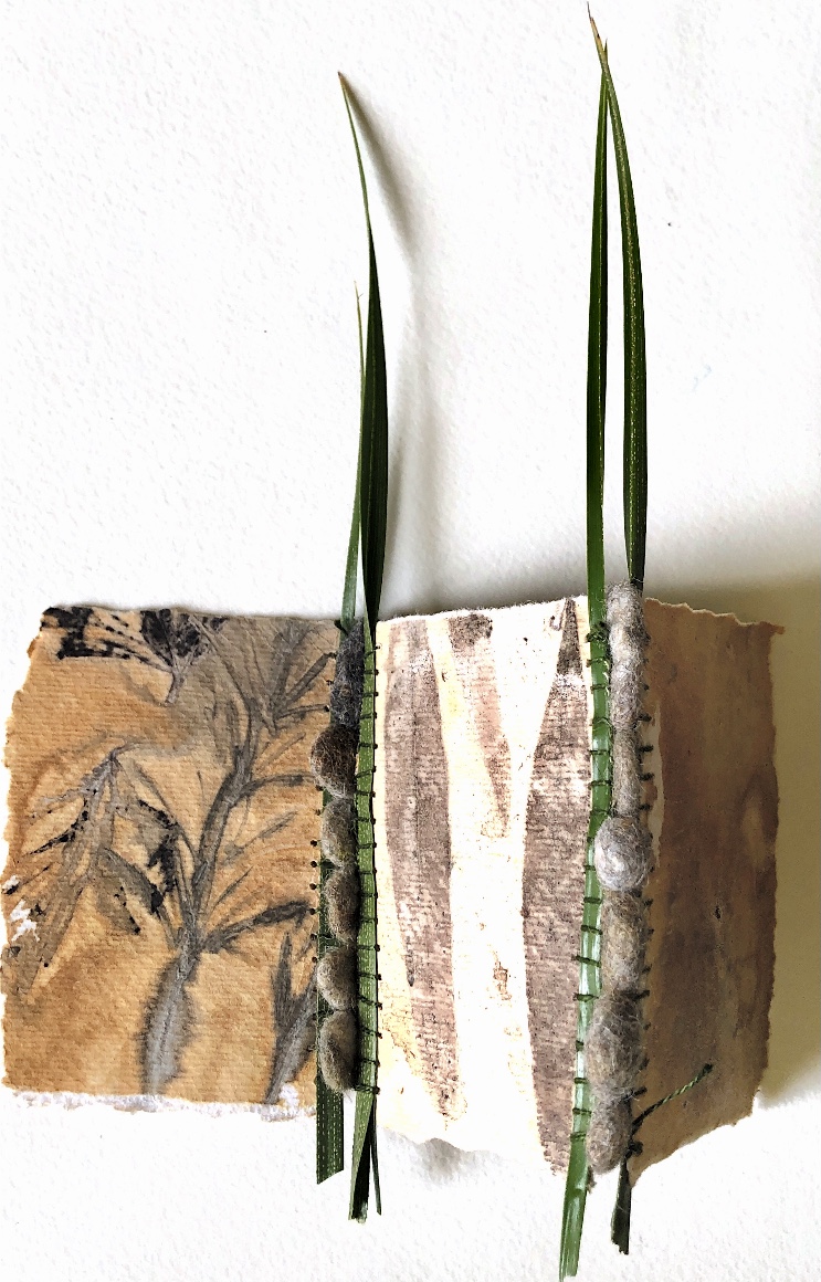
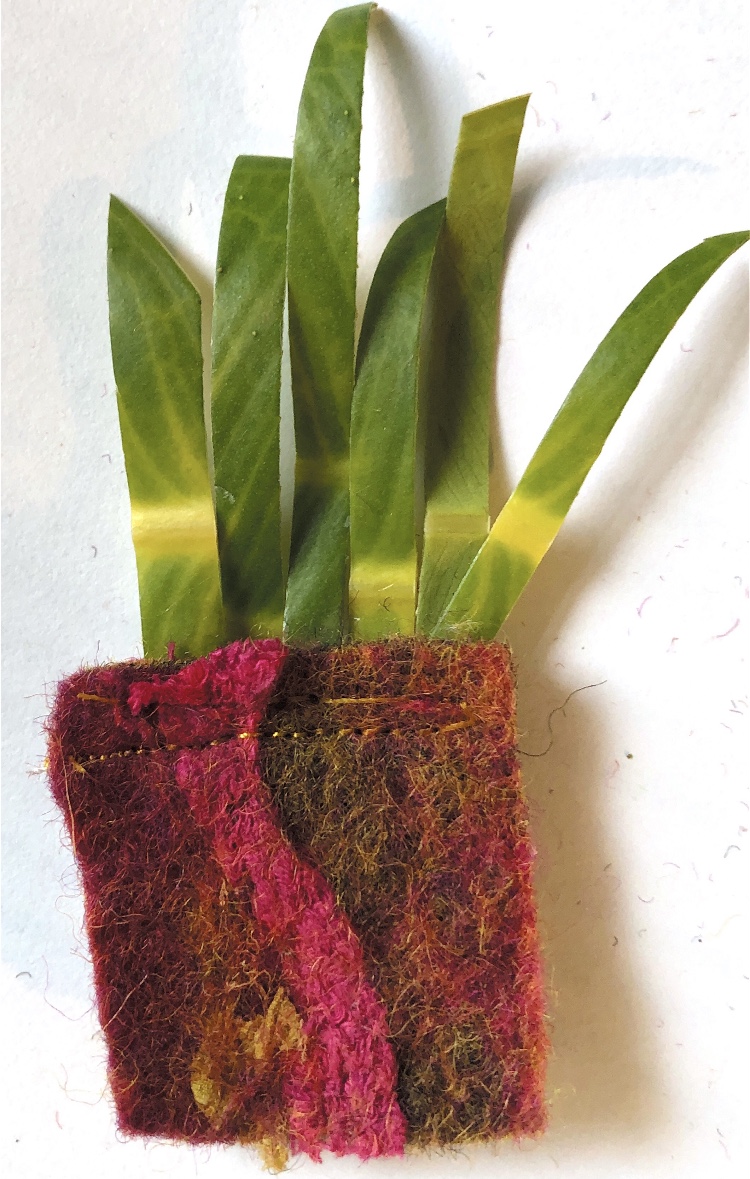
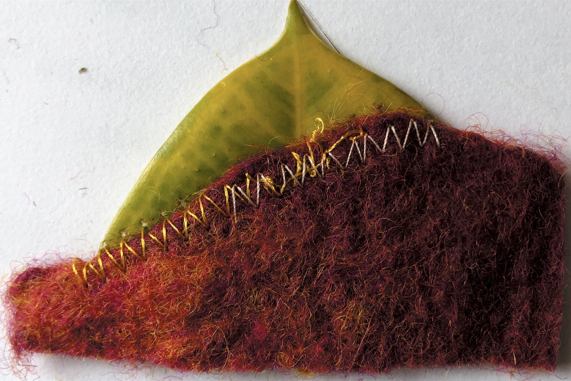
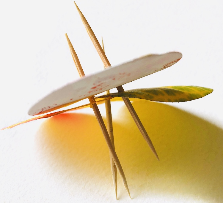
I have discovered working through these exercises, that almost every join makes some sort of angle. In the following samples I have stitched leaf strips to hand made felt. The fact that both are natural fibres pleases me and also the total difference in strength, texture, colour and permanence. Machine stitching on leaves is not easy and causes the leaf to become very fragile, but as the leaf will break down quickly and the samples will not last, this did not really matter too much.
So now I need to choose which samples to develop from this project. I think the ones that excite me and inspire me most are the following. There are too many here but maybe I could combine some?
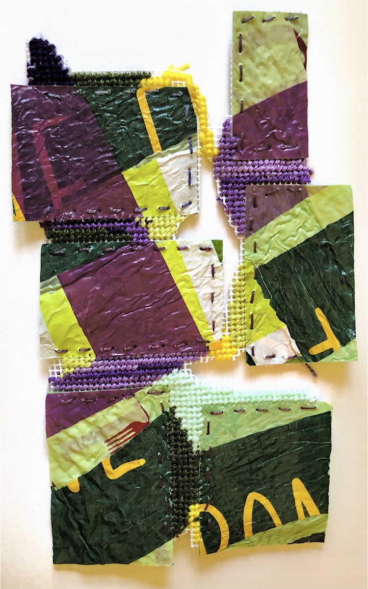
Materials joined – watercolour paper, chenille upholstery fabric, silk chiffon, plastic, newspaper, metal sheet, hand made felt, heavy card, corrugated card, cross stitch canvas
Methods and materials used to join – glued strips, machine stitch, hand stitch, cocktail sticks, paper fasteners, wire with beads, cross stitch, folding, safety pins
Simple shapes joined with hand stitch, glued strips and machine stitch, plus printed samples joined with paper fasteners and cocktail sticks.
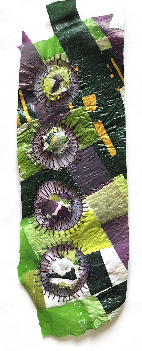
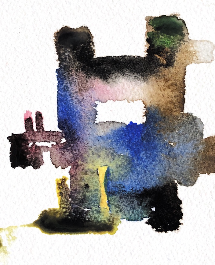
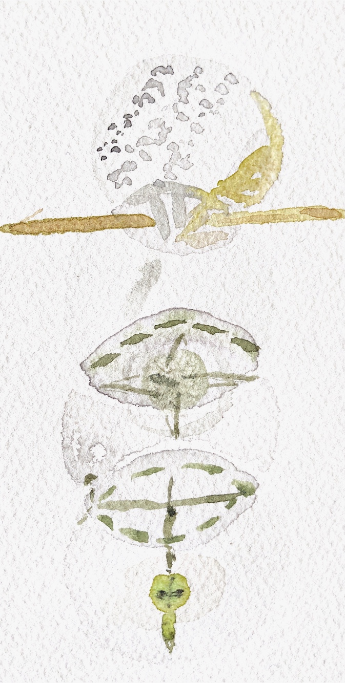
Exploring translucency with stitch and newspaper – this sample is a bit messy but I think it has possibilities for further exploration. It was a challenge to capture the qualities of this sample in watercolour but I think I have achieved a fairly good representation.
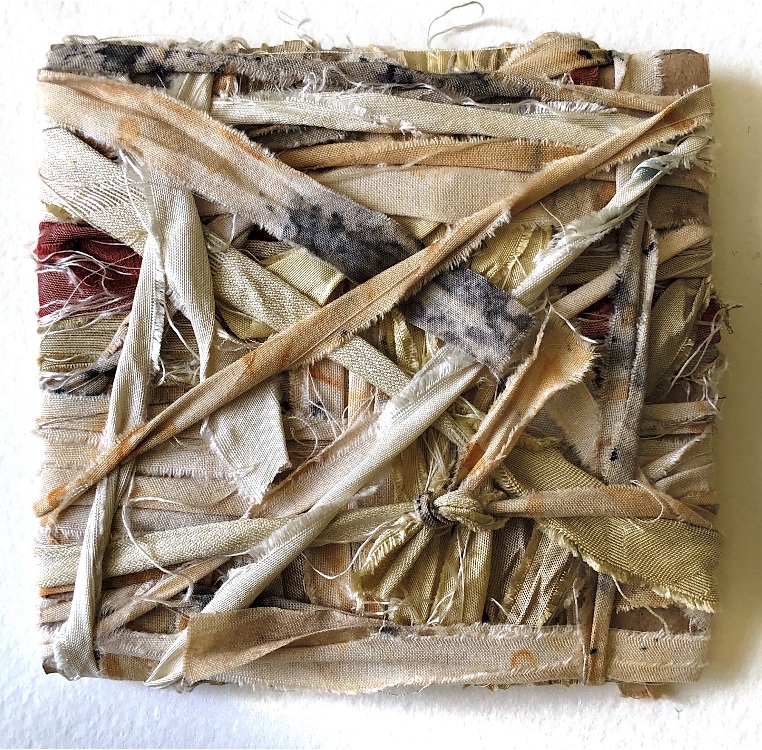
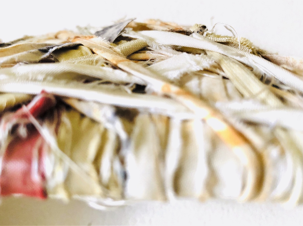
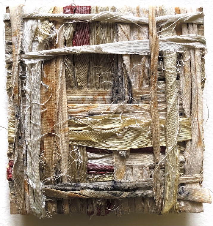
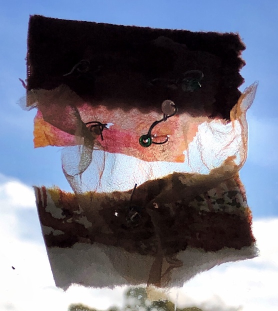
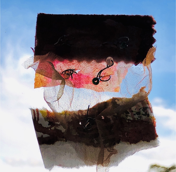
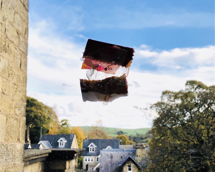
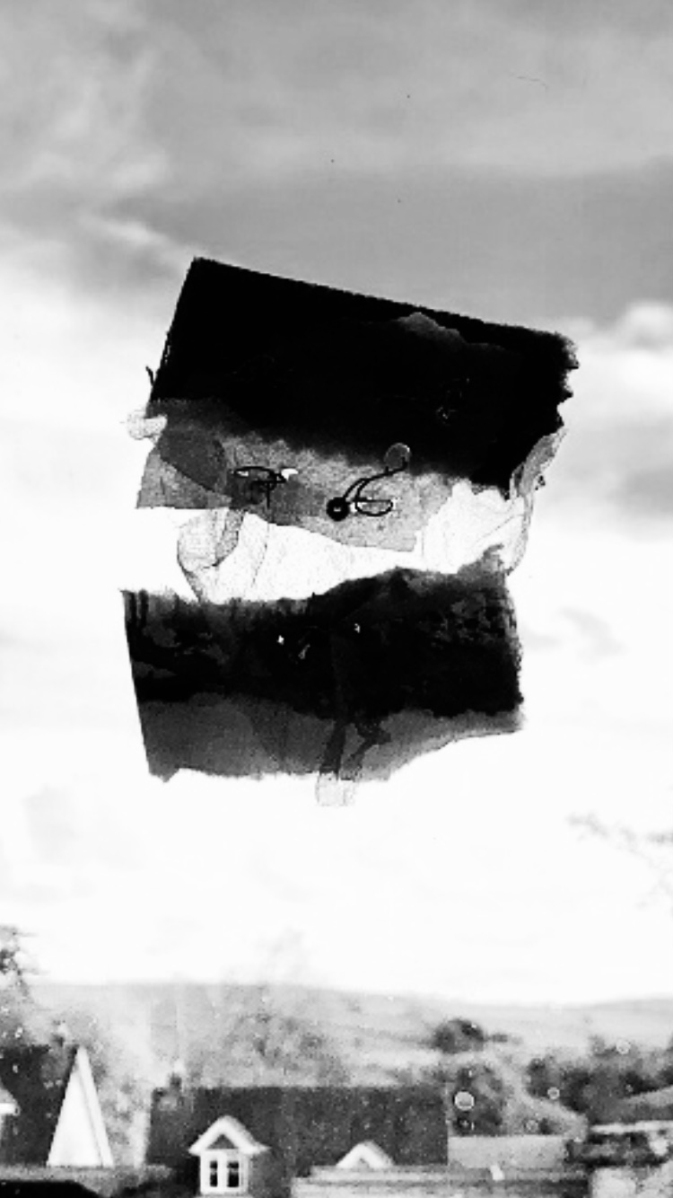
Moving on to translucent fabric overlapped onto a heavy furnishing fabric and watercolour paper, secured with wire and beads – this was a successful sample with lots of possibilities for development. The sample looked very different when photographed against a window – highlighting the transparency of the fabric and darkening the other more solid materials. There is a lot of movement in this piece. I like the way it appears to be floating away in the sky.
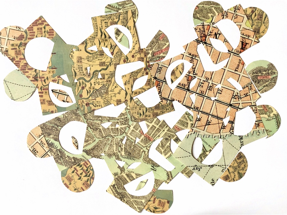
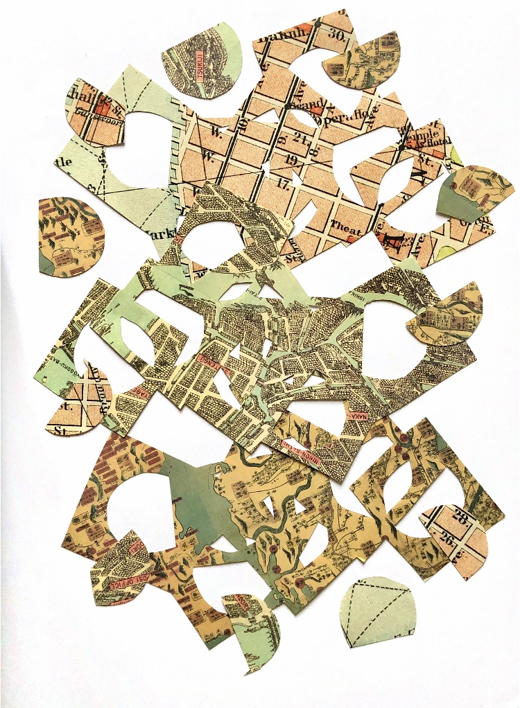
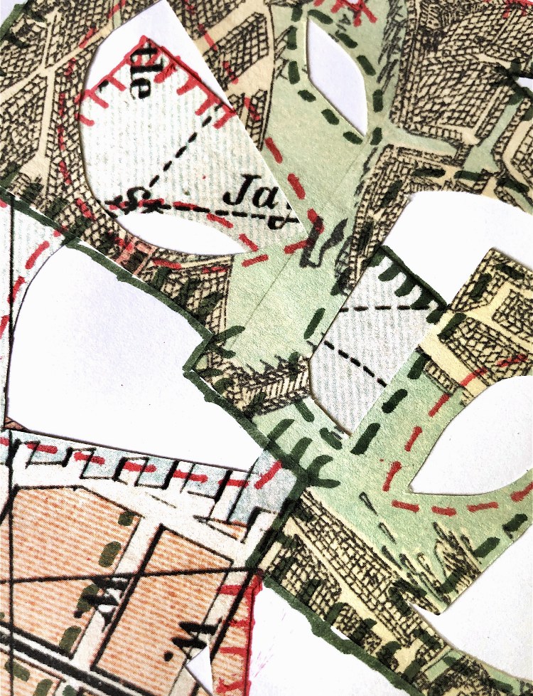
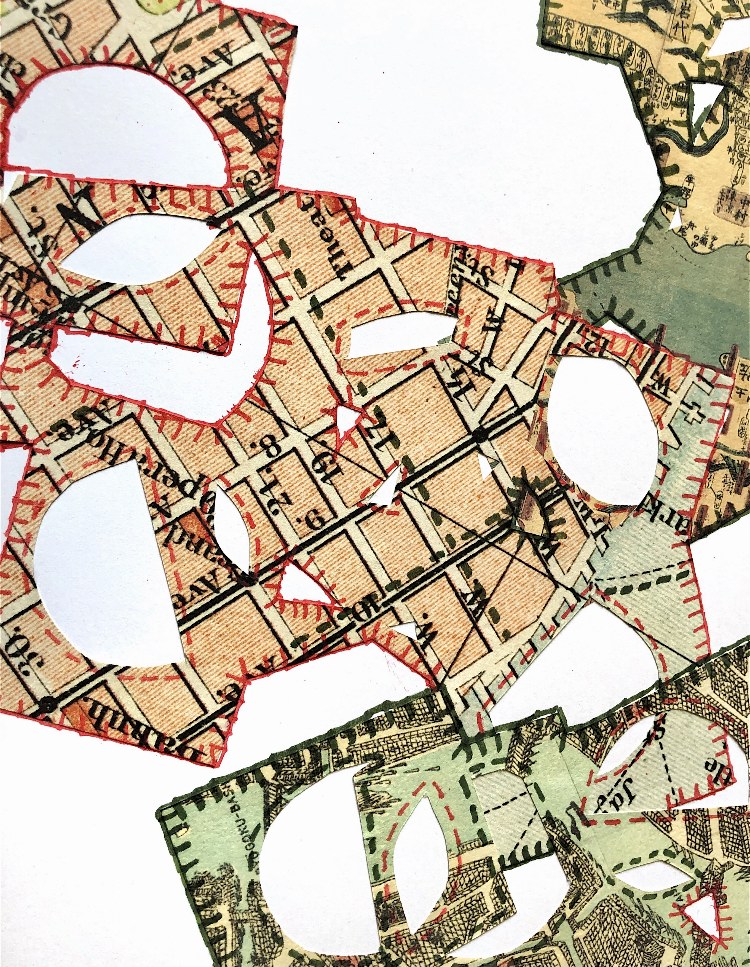
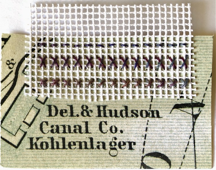
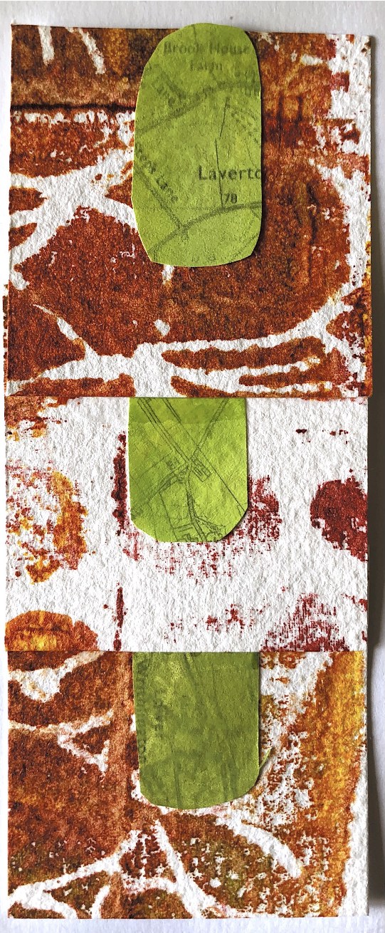
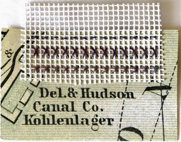
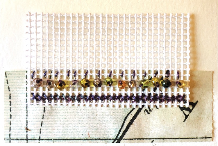
I overlapped cross stitch canvas onto a piece of map paper and used cross stitch, running stitch and beads to hold the materials together. I like the even, ordered stitching contrasting with the writing and map drawings on the paper. The idea of completely contrasting materials and patterns intrigues me.
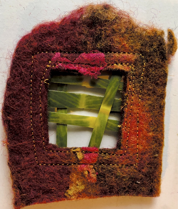
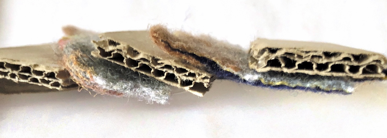
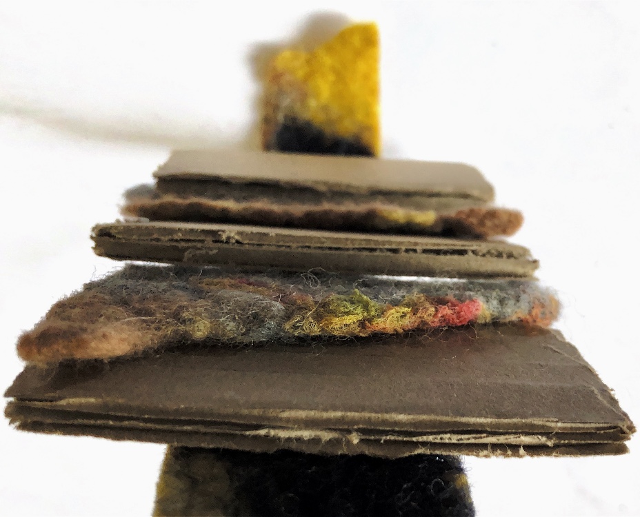
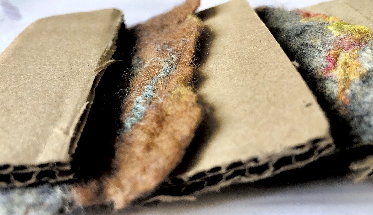
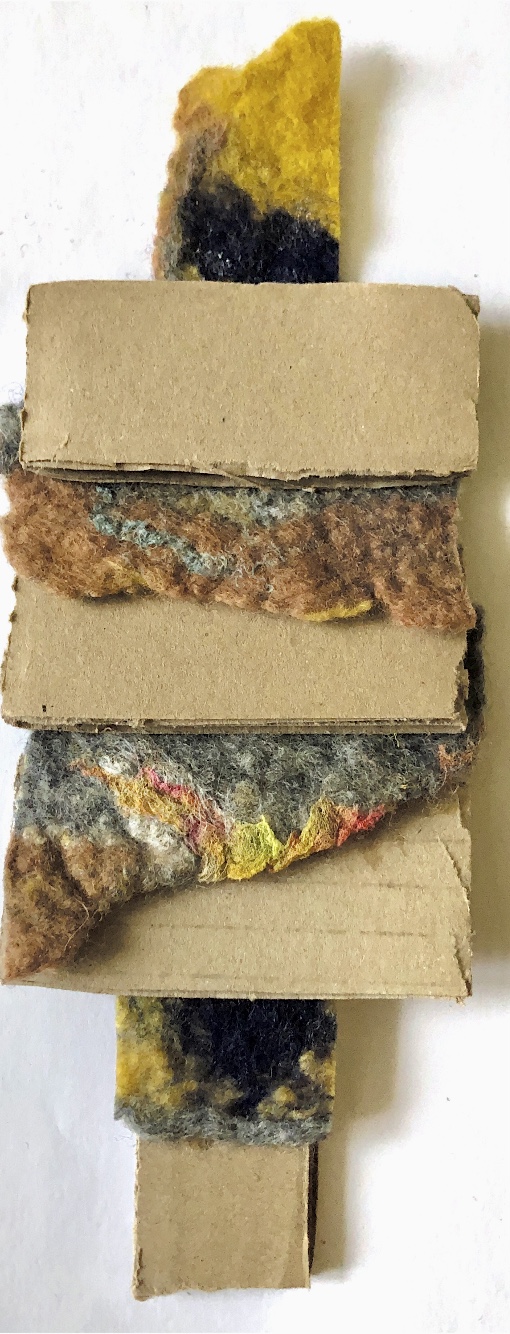
Corrugated card and a cut up piece of hand made felt were glued together and photographed from different angles. The soft, uneven edges of the felt sit in with the smooth, hard card to create a tactile sample.
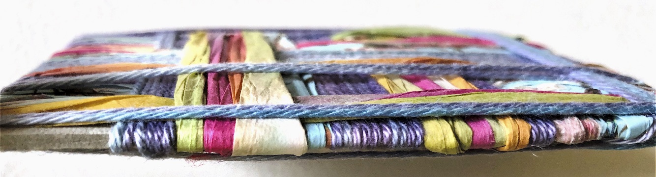
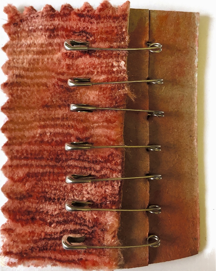
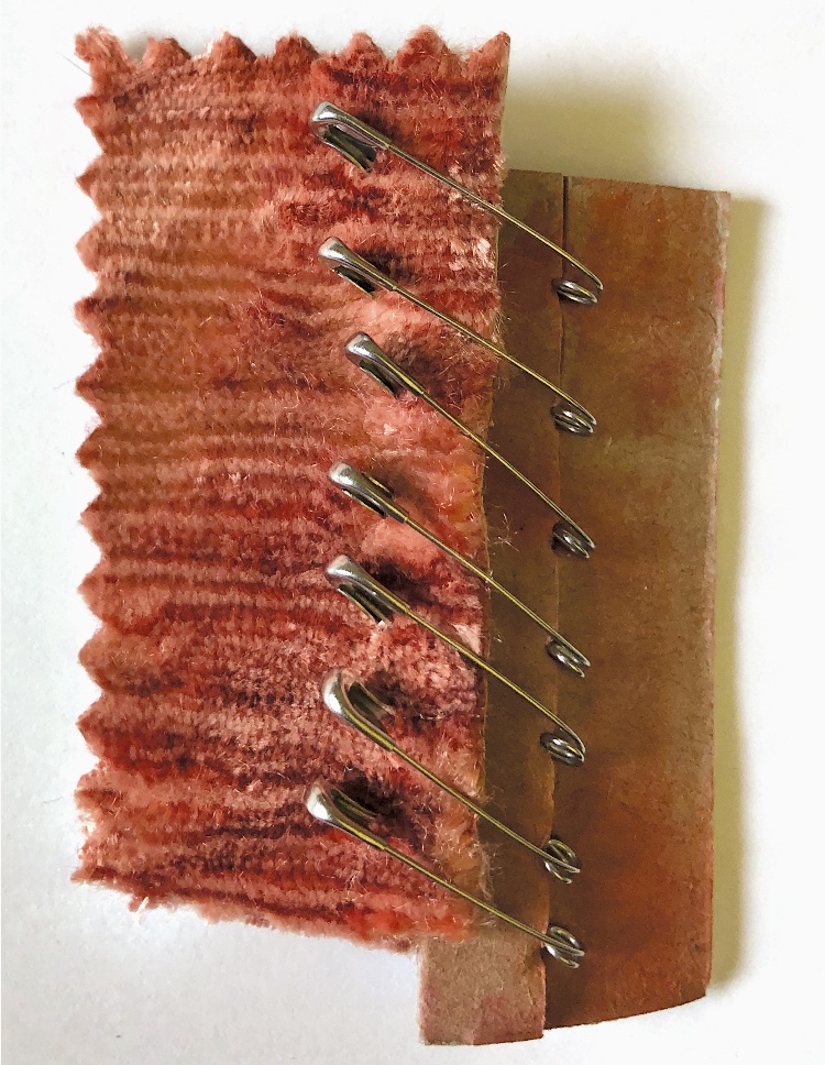
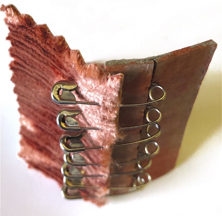
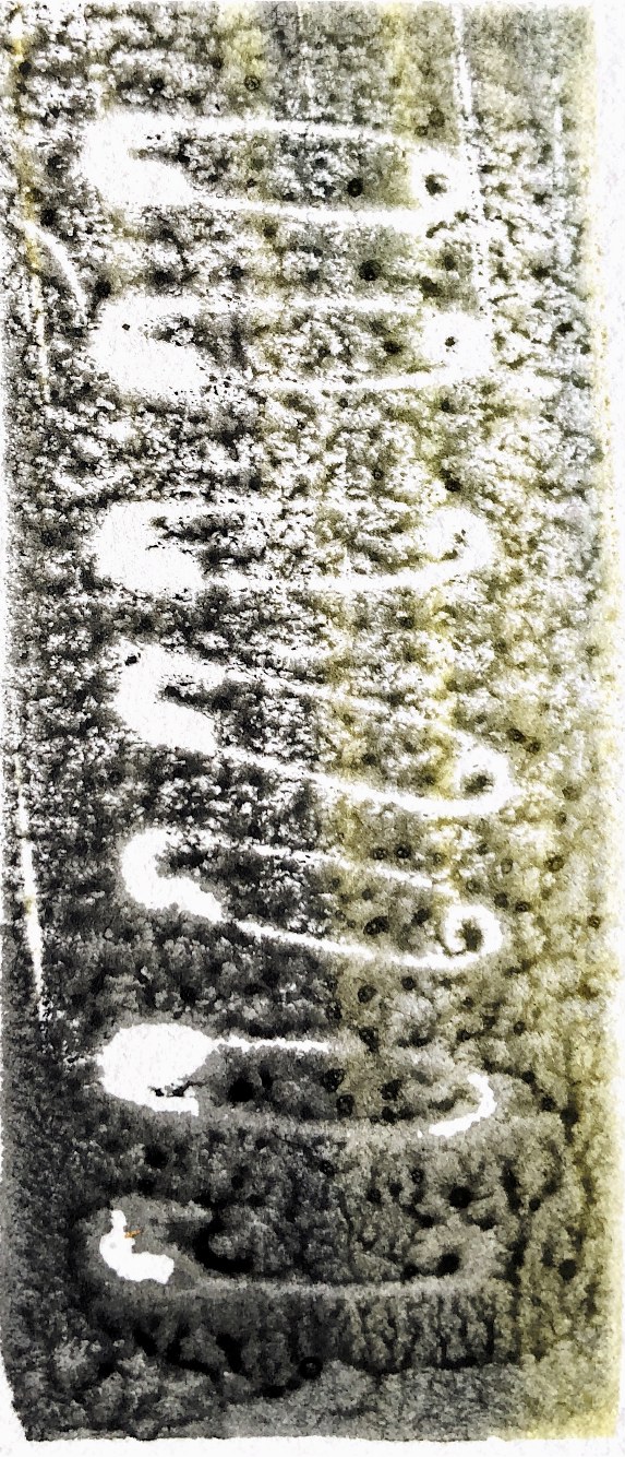
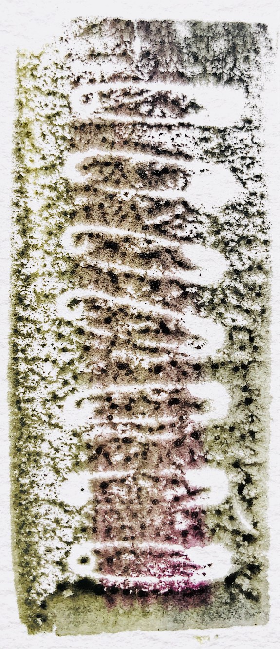
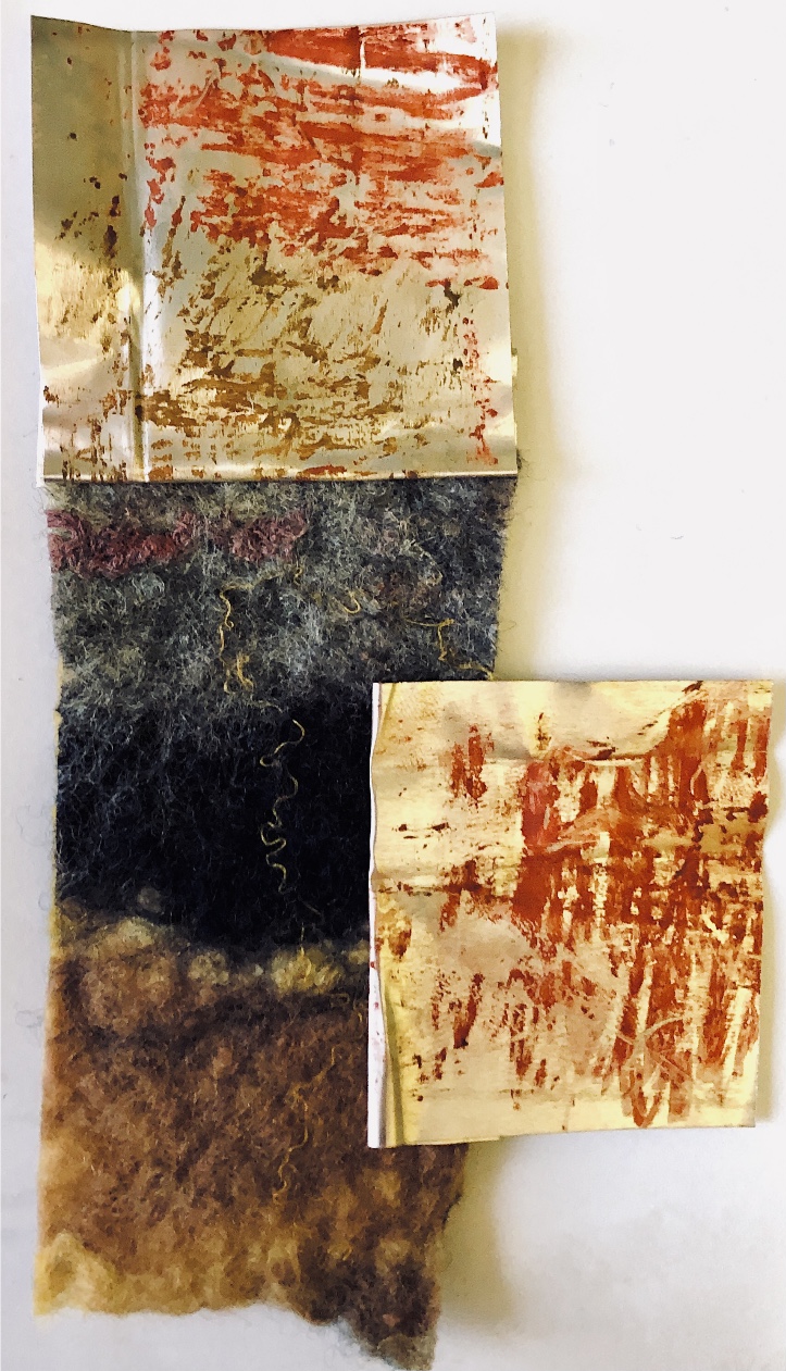
Thick card (this would also work with a thin piece of wood) had holes made with a bradawl and was joined with chenille fabric with safety pins. The method of joining allowed for the materials to be moved up and down and also to be positioned in a ‘v’ shape. I was keen to use the safety pins to make a print – it was easy to imprint a foam sheet with the pins and then print.
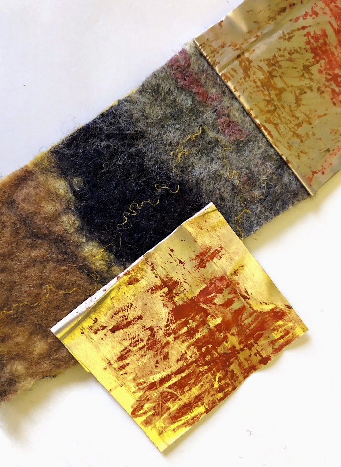
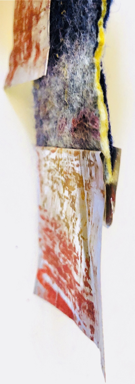
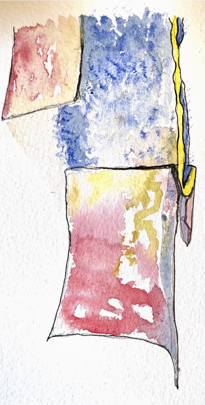
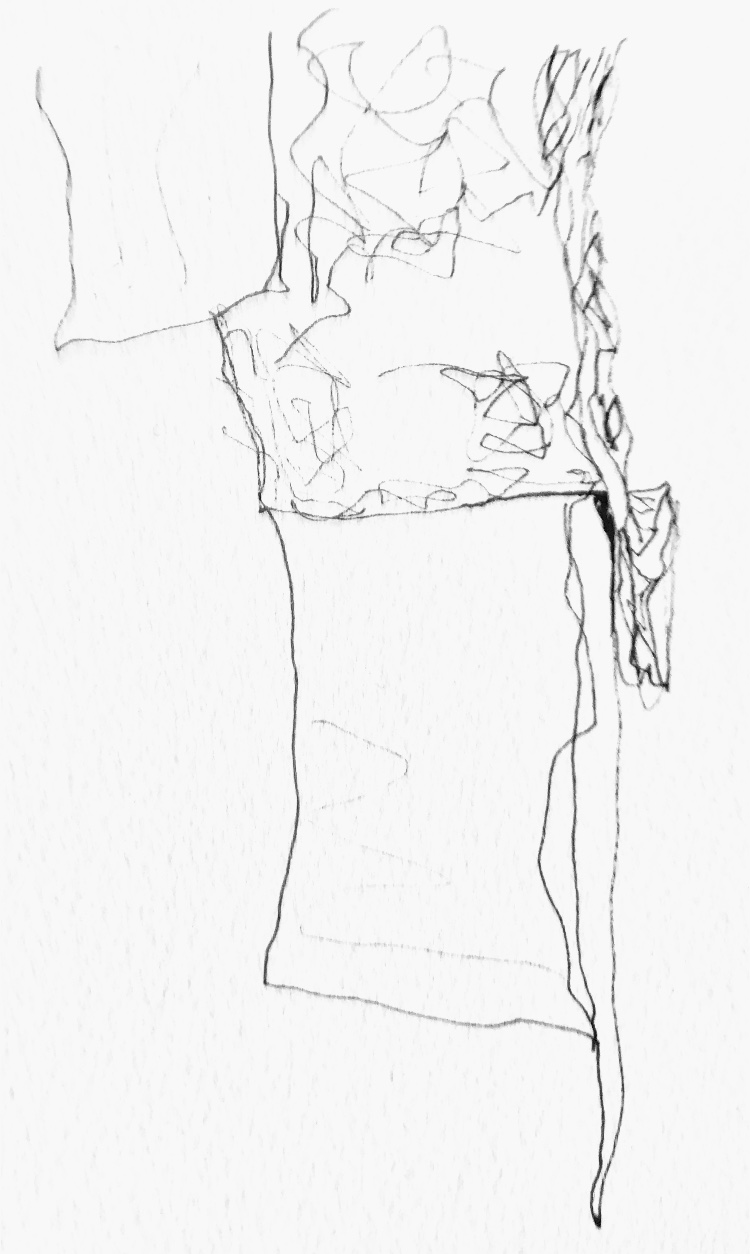
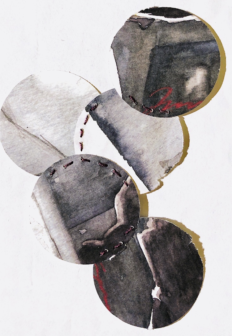
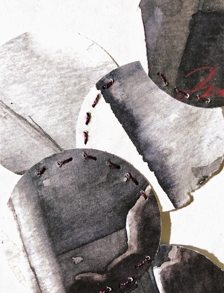
Handmade felt and thin metal sheet are very different materials, – the sheet could be folded to enclose the felt without another joining method. Photographed from the edge of the sample makes an interesting line pattern. What was difficult was translating the textures into the drawing.
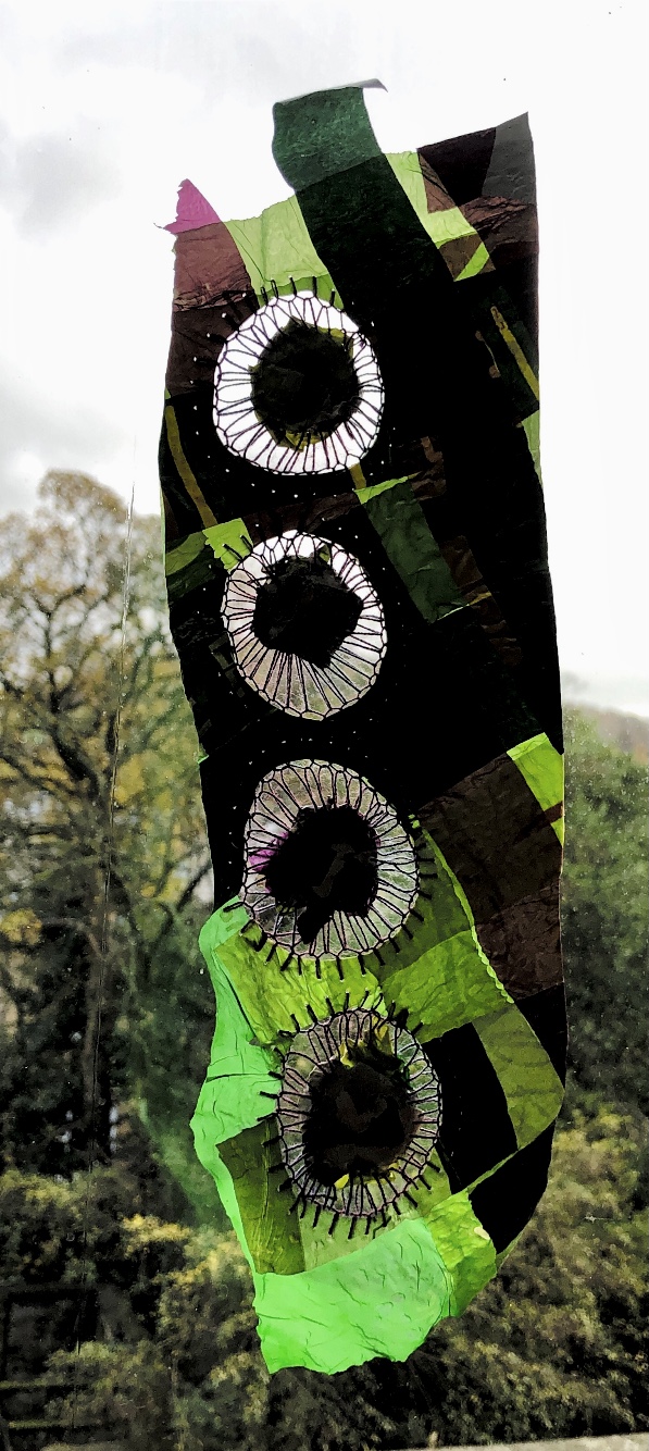
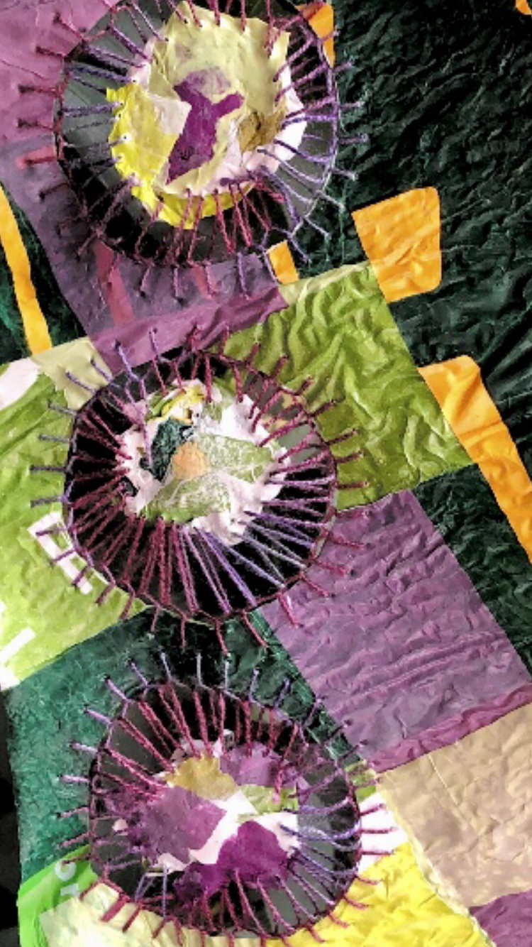
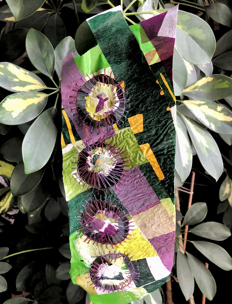
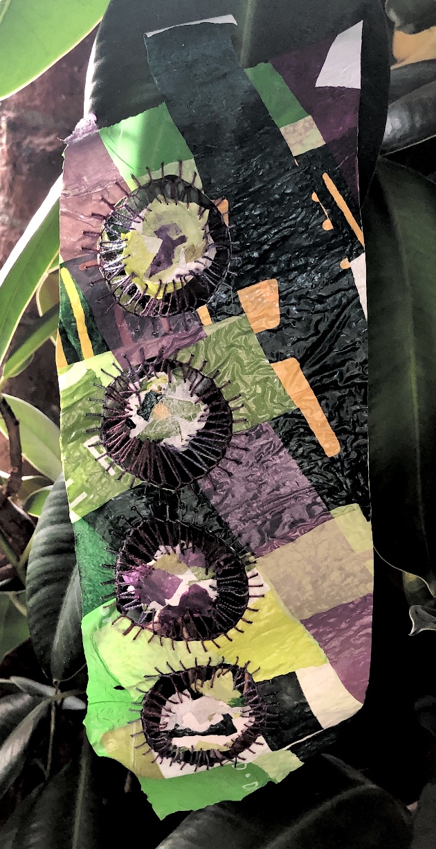
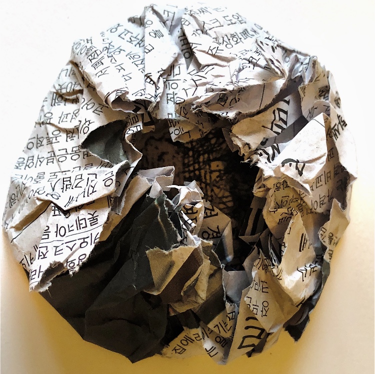
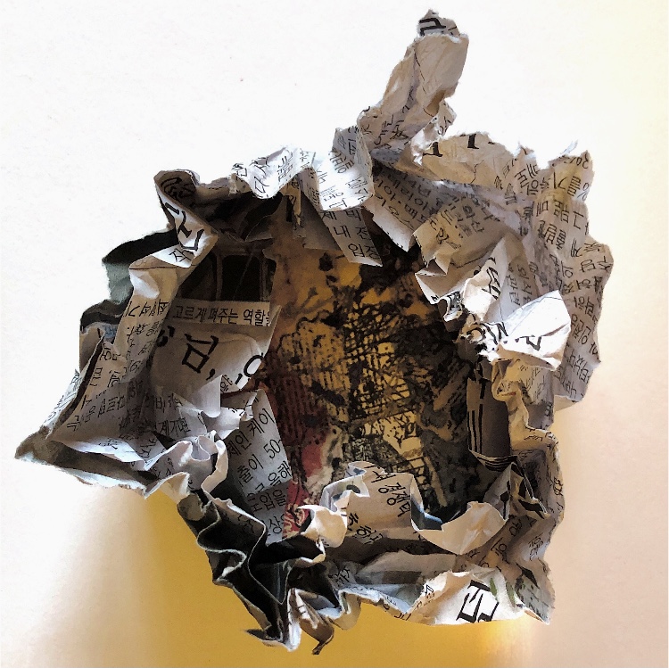
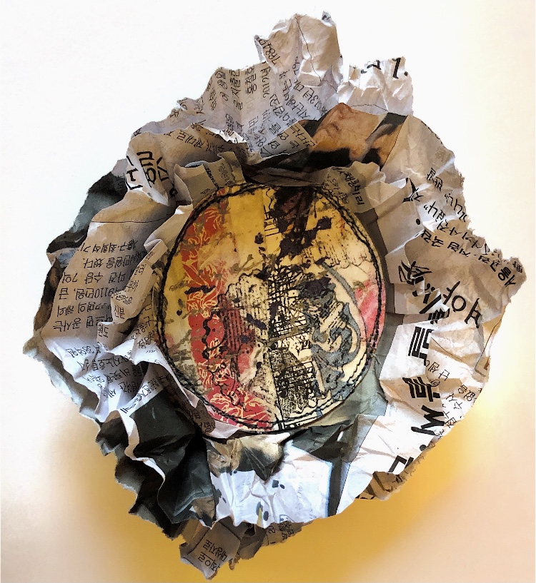
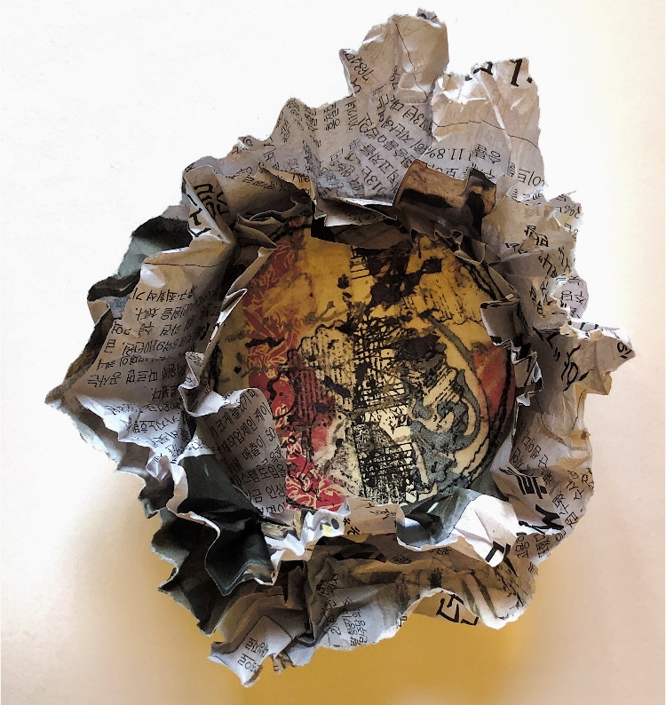
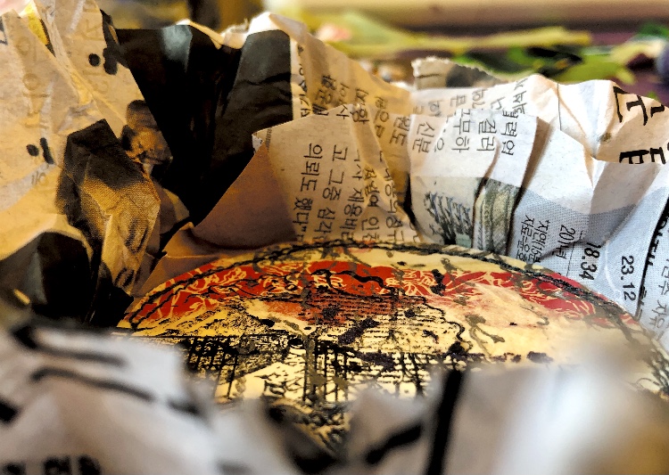
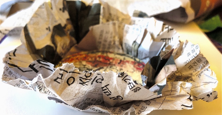
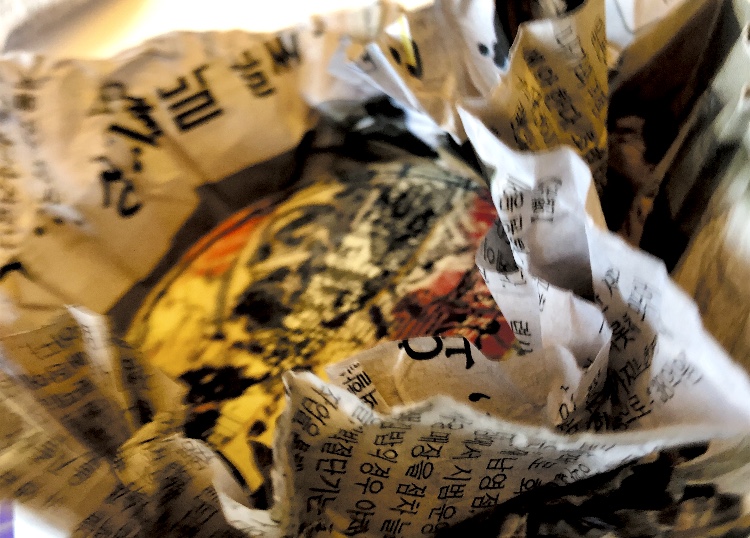
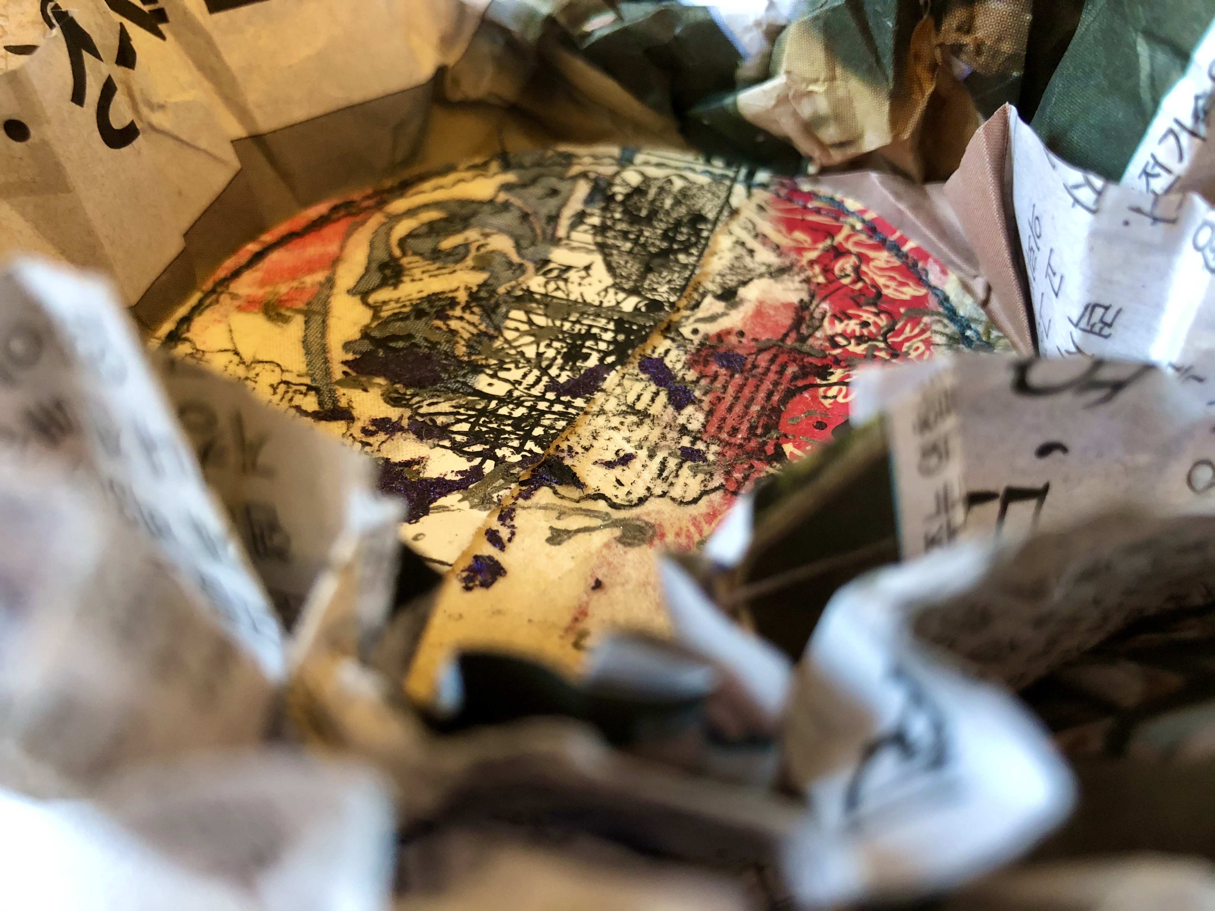
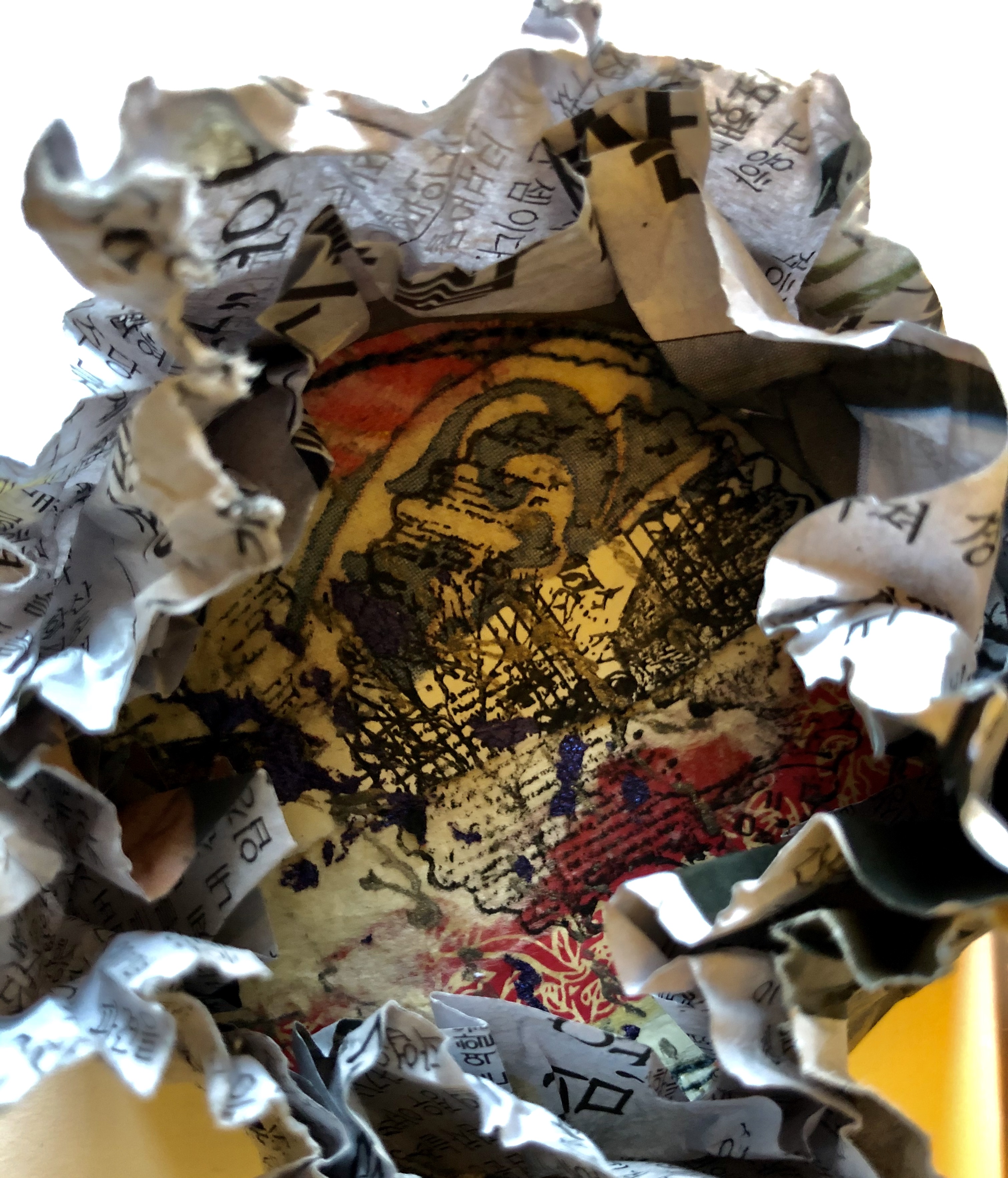
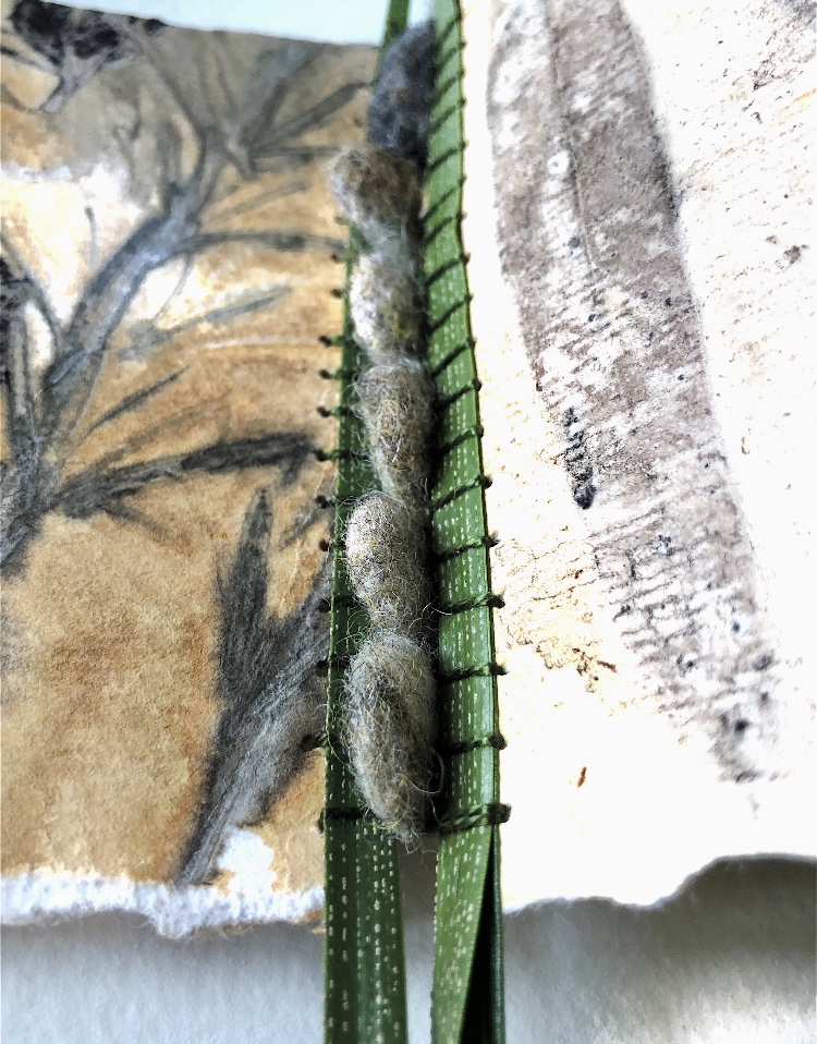
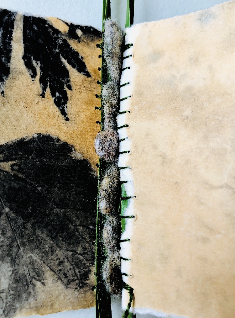
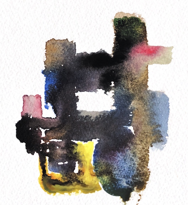
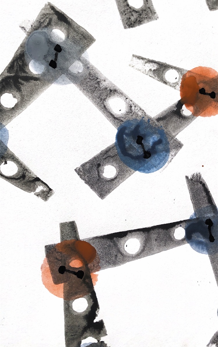
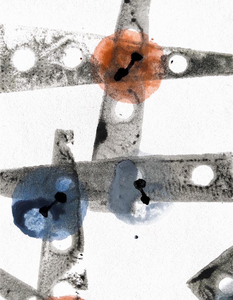
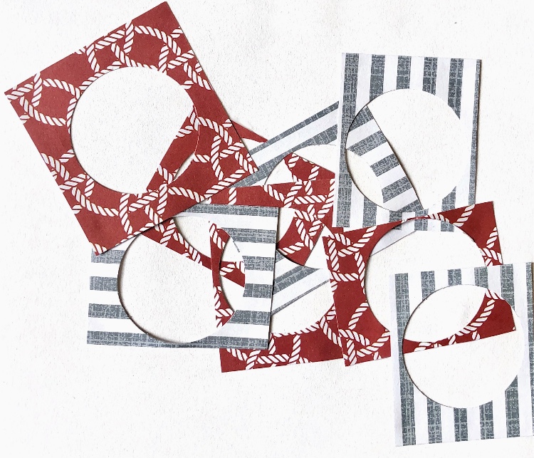
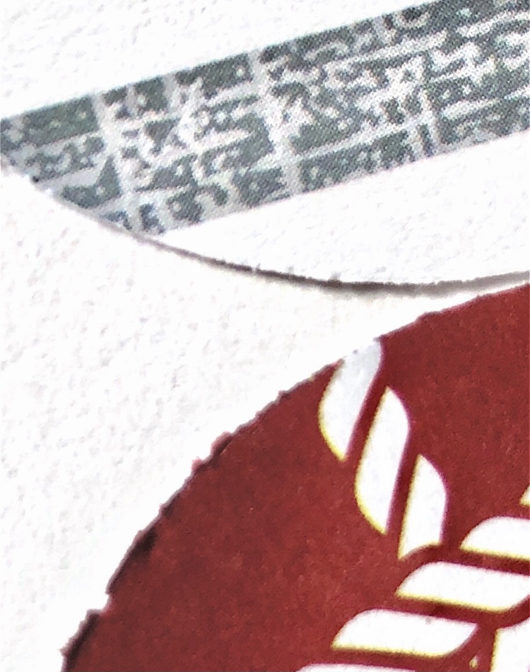
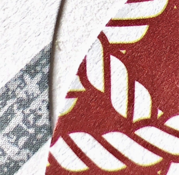
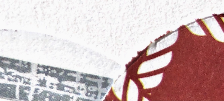
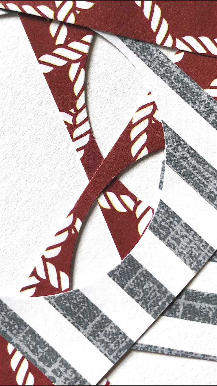
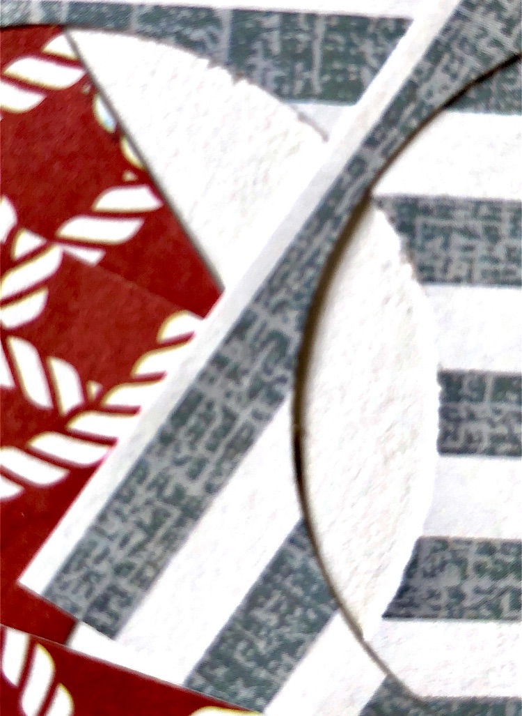
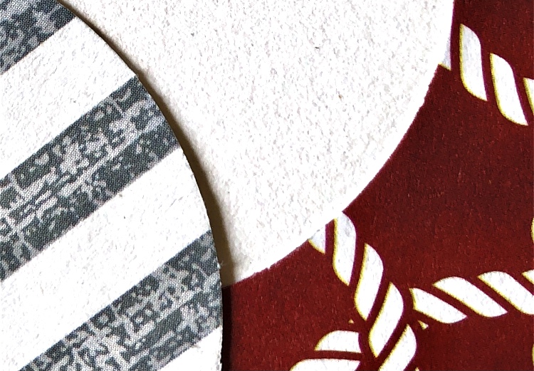
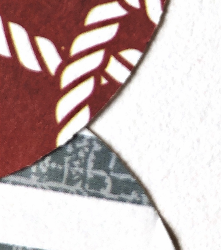
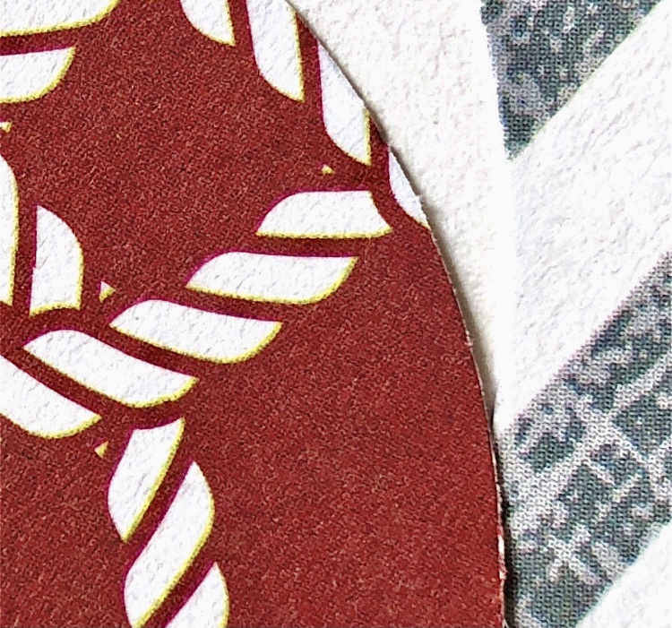
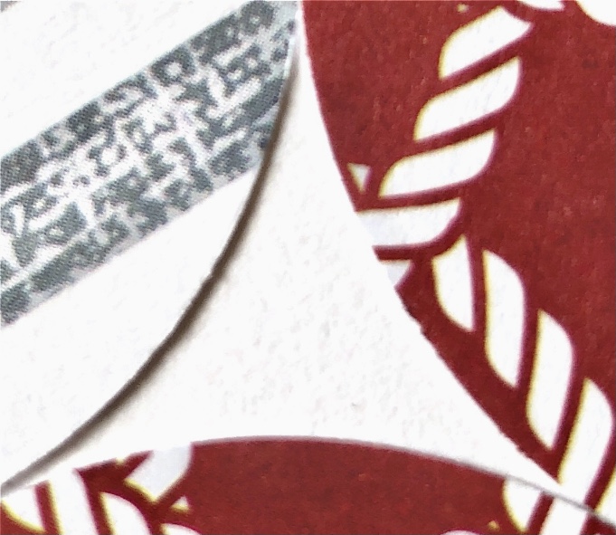
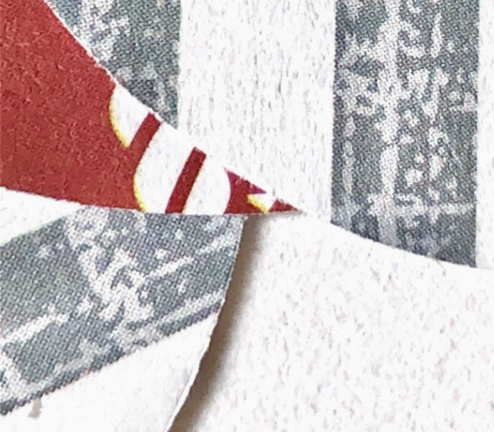
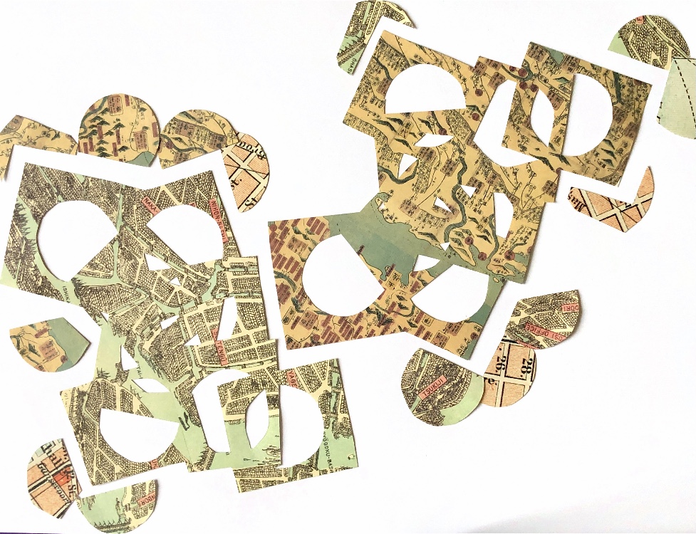
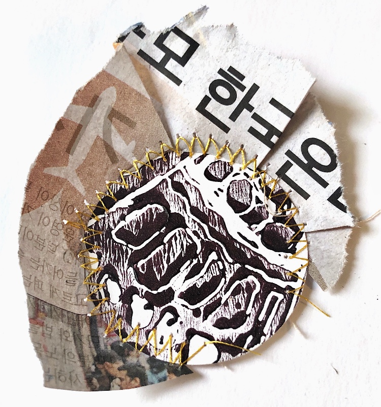
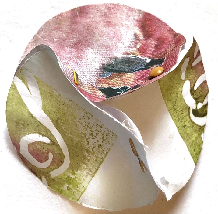
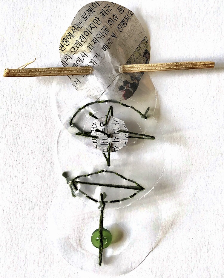
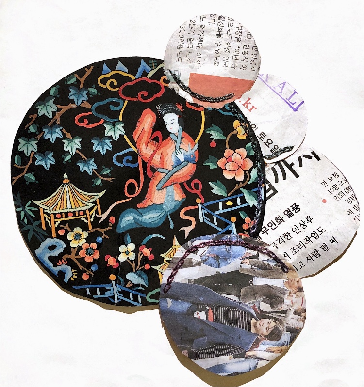
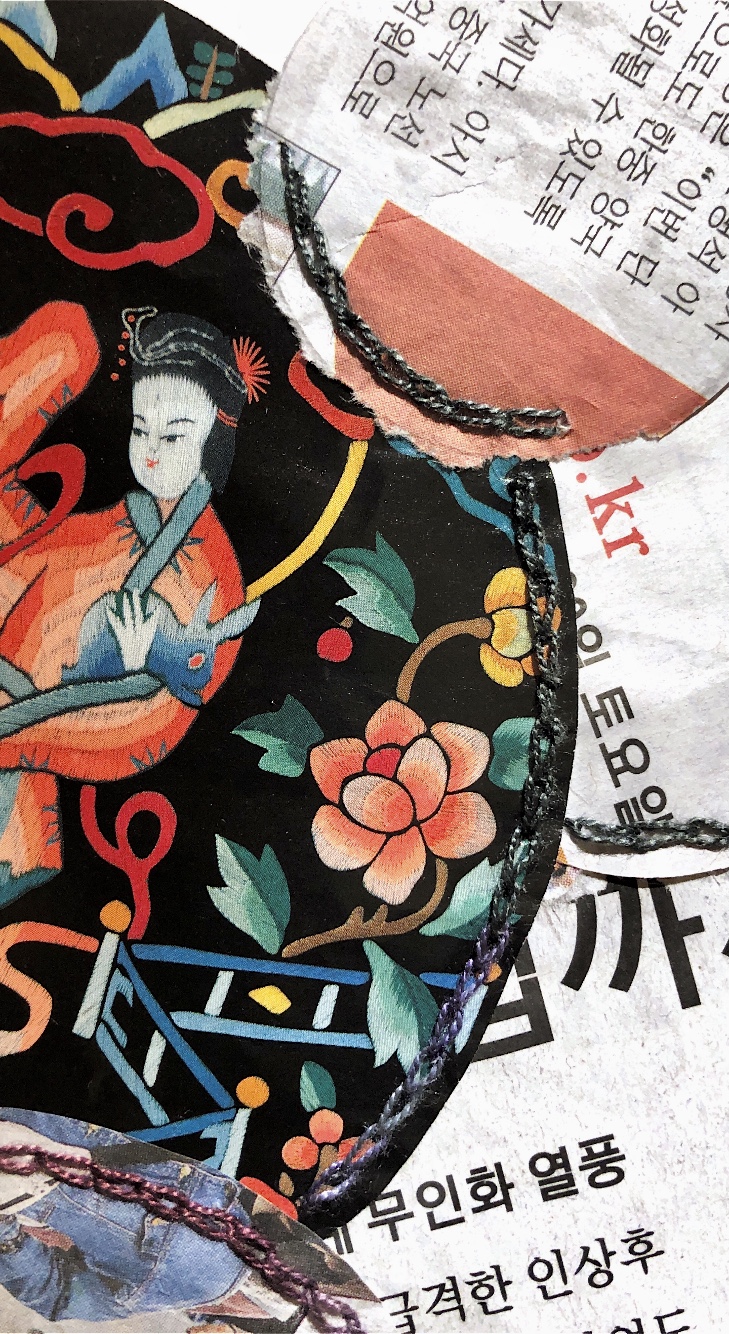
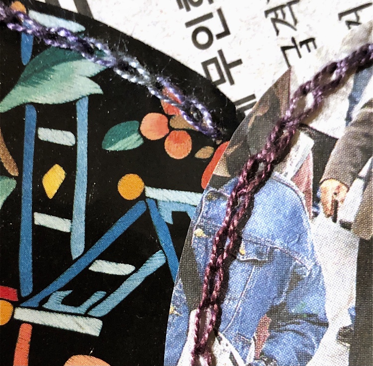
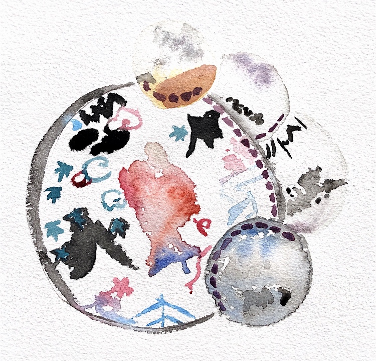
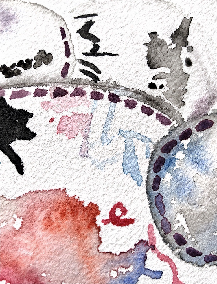
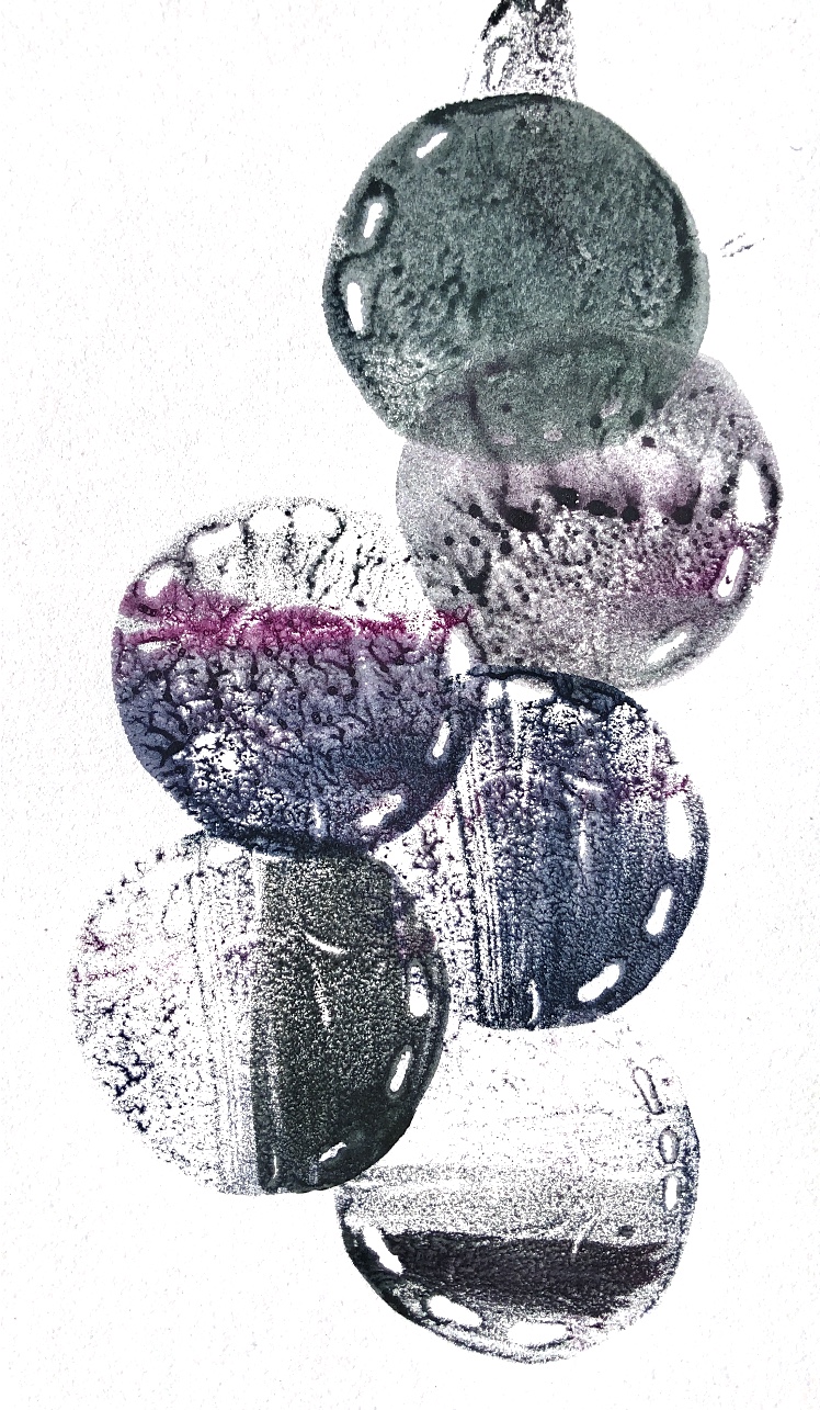
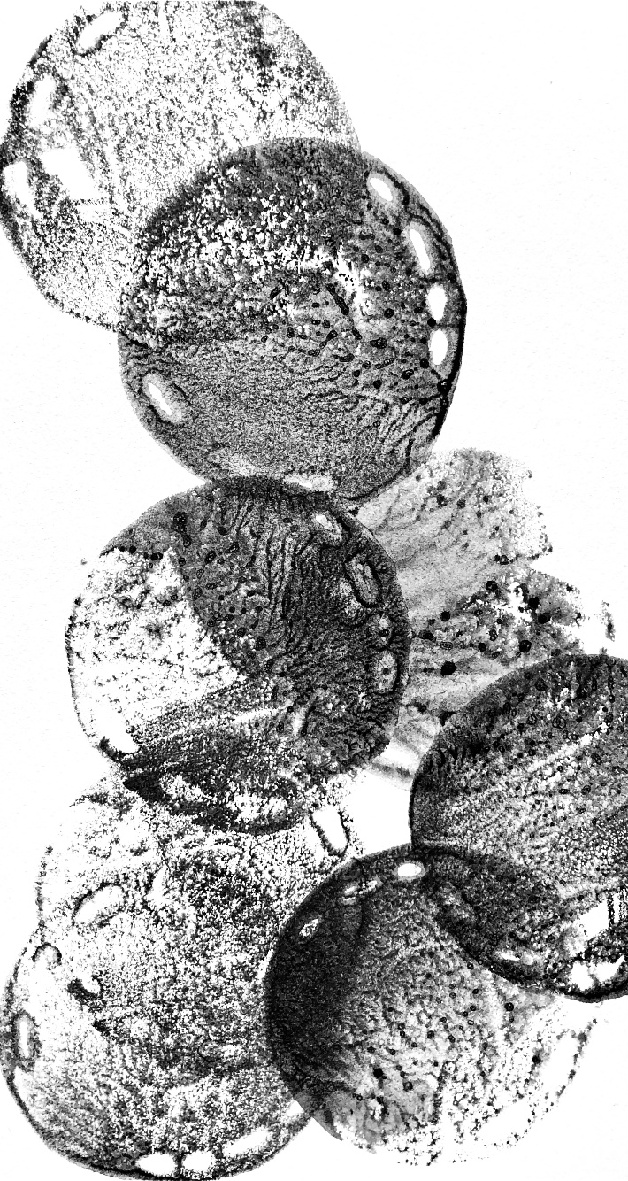
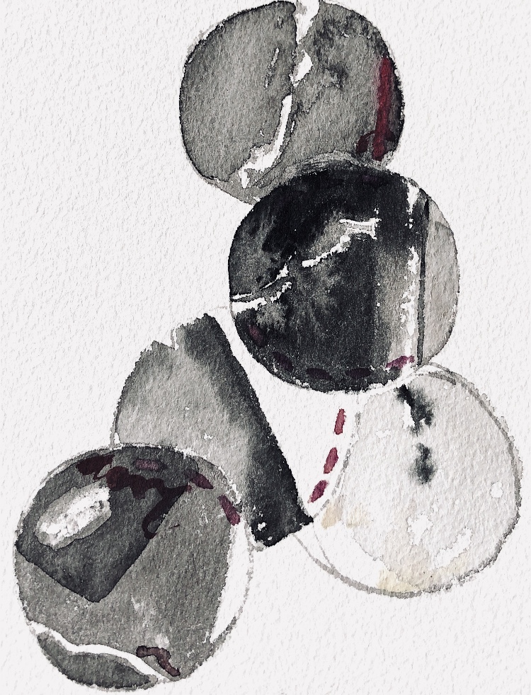
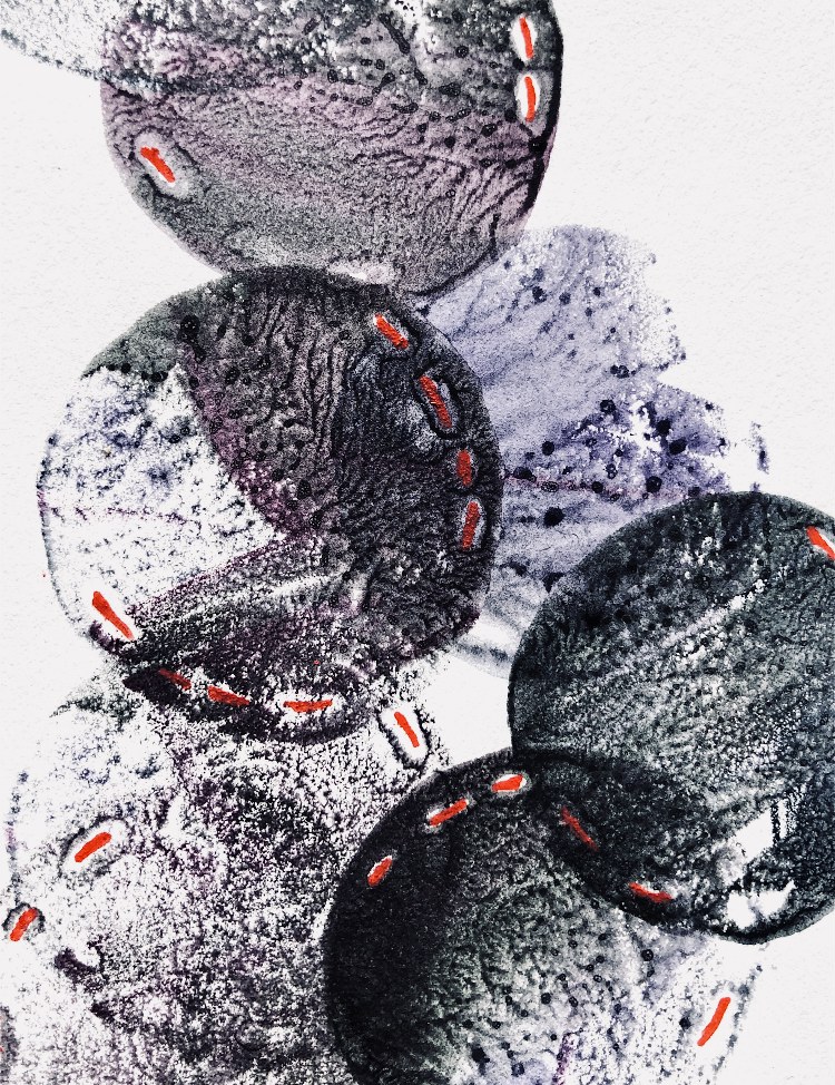
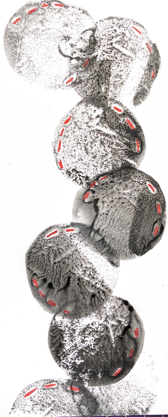
Joining curved edges – I chose to use a Japanese themed wrapping paper and newspaper. I always buy a newspaper when I visit another country and try to use bits in my work. Here the text contrasts nicely with the decorative wrapping paper and the chain stitch join adds another element. I think I have captured the feel of this sample in my watercolour even though I chose to leave out much of the black background. The different sized circles work well for the composition.
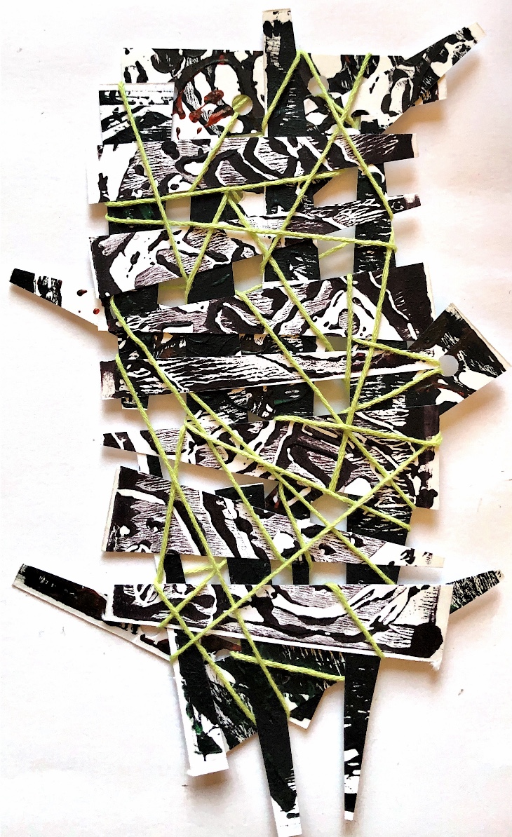
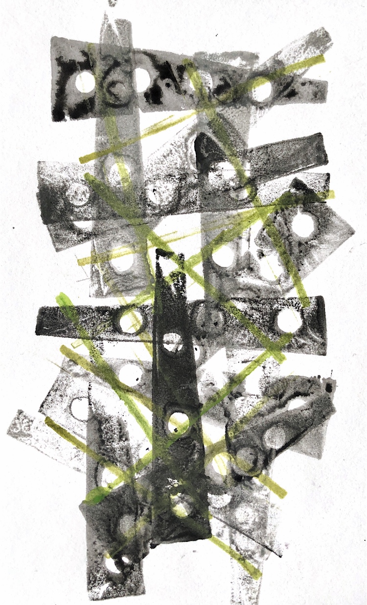
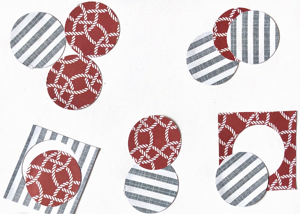
Overlapping circles of one size can be used to create an endless series of patterns. I made just one print block to experiment with designs and also painted a watercolour version to help inspire the printing. Adding a little red pen for the stitching on the prints added interest.
I am constantly amazed at how simple techniques can lead to samples with so many possibilities and i’m looking forward to developing some of these further.