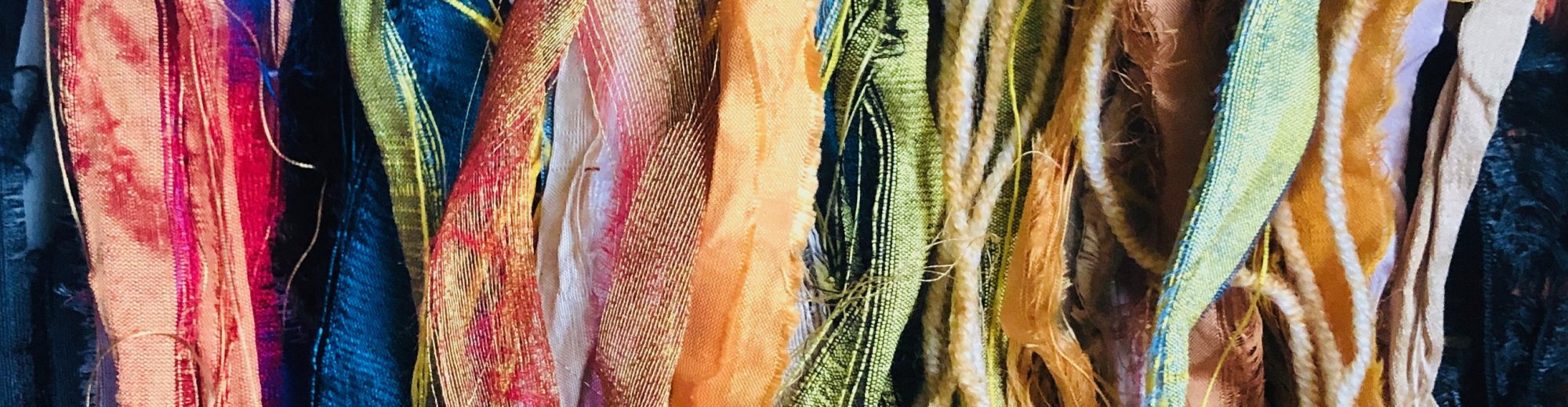
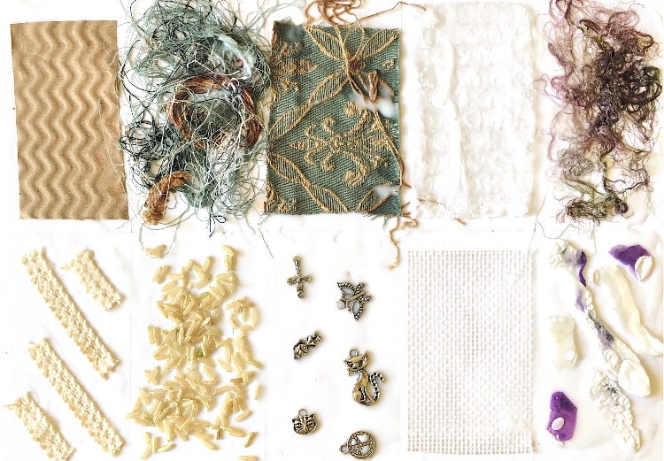
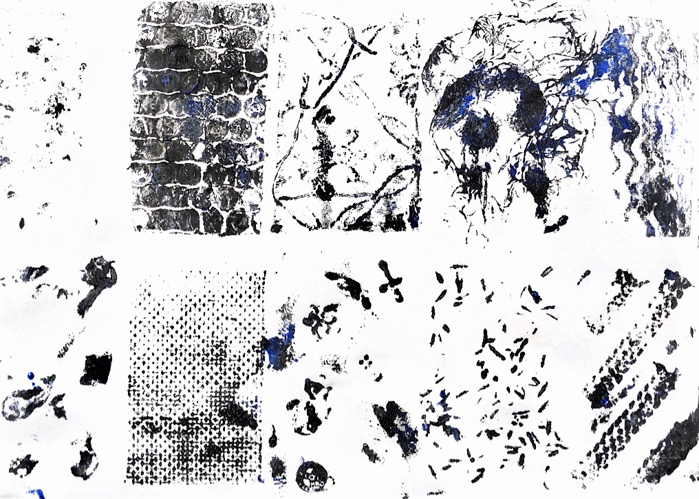
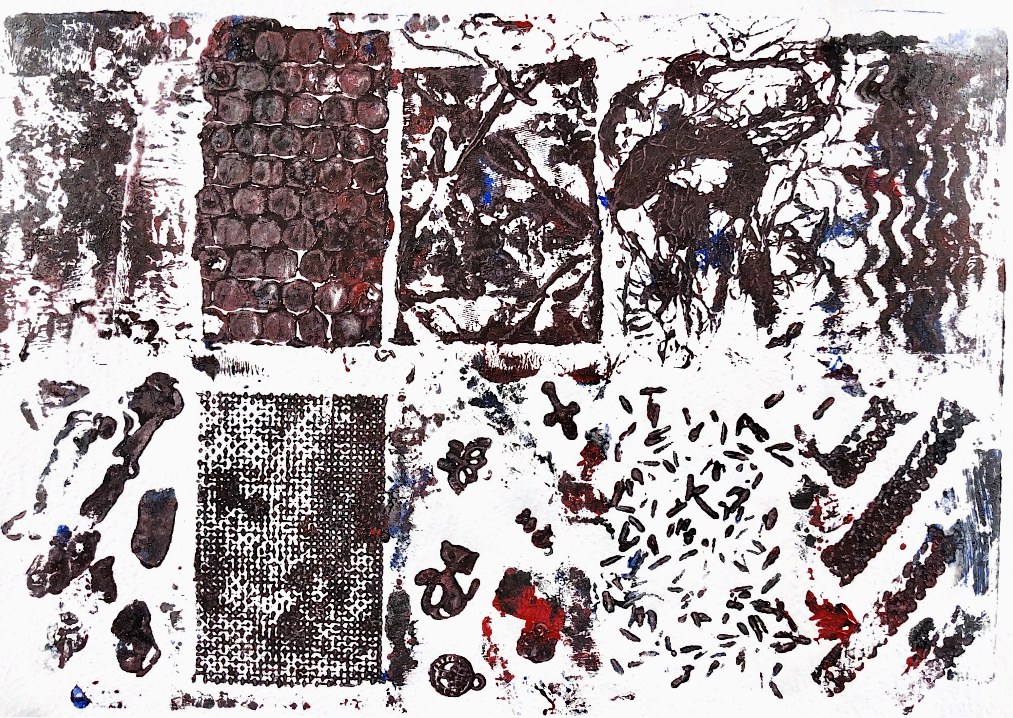
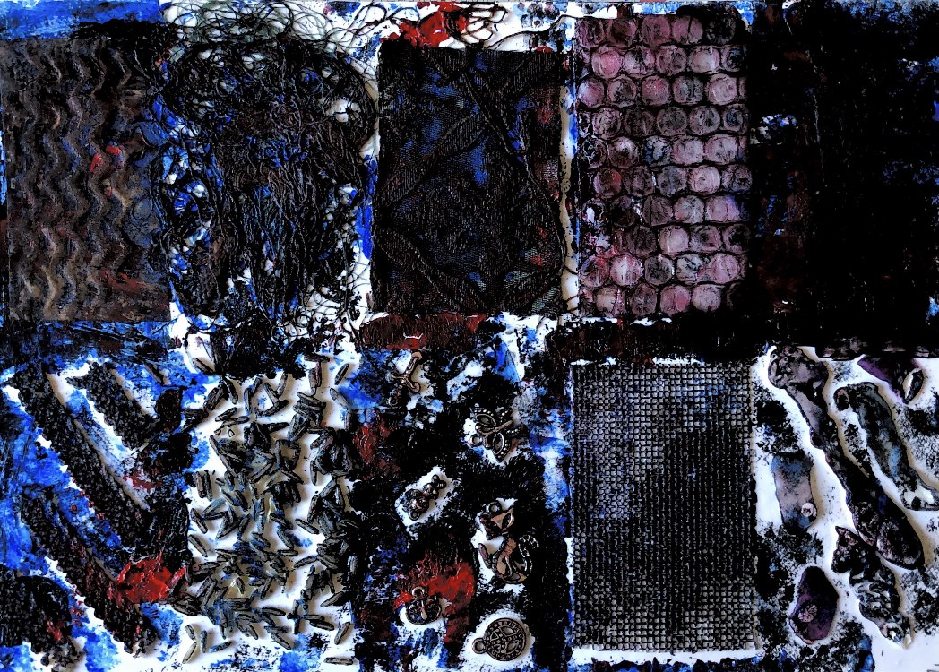
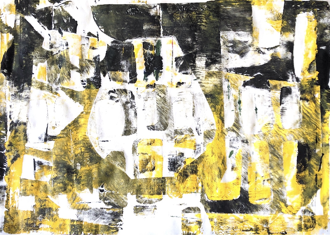
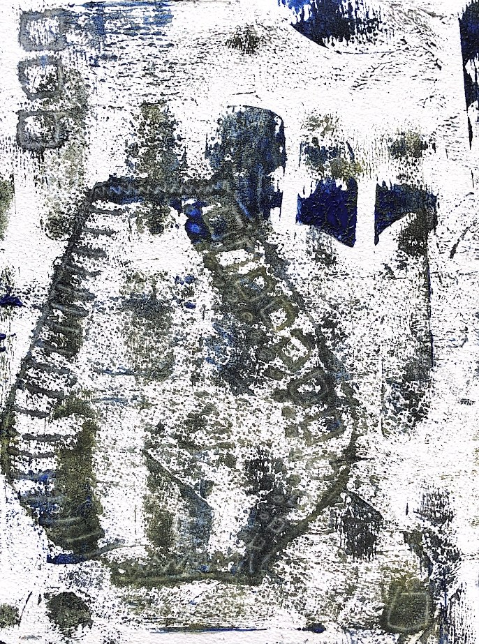
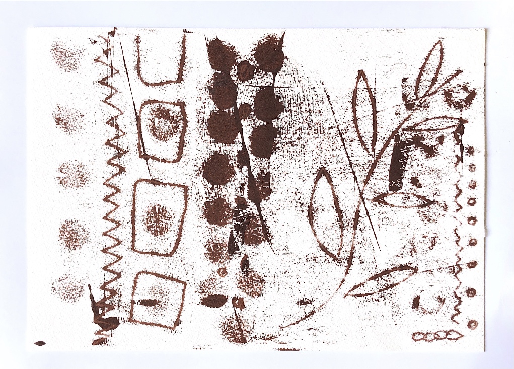
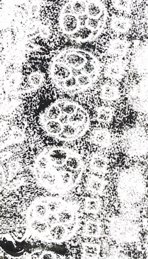
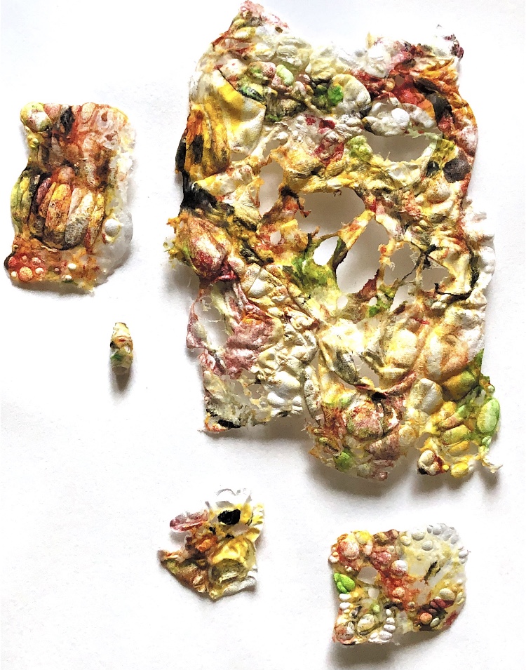
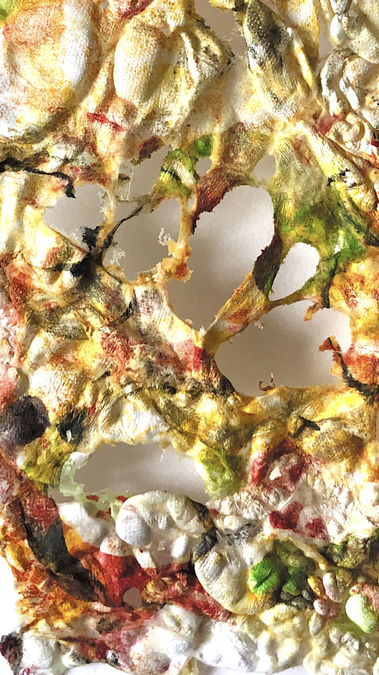
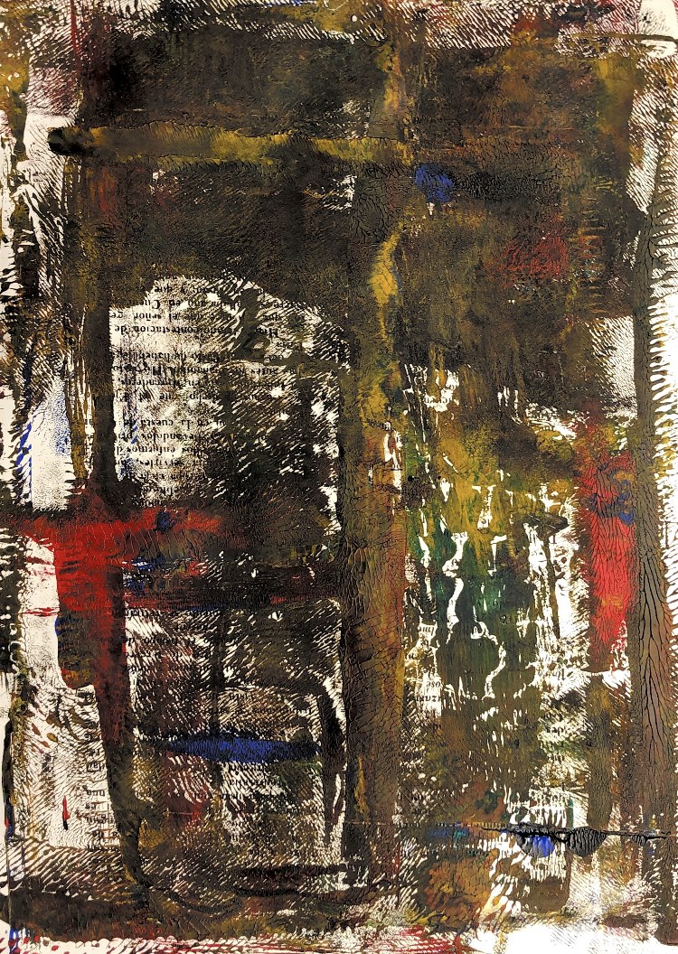
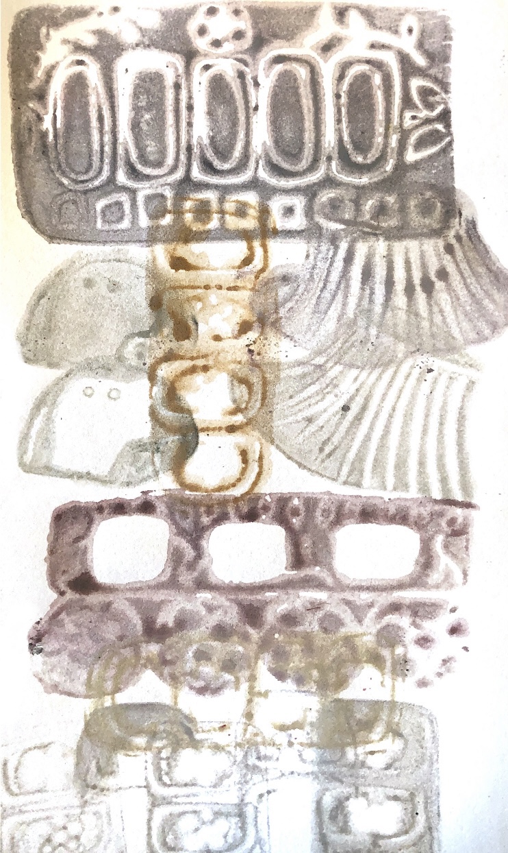
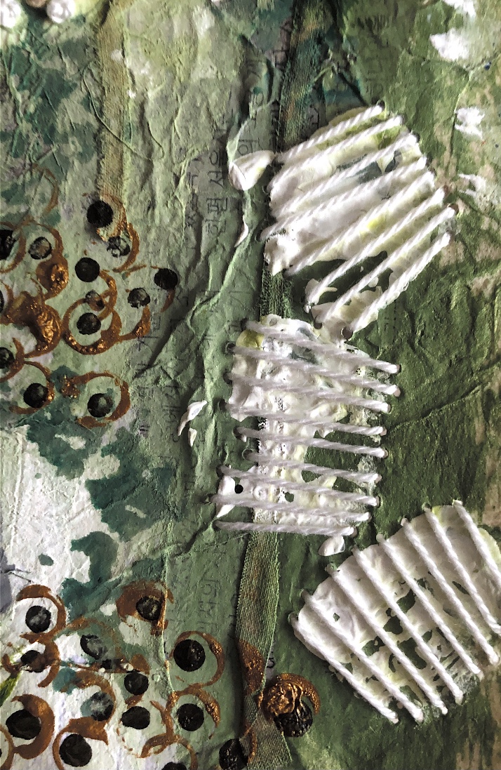
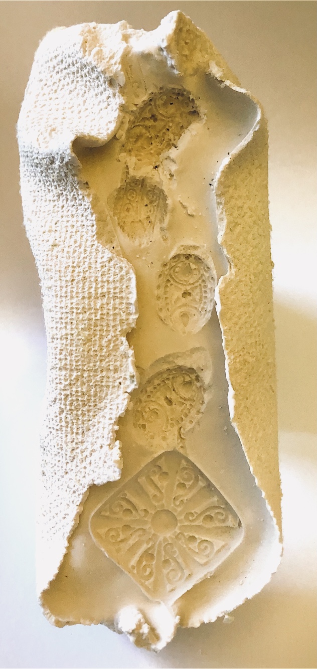
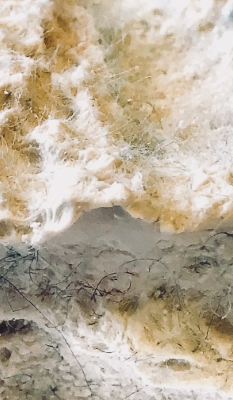
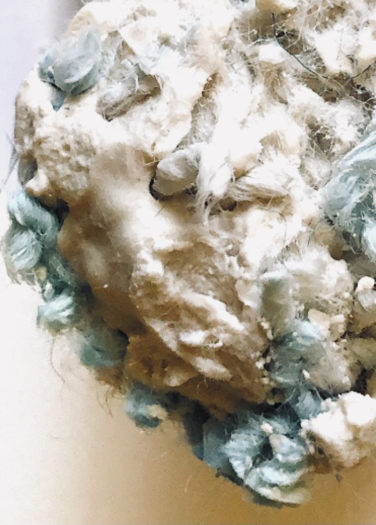
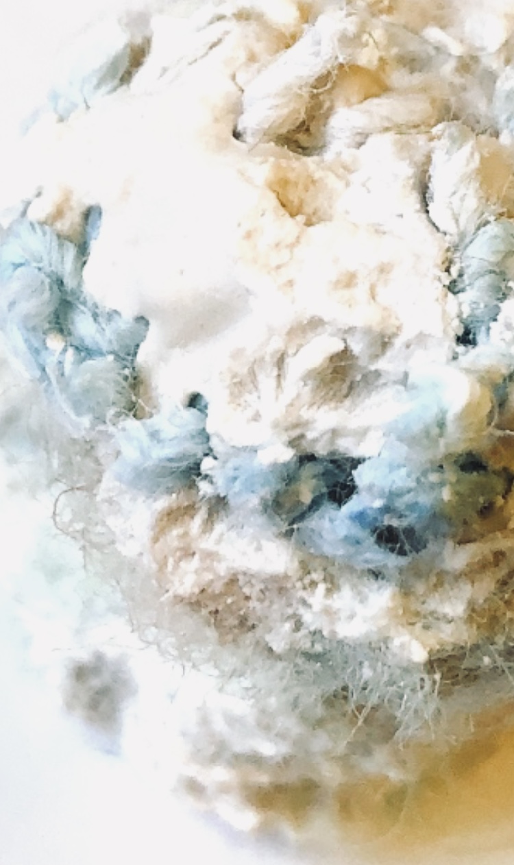
Fig, 1. (Clockwise from top left) Collage block made with zig zag cardboard, frayed threads, curtain fabric, bubble wrap, silk waste, heated tyvek, tapestry fabric, metal charms, rice, and lace. Sealed with PVA.
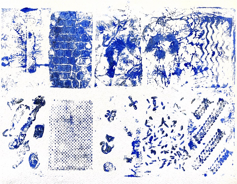
Fig, 2. This was not easy to ink up, and I needed to use an extender to keep the paint wet enough to print. I tried wet watercolour paper, thin Japanese rice paper, cartridge paper and book paper. The exercise was an experiment to see what works – I think the bubble wrap and tapestry fabric are good for a textured background, and the rice would also work well for this. The bubble wrap, fabric and cardboard held a lot of paint while the other surfaces were more difficult to get a print from until I loaded a lot more paint onto the block.
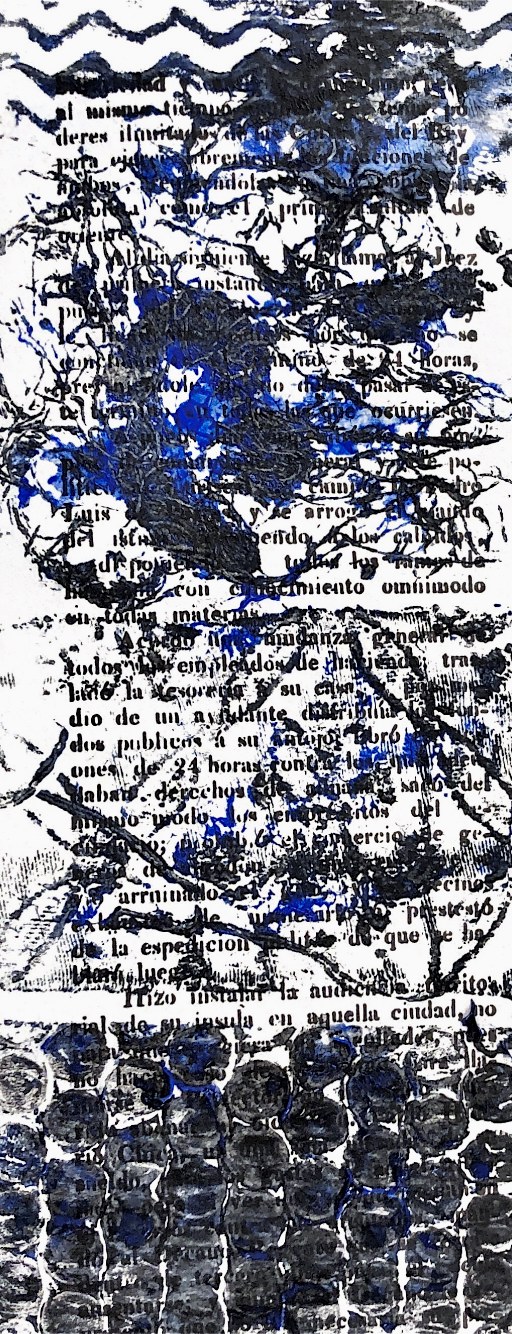
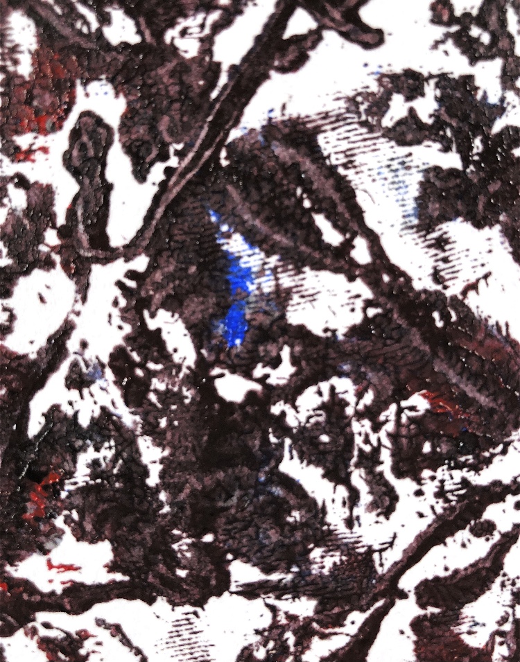
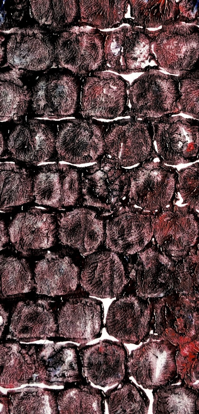
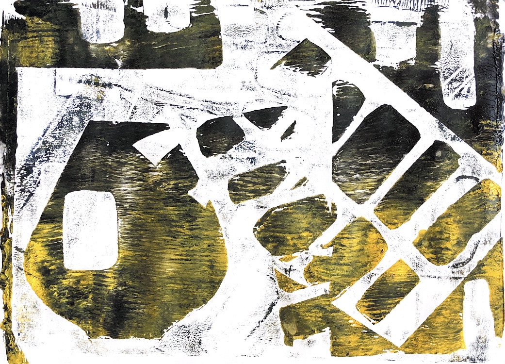
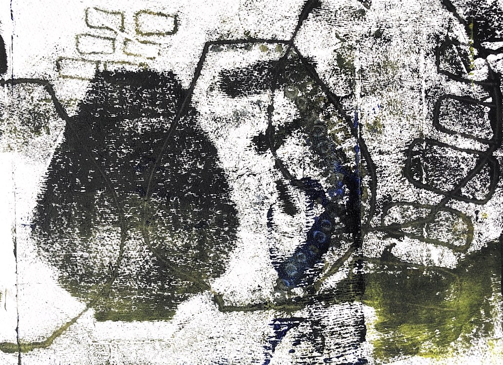
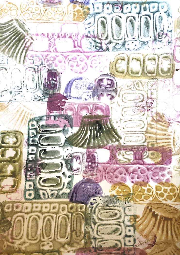
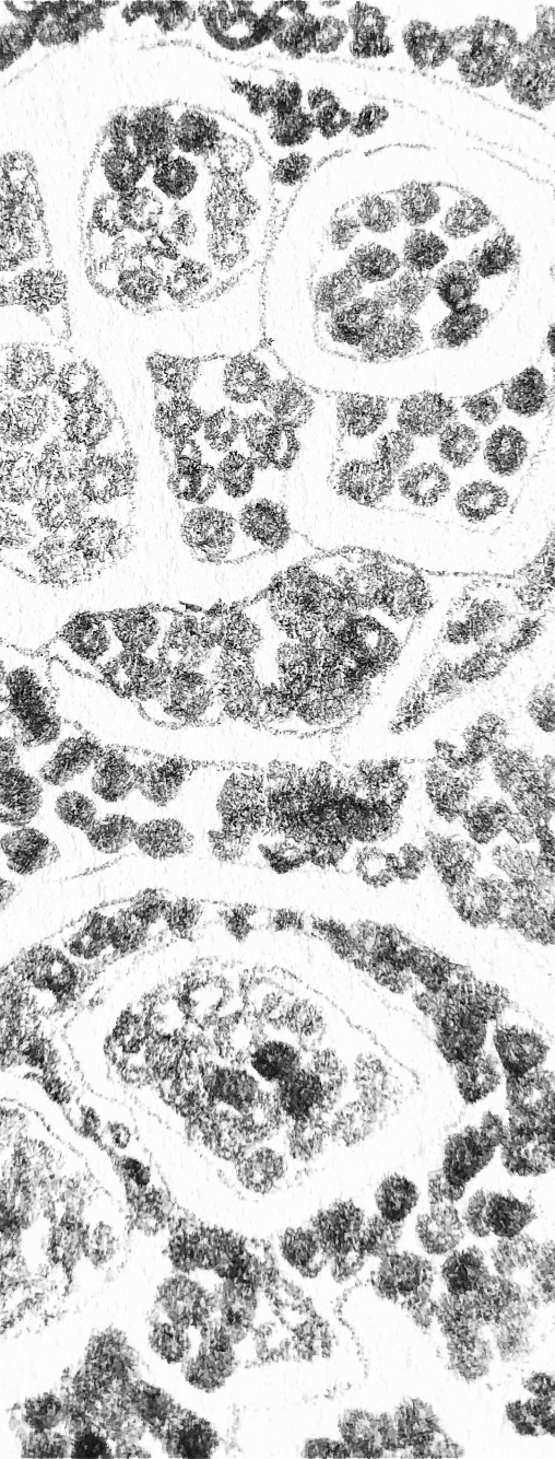
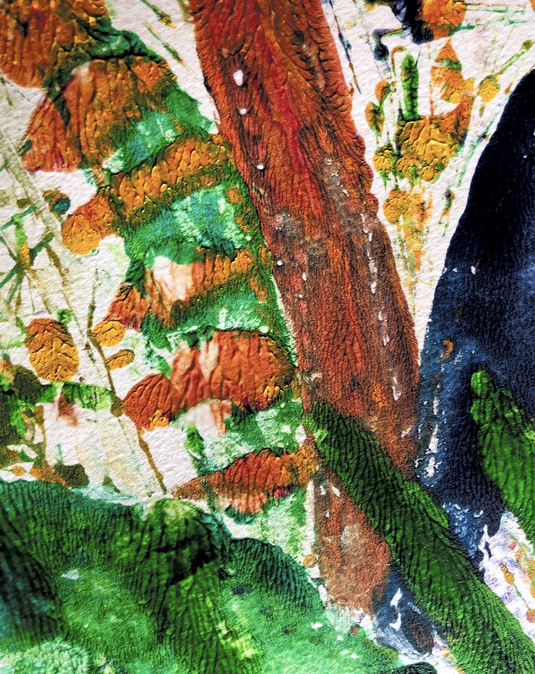
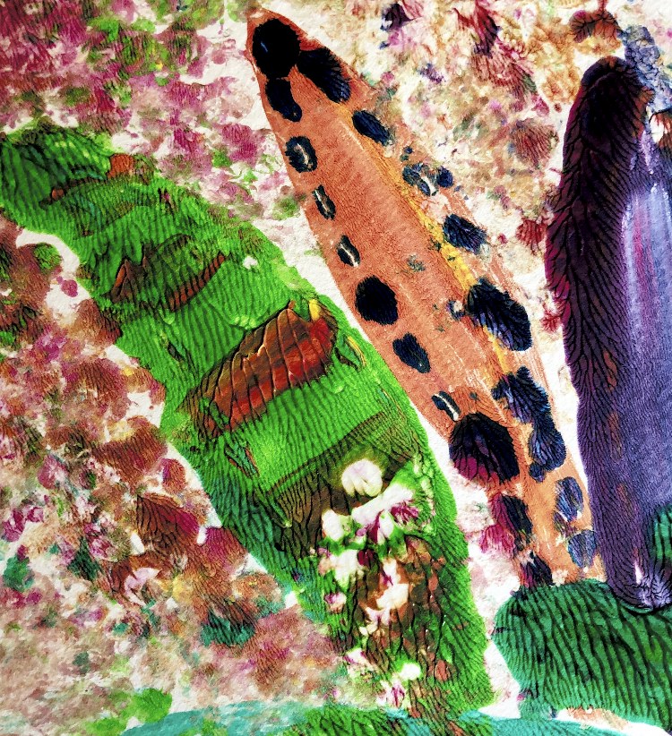
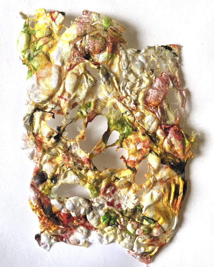
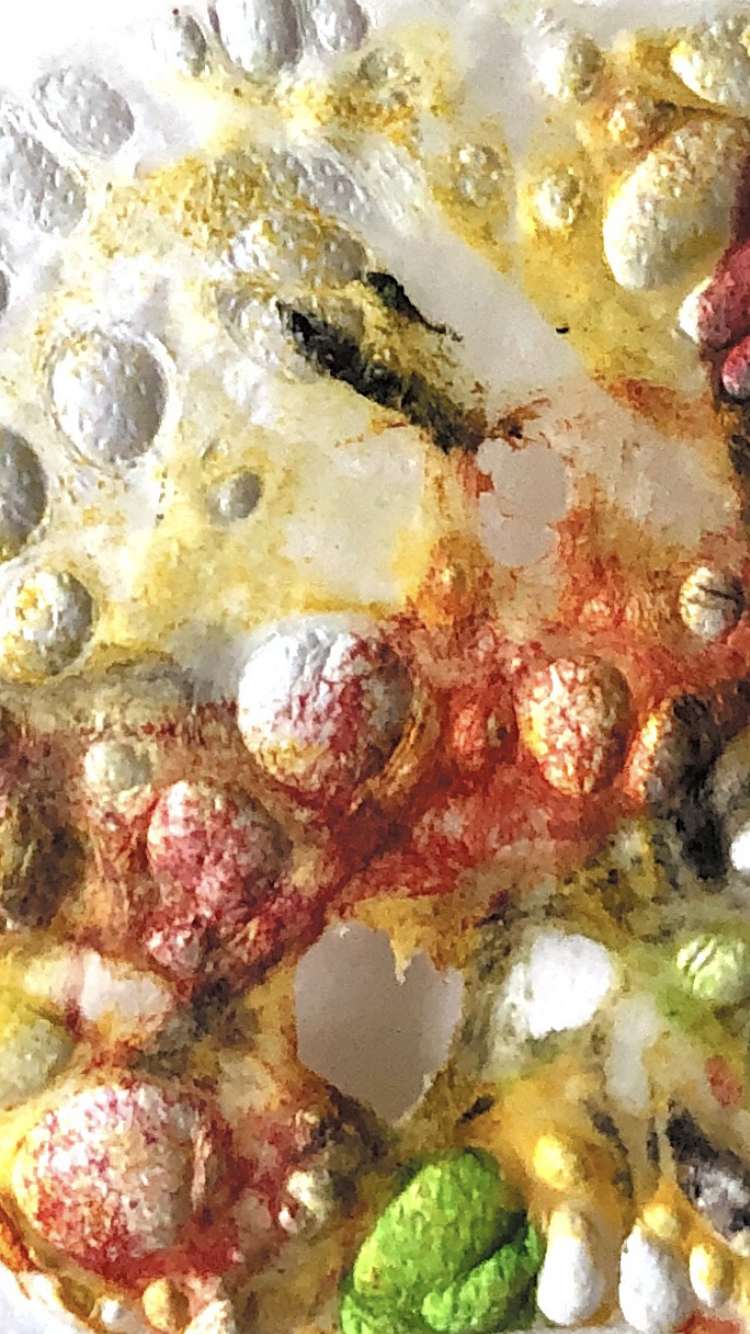
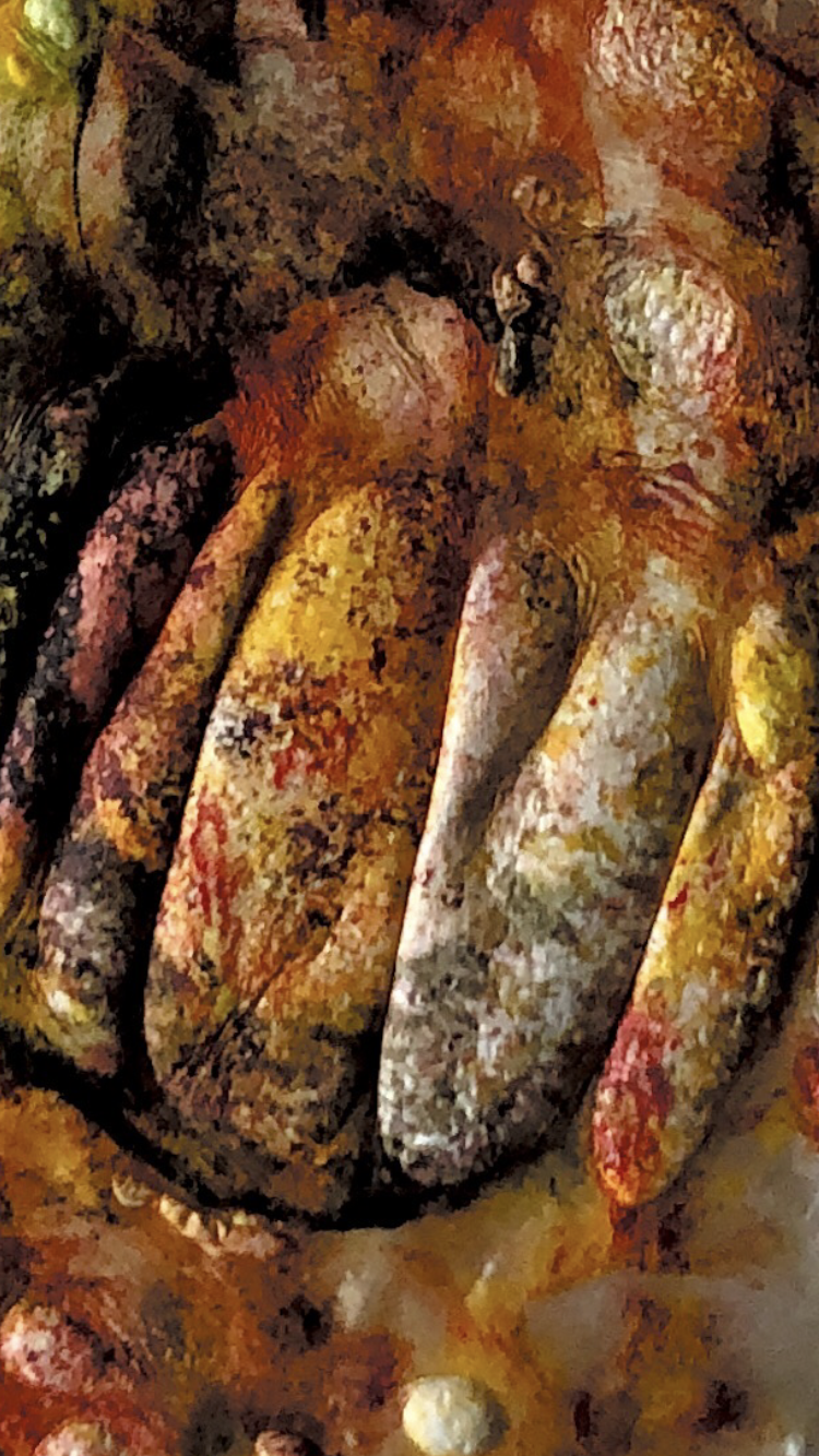
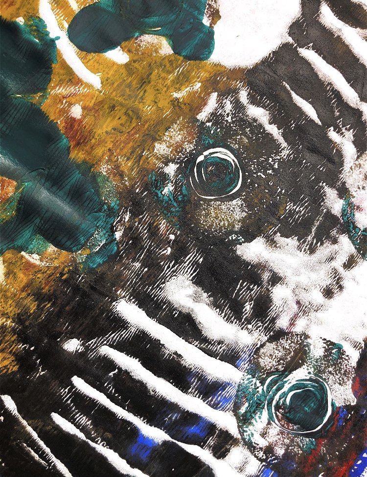
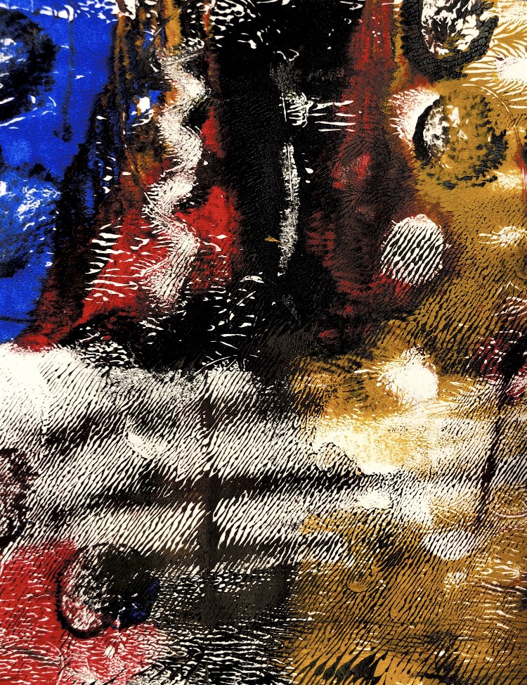
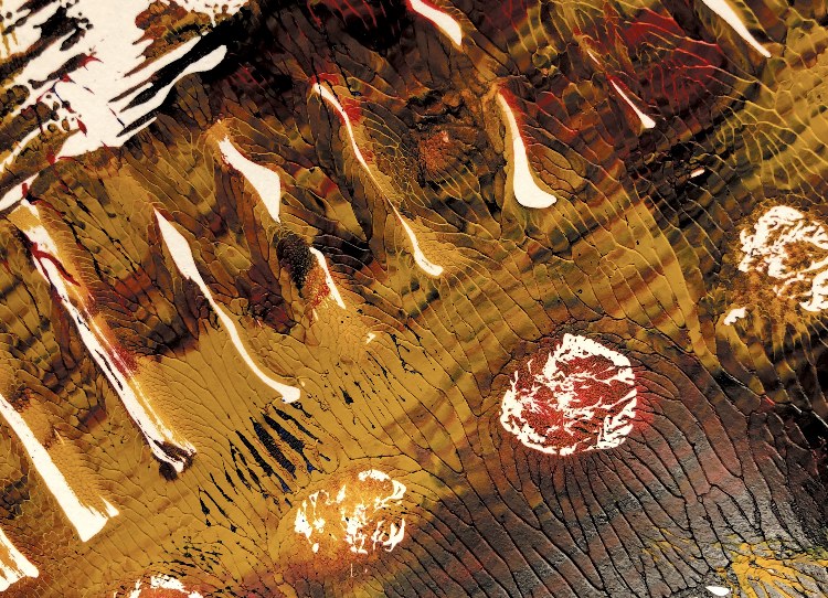
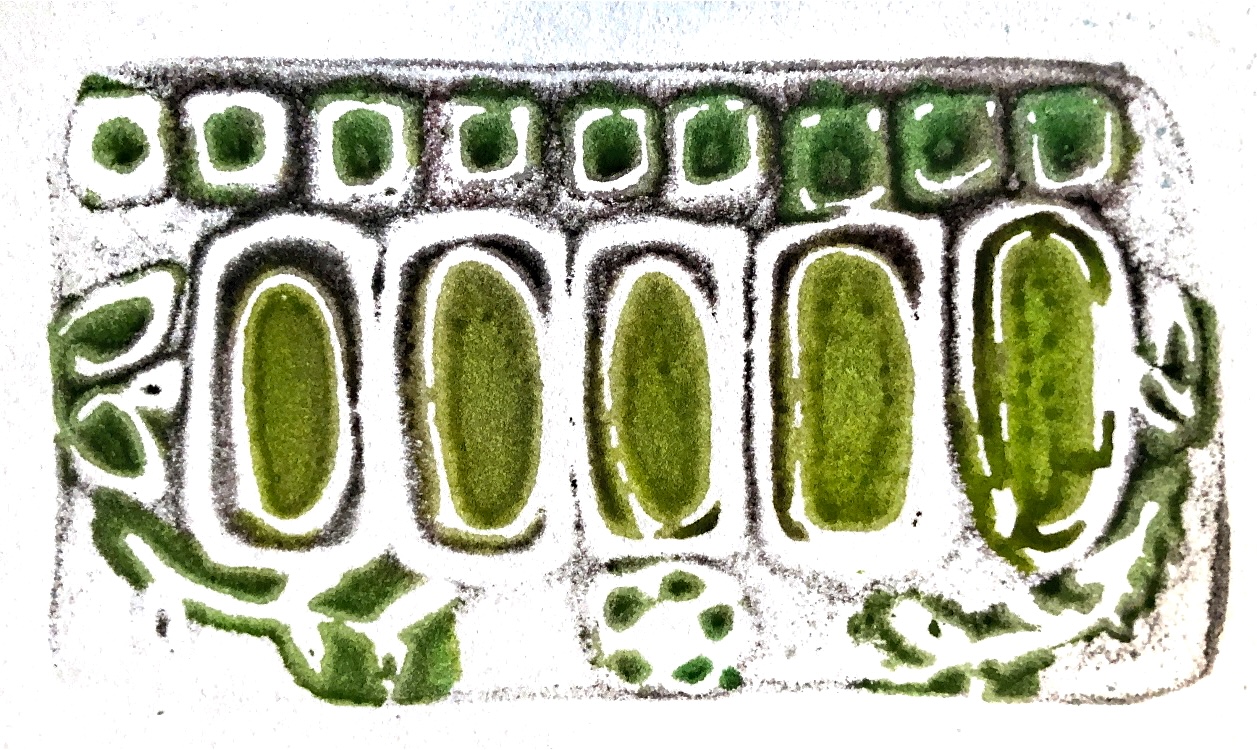
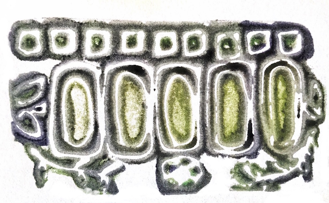
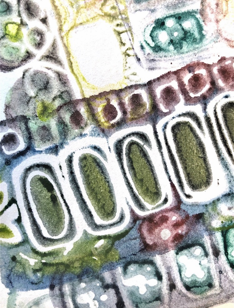
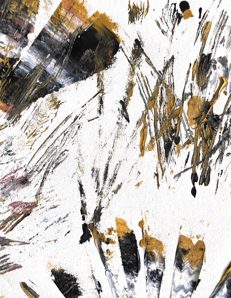
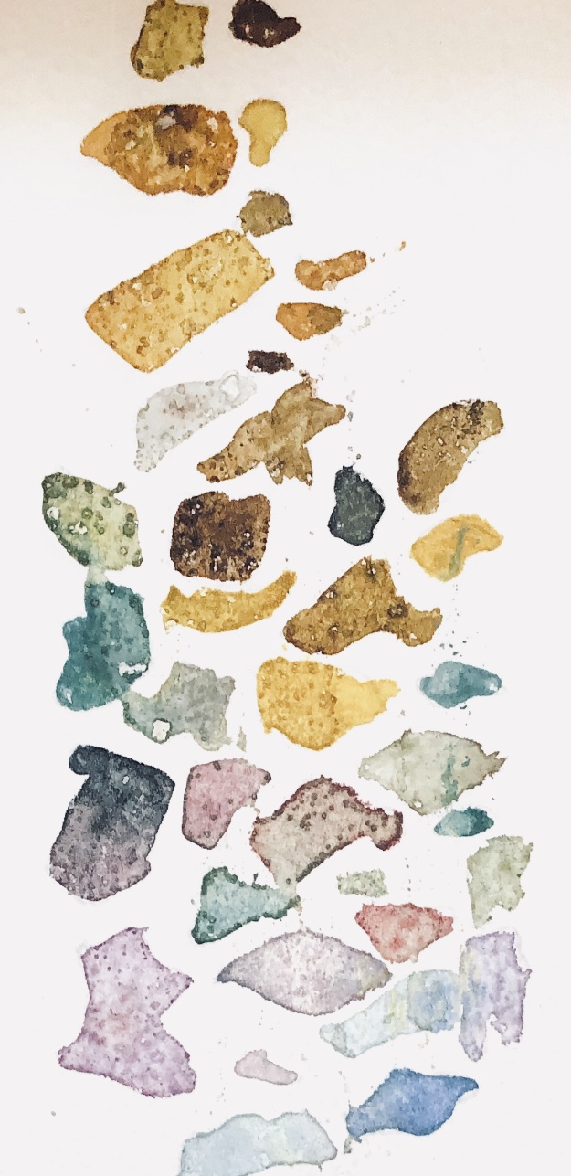
Fig, 3. Close ups from one of the prints show the detail. This print had a lot more paint put onto the plate and is on wet watercolour paper, and I think it is the most successful as the detail and shapes are clear, with added interest from the thick paint.
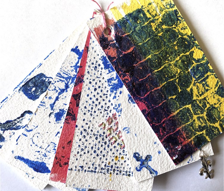
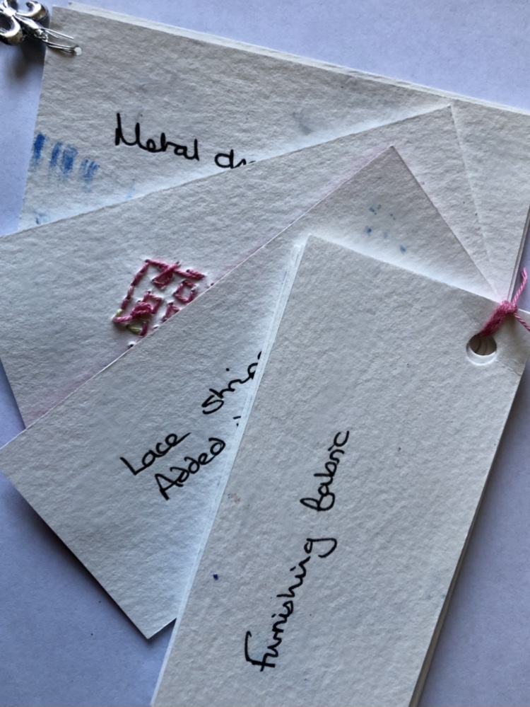
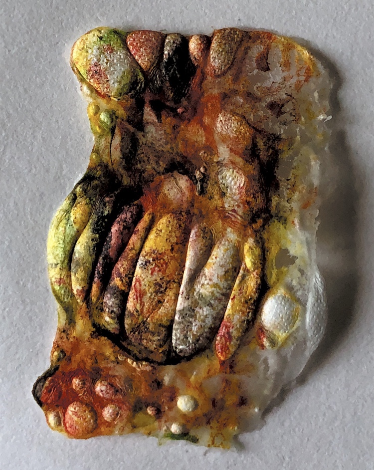
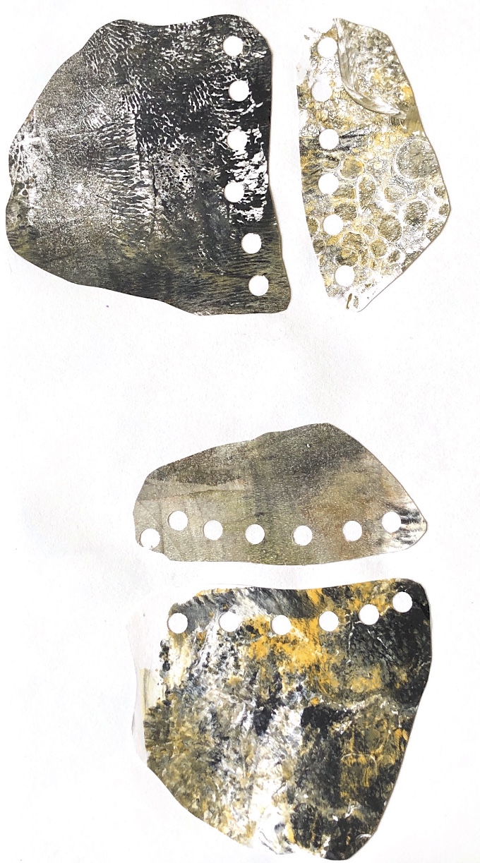
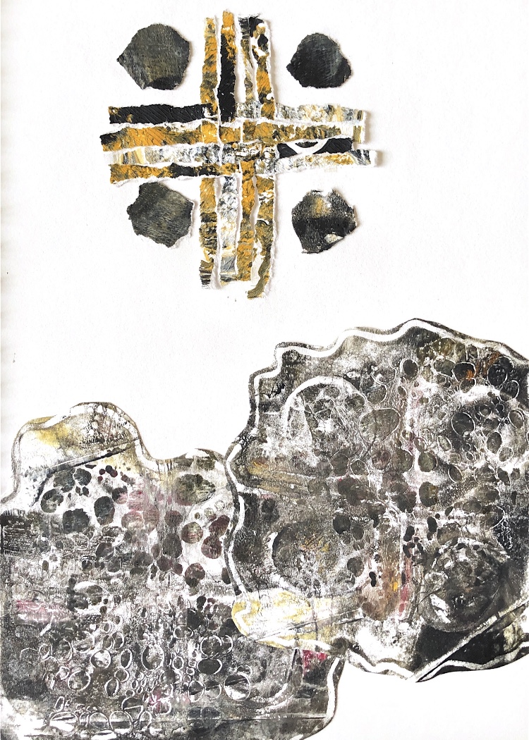
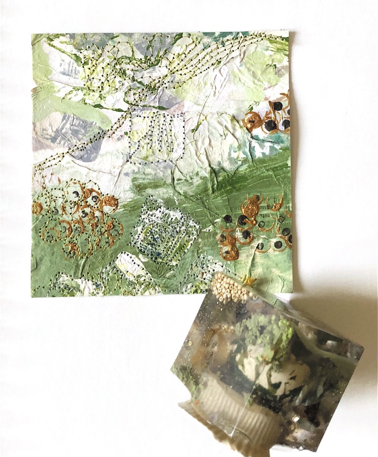
Fig, 4. I cut up the first print into ten pieces to make a tag book which displays them nicely with information on the back of each tag. Some of the tags have added ink or stitching which I will explore further.
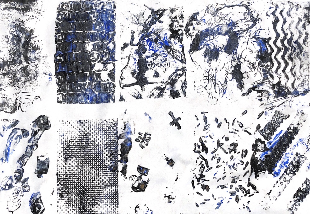
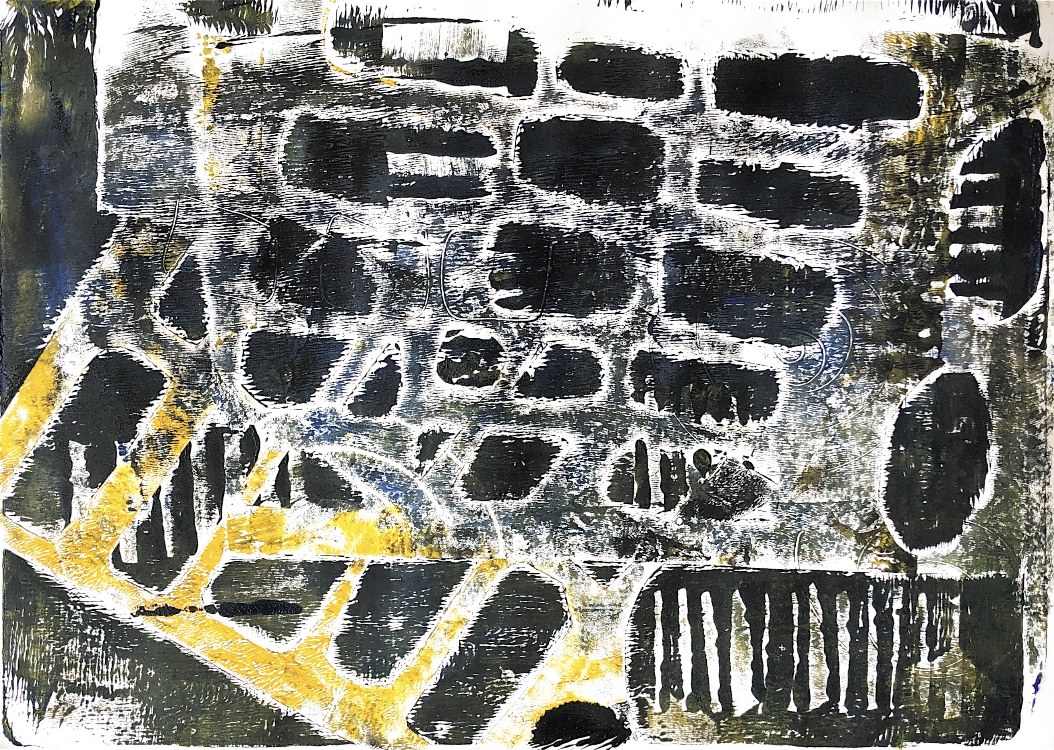
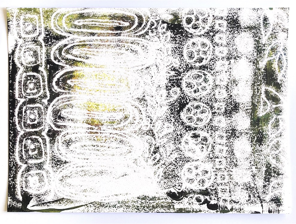
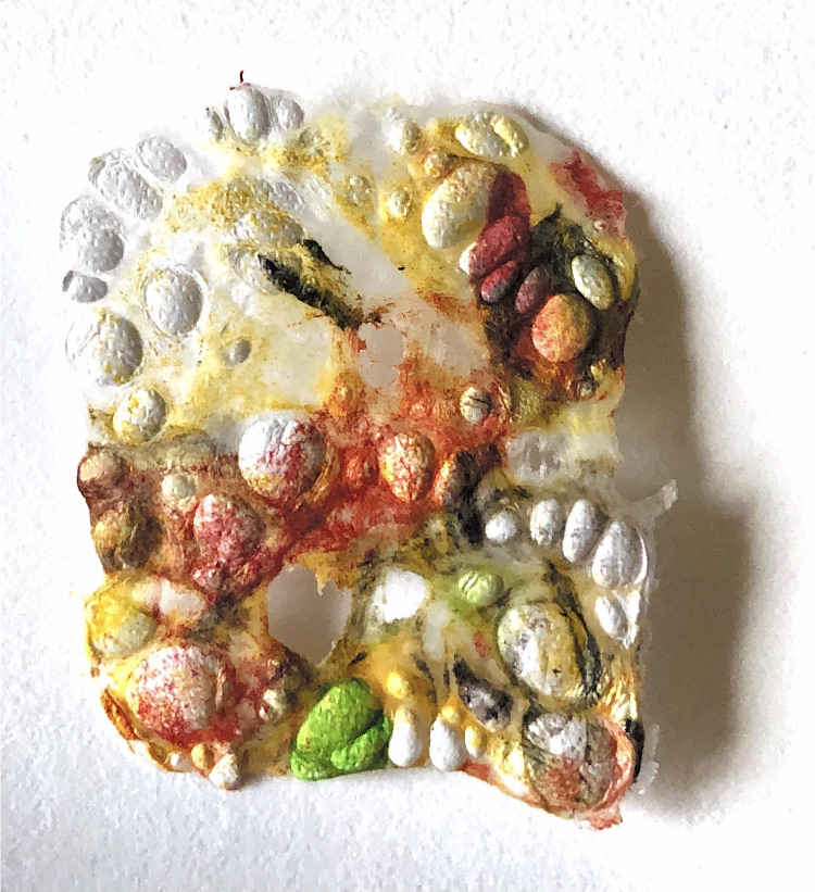
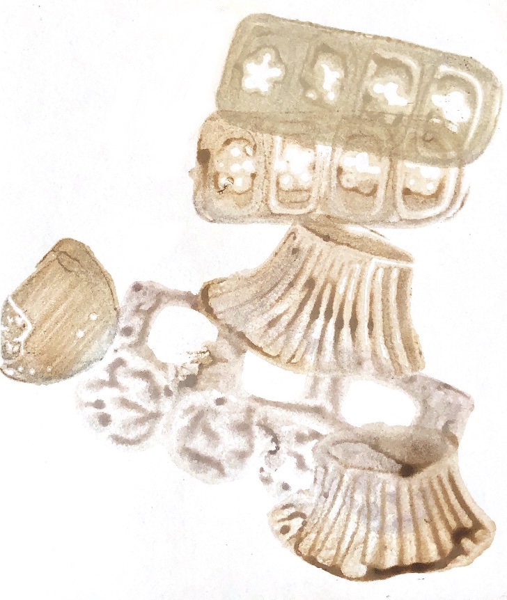
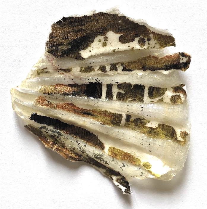
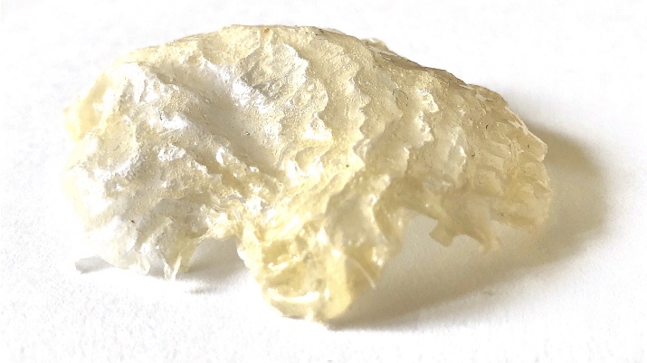
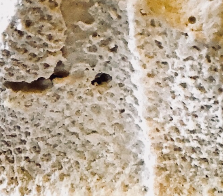
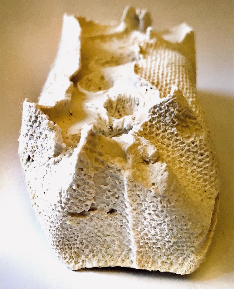
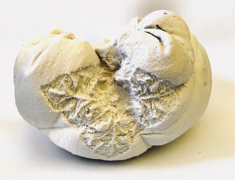
Fig, 5. The plate after use.
This was not the most inspiring exercise for me so I will move on to the next one. I have realised that it is difficult to print from a plate that has so many different levels; there is a risk of tearing delicate paper as well as the difficulties in getting a clear print.
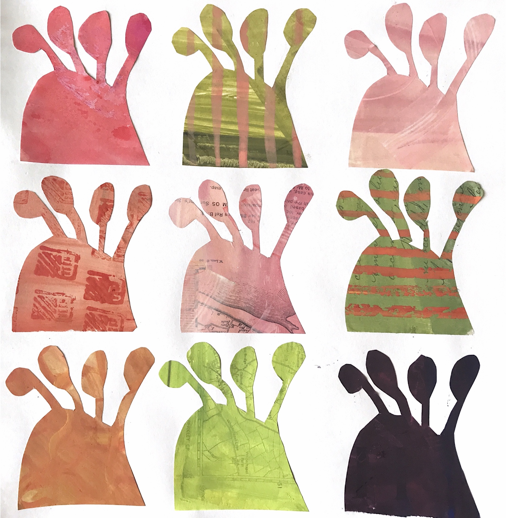
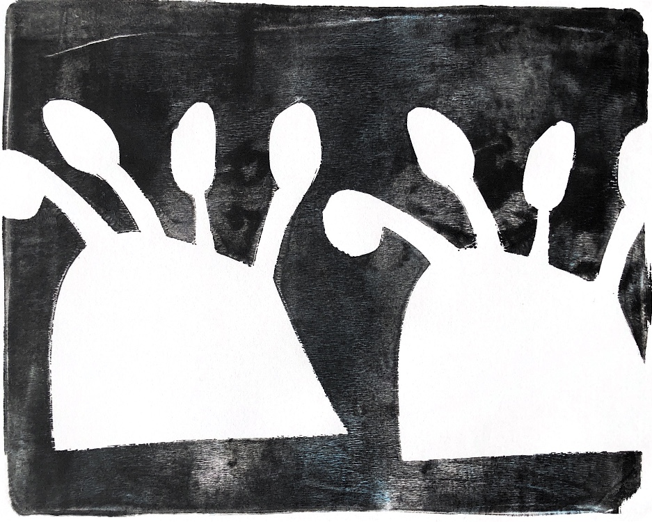
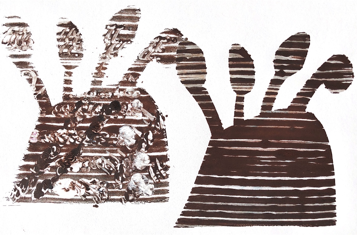
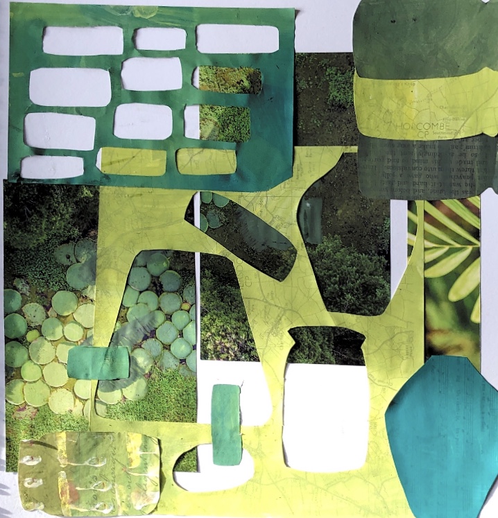
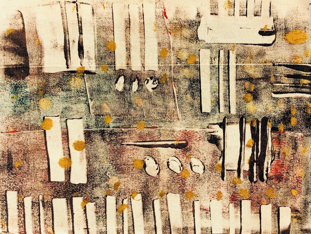
Fig, 1. I used this shape created in design work for ATV, to make paper stencils. I always liked this shape and it gives a strong outline for a stencil. These prints are clear and strong with a dark background.
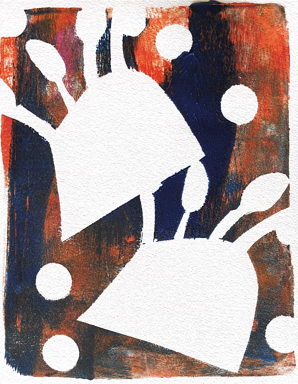
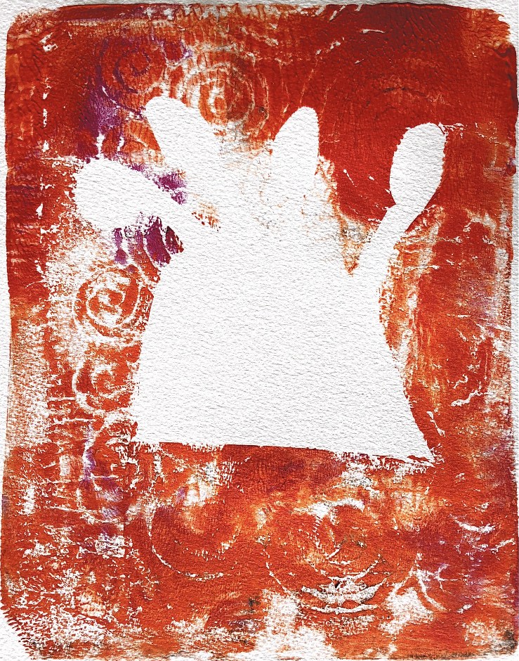
Fig, 2. I used a credit card and cardboard to make textured strips and patterned, raised paper to create a swirly background. Here I have used positive and negative shapes. Creating texture in the paint before adding the stencil created intriguing designs. The print with a striped background and patterned shapes is too messy for me – I prefer the patterns to stand out clearly.
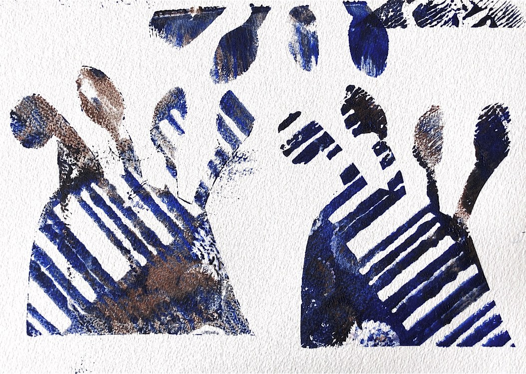
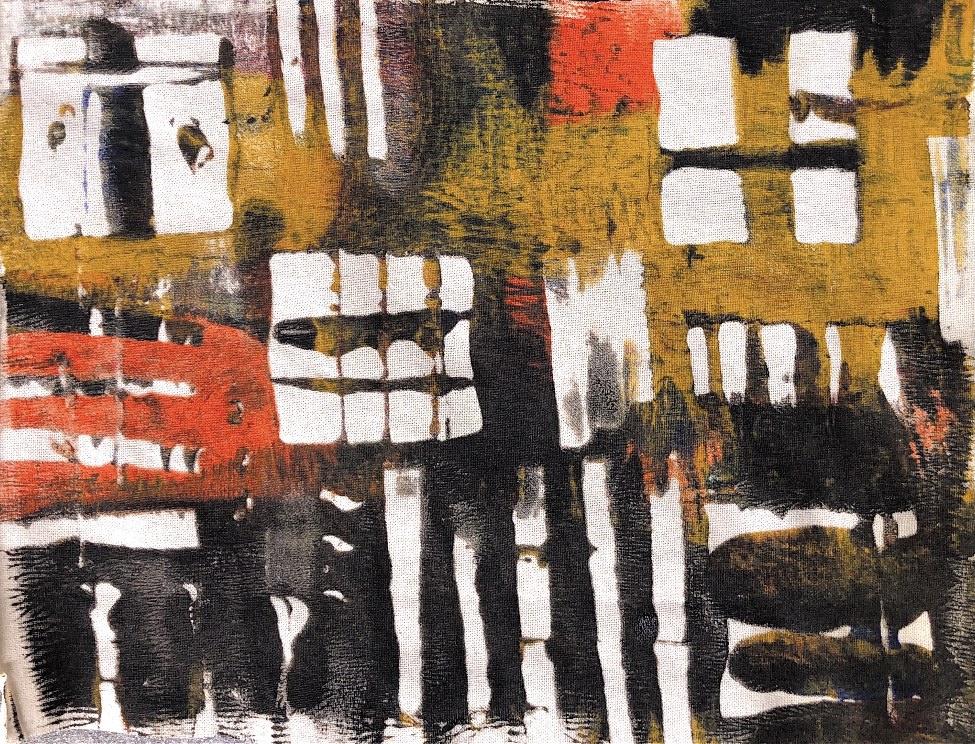
Fig, 3. Positive and negative prints on fabric. Although it is good to try fabric printing, I prefer the versatility of paper prints – I feel like I know more how the paper will react. However I know it is good to experiment to see what will happen – firm cotton prints well for a clear design.
Having created these initial prints on cartridge paper, newsprint, watercolour paper and fabric using a gel plate and acrylic paint, I realised that paper stencils can only be used once and tear easily. So for my next lot of samples I have cut stencils from Tyvek which will hopefully last longer.
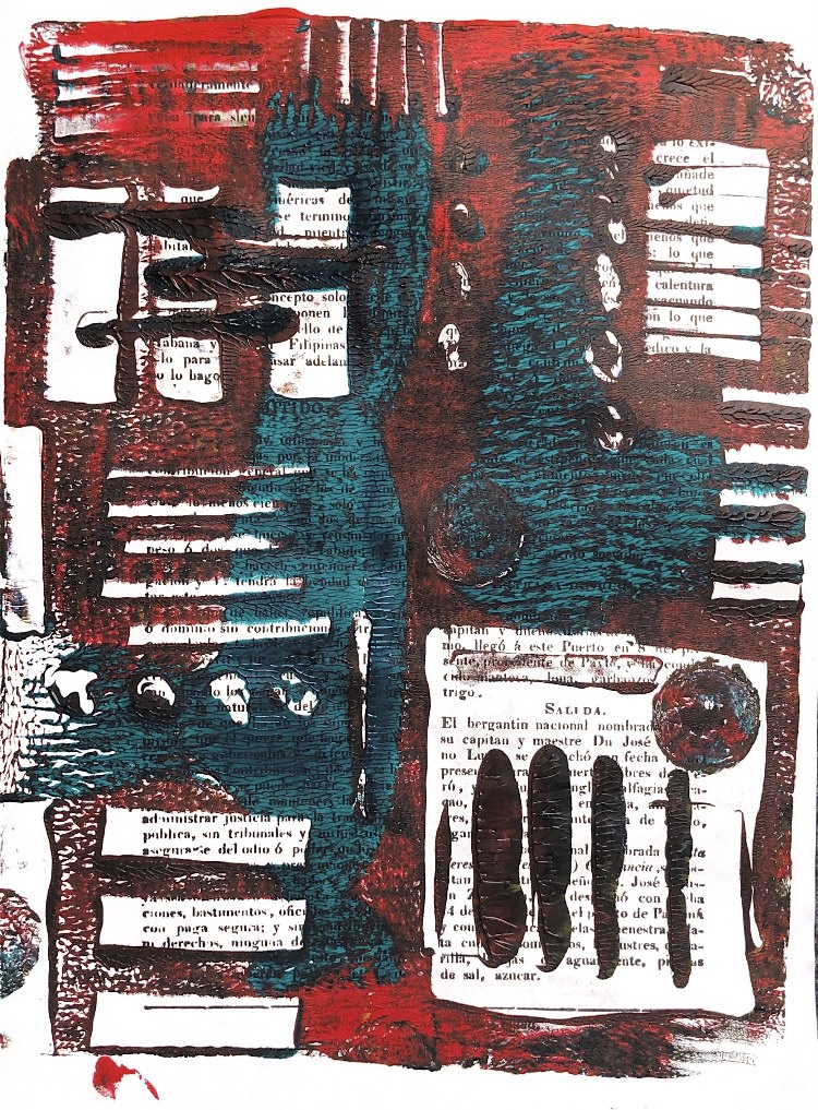
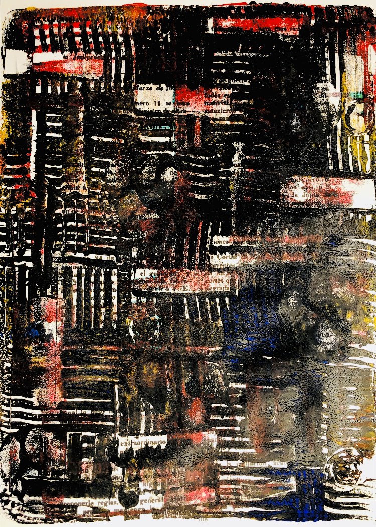
Fig, 4. Using a black and white collage I had created for ATV as inspiration I copied the paper stencils made for this exercise onto Tyvek. I started by using the stencils on a glass plate to take a print, and then overprinted. I used black and one other colour for most of my prints, and this has proved more successful than lots of colours on a printing plate.
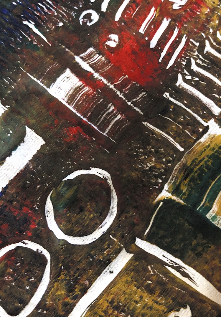
Fig, 5. This print was first made using the stencils, and then when dry a further print was pulled which filled in the white areas and really emphasises the shapes. Some drawings with a credit card were made into the plate before the second print was taken. I love the composition of this print, it has the appearance of layers with holes cut in them and would be a great starting point for layering fabric shapes.
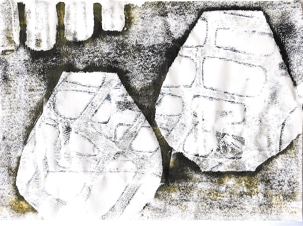
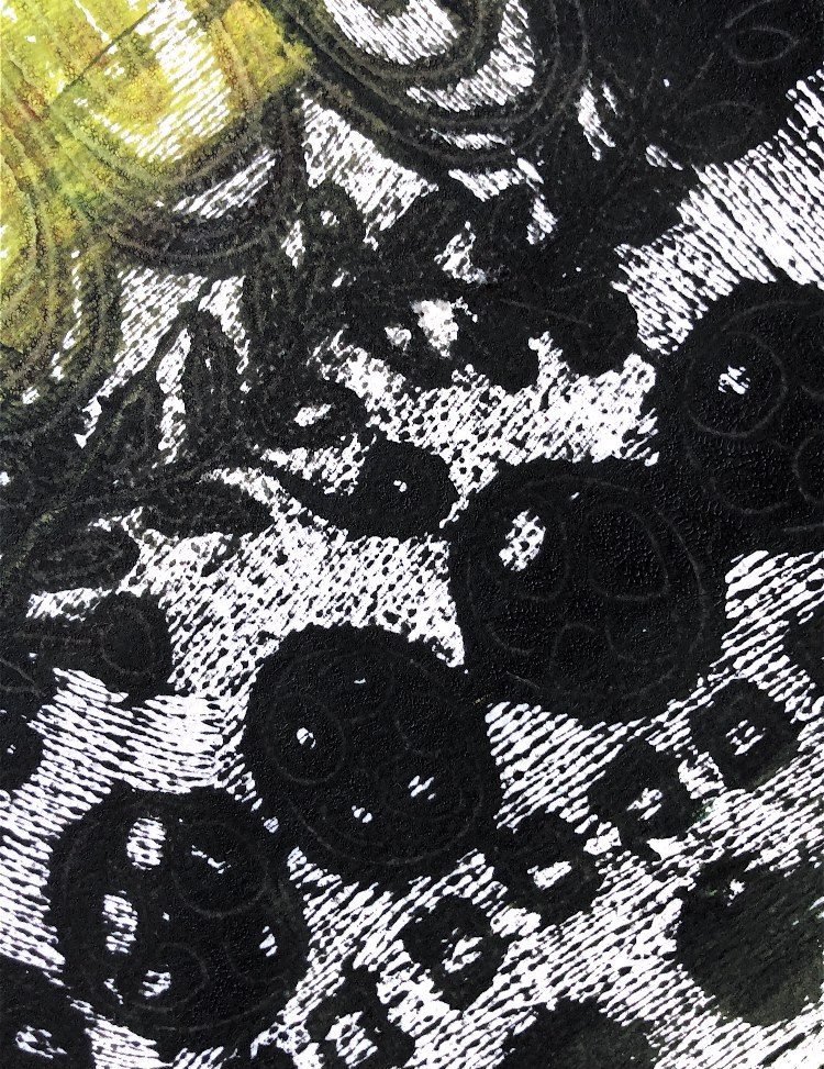
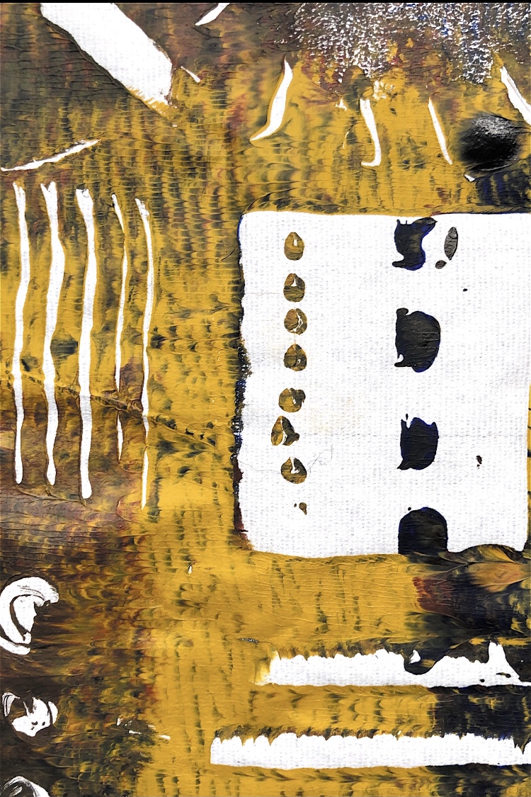
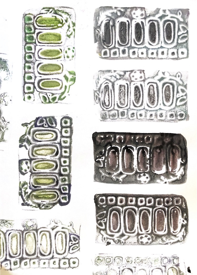
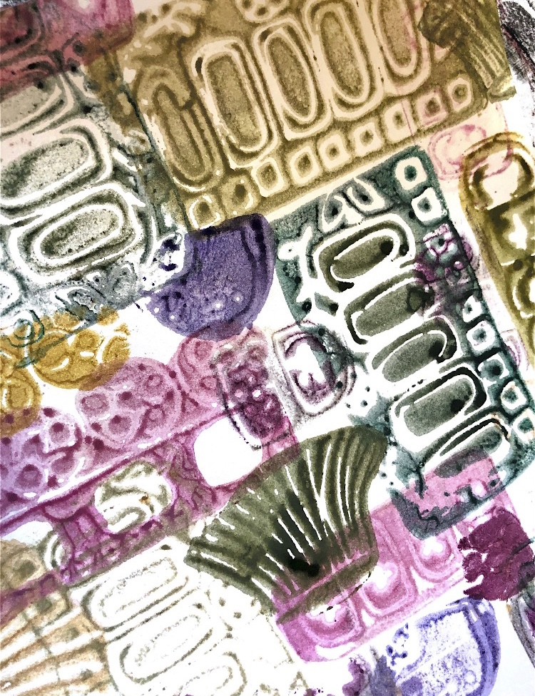
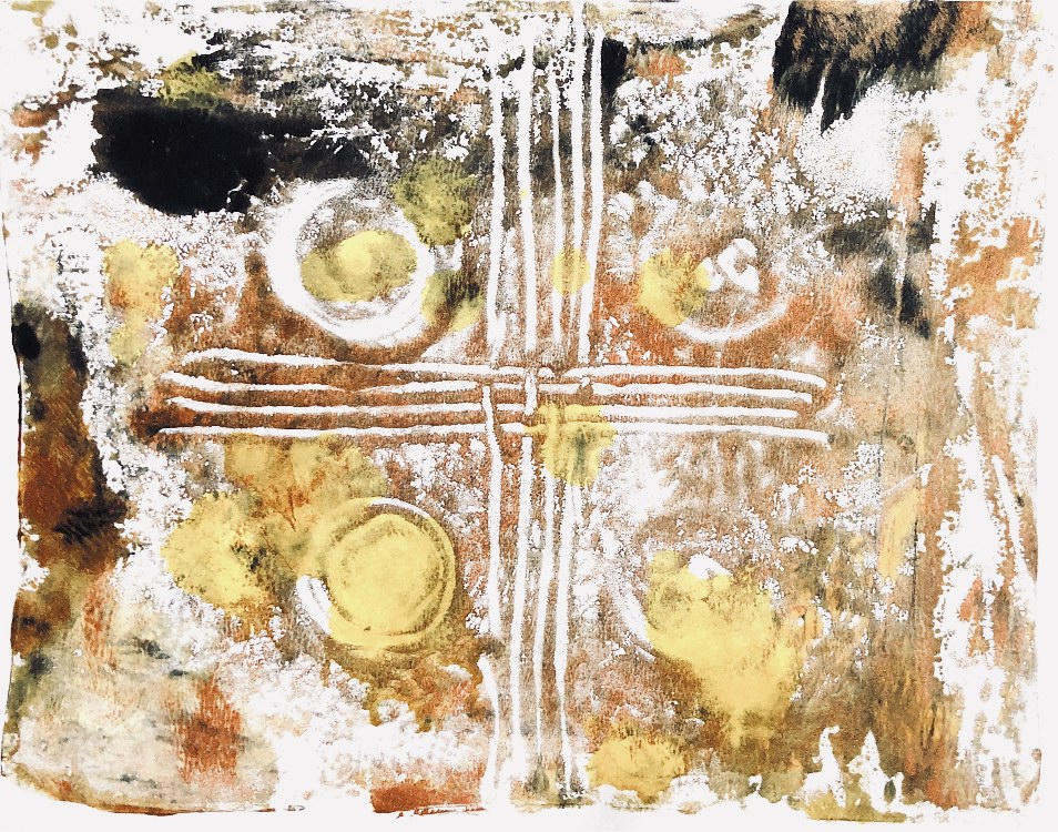
Fig, 6. These prints were made on watercolour paper which didn’t pick up much paint on the initial print. However it is this quality that makes this paper so good for back drawing, and I was able to use this technique to add pattern and outlines to the initial print. These shapes are smudgy and barely there but have patterns and overlays which make them interesting. The colours add to the look of ancient pottery and symbols.
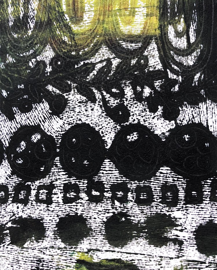
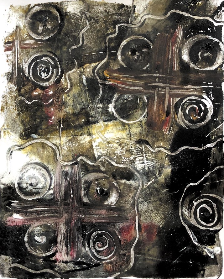
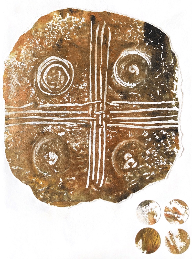
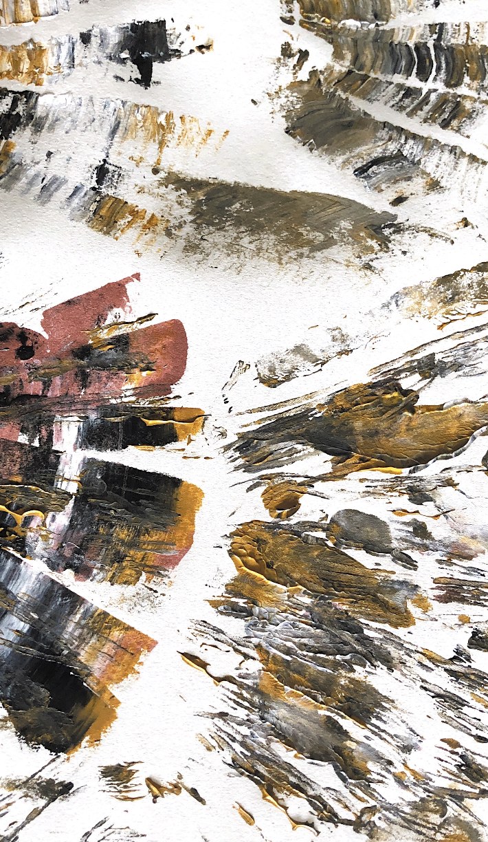
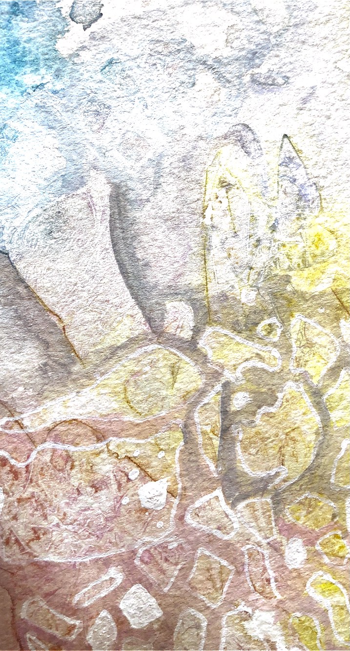
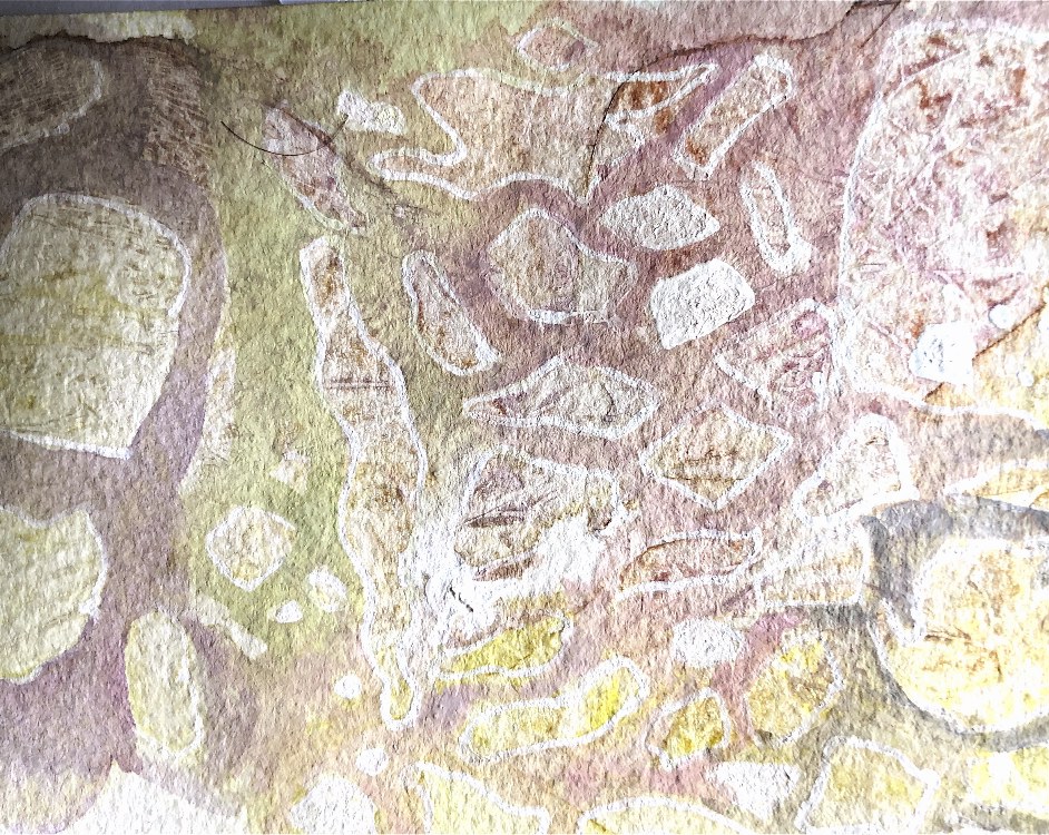
Fig, 7. This print I think has worked really well using the same technique of a stenciled print followed by back drawing. One pot shape stands out in the foreground, while the other pots have just an outline and one has pattern. The oblong shapes look like stones and could suggest the landscape where these pots have been left, to be dug up in another time. The print looks dirty and muddy, but there is a hint of green in the bottom right hand corner like grass. The composition is pleasing and balanced with a focal point in the front pot and different scales of pattern.
I am really intrigued by these techniques which have given me so much inspiration. I am definitely going to revisit some of the exercises when I have completed the next project.
Fig, 1 Having been inspired by the linear monoprints of Paul Klee I was excited to have a go at this technique. My first attempts however were very disappointing. I used a Gel plate, acrylic paint and cartridge paper, but the paper picked up too much paint and the lines I had carefully drawn couldn’t be seen.
Fig, 2. Ready to give up, I decided to try watercolour paper and a glass chopping board. What a difference! I doodled on the back of the paper with embossing tools, a cork, paint lids and a toothbrush and I was really pleased with the effect. The marks are clear and the background has picked up a little hazy colour on the textured paper.
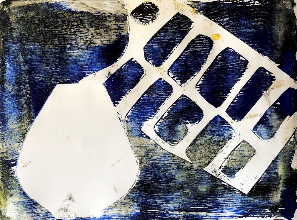
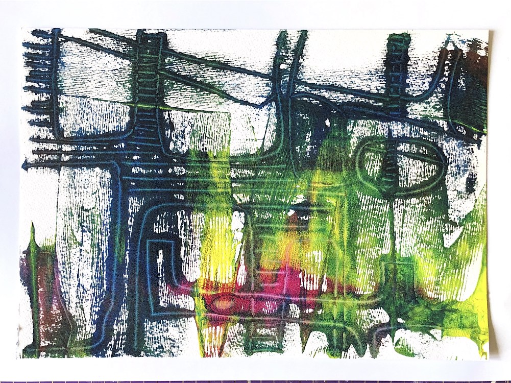
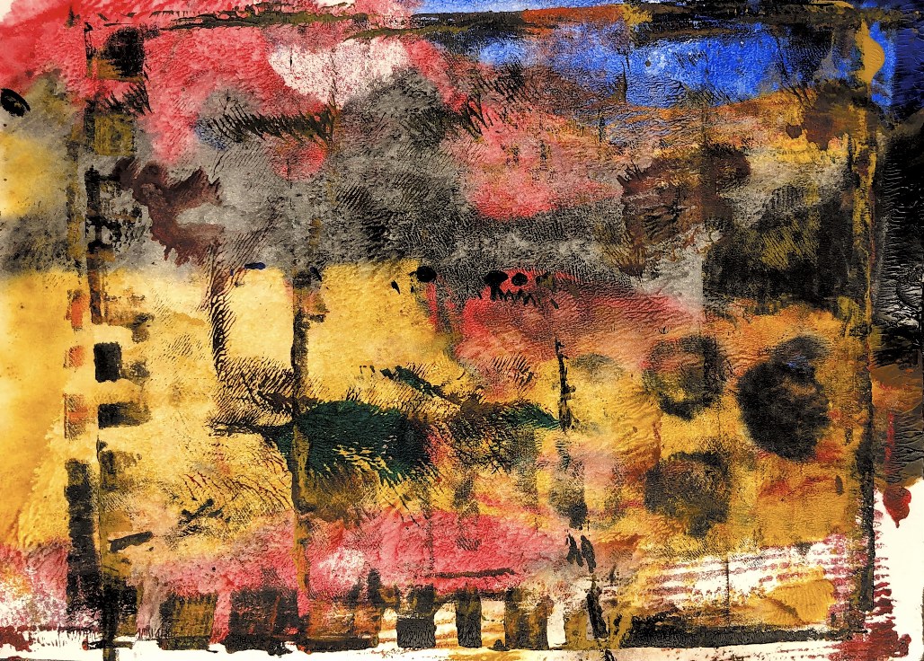
Fig, 3. Using a collage from ATV as inspiration I rollered yellow, blue and pink acrylic paint onto the plate and drew onto the back of the paper. I am pleased with the result, and the second print on cartridge paper picks out the lines clearly on the white background. Although I quite like the colours, I think this technique is more effective with just a couple of colours. The areas in dark blue look architectural and bold whereas the coloured section is a bit messy.
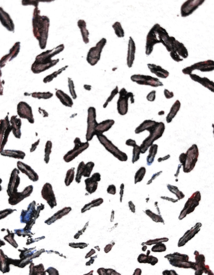
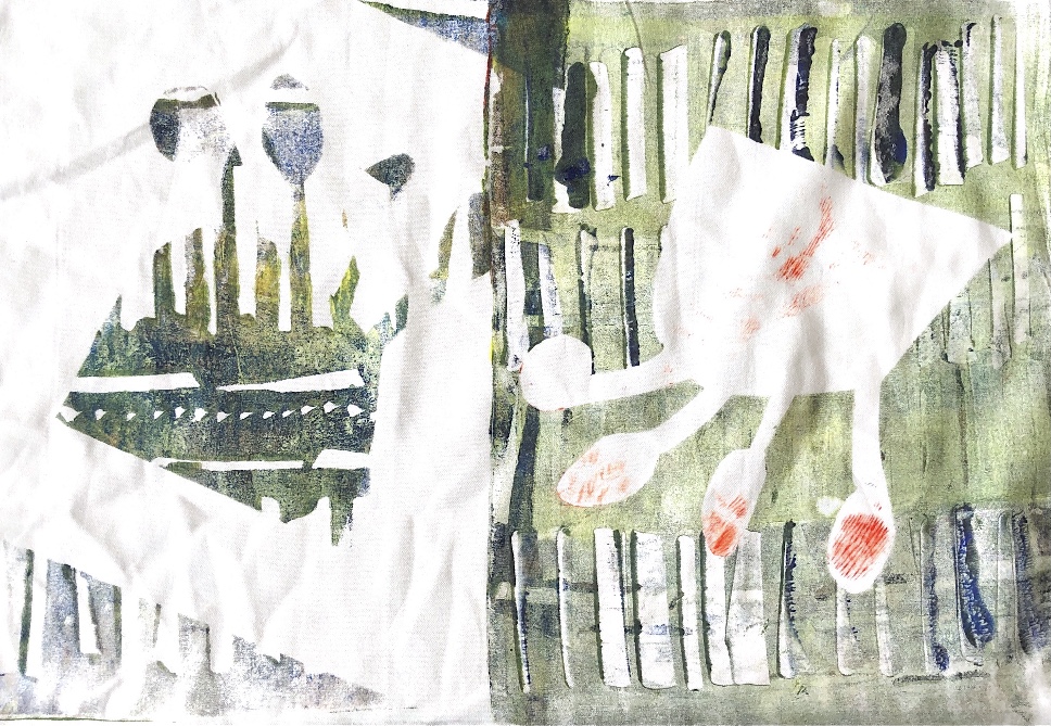
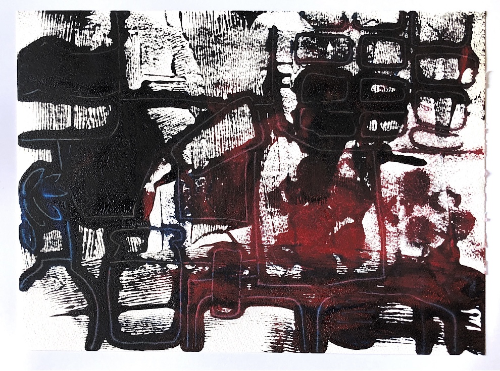
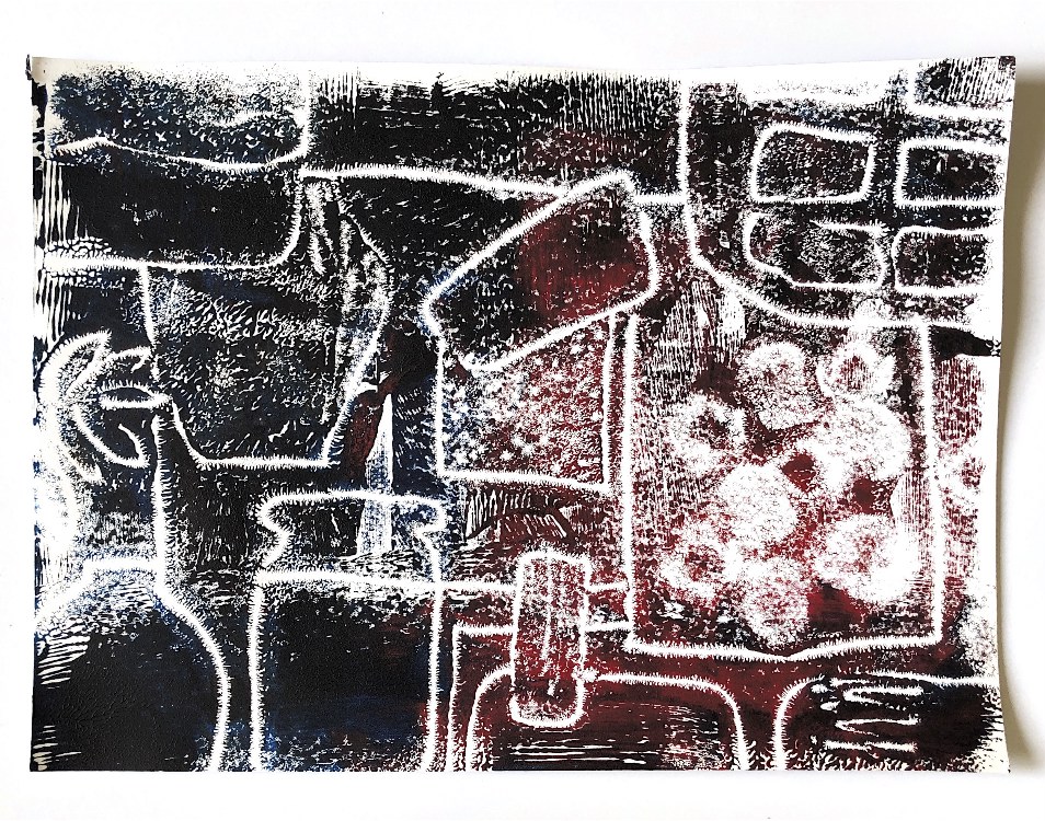
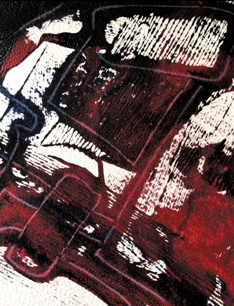
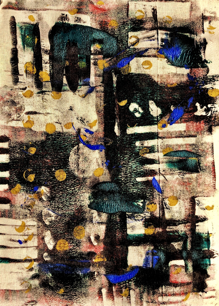
Fig, 4. Using another collage as inspiration and just red and black paints I have used the same technique to make a really striking print. The lines and shapes are bold with lots of texture in the background. The print is not at all reminiscent of the inspiration and conveys a much darker, slightly unnerving image with its bright red spots looking like spots of blood. The second print is much more linear and not so sinister, as the lines don’t print and remain white; it looks like a chemistry lab to me. The close up photo of the first print shows all the fine lines and could be very inspirational for stitch.
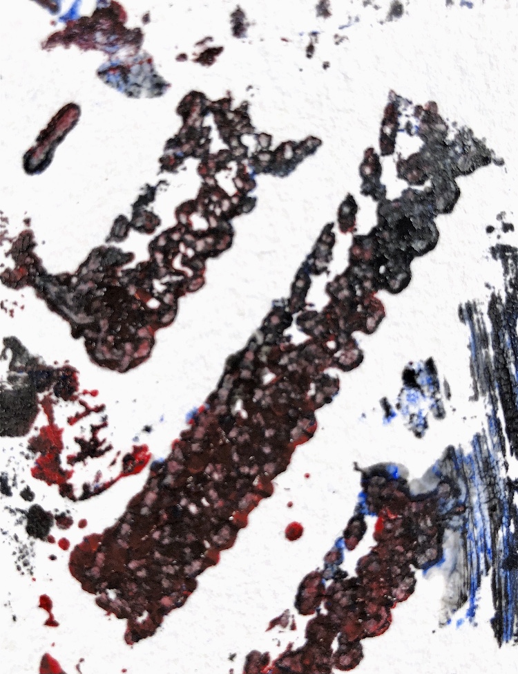
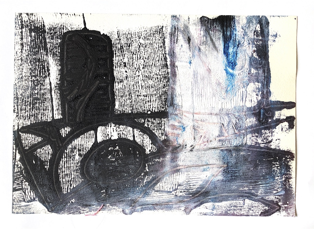
Fig, 5. This print again is most striking in the area where it is just black. It has a bold shape like a chimney and a circular shape like a water wheel. It looks grim, bleak and forbidding. I used my fingers on the back of the paper to fill in the dark shapes, and these stand out in the composition.
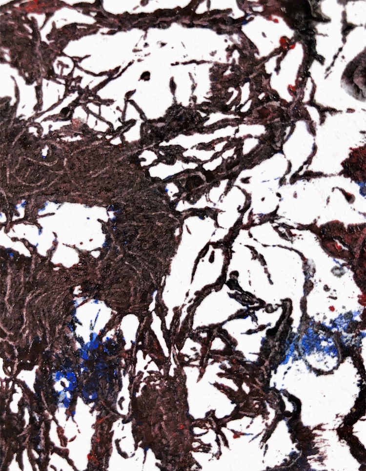
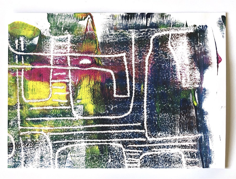
Fig, 6. I continued to use watercolour paper for this print but changed my inspiration to some of the work I have done in MMT. I drew patterns and designs but used totally different colours to those of the pretty sweet like colours of the inspiration. The resulting print has a lot of black down one side – I’m not sure why – maybe there was more ink here or I accidentally leant on it while mark making. The rest of the piece reminds me of a lace veil with heavily machine-embroidered patterns.
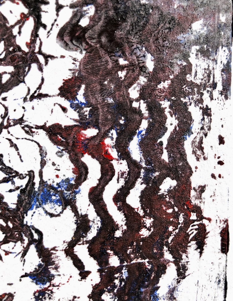
Fig, 7. I also did a little pencil drawing of a section of one of the prints which could be an inspiration for french knots.
From this exercise I have learnt not to give up too easily. I have made prints that really move away from the feel of the original inspiration and give me a totally different experience and perception. I am pleased I persevered with this technique as it has produced exciting, bold samples unlike any of my other printing work.
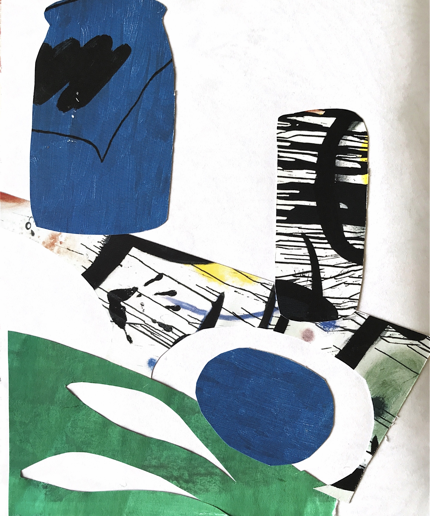
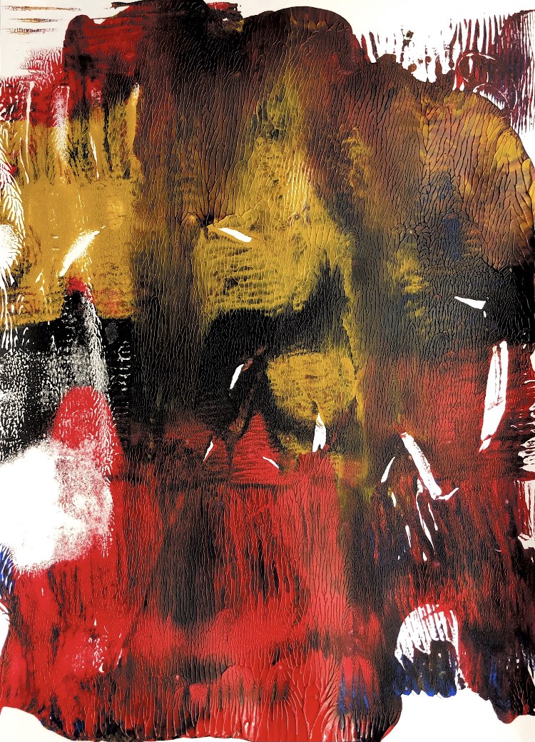
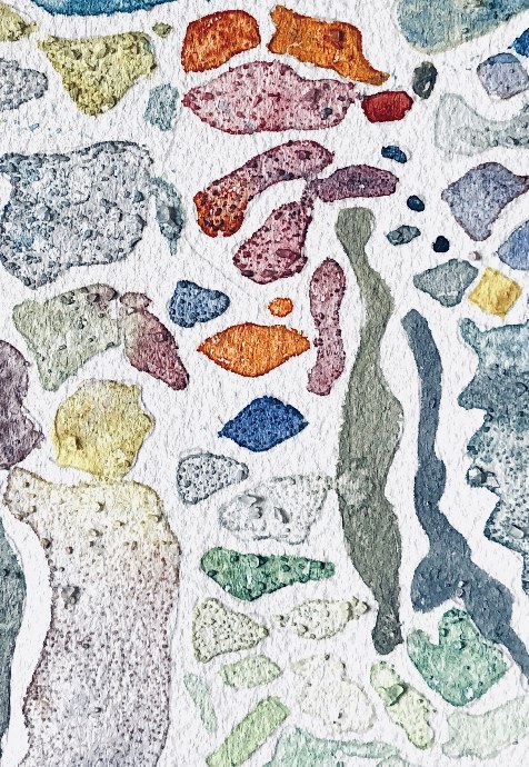
Fig, 1. This stitched collage from ATV gave me some bold shapes to paint for these prints. I painted the image and then had to create a background which I did with bubble wrap for the first print and then a credit card for the second.
Fig, 2. For these prints I used an image I had painted in response to my concrete samples in MMT 3. I got lots of texture into the image once I had painted it onto the plate – using a scrunched up tissue. I am pleased with the overall effect of the prints but they do look too much like the original painting for me to have gained any new understanding of the image.
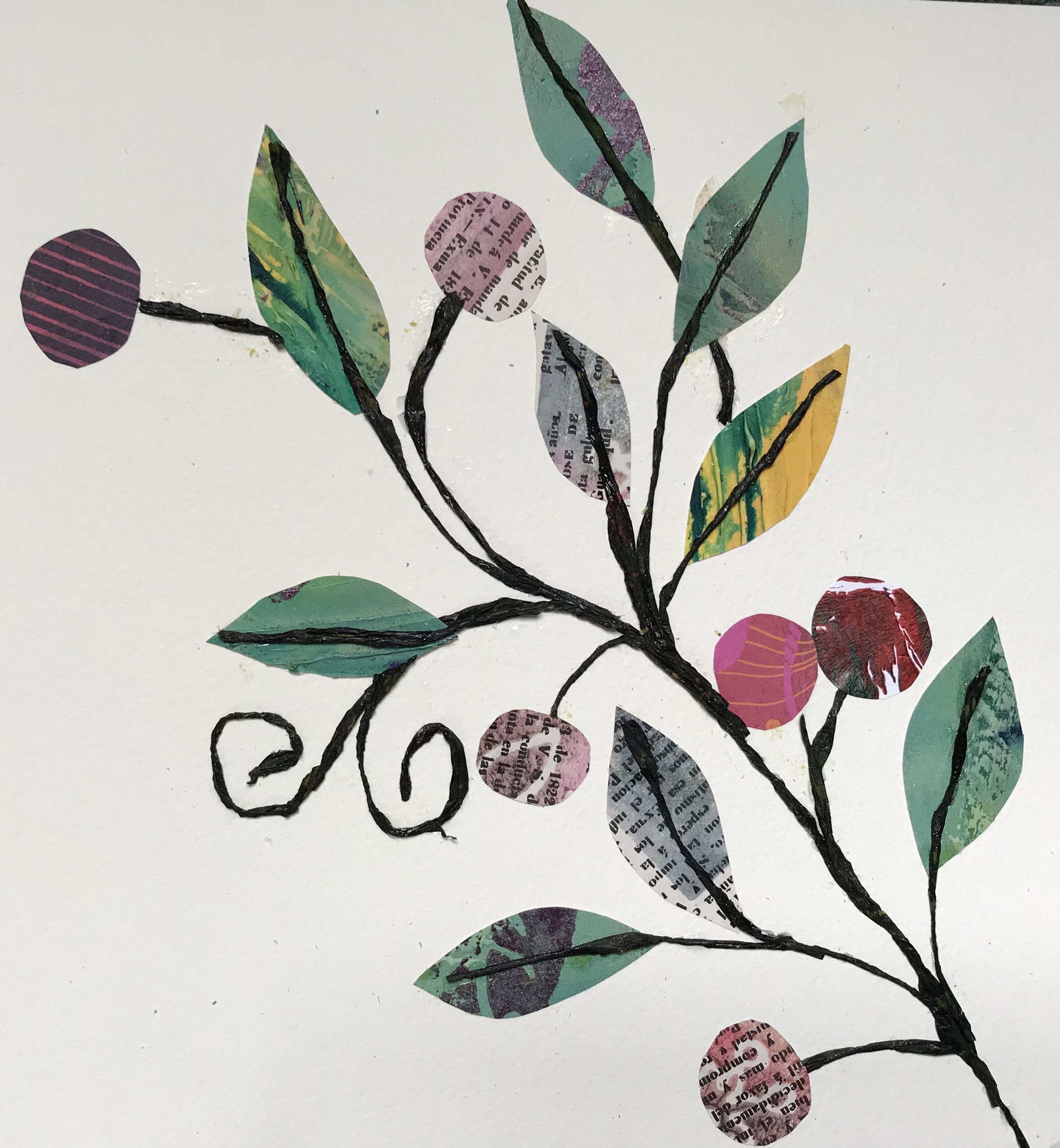
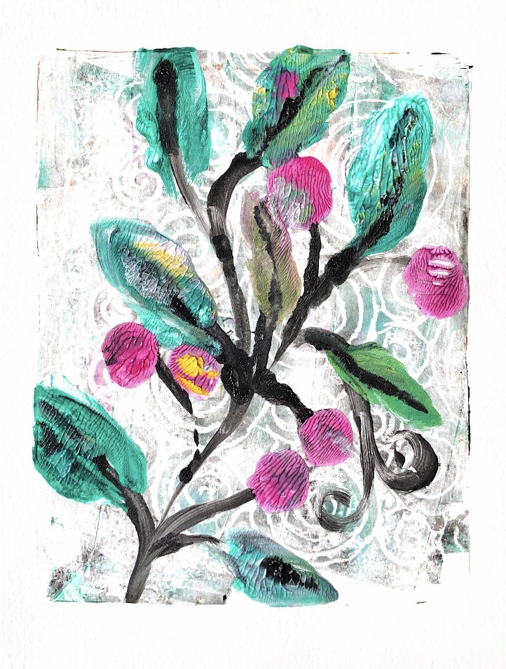
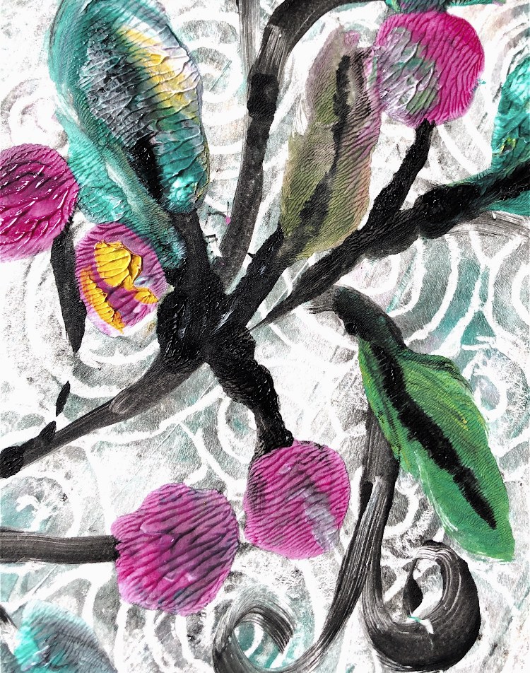
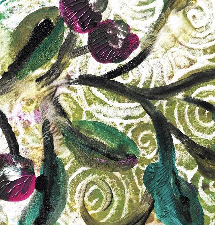
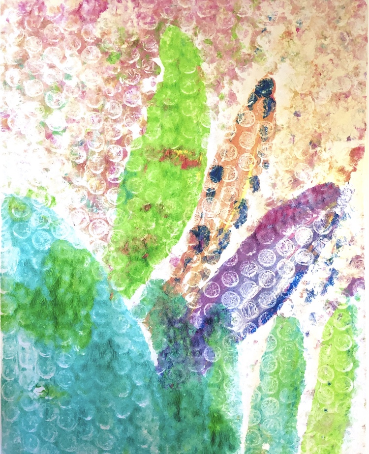
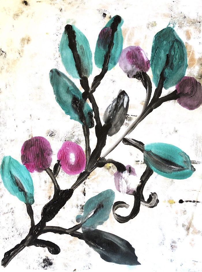
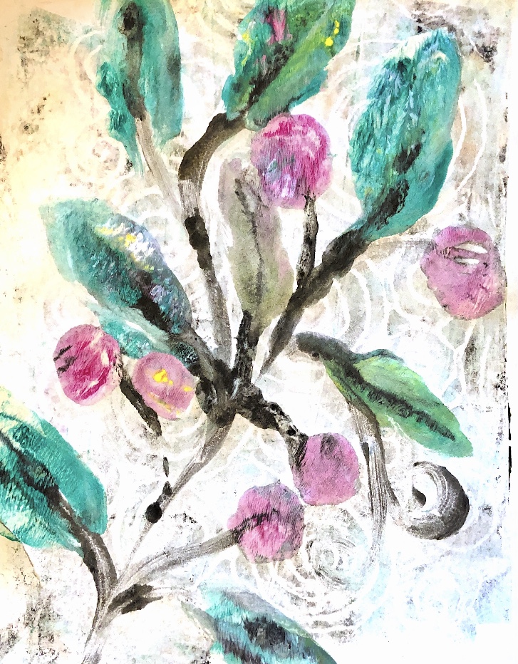
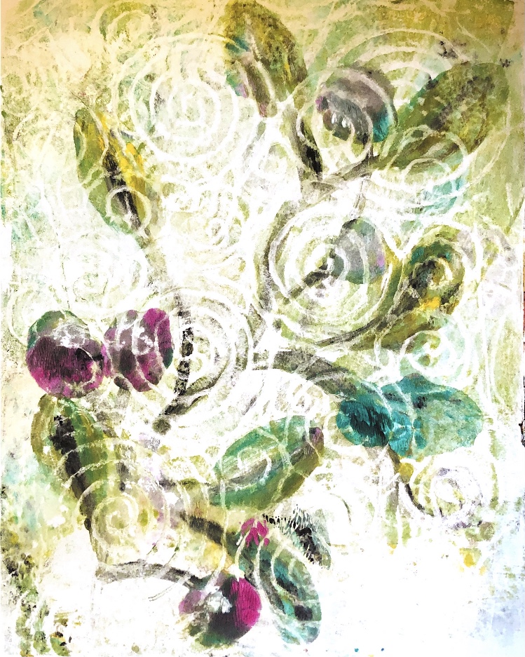
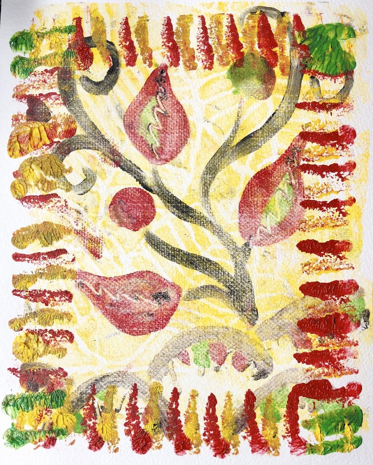
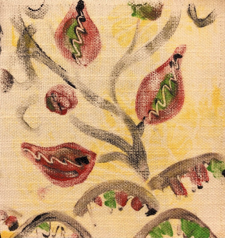
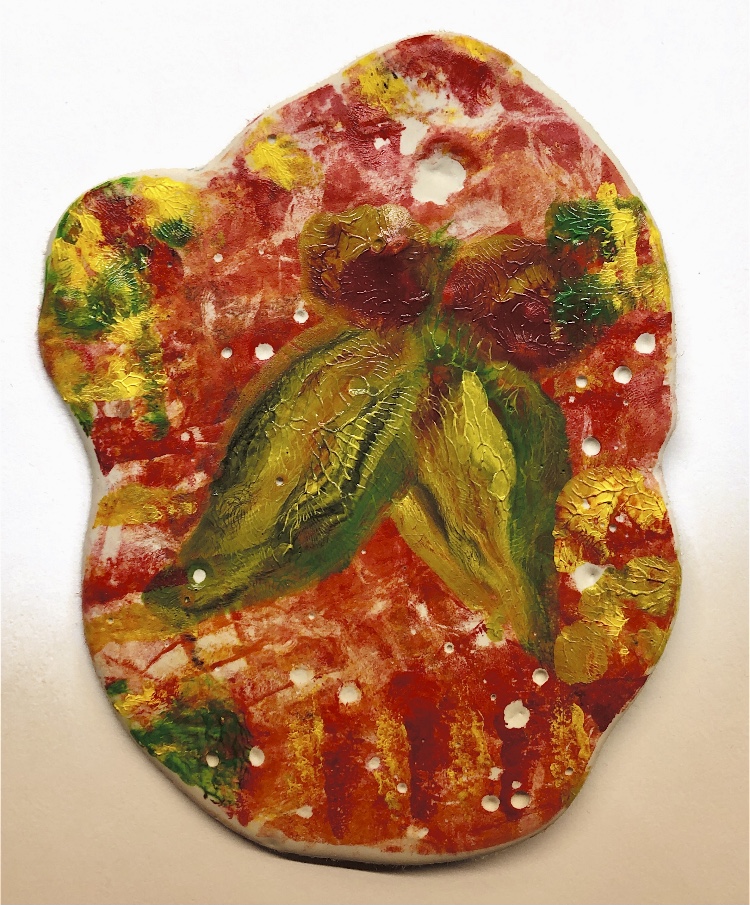
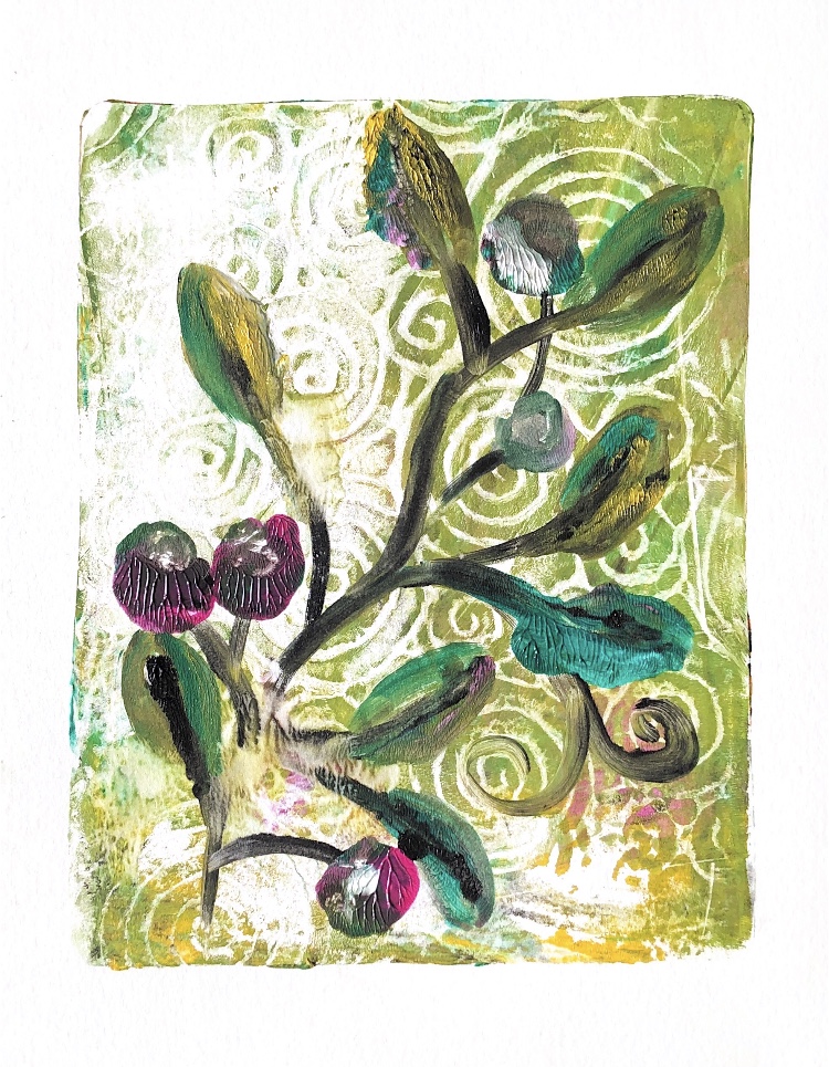
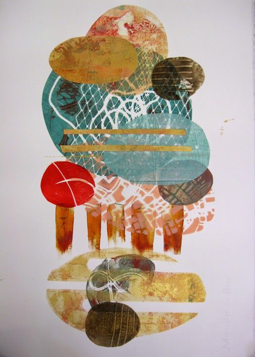
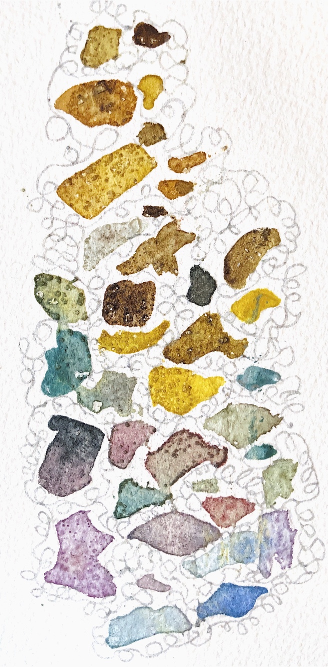
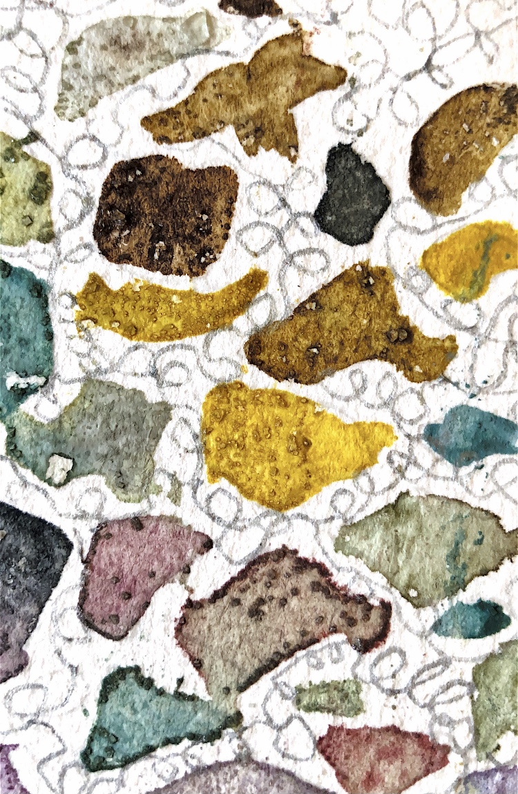
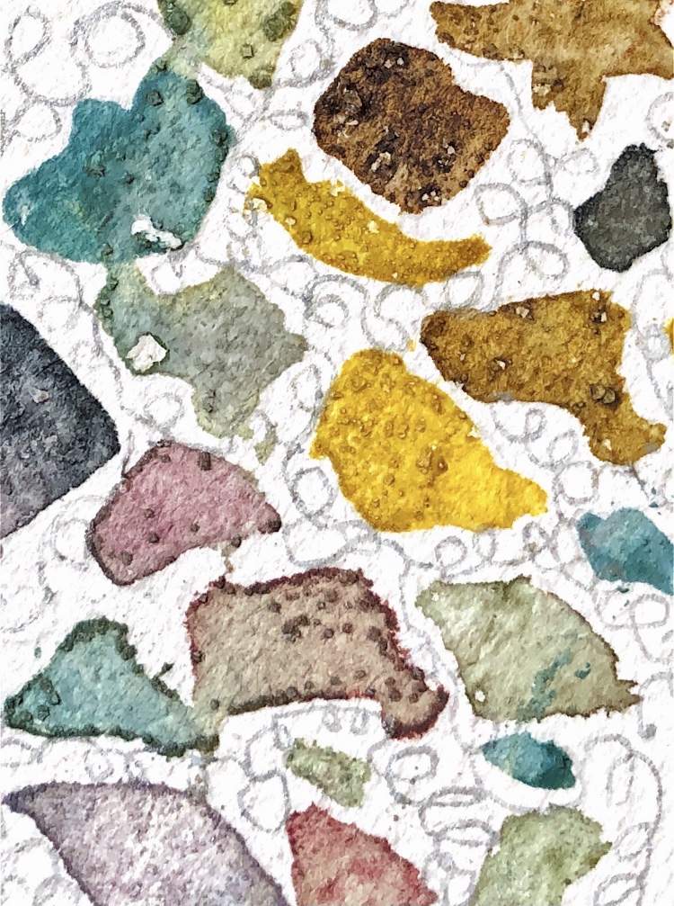
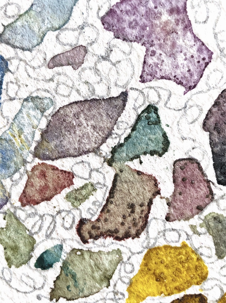
Fig, 3. This collage from ATV 1 was the inspiration for these prints. For these samples I created a background first by spreading a small amount of paint onto the plate and pressing textured patterned paper in to create a curly design. The swirly background works really well with the painted leaves and flowers.
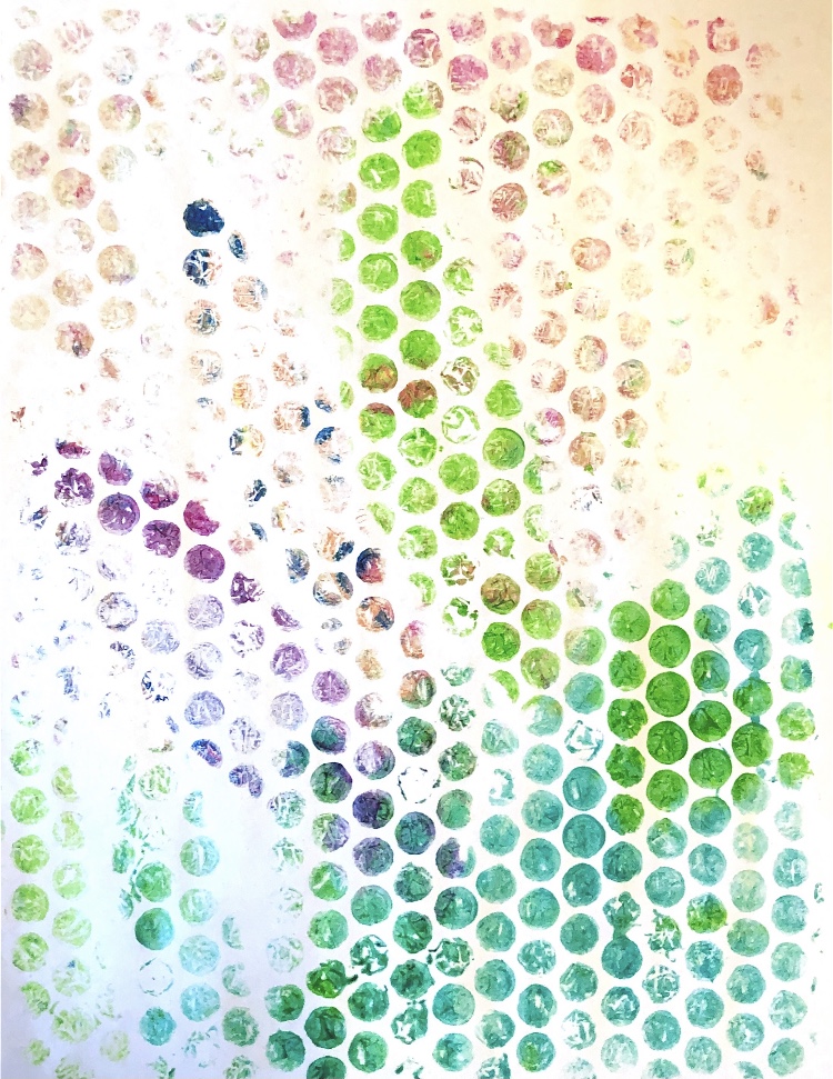
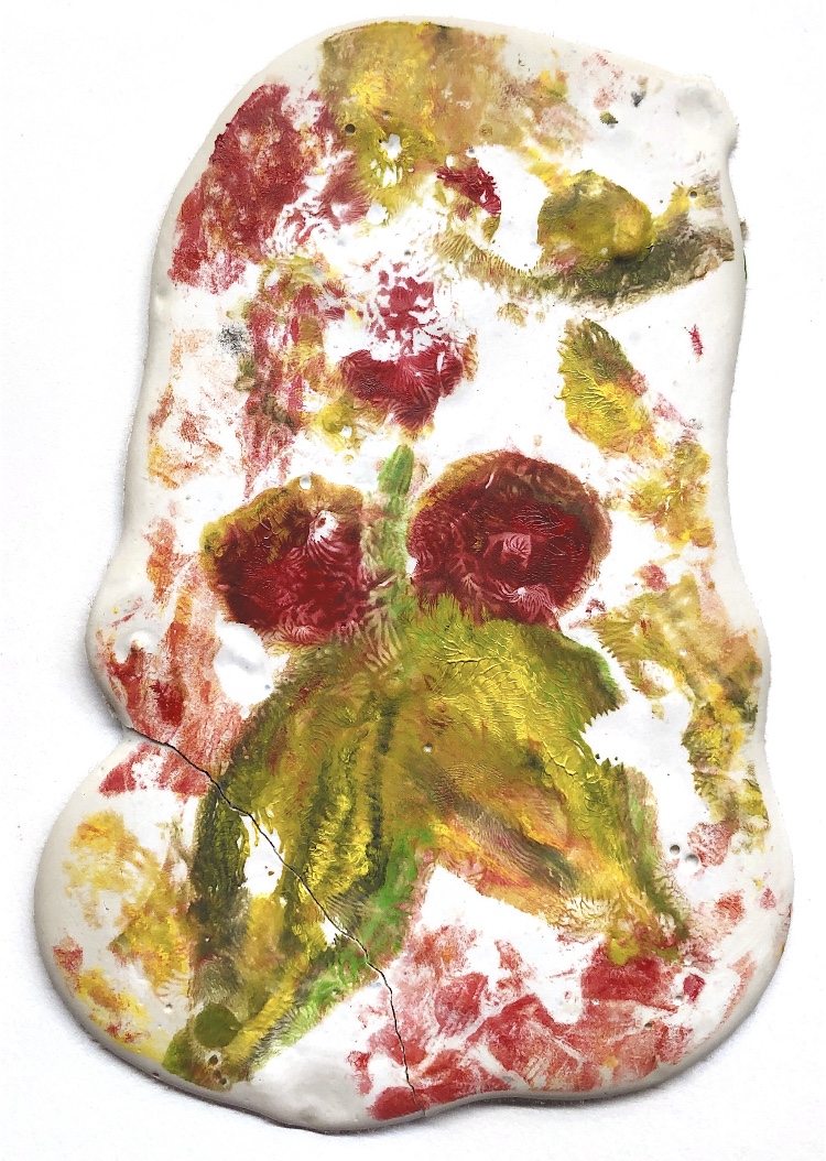
Fig, 4. The prints taken for the images above are all on watercolour paper, but I also took some prints and ghost prints on other papers such as cartridge paper and newsprint. I printed from the plate onto bubble wrap and then from the bubble wrap to the paper for one sample.
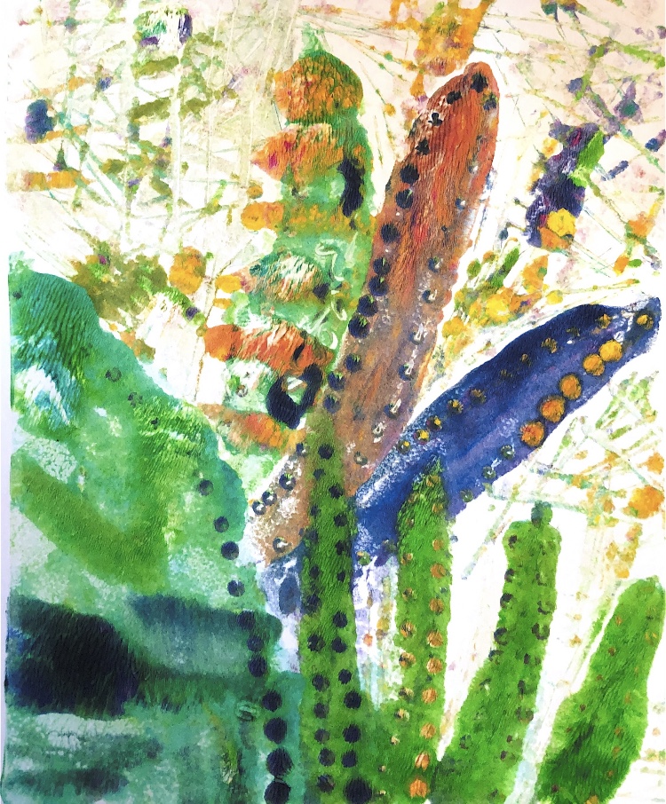
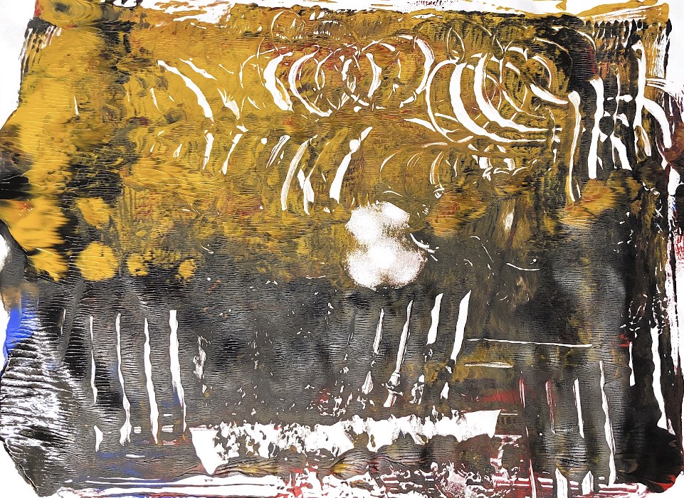
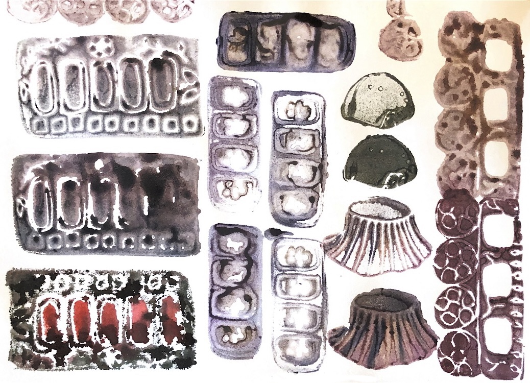
Fig, 5. Using an iPad drawing from ATV as inspiration I made one print on watercolour paper and then tried printing on other materials – upholstery fabric, plaster of Paris (bumpy and smooth) and Tyvek. With the bumpy plaster I had to press the gel plate to the plaster rather than the other way round to make sure the print reached all areas; this would not have worked with a glass plate.
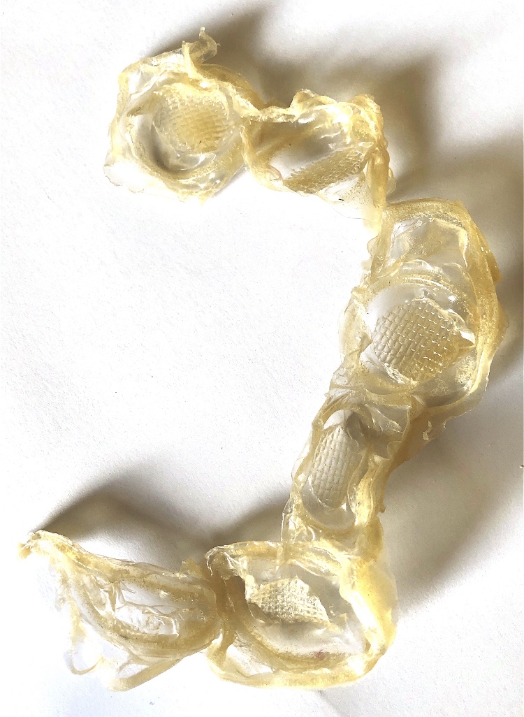
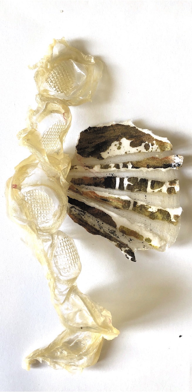
Fig, 6. These are pieces of the print on Tyvek cut up and heated.
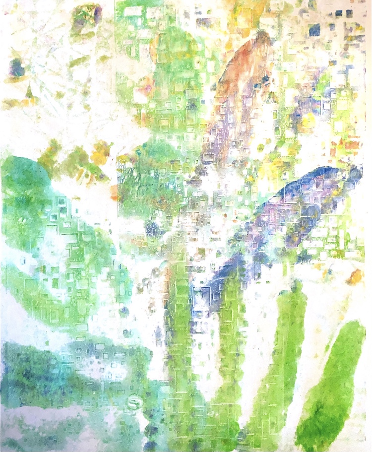
Fig, 8. I have discovered that it is not easy to draw on a plate with acrylic inks, even with a printing medium added. The choice of image is really important, as is the choice of material on which to print. I feel the print has to add something to the original drawing, otherwise what is the point? For this reason I think the following image is the most successful, – the background adds colour and movement while not detracting from the painterly image which is simple but has lots of texture and subtle colouring where the paint has mixed. I am pleased with the way the background has printed more strongly in some areas, highlighting some of the foreground and moving the eye around the piece in the way of natural or sun light in a painting. This may be a happy accident in this case but it is something that could be controlled with more or less pressure in future sampling.
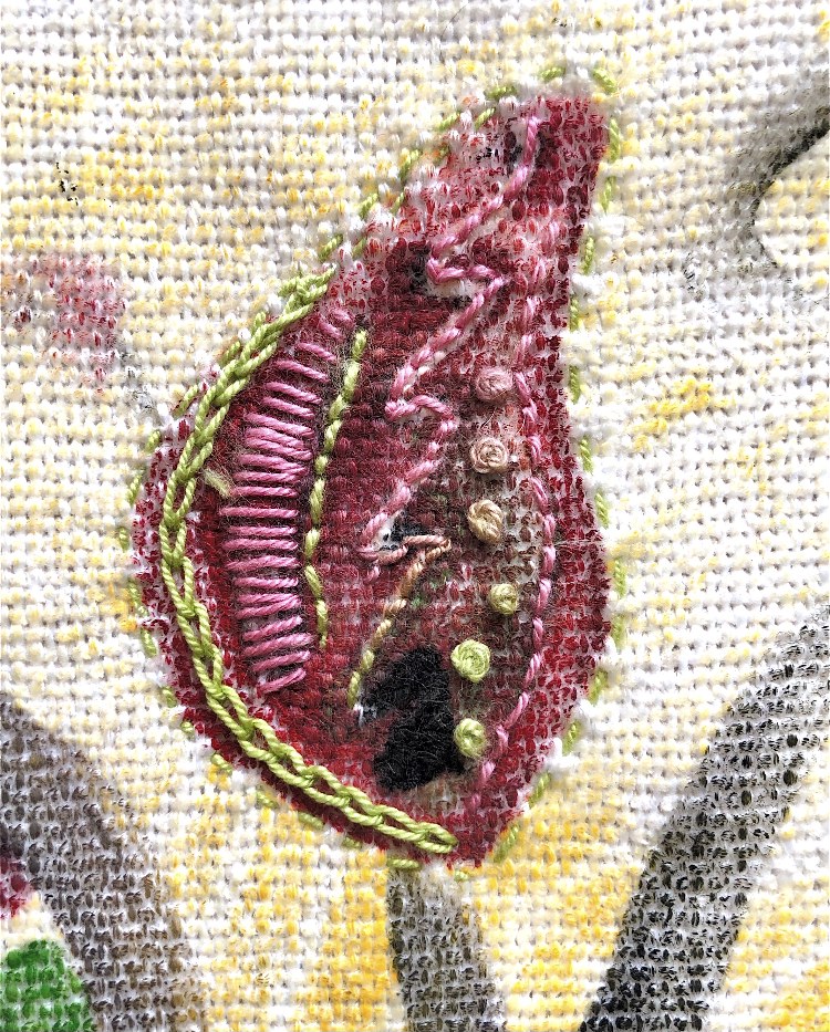
Fig, 8. Sample stitching on one of the fabric prints
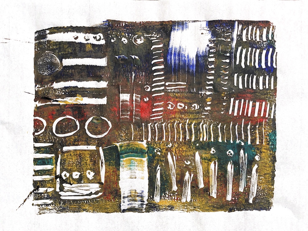
Fig, 1. I started with a glass plate (my chopping board), some acrylic paints and some mark making tools – credit cards, cardboard, toothbrush, embossing tools, cork, makeup sponge and twigs. I printed onto newsprint and cartridge paper, using a few colours. Using this method I found that the marks I made into the paint did not transfer well to the paper – I needed to be bolder with my marks.
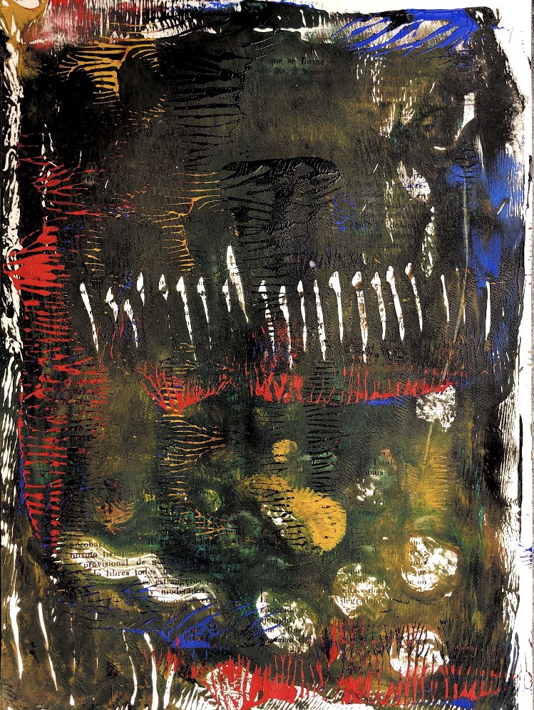
Fig, 2. Working into the paint with a heavier hand produced more pattern, I printed onto book pages, took ghost prints, and also overprinted a couple of pieces. These samples are more interesting, with random patterns appearing, and words showing through from the book pages. I found that the ink dried quite quickly. The patterns created by the roller to apply the paint to the page also creates interesting textural and visual effects.
Fig, 3. Some of the paint was quite dry on the plate so I sprayed it with water before taking a print which made a wishy washy print. To liven it up I later overprinted with another pattern.
Fig, 4. I decided to use a Gelli plate for the next group of samples. To start with I printed on Japanese rice paper, then on book pages. I was able to make more definite patterns on the Gelli plate with credit cards, cut cardboard, corks, sponges, and embossing tools.
Fig, 5. Ghost prints and overprinting produced more samples. These would be great to use for collage.
Fig, 6. Next I printed on fabric – unbleached calico. I think by this time my colours were getting a bit muddy and the colour of the calico did also have an impact on the look of the print, dulling it.
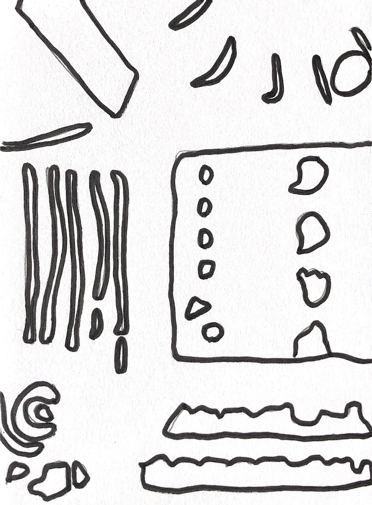
Fig, 7. Close up photographs of the samples provide lots of shapes and inspiration for paper and fabric collage.
I definitely found it much easier to print with a Gelli plate but the one I have is only A4 size. However these samples all have lots of texture, pattern, colour and inspiration. I really liked printing onto the fine rice paper and newsprint – these papers took the colour well – they are quite absorbent, as are the book pages and are great for tearing into smaller shapes.
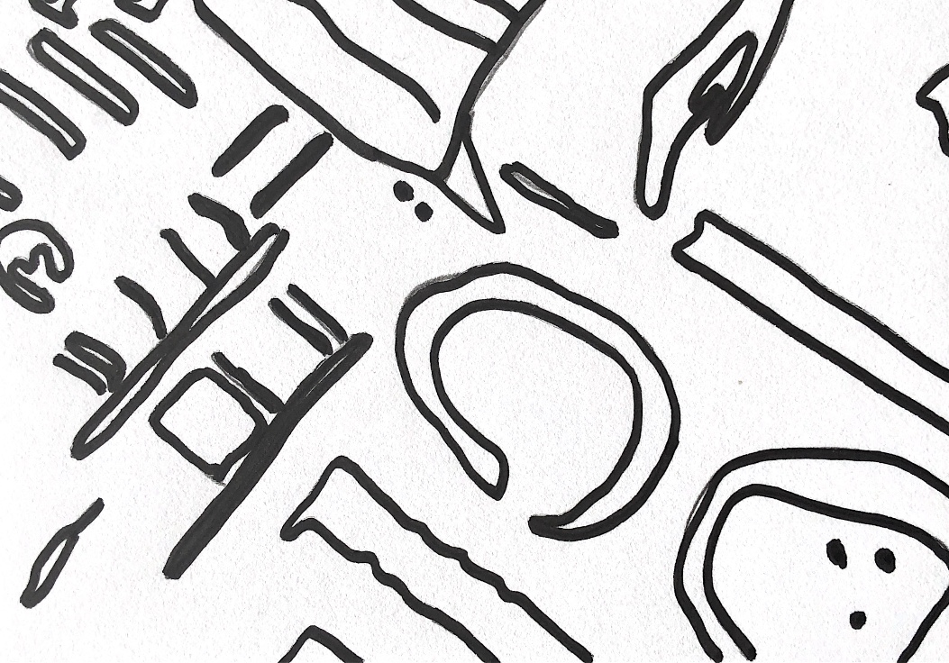
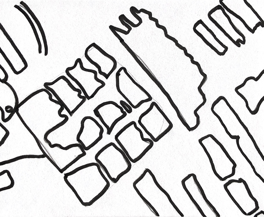
Fig, 8. Here I have taken some close up pictures and drawn the outlines as inspiration for applique stitched pieces.
Fig, 9. This is one of the monoprints on fabric, with some added stitching and small torn newsprint paper.
So what have I learnt from this initial exercise? That I need to work quickly with lots of paint and not think too much – less is not more in this case! If I want bright clear colours I need to clean my plate regularly and use paper or fabric that is white or a colour that I don’t mind showing through. I need to make bold marks on the plate to get them to print clearly, or try a printing medium to slow the drying time and thereby allow finer lines to be drawn in less paint. I also want to try printing onto some other surfaces – maybe cardboard, silk, felt, and plaster.
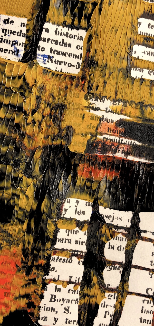
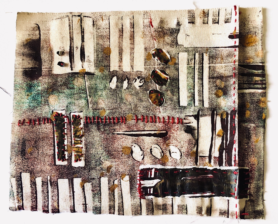
Fig. 1 Lloyd S (2015) Untitled Drypoint etching with added silk waste and chine-collé.
Monoprinting
I have previously tried monoprinting both using a plastic sheet and a gel plate, using printing inks and acrylic paints. However I know that I haven’t fully explored the possibilities of this technique. I already have a lot of books on the subject of printing and over the course of this module I will keep referring to them for ideas and possibilities.
I like the idea of a one off print that cannot be exactly replicated, the spontaneity and unique process for each print is exciting. I am hoping to incorporate mark making with my fingers and hand made implements, linear monoprinting, stencils, masks, texturing techniques, stamps, ….
Brainstorming ideas – corrugated card, palette knife, using both sides of a stencil, straws, leaves, hot glue stencils, crochet chain, Inktense blocks for colour, masking tape, cotton bud, fruit to print, sponge, overprinting, adding details to print, paper stencils and masks, bubble wrap, doilies, scribbling and writing with fine tip paint tubes, tyvek shapes, acrylic skins, spatula, knives, combs, cards, torn resists, bleeding tissue paper, painted still life/landscape.
Artists using monoprint techniques
Degas
Degas used monotype printing, using finger painting together with wiping and scratching techniques to provide backgrounds that he then worked into with pastels. This technique gives a background with lots of depth and movement for his figures.
This technique of creating a background and using this as a starting point for further work is an inspiring idea that I think I can use.
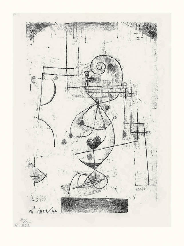
Klee
Klee pioneered the technique of linear monoprint where a sheet of paper is painted on one side with ink or oil paint and then placed paint side down rather like carbon paper. A tracing can be laid over or the design can then be drawn freehand to create a linear image.
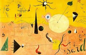
I really like the way the ink has transferred to part of the background as well as the line drawing, and this is what distinguishes it as a print. The simple lines remind me also of the work of Miro and make me wonder if I could also use his work as inspiration.
I have now discovered that Miro did work with printmaking, making woodcuts, collagraphs and lithographs.
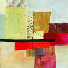
Jane Davies
Jane Davies uses monoprints to create fantastic abstract prints to cut up for collage. She is an abstract painter who uses bold, lively colours and marks in her prints.
Fig. 4, 5, and 6 Davies J (Dates unknown) Monotype prints made into collage. At:https://www.pinterest.com. Accessed 28/01/2021
I love the bold colours and shapes used by Davies. She makes strong compositions with simple shapes that really inspire me. I can see netting in one of these pieces, which I can add to my list for texture in my prints. Jane Davies makes lots of interesting videos which are readily available on the Internet – not sure whether to watch them or not as I don’t want to be too heavily influenced by another artist.
Collatype printing
This is a technique that I haven’t explored. I did attend a course a couple of years ago where I did some drypoint etching and combined this with chine-collé using tissue paper. This required the use of a printing press which I don’t have, so I am interested to try collagraphs without a press. I do however have a pasta machine so maybe I could try this for smaller scale samples.
A collagraph plate is collaged with different materials to create pattern and texture. Textures can be cut into the plate or added, and the plate needs to be sealed with varnish or glue. Some materials will print more densely than others. The plate can be reused many times but inevitably some softer materials such as corrugated card will squash over many prints and will not be so well defined.
Suzie Mackenzie is an artist printmaker. Her prints are mainly representational, depicting animals and scenes, together with pattern. She works both by taking a plate and scraping away to create her design, but also with relief collagraph where collage materials are added.
I chose this print as it is so different to the work of other artists I have researched and shows the versatility of collagraph printing.
Brenda Hartill
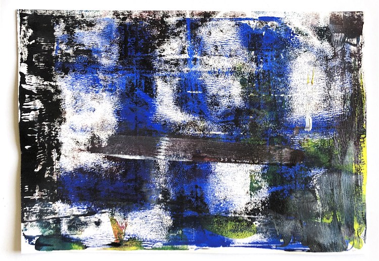
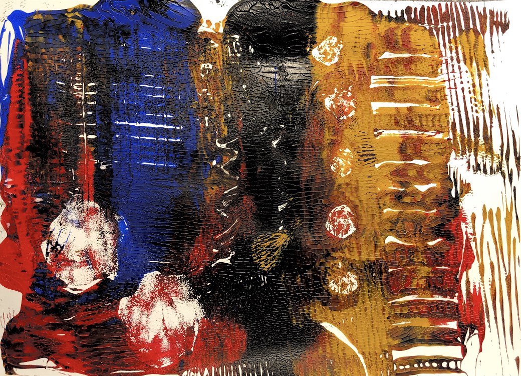
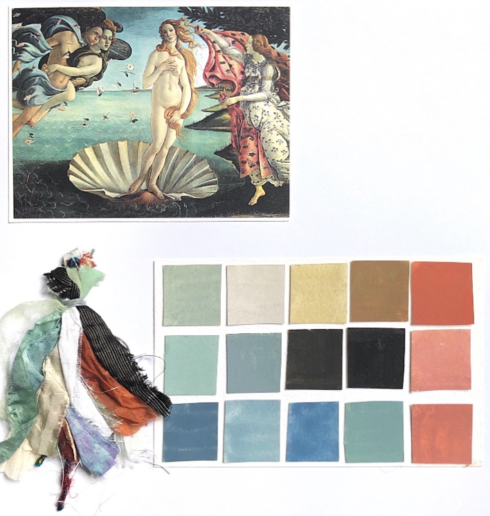
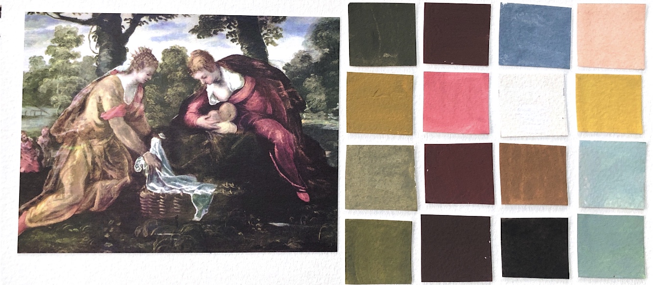
Brenda Hartill uses etching and collagraph in her work to create abstract pieces mainly inspired by landscape. They have lots of texture with embossing playing a significant part in the process, and she uses a wide range of colour schemes. Her pieces are bold and vibrant. One colour she uses successfully – as in the piece below – is blue. This is a colour I find difficult to use, so the inspiration I have obtained from Hartill’s work hopefully will encourage me to experiment with blues in my colour schemes for printing. I have looked back at some of my ATV colour work and see that I did successfully use blue in these exercises so these may be a good place to start.
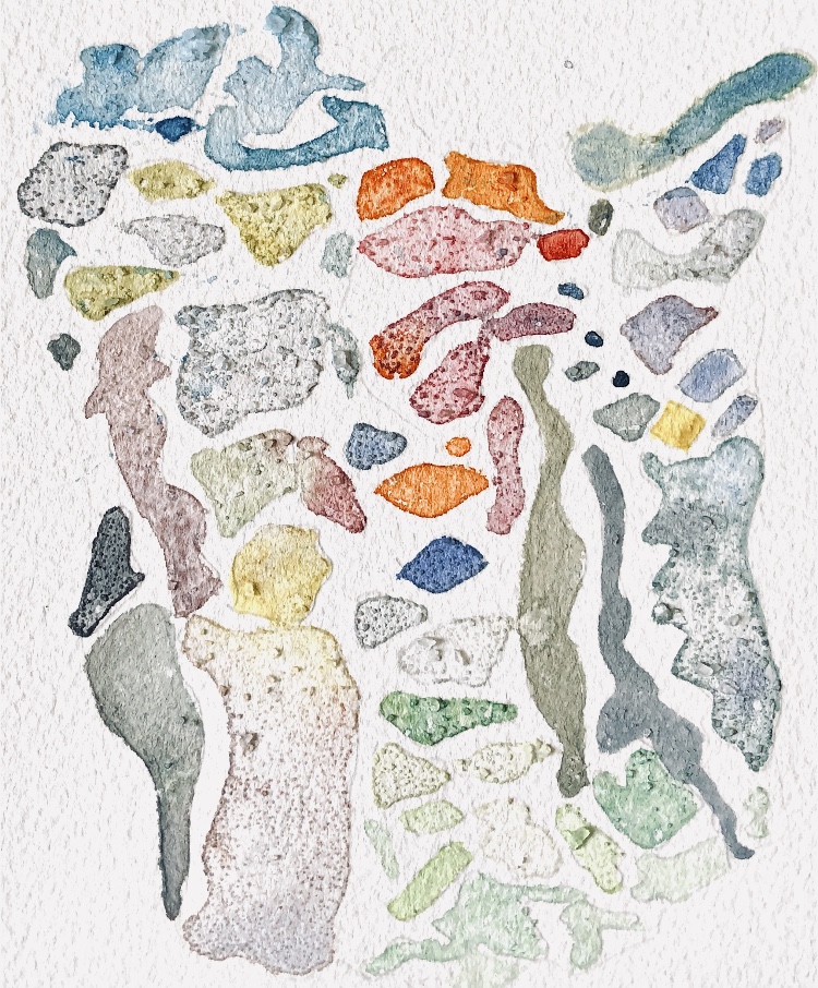
Fig. 9 Examples of my work from ATV 3 using blue in my colour palette.
Laurie Rudling
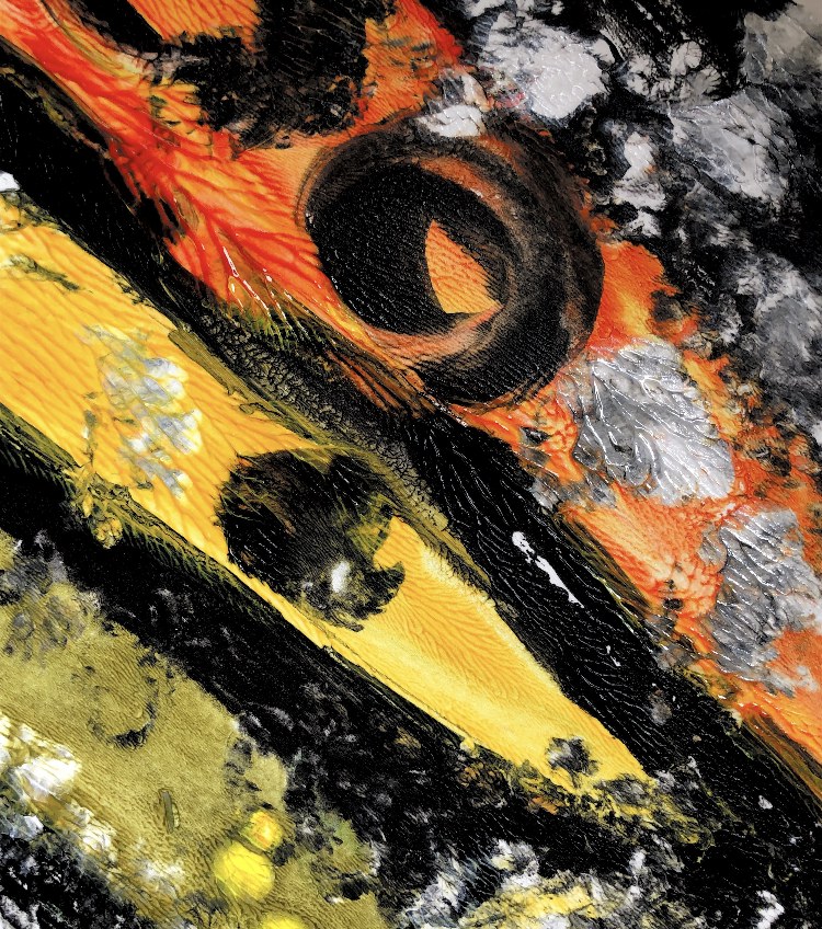
Laurie Rudling is an artist and printmaker. He mainly works with etchings and collagraph although he sometimes uses monoprint, and painting in his work. He uses landscape as his inspiration. I was interested in his collagraph prints of industrial buildings in particular as I live in a huge old cotton mill in Cheshire where there are many industrial buildings.
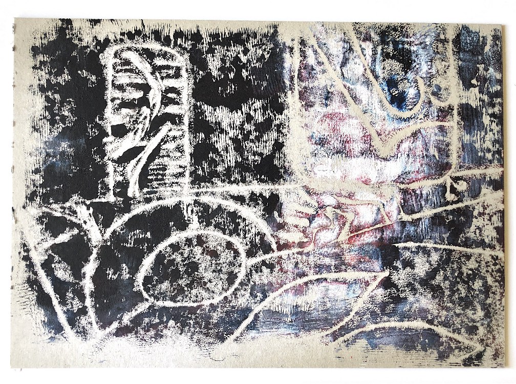
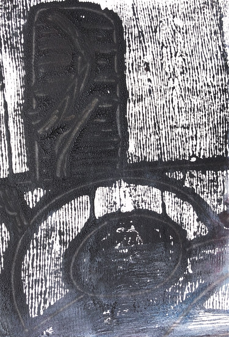
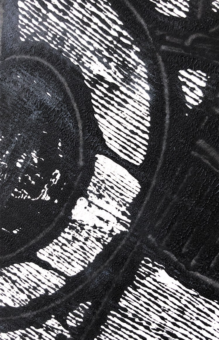
I am interested in the techniques used here to ink the plate, achieving a gradual change of colour from muddy blue to grubby ivory. The colours are muted and dirty looking, echoing the subject. There is so much texture and detail in the buildings, contrasting with the sky full of smoke. The lines are angular apart from the wheel which really stands out. Some shapes are overlaid so I wonder if this has been overprinted with a second plate? Something to try!
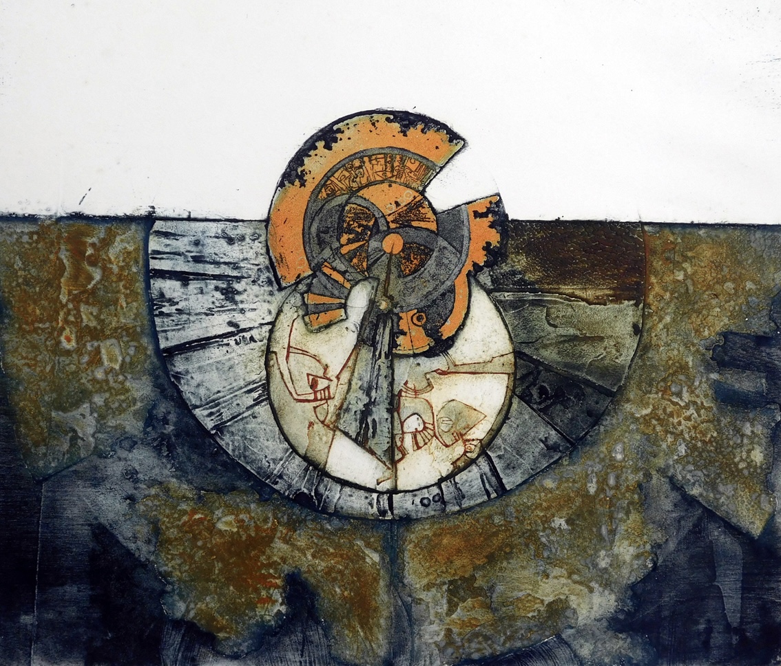
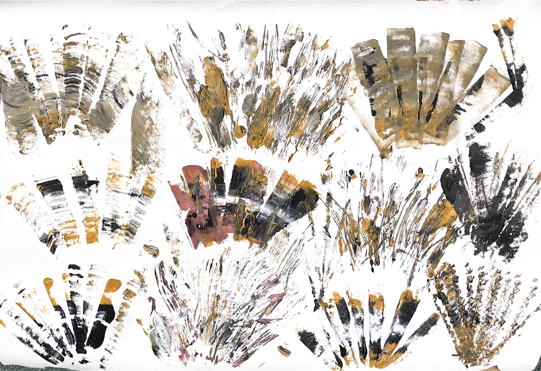
Peter Wray
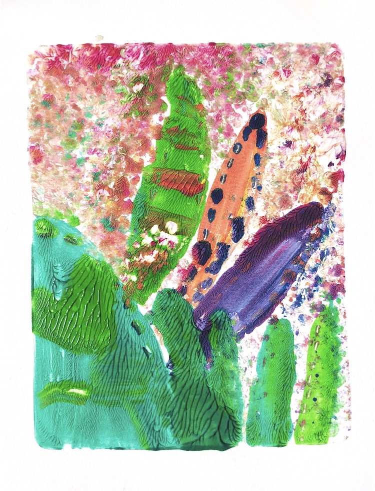
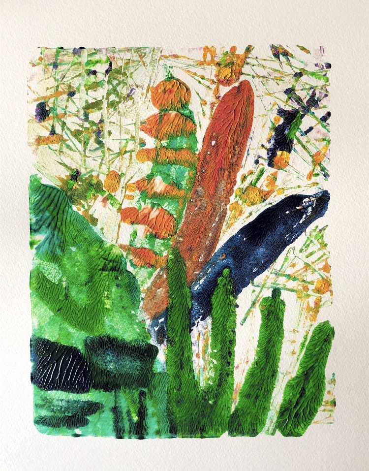
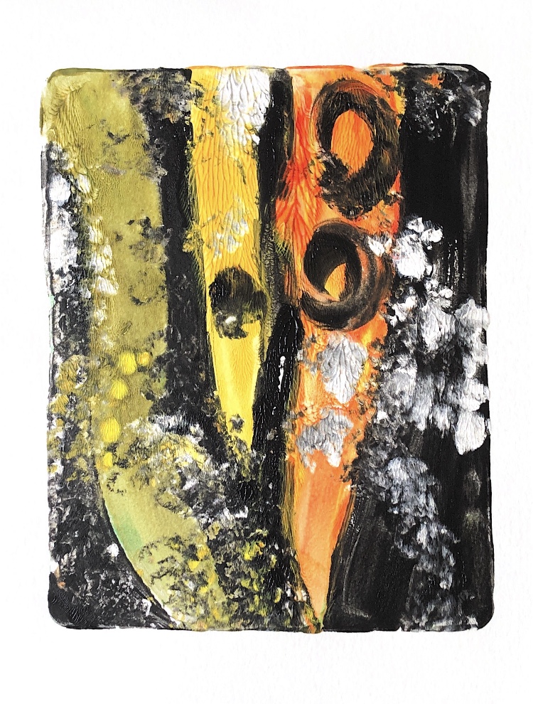
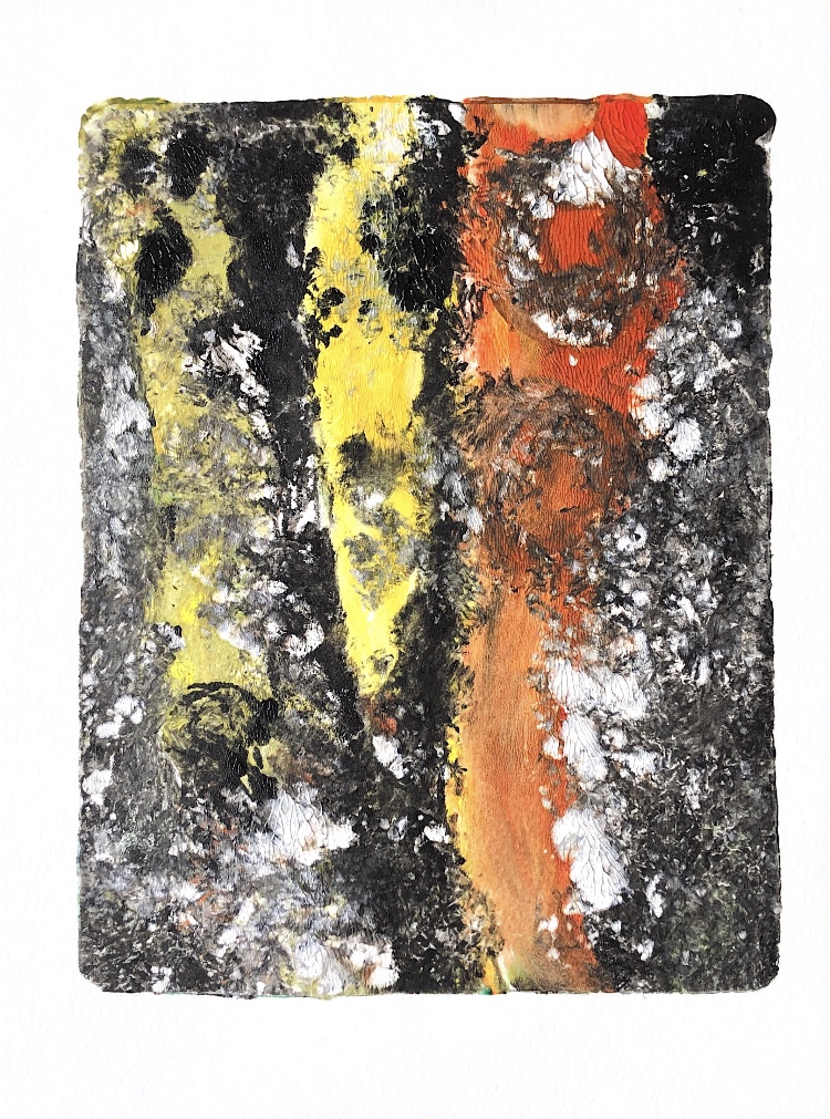
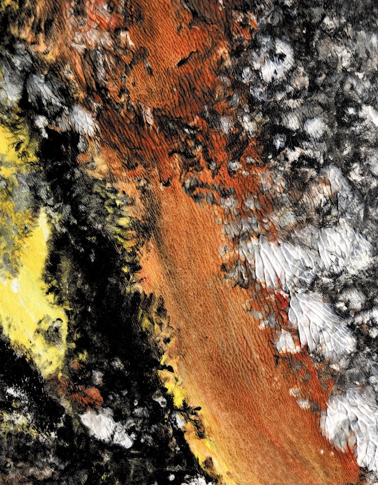
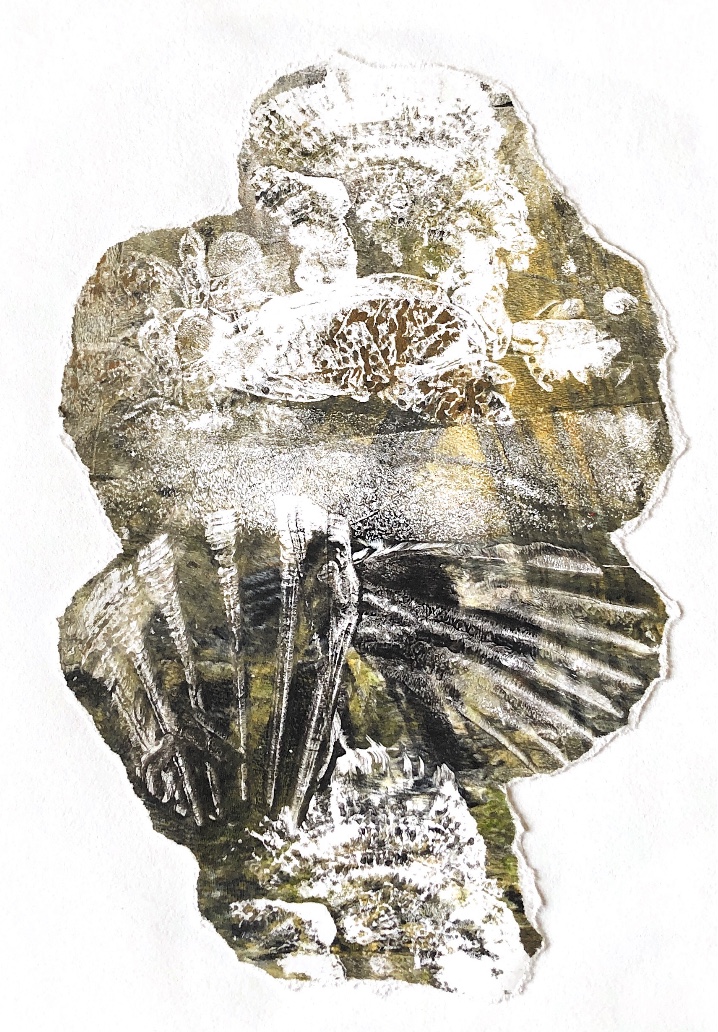
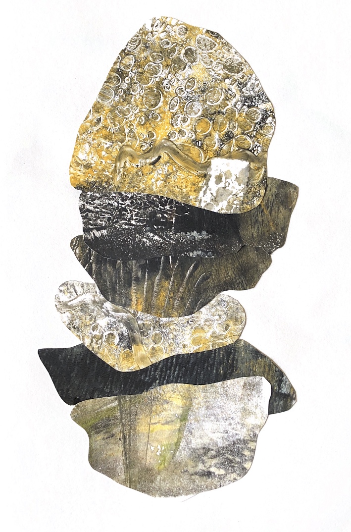
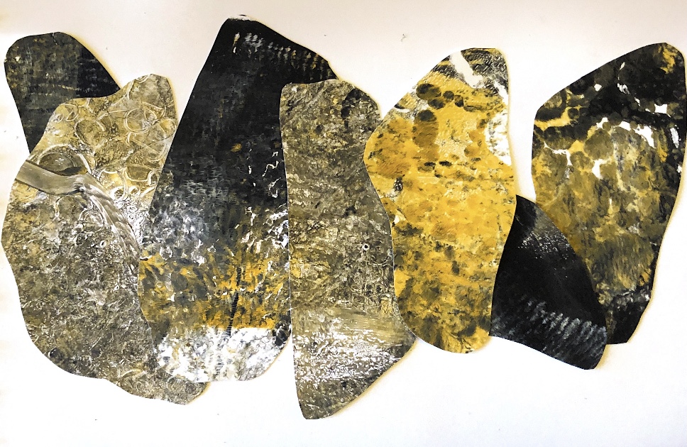
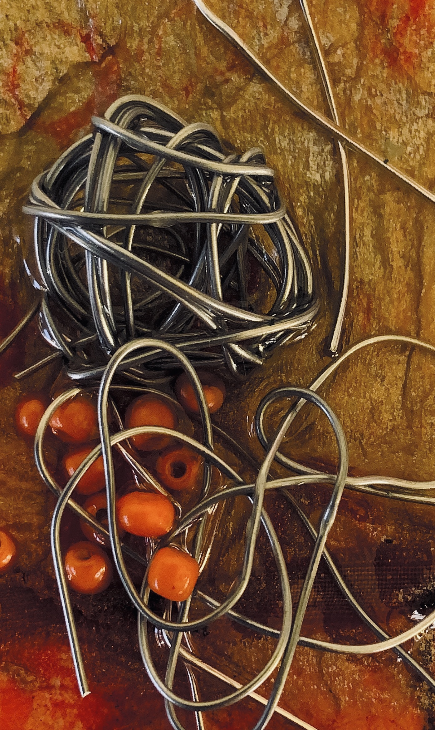
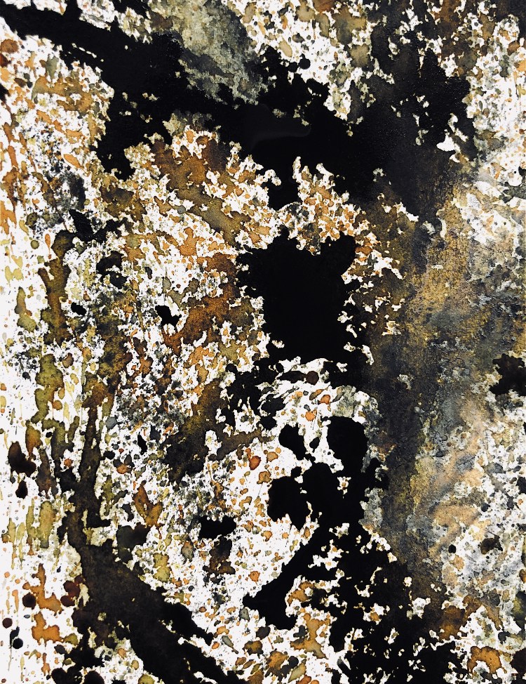
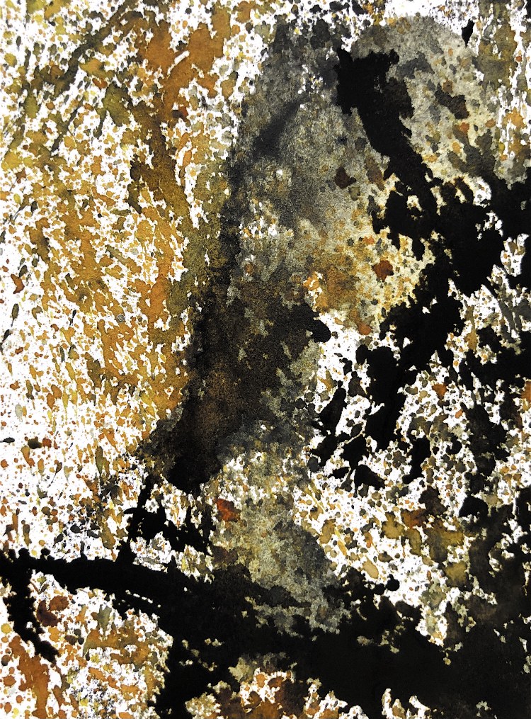
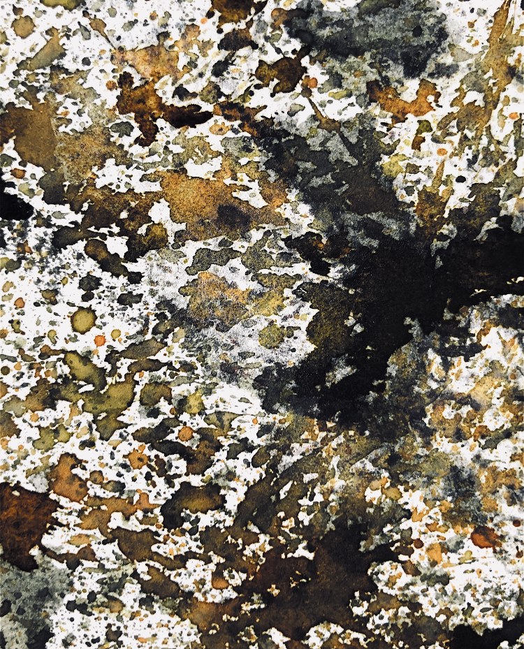
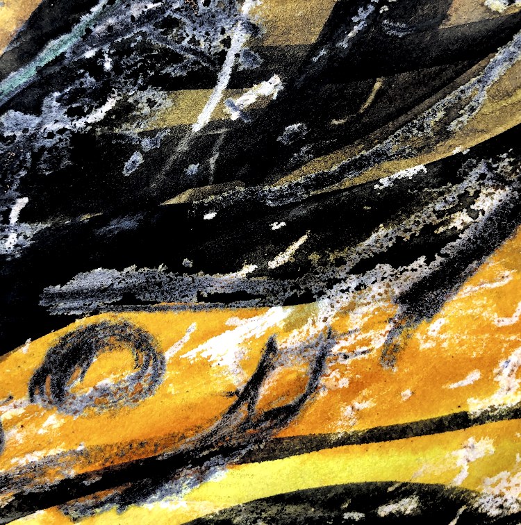
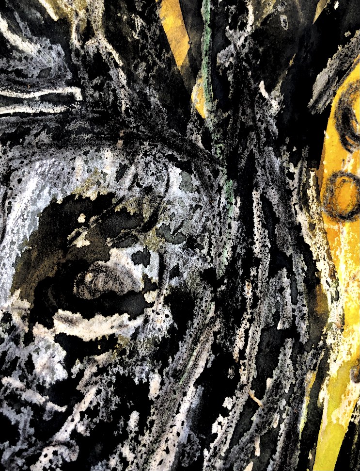
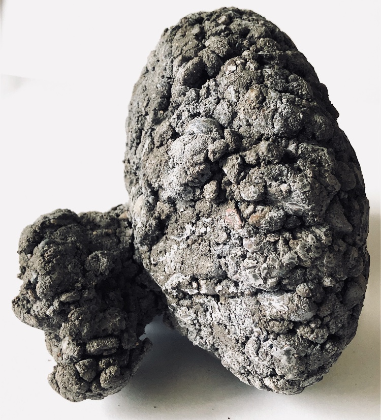
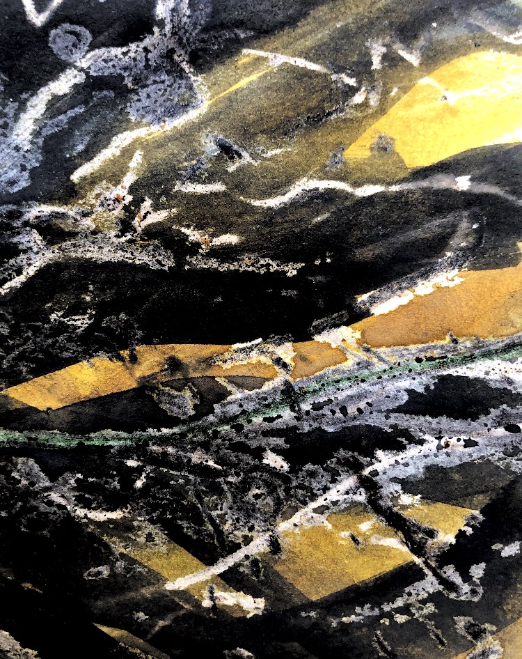
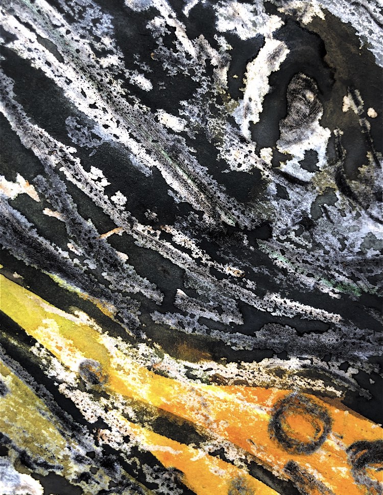
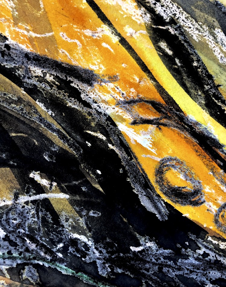
Peter Wray works with paint, sculpture and print. His prints are inspired by fossils, rust, stone, semi religious symbols, coal mining, steelworks and also by music and Haiku. He uses colours which echo these inspirations to create strong images, sometimes with an industrial feel.
I absolutely love the colours in this piece, they are natural yet metallic and manmade; the shapes look as if they have come from the earth and yet are structures reminiscent of tools, or a timepiece. They remind me of something brought up in an archeological dig.
I have investigated Carborundum, which can be used as a fine grit to add texture to collagraph plates – it can be rough, medium and fine, each giving different results to the print – definitely something to experiment with.
I have gained so much inspiration from my research, I don’t want to copy these ideas so I may put them away and do a lot of experimenting with different techniques.
I can’t wait to get started now.
Bibliography
Books
Bess, J. Gelli Plate Printing North Light Books
Edmonds, J (2010) From Print to Stitch Search Press
Bautista, T Printmaking Unleashed North Light Books
Major-George, K (2011) Collagraph a journey through texture… Murrays the printers Ltd
Throughout this module I have used a wide range of materials for each exercise and clearly documented in my learning log my ideas, and inspirational sources. I have pushed myself to expand my techniques for drawing, improving my observational skills and thinking carefully about composition. I became interested in assemblage while researching the work of Louise Nevelson and used this as inspiration while using plaster of Paris. I carried this technique through to my collage work. I built on my strengths of working with colour, shape and texture together with surface manipulation and made some well thought out samples. I like my learning log to be visually stimulating and exciting and to demonstrate my design skills.
Quality of outcome
I made a lot of successful samples, exploring different materials, which I photographed clearly and presented effectively in my learning log with clear explanations. During the sorting exercise I used judgement to decide which samples had worked well to provide inspiration, and also those from which I had learnt even if the outcome wasn’t to my liking. I am pleased with the work I selected at this stage although I do sometimes find it hard to narrow it down to a limited number of samples. I have clearly documented the progression from initial to developed samples.
Demonstration of creativity
I have taken more risks both with my sampling and also with my drawing. I have mixed different materials and techniques in an experimental way, linking with previous exercises such as joining and wrapping. I have presented sources of inspiration and tried lots of ways to interpret these. I am really pleased with the way that my mark making skills have improved by using different materials and also varying the scale. The observations are freer and more exciting, providing lots more inspiration to move away from the original inspirational source and find my own creative voice. My colour choices are carefully thought out and documented.
Context
I have researched a number of artists, some of which were not on the suggested list, and referred to these within my log during the sampling process. I have looked at methods and ideas from a wide range of magazines, books, internet sites, and also from my peers in my stitching group who give me feedback during our weekly Zoom meetings. I regularly look at the work of The Textile study group, and the Internet site Textile artist.org.
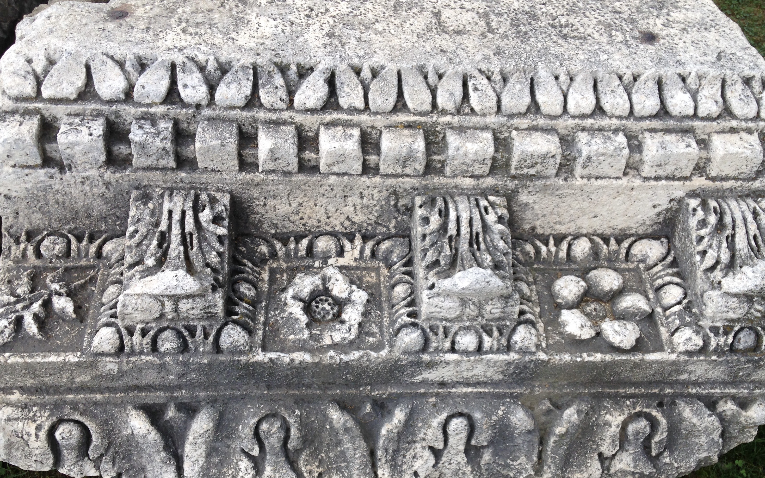
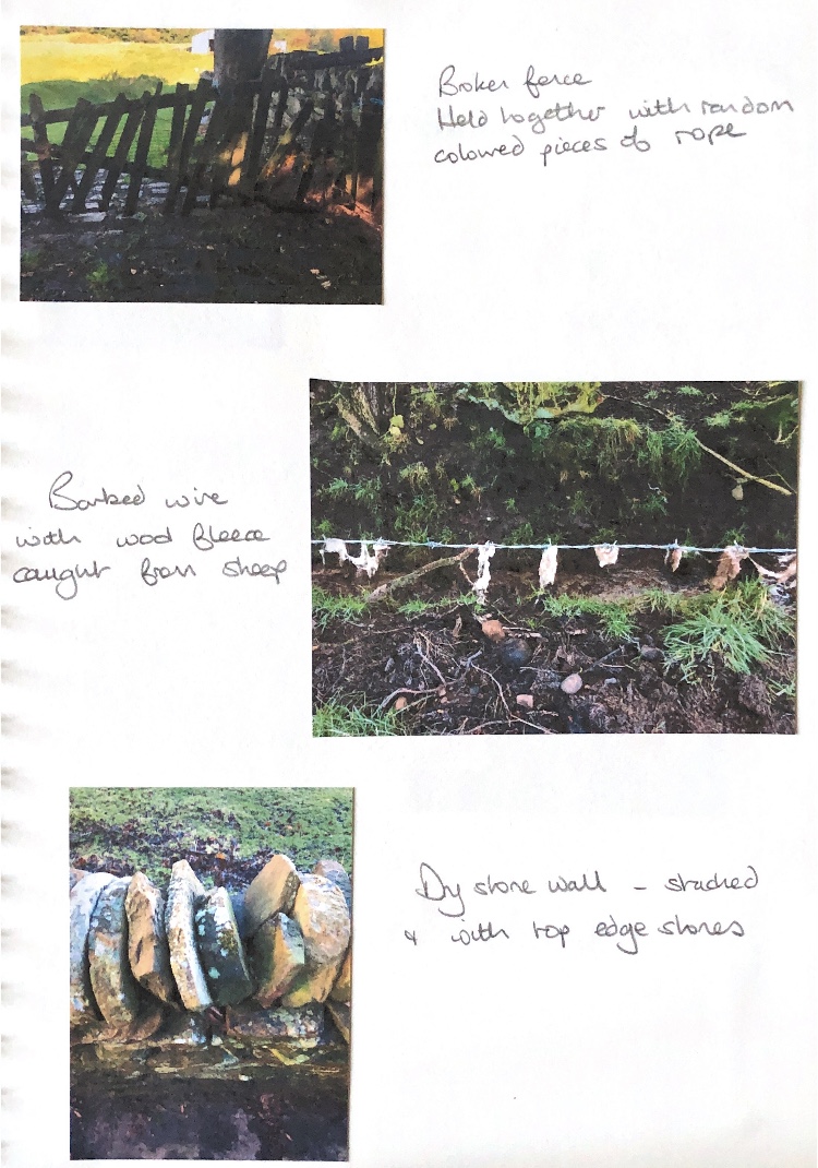
During my sampling I have also looked for inspiration from artefacts such as Roman remains, and nature, including man made structures such as dry stone walls.
I am reflecting constantly on my progress and trying to think of things in different ways so as to learn and grow. I am always excited to try new ideas and to look at other artists. My head is full of ideas to take forward to the next module.
These two materials, paper mache and plaster of Paris are very different to use but once cast could be put together to make assemblage pieces. I was inspired by Roman ruins with intricate patterns, and by the work of Louise Nevelson who uses separate individual sculptures to assemble into a larger piece, usually one colour.
These individual pieces are beautiful in their own right but once combined with others they take on new meaning and create a whole new piece of art.
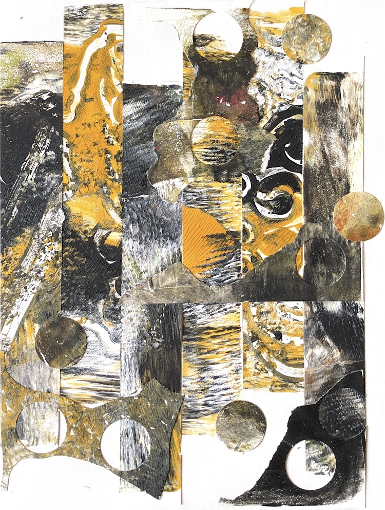
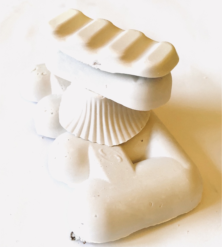
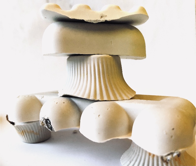
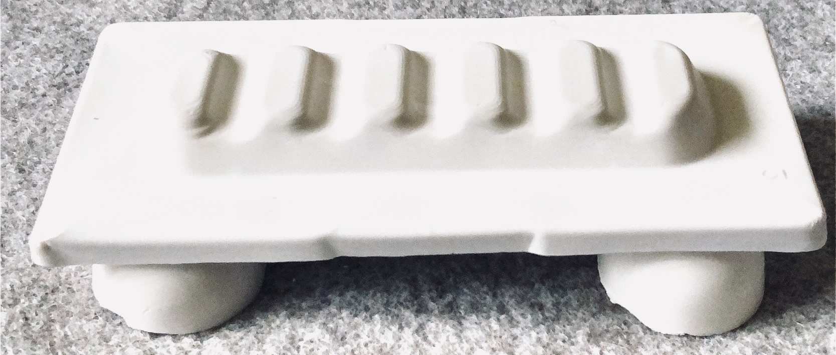
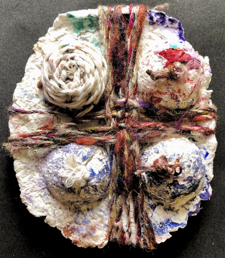
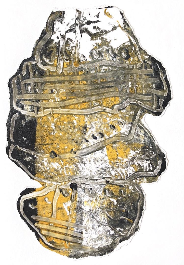
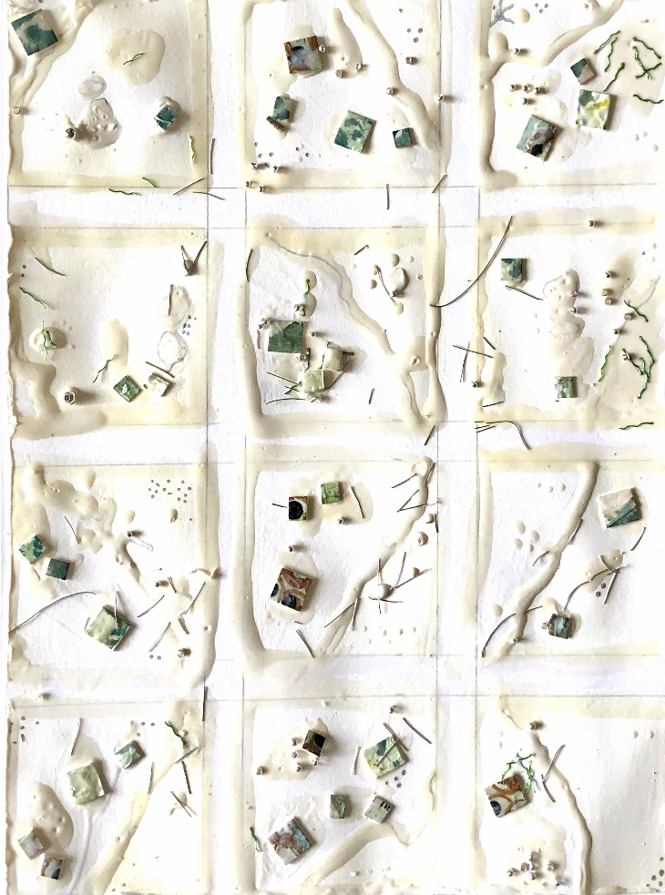
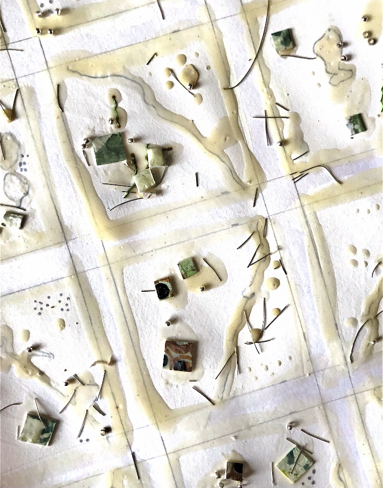
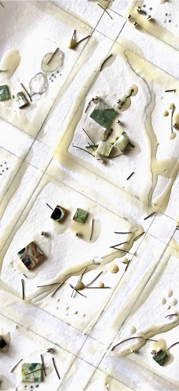
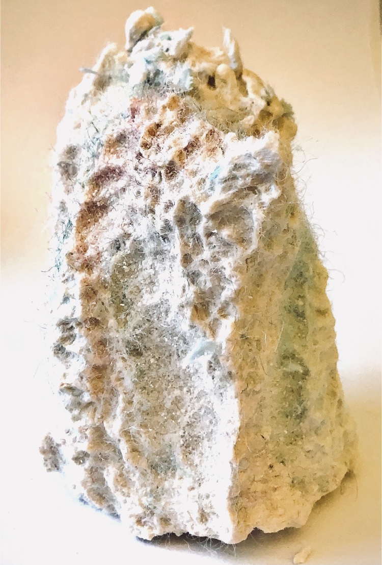
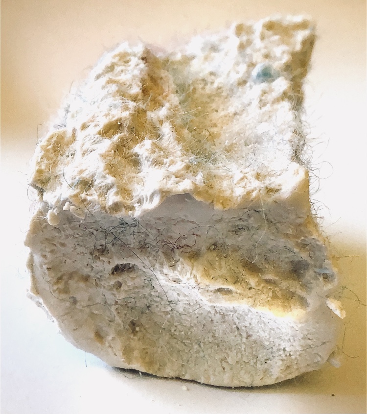
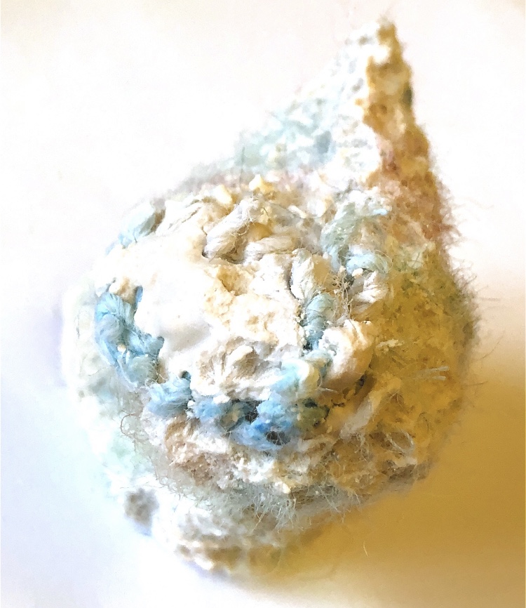
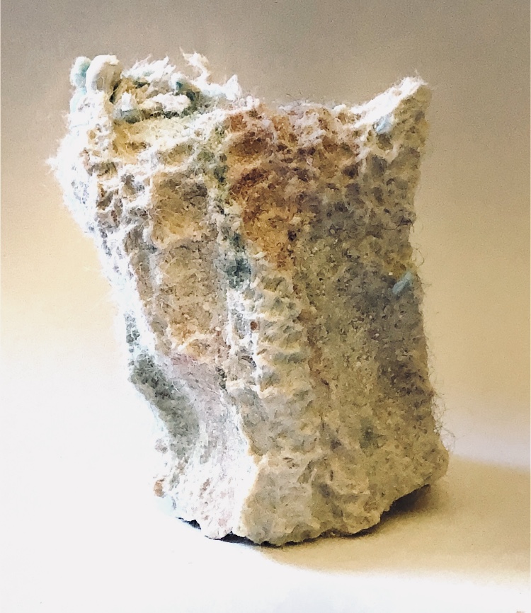
I made individual print blocks and combined thes to make print assemblages which I am pleased with. I have added some colour to some of them. These would make lovely fabric prints and ideas for stitch.
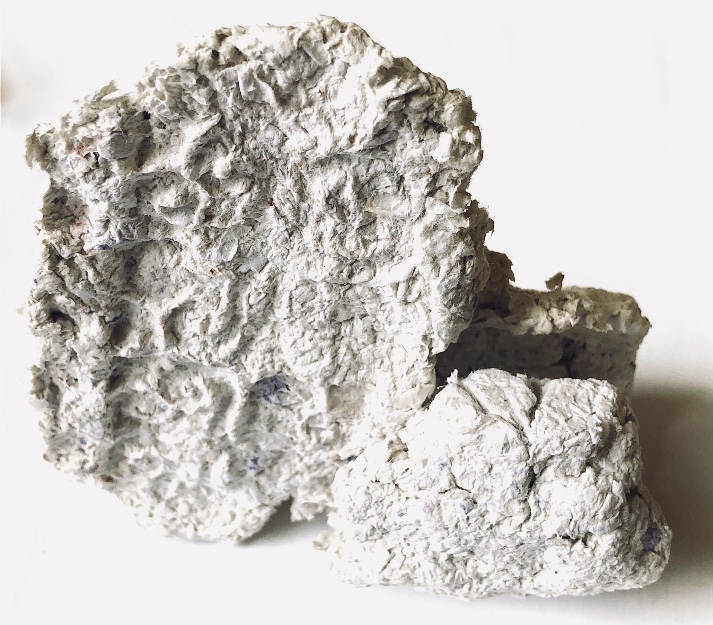
Fig.2 For this piece of paper mache I used a paint palette to cast and as a result the material picked up colour in places. I used wool in matching colours to wrap and weave the sample. The colours did not create the natural feeling that I wanted so I chose to use different colours for monoprinting and collage to document the sample.
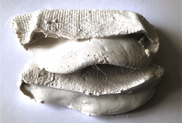
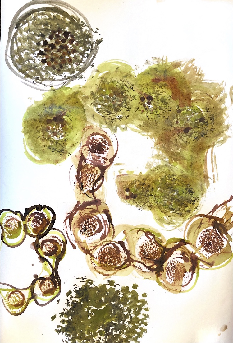
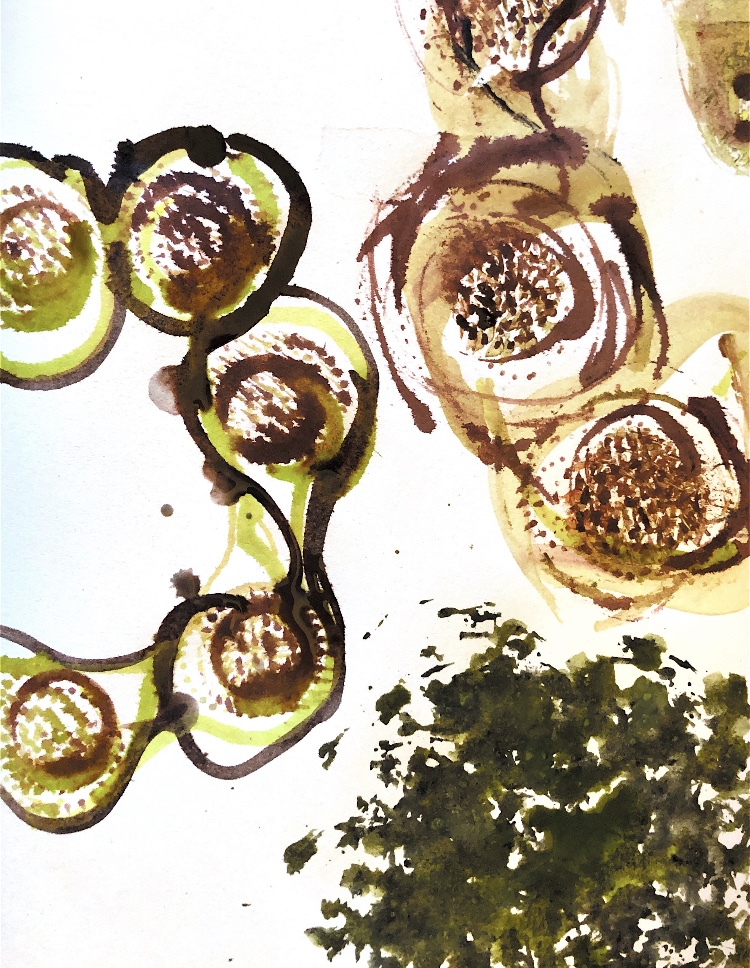
Fig 3. Inspired by a walk in the countryside and also keeping in mind the idea of assemblage I created plaster of Paris samples with textured surfaces. The material was poured onto fabrics to create stone like shapes and textures and these were assembled into layers reminiscent of dry stone walls. Tiny fibres from the fabrics, like the wool caught in barbed wire, remain in the samples. The shapes and patterns were really inspirational for monoprinting and collage, using the natural colours of the stone walls in the picture.
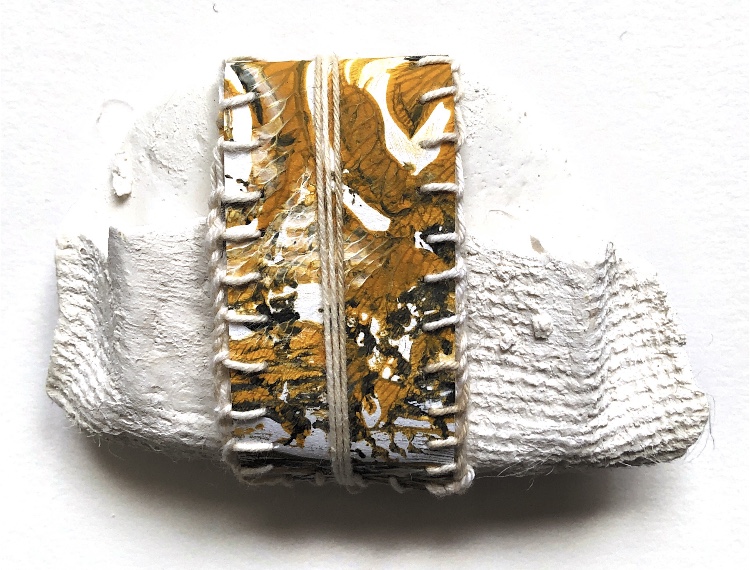
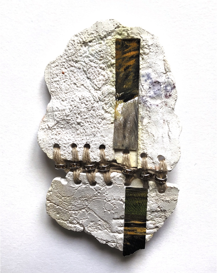
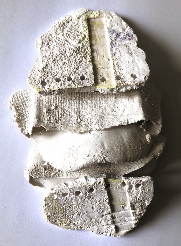
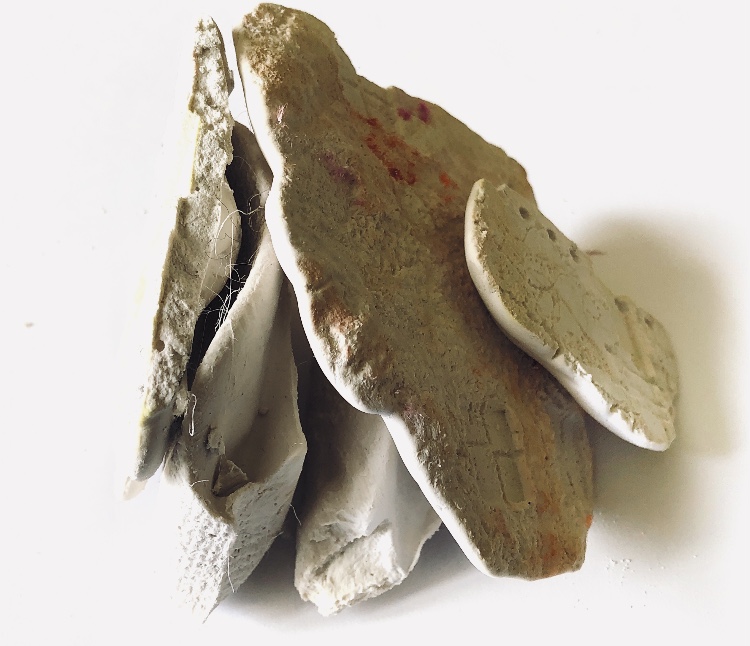
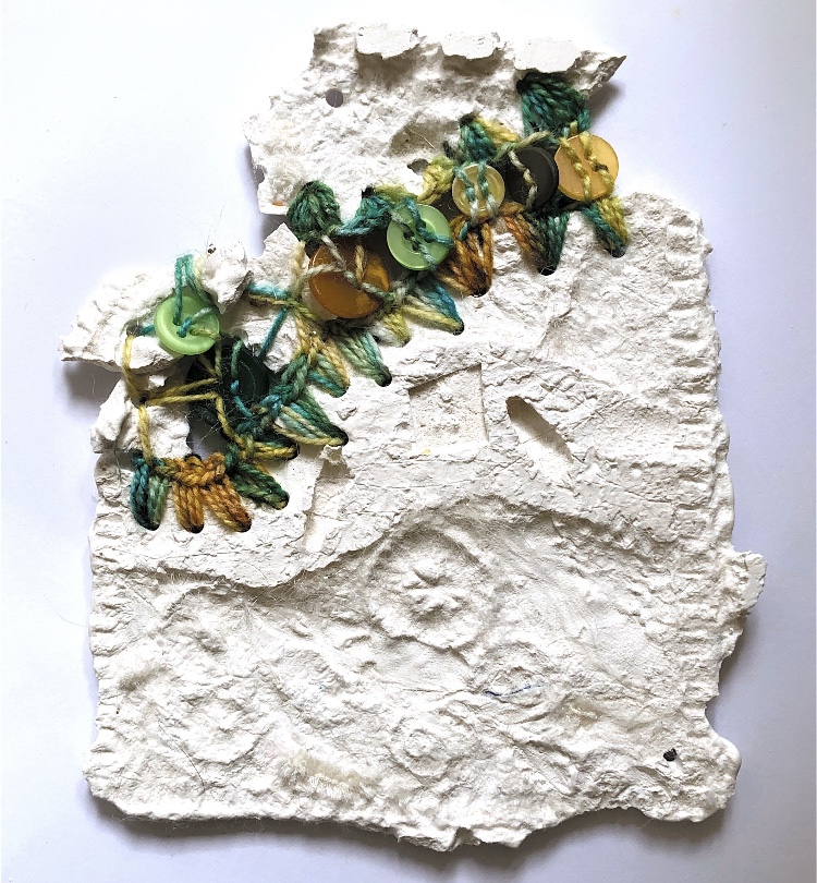
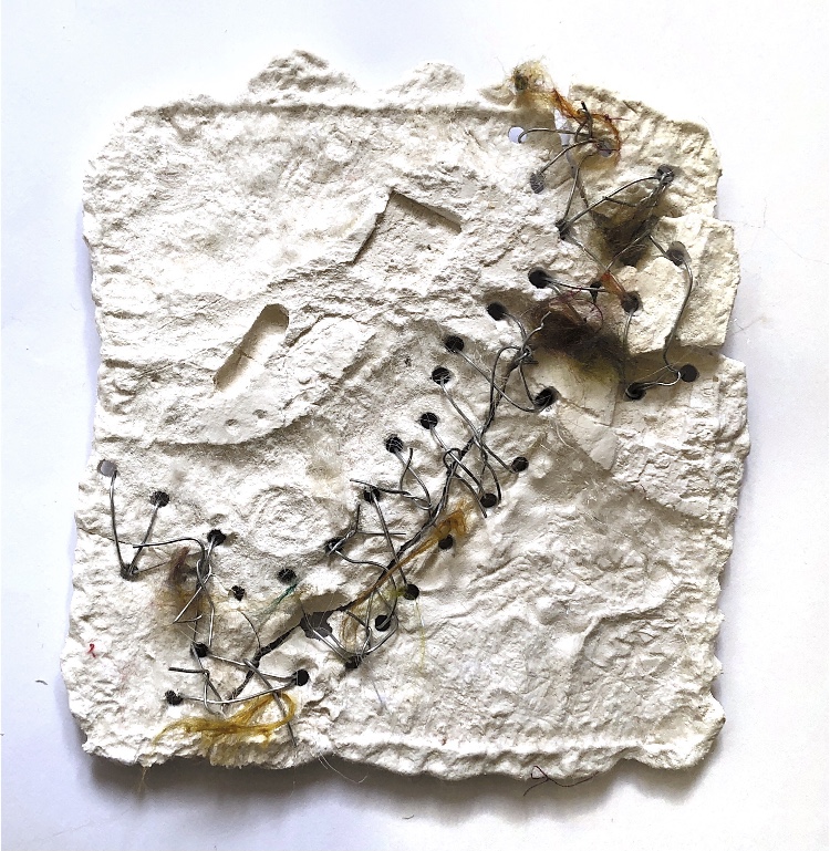
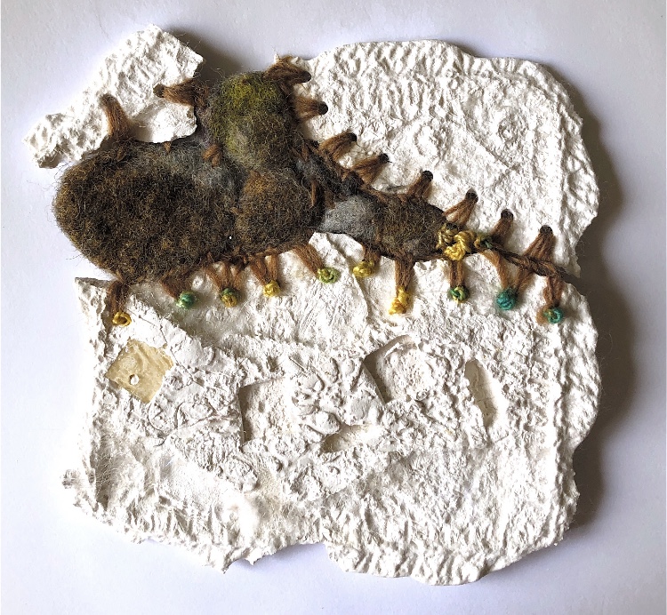
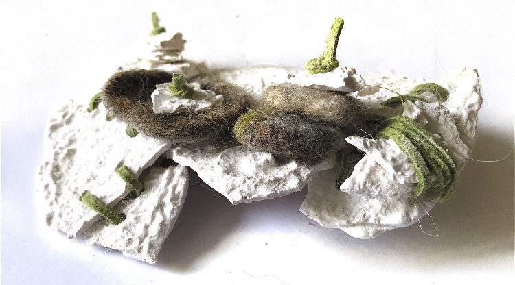
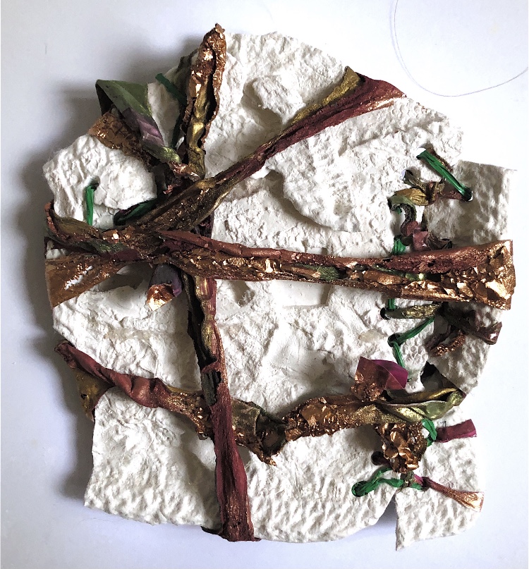
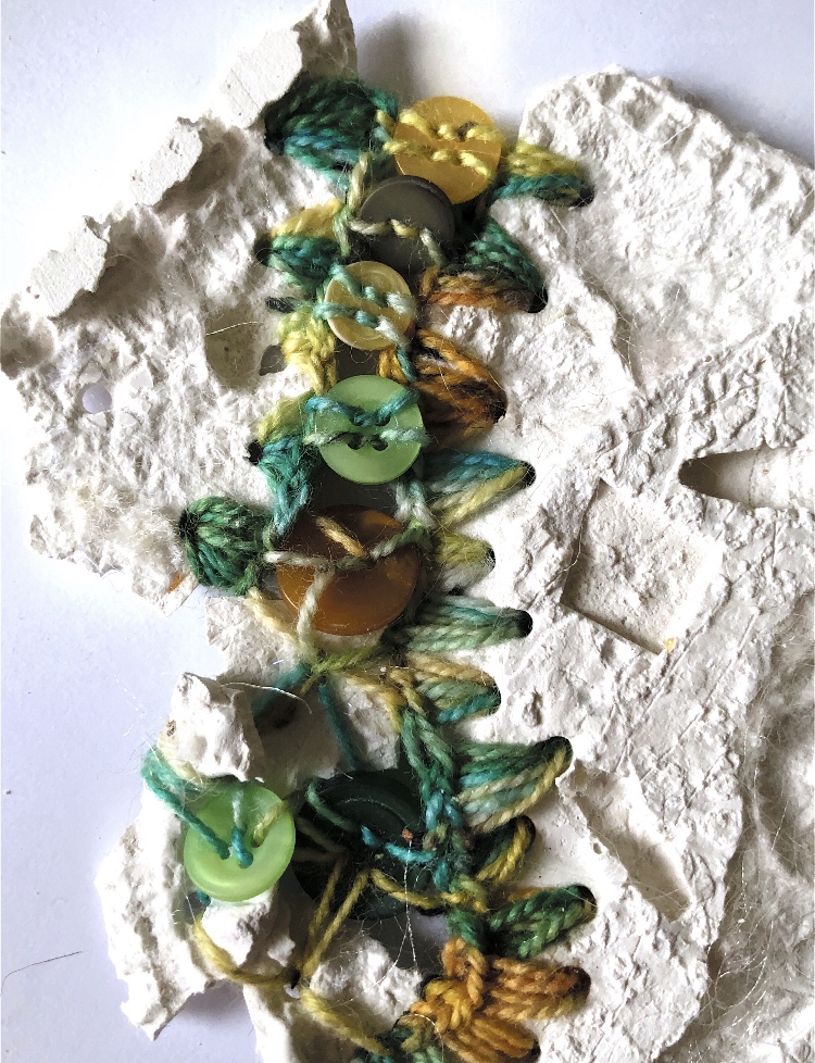
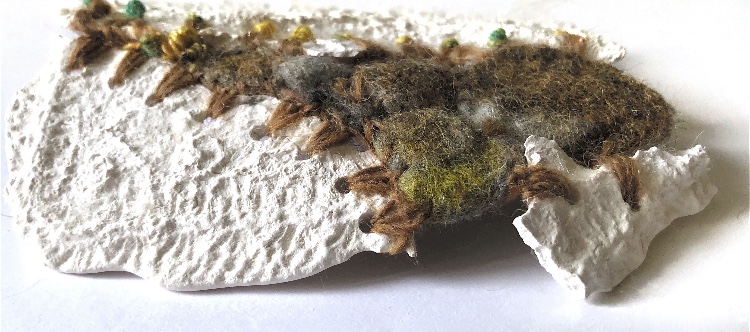
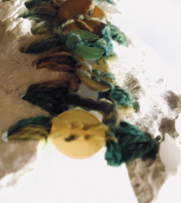
Fig 4. These are a set of developed samples, following my initial sampling, produced by molding from a surface. I wanted to use some of the joining methods from previous exercises. Using thread, wire, felted pebbles, buttons, leather, plastic bags, tyvek strips and wool, I rejoined broken plaster samples which had holes drilled in them. These pieces of plaster had been cast on textile pieces and have lots of pattern in them. I left the plaster in its natural colour so that it contrasts strongly with the joining methods. These samples have some flexibility at the joining points and this makes for 3d pieces with contrasting viewpoints.
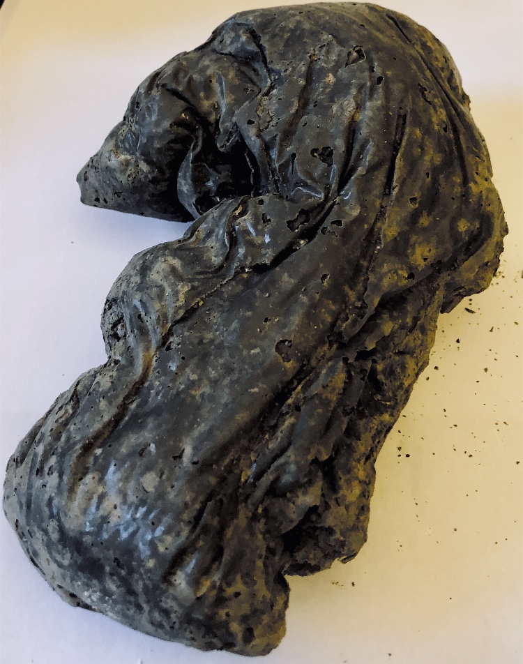
Fig 5. I didn’t really know how to use latex but after talking to my tutor I was inspired to have a go. Casting from sweet packets and shells provided the texture and I added in paper from previous monoprinting on one piece. I also used the lid of a candle jar which produced a very intricate geometric sample, but I prefer the natural look of the first few casts. The piece cast from sweet packets has the look of seaweed and works nicely alongside the shell samples. I think these pieces are fragile, diaphanous and ethereal, like seashore finds – worn by the sea and wind and ever changing. I find the use of paper strips intriguing and I am hoping to return to the combination of latex and paper for future inspiration.
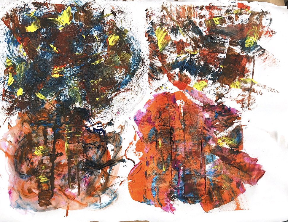
My large paintings using homemade implements captured the seashore theme.
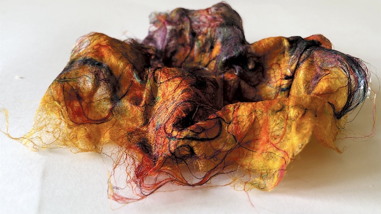
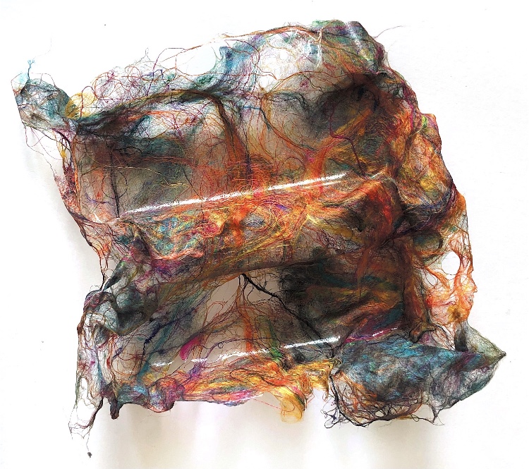
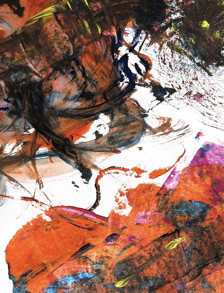
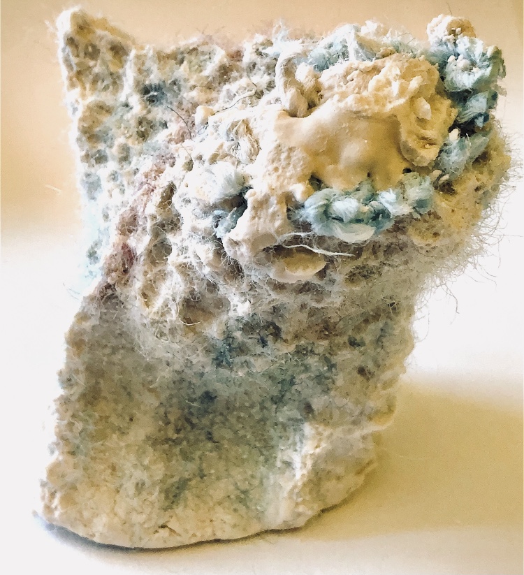
Fig 6. Using silk fibres in bright colours, I cast into plastic containers, using watered down PVA to mold to the surfaces and shapes. Although I don’t think these samples added anything to my discovery, I have included them as I was enjoying using paint and ink freely to respond to these samples and along with a lot of my sketchbook work in this part I feel I am loosening up. These paintings are A2 size in response to feedback from my tutor about trying to draw on a larger scale, and I think they represent a braver style and outcome in my ‘drawing’.
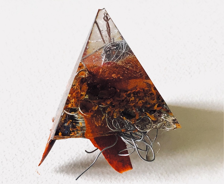
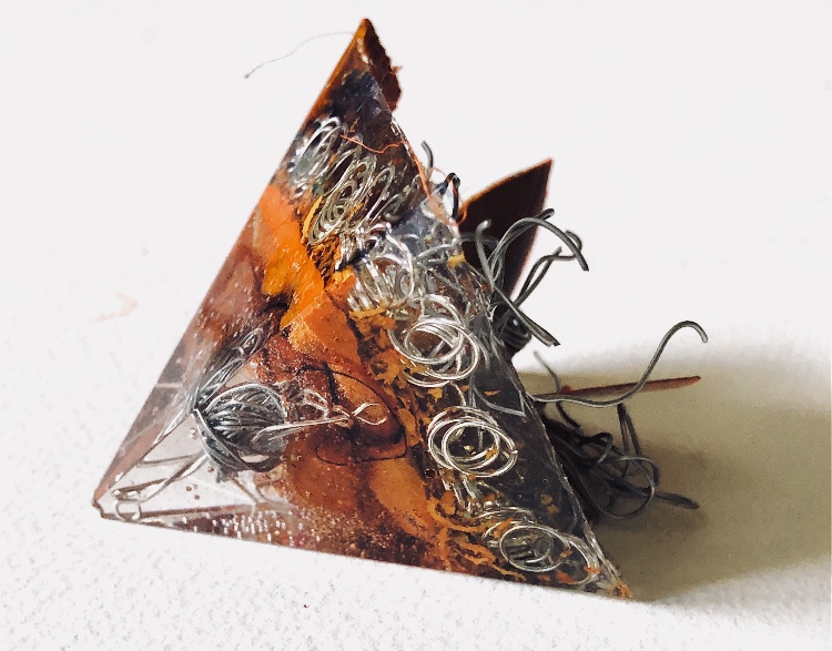
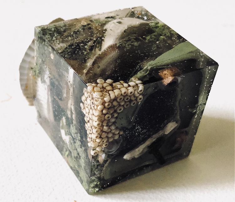
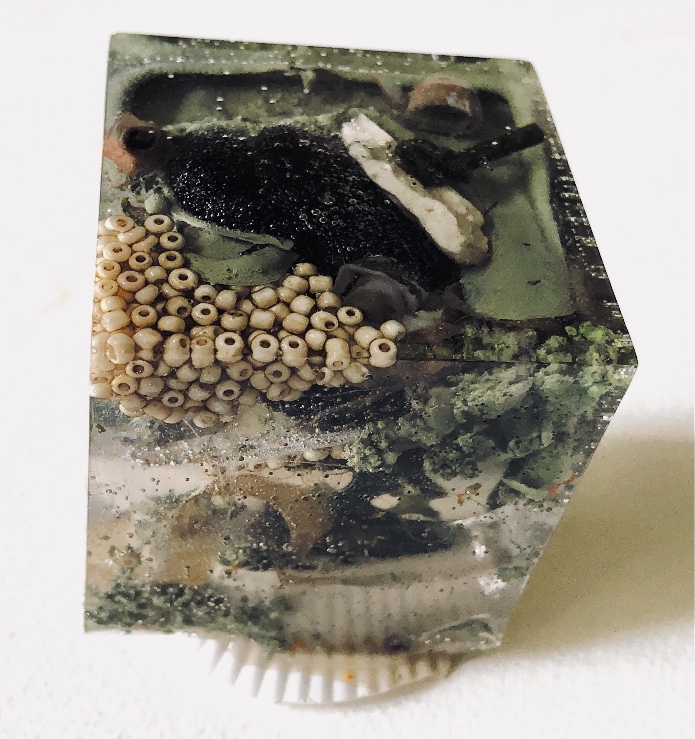
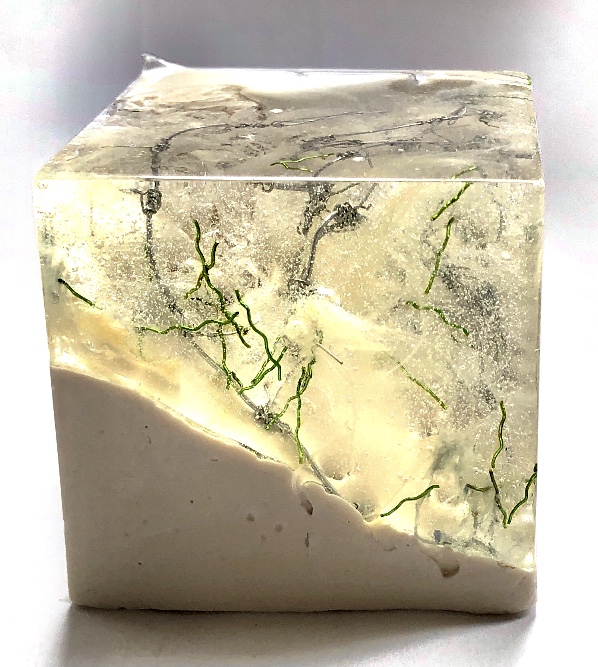
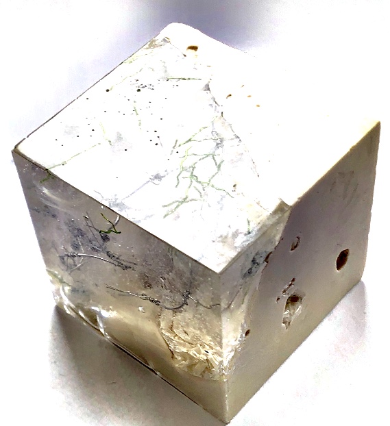
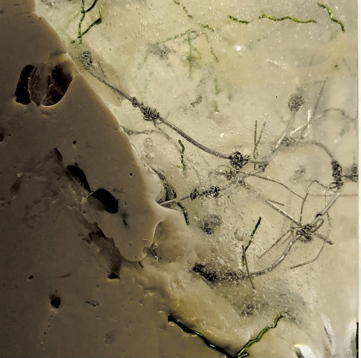
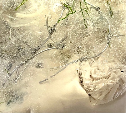
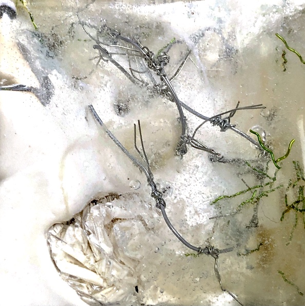
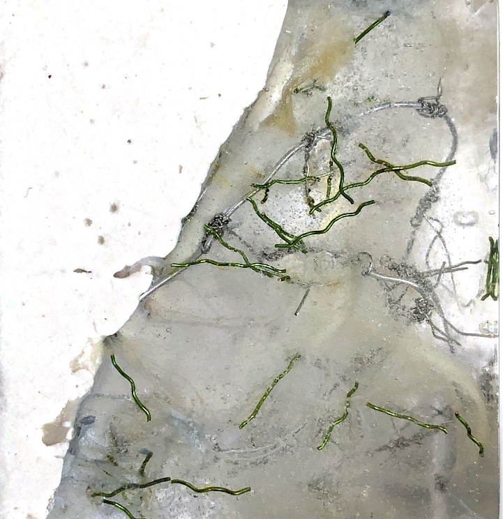
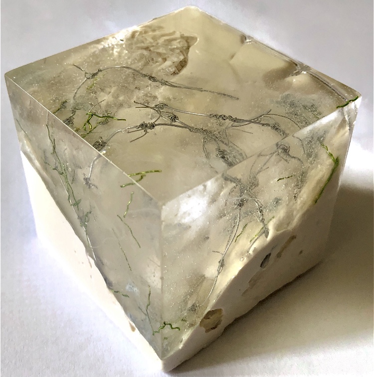
Fig 7. Making a series of resin samples was very satisfying. I was inspired once more by barbed wire, landscapes and nature to create three different samples.
For this pyramid shape I experimented with melted crayon, wire and silk fibres, creating a piece which offers a different ‘landscape’ on each facet. The base has wire and crayon sticking out which enables the piece to stand at an angle and creates a textured tactile surface contrasting with the four very smooth surfaces of the pyramid. The transparency of the material entices and allows the viewer to look closely inside to see the intricate patterns made by crayon shavings, jewellery rings, fibres and wire.
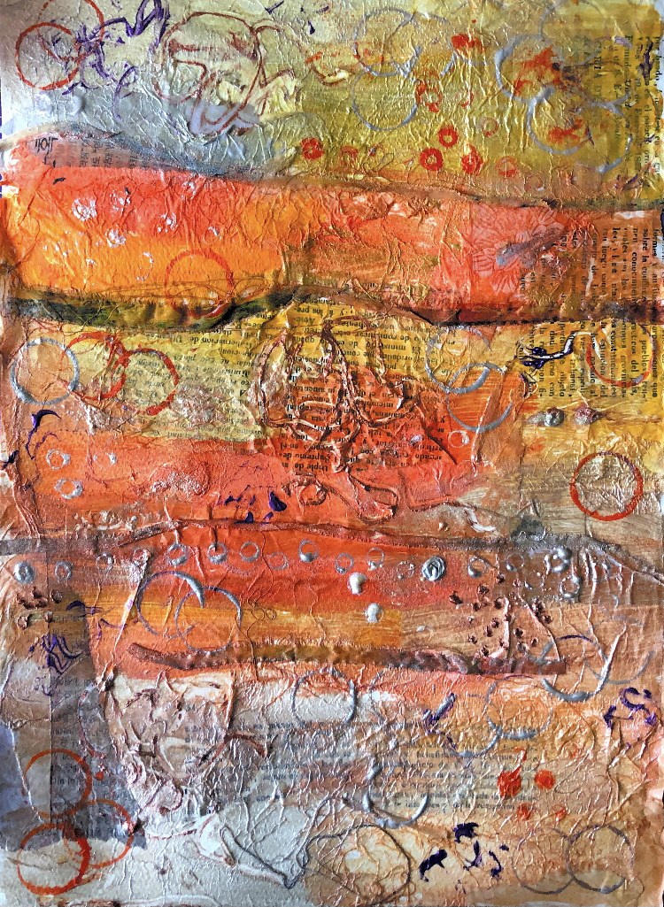
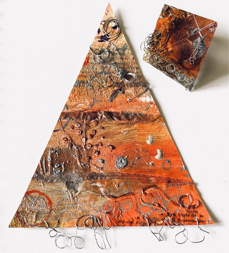
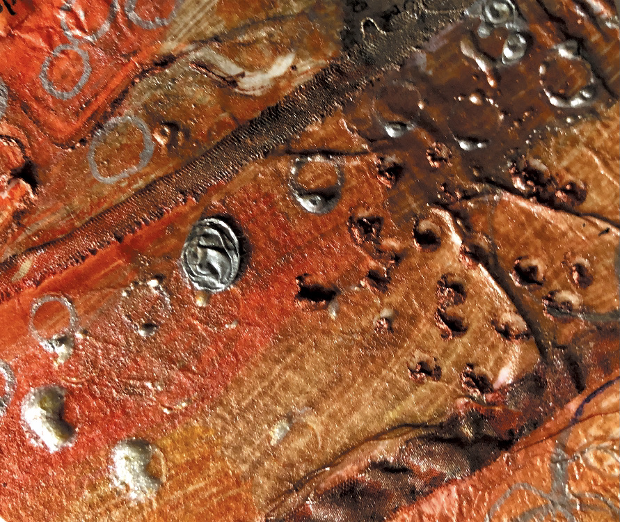
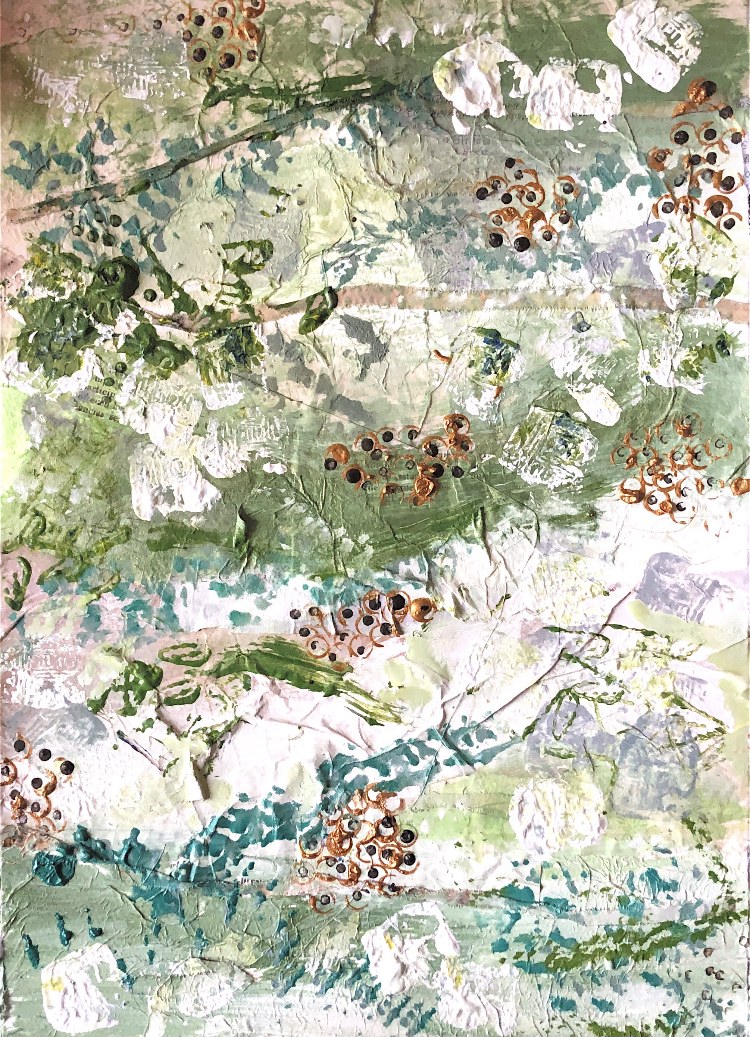
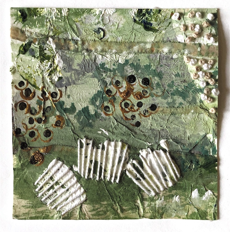
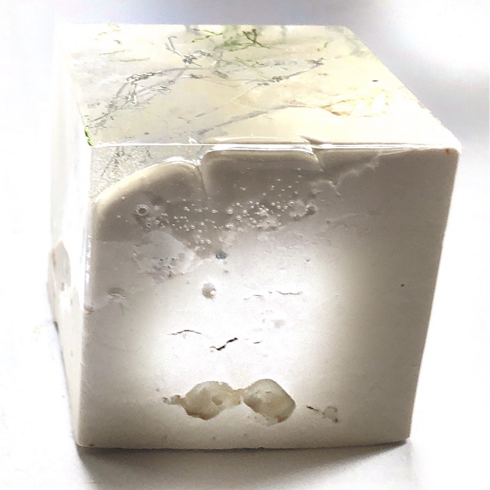
Using collaged papers which I allowed to dry and then painted with inks and acrylic, I have created a textured material in response to this sample, which was then cut into a triangle and embellished further with wire, beads and more poured resin.
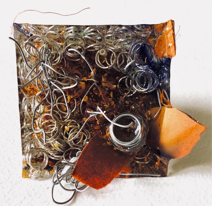
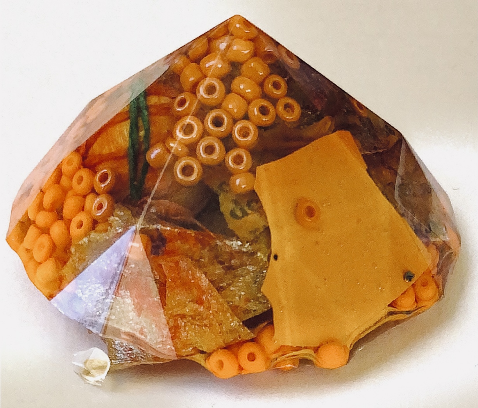
Fig 8. This square sample again uses wax crayon for colour, together with beads, plaster of Paris pieces, felted pebbles, cord, torn painted paper and paper strips to create an intricate organic piece. It is as if a square has been cut from nature – either from a submerged forest or underwater in a rock pool. It is a slice of time captured in space. The use of a semi submerged plaster shape allows the sample to stand at an angle, helping the viewer to see from all viewpoints the beautiful shapes and patterns inside.
The weight of the resin pieces makes them satisfying to pick up and look closely. The smooth surfaces are so different to what is contained within.
Again I have used collage and paint to further explore this piece, together with some stitching.
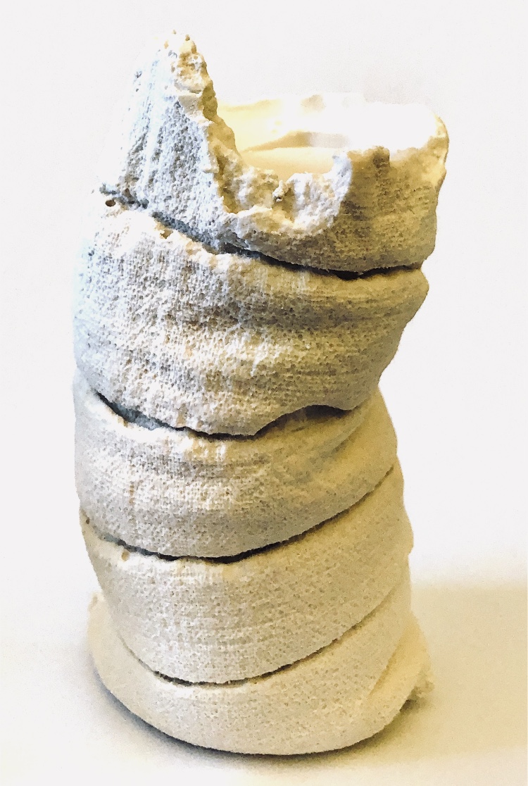
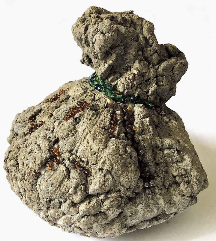
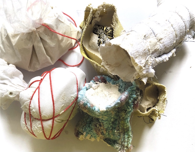
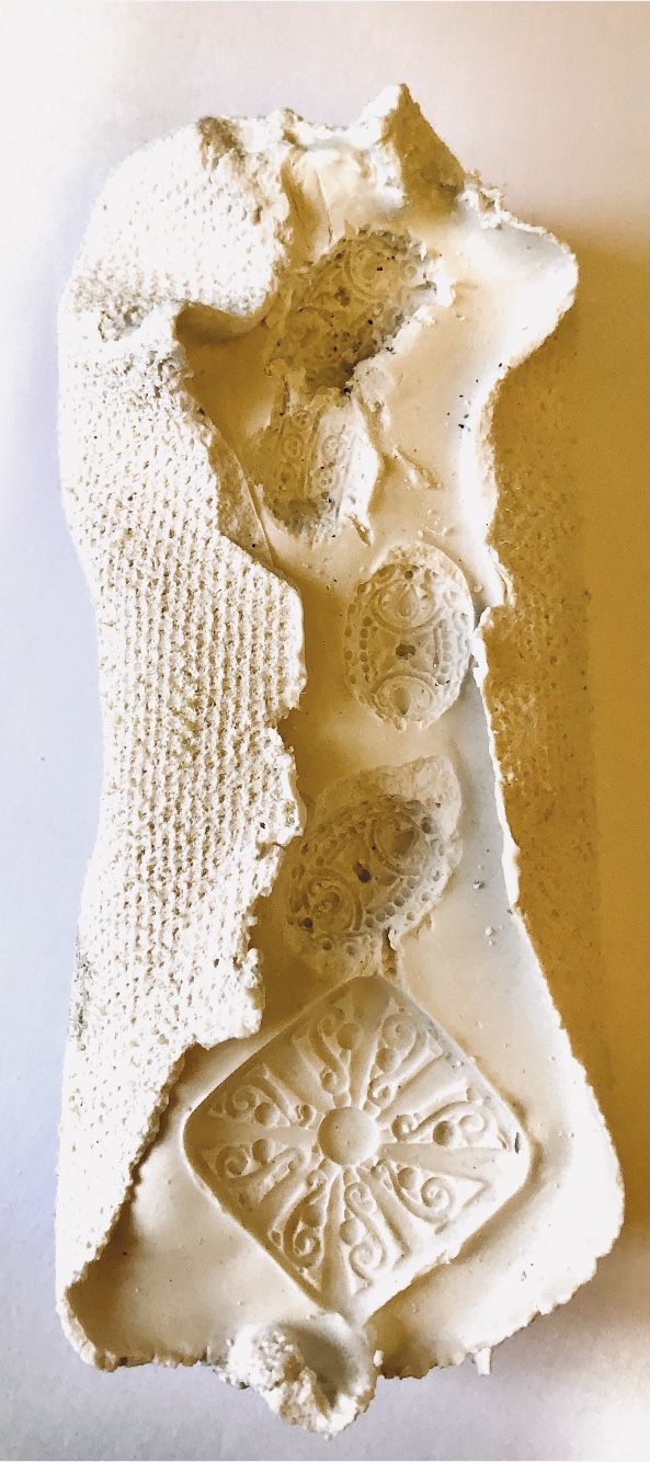
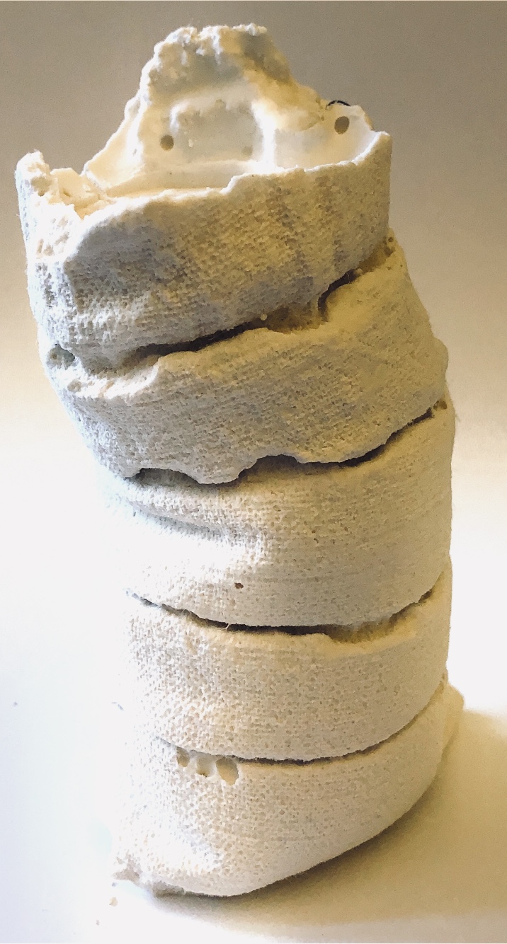
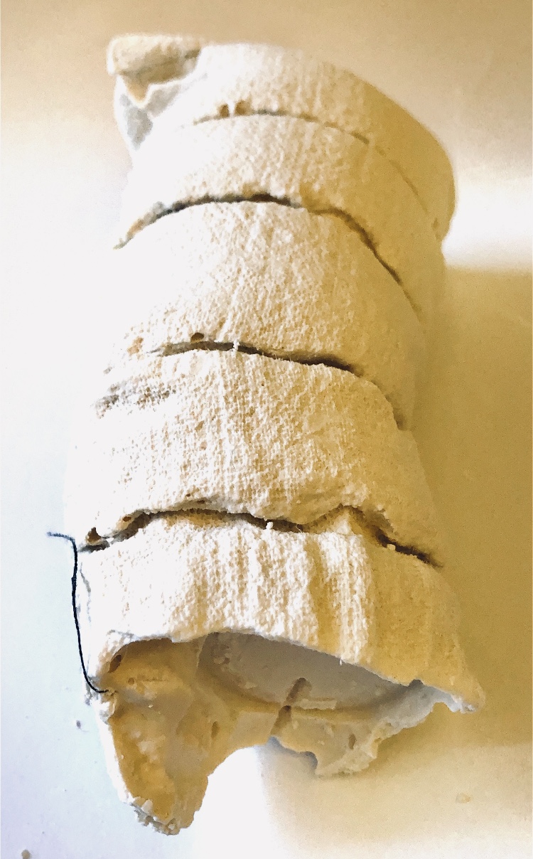
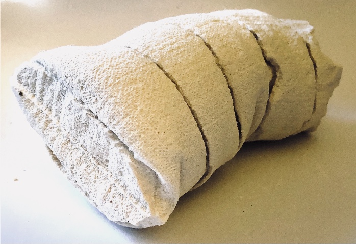
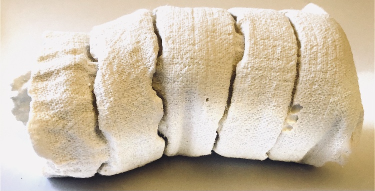
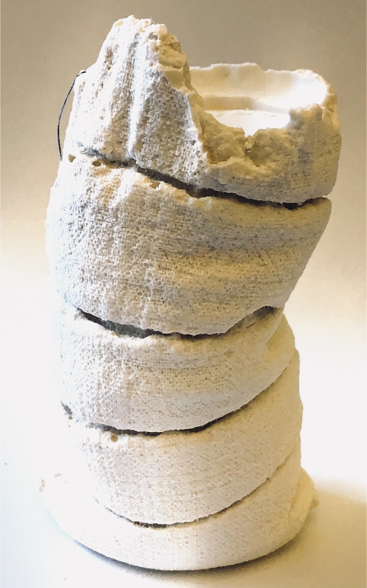
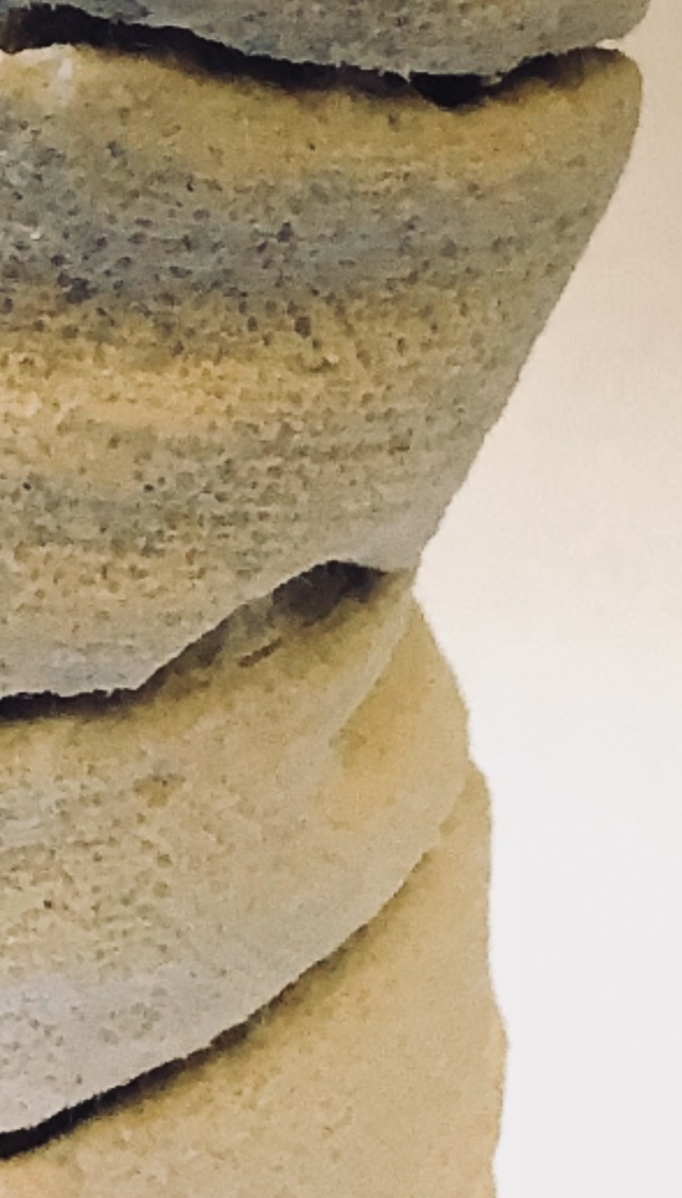
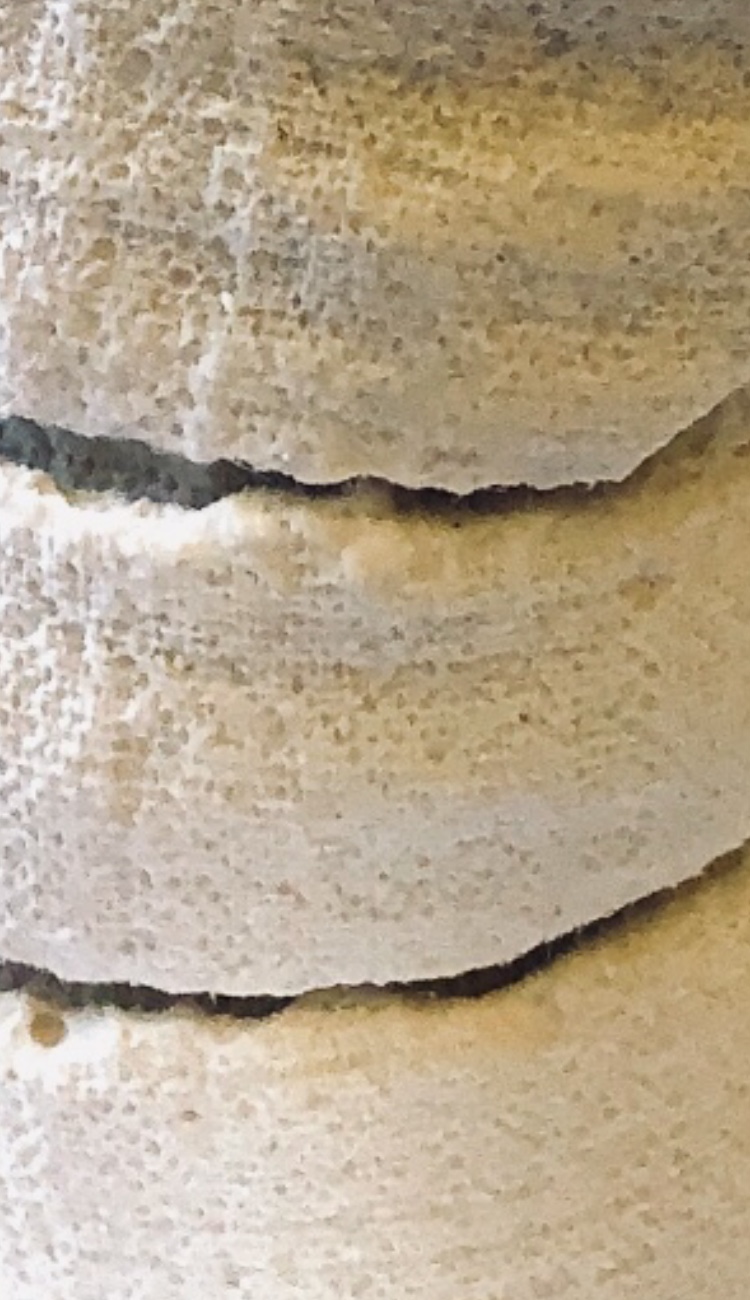
Fig 9. For Project 2 I used plaster again. I made small bags from different fabrics to cast the plaster in and manipulated these with pleats, and stitch. I have chosen these because the detail picked up by the plaster is so fine that every warp and weft yarn, pleat, seam and stitch can be seen on the resulting samples. The first sample stood on a flat surface to dry and this means the bottom is fairly flat and the sample stands up nicely, leaning to one side like a sack full of grain. The second sample is open at the top with decorative beads cast into the surface. I love the intricacy of the surface of these casts, demonstrating the versatility of this material.
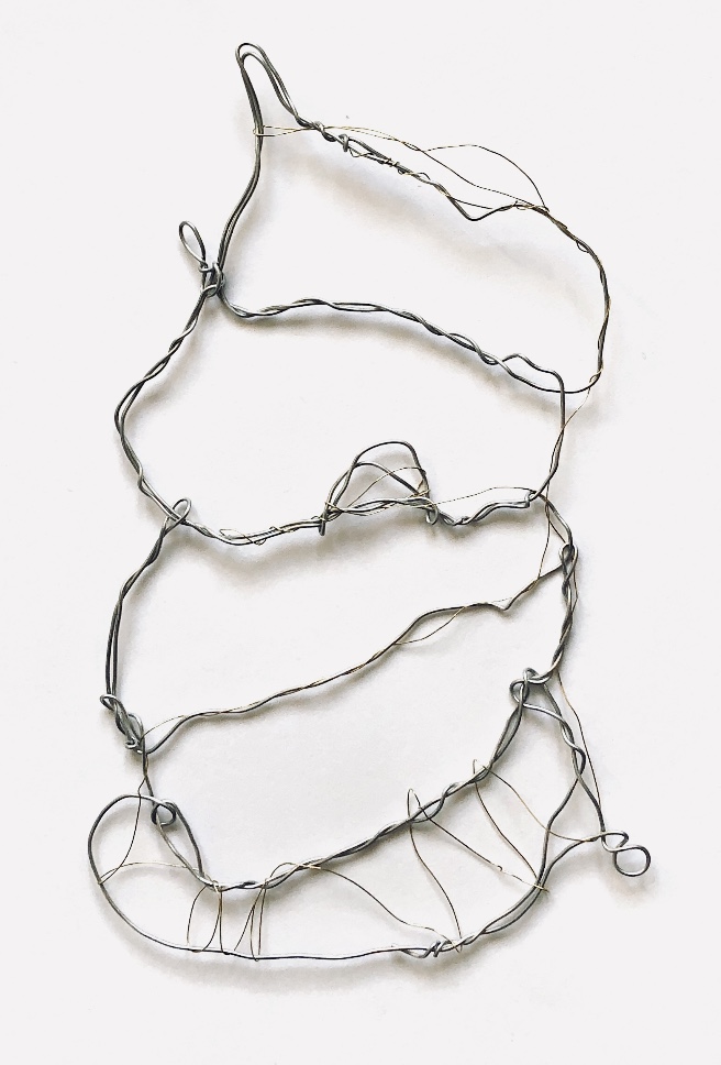
I ‘drew’ one sample with wire and then stitched it to a patchwork of fabric. I think I prefer it before it was stitched down as it has got a bit lost in the material.
Fig 10. Using the work of textile artist Rebecca Fairley as an inspiration I have cast a sample from a knitted and felted scarf, sewn up the sides and bottom to make a small vessel. Rebecca casts concrete into knitted fabric and uses the stretch of the knitted material to create the resulting shape. Once I had stopped the plaster leaking from the bottom of the vessel, the sample found its own shape, and when removed from the knitting retained quite a lot of coloured fibres. This was a happy accident that I did not predict, and it adds another dimension to the sample. There is so much detail from the knitted stitches in this piece which is full of texture from the plaster and the wool fibres. I am pleased I used plaster rather than concrete for this as I wanted fine detail.
Using watercolours to capture this sample worked well – I used salt and cling film to add texture, and watercolours created the soft, washed out look of the sample.
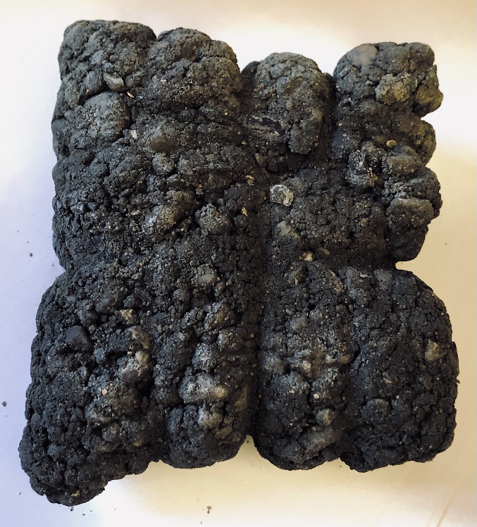
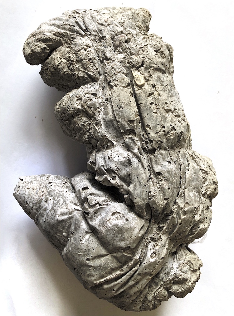
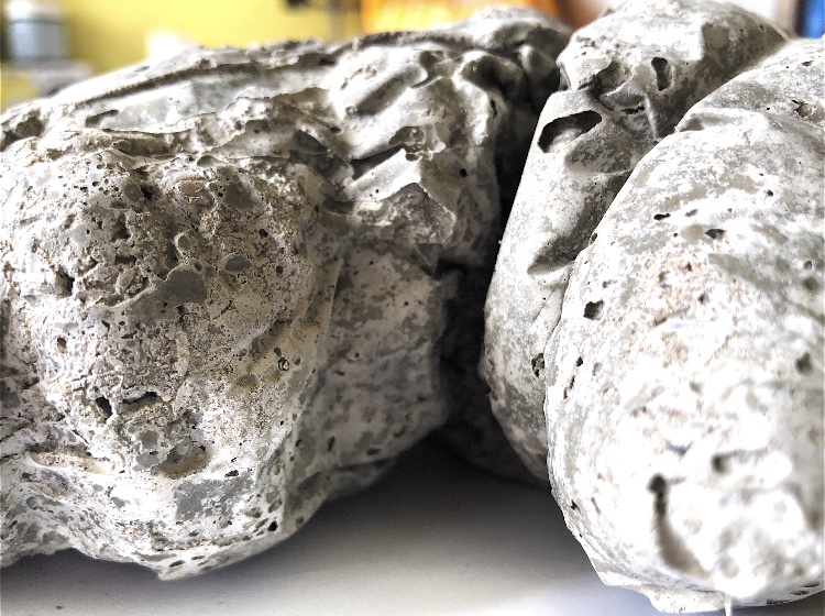
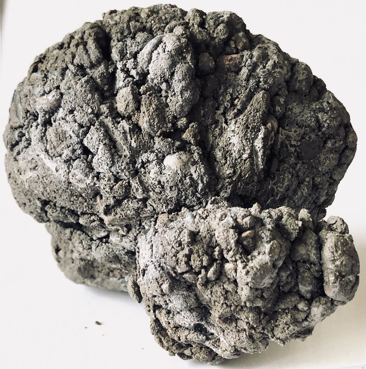
Fig 11. Concrete was a whole new world for me. The mix I purchased was quite rough with a lot of stones so I thought it would not pick up fine textures. The first sample I made was quite a dry mix and although it was made in a plastic bag it retains a lot of lumps and bumps. The bag was tied with string and this made deep crevasses in the sample as well as influencing the final shape.
Crayon rubbings and inks captured the surface of this sample.
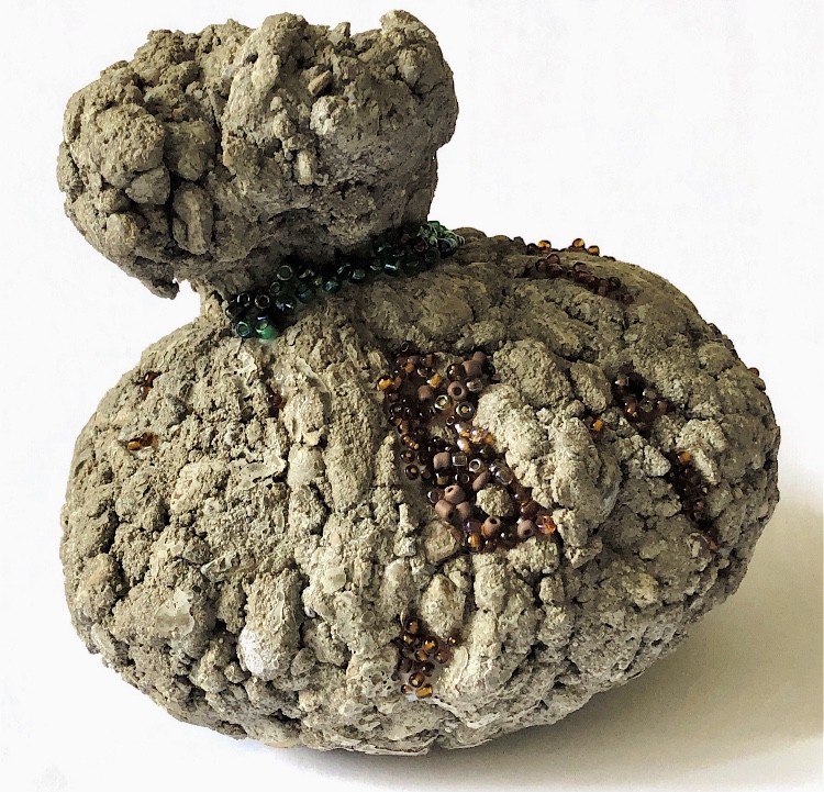
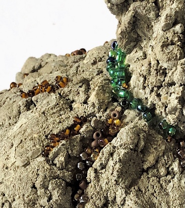
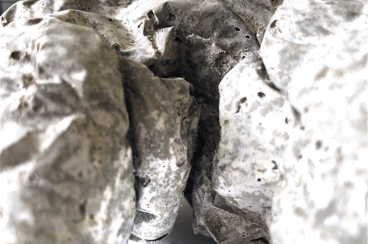
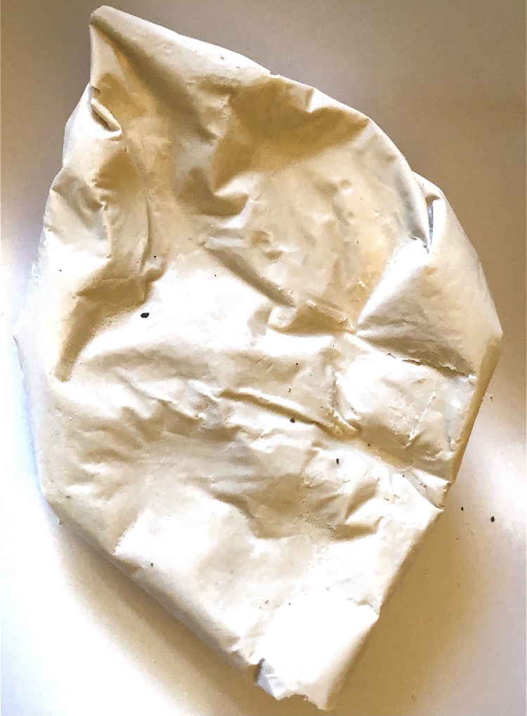
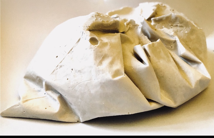
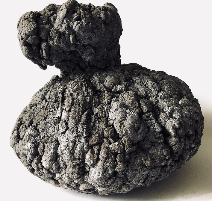
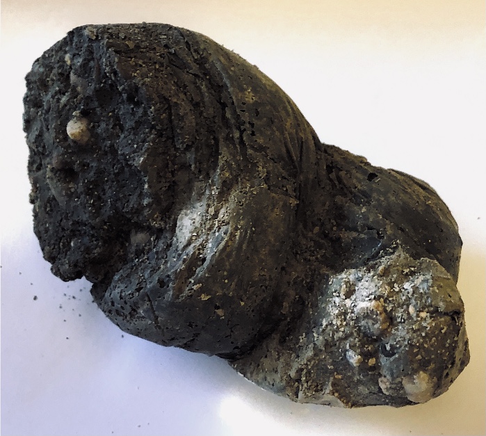
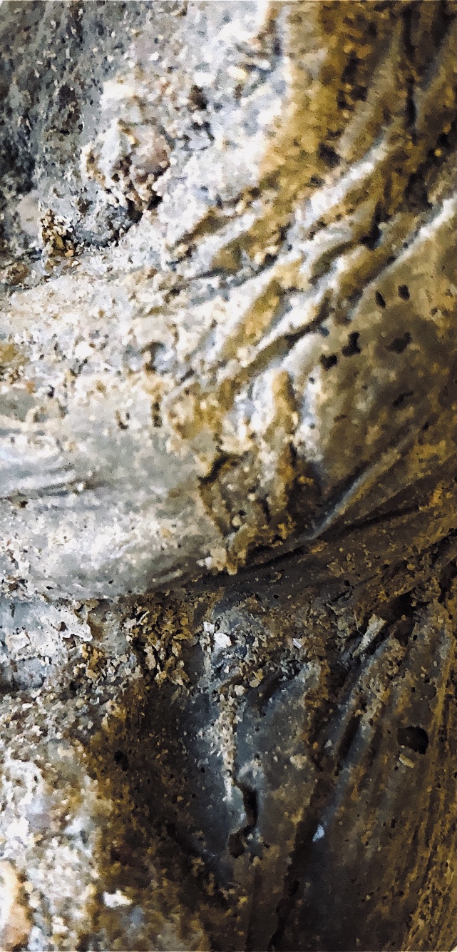
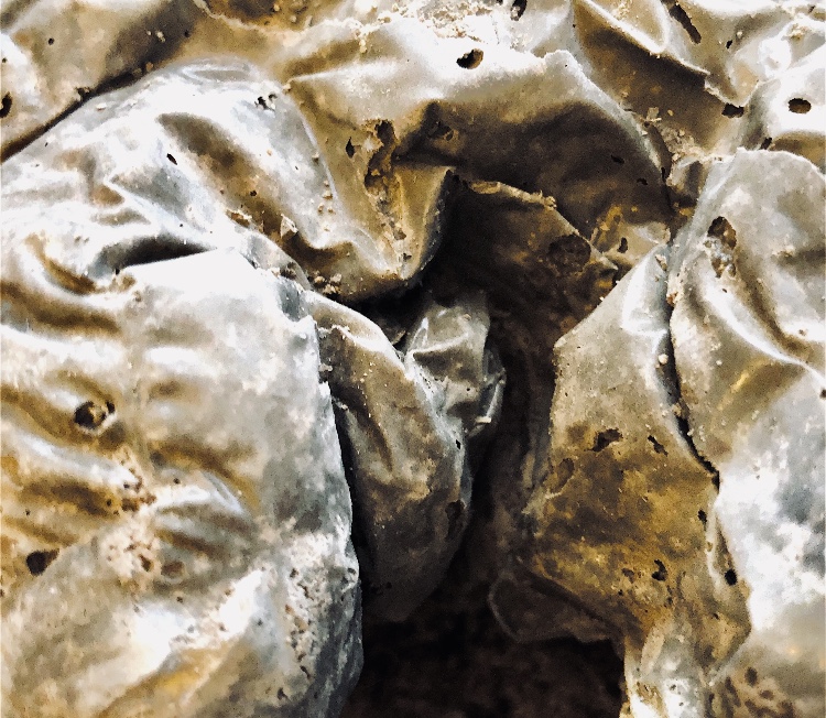
Fig 12. This sample was also cast in a plastic bag with a dryish mix. The bag was tightly wound around the neck and then bound to create tucks folds and gathers. The resulting bag-like form is a really lovely shape and is reminiscent of an ancient purse or money bag. Splatter painting worked really well to explore the textured surface of this sample.
I was intrigued by the idea of an old purse and decided to add beads to the fissures as if small remnants of ancient decoration remained.
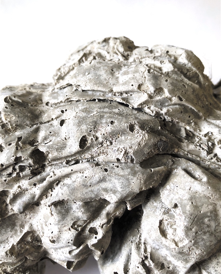
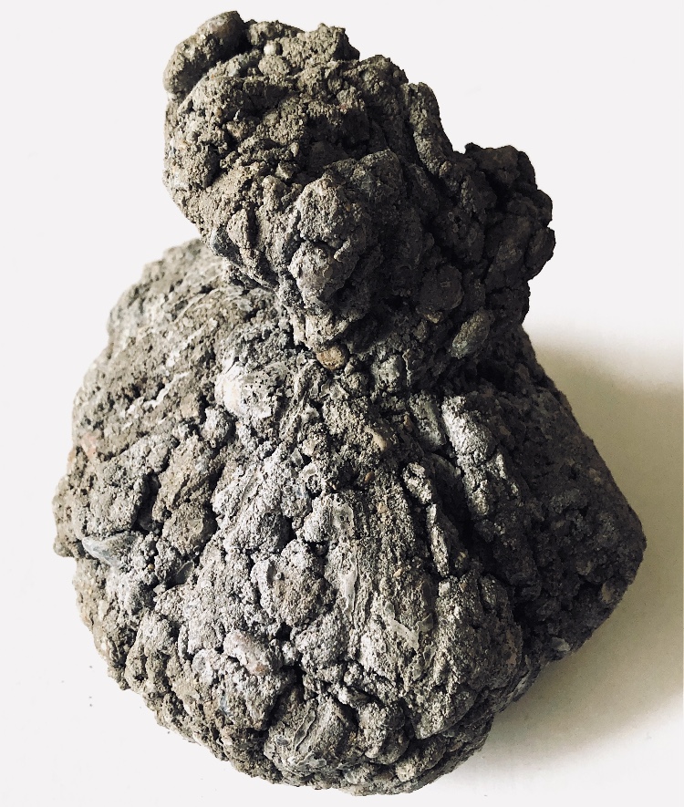
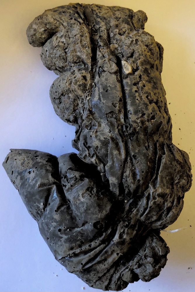
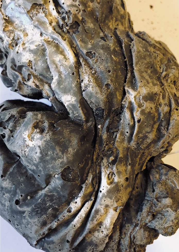
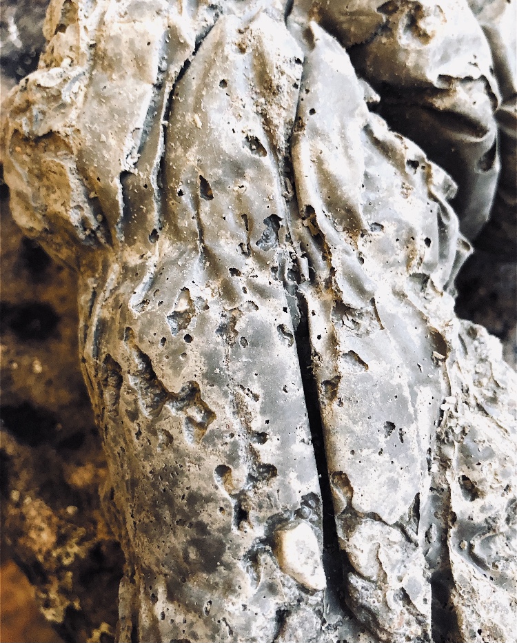
Fig 13. For this sample I added a bit more water to the concrete mix and ended up with a much smoother sample. I cast in a plastic bag and twisted and bent it to make an organic looking sample. This method made a sample with so much movement in beautiful twists and turns in its surface, and fantastic colours where these catch the light. In certain lights the colours look metallic, and I loved painting these patterns with crayon and inks. Crayon rubbings created lots of texture.
As the concrete dried (which took longer than I anticipated) it lightened in colour, and appeared more stone like. The smaller air bubbles became more apparent and the sample looked really different. I think I prefer the darker version as this colouring complements such a heavy, strong piece.
Fig 14. While sorting through my samples I decided to make one more piece combining resin, latex and plaster. I was inspired partly by the work of Ben Young who makes sculptures with glass, metal and concrete. I researched his work at the start of this module. His pieces quite often combine a geometric shape – usually translucent glass representing the sea, with something organic – the concrete representing a geological feature such as mountains. The glass is usually blue and the colour of the concrete is left natural.
For my sample I added in snippets of green wire, barbed wire that I made, fine wool and cotton fibres and some scrunched up cling film together with a piece of a latex sample. I tipped the mold to allow the resin to set at an angle before adding the plaster.
One thing that struck me when I first held this piece was the difference in temperature between the resin and the plaster. The plaster is much colder. The plaster also creates a sort of surface for the resin to sit on, like the bottom of the sea. The latex has got lost a bit in the poured plaster so this is something I need to consider next time.
This sample beautifully reflects light.
I was a bit unsure about drawing this sample but had a go using gouache, gesso and latex with added bits of wire, beads and paper.
So these are the samples that I feel have taken me on new journeys and have lots of inspiration for future projects.
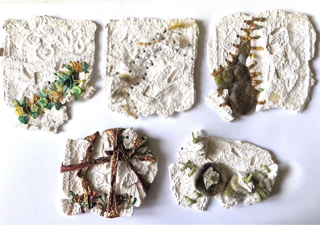
Using plaster enabled me to use a range of surfaces which are fine and intricate as the plaster picks these up when cast. I made some small bags from different fabrics to hold some of the casts, adding pleats and gathers to manipulate some of them.
Fig 1. For this sample I used a plastic food bag, gathered tightly at the top and laid on a pile of buttons to dry. Although the indent of the buttons can be seen, the bag stopped any fine detail showing. The folds however are intriguing, creating shadows in the hidden places. This sample is very smooth due to the shiny plastic it was cast in.
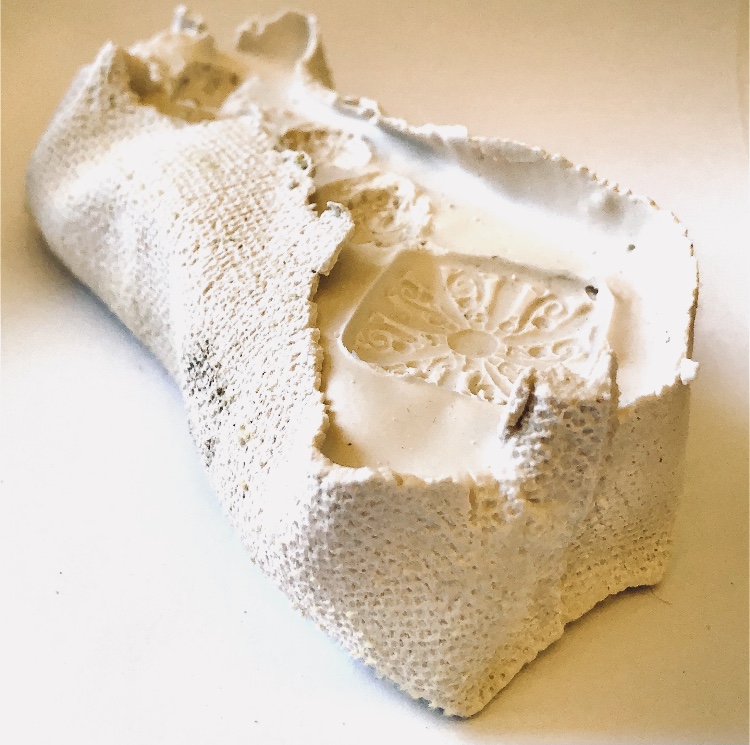
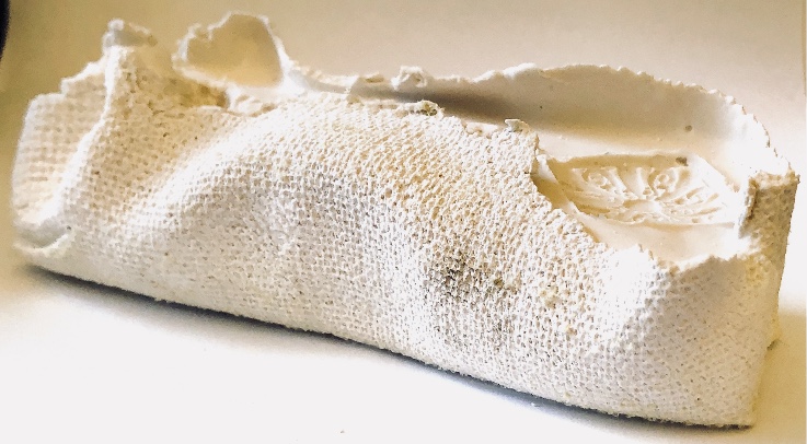
Fig 2. I made a small container from some woven furnishing fabric. As the top wasn’t sealed I had to hold it in place until it had dried sufficiently not to leak – bit messy! I also embedded decorative beads on the open surface. The texture of the fabric and the sewn seams have been captured perfectly and contrast with the flat surface embedded with patterned beads. The rough edges of the fabric are uneven, and this is a very tactile sample.
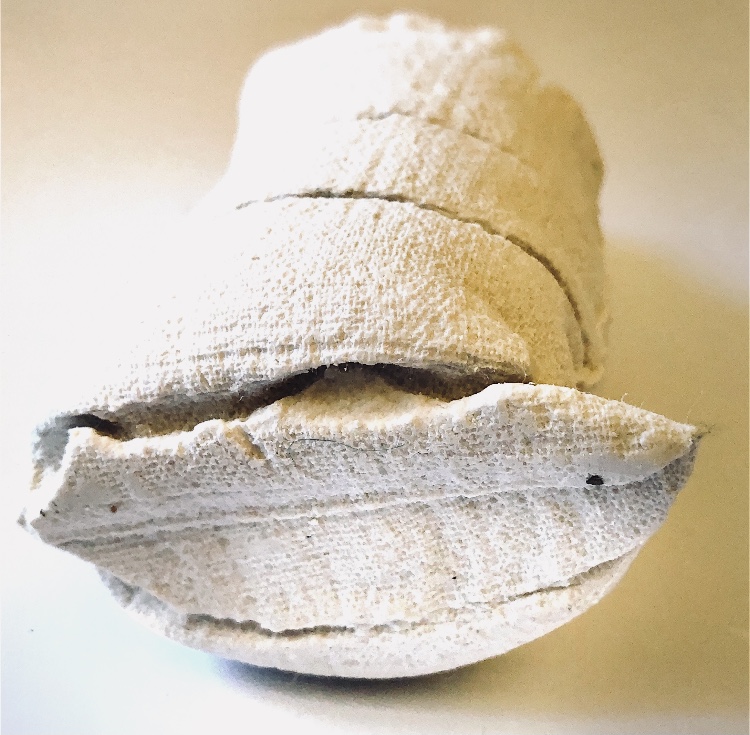
Fig 3. For this sample I made a small container from a piece of knitted and felted material (originally a scarf I had made). Some of the stitches had biggish holes and the plaster did leak a bit from the bottom but this soon stopped. It was quite difficult to remove the plaster from the knitting and it retains a lot of fibres and even a few stitches. I like the fibres as they add a soft quality to the hard plaster and also some colour. The stitches can be clearly seen in the sample which gives lots of interest and pattern to the organic looking shape.
Fig 4. For this sample I cut up an old blouse with an embroidered motif, and pleated and gathered it to make a bag. Once the plaster was poured I tied and manipulated the sample – from the photos one can see that this sample looks very different when seen from different angles. The embroidered motif can be clearly seen but has been distorted by the tying.
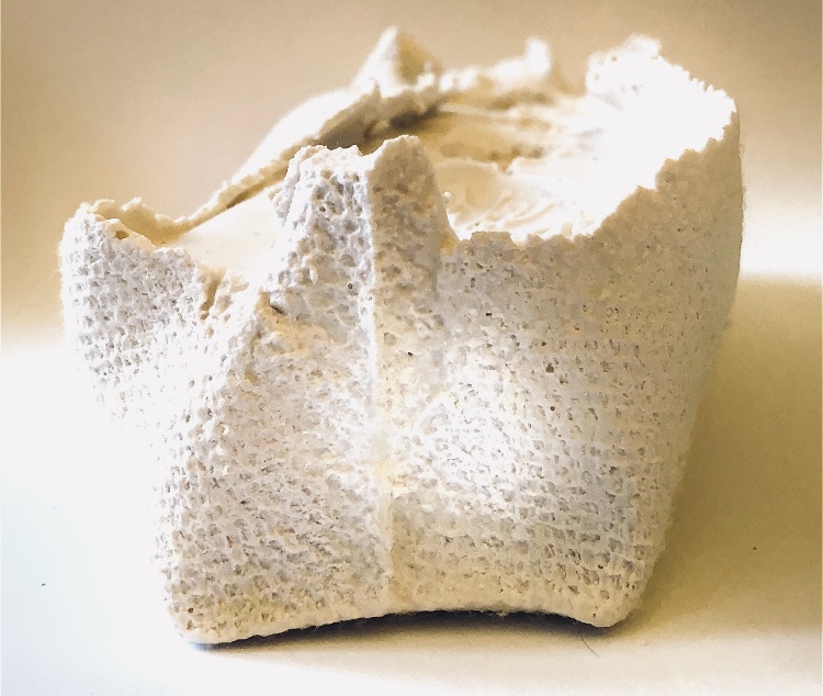
Fig 5. I made a different shaped bag from an old pair of linen trousers and added some tucks which were on the inside of the container. This sample stands up nicely like a full sack just slightly bending to one side. The tucks can clearly be seen and they help delineate the bend in the piece. The seams from the bag are clear, and a piece of cotton from the stitching became embedded in the plaster and remains in the sample.
Sketchbook work
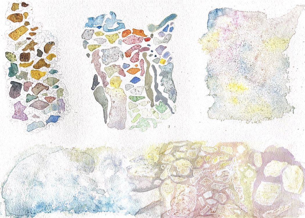
Watercolour paintings with pen detail, using salt and cling film to add texture.
I really enjoy working with plaster as it can pick up the tiniest detail and can be poured into a variety of shapes. It feels good to hold and takes colour well.
The concrete I got for this exercise was very coarse and was obviously not going to pick up subtle shapes, so I went for plastic bags tied in different ways and quite large samples.
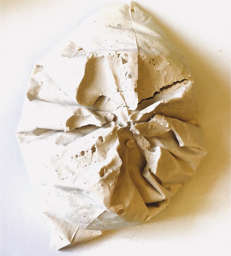
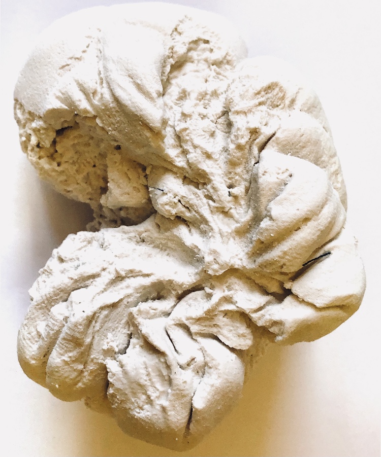
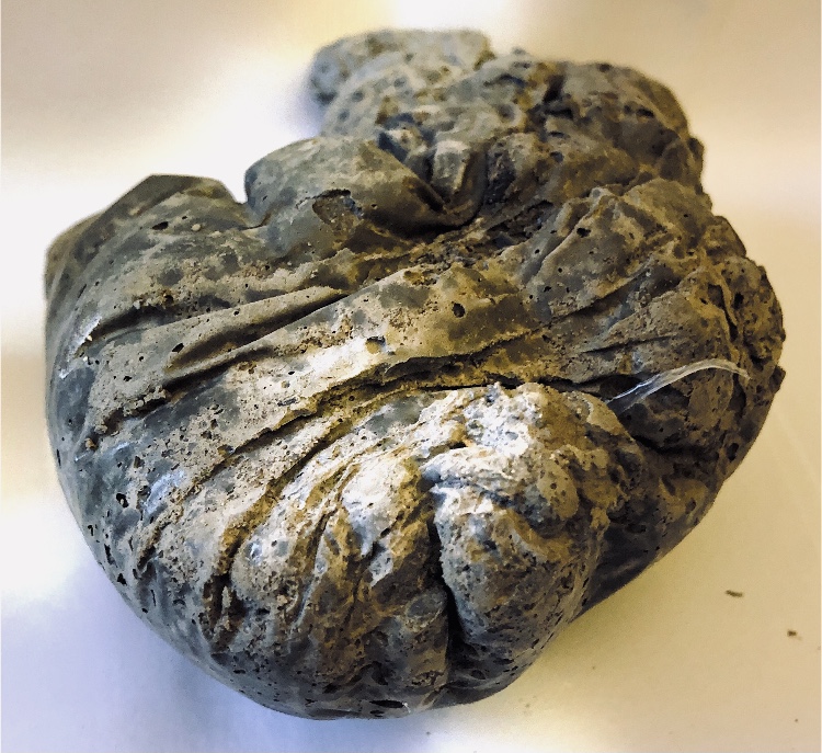
Fig 1. This piece I tied around the top of the bag to make a purse or money bag shape, gathered around the top. The creases and folds produced by tying the bag are visible and the neck of the piece where the string was wrapped around and around, is clearly defined. There is a lot of texture reminiscent of ancient embellishment. I laid the sample on a flat surface to dry and this adds to the feeling of a bag full of money or heavy jewellery.
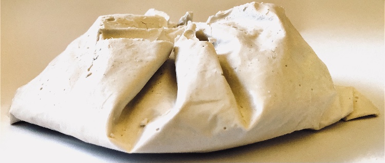
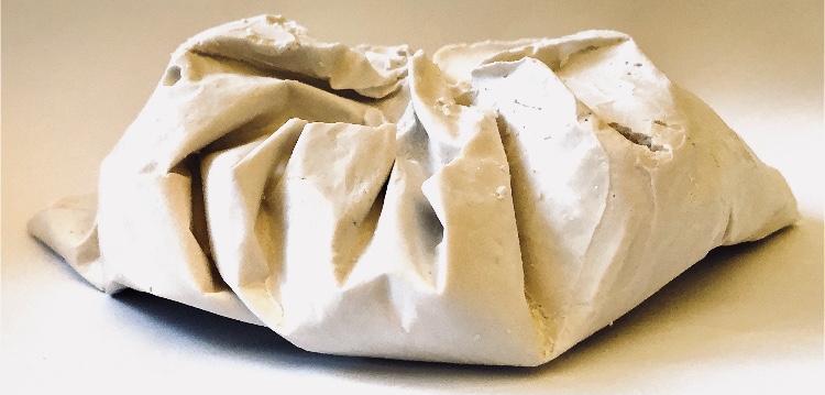
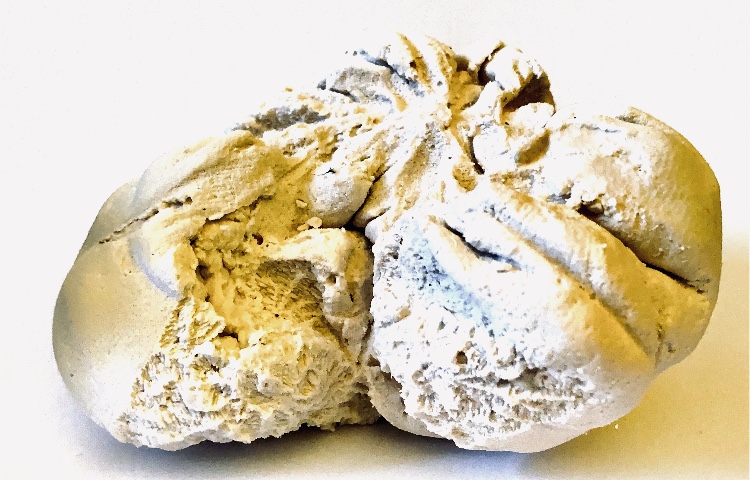
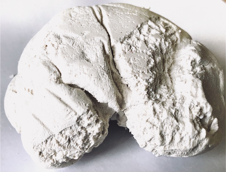
Fig 2. The next few pieces were also cast in plastic bags which were twisted and bent as well as tied with string. I decided not to try to make other impressions but to rely on the impressions of the twisted bags and the string. Some of the mix was a bit wetter in some samples and a smooth shiny surface has resulted with clear lines and twists creating organic patterns. Samples made with the drier mix are rougher to touch and to look at but still clearly show the tying lines.
Crayon and ink drawing
Having done a quick sketch with crayon and ink for a couple of samples I decided to have another go. This drawing is done with different coloured crayons with an ink wash over the top. To get some texture I laid a homemade textured glue stencil under the paper and did a crayon rubbing before inking.
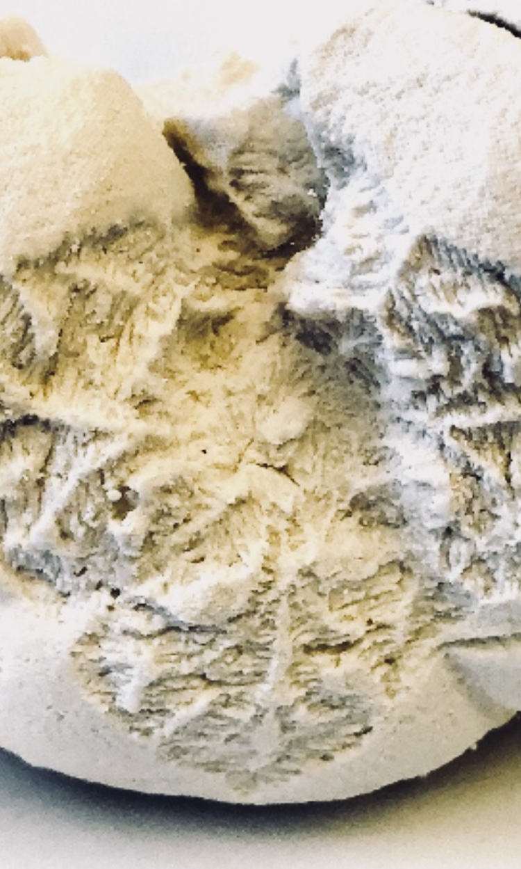
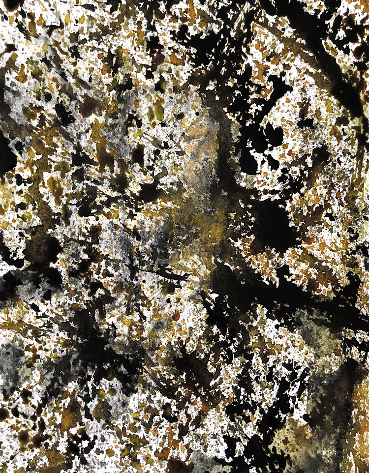
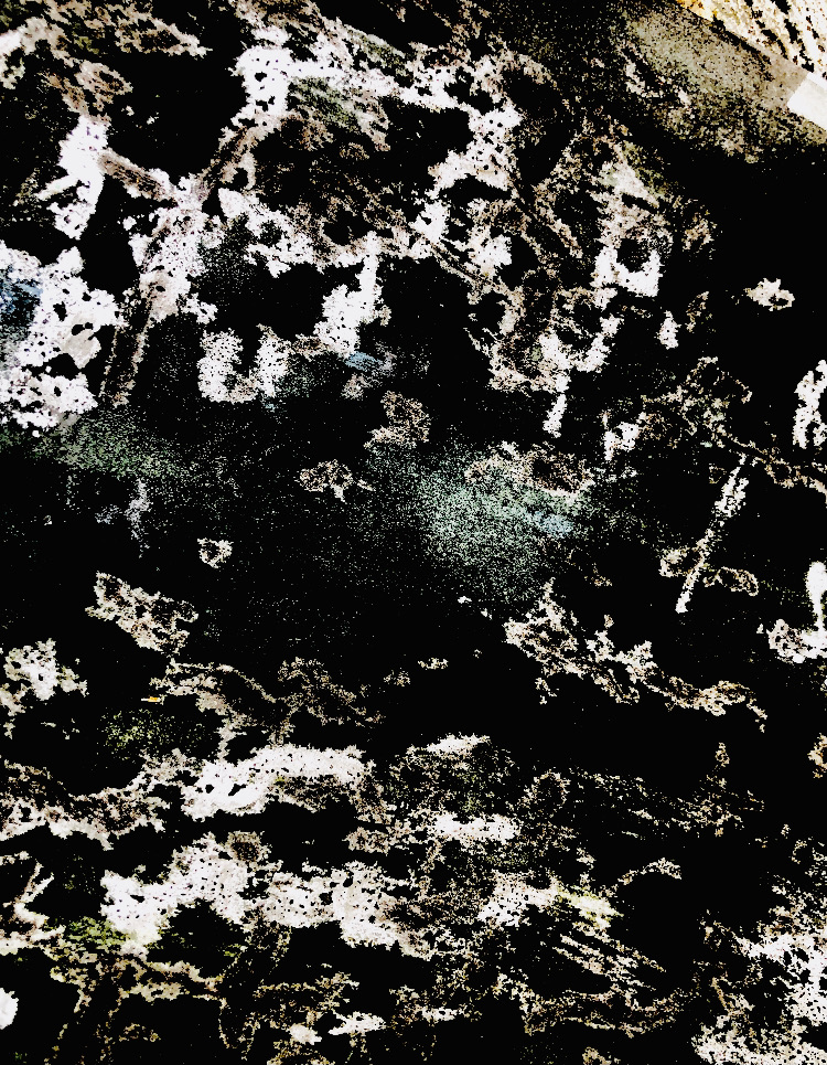
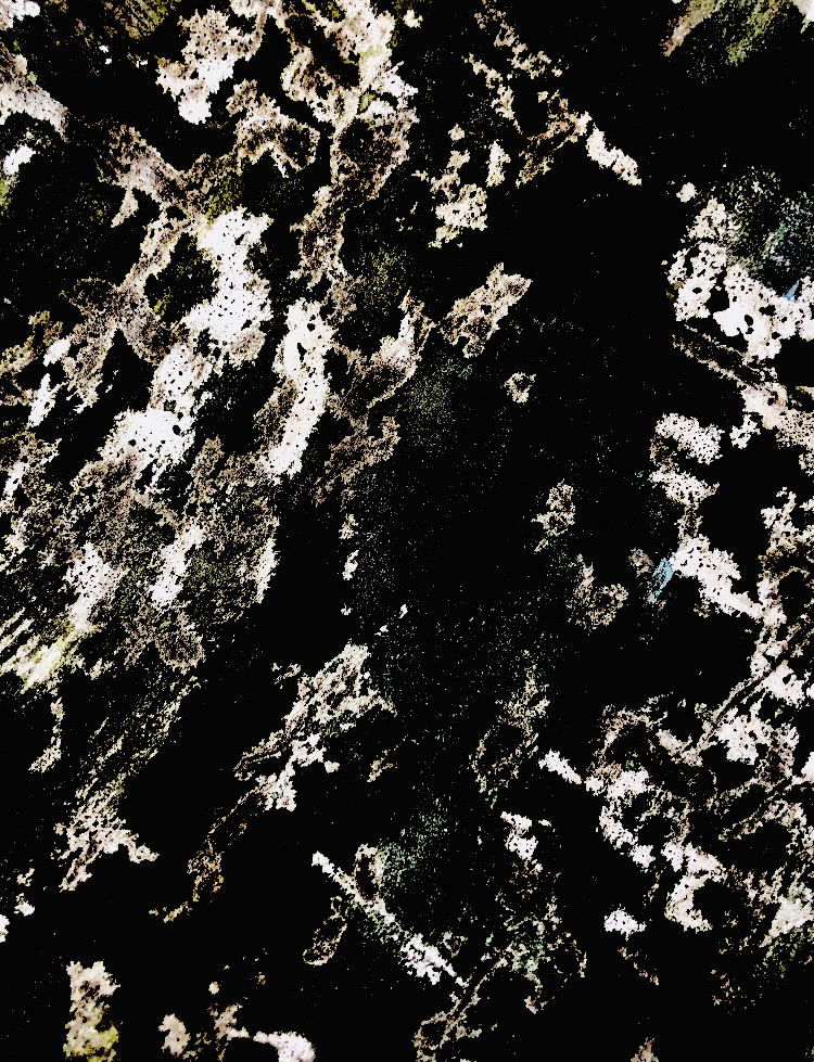
Close up photos of the samples show the air bubbles and twisted patterns more clearly.
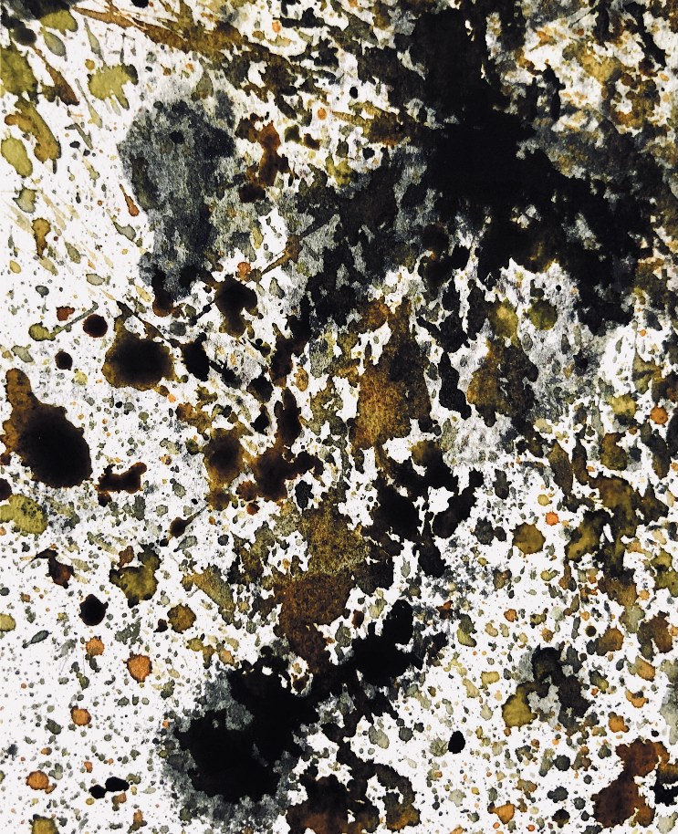
These drawings were inspired by the texture of the concrete and were made by splattering ink from a brush onto the paper And everything else within a 1 metre radius)!
The colour of the samples is getting lighter as it dries out which is more attractive.
The texture of the folds, bubbles and rough and smooth surfaces are what I have found most inspiring in these samples.